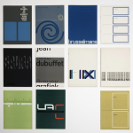
Published within the Stedelijk Museum series with no. 50, designed by Willem Sandberg and with the “creme de la creme” of sculptors from France / Paris, this has arguably become one of the most important exhibitions and catalogues for the Stedelijk Museum from the Fifties. Within the catalogue you will encounter only the most famous of names. Here they are: Brancusi, Gonzales, Gargallo, Laurens, Arp, Chauvin, Zadkine, Lipchitz, Giacometti, Richier, Couturier and Auricoste. Another important aspect to this exhibition is the catalogue. It uses multiple kinds of brown and glossy papers, making this one of the first for a series of catalogues which were designed by Willem Sandberg in such a way for the Stedelijk Museum. This design was typical for Sandberg in the Fifties and he continued to use these papers throughout his career as a designer. Wim Crouwel broke with this tradition and presented a much cleaner, more contemporary design, but i admire these Sandberg catalogues and this is probably one of the very best and most important.
Category: stedelijk museum amsterdam
Günther Förg at the Gemeentemuseum in 2003
An important discovery among the many invitations i acquired recently. It is an original sketching by Förg for what presumably could be a wall drawing in one of the rooms of the Gemeentemuseum during and after his 2003 exhibition. In that time Förg was experimenting with loosely painted forms on canvas and walls.
On the painted paper sheet is the studio stamp of Günther Förg in Freiburg and the paper is devided into two parts. The upper part is painted with a deep green and handwritten the text Gemeentemuseum in blue ballpoint, underneath in pencil Den Haag 2003. Left of the green a text in blue ballpoint ” Moikan (?)” The lower part of the design/drawing/painting is in a “leather brown” color and in pencil beside “Israel” is written . On the lowest part of the sheet the studio stamp in black ink.
My educated guess is that this is a proposal for a wall drawing in one of the rooms of the Gemeentemuseum Den Haag and this highly collectable item is now available at www.ftn-books.com.
New Business Card FTN books & Art
Some recent changes made it necessary to translate these changes into a new business card. The most important one being two new email addresses. One personal one and the other for the FTN books & Art contacts. So here is all the new business information to contact me and keep track of my activities, the daily blog and additions to my inventory.
Wilfried van den Elshout / FTN books
Veursestraatweg 106c
2265CG Leidschendam, the Netherlands
new email : wilfriedvandenelshout@gmail.com
new email : ftnbooksandart@gmail.com
Friedrich Vordemberge-Gildewart (1899-1962)
Beside the spectacular constructivist paintings Friedrich Vordemberg-Gildewart made, there is another aspect in his art life what made him special and important. FVG was the first artist who made abstract paintings throughout his entire career. At first glance his work is related to Mondriaan, de Stijl and Malewich, but look at it more careful and you notice that there is mus more space within the paintings. A way of painting which makes the painting seem less crowded. It is the way i like a painting to intrigue
Friedrich Vordemberge-Gildewart was born in Osnabrück, Germany and studied architecture, interior design and sculpture at Hanover School of Art and the Technical College, Hanover. In 1924 he formed the abstract art group Gruppe K in Hanover with Hans Nitzschke and joined Der Sturm in Berlin. After meeting Theo van Doesburg, Kurt Schwitters and Hans Arp, he became a member of De Stijl in 1925. Together with Kurt Schwitters and Carl Buchheister he formed the ‘Abstrakten Hannover’ group in 1927. He was a member of a number of other artistic groups including: the Cercle et Carré, 1930, Paris and was a founding member of Abstraction-Création (1931), also in Paris. In 1937, in Munich, the Nazi regime exposed his works in the infamous Degenerate Art exhibition. Most of his works were confiscated and he was forced to leave Germany for the Netherlands.
there is a very special Bottrop publication from 1980 available at www.ftn-books.com, which contains 3 silkscreen prints by FVG.
Kitaj (1932-2007)
Robert Brooks Kitaj was born in the US but his art is closely related to the British Pop Art. I am writing this blog because i recently acquired a german catalogue on his exhibition at the Kunsthalle Dusseldorf and i was impressed. Later i learned that Kitaj received a lot of criticism on his art as the press slaughtered his exhibition at the Tate gallery in 1994. Her is what i found on Wikipedia
A second retrospective was staged at the Tate Gallery in 1994. Critical reviews in London were almost universally negative. British press savagely attacked the Tate exhibit, calling Kitaj a pretentious poseur who engaged in name dropping. Kitaj took the criticism very personally, declaring that “anti-intellectualism, anti-Americanism, and anti-Semitism” had fueled the vitriol. Despite the bad reviews, the exhibition moved to the Metropolitan Museum of Art in New York and afterwards to the Los Angeles County Museum of Art in 1995. His second wife, Sandra Fisher died from hyperacute haemorrhagic leuco-encephalitis in 1994, shortly after his exhibition at the Tate Gallery had ended. He blamed the British press for her death, stating that “they were aiming for me, but they got her instead.” David Hockney concurred and said that he too believed the London art critics had killed Sandra Fisher.[14] Kitaj returned to the US in 1997 and settled in Los Angeles, near his first son. “When my Wife died”, he wrote to Edward Chaney, “London died for me and I returned home to California to live among sons and grandsons – It was a very good move and now I begin my 3rd and (last?) ACT! hands across The Sea.” Three years later he wrote: “I grow older every day and rather like my hermit life.” The “Tate War” and Sandra’s death became a central themes for his later works: he often depicted himself and his deceased wife as angels. In Los Angeles No. 22 (Painting-Drawing) the beautiful young (and naked) girl records the shadow of her aged lover (on whose lap she sits) in a pose directly taken from the Scots Grand Tourist David Allan’s Origin of Painting. The latter was included by Ernst Gombrich in his 1995 National Gallery exhibition (and catalogue) on Shadows so that Kitaj would have seen it two years before he left England for ever.
Personally i think the critics are wrong. Kitaj deserves his place among the great European Pop Art artists and the future exhibitions that will include his works will probably prove me right. Some Kitaj catalogues are availableat www.ftn-books.com
2x Borek Sipek and 2x Erwin Olaf
Why another blog on Erwin Olaf? This one is on the occasion of the addition of the book BOREK SIPEK / Glas Design Architectuur in which a series of photographs by Erwin Olaf with works by Sipek is published . Almost the exact series was used before. The series was made on location with gypsies holding glas and design by Sipek and photographed by Erwin Olaf for the Stedelijk Museum exhibition and publication which was designed by Irma Boom ( Book on the left/private collection). The addition to my inventory is the book published by the Drents Museum, which contains 8 color photographs by Erwin Olaf together with the Anton Corbijn cover. This makes the book a true collectors item since these photo’s are among the best Olaf ever made.
When you study both series ( Stedelijk Museum and Drents museum), at first you think the photographs are the same , but study them closely and you will notice some subtil differences. I conclude that Erwin Olaf must have made shortly after each other two series. One in Black and white, the other in color.
Using 2 cameras this must have been technically possible. Just look at the position of the hand of the gypsy boy. The book published for the Drents Museum is now for sale at www.ftn-books.com
Richard Long / Stedelijk Museum 1974
The catalogue by Richard Long he made for the Stedelijk Museum in 1974 has on the front the text of the tarditional song JOHN BARLEYCORN”. for those who are not familiar with the song . Here is the song performed by the British ” super” group Traffic member, Steve Winwood.
The catalogue is available at www.ftn-books.com
Nicolaas Wijnberg as a poster artist
At one time Pieter Brattinga, who knew every good poster artist in the Netherlands , was asked who were the best poster designers. His answer, Crouwel, Sandberg, Treumann and Bons, but the very best was Nicolaas Wijnberg. Because his father was the director of the famous Steendrukkerij de Jong he had seen their works for some decades being printed on the presses of his father company. Because he had seen them all, his opinion is important and when you look at the posters by Wijnberg you can see why these were liked so much. His posters are not the ones with the beautiful clean lay-out. Nor the ones which stand out because of the use of color. No……. the Wijnberg posters are special because each of them tells a small story. This is not the poster who draws your attention for an event. The Wijnberg posters reaches out to you with a part of the performance or event. This makes you curious and therefore you will remember it.
The book on the Nicolaas WIJNBERG posters is available at www.ftn-books.com
Wim Oepts (1904-1988)
Wim Oepts , always reminds of the more abstract brother of Vincent van Gogh. The choice of colors even reminds of van Gogh and in many cases his landscapes are the same kind of Landscapes van Gogh preferred to paint. The days that Oepsts started to paint were the same days that van Gogh was finally recognized as being one of the great painters of all time. This meant that Oepts must have known his paintings very well and admired them. This also meant that he never followed the road into abstraction . His paintings were always colorful and the subjects recognizable. Friendly paintings for those who want an ” easy” work of art on the wall. Affordable certainly , artistically important? ….i doubt it.
left Oepts / Right van Gogh
Wim Crouwel (continued )
Early September 2019 i recommended the Mr Gridnik exhibition which would open shortly after in the Stedelijk Museum. Just a few days before opening Mr. Gridnik/ Wim Crouwel died and he never witnessed his tribute at the Stedelijk. Since i have not found the time to go to this exhibition myself, but now that i finally have the opportunity and started planning my visit, i found out that all rooms are photographed and can be visited on line. It is a worthy tribute to one of the greatest designers from the last decade, but could have been much more complete. It focusses for 90% on the Stedelijk Museum publications, but it is still a very impressive sight to see so many great designs collected, but the real surprise is that i noticed that i have almost all of the books on show in my inventory. (www.ftn-books.com)
For those living too far away to visit the exhibition….here is the direct link to the rooms and showcases with Crouwel material:
https://www.stedelijk.nl/nl/crouwel-vitrines
and another excellent site with 19 photographs:
http://dutchdesigndaily.com/nl/nieuw/wim-crouwel-mr-gridnik/