Posted on Leave a comment

Martijn Sandberg (1967)

Schermafbeelding 2021-07-11 om 09.36.03

Just a simple blog on a great artist and his ideas . I admire Martijn Sandberg for his art. Every few month i look at his site and find some new works that fascinate me . Just take a dive into Martijn’s ideas and visit the link below. An internet related project by Martijn Sandberg. An art work he exclusively made available on the internet

http://www.msandberg.nl/noimageavailable/

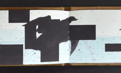
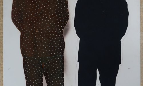
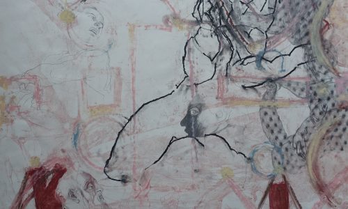
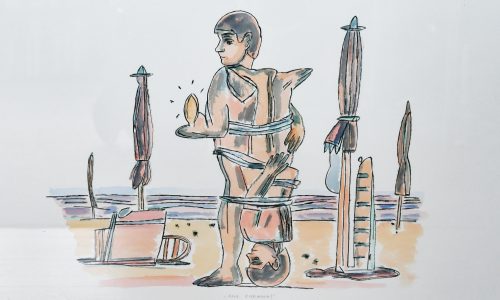
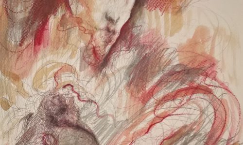
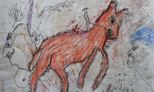
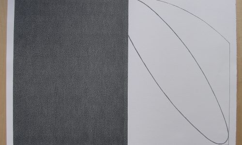
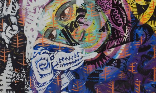
Martijn Sandberg ‘Image Messages’The work of Amsterdam based visual artist Martijn Sandberg (1967) constantly explores border areas, such as the tension between text and image, illegible into legible, the private and the public domain. ”I make Image Messages, image is message is image.” The image hides the message.
In the cut paintings, such as ‘Sorry No Image Yet’ and ‘Im Westen Nichts Neues’, there is a subtle play between the language of the image and the significance of the image, and this gives rise to questions. Here, even the lack of image seems to be elevated to an image by the artist.


The direct relationship between the image, the material bearing the image and the environment is also expressed in his site-specific works in public space and architecture. As in the ‘De Oude Weg Naar De Nieuwe Tijd’ artwork, integrated as a brick relief in the walls of the gates and the pavement of the Spaarndammerhart building, Amsterdam. Or in the sculpture ‘I Will Survive’ located at the border of a burial ground in Hardenberg, The Netherlands.

BTW. For those interested in the editions by Martijn Sandberg please visit his shop at :

http://www.msandberg.nl/shop.php?shop=yes

Posted on Leave a comment

Imre Reiner (1900-1987)


Schermafbeelding 2021-07-30 om 16.25.30

Imre Reiner is most known for his typograohic innovations and fonts, but recently i added a book on his Ziffernbilder to my inventory. It shows that he was beside as typographic artist a very talented graphic artist too.

Born August 18, 1900 in Versec (Hungary), died August 21, 1987 in Lugano. Staatliche Bildhauerschule Zalatua (Zalatua State Sculpture School) and Kunstgewerbeschule Frankfurt (Frankfurt School of Arts and Crafts), from 1921 Kunstgewerbeschule (School of Arts and Crafts) in Stuttgart (Prof. F. H. Ernst Schneidler).

1923 to 1925 – worked as a graphic designer in London, Paris, New York and Chicago. Until 1927 – master-class student of F. H. Ernst Schneidler. From 1931 worked in Ruvigliana near Lugano as painter, graphic designer and illustrator.

Fonts: Meridian (1930), Gotika (1933), Corvinus (1934–35), (1938), Symphonie (1938), Floride (1939), Reiner Script (1951), Contact (1952), Reiner Black (1955), Mustang (1956), Bazar (1956), London Script (1957), (1957), (1959).

Matura, Mercurius Script and Pepita are trademarks of Monotype Typography.

the book below is available at www.ftn-books.com

Posted on Leave a comment

Zonnehof Amersfoort posters

zonnehof zweden a

From the same source as the Crouwel posters of yesterdays blog comes this series of posters for the ZONNEHOF AMERSFOORT museum. Later this would become the Armando museum, but in the Sixties and Seventies they had their own small program of exhibitions. Well worth visiting and it is interesting to see that also a smaller dutch museum thought it important that design and typography of their publications was important. The main part of these series was designed by van den Brink. All are now available at www.ftn-books.com


Posted on Leave a comment

Jurriaan Schrofer ( continued )


Last month…. on the bookmarket…. i found a series of beautiful and typical late Sixties designs by Jurriaan Schrofer. Schrofer is together with Wim Crouwel the other favorit dutch designer from the Sixtie.

A Pop Art like style he developed over the decade and used this for his projects and the series he made for Museum Journaal is one of the most impressing from that decade. The series is now for sale in separate volumes at http://www.ftn-books.com, nbut for the collector that desires them all please contact me at wilfriedvandenelshout@gmail. com for a special offer of all volumes available.

schrofer MJ b


Excellent piece on Schrofer written in French at this site:

Jurriaan Schrofer

Posted on Leave a comment

Henk de Vries (1931-1986)

Schermafbeelding 2021-03-23 om 15.39.13

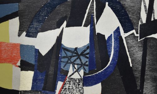
The french would call it a “petit maitre” a small master and for me this is true. de Vries was never known that much among art lovers, but now that the Fifties and Sixties become “en vogue” he is discovered . His paintings lean towards cubism , but have those typical Fifties colors in them. I first took notice of his paintings when i bought the 1966 Museum van Looy catalogue on de Vries ( now available at ww.ftn-books.com), but the most impressive elements were the typical Sixties invitations that i found within the publication. Great design and highly collectable invitations that are typical for these years.

Posted on Leave a comment

Jean Widmer (1929)

Schermafbeelding 2020-11-30 om 16.39.42

Yesterdays blog and the acquisition of some former Ben Bos library books on grapphic design inspired me to find some more information on Jean Widmer.

Jean Widmer is an acclaimed Swiss graphic designer too based in France.

From 1946 to 1950 he studied at the Kunstgewerbeschule (School of Arts and Crafts) of Zurich, then directed by the former Bauhaus master Johannes Itten (1888-1967). In 1953 he moved to Paris, where attended lithography courses at the École des Beaux-Arts (School of Fine Arts).

After one-year internship at the Atelier Tolmer, located on the Île Saint-Louis, he was appointed Art Director of SNIP—Société Nouvelle d’Information et de Publicité (New Society of Information and Advertising), holding this charge from 1956 to 1959. He later moved to Galeries Lafayettes, a major department store, substituting Peter Knapp as its Art Director, from 1959 to 1961. At the same time he also worked at Jardin des Modes magazine as art director and photographer, holding the position until 1969. During the 1960s he also travelled in Japan to study ‘shodo,’ Japanese calligraphy, and ‘mon,’ Japanese traditional crests.

In 1969 he opened Visuel Design, focusing on coordinated graphic communication for cultural and public institutions. The same year he was the first designer to develop a corporate identity system for a French cultural institution, developing the graphic communication of the CCI—Centre de Création Industrielle (Center of Industrial Creation).

It was during this period that Widmer developed his own original graphic language, based on synthesis, rigorous geometry, and schematic typography that to this day represents the first and one of the few examples of Modern graphic design in France.

In 1972 he took charge of the first design for the French Highways signage, drawing a beautiful and effective pictogram system. From 1974 to 1977, and again in 1985, he designed the coordinated identity for the Centre Georges Pompidou, formed from the merging of the CCI with other cultural institutions, for which he designed a beautiful and iconic mark that portrays the famous façade of the building.

In 1979 he designed an acclaimed poster for Kieler Woche, the major sailing event in the world that is famous in the world of graphic design for its striking communication. From 1983 to 1987 he worked on the corporate identity design for the prestigious Musée d’Orsay, in collaboration with the prominent graphic designer Bruno Monguzzi.

He continued to focus on corporate graphics for cultural institutions, developing the identity for the Théâtre National de la Colline, and the IMA—Institut du Monde Arab, both in 1987, and the Bibliothèque Nationale de France in 1994. In 1989 he also designed a typefaces, Bi-89, on the occasion of the French Revolution’s bicentennial.

In 1960 he joined the faculty of the ENSAD—École Nationale Supérieure des Arts Décoratifs (School of Decorative Arts), Paris, where he taught until 2000 remodeling the graphic design curriculum, stressing mastery of typography and color as fundamental skills. Since the early 1990s, he also taught at the Atelier National de Recherché Typographique (National Bureau for Typographic Research).

During his career he received important recognitions, including the Toulouse-Lautrec Prize in 1980, the Grand Prix National des Arts Graphiques from the French Ministry of Culture in 1994, and the Distinctive Merit Award from the ADC (Art Directors Club), New York. He was appointed Chevalier of the Ordre des Arts et des Lettres in 1983, Officer of the same order in 1991, and Commandeur in 2001.

The important Centre Georges Pompidou publication is now available at www.ftn-books.com

widmer a

Posted on Leave a comment

Posters by Willem Sandberg and Wim Crouwel…part 7

It is not the catalogue which steals the show, but certainly the poster designed by Wim Crouwel does.

jensen poster a

Another iconic duo . Both designed by Wim Crouwel, but the poster is something really special which features in many publication on poster and graphic design. Bot are available at www.ftn-books.com


Posted on Leave a comment

Happy New Year…and a healthy 2021

sandberg portret

Dear Reader,

Thanks for your interest in this continuing daily blog. It has been been a year filled with changes and I truly hope next year will be a more normal year and of course a healthy one for you and all your loved ones.

What way to have a better start of the blogs remembering the New Years wishes Willem Sandberg made during his directorship at the Stedelijk Museum Amsterdam.

Each year until the early Sixties he made a yearly New Years wish for the Stedelijk Museum. Recognizable, highly original and in a way only Sandberg could design and make them. I encountered these New Years wishes in a biography which was published in 2004 and written by Ank Leeuw Marcar. In the centre of the book all Sandberg New Years Wishes are assembled. ( available at http://www.ftn-books.com).

To finish ….My best wishes for you and your loved ones and have a wonderful 2021.

sandberg portret

Posted on Leave a comment

Pretty Dutch / 2007

I have seen thousands of art book covers during this last year and here is the one that I think struck me most. It is a publication by the Princessehof from 2007 in which their collection is presented in the very best way possible. Photography of the collection by Erik and Petra Hesmerg and then there is this cover……..

pretty dutch

Photography by Fritz Kok and catalogue design by Ben Lambers

printed by Die Keure

an excellent threesome making a great publication now available at www.ftn-books.com


Posted on Leave a comment

Gracia Lebbink (1963)

OLYMPUS DIGITAL CAMERA

This blog is long time overdue. I met Gracia for the first time when she was designing the artist book LA STANZA VEDE by Kounellis for the Haags Gemeentemuseum in 1990. She was introduced to the Haags Gemeentemuseum by Rudi Fuchs who was the director at that time and because trusted her skills after being introduced to Rudi by  Walter Nikkels some time before.

Since, she designed for the Gemeentemuseum many publications and posters and build a prestigious agency on the way, “designing” for many cultural institutions and museums. Always recognizable, simple , beautiful designs and with a typography that invites reading the texts.

I mentioned Nikkels and Lebbink in the same sentence and that is not without a reason … I consider both to be the very best from the generations to follow Sandberg and Crouwel and because I have known Gracia professionally, she is placed on the no. 1 spot, followed at some distance by Walter Nikkels. It proves Rudi Fuchs had a nose to pick not only the best artists, but also the right choice in commissioning a designer with a project. Gracia had to stop her professional career in 2003, leaving us some very beautiful and appealing designs.

Because of my personal interest in her works I have collected many of Gracia’s designs for FTN-books. Many are available at www.ftn-books.com…..just search for Lebbink and you will encounter over 30 Gracia Lebbink designed publications available.