Posted on Leave a comment

Kunst op Kamers/ de Rijp

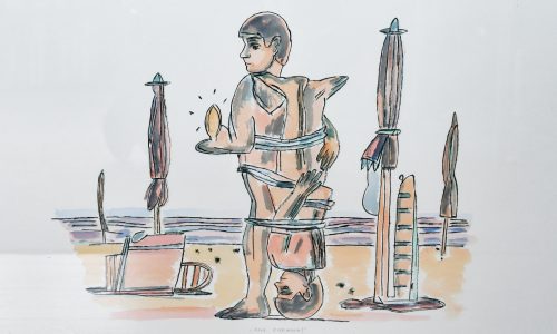
During the manifestation ‘Kunst op Kamers’ in de Rijp, art is shown in private houses. The booklet contains the portrait of the artist involved; however, the page showing a sketch of what the artist is planning to make is closed. The reader has to tear the page open to be able to see it.

Committee

The finishing of this book is stunning: the side margins of the brochure have been left untrimmed, which makes the pages bulge towards the centre. The fine slipcase design refers to the nature of the event: peeking at other people’s interiors. Another fine detail is the accompanying mini-booklet, which contains the tickets for all open houses.

Over the years http://www.ftn-books.com has collected many of the publications related to this art manifestation. Also the book by Irma Boom which was chosen as one of the best designs books from 2008.

Posted on Leave a comment

Herman Zeekaf (1937-2009)

Schermafbeelding 2021-08-25 om 14.36.47

Self made architect and furniture designer is known in a very small circle of admirers. Among them were Cor and Jean Rosbeek, the founders and owners of the famous Rosbeel printers in Nuth. These brothers commissioned Zeekaf to design the in and outside of their printing facilities in Nuth in 1977 and 1991.

Beside this building he became famous for some very functional furniture. This Herman Zeekaf is now getting more and more fame , because his designs are timeless.

Others have known him from a Interior Design shop he had in the city of Heerlen. His life was filled with design, furniture and architecture and in some projects he had the oppertunity to combine all into one great work of art.

www.ftn-books.com has now the ROSBEEK special on Zeekaf available.

zeekaf

Posted on Leave a comment

Visible Language

Because of a recent addition to my inventory here is the information on the VISIBLE LANGUAGE magazine. It is one of the leading publications in the world of graphic design and i have added some important volumes from the 70’s and 80’s to my inventory.

Visible Language is an American journal presenting visual communication research. Founded in 1967 as The Journal of Typographical Research by Merald Wrolstad, occasional Visible Language issues are co-edited with a guest editor-author.

The journal was founded with the primary tenet of the journal being that reading and writing together form a new, separate, and autonomous language system. The journal has evolved to focus on research in visual communication. The journal has covered the subject of concrete poetry, the Fluxus art movement, painted text, textual criticism, the abstraction of symbols, articulatory synthesis and text, and the evolution of the page from print to on-screen display. Guest editor-authors have included Colin Banks, John Cage, Adrian Frutiger, Dick Higgins, Richard Kostelanetz, Craig Saper, and George Steiner.

The journal was edited for 26 years (1987–2012) by Sharon Poggenpohl of the Illinois Institute of Technology’s Institute of Design, with administrative offices at the Rhode Island School of Design. It is currently edited by Mike Zender of the University of Cincinnati, which publishes and provides administrative offices for the journal.

Below a first selection of the volumes available:


Posted on Leave a comment

Roelof Mulder (1962)

Schermafbeelding 2021-08-27 om 15.54.15

Roelof Mulder is a multidisciplinary artist, operating in the field of graphic design, type design, interior and exhibition design. He studied fine art at the Academy in Arnhem and he attended the Jan van Eyck Academy in Maastricht for a year in order to underline his love for the graphic arts. Mulder’s departure from the academy was quickly followed by the announcement that he was to be the first winner of the Rotterdam Design Prize.
His graphic and editorial work includes books for Droog, MVRDV architects, Marcel Wanders, Stedelijk Museum Amsterdam, E&Y, and artists Yasumasa Yonehara, Marijke van Warmerdam and Marlene Dumas. He was member of the editorial staff and designer of Forum magazine and he has been art director of Frame magazine twice. Mulder also did campaign work for fashion brands such as Takeo Kikuchi and Diesel, various exhibition and communication work for incubator Platform21, and stamps for the Royal Dutch Post.

From his early years http://www.ftn-books.com has a nice book in its inventory

Posted on Leave a comment

Zonnehof Amersfoort posters

zonnehof zweden a

From the same source as the Crouwel posters of yesterdays blog comes this series of posters for the ZONNEHOF AMERSFOORT museum. Later this would become the Armando museum, but in the Sixties and Seventies they had their own small program of exhibitions. Well worth visiting and it is interesting to see that also a smaller dutch museum thought it important that design and typography of their publications was important. The main part of these series was designed by van den Brink. All are now available at www.ftn-books.com


Posted on Leave a comment

Delft Chair Collection ….STOELEN

stoelen delft a

Containing over 300 chairs collected for teaching purposes since 1957, the collection is currently under the supervision of the Chair History of Architecture and Urban Planning (Van Wijk). It is acknowledged as one of the most important furniture collections in the Netherlands and is a source of knowledge about materials, construction and typologies for students and designers alike. In the past, the chairs were used as examples during lectures and as models during drawing lesson, but we now also use them as point of departure for research and design courses. Preliminary evaluations show that the close engagement with these unique objects improves students’ design processes and products.


Therre is an excellent article on thsi important collection to be found here:

JoDH_artikel_def.pdf (stoelencollectiedelft.nl)

and of course www.ftn-books.com has the first impostant publication from 1980 on this collection available.

stoelen delft b

Posted on Leave a comment

Jurriaan Schrofer ( continued )


Last month…. on the bookmarket…. i found a series of beautiful and typical late Sixties designs by Jurriaan Schrofer. Schrofer is together with Wim Crouwel the other favorit dutch designer from the Sixtie.

A Pop Art like style he developed over the decade and used this for his projects and the series he made for Museum Journaal is one of the most impressing from that decade. The series is now for sale in separate volumes at http://www.ftn-books.com, nbut for the collector that desires them all please contact me at wilfriedvandenelshout@gmail. com for a special offer of all volumes available.

schrofer MJ b


Excellent piece on Schrofer written in French at this site:

Jurriaan Schrofer

Posted on Leave a comment

Jan Meijer / Jurriaan Schrofer/ Ed van der Elsken

Schermafbeelding 2021-03-25 om 14.19.12

Another artist i had no memory of. I had heard the name before, but coould not place his works in any context. I must have seen his work at some time, but no recollection at all.

So why this blog on Jan Meijer. The artist is perhaps the least interesting in this blog. Still Meijer’s lyrical abstract works are well worth looking at and deserve much more recognition.

Schermafbeelding 2021-03-25 om 14.25.54

But…..the true reason i write this blog is the Jan Meijer catalogue which was published in 1957 for the Galerie Dina Vierny exhibition. A typical 50’s publication with a colored cover, BUT, what makes it stand out ……..it is designed by Jurriaan Schrofer and photographs by Ed van der Elsken. It is one of those rare occasions that these great Fifties artists come together. Perhaps they needed to make some money, perhaps they were friends and have known each other from their Paris time. I do not know, but ik know that this is an extremely scarce publication, well worth collecting and to dream away and try imagining how life must have been in Paris in the mid Fifties.

the catalogue is available at http://www.ftn-books.com

Posted on Leave a comment

Henk de Vries (1931-1986)

Schermafbeelding 2021-03-23 om 15.39.13

The french would call it a “petit maitre” a small master and for me this is true. de Vries was never known that much among art lovers, but now that the Fifties and Sixties become “en vogue” he is discovered . His paintings lean towards cubism , but have those typical Fifties colors in them. I first took notice of his paintings when i bought the 1966 Museum van Looy catalogue on de Vries ( now available at ww.ftn-books.com), but the most impressive elements were the typical Sixties invitations that i found within the publication. Great design and highly collectable invitations that are typical for these years.

Posted on Leave a comment

Jean Widmer (1929)

Schermafbeelding 2020-11-30 om 16.39.42

Yesterdays blog and the acquisition of some former Ben Bos library books on grapphic design inspired me to find some more information on Jean Widmer.

Jean Widmer is an acclaimed Swiss graphic designer too based in France.

From 1946 to 1950 he studied at the Kunstgewerbeschule (School of Arts and Crafts) of Zurich, then directed by the former Bauhaus master Johannes Itten (1888-1967). In 1953 he moved to Paris, where attended lithography courses at the École des Beaux-Arts (School of Fine Arts).

After one-year internship at the Atelier Tolmer, located on the Île Saint-Louis, he was appointed Art Director of SNIP—Société Nouvelle d’Information et de Publicité (New Society of Information and Advertising), holding this charge from 1956 to 1959. He later moved to Galeries Lafayettes, a major department store, substituting Peter Knapp as its Art Director, from 1959 to 1961. At the same time he also worked at Jardin des Modes magazine as art director and photographer, holding the position until 1969. During the 1960s he also travelled in Japan to study ‘shodo,’ Japanese calligraphy, and ‘mon,’ Japanese traditional crests.

In 1969 he opened Visuel Design, focusing on coordinated graphic communication for cultural and public institutions. The same year he was the first designer to develop a corporate identity system for a French cultural institution, developing the graphic communication of the CCI—Centre de Création Industrielle (Center of Industrial Creation).

It was during this period that Widmer developed his own original graphic language, based on synthesis, rigorous geometry, and schematic typography that to this day represents the first and one of the few examples of Modern graphic design in France.

In 1972 he took charge of the first design for the French Highways signage, drawing a beautiful and effective pictogram system. From 1974 to 1977, and again in 1985, he designed the coordinated identity for the Centre Georges Pompidou, formed from the merging of the CCI with other cultural institutions, for which he designed a beautiful and iconic mark that portrays the famous façade of the building.

In 1979 he designed an acclaimed poster for Kieler Woche, the major sailing event in the world that is famous in the world of graphic design for its striking communication. From 1983 to 1987 he worked on the corporate identity design for the prestigious Musée d’Orsay, in collaboration with the prominent graphic designer Bruno Monguzzi.

He continued to focus on corporate graphics for cultural institutions, developing the identity for the Théâtre National de la Colline, and the IMA—Institut du Monde Arab, both in 1987, and the Bibliothèque Nationale de France in 1994. In 1989 he also designed a typefaces, Bi-89, on the occasion of the French Revolution’s bicentennial.

In 1960 he joined the faculty of the ENSAD—École Nationale Supérieure des Arts Décoratifs (School of Decorative Arts), Paris, where he taught until 2000 remodeling the graphic design curriculum, stressing mastery of typography and color as fundamental skills. Since the early 1990s, he also taught at the Atelier National de Recherché Typographique (National Bureau for Typographic Research).

During his career he received important recognitions, including the Toulouse-Lautrec Prize in 1980, the Grand Prix National des Arts Graphiques from the French Ministry of Culture in 1994, and the Distinctive Merit Award from the ADC (Art Directors Club), New York. He was appointed Chevalier of the Ordre des Arts et des Lettres in 1983, Officer of the same order in 1991, and Commandeur in 2001.

The important Centre Georges Pompidou publication is now available at www.ftn-books.com

widmer a