Posted on Leave a comment

Josef Albers and his Christmas card from 1952

Schermafbeelding 2018-09-25 om 17.23.28

On this Christmas eve some thoughts by Josef Albers :

Wenn ich male
sehe und denke ich zunächst – Farbe

Und zumeist Farbe als Bewegung

Nicht als Begleitung
von Form, die seitwärts bewegt,
nur seitwärts verbleibt

Sondern als Farbe in dauernder innerer Bewegung

Nicht nur in Interaktion und Interdependenz
mit Nachbarfarben,
verbunden wie unverbunden

Sondern in Aggression – zum wie vom Beschauer
in direktem frontalen Uns-Anschauen

Und näher betrachtet,
als ein Atem und Pulsieren – in der Farbe

When I paint
I think and see
first and most – color
but color as motion

Color not only accompanying
form of lateral extension
and after being moved
remaining arrested

But of perpetual inner movement
as aggression – to and from the spectator
besides interaction an interdependence
with shape and hue and light

Color in a direct and frontal focus
and when closely felt
as a breathing and pulsating
– from within

Josef Albers

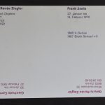
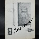
The card below was the original Josef Albers Christmas card from 1952

Schermafbeelding 2018-09-25 om 17.27.03

Unfortunately this card is NOT available at www.ftn-books.com, but many other Albers item are available. a Merry Xmas from Wilfried van den Elshout and FTN books


Posted on Leave a comment

Piet Dirkx daily … Christmas edition

On the 1st of September 2016 i started the “Piet Dirkx daily” with the publishing of a Piet Dirkx cigarbox on each day since. There were over 850 cigarboxes that were once part of the installation Biotoop at the Gemeentemuseum Den Haag. This publication of the collection of cigarboxes has come to an end. That does not mean that the Piet Dirkx daily will not continue. Yes…. it continues ….however the frequency will be different. Every week on Saturday or Sunday a new “classic” Piet Dirkx item will be published, but this time it will be mostly very colorful larger and extreme large items. Drawings, paintings and special publications all other parts of my/our collection will eventually be published.

So it is certainly still not the time to stop, but the name will change and be different of course. the “Piet Dirkx daily” will become the “Piet Dirkx weekly”. Starting this weekend when a new chapter in the Piet Dirkx publications will start. I did not plan it, but there was some real symbolism in this last Piet Dirkx cigarbox no. 855 published .

For all those who are not familiar with the dutch language…on the last box Piet stated …De trein staat stil and positief leven, which means the “train has stopped” and “live positively”. The last few words are maybe the most important to us all. Translated they mean:

Live positively

and on a personal note….Merry Xmas to you all.

The BIOTOOP / Biotope catalogue of the Piet Dirkx exhibition at the Gemeentemuseum Den Haag is available at www.ftn-books.com


Posted on Leave a comment

Gerard Verdijk THE MOUNTAIN OF EINSTEIN

verdijk monografie

Finally, after a period of over 7 years , the long awaited publication on Gerard Verdijk and his art was presented last month in Amsterdam.  After hard work and contributions by many a  true MAGNUS OPUS has been published on the art and life of Gerard Verdijk. To give an impression….. it is thick and heavy, a publication with approximately 1000 photographs on Verdijk and his works. 382 pages, size is 12 x 12 inches and the weight…. a heavy 3.1 kg.

But what is more important, this publication has hardly any faults and is an absolute must for the art lover and collector. Edition size is only 700 copies of this 1st and only printing. The MOUNTAIN OF EINSTEIN is a book to hold, collect and cherish and can be ordered as long as it is available for only euro 99,00 ( excl. postage) at :

www.ftn-books.com or you can place your order with Josephine Sloet at : josephinesloet@gmail.com.

btw. More news on Josephine Sloet and her art in the next couple of days.

Posted on Leave a comment

Jean Paul Riopelle (1923-2002)

Schermafbeelding 2018-09-19 om 11.21.42

Two names spring to mind when you look at the works by Jean Paul Riopelle  ( Canada , 1923) and read about his life. He lived near Giverny ( the place where Monet had his studio and gardens) and he used a technique much the same as Jackson Pollock did. Dripping paint on a horizontal canvas. The result ….. colorful and abstract compositions which have the colors of a Monet painting and the abstract construction of a Pollock one.

riopelle 3 a

Riopelle’s style in the 1940s changed quickly from Surrealism to Lyrical Abstraction (related to abstract expressionism), in which he used myriad tumultuous cubes and triangles of multicolored elements, facetted with a palette knife, spatula, or trowel, on often large canvases to create powerful atmospheres.

The presence of long filaments of paint in his painting from 1948 through the early 1950s has often been seen as resulting from a dripping technique like that of Jackson Pollock. Rather, the creation of such effects came from the act of throwing, with a palette knife or brush, large quantities of paint onto the stretched canvas (positioned vertically).

For me Riopelle is a fascinating artist and because of the beautiful publications Maeght made with this artist it is not entirely out of reach financially. A very nice Riopelle publications can be obtained for less than euro 100,– at www.ftn-books.com


Posted on Leave a comment

Jiří Georg Dokoupil (1954)

Schermafbeelding 2018-09-17 om 14.41.35

We are from the dame generation and perhaps that is why i appreciate Dokoupil’s painting. Always extremely colorful and becoming more and more abstract.

The association is one of “stained glass” and i would not be surprised that in the end of his career he will be invited to make some church windows ( btw. Marc Mulders made some for the Chapel in the Gouda Museum). It takes some time to get  accustomed to the art of Dokoupil, but once you get know his paintings you only can admire them. Fled to Germany from Tsjechoslovakia in 1968, he soon joined the Mulheimer Freiheit group and participated in performances and group exhibitions together with Dahn and Adamski. In the Nethertlands he had his “one man” exhibitions at the iconic galerie Riekje Swart and became part of the exhibitions organized on the NEUE WILDEN by Frans Haks in the Groninger Museum and the Centraal Museum Utrecht. From these early days on his art developed into an abstract kind of art which is personal and typical for Dokoupil. An artist to keep following and see what his next step in art will be .

There are some Dokoupil publications available at www.ftn-books.com

Posted on Leave a comment

Adolphe Monticelli ( 1824-1886) and Benno Wissing

Schermafbeelding 2018-09-13 om 16.20.50

Why a blog on Monticelli? Two simple reasons. Monticelli was one of the great inspiration sources for the Impressionists and specially Vincent van Gogh was a great admirer and because of this connection two of the large museums in the Netherlands held exhibitions in the Fifties and Sixties. The Boymans van Beuningen was one of them and held a retrospective exhibition in 1959 of which the catalogue is available at www.ftn-books.com

OLYMPUS DIGITAL CAMERA

It is this appreciation of Monticelli’s art and the connection with van Gogh that some of the museums over here have Monticelli’s in their collections. I know that Kroller Muller, Gemeentemuseum, Boymans and the Stedelijk all have Monticelli’s in their collections. Personally i think it is time again for a re appreciation of this great painter who’s works are timeless and in so many cases a source of inspiration for the Impressionists. I started this blog on Monticelli because today i bought a poster for the 1959 Boymans exhibitions. It is in excellent B- condition and i consider this to be one of the best Benno Wissing made for the Boymans museum during the Fifties.

MONTICELLI aa


Posted on Leave a comment

Frank Stella and his 1970 exhibitions

Schermafbeelding 2018-06-19 om 15.22.45

Frank Stella became a celebrity in the early Seventies in Europe , where exhibitions were being organized all over Europe. Among them, his exhibitions in Zurich and Amsterdam where on both occasion were his V series exhibited. The difference?…. in Zurich these works were for sale and in Amsterdam they only were on show, but what makes thgis exhibition fro me more special is that with the exhibition a wonderful Wim Crouwel designed catalogue was published .

OLYMPUS DIGITAL CAMERA

The catalogue was published with a relief cover and this made it a true artist book as for an invitation…. they decide to use the shape of the 1960 Newstead Abbey painting to make the event even more special. In contrast the Zurich exhibition at the galerie Renee Ziegler had only an invitation with a special silkscreened V series pattern on the card ( but this is also very beautiful;-) 1970 was an important year for Frank Stella and www.ftn-books.com is lucky to have all three discussed items now in its inventory.

Posted on Leave a comment

Claes Oldenburg recent additions from the 60’s and 70’s

Schermafbeelding 2018-12-10 om 16.03.08

When at auction, i noticed a “lot” with early Oldenburg publications . Most from the sixties an all from renowned galleries like Sonnabend, Sidney Janis and the Margot Leavin gallery. His works do always mean something special to me , because of their scale they instantly impress and make you want to touch these beautiful works. Still the best way to make yourself familiar with these works is to study them out of a book, because of their extremely large size you must travel a lot to get a great overview of the most famous Oldenburg sculptures. It is easier to buy some classic Oldenburg books at www.ftn-books.com

and to make it easier ….use the code : Oldenburg for a 10% discount on all items listed on FTN books this week ( 12/11/18 – 12/18/18)

Posted on Leave a comment

Aat Veldhoen (1934-2018)

Perhaps he wasn’t the greatest dutch artist that ever lived, but still Veldhoen deserves his place in art history . He was the artist who almost “commercially” destroyed himself, by making his prints available for ALL and in someway inventing the multiple for the masses.

He drew his subjects directly on the plate and made rotaprints from these plates. Used cheap papers and sold these prints, which were not signed nor numbered from a cart run by Robert Jasper Grootveld for the extremely small amount of 3 dutch guilders. It meant that with so many works by Veldhoen on the market, his paintings and drawings were not valued as they should be.

Aat Veldhoen was a well known and colorful figure in the dutch art scene and had a 20 year relationship with Hedy d’Ancona, the former minister of Culture from the Netherlands.


Posted on Leave a comment

Hans Hartung (1904-1989)

Schermafbeelding 2018-09-09 om 10.52.39

One of the exhibitions i thought to be one of the very best during the time i was working at the Gemeentemuseum Den Haag, was one curated by Franz Kaiser on the abstract artist Hans Hartung . Just one word describes the exhibition….impressive.

It showed that the art Hartung created was not just random, but a well thought over creation of abstract art in which a small sketch was turned into a large painting.

Here is the text on the exhibition:

Hans Hartung (b. Dresden, 1904) was regarded as one of the founding fathers of French Lyric Abstractionism, the European counterpart of American Abstract Expressionism: a term in which the word Expressionism refers to an extremely physical and spontaneous manner of painting. The members of the movement wanted, as it were, to work out their emotions on the canvas without any form of symbolism.

Hartung’s paintings displayed a plain ground covered with rough and apparently spontaneous brushwork, with all the paint spatters and brush marks that go with that way of painting. After his death, therefore, people were astounded when the study of unfinished pictures revealed that his paintings had not in fact been created in a wild and spontaneous way, but by carefully filling in predetermined outlines based in every detail, right down to the smallest flecks of paint, on sketches prepared in advance. This exhibition, which the Gemeentemuseum is holding to mark the hundredth anniversary of Hartung’s birth, reveals an artist who would better be described as a conceptual artist, were it not for the fact that conceptual art did not exist as a movement when he produced his works. In this first Dutch retrospective of Hans Hartung’s work, early drawings are presented next to the equivalent paintings, and early versions alongside later versions. The similarities in terms of motif are astonishing.

More about Hans Hartung: www.fondationhartungbergman.fr

There are some nice publications on Hartung available at www.ftn-books.com