Posted on Leave a comment

Eugenio Carmi (1920-2016)

Schermafbeelding 2021-07-07 om 15.52.12

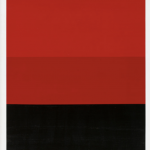
Without realizing it i have collected some nice collectable items by Eugenio Carmi which are all available at http://www.ftn-books.com

Carmi was one of the first Modern Abstract painters in Italy. By chance i collected some works, but finding info on him was musch harder so here is the text i found on Wikipedia.

He is considered to have been one of the main exponents of abstractionism in Italy.

Born in Genoa, in 1938 Carmi moved to Switzerland because of the racial laws imposed by Benito Mussolini. He graduated in Chemistry at the ETH Zurich. Carmi returned to Italy after the war, where he studied painting with Felice Casorati and sculpture with Guido Galletti.

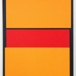
In the early 1950s, Carmi abandoned the informal style and adopted a geometric rigor in his works.His works often used factory materials such as welded steel and iron.[1]

Between 1958 and 1965 Carmi collaborated with the steel company Italsider (later Ilva) as their responsible for the image.In 1963 he founded with Flavio Costantini and Emanuele Luzzati the cooperative of artists Galleria del Deposito. A close friend of Umberto Eco, he collaborated with him on several projects.] He also taught in several academies

Posted on Leave a comment

Willem Hussem (continued)….the poet

Schermafbeelding 2021-04-22 om 15.21.13

Willem Hussem has been a long time favorit of mine and not only for his paintings , but also his poetry is remarkable. Influenced by the rythme of japanese poetry , Hussem began to write his poems as early as 1950. He is becoming deservedly more and more known for his poems of which one recently found a place on a wall in the city of Leiden. It is the same poem as the one that graces the cover of the book which was published in 1977 by Bert Bakker and Nouvelles Images which is now available at http://www.ftn-books.com

Where do you draw the line between the art of painting and poetry? Willem Hussem started out as a painter of landscapes and portraits but from the 1950s onwards his work became more abstract. This way, he hoped to capture the essence of an image, a technique he also used in his poetry. His poems became shorter and more powerful, which is also evident in this poem, in which Willem Hussem uses words to paint the beach of Scheveningen.

After his return to the Netherlands, Hussem also started writing poetry. His first collection of poems, De kustlijn (The coastline), was published in 1949. In subsequent collections the sea also plays a prominent role. The beach of Scheveningen, on which this poem is based, was his primary source of inspiration. Hussem mostly wrote short poems in which he ‘painted’ images for which he received the Dutch Jan Campert award for poetry in 1965.

Translated it is :

PUT THE BLUE

Put the blue
of the sea
against the
blue of the
heavens, wipe
some white
of a sail
in it and the
wind starts to blow

the book is available at http://www.ftn-books.com

Posted on Leave a comment

Burgoyne Diller (1906-1965)

Schermafbeelding 2020-09-22 om 09.24.27

A pioneer of American modernism, Burgoyne Diller devoted his career to the exploration of geometric abstraction in paintings, drawings, collages, and sculptures.

For Diller, abstraction was the ideal realm of harmony, stability and order in which every form and spatial interval could be controlled and measured. His style began with forms of modernism, including cubism, Kandinsky’s abstraction, constructivism, and other European models.He simplified his palette to the bold colors and black and white of neoplasticism and reduced his visual vocabulary to squares and rectangles.” “Diller developed a highly personal language based on three major compositional themes. These themes, which he labeled “First,” “Second,” and “Third,” explored the picture plane in relation to forms in movement and forms in constant opposition. By 1934 Diller had likely become the earliest American exponent of Mondrian’s type of geometrical abstraction. In the early 1940s, he began creating wall-mounted wood constructions, and during the 1950s and 1960s his sculptures developed into the large-scale, free-standing, formica works for which he is well known.”

The Sullivan Goss Art Gallery notes the following about Diller’s style: “Composed predominantly of squares and rectangles and accented with primary colors against a solid white background, Diller’s mature abstract paintings are the result of his explorations of pure color and form. Diller’s austere work recalls the stinging isolation of the lives of all Americans of the Depression era, and possibly his own. However, the well-planned geometric nature of his paintings reveals his desire for a reconstructed world prevailing over the seemingly hopeless situation in the United States during the Depression

Above is the excellent text on Diller and his style of painting found on Wikipedia

http://www.ftn-books.com has some excellent and scarce Diller publications available

Posted on Leave a comment

Een Nieuwe Synthese, 1988


OLYMPUS DIGITAL CAMERA
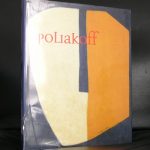
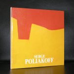
This publication is one of the starting points for my collection.

I had been working for 8 years at the Haags Gemeentemuseum when this exhibition was held at the Rijksmuseum Twenthe. First there was the catalogue which we sold in the museum shop and then there was the exhibition itself which opened my eyes for the quality of Abstract Geometric art in the Netherlands.

It has been 32 years now since that exhibition was held , but it has proven to be a very important one. Of all the names presented at that time, artists which were hardly known and could be picked up at auction at extreme low prices, many have had their reevaluation, resulting in a steep rise of prices fetched at auction.

Among them names  as Constant, Domela, Hussem, Huszar, van der Leck, Peeters and Vordemberge Gildewart. But among them were so many other great artists. These are now the artist who are on the verge of their breaktrough. I predict that these names will be the future stars in private and public collections. The names?…….. Siep van den Berg, Piet de Haard, Frieda Hunziker, Wim Sinemus, Andre Volten and Nicolaas Warb.

I have the exhibition publication now available at www.ftn-books.com and you can check these names and all others within the exhibition out in the “DE NIEUWE SYNTHESE”

Posted on Leave a comment

Amédée Cortier (1921-1976)

Schermafbeelding 2020-07-06 om 15.19.50

This blog on Cortier is long due. I love Cortier and because his publications are scarce I almost forgot about him, but now that I have found the most important Cortier publication on his abstract works it is time to devote a blog to Amédée Cortier.  The book is on his abstract works and even contains a chapter on Cortier written by one of all times best curators …Jan Hoet.

cortier ludion a

From 1936 to 1942, Amédée Cortier enjoys his training at the Royal Academy of Fine Arts in Ghent. On the one hand, his oeuvre consists of paintings that he makes in various media (acrylic, oil, gouache, aquarelle, India ink or bistre, among others) on panel, paper or cardboard. On the other hand, he makes pen drawings, reliefs and models. Around 1950, influenced by the exhibition Le Cercle Artistique (Ghent, 1949), he applies himself to a short-lived geometric-abstract experiment, but decides after this to return to embrace his figurative visual language. He begins with painting rural scenes (1940), still lives and portraits of women (1950), and evolves towards a stark, simplified figurative language in schematic compositions. André Lothe (1885 – 1962) exerts an important influence on him with his Traité de la figure (1950) and Traité du paysage (1939). Around 1964 Cortier begins to paint resolute abstract and from 1966 – 1967 he favours colour over the relations between the forms. The transition to acrylic paint is to be understood in the same context. This medium helps him to heighten the intensity of his colours. His stark works are witness to a sense of natural law, but also leave room for intuition. Ultimately Cortier changes over to monochrome, by which he creates mutually coherent ensembles in the form of diptychs and triptychs. With his reliefs (1968), he evolves from the traditional painting to painting as object. Beginning in the 1970’s his work is completely dominated by colour, built up around a stark composition and a unity between colour and form. He gains public recognition with these works.

Cortier sees his own oeuvre confirmed in the work by the artist Ellsworth Kelly (1923 – 2015). Under the impulse of Peter Struycken (1939) he meets Kelly in 1976. As a member of Het Antenneke, his fascination grows for the Golden Ratio, an important compositional rule in his oeuvre. His friendship with Yves De Smet (1946 – 2004) is of crucial importance for his artistic career. He is not only a like-minded artist friend, but is also an important promoter and organiser of exhibitions dedicated to Cortier, such as Horizonnen & horizontalen (Horizons & horizontals) (1976). Cortier becomes a member of the Ghent group organised by De Smet called Plus-Groep, a collective of Ghent constructivists that are seeking the unity between form and colour. Via Plus-Kern – Centre for Constructive Design, established by De Smet and others in 1969, Cortier is actively promoted. This occurs through the medium of publications such as Plus-Nieuws, though also through participation in international exhibitions. In 1973 he is internationally recognised with the Sikken Prize.

Posted on Leave a comment

Ad de Keijzer (1923-1997)

Schermafbeelding 2020-06-25 om 16.33.29

Ad De Keijzer was a creative visual artist. Ad De Keijzer was born in 1923. Also born in 1923 and of this same generation are John Balmain, Guy Fouquet, Paul Jenkins, José Maria Ascunce, and Nicole Fonlladosa.

Schermafbeelding 2020-06-25 om 16.36.12

Born in 1923, Ad De Keijzer grew up during the 1950s and was inspired by the artistic atmosphere of the time. Abstract Expressionism prevailed in the 1950s as a chief method of painting, and explored ideas concerning the sublime and spirituality. Artists endeavoured to focus on painting’s formal properties, and Action Painting took inspiration from the political freedoms of the United States, in opposition to the limitations of the Soviet bloc. Significant artists of this period included Jackson Pollock, Willem de Kooning, Mark Rothko, Frank Kline, Barnett Newman, Clyfford Still and Adolph Gottlieb. In later revisions, the contributions and efforts of female artists such as Lee Krasner, Joan Mitchell, and Louise Bourgeois have been celebrated, amongst many other female creatives.

http://www.ftn-books.com has one Ad de Keijzer available.

ad de keijzer


Posted on Leave a comment

KRH Sonderborg (1923-2008)

Schermafbeelding 2020-06-15 om 16.04.13

A Danish born artist where KRH stands for Kurt Rudolf Hoffmann and the Sonderborg stands for his birth town and he started to call himself KRH Sonderborg since 1951.

Sonderborg went to school in Hamburg, Germany and completed a merchant’s apprenticeship in 1939. He became a private student of the painter Ewald Becker-Carus in Hamburg in 1946. From 1947 to 1949 he studied painting, graphic art and textile design at the State Art School in Hamburg under Willem Grimm and Maria May.

Starting in 1953, he became a member of the group “Zen 49” and he went to Paris the same year where he learned engraving from Stanley William Hayter in the Atelier 17. Paris is also the place where he first encountered Tachism. In the years following the artist continued his travel and worked for some time in London, Cornwall, New York, Ascona, Rome and Paris again. While in New York, Sonderborg came into contact with Action Painting and Abstract Expressionism.

His own style is became more abstract, painting using swift, gestural strokes that reveal the painting process, with spontaneous colour application. Black and white contrasts are an important feature, later he added colours such as cadmium red.

K.R.H. Sonderborg exhibited in the 1958 Biennale in Venice. He was awarded the Prize for Graphic Art at the Biennale in Tokyo in 1960 as well as the Great International Prize for Drawing at the 1963 Biennale in Sao Paulo, Brazil.

From 1965 to 1990 Sonderborg held a post as professor of painting at the Stuttgart Art Academy. In 1969/70 he was a guest lecturer at the Minneapolis College of Art and Design, as well as at the Art Institute of Chicago in 1986.

the following Sonderborg publications are available at www.ftn-books.com

Posted on Leave a comment

Serge Poliakoff (1906-1969)

Schermafbeelding 2020-06-15 om 15.54.39

I love his art. It always reminds me of the best dutch abstract artists from the 60’s and i would not be surprised of Willem Hussem was influenced by Poliakoff’s art

Serge Poliakoff was born in Moscow in 1906, the thirteenth of fourteen children. (Some sources claim that he was born in 1900, which in fact fits in better with his later history – 1906 would have him leaving home and earning his living as a musician at the age of 12.) His father, a Kyrgyz, supplied the army with horses that he bred himself and also owned a racing stable. His mother was heavily involved with the church, and its religious icons fascinated him. He enrolled at the Moscow School of Painting, Sculpture and Architecture, but fled Russia in 1918. He arrived in Constantinople in 1920, living off the profits from his talent as a guitarist.

He went on to pass through Sofia, Belgrade, Vienna, and Berlin before settling in Paris in 1923, all the while continuing to play in Russian cabarets. In 1929 he enrolled at the Académie de la Grande Chaumière. His paintings remained purely academic until he discovered, during his stay in London from 1935 to 1937, the abstract art and luminous colours of the Egyptian sarcophagi. It was a little afterwards that he met Wassily Kandinsky, Sonia and Robert Delaunay, and Otto Freundlich.

With these influences, Poliakoff quickly came to be considered as one of the most powerful painters of his generation. In 1947, he was trained by Jean Deyrolle in Gordes (Vaucluse region in France) amongst peers such as Gérard Schneider, Giloli, Victor Vasarely, and Jean Dewasne. By the beginning of the 1950s, he was still staying at the Old Dovecote hotel near Saint-Germain-des-Prés, which was also home to Louis Nallard and Maria Menton, and continuing to earn a reliable income by playing the balalaika.. A contract enabled him to quickly gain better financial stability.

In 1962 a room was given over to his paintings by the Venice Biennial, and Poliakoff became a French citizen in the same year. His works are now displayed in a large number of museums in Europe and New York. Poliakoff also worked with ceramics at the Manufacture nationale de Sèvres. He influenced the paintings of Arman.

The following Poliakoff publications are available at www.ftn-books.com

Posted on Leave a comment

Jaap Mooy (1915-1987)

Schermafbeelding 2019-10-22 om 15.57.17

Jaap Mooy is a dutch artist who is increasingly recognized as being important for Modern Art in the Netherlands. He witnessed the development of abstract art and was in the last decade of his artistic life an abstract painter pur sang. There are many influences to be recognized within his art. There is a bit Lucebert, Karel Appel, Tajiri, Jean Arp and Tinguely, but also influences of Bauhaus in his collages.

Schermafbeelding 2019-10-22 om 16.03.22

Still this kind of art is getting more important by the year, because it shows the way abstract painting was developing over the years in the Netherlands and Jaap Mooy was an important artist contributing to this development.

left Mooy and right Jean Arp

http://www.ftn-books.com has now the most important Jaap Mooy publication available.

Posted on Leave a comment

Ben Akkerman (1920-2010)

Schermafbeelding 2019-10-17 om 16.22.21

I have always been an admirer of the works by Ben Akkerman. The first time i saw a painting by Akkerman was at the Centraal Museum and since i have been interested in his works. The paintings and drawings i could not afford so instead i started to collect Ben Akkerman publications. The result is that i have collected myself a small but important Akkerman library and the years made me find some duplicates which i now have put up for sale at www.ftn-books.com

Ben Akkerman was , the same as Jan Schoonhoven, an employee for the municipality of Enschede and he painted in the evening in his spare time. Called a ‘hardcore abstract ” painter i personally share his paintings among the Minimal paintings from that era. These are very delicate compositions that are pure minimal art.

Schermafbeelding 2019-10-17 om 16.34.27

The Gemeentemuseum used the “diamond” by Ben Akkerman for almost 10 years in its letters and invitations, but now that the name has changed in the far less appealing name ” Kunstmuseum Den Haag” they left the beautiful yellow diamond shaped logo for one i do not like at all. To commemorate the diamond they collected 30 Ben Akkerman paintings and made a wonderful presentation  to honor Ben Akkerman and its “diamond”.