Posted on Leave a comment

Gracia Lebbink (1963)

OLYMPUS DIGITAL CAMERA

This blog is long time overdue. I met Gracia for the first time when she was designing the artist book LA STANZA VEDE by Kounellis for the Haags Gemeentemuseum in 1990. She was introduced to the Haags Gemeentemuseum by Rudi Fuchs who was the director at that time and because trusted her skills after being introduced to Rudi by  Walter Nikkels some time before.

Since, she designed for the Gemeentemuseum many publications and posters and build a prestigious agency on the way, “designing” for many cultural institutions and museums. Always recognizable, simple , beautiful designs and with a typography that invites reading the texts.

I mentioned Nikkels and Lebbink in the same sentence and that is not without a reason … I consider both to be the very best from the generations to follow Sandberg and Crouwel and because I have known Gracia professionally, she is placed on the no. 1 spot, followed at some distance by Walter Nikkels. It proves Rudi Fuchs had a nose to pick not only the best artists, but also the right choice in commissioning a designer with a project. Gracia had to stop her professional career in 2003, leaving us some very beautiful and appealing designs.

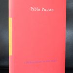
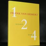
Because of my personal interest in her works I have collected many of Gracia’s designs for FTN-books. Many are available at www.ftn-books.com…..just search for Lebbink and you will encounter over 30 Gracia Lebbink designed publications available.
Posted on Leave a comment

Marijke van der Wijst (1940)

Schermafbeelding 2020-06-25 om 16.52.38

Marijke van der Wijst is a true force in the dutch design world and responsible for many of the great dutch interior designs of public cultural places. There is of course the interior of the Anne Frank huis and the Berlage wedding room,

Schermafbeelding 2020-06-25 om 17.02.50

but for me, van der Wijs most important project was her influence tof the way the Boymans van Beuningen Museum reshaped its presentations in the Eighties. More spacious, clean coll colours and almost transparent. This way of presenting the great collection of the Boymans van Beuningen was followed by many in the years after they had made the changes in resenting the collection. This is part of the great book on van der Wijst published by 010 Publishers and designed by the very best for this subject…Gracia Lebbink. A beautiful publication, timeless and filled with great van der Wijst designs. Available at www.ftn-books.com

wijst


Posted on Leave a comment

Company design

bedrijfsstijlen

People almost forget that every publication and every outing by a larger company has been designed by a designer. In the tine that i worked at the Gemeentemuseum Den Haag, i have witnessed that every director wanted a change in company style. It was a bit like the french presidents always want to erect a building to show the people in the country that he once was their president ( Pompidou, Mitterrand, Chirac they all had their building projects and are now remembered in the name of the building.

Schermafbeelding 2020-02-03 om 16.54.05

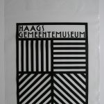
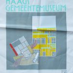
It was the same with the directors i worked with at the Gemeentemuseum. First there was Theo van Velzen who was very fond of Donald Janssen, followed by Henk Overduin who continued with Donald. After Henk Overduin the museum had Rudi Fuchs as a director. Fuchs trusted Walter Nikkels , but after a few month he decided for Gracia Lebbink as a designer and young and saspiring designers who had the “style’ he desired for the publications of the museum and i must admit, personally i think this period produced the best and most beautiful publications. Gracia continued to design some 8 years for the museum. In the time of some 20 years i had witnessed and worked with 4 designers and as many of 4 times every printed outing of the museum was redesigned. Posters, books, printing paper , entrance tickets, shopping bags every aspect of printing was designed agin with the coming of the new company style. It the meantinme i had also witnessed 3 name changes of the museum itself. To show some of the bags that were published over the time i show you the most famous plastic bags of the museum , which are both available at www.ftn-books.com 

Posted on Leave a comment

A great Museum Alphabet book / 1995


museum alphabet.jpgIn the very long period that i am now active  as a bookseller and collector i have seen many Alphabet books published and sold by the most famous of museums. Arguably one of the best, and certainly a personal best was the one designed by Gracia Lebbink. ( i only have a personal copy in my collection) but recently i bought another MUSEUM ALPHABET book which is nice and adventurous. It is the book published by the Museum of Fine Arts in Boston. The museum published a 30 page hard paged book with details of some of the highlights within the collection, making the very youthful in a playful way familiar with the Museums collection. The book was designed and “written” by Gisela Voss and published in 1995 and is well worth collecting.  There is nothing to be found on the internet on the author, but this book is one of a series of other books she made for the Boston Museum .This book is now available at www.ftn-books.com

museum alphabet b

Posted on Leave a comment

Piet Dirkx weekly

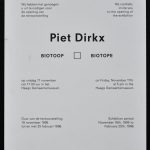
The official invitation for the BIOTOOP installation at the Haags Gemeentemuseum in 1995. I remember that this was the last exhibition my mother witnessed.aaaa a memorable occasion.

The card design by Gracia Lebbink is superb it is totally different from the invitation that are nowadays used by the Kunstmuseum Den Haag. For me these are far superior with the little embossed yellow rectangle. Simplicity makes these stand out and all are designed in the best of dutch design tradition.

Posted on Leave a comment

Pierre Weiss (1950)


An exhibition of which i remember a hellish ride to Gent to see the print proofs of the catalogue on Pierre Weiss.  One of the first exhibitions curated by Franz Kaiser and with a catalogue designed by Gracia Lebbink. The printers waited for my arrival, but extremely heavy rain showers delayed my arrival by some 2 hours. After finally arriving it was the lunch break at the printers and lunch is “holy” in Belgium. Everybody stops working and has lunch. So did i . I was invited by the printers to have lunch and with them it meant a very nice lunch indeed at one of the finest restaurants in Gent. a 3 course lunch was normal including 2 glasses of great wine and a coffee it made me forget the terrible ride i had to arrive in Gent. This was almost 30 year ago now. I have forgotten the catalogue on Weiss, but the ride is still a vivid memory.

OLYMPUS DIGITAL CAMERA

Posted on Leave a comment

Piet Dirkx weekly

The personal classic of all Piet Dirkx publications. Design by Gracia Lebbink. Biotoop is from 1995dirkx biotoop weekly

Posted on Leave a comment

Jack B. Yeats (1871-1957)

Schermafbeelding 2019-04-25 om 17.03.55

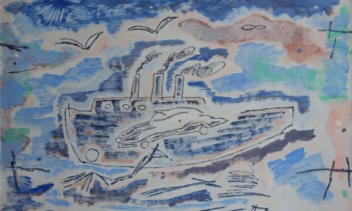
Never heard of Yeats as a painter, until Rudi Fuchs curated an exhibition with his paintings at the Haags Gemeentemuseum and it was a nice surprise. His painting is spontane , a little childish and impressionistic at the same time and thus resulting in a painting what is typical for Yeats with a signature of its own. The exhibition was not that large and i remember that the sizes of the paintings were not that large too.

Schermafbeelding 2019-04-25 om 17.05.31

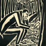
What i do remember was the excellent catalogue Gracia Lebbink designed with the exhibition. It was one of her first lareg catalogues she made for the Gemeentemuseum but it has proven to be a classic and available at www.ftn-books.com

yeats

Posted on Leave a comment

World Fairs from 1851-1992


Schermafbeelding 2019-04-23 om 13.59.45An important publication. published within the series of Grafisch Nederland and designed by Gracia Lebbink. A quintessential 150 years with some great inventions ( telephone, TV, Radio and Nylon) and a developing art scene which made the transition into constructivist and abstract art.  The book not only has a beautiful design by Gracia Lebbink , but it is great fun to look at the history of these World Fair’s. What struck me is that the architecture is truly innovative, but only a few buildings were kept. Of course the Eiffel tower is one of them and it has grown into a landmark for Paris and France, but when you look at some of the other great architecture realized, it is a pity that so few of the buildings remain.The book is available at www.ftn-books.com

wereldtentoonstellingen

Posted on Leave a comment

Siegfried Anzinger (1953)

Schermafbeelding 2019-03-25 om 11.23.04

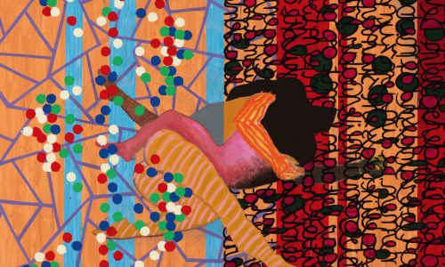
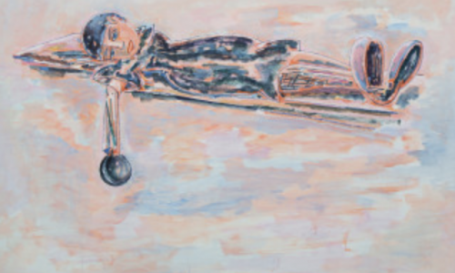
At the time Anzinger had an exhibition at the Gemeentemuseum Den Haag ( curated by Franz Kaiser  i was not very interested in this kind of art, but sone 25 year ahead in time thingds change and now i find his work at least….INTERESTING and INTRIGUING.
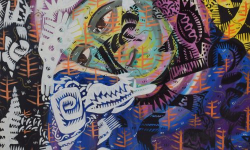
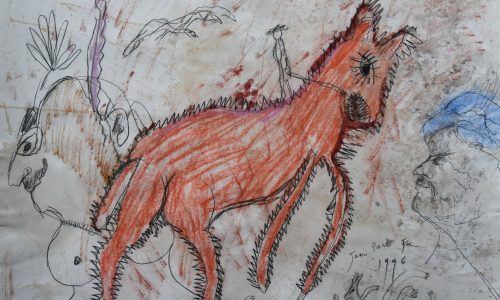
Perhaps that is because i have learned to appreciate this kind of art. His paintings remind me of some of the ones Bacon has made and in the Netherlands John van ‘t Slot approached his subjects in the way Anzinger does. (Van ‘t Slot and Anzinger are from the same generation) and still they are rooted in the Austrian way of painting.

Schermafbeelding 2019-03-25 om 11.27.05

If you try to find some information on Anzinger you will have a hard time finding it. There is some put on line by his gallery  MAX WEBER, but even this information is not very elaborate. An interesting artist, but hard to keep track of his works, because outside Germany and Austria his work is rarely seen.

http://www.ftn-books has one important publication on Anzinger available

OLYMPUS DIGITAL CAMERA