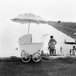
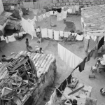
Posted on Leave a comment

Jacques Monory (1924) and the color BLUE

Schermafbeelding 2018-07-30 om 09.17.02

Here is the first few lines of the text i found on Wikipedia. Berside i noticeed the high age of the artist i also noticed that the color Blue was present in his works during his entire career.

Jacques Monory, June 25, 1924 (age 94) Cachan, France Nationality French Education École nationale supérieure des arts appliqués et des métiers d’art Known for Painter, filmmaker Movement Narrative Figuration Spouse(s) Paule Monory Website http://www.jacquesmonory.com Jacques Monory (25 June 1924) is a French painter and filmmaker whose work, highly influenced by photography and cinema, is an allegory of the contemporary world with a focus on the violence of everyday reality. His canvases evoke a heavy atmosphere, pulling subject matter from modern civilization through the lens of his signature monochrome color blue.

OLYMPUS DIGITAL CAMERA

If you look at the catalogue which was published for his Stedelijk Museum exhibition in 1972, You will notice 2 things. First there is the excellent design by Wim Crouwel, but secondly the use of Blue for the cover and the photographic scene on the front. A lesser known catalogue , but certainly an excellent designed Crouwel one and available at http://www.ftn-books.com. Monory is still not very well known, but i am convinced of his importance and will look forward to more exhibitions of this fascinating artist.

Posted on Leave a comment

Willem Sandberg… Experimenta Typographica 1943 – 68.

OLYMPUS DIGITAL CAMERA

As you can read in the title , Willem Sandberg experimented with typography and designs.

During the occupation by the Germans he published experimental books with his own typography. Mostly a combination of very original and personal lay-out and torn out letters, making these publications unique. Unique because of their chosen size, material, printing ,their design and the very limited numbers in which they were produced.

Sandberg produced nineteen pamphlets between December 1943 and April 1945, making a couple of copies of each one, all done by hand. They consisted of twenty to sixty pages of drawings, collages, and texts, which were either written by Sandberg himself or quoted from Confucius, Proudhon, Stendhal, and other favorite writers on themes like love, death, education, architecture, and typography. As Sandberg had no money and materials were scarce in wartime, he improvised by using whatever he could find: scraps of wallpaper, cardboard packaging, tissue paper, and wrapping paper together with photographs, drawings, and symbols torn from magazines for his collages.

The originals are very very rare and exceptionally hard to find. Luckily some of the dutch publishers decided to make some reprints and make them in this way available for other admirers. These reprints are getting more scarce every year now, but www.ftn-books.com still has some available.

Posted on Leave a comment

A new OSSIP addition from 2003.

Schermafbeelding 2018-07-06 om 15.40.41
Ossip / JONGEN, 2003

Just take a look and see that i added this beautiful hypnotizing Ossip to FTN collection about 2 months ago at http://www.ftn-blog.com. It comes from the the Vescom collection . A collection which was created over the last 3 decades and was sold at auction in Amsterdam. I was lucky to buy this “JONGEN” by Ossip together with 2 works by Joris Geurts ( in another blog later). This “Jongen” is one of the more “static” works . It has the same qualities as the works he presented in his exhibition at the Gemeentemuseum Den Haag . Most of the works i know of have moving parts but this late Nineties /early 2000 work was made when composition and image were the typical Ossip elements within a work of art. I know that there exists also a larger version of ” JONGEN” which is depicted in the Ossip monograph , but this version measures 112 x 89 cm. and is signed and dated Ossip, 23-11-2003 and now available at http://www.ftn.blog.com

at : https://ftn-blog.com/product/ossip-jongen-2003-112-x-89-cm-excellent-condition/

Posted on Leave a comment

Ewerdt Hilgemann (1938)


Schermafbeelding 2018-07-04 om 12.19.28

For me Hilgemann was one of the first Zero artists i learned to appreciate, but there is so  much more to Hilgemann as an artist. Here is an excellent article i found on Hilgemann  at the Borzo site / http://www.borzo.com

Borzo still sells his works and perhaps now is right the time  for Hilgemann.

A child of about six in the war, Ewerdt Hilgemann searches through the rubble of the bombed ruins of his hometown Dortmund for shrapnel. He finds them interesting, exciting too, these sharp-edged metal splinters.

Forty years later, and now an artist, Hilgemann works in the marble quarries of Carrara (1975-1985). A truck transports a perfectly sawn one and a half metre cube of marble that he has carefully polished, to the top and then with a thunderous crash sends it toppling off the steep mountainside. And a marble sphere of a similar size, polished to a perfect sheen, has explosives inserted and is then blown up.

Both conceptual ‘performances’ are recorded on film. The artist creates perfect forms, which are then deformed using forces of nature: a sort of reverse creative process.

Thirty years later, in the summer of 2014, Hilgemann exhibits his Magnum Opus. In response to an invitation from the City of New York he places a series of implosion sculptures on Park Avenue. ‘Dancers’, ‘Triples, ’Flowers’ and ‘Cubes’, six metres high, gleaming in the sun, the deformed surfaces of these Titans of steel distort and reflect the overwhelming architecture of the buildings on each side of Park Avenue.

From his earliest days in a devastated Dortmund to the Park Avenue manifestation in New York, Hilgemann has been consistent in his fascination and his art. In his own words: “To deform a perfect shape without me hammering on it”.

From the start the cube and the square are his best-loved shapes. Hilgemann studies and comes to understand these solid forms. He learns it at the Saarbrucken Art Academy under his tutor Oskar Holweck. (In 1958 Holweck had joined the Zero movement, founded that year by Mack and Piene). Here the young art student Hilgemann learns to respect material and form in their most elementary states. Plasticity is achieved through the effect of light on the surface and the – mathematic – interventions performed thereon by the artist.

In 1970 Hilgemann and his wife Antoinette settle in Gorinchem and here a close friendship develops with Ad Dekkers, Marinus Boezem and herman de vries. In these days Gorinchem is apparently a hotbed for avant-garde art. Irritated – provoked even – by a conservative artistic climate in this small town on the River Merwede, these artists discover common ground for their minimalistic and conceptual ideas.

Their haven at the time is Riekje Swart’s legendary Amsterdam gallery. Hilgemann exhibits his white objects oriented according to mathematical studies here from 1966.

In 1973 the four artist friends – and their partners! – take the initiative for a much discussed and now legendary symposium, whereby the town wants to be a centre for “examining the position of the visual arts in our society”. Fifteen European artists stay together in Gorinchem for six weeks. These include now famous artists such as Kenneth Martin, Morellet, Panamarenko, Pohl, Prantl and Winiarski. Exceptional works of art, lectures and performances fill the town. For Hilgemann ‘Gorinchem’ is an extraordinarily significant period in which his art reaches full maturity and he also establishes his international orientation.

Hilgemann produces his first sculpture created through implosion in 1984 for the exhibition “Beelden aan de Linge” by collector Piet Cleveringa from the neighbouring town of Acquoy. He moves to Amsterdam the same year and from that moment on this visual language of imploded constructions will always typify the art of the ‘air-smith’ Ewerdt Hilgemann.

m has some Hilgemann publications available.


Posted on Leave a comment

Anthon Beeke (1940-2018)

Schermafbeelding 2018-09-26 om 09.15.13

This morning i learned that one of the greatest of all dutch graphic designers, Anton Beeke, died in an Amsterdam hospital, yesterday on the 25th of September. Born in 1940 he soon became part of Fluxus and Provo and was one of the famous names in the AMSTERDAM art world in the sixties. He even became later a contributing partner of Total Design, the agency which was founded by Wim Crouwel ao. I mention this because where Total design was one of the first agencies to apply the computer in designing, Beeke stayed true to his own method, the typical way of composing an image with “camera, scissors and glue”.

His images are strong and stood out and drew immediate attention to the subject. One of his best known designs was the alphabet composed with nude woman.

Schermafbeelding 2018-09-26 om 09.17.55

It was a meant and searched for reaction on the New Alphabet by Crouwel. There are several Beeke publications available at www.ftn-books.com

Posted on Leave a comment

Robert Filliou (1926-1987)

For me Fluxus is Robert Filliou and Robert Filliou is Fluxus. There are so many examples how Filliou approached art in his very personal way. Born in France, but at one time he worked in Los Angeles for Coca Cola. This is where he must have learned to speak and write english, but when you listen to him he learned to speak the language, but not without the french accent.

Still i like his works and there is always something to discover within his projects of which one  was a project he did at the StedelijK Museum Amsterdam in 1971 after which project a catalogue was published. The catalogue RESEARCH AT THE STEDELIJK Nov.5-Dec.5 1971 is available at www.ftn-books.com , is one of the rarest from the Seventies Stedelijk catalogues and is an excellent introduction into the fascinating world of Robert Filliou.

Posted on Leave a comment

KD at the Stedelijk Museum Amsterdam in 1963


kd c

Willem Sandberg was a visionary designer and director for the Stedelijk Museum in Amsterdam. He was one of the first who recognized the importance of designs by artists for daily used items and so he decided to invite 4 artist to design special curtains and tissues for a ” KD” exhibition/ Kunstenaars Dessins.

The artists? …Karel Appel, Jef Diederen, Ger Lataster and Dick Elffers. These four made some wonderful designs which were presented in the KD exhibition. With the exhibition a catalogue was published in 1963 which has become one of the rarest of Stedelijk Museum catalogues of all time. Three reasons why this has become rare. Less than 500 copies were made. The paper used was fragile and it was a thin catalogue of only 12 pages and folded and last but not least…. the photography was done by Ed van der Elsken which made the remaining copies desirable and collectable. Still at least one copy is still on the market and available at www.ftn-books.com

Posted on Leave a comment

Co Westerik ( 1924-2018) dies at the age of 94.

Yesterday morning the family of Co Westerik announced the death of this great dutch painter. His works are present in practically every large dutch museum and some admiring collectors ( the late Frits Becht ao) managed to buy more than average numbers of paintings from him and that is quite an accomplishment since his production was low…..extremely LOW. In many a year he managed to complete only as few as 3 paintings, making his work a rare work to add to a collection. It was different with his prints and drawings, because here his production was “normal”. One quality all his works have in common……it is the extreme detail and craftsmanship that make his works of high quality and stand out from the rest. At the time i worked at the Gemeentemuseum  i met the artist on several occasions, but i only remember that i spoke to his representatives concerning catalogue and postcard productions. Even on these occasion he was highly (rightfully) concerned about the result. But in the end he had the publication as he had visualized it. The costs did not matter to him….the result did. ww.ftn-books.com has many titles available on Co Westerik.

Posted on Leave a comment

Hamish Fulton (1946)

Schermafbeelding 2018-06-18 om 12.36.43

An earlier blog on Fulton told the story i met Fulton and he graciously signed 20 copies of his book “100 walks” to be sold in the shop of the Gemeentemuseum, but this time i want to tell you about the special publications Fulton has made in the Netherlands. As far as i know there are 4 publications that are worth mentioning of which 3 are available at www.ftn-books.com.

  • the Art & Project publication is rare and very hard to find
  • the 100 walks is available at http://www.ftn-books.com
  • the van Abbemuseum / Hamish Fulton is available
  • the Stedelijk Museum Hamish Fulton publication from 1973 is the rarest of them all and…..available

These publications are real finds when you find one and true artist books which are highly collectable Fulton items. Hamish Fulton is becoming more an more important, s as long as these publications are available add them to your collection.

Posted on Leave a comment

Wim Crouwel and the van Abbemuseum

Schermafbeelding 2018-06-11 om 12.20.40

Before Wim Crouwel became the main designer for all publications published by the Stedelijk Museum Amsterdam in in the 60’s, 70’s and early Eighties (TD). There was a short 4 years that he made some beautiful publications for the van Abbemuseum Eindhoven. In these you can recognize the early Wim Crouwel. Size, use of multiple ( colored) papers, typography and layout are all typical for the early Wim Crouwel. www.ftn-books.com is fortunate to have a nice selection of these early WimCrouwel designed publications. Pictures tell a better story than words can . In this case , this certainly true. So here are some nice van Abbemuseum publications by Wim Crouwel.