Posted on Leave a comment

Dick Ket (1902-1940)

Schermafbeelding 2019-07-02 om 14.16.46

This blog is long time overdue. Of course we have some of the greatest realistic painters in the Netherlands from the 20th century. Specially Carel Willink and Pyke Koch are well known, but my personal favorite in this genre is definitely Dick Ket. Ket had a short but very productive painter’s life , specially the last 10 years of his life he had a large production and made a name for himself producing beautiful highly detailled portraits and oil paintings.

His health was fragile, but had he had better health i am sure that his style would have developed into a brilliant abstract kind of paintings , since he experimented with cubism during his career which could have become the fundament of his abstract painting. What is left are some brilliant portraits and still life paintings that could be compared with the best that painting has brought us in the 20th century in the Netherlands. www.ftn-books.com is fortunate to have some dick Ket titles available.

ket arnhem

Posted on Leave a comment

Time slots in art

Schermafbeelding 2020-03-29 om 16.28.49

Within each decade there is always one or there are even multiple time slots that are important to art in genera. As for painting, the mid eighties from the 19th century is important because of the start of impressionism in art. The late Fifties from last century showed the start of abstract expressinionism in the US , followed in the Sixties by Pop ART and for the dutch there are the first four years of the Eighties. Here comes the art of some of the greatest dutch artist to bloom. Rene Daniels, Jan Dibbets, Ben Akkerman, Ger van Elk and the grand old master Bram van Velde found their way and art into galeries , private collections and museums. There even was a time that these 5 master of dutch Modern Art had a group exhibition at the MUSEU DE ARTE MODERNA DO RIO DE JANEIRO. It was 1984 and the museum presented these dutch modern artist together in one great group show. An important one , because now we know that these five dutch artists belong to the most important ones in the Netherlands from last century. The catalogue is now available at www.ftn-books.com

Because i like the photograph…it is Bram van Velde who represents these 5 artists for this blog

dibbets holanda

Posted on Leave a comment

Polariteit and Polarität, 1961 exhibition

No difference in name of the exhibition. Just a different spelling. One is for the 1961 Stedelijk Museum and the other for the 19761 Recklinghausen exhibition. Both are designed by Willem Sandberg, almost identical covers and the use of different sorts of paper is equal too. …….But there is a difference. The German catalogue contains 208 pages and the dutch only 140 pages. I am still wondering if the complete exhibition was at the Stedelijk Museum or that the Recklinghaus exhibition was much more complete. I prefer the german one and i wish i could have seen this one. It is such a great exhibition and must be counted as one of the greatest exhibitions from the second half of last century.

Both catalogues are now available at www.ftn-books.com

Posted on Leave a comment

Hildo Krop (continued)

Almost a year ago i published my first blog on Hildo Krop, who’s work you can encounter all over the streets and bridges of Amsterdam. You can read it here:

https://wordpressstrato-pacfwc5kp0.live-website.com/2019/05/17/hildo-krop-1884-1970/

I recently discovered that he also made some special covers for the “Kroniek van Kunst en Kultuur” which was published in the late Forties from last century. The woodcuts he made for the cover of this magazine have all a  very strong appealing composition. Dark and much influenced by his German counterparts these covers are wonderful prints. The best is of course that these were taken from the original woodblocks and therefore true original woodblock prints by Hildo krop.

krop kroniek b

this “Kroniek van Kunst en Kultuur” is now available at www.ftn-books.com


Posted on Leave a comment

José Vermeersch (1922-1997)

Schermafbeelding 2020-03-25 om 11.29.17

One of the only sculptors from Belgium who has made a name for himself during the second half of last century. Of course for me the best during those years is Walter Leblanc, but although his work is completely different the sculptures by Vermeersch rate for me personally almost as high as the ones by Leblanc and he certainly is one of the best from Belgium of the lastFifty years. The title of the book that is now for sale at www.ftn-books.com is BEELDBOUWER and reflects the way Vermeersch “builds” his sculptures, which are constructed from different kinds of ceramic parts.

The individual parts are controlled and shaped until they enter the oven at 1200 Celsius. After that the fire shapes the surface and makes the “skin” of the ceramics dustier, sandy more experimental. With some sculpturen “props” are added like hair, sticks and beads., but always the shape and structure in the end is a typical Vermeersch sculpture.

Posted on Leave a comment

Cuban posters

A recent auction of famous movie poster by Sotheby’s inspired me to have another look at the 70’s Crouwel designed catalogue which was made for the Cuban poster exhibition at the Stedelijk Museum. In 1971 the Stedelijk Museum had the foresight of organizing a Cuban poster exhibition. They recognized the outstanding quality of these posters. Political images were presented in colorful and powerful posters, but the auction shows a different side of these Cuban posters. Their interpretation of famous classic western movies. The Cuban designs were “classic” films with a twist. These posters were used to advertise famous titles in Cuba. Their strong designs and vibrant colours recall Havana in its heyday. The Cuban poster catalogue from 1971 is available at www.ftn-books.com

Posted on Leave a comment

NUL/Zero and Al Held exhibition

This can not be coincidence…. On the left there is the NUL exhibition catalogue for the Peeters, Armando, Schoonhoven exhibition and on the right there is the Al Held catalogue from 1966 , designed by Wim Crouwel for the Held exhibition at the Stedelijk Museum Amsterdam. The white fond and the strong circle part on the back must have impressed Crouwel, since he used almost exactly the same layout as the ZERO/NUL catalogue which was published 2 years earlier for the Haags Gemeentemuseum exhibition.

www.ftn-books.com has both catalogues available and of course the special stitched multiple by Henk Peeters which was published shortly before his death.

echt peeters aa

Posted on Leave a comment

Marie Hanlon (1948)


Schermafbeelding 2020-06-24 om 14.00.50

Sometimes you must consider yourself very lucky. I have been writing on art and artists for almost 5 years now and during this period I have written blogs on many known and lesser-known artists. In the meantime selecting with these blogs those publications that are available through FTN-Books. In this way promoting the art, books and publications I am selling.

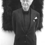
It must have been a month ago that I received an email by an artist I did not know. She introduced herself, spoke of the great selection of books I am selling and wanted very much to introduce her works. Her name …MARIE HANLON…. and she asked if I would like to take a look at her site….and so I did.

hanlon books b

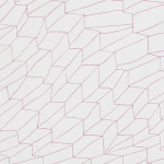
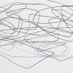
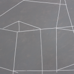
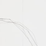
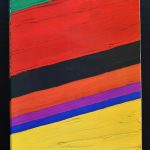
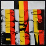
I am always intrigued by artists who I do not know, so I searched for her on the internet and found that she makes the kind of art I am fond of. It is a mix between minimal, constructivist, hard edge and even surrealistic art at some times. We wrote and agreed that it would be nice to make her works known with the help of the ftn-books.com site and ftn blogs and now I am proud to announce that her publications are available at www.ftn-books.com and that she made an artist selection of 4 drawings that are exclusively available through FTN ART at special introductory prices.


In future blogs, new material will be proposed to my readers, but in the meantime here is a short biography on Marie and the link to her site so you can find out yourself why I was fascinated by her work. https://www.mariehanlon.com/

and for information on the books and art by Marie Hanlon please contact me at ftnbooksandart@gmail.com

Marie was born in Kilkenny and studied History of European Painting and English at University College Dublin, at the National College of Art & Design/Dublin and has worked as a professional artist since 1990.

Known mainly as an abstract artist of finely made small and medium-sized works, Marie’s output in recent years encompasses a broader range of media. Through her collaboration with contemporary composers, she has developed new work, especially in video and installation.


Posted on Leave a comment

Belgium Covers

There is no country in Europe that is so patriotic in its covers as Belgium. Many of the publications used for fairs and Biennales use the national colors of Belgium and the series of Europalia publications is inspired by the national colors of the country which is the guest country of Belgium museums, but still there is always a hint of the national colors to be found . I tried to find equivalents for France and the Netherlands, but apart from an occasional catalogue you can count the publication on the fingers of one hand.

Here are some examples which are now available at www.ftn-books

Posted on Leave a comment

Jo van Katwijk (1953)

Schermafbeelding 2020-03-05 om 15.46.30

For me personally i find that Jo van Katwijk/ Joke van Katwijk  has had  a fascinating career. I noticed her works some 15 years ago and started to visit her gallery exhibitions. Because I admired her Heliogravures i began to study her other photographs and found that they too had a quality i admired in black and white photography.

Schermafbeelding 2020-03-05 om 16.02.17

Beside her heliogravures i very much liked her nudes and still lives and recently i finally found the book i was looking for for a long time . The book is the KWAK & VAN DALEN & RONDAY publication which was published  on the occasion of the Grafiekprijs they initiated. It is a shared publication with POL TAVERNE, but for me the interesting part is the van Katwijk part which has some of her best Heliogravures published. This second copy that i now have( beside my personal copy ) is in great condition and now available at www.ftn-books.com