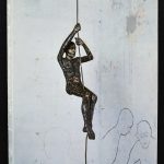
“I call myself a haunted house… we all have ghosts and histories.” – John Davies
Davies’ interest in the human presence set him apart from many of his contemporaries in British sculpture at the beginning of his career. Of his early figures, often cast from life and clothed, Davies has said, ‘I wanted to make a figure, not like a piece of sculpture, more like a person…. I wanted my sculpture to be more like life in the street’.
His more recent works are modelled in clay, before being cast in polychrome polyester and fibreglass, or bronze. Davies arranges these figures in carefully choreographed relationships. Animals and inanimate objects such as houses also appear in works whose thematic concerns are always with human experience.
Of The Deerson Series, shown for the first time in this exhibition, John has said: ‘This series of scarecrow-like figures, with their moons, are a kind of self-portrait. I never intended to make these images, having other ideas to the fore, when I had a car crash in 2010. My life always leaks into my work, so inevitably and reluctantly these images emerged. They are works processing my long recovery. Now to me they seem to have a life of their own, independent of my story. Mad dancing ‘scarecrows’ coming to life, a protest against fate and physical frailty, like the figures in the Watersons’ song, ‘The Scarecrow’.’
Drawing, often in series, has always been an important aspect of John Davies’ practice, and the sculpture and drawings are equally important to him. The drawings in this installation demonstrate how the two practices influence each other.
The above text was found in Fuse magazine
www.ftn-books.com has some John Davies catalogues available
I am always looking for special publications on art and artists and this one i found with a Prague antiquarian. It is a publication on Hans Erni. There are nowadays many of Erni publications , ( Erni has become the oldest artist i have ever written about), but at the time of this publication in 1947 , Erni was hardly known and with this Czech publication had one of his very first publications realized. It is in its kind spectacular because the art within is presented in a small portfolio with 16 offset prints. Published by Vladimir Zikes in 1947 t….. a very nice and highly collectable Erni item.
OLYMPUS DIGITAL CAMERA
( wikipedia ays about erni) Erni was commissioned by the Lucerne Museum Fine Arts to organize an exhibit about Pablo Picasso. The Spanish artist remained grateful for that opportunity to show his art in Switzerland. In 1936 Erni started to work with abstract art. From 1940 to 1945 he was a soldier in the Swiss army and was engaged as a camouflage painter because of his experience with large-size murals. In 1948, he was a competitor in the 1948 Summer Olympics’ painting competitions.[5] Between 1950 and 1952 he participated to exhibitions in Latin America. However his participation in the Biennale of São Paulo was not authorized by Federal Councillor Philipp Etter. After a stay in Mauritania and Guinea he painted African topics. In 1960 he organized with Alfred Pauletto, Celestino Piatti, Hugo Wetli and Kurt Wirth an exhibition in Olten about graphic design and painting. He participated to the 1964 Documenta exhibition in Kassel, in the graphic design department.
On 15 September 1979 the Swiss Museum of Transport opened a large personal collection of Erni’s works. He realized a 30 meter long mural for the Museum. Erni was very interested in sport and received the United States Sports Academy award of sport artist of the year in 1989. In 1993 his works were exhibited at the Pence Gallery in San Francisco.
He celebrated his 100th birthday in 2009. His sister, Maria Strebi-Erni (January 14, 1907 – January 29, 2014), died at the age of 107.[6] Erni died on March 21, 2015, aged 106.
You can not write about Posada without thinking of Manuel Manilla, his artistic mentor. Both are extremely important for the development of Modern Art in Mexico. He has been a great influence to Diego Rivera. I am still searching for the reason why van Gennep published 2 very important monographic titles on Manilla and Posada. Is it interest or because of the worldwide reach of these publications that he thought these were interesting?….i really do not know.
Academics have estimated that during his long career, Posada produced 20,000 plus images for broadsheets, pamphlets and chapbooks. Posada was studied by key figures of Mexican muralism. Mural artists inspired by Posada, such as Diego Rivera and José Clemente Orozco catered to a Mexican elite that rejected foreign styles as part of their new-found bourgeois taste.
Posada is now a part of the Mexican art legacy and just a quick look into the book that is now for sale at www.ftn-books.com shows immediately why his art is timeless and a part of the Mexican folklore.
Jozef Cantré is well known in the Netherlands, He is originally from Belgium and lived for the main part of his life in Belgium, but by the end of WWI he fled to the Netherlands and stayed with some fellow artists in Blaricum. It is at that time that some dutch collectors took an interest in his works and acquired paintings, drawings, sculptures and woodblock prints. For me personally i think i like his woodblock prints the most of all. They have a rare graphic quality . www.ftn-books.com has some of his woodblock prints for sale ( for more information mail to wvdelshout@ziggo.nl).
Cantre had a very productive artistic life and together with his brother Jan Frans Cantre, Joris Minne, van Straten and Frans Masereel he was part of the great “five”. These artists were among the very best woodblock artists from their generation and inspired each other. Personally i admire Frans Masereel the most. His woodblock prints are like comics that make up a story, but Jozef Cantre is a very close second.
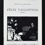
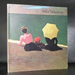
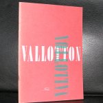
Felix Valotton is without a doubt one of those less familiar names in Modern Art, but still he is very important for the development of modern Art as we know it, because when you look at his works more closely you can discover the fundaments of abstraction.
In 1893, he became a member of Les Nabis, a semi-secret, semi-mystical group of young artists, mostly from the Academie Julian, which included Pierre Bonnard, Ker-Xavier Roussel, Maurice Denis, and Édouard Vuillard, with whom Vallotton was to form a lifelong friendship. While the Nabis shared certain common ideas and goals, their styles were quite different and personal. While he was a member of the Nabis, he kept his distance; his jocular title among the Nabis was “The Foreign Nabi”, [10] Vallotton’s paintings in this period reflected the style of his woodcuts, with flat areas of color, hard edges, and simplification of detail. His subjects included genre scenes, portraits and nudes. Examples of his Nabi style are the deliberately awkward Bathers on a Summer Evening (1892–93), now in the Kunsthaus Zürich, and the symbolist Moonlight(1895), in the Musée d’Orsay.
His paintings began to be noticed by the public and critics; Bathers on a Summer Evening, presented at the Salon des Indépendents, was met with harsh criticism and laughter. But they also woodcuts also attracted considerable and growing attention and clients, and he became financially secure. Between 1893 and 1897, he received many commissions for illustrations from notable French newspapers and magazines, including La Revue Blanche, and from foreign art publications, including The Chap-Book of Chicago. He also made woodcuts for the covers of theater programs and book illustrations. One of his prominent patrons was Thadée Natanson, the publisher of the Revue Blanche, and his wife Misia, who commissioned many important decorative works from the Nabis. Through the Natansons Vallotton was introduced to the avant-garde elite of Paris, including Stéphane Mallarmé, Marcel Proust, Eric Satie, and Claude Debussy.
During the Nabi period, he also produced a remarkable series of woodcuts. His woodcut subjects included domestic scenes, bathing women, portrait heads, and several images of street crowds and demonstrations—notably, several scenes of police attacking anarchists. He usually depicted types rather than individuals, eschewed the expression of strong emotion, and “fuse[d] a graphic wit with an acerbic if not ironic humor”. Vallotton’s graphic art reached its highest development in Intimités (Intimacies), a series of ten interiors published in 1898 by the Revue Blanche, which deal with tension between men and women. Vallotton’s woodcuts were widely disseminated in periodicals and books in Europe as well as in the United States, and have been suggested as a significant influence on the graphic art of Edvard Munch, Aubrey Beardsley, and Ernst Ludwig Kirchner. In 1898, he produced one of his most important series of woodcuts,
By 1900, the Nabis had drifted apart. One source of the division was the Dreyfus affair, the case of a Jewish army officer falsely accused of aiding the Germans. The Nabis were divided, with Vallotton passionately defending Dreyfus. He produced a series of satirical woodcuts on the affair, including The age of the Newspaper,which were published on the first page of Le Cri de Paris on January 23, 1898, at the height of the affair.
Another major event during this period was his marriage to Gabrielle Rodrigues-Hénriques, a upper middle class member of the Paris artistic and social elite. The union also brought to his household three children from her previous marriage. After a brief honeymoon in Switzerland, they moved to a large apartment on near the Gare Saint-Lazare train station. He also established a solid relationship with the Bernheim family and their gallery, which presented a special exhibition devoted the Nabis, including ten of his works. The marriage brought him financial security, and he gradually abandoned woodcuts as his main source of income. Thereafter he devoted his attention almost entirely to painting. www. ftn-books.com has some titles on vallotton available.
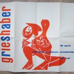
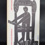
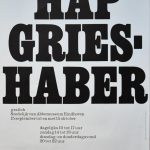
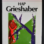
Hap Grieshaber is one of the great graphik artist from the 20th Century.
Personally i consider Hap Grieshaber, H.N.Werkman and Josua Reichert to be the top in graphic artists from the 20th century. Reichert is the best, but Grieshaber and Werkman are close in second spot.
Grieshaber is a typical 50’s /60’s artist. The first time i encountered his works i had a strong asscociation with the Catholic bid prints, inserted and collected in bibles by young people in the early 60’s.
But there is so much more to be discovered in his works than simple figures. The combination of abstract patterns in the background of slhouetted figures are typical Greishaber and make the composition to appear totally abstract. Willem Sandberg was a Grieshaber admirer and together they made one of the most iconic of all Sandberg / Stedelijk Museum catalogues
This and other Grieshaber publications are available at www.ftn-books.com
Grieshaber was honoured with numerous prizes and retrospective exhibitions. He exhibited works at the documenta in 1959 and 1964. In honor of his 70th birthday in 1979, large retrospectives were shown in various museums in both parts of Germany. The last prize that Grieshaber was awarded in 1980 was the art prize of the town of Konstanz. Grieshaber died in 1981 in Eningen unter Achalm aged 72 years.
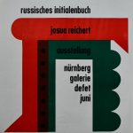
It took me a while, but finally i purchased the small and interesting collection of Josua Reichert prints/posters i had my eye on. It contains 2 of his best and signed lino cut prints and 3 Museum publications from the Sixties. The one i want to point out is the one Reichert specially made for the Werkman exhibition in Baden-Baden. Two print masters united in one print makes this very special to me and shows the genius and complexity Reichert could realize with prints. all prints are available at www.ftn-books.com
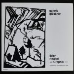
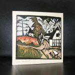
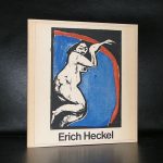
Germany has a great history of Woodblock printing. Dürer was one of the arliest of great artists who used the technique but the 20th century had his own group of great aretists who used the technique. Tere were of course the rtaist of the BLAUE REITER, but there was also the group of the BRÜCker to which Heckel belonged. Heckel is arguably one of the most abstract Brücke artists, but his technique is as good as all the other together, Personally i like Heckel very much and this has resulted in a nice selection of publications available at www.ftn-books.com
OLYMPUS DIGITAL CAMERA
OLYMPUS DIGITAL CAMERA
OLYMPUS DIGITAL CAMERA
Heckel and other members of Die Brücke greatly admired the work of Edvard Munch, and aimed to make a “bridge” between traditional neo-romantic German painting and modern expressionist painting. The four founding members made much use of the print as a cheap and quick medium with which to produce affordable art.
Primitive art was also an inspiration to the members of the Die Brücke. It was Heckel’s brother who introduced the group to African sculpture, and it is noted that their acceptance of primitive art, which was to fortify decisively the expressive yearnings of European artists- Was unequivocal. It is through this style that they found a source of strength in the barbaric figures.
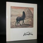
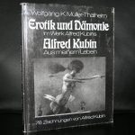
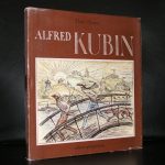
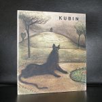
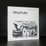
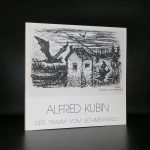
Alfred Kubin was a Bohemian printmaker and illustrator who became an important figure of both the Symbolist and Expressionist movements. His inventive black-and-white drawings often featured fantastical or morbid elements, and depicted supernatural creatures and sexual violence. Born on April 10, 1877 in Leitmeritz, Bohemia (now the Czech Republic), Kubin had an emotionally unstable childhood, attempting suicide and suffering a nervous breakdown before the age of 20. Upon moving to Munich in 1899, he was introduced to the works of Francisco de Goya and Max Klinger, the latter having a particularly profound impact on Kubin. He began producing nightmarish ink-and-wash drawings, and briefly became affiliated with the Russian artist émigré group, the Der Blaue Reiter, which included Wassily Kandinsky and Marianne Werefkin. Kubin was perhaps best known for illustrating the German editions of books by Edgar Allan Poe and Fyodor Dostoevsky. During rise of Nazism in Germany, his work was considered degenerate; he retreated into solitude and lived in a castle in Zwickledt, Upper Austria. He was awarded the City of Vienna Prize for Visual Arts in 1950, and died at his home on August 20, 1959.
It was a necessary step to make the site more accessible, so i changed the lay-out made it much more clear for all visitors to find their way among the 8000+ items that are for sale at www.ftn-books.com.
The result a clean and pleasing site in a blue and creme color scheme. Pleasing to the eye, with a great search engine to find those titltes you are looking for . Please take a look at www.ftn-books.com and when you order use the discount code: FTNnew (10% discount on all items), which is valid until the 6th of February 2019.
Artist/ Author: Oliver Boberg
Title : Memorial
Publisher: Oliver Boberg
Measurements: Frame measures 51 x 42 cm. original C print is 35 x 25 cm.
Condition: mint
signed by Oliver Boberg in pen and numbered 14/20 from an edition of 20