Posted on Leave a comment

DADA en Drachten ( Dr8888 )

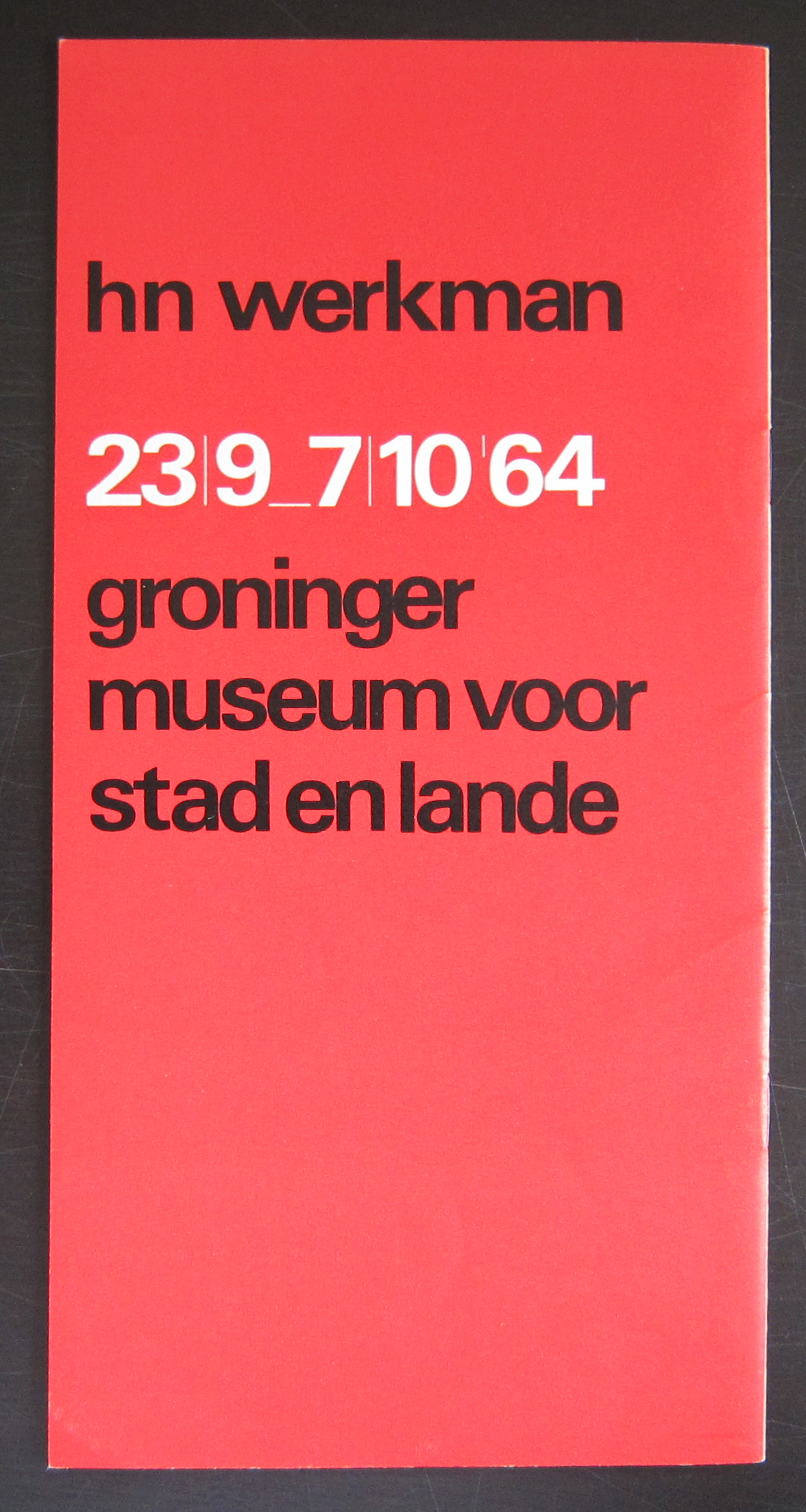
Most people do not know it and personally i did not realise the relationship between Drachten/ Dr8888 and the Dada and Merz mouvements until recently.

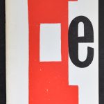
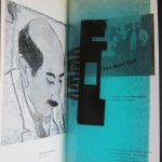
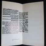
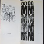
But it appears that some of the artists from Friesland had strong relationships with Dada artists and even were influenced by them . In the same way Dada artists freed themselves from the bourgeois morality, Werkman tried to do the same, although freedom in morality was less important than having a free spirit, searching freedom in his art. The Museum in Drachten finally realized some decade ago that their true importance was this heritage. Dada in the Netherlands is nothing else than Dada in Friesland and Drachten. They made a choice and exploited this heritage since and with one of these exhibition a magnificent catalogue was published, which is now available at www.ftn-books.com

holland dada aa


Posted on Leave a comment

Siep van den Berg … a painting

Schermafbeelding 2020-04-09 om 13.57.23

My blog readers know of my admiration for Siep van den Berg. A dutch constructivist painter who was at the end of his life recognized as one of the most important dutch modern painters from last century. A true constructivist with some side steps in which he searched for the perfect landscape, still life or portrait, but the main part of his sketchbooks is filled with sketches of possible constructivist compositions ( see tomorrows blog) but in the end, out of hundreds of sketches he choose the best one and painted. First the sketch, after the sketch the alterations with small pieces of paper cut from the edge of the sheet and then he filled in the colors and noted his findings on the sketch. Followed by painting the canvas. One of the ultimate paintings i now have acquired for our collection. It was one of the highligjts of the Siep van den berg exhibition at the Genootschap Pictura in Groningen :…yes and here it is presented in landscape mode.

So my previous post on this painting has to be altered in a small way. I am getting convince more and more it has to be presented horizontally. Like this.

Schermafbeelding 2020-04-09 om 13.58.29

This and other Siep van den bBerg publications and original works are available at www.ftn-books.com and ftn-art


Posted on Leave a comment

Hap Grieshaber (1909-1981)

Schermafbeelding 2019-04-09 om 14.03.03

Hap Grieshaber is one of the great graphik artist from the 20th Century.

Personally i consider Hap Grieshaber, H.N.Werkman and Josua Reichert to be the top in graphic artists from the 20th century. Reichert is the best, but Grieshaber and Werkman are close in second spot.

Grieshaber is a typical 50’s /60’s artist. The first time i encountered his works i had a strong asscociation with the Catholic bid prints, inserted and collected in bibles by young people in the early 60’s.

But there is so much more to be discovered in his works than simple figures. The combination of abstract patterns in the background of slhouetted figures are typical Greishaber and make the composition to appear totally abstract. Willem Sandberg was a Grieshaber admirer and together they made one of the most iconic of all Sandberg / Stedelijk Museum catalogues

grieshaber cata a

This and other Grieshaber publications are available at www.ftn-books.com

Grieshaber was honoured with numerous prizes and retrospective exhibitions. He exhibited works at the documenta in 1959 and 1964. In honor of his 70th birthday in 1979, large retrospectives were shown in various museums in both parts of Germany. The last prize that Grieshaber was awarded in 1980 was the art prize of the town of Konstanz. Grieshaber died in 1981 in Eningen unter Achalm aged 72 years.

Posted on Leave a comment

Josua Reichert…5 additions

Schermafbeelding 2019-05-27 om 08.13.05

It took me a while, but finally i purchased the small and interesting collection of Josua Reichert prints/posters i had my eye on. It contains 2 of his best and signed lino cut prints and 3 Museum publications from the Sixties. The one i want to point out is the one Reichert specially made for the Werkman exhibition in Baden-Baden. Two print masters united in one print makes this very special to me and shows the genius and complexity Reichert could realize with prints. all prints are available at www.ftn-books.com

reichert werkman a

Posted on Leave a comment

A very special Wim Couwel publication for the H.N. Werkman 1964 exhibition

Some combinations are hard to beat and this one is surely a classic. Wim Crouwel was not yet promoted to the position of designer of the catalogues of the Stedelijk Museum Amsterdam and had just left the van Abbemuseum with his designs. In the in between period he did some free lance works and one of these was the catalogue he designed for the H.N.Werkman exhibition of 1964 in the Groninger Museum and this catalogue became the standard for all his future designs. He chose a slim sized catalogue, but within the book he used some of the papers which he had used in the van Abbemuseum catalogues and would use again for the Stedelijk Museum catalogues. Making it simple but still complex.

On the cover a bold and typical Werkman print which emphasized the graphic quality of the catalogue. The back…. a typical red with clear black and white lettering. This is in my opinion one of the very best graphic designs ever made in the Netherlands and i am proud to still have a copy for sale of this beautiful and splendid Wim Crouwel catalogue.

For this catalogue please visit www.ftn-books.com

Posted on Leave a comment

Josua Reichert ( 1937 )… a printer

Schermafbeelding 2018-03-08 om 10.18.28

Reichert is a typographer, designer, author and printer combined in one person. Take a little bit of Werkman, put in a dash of Piet Zwart combine this with the authenticity of Reichert and you have some idea of the fantastic prints he makes. Study his prints and you see mouvement and a highly original approach to printing  which makes them typical Josua Reichert prints.

One of the publications http://www.ftn-books.com has for sale is the excellent Wim Crouwel designed catalogue for the 1966 Stedelijk Museum exhibition on Josua Reichert and his prints.

OLYMPUS DIGITAL CAMERA

It is only 4 pages , but the fairly standard design by Wim Crouwel in blue was altered and printed on by Reichert with 3 special prints for this occasion. This combination of Reichert prints with Crouwel typography/design makes this for me personally one of the most valued and appreciated publications by the Stedelijk Museum in the Sixties.

Posted on Leave a comment

A very special WERKMAN publication (1964) by Wim Crouwel

Schermafbeelding 2017-05-30 om 09.46.52

Because i get notified by Pinterest which items are shared and saved, i found out that this is one of the most appreciated photographs of all publications on www.ftn-books.com

This publication was published on the occasion of the Werkman exhibition in Groningen in 1964 and one of the first designs that Wim Crouwel made for a dutch museum. In this same period he designed the publications for the van Abbemuseum which were followed from the early sixties on by the publications of the Stedelijk Museum. What makes this one special is the condition it is in  and the highly unusual appearance. The use of multi colored papers, its odd size and a cover chosen in relation with the Werkman print which is used as a cover. This publication is the top in dutch lay-out and design and must be considered as one of the very best publications of the sixties. Curious?………take a look at

https://ftn-books.com/products/groninger-museum-dutch-typography-h-n-werkman-wim-crouwel-design-1964-nm

and see for your self the many special qualities of this rare collectable Crouwel item.

werkman crouwel a