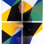
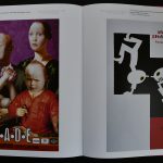
Another impressive poster by Willem Sandberg for a series of 1962 exhibitions. Among these the first presentation of works by Philip Guston.

of these the published catalogues look quite different. All publication are available at www.ftn-books.com.


Another impressive poster by Willem Sandberg for a series of 1962 exhibitions. Among these the first presentation of works by Philip Guston.
of these the published catalogues look quite different. All publication are available at www.ftn-books.com.

Jan van Toorn dies last Friday at the age of 88 years.
Tragic newss this morning , but one of the greatest of all dutch designers from last century dies at the age of 88 years.
I have followed his career with all kinds of examples of his design through all decades of last half century. Many of these are also available at www.ftn-books.com


. Many of them stand out and some are also known outside our borders, since many of his designs were done for exhibitions outside the Netherlands. His style….highly recognizable and less formal than Crouwel is known for. van Toorn sits in between Sandberg and Crouwel and developed over the years a style of his own. He was one of the main designers for the van Abbemuseum and a director for the Jan van Eyck academy and beside the van Abbemuseum made design for PTT Nederland and the Cultural Foreign office. His archives are now with the Unviversity of Amsterdam.
During his life Van Toorn received two prestigious art prices for his designs. First the H.N. Werkmanprijs in 1972 and second in 1985 the BNO Piet Zwart award.

The HOCHSCHUKLE FÜR GESTALTUNG has become over the years a legendary institution and one of its many well-known students was the Brazilian born Almir Mavignier. He attended the school in 1953 and has become part of art history since.

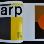
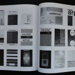
Friend of Max Bill, witnessing the very early beginnings of the ZERO movement and later becoming one of the most appreciated Poster designers from the 3 decades to follow. He himself was working as a constructivist/minimal artist and that meant he was interested in all artists who were working along the guidelines of the movements. Because of this interest and the resulting friendships, he had a chance to design the posters for many of the artists he met. To name a few….Calderara, Arp, Morellet and Soto….and all of these artists I personally admire very much. This makes the book I now can offer on www.ftn-books.com very special for me personally too. A great publication of the Gewerbe Museum Hamburg in cooperation with the German Poster Museum. Great poster designs by Mavignier. btw. …. the site on Mavignier is well worth visiting and can be found here: https://www.mavignier.com


A recent auction of famous movie poster by Sotheby’s inspired me to have another look at the 70’s Crouwel designed catalogue which was made for the Cuban poster exhibition at the Stedelijk Museum. In 1971 the Stedelijk Museum had the foresight of organizing a Cuban poster exhibition. They recognized the outstanding quality of these posters. Political images were presented in colorful and powerful posters, but the auction shows a different side of these Cuban posters. Their interpretation of famous classic western movies. The Cuban designs were “classic” films with a twist. These posters were used to advertise famous titles in Cuba. Their strong designs and vibrant colours recall Havana in its heyday. The Cuban poster catalogue from 1971 is available at www.ftn-books.com


At one time Pieter Brattinga, who knew every good poster artist in the Netherlands , was asked who were the best poster designers. His answer, Crouwel, Sandberg, Treumann and Bons, but the very best was Nicolaas Wijnberg. Because his father was the director of the famous Steendrukkerij de Jong he had seen their works for some decades being printed on the presses of his father company. Because he had seen them all, his opinion is important and when you look at the posters by Wijnberg you can see why these were liked so much. His posters are not the ones with the beautiful clean lay-out. Nor the ones which stand out because of the use of color. No……. the Wijnberg posters are special because each of them tells a small story. This is not the poster who draws your attention for an event. The Wijnberg posters reaches out to you with a part of the performance or event. This makes you curious and therefore you will remember it.
The book on the Nicolaas WIJNBERG posters is available at www.ftn-books.com


This has been one of the highlights from the past year. A book i did not know was published but a true treasure trove. The book dates back from 2001 and shows the history of 10 years of “Stage” posters. These are done by the very best of dutch (poster) designers. To name a few Anthon Beeke, Jan Bons, Joost Swarte, Lex Reitsma, Marten Jongema. A beautiful published book. BIS published these posters on a larger sized format. Giving these the best possible size in a still reasonably sized book . The book contains the very best of 10 years of posters starting in 1991 and ending in 2001. This book is now in my personal book case and i am glad to give this a place in my personal collection until it sells…..i love it!


For me Mucha was a great way to start appreciating art. Together with Henri de Toulouse Lautrec ( roughly from the same period), Alfons Mucha was the artist i appreciated the most in my mid teenage period. Accessible art and still a little bit more avant garde than the Impressionist painters who were widely appreciated in those days. Mucha was THE Art Nouveau artist and together with some French and Belgian artist was the top in Art Nouveau art. The art of Alfons Mucha is highly recognizable. The use of women models who look straight at you is one of his trademarks.

Since for me personally a lot has changed. From the accessible Art Nouveau by Mucha i made a “travel” through art history which resulted in appreciating Minimal and conceptual art. Still Mucha has a lot of quality and for those seeking a nice work by an Art Nouveau , please include the works by Mucha, since there are many extremely nice prints now available since this artist is copyright free. For those looking for some publications on Mucha , visit www.ftn-books.com


Jan Gregoor, became “famous” in the Netherlands for his crayon works, but for me it is not his art that makes the artist attractive. It is typical for the decades he lived and worked in, but what struck me most about Gregoor was the EXCELLENT exhibition poster that was made by the van Abbemuseum for an exhibition on the artist and designed by Cornet. It has the simplicity of the greatest of 60’s designs and for me personally i think this is absolutely one of the most splendid of all van Abbemuseum posters ( available at www.ftn-books.com).


I just told that i am not that fond of Gregoor, but still he has made some excellent prints., which are worthwile to search for.


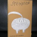
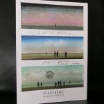
….and now for the other Steinberg…SAUL STEINBERG.
First i must say that writing a blog on Steinberg, can not do justice to the excellent site , which the Steinberg foundation has constructed on the life, times and art of Saul Steinberg. You can visit the site at : http://saulsteinbergfoundation.org
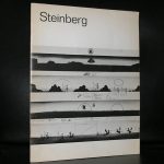
But some personal notes on the artist. Saul Steinberg is a very well known artist in Europe. He had his exhibitions at the Maeght galleries in the Sixties and Seventies and both the Stedelijk Museum and the Boymans van Beuningen museum in the Netherlands organized exhibitions on the artist. In the beginning i always had considered Steinberg to be an illustrator and not the artist he later became to me. Later i realized to look at his art in a way that his drawings were meant to be seen. A citation from his site makes this clear :
Saul Steinberg defined drawing as “a way of reasoning on paper,” and he remained committed to the act of drawing. Throughout his long career, he used drawing to think about the semantics of art, reconfiguring stylistic signs into a new language suited to the fabricated temper of modern life. Sometimes with affection, sometimes with irony, but always with virtuoso mastery, Saul Steinberg peeled back the carefully wrought masks of 20th-century civilization.
This is an artist to be discovered by a far larger audience. At this moment i think he is the lesser of both Steinberg’s i recently wrote a blog on, but perhaps time will prove me wrong and i will think of his art just the way around in a few years. www.ftn-books.com has some nice and rare Saul Steinberg publications available.

It was a necessary step to make the site more accessible, so i changed the lay-out made it much more clear for all visitors to find their way among the 8000+ items that are for sale at www.ftn-books.com.
The result a clean and pleasing site in a blue and creme color scheme. Pleasing to the eye, with a great search engine to find those titltes you are looking for . Please take a look at www.ftn-books.com and when you order use the discount code: FTNnew (10% discount on all items), which is valid until the 6th of February 2019.


