This is one of those artists that stayed out of sight for me because i never had seen his work in a museum before, but after i found a book ( available at www.ftn-books.com) it became clear to me that his implressionist art is not less than the the works by his french and european counterparts.
Sergey Ivanovich Lobanov was one of the significant but little known artists of the first half of the 20th century. His fauvist landscapes participated in exhibitions of the Jack of Diamonds in 1910 and 1912. Unfortunately, Sergey Lobanov’s works were hardly displayed hereafter but for few exhibitions in the 1920s.
<divSergey Lobanov studied in art studios of F.I. Rerberg (1906) and I.I. Mashkov (1907), at the Moscow School for Painting, Sculpture and Architecture (1907-1913). As a school student yet, he got interested in the history of fine arts. Sergey Lobanov attended courses on the history of arts at the Moscow Archaeological Institute in 1914.
He became an official of the Museum and Monument Protection Department of the People’s Commissariat for Education in 1918. Sergey Lobanov was seated the custodian of the nationalized collection of S. I. Schukin in 1922. For one and a half decades the artist was the deputy director of the State Museum of New Western Art (later a considerable part of the museum collection was shifted to the Pushkin Museum of Fine Arts and made the basis of the collection of French painting of the second half of the 19th and 20th centuries).
After his short membership in the Artists Association of Revolutionary Russia he was excluded from it as being “alien to ideology of the Association” in 1924 and walked off from any art groups.
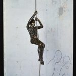
“I call myself a haunted house… we all have ghosts and histories.” – John Davies
Davies’ interest in the human presence set him apart from many of his contemporaries in British sculpture at the beginning of his career. Of his early figures, often cast from life and clothed, Davies has said, ‘I wanted to make a figure, not like a piece of sculpture, more like a person…. I wanted my sculpture to be more like life in the street’.
His more recent works are modelled in clay, before being cast in polychrome polyester and fibreglass, or bronze. Davies arranges these figures in carefully choreographed relationships. Animals and inanimate objects such as houses also appear in works whose thematic concerns are always with human experience.
Of The Deerson Series, shown for the first time in this exhibition, John has said: ‘This series of scarecrow-like figures, with their moons, are a kind of self-portrait. I never intended to make these images, having other ideas to the fore, when I had a car crash in 2010. My life always leaks into my work, so inevitably and reluctantly these images emerged. They are works processing my long recovery. Now to me they seem to have a life of their own, independent of my story. Mad dancing ‘scarecrows’ coming to life, a protest against fate and physical frailty, like the figures in the Watersons’ song, ‘The Scarecrow’.’
Drawing, often in series, has always been an important aspect of John Davies’ practice, and the sculpture and drawings are equally important to him. The drawings in this installation demonstrate how the two practices influence each other.
The above text was found in Fuse magazine
www.ftn-books.com has some John Davies catalogues available
Discovering “new” artists is one of the nicer thing of writing a daily blog. And writing a blog on this artist is a pleasurable experience since i like his art . Mix total astraction wit constructivist art and use very delicate colors and you get an impression of the art Eggenschwiller stands for. Born in 1930 het must have known the abstract painters from his generation, but this does not show. His art is original and although not very well known, deserves to be presented in exhibitions and galeries. This is one of the goals the Eggenschwiller-Wiggli foundation has set for themselves.
Eggenschwillers works must be known with a much larger public than these are known now. Works by Franz Eggenschwiller are present in the Solothurn Museum and www.ftn-books.com has the most important publication on this artist available.
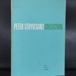
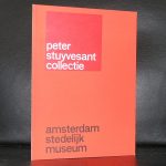
I have a weakness for the Stuyvesant Foundatio. The foundation was founded by Alexander Orlow of Turmac company who had the brilliant idea to bring great art works among his factory workers by placing the art in the middle of the production. This meant that many large sized works were purchased over a period of 30 years. Zero, Cobra en abstract expressionism being the most important among these works. For most of the collection they had one thing in common. Their size was large and larger, since the works had to be seen by the people who worked a fair distance from them.
The following article appeared in the Telegraph a few days before the first auction was being held. In total there were 3 auctions. Personally i thought the first was exceptional, the second very good and the third was filled with the leftovers. I was lucky to buy one of the best Gerard Verdijk paintings ever in the 2nd auction at AAG. My luck….it is too large for many, so no bids were placed after the initial price set by the auctioneer.
The cream of one of Europe’s most highly regarded corporate art collections is to be dispersed by Sotheby’s next week in spite of efforts by civil authorities and art experts to preserve it and turn it into a museum. Known as the Peter Stuyvesant collection, it originated in the late 1950’s when Alexander Orlow, managing director of Turmac Tobacco, which made the popular Peter Stuyvesant brand of cigarettes in its factory in Zevenaar, Holland, decided his workforce needed something to cheer them up. “However complicated the operations of a machine may look, it soon becomes monotonous to a factory worker,” he said.
His solution was to buy art – preferably big, colourful abstract paintings – and in 1960 commissioned 13 artists from different European countries to make works on the theme of “joie de vivre” to hang in the factory’s production halls. The experiment was so popular that in the following year he invited William Sandberg, formerly the director of Amsterdam’s Stedelijk Museum, to expand the collection. Over the next 50 years, the collection grew under the supervision of a series of former Dutch museum directors.
However, in 2000, Turmac was swallowed up by the British American Tobacco Company (BAT), and the art collection renamed the BAT Artventure collection. But there was not to be much in the way of artistic venture in store. In June of 2006 it was announced that the Zevenaar factory would close with the loss of 570 jobs, so that European production could be concentrated in Germany and Poland. That left over 1,400 works in the art collection valued at some 23 million pounds looking for a new home.
Jan de Ruiter, the mayor of Zevenaar, supported by Martijn Sanders, chairman of the Advisory Committee on the Future of the Stedelijk Museum, looked for a way to buy the collection and keep it locally, possibly as a wing of the museum. But “BAT did not really want to make a deal,” said de Ruiter. It went to Sotheby’s instead.
Sotheby’s has a good track record in handling corporate art collections. Back in 1989 it handled the disposal of the British Rail Pension Fund collection and the $93 million (£62.5 million) Reader’s Digest collection. Since then we’ve seen a series of high profile sales for IBM, the 7-Eleven photo collection, the HSBC collection of 19th century pictures, not to mention a certain £65 million sculpture by Giacometti from the German Commerzbank last month.
The company clearly sets some store by advising corporations on the acquisition and disposal of art, setting up a department just to deal with that in New York 20 years ago, and another in London last year. Saul Ingram, who runs the London department, says most companies sell to buy new work or channel profits into broader cultural activities. The Stuyesant/BAT collection is different because it was site specific, and without the factory and its workers, its purpose has gone.
Its value, though, is still substantial. The 163 works to be sold by Sotheby’s Amsterdam next week are estimated to fetch between £3.6 million and £4.6 million, with further sales planned in the future. Avant garde European groups from the 50s and 60s such as CoBrA, the abstract expressionist group based around Copenhagen, Brussels and Amsterdam, and Zero, the Dusseldorf based group who worked with experimental materials such as fire, nails and papier mache, are to the fore.
The Zero artists, Gunther Uecker and Jan Schoonhoven, who starred at Sotheby’s recent Lenz collection sale last month, are expected to do exceptionally well. A rarity is Lily ou Tony (1965), one of Nicki de St Phalle’s first Nana sculptures that celebrate womanhood. Though fragile, made of tissue and wire mesh, it carries a £180,000 to £270,000 estimate. The most significant example of British art is a 1958 Alan Davie painting that has been undervalued at £27,000 to £36,000.
In addition to the stylish brand name Stuyvesant gave to the world of smoking, it also achieved brand recognition in the art world, especially in Britain, where, during the sixties, the Stuyvesant Foundation sponsored the Whitechapel Gallery’s trendsetting The New Generation exhibition, which included David Hockney and Bridget Riley, and also the talent spotting Young Contemporaries, much of which was immortalised in the Tate Gallery’s Recent British Art show of 1967. The separate collection of British art that was formed by the Stuyvesant Foundation between 1964 and 1967 was eventually sold in the late 1980s and established what were then huge prices for Davie, Riley, and others of that generation. The last sale, held at Bonhams in 1989, was a complete sell out. Next week will see how well the Stuyvesant brand has survived.
www.ftn-books.com has nearly all dutch publications on the Stuyvesant collection available.
On the “outskirts” of the COBRA group she operated like a true Cobra artist. In 1951 she left for Paris and joined the artist at the Rue Santeuil and became friends with Karel Appel and Corneille and somehow got influenced by everything COBRA that surrounded her . in 1997 the NRC wrote about het works that they were still fresh and vivid and compared to some works by her fellow artists never had lost their quality. When you leaf through the book that is now for sale at www.ftn-books.com, one notices that her work is far more abstract than the early COBRA works that were in many cases inspired by children.
These works by Tuynman are more like the Klee drawings from the Twenties, but put on canvas. The publication was initiated by Mrs. E. Tuynman and published by DE DRIJVENDE DOBBER of Tom Mercuur. A keen publisher who has an eye for the undiscovered talent. The book is now available.
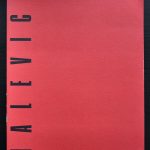
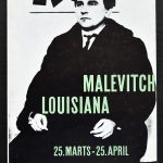
On a recent book market visit i found 2 totally different publications on the same artist. Malevich being the subject it occurred to me that there was a great difference between both publications. One rather modern with the emphasize on his early works proved that the interest in his early works was not there from the early beginning. The other being earlier…. a Louisiana / Denmark Museum publication from 1959. Shows the influence of Willem Sandberg in its catalogue design and its approach is totally different. Only a few early works are depicted and the focus is on his Suprematist works, which were being discovered as highly important in those days. The ultimate “BLACK SQUARE” being the final result of his search in constructivist painting.
These and other great Malevitch publications are available at www.ftn-books.com
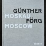
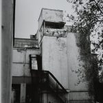
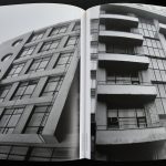
For many among us Günther Förg is the painter of lead surfaced paintings and one great print maker, but there is another quality in which he excels. Förg was a great photographer and made some high quality photo books on the almost forgotten ( Bauhaus )architecture of Tel Aviv and Moscow. The book on Tel Aviv i have sold a very long time ago, but was fortunate to find a Moscow copy with his photographs on a recent book market. This is a truly outstanding publication. Large sized , printed and published by Snoeck and of the highest print quality. The book shows the excellence of his photographs and makes you wonder why art lovers all over the world are not familiar with this part of Förg’s work.. The photographs look like still lives and do not only have an artistic quality but a historic quality too. Where the Tel Aviv book is of the highest quality, this Moscow book even looks better. It is a publication of a rare quality and a highly collectable photography/art book.
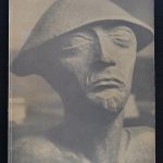
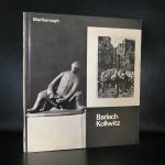
Barlach died just before the outbreak of WWII. Kathe Kollwitz was about the same age and both were heavily influenced by the events of WWI. This war made an impression on both artists and many of their statues and sculptures reminders of this war.
Wood was the material with which Barlach preferred to work and it has taken a very long time that his works received the appreciation they rightfully deserved to get. In the Netherlands only one exhibition was held. It was held at the Boymans van Beuningen Museum in 1961. Personally i did not take notice of this exhibition until last week when i found the catalogue. I discovered it at the local Bookmarket and thought it had a beautiful design….yes designed by Benno Wissing and the design of the catalogue emphasized the qualities of barlach’s sculptures. The catalogue is nowavailable at www.ftn-books.com and for those visiting the Hamburg region, There are 2 Barlach museums in the region. One in Wedel and one in Ratzeburg.
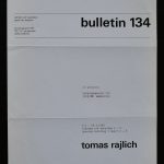
The following blog has certainly to do with my personal fascination for the works of Tomas Rajlich. Rajlich has been a long time favorit of us and i was very happy that i finally could add the Art & Project Bulletin 134 from 1983 to our collection. Within the 4 pages the pages 2 and 3 are devoted to a beautiful golden composition with a fine mazed grid. This is a great composition and shows what Rajlich was doing at that time. Gold painted minimal compositions were painted and on it a grid in pencil was drawn. IN almost all cases the grid was 5 x 5 cm. squares in pencil. The Bulletin 134 is available at www.ftn-books.com
Artist/ Author: Oliver Boberg
Title : Memorial
Publisher: Oliver Boberg
Measurements: Frame measures 51 x 42 cm. original C print is 35 x 25 cm.
Condition: mint
signed by Oliver Boberg in pen and numbered 14/20 from an edition of 20