Posted on Leave a comment

Robert Jacobsen (1912-1993)….(the other Jacobsen)

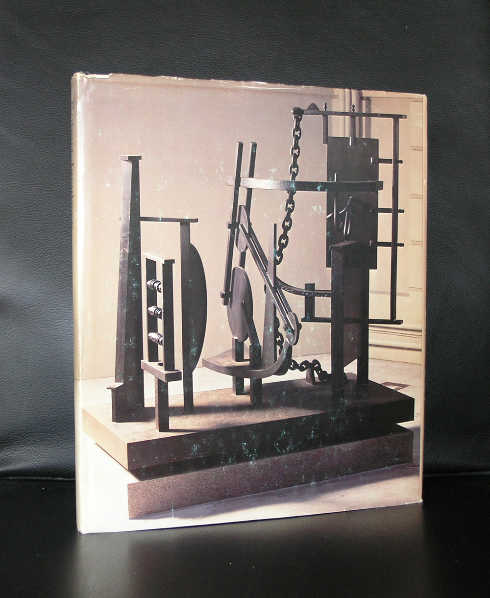
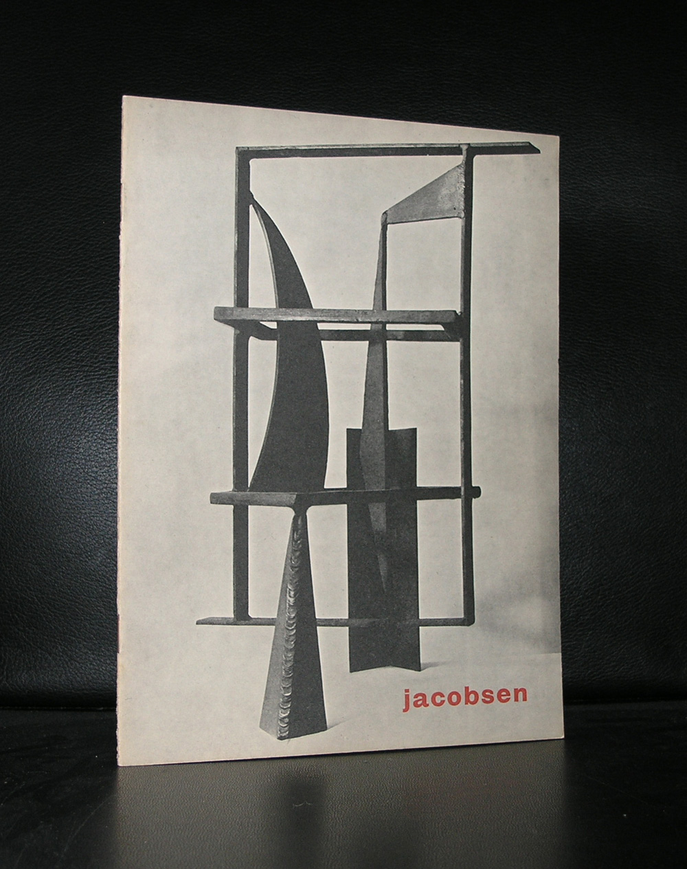
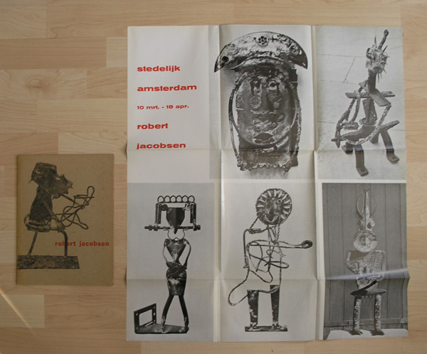
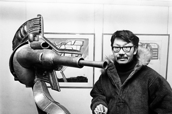
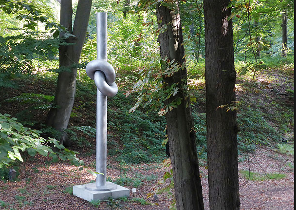
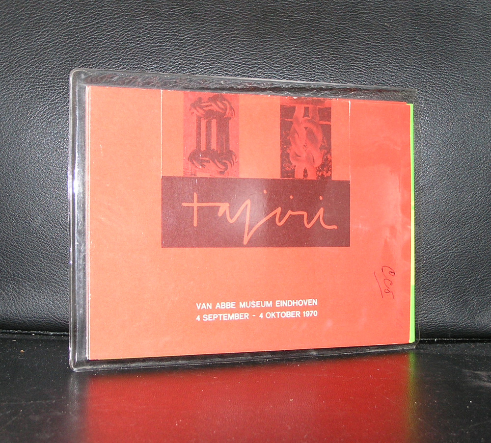
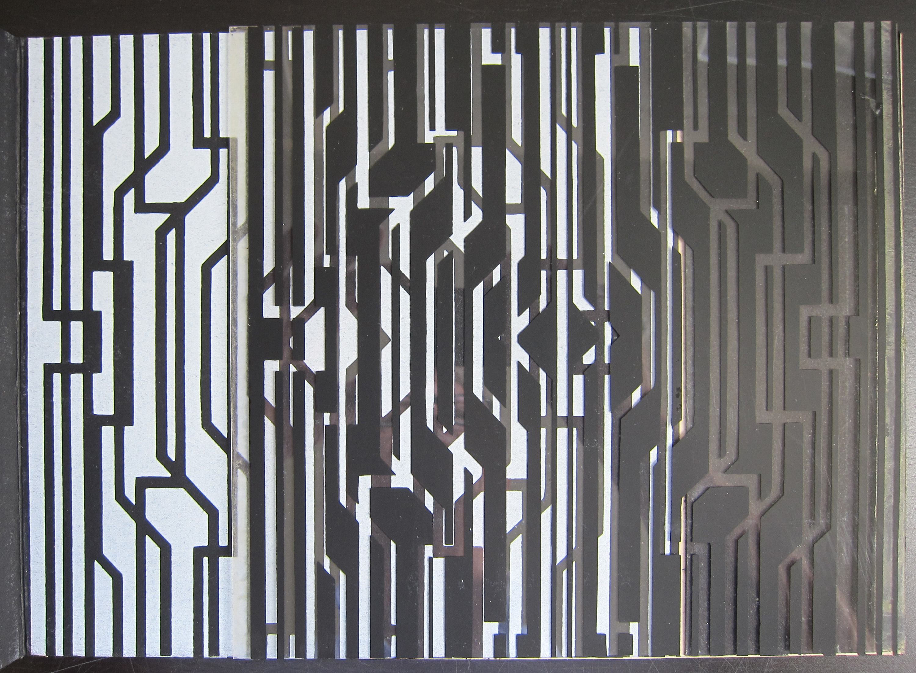
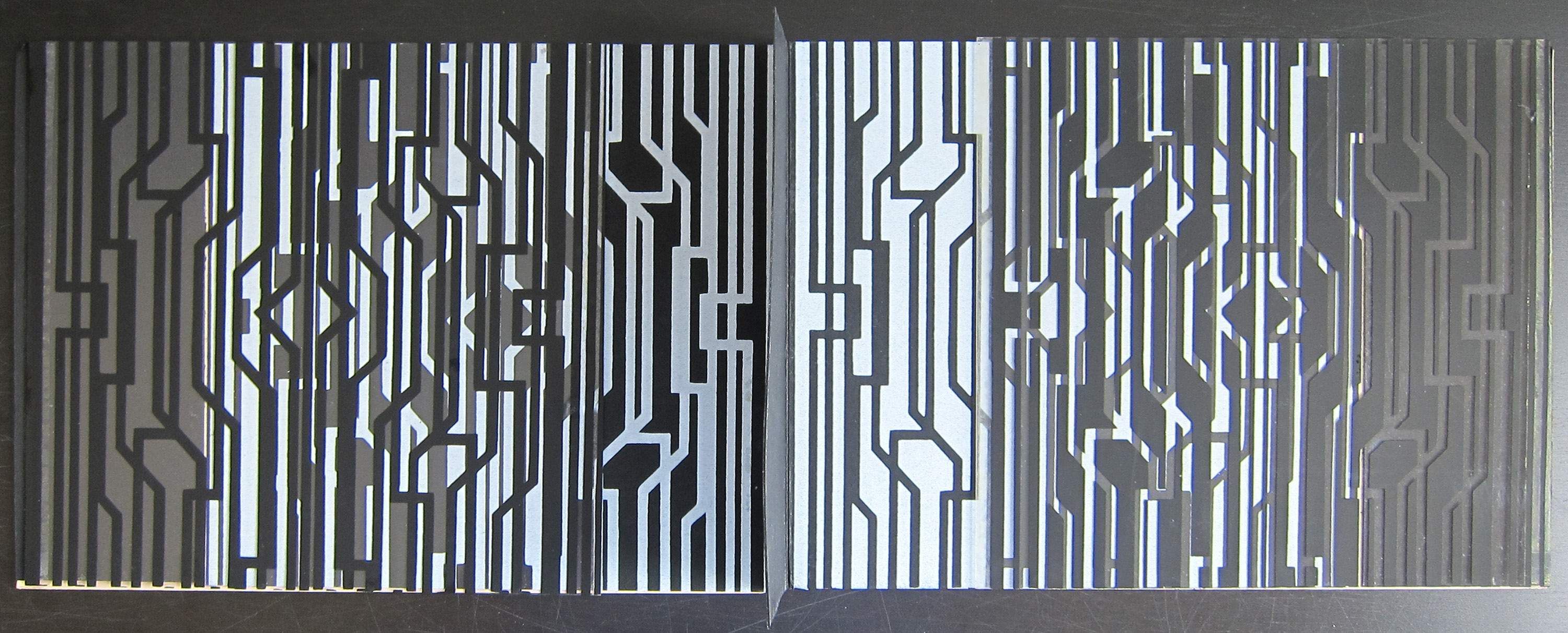
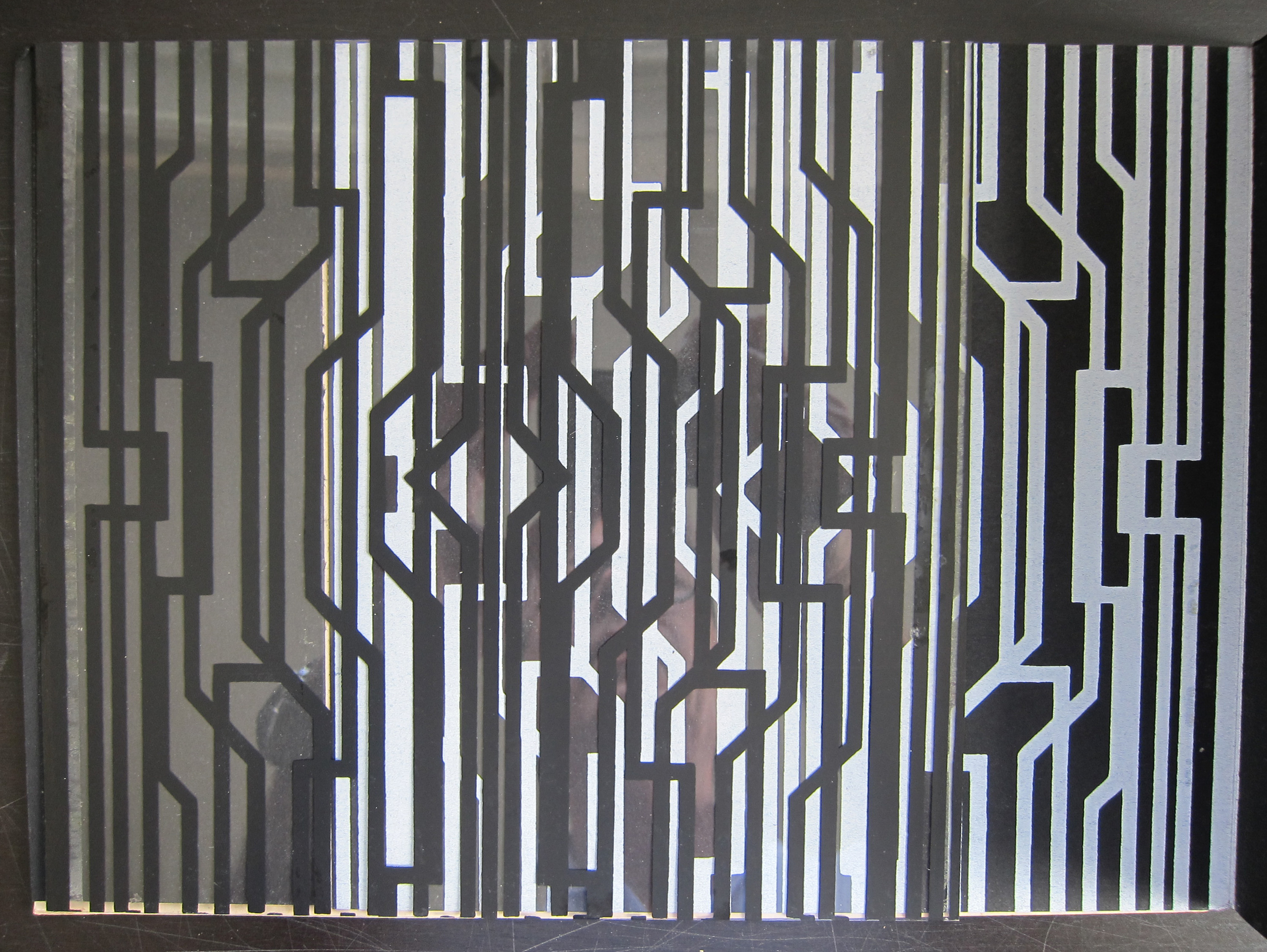
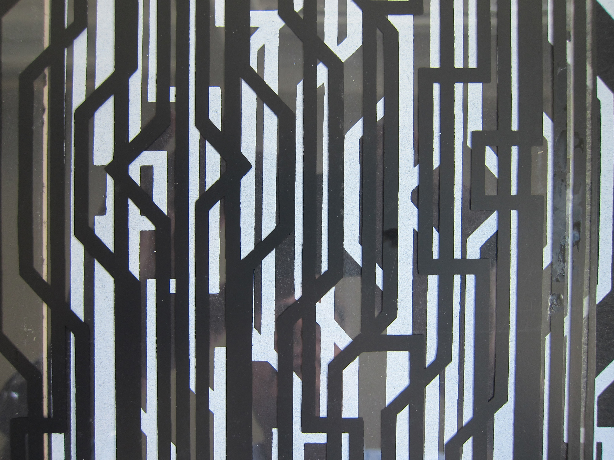
Same decade, same museum, same curator and same designer for the catalogue. A week ago i wrote about Arne Jacobsen, but in the sixties another Jacobsen was given an exhibition in the Stedelijk Museum too. Robert Jacobsen had a solo exhibition in 1960 and his friend Willem Sandberg designed the catalogue for it. This time his approach was different because within the catalogue a special compartment was made in which an exhibition poster could be folded and sold together with the catalogue. This meant that most of the catalogues which are sold nowadays, lack the poster because in most cases it is or was sold separately. Both items are Willem Sandberg designs , so both are very much worth collecting. Beside the great design by Sandberg Robert Jacobsen is of course a magnificent artist too and after his Sixties exhibition in the Stedelijk i know of only one location in Europe, the Louisiana Museum, in which his works were presented. Most of his exhibitions took place in museums and galleries the US.

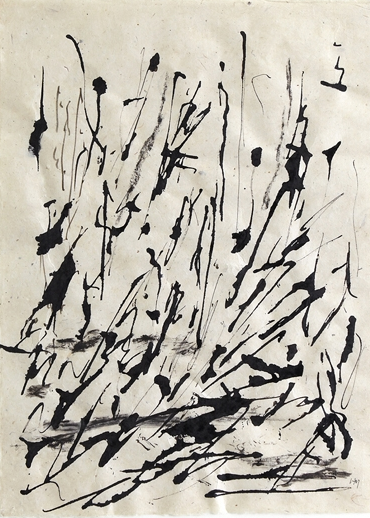
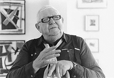
The print beside the portrait of Jacobsen is available at www.ftn-books.com as are the book titles on this page.

Posted on 1 Comment

Shinkichi Tajiri (1923-2009)

Tajiri…. Photographer, Painter, sculptor, graphic artist . He has practically explored every discipline art has. His claim to fame were his large sculptures and specially the KNOTS are more than impressive. As a person he is even more fascinating, because he was in the middle of things, because of his studies and travels he had met many very important artists.

In 1949 he went to Paris to study with Ossip Zadkine and then Fernand Léger. He met Karel Appel and Corneille in Paris and shows at the 1949 COBRA exhibition at the Stedelijk Museum, Amsterdam. In 1951 he went to Germany and taught at the Werkkunstschule Wuppertal. In 1955 he won a Golden Palm at Cannes, for his first short film, The Vipers, because of his experimental use of the language of film. From 1956 he lived in the Netherlands, since 1962 in Baarlo. He worked as a sculptor and painter. He exhibited at the famous Kassel documenta II, 1959; III, 1964 and IV, 1968. From 1969 Tajiri taught at the Hochschule für Bildende Künste at Berlin. 1969 and 1970 Shinkichi took pictures of every part of the Berlin Wall. In 1970 he went to Denmark and directed the award-winning documentary Bodil Joensen – en sommerdag juli 1970 about Bodil Joensen. In 1975 and 1976 he recreated the Daguerreotype: surreal portraits, nudes and daguerreotypes of the Wall.

On this last subject www.ftn-books.com has a very nice publication available. Daguerreotyoes were Tajiri’s other specialty.

Posted on 3 Comments

Informele Kunst exhibition / 1983

Yes ….34 years ago i was a rookie and just had walked into the museum world and there there was this exhibition which i could not understand. An exhibition on INFORMELE KUNST in Nederland en Belgie ( dutch language) in the Schamhart wing with at the entrance an extremely large painting by Jan Cremer. At the time it was painted he asked a price for it of 1 million guilders.

schermafbeelding-2017-01-11-om-14-39-04

At that time a ridiculous amount of money for a work of art, but time passes and if i had known what i know on art now i would have started collecting these works which were within the exhibition. names? Schoonhoven, Leblanc, Cremer, Peeters, Armando, Verheyen, Gentils, Mortier. If only……….

A pity I did not start collecting these artists, because then the time was perfect to buy at reasonable prices. Prices started to rise from that year on and the end is not in sight. What remains is the excellent catalogue which is still available at www.ftn-books.com

Posted on 8,244 Comments

Matisse…..La Dance (1933)

OLYMPUS DIGITAL CAMERA
Matisse

On the location of the Museum of Modern Art in Paris, there is a basement and within that basement is one of the best kept art secrets of Paris. Open for the public, no ticket needed,……just walk down the stairs and see one of most breath taking paintings by Matisse ever.

schermafbeelding-2017-01-11-om-14-08-01
Matisse La Dance

The 3 works form together one large mural/painting in which elements of the Dance are depicted. Size approx. 25 x 5 meters.

No crowds, because people forget to visit this space with the Palais de Chaillot, but it is very well worth visiting and i can predict you will be in the neighbourhood, because when you visit Paris and want to have the best view on the Eiffel tower, you will stand opposite it at the Palais de Chaillot, walk another 200 meters to the left and you are standing before the LA DANCE, at least as impressive as the Eiffel tower you came for.

title: La danse

year : 1933

adresse: Palais de Chaillot, 1 Place du Trocadéro et du 11 Novembre, Paris

+: Installé dans le Palais de Chaillot en 1977

Posted on 10 Comments

Art & Project and Conceptual Art

in-out-a
In & Out of Amsterdam

The best book from the last years on the fascinating world of Conceptual Art is by far the book IN & OUT of AMSTERDAM/ Travels in Conceptual Art 1960-1976. A book which i cherish , because this is a treasure trove of ideas and excellent publications which can still be found on the market(s). The book si published by MoMa where in 2009 the exhibition was held with the same name. In &Out of Amsterdam  shows the most important and possibly the best works by the following artists:

Bas Jan Ader

Stanley Brouwn ( see blog)

Hanne Darboven

Jan Dibbets

Ger van Elk

Gilbert & George

Sol LeWitt ( see blog)

Charlotte Posenenske

Allen Ruppersberg

Lawrence Weiner

All excellent artist and all published within the series of Bulletins published by Art & Project.

These publications have certainly become highly collectable items, because during the time they were published and now ( some 40 years ) few have survived. So start collecting them now while they are still available. see www.ftn-books.com


Posted on Leave a comment

Bram van Velde versus Willy Boers


Yesterday, i listed a lithograph by Bram van Velde on Kunstveiling.nl and because i searched for the title of the lithograph i encountered another painting by van Velde from an earlier date. The painting is from 1959 and now in the collection of a Belgium collector. ( See a nice article on van Velde at http://hyperallergic.com/182278/failure-as-success-in-painting-bram-van-velde-the-invisible-part-2/).

But what struck me most were the similarities between a painting from another dutch painter …Willy Boers. A painting i know very well, title “Quintessens” and from a much earlier date. A painting which is one of the key works in dutch Modern Art and one which is depicted in the book. DOORBRAAK VAN DE MODERNE KUNST IN NEDERLAND

This Willy Boers painting was made in 1947 and finished in 1948. There are 11 years apart in both works. The Boers painting is strongly influenced by Miro and Picasso, but is it possible that Bram van Velde has seen the Willy Boers painting?

The books are available at www.ftn-books.com


Posted on Leave a comment

Vasarely at Denise Rene, 1970

schermafbeelding-2017-01-09-om-11-29-21

The year….1970…..the exhibition MASTERS OF MODERN ART, location gallery Denise Rene…the invitation…..a special object designed by Victor Vasarely.

This is one of the most impressive invitations ever, because it was made in a limited edition and only a few will have remained during the past 47 years. The invitation is printed in an oblong format and consist on one side of the name of and the artists within the exhibition. The other side is printed with a Vasarely design on which a transparent, but printed design can be placed and moved over the original design. Resulting in an ever changing Vasarely composition. … a spectacular original Vasarely which is available at www.ftn-books.com

Posted on Leave a comment

Antonio Calderara (1903-1978)

schermafbeelding-2017-01-04-om-09-42-49

Because of a sale today, i was reminded of the very nice Antonio Calderara catalogue published by the Stedelijk Museum Amsterdam in 1977. The catalogue was designed by Wim Crouwel and what this one makes really special are the 3 original silkscreen prints within this publication. Thin, only  16 pages but with 3 striking silkscreens i consider this as one of the very best seventies Stedelijk Museum publications. Published with Sm catalogue number 616 the catalogue stands out from the others published in the same period. One of the silkscreens is used as cover ( orange /red) and 2 are within ( yellow and sky blue). The very little text and the beautiful impressive photograph of Calderara complete this exquisite publication. This one and others on Antonio Calderara are available at www.ftn-books.com


Posted on 1 Comment

Bernard Buffet and TOXIQUE by Sagan

Why Bernard Buffet in this blog. …an hour ago i was reflecting on my early youth and i remembered we had a reproduction of a Clown by Bernard Buffet hanging on the wall.

schermafbeelding-2017-01-03-om-12-29-12

In the early sixties, Buffet was one of the most famous young artists who was appreciated by the great public. A recognizable style and what is more important…. No abstraction what so ever. A stylized reproduction of reality in portraits, landscapes and still lives and made available for a large audience through reproductions .

This resulted in an overkill of Buffet’s on the market and meant his work was not in fashion for at least 3o years, but now this is changing. Large retrospectives are being held and one now realizes that his works are part of the evolution in Modern Art. One of his very best 60’s artist publications is TOXIQUE , By Francoise Sagan


and available at www.ftn-books.com, but looking through the inventory and reading some of his older catalogues you must admire the very personal style of Bernard Buffet and understand why he is now considered as one of the great artists from the 20th century.

Posted on Leave a comment

Henri Michaux ( 1899-1984)

schermafbeelding-2017-01-01-om-11-03-57

Henri Michaux had two talents. For me, above all , he was a painter, but others would say he was a poet/writer. Michaux was good with language and because of that it was easy for him to derive from his letters, signs and bend them into a completely different language of art and make an abstract composition with them.

If i had not known a little more about Michaux and of his background as a writer i easily would have categorized him among the ZERO artists. (on the left there is a drawing by Michaux and on the right there is a drawing by Jan Schoonhoven.)

But his “signs” are not made randomly. Some of his most intriguing ones are done under the influence of LSD and Mescaline with which he experimented. Two separate methods in creating great art by 2 artists, resulting in almost the same composition, some 10 years apart from each other ( 1963 and 1974), but both highly intriguing.

The books are all available at www.ftn-books.com

blog is published on www.ftn-blog.com