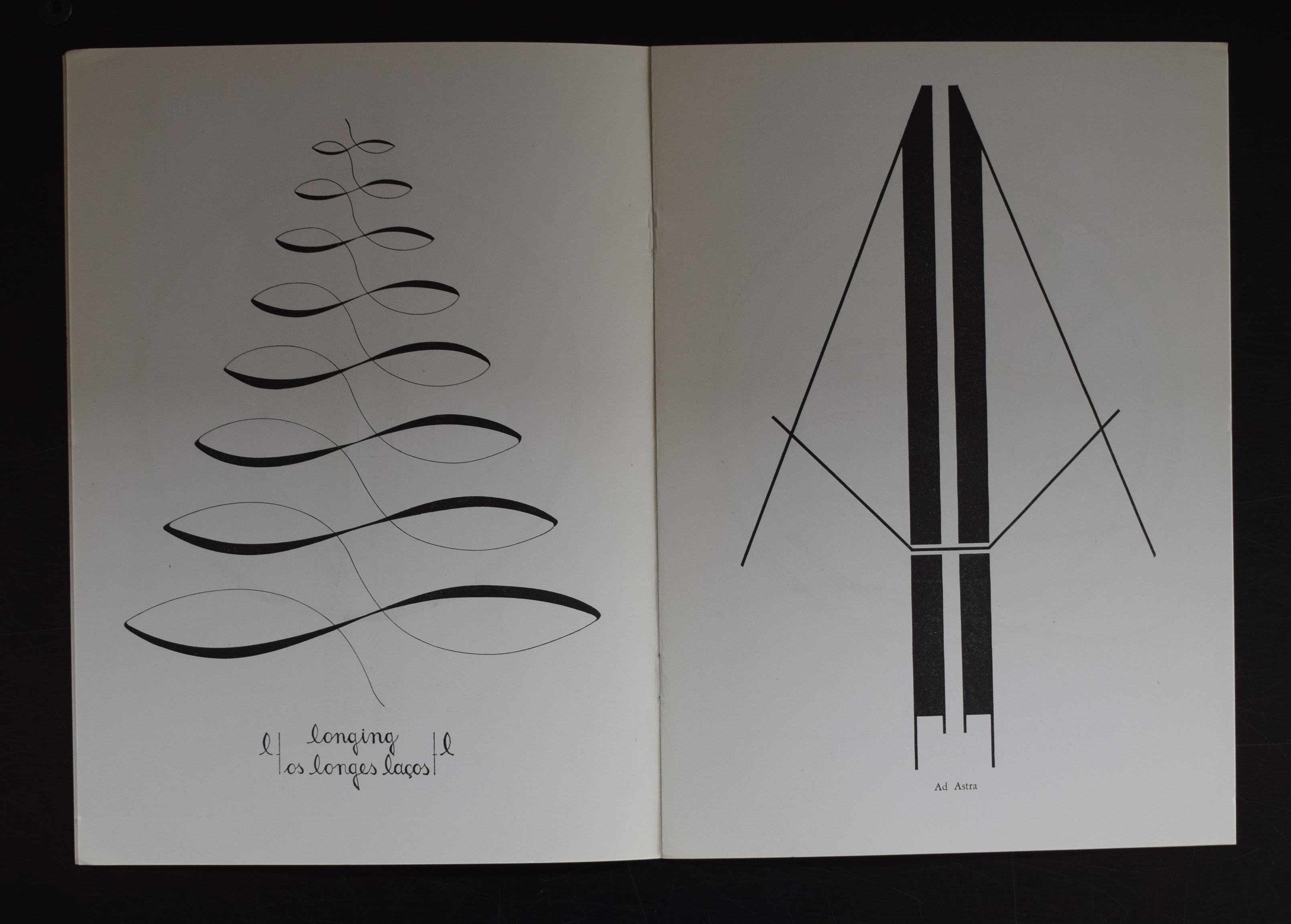
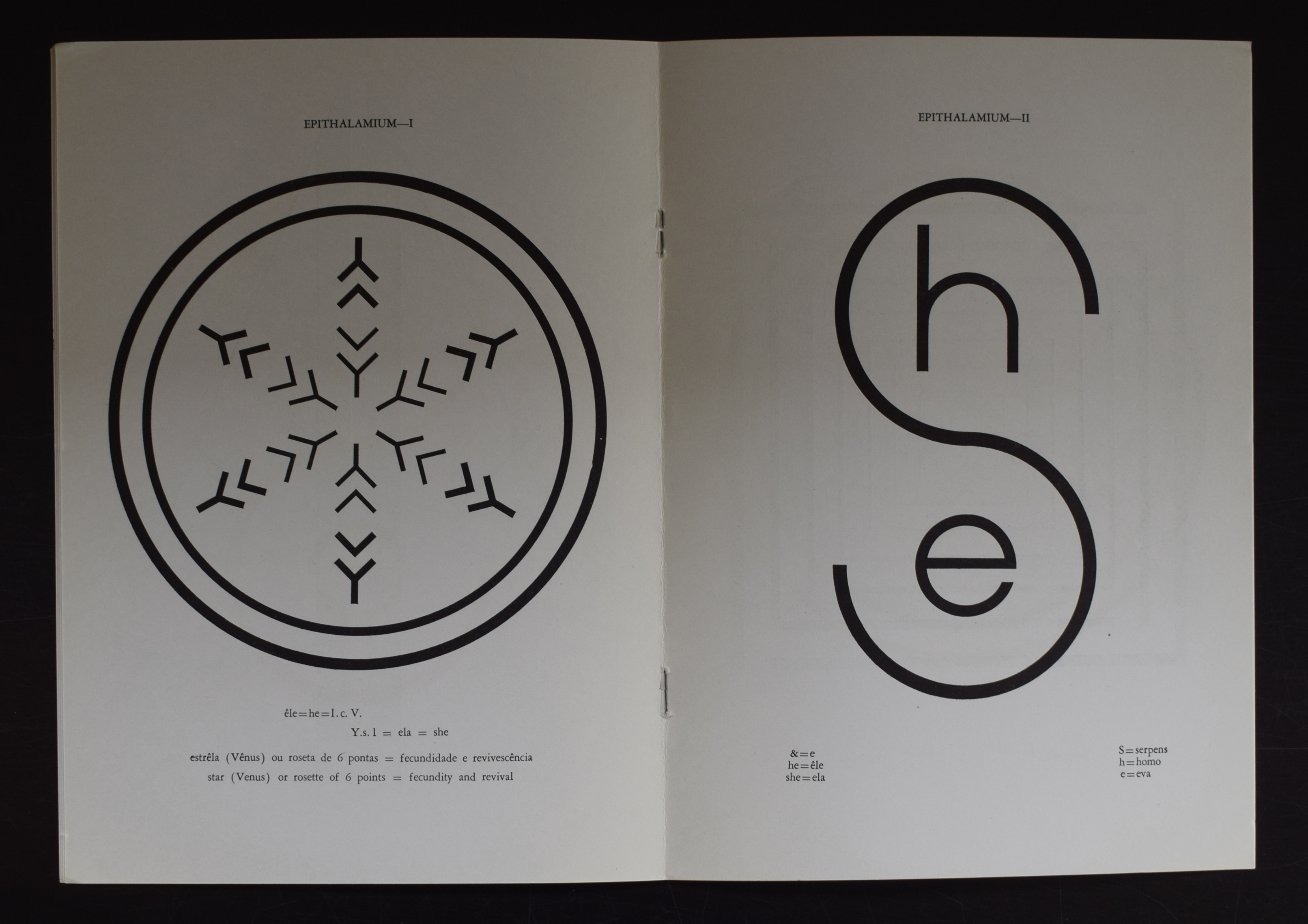
A not likely combination. Concrete Poetry and Brasil, but still there was a faithful group among the Brasilian artist who made Concrete Poetry and held exhibitions with them. One of them and perhaps the most famous among them, was Pedro Xisto. By chance i have bought a very nice publication by Xisto some 10 years ago and this is for sale at www.ftn-books.com. The books is in excellent condition and a typical artist book. Published in a limited edition and signed/dedicated by the artist and i believe this is the only one available on the internet at this moment. A rare chance to add this excellent publication to your collection.
Are there any works of art that justify an auction result/price as much as the recently sold “assumed” Leonardo da Vinci painting?
Imagine what you could do with an amount as large as 450 million USD. There are so many within the world of arts that are suffering financial problems. Starting artists, experimental theater companies, dance companies and of course orchestras all over the world, not all…., but many could be helped with a substantial sum and if you do not like the arts, what about hunger, water projects and small micro finance projects? I can think about dozens of projects other and far better than buying an ugly painting like the “Salvator Mundi” by Leonardo da Vinci.
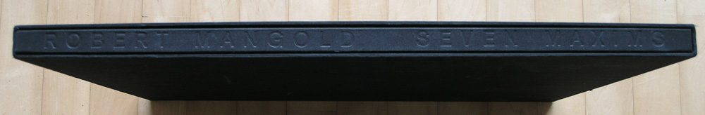
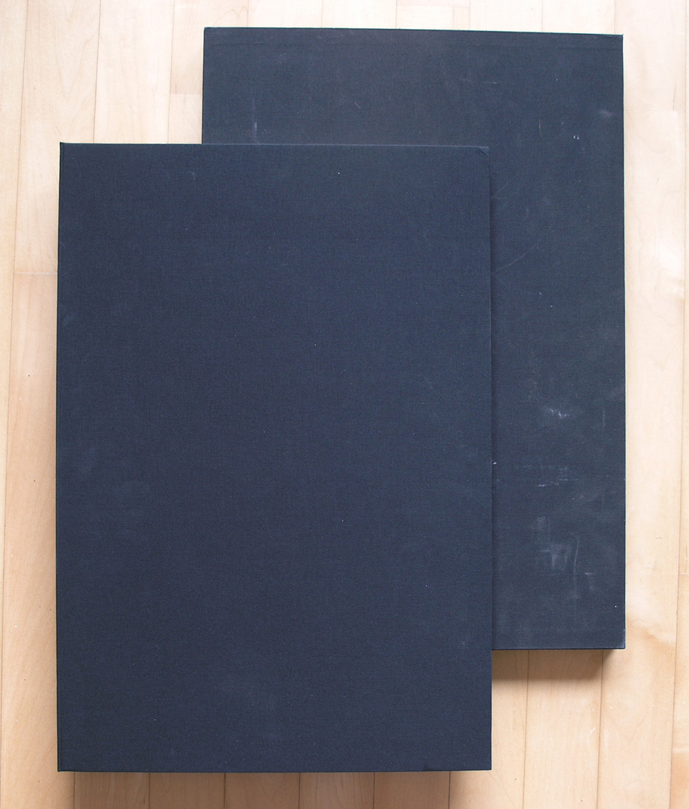
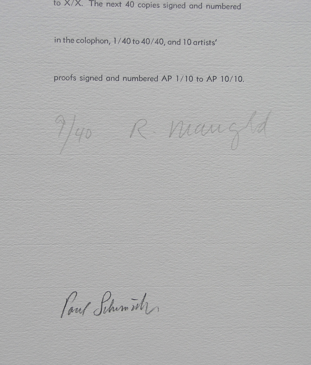
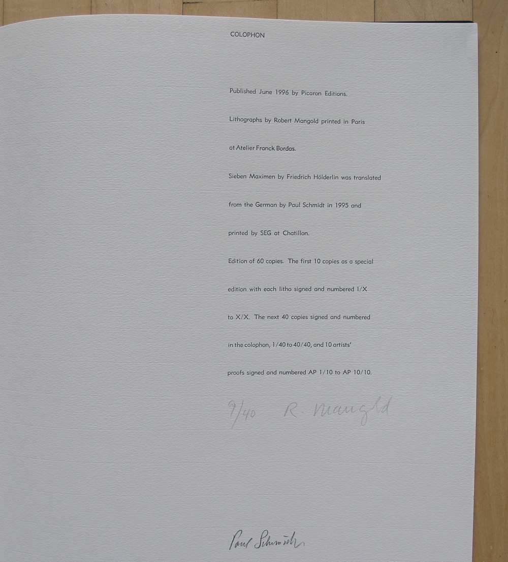
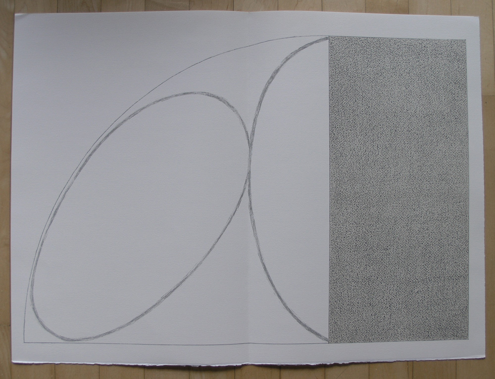
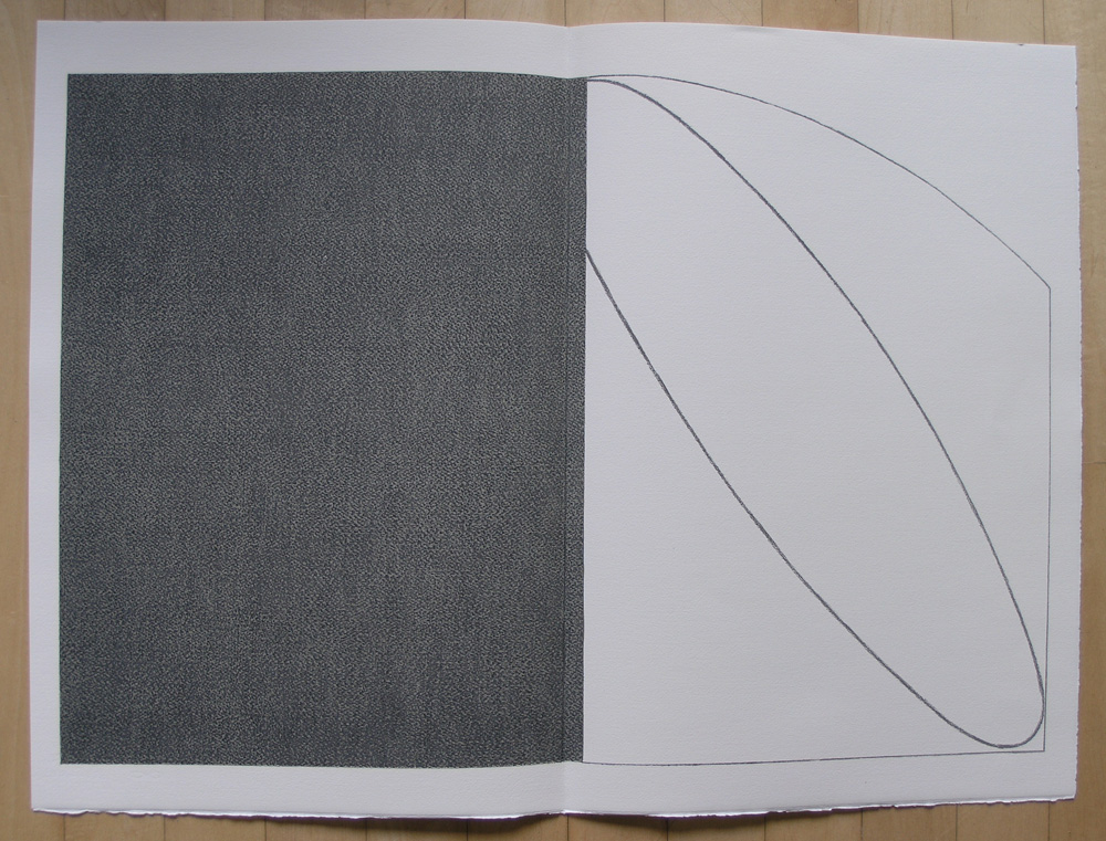
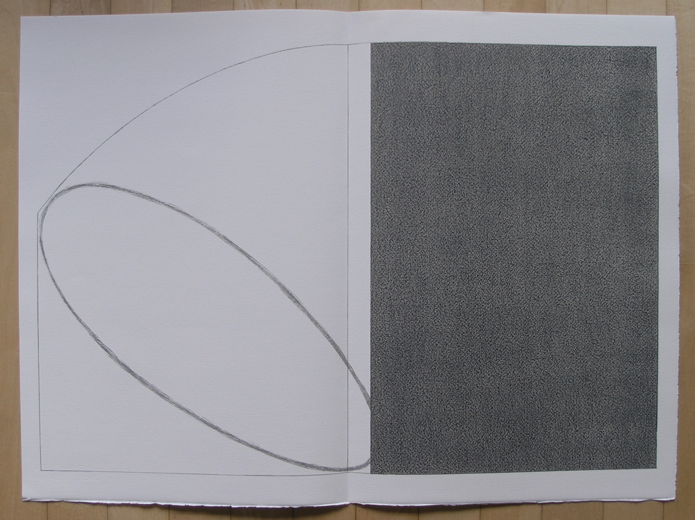
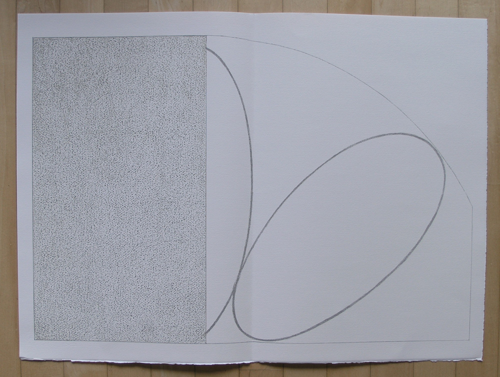
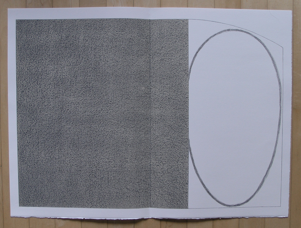
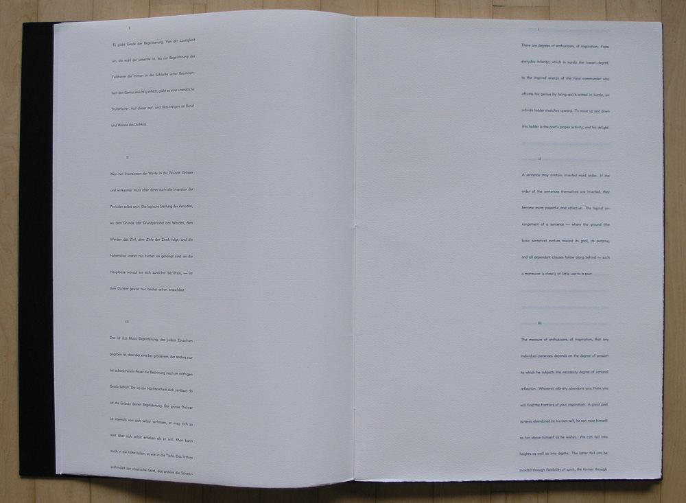
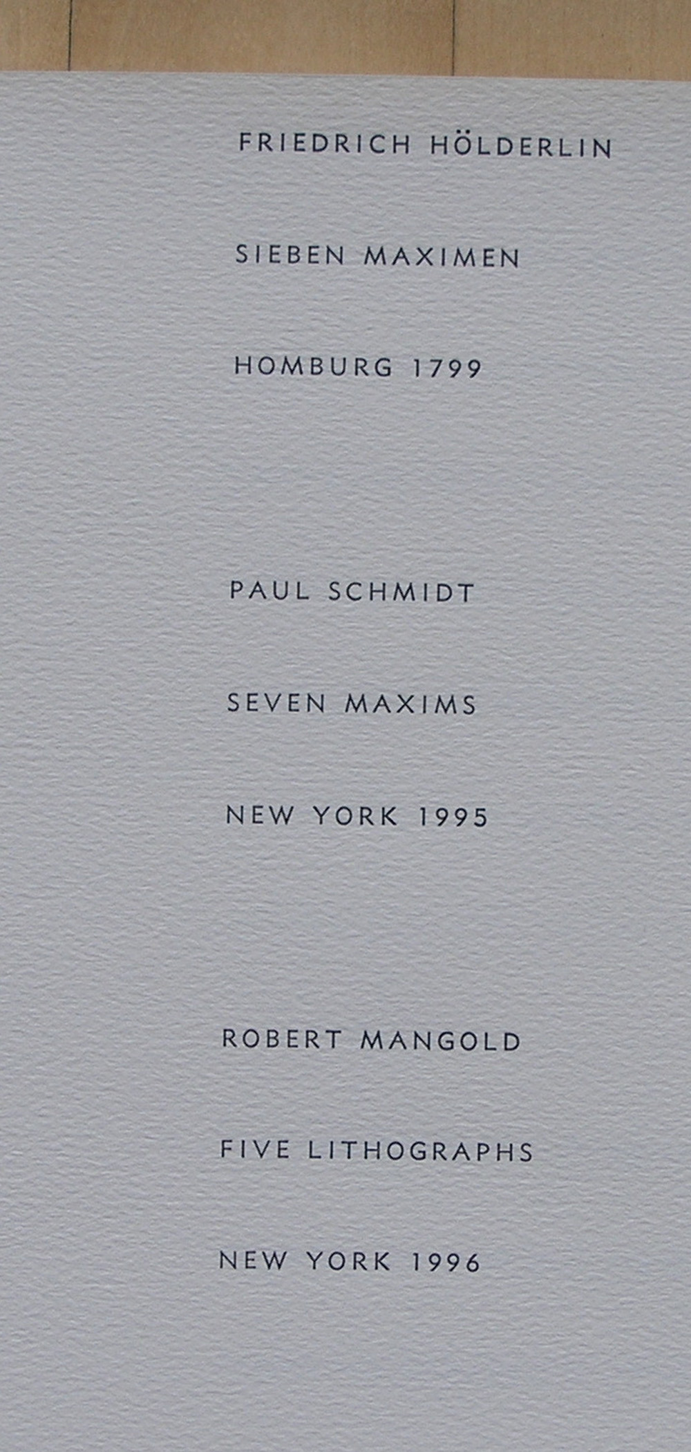
This is one of the highlights in my inventory. Not because it is expensive, but i think this is outright beautiful and has everything what a great art limited edition should be. Slipcase, loose sheets. prints spread over double pages , best possible print quality, very limited edition, signed and numbered. This is really superb and needs to be presented in this blog on SEVEN MAXIMS by Mangold.
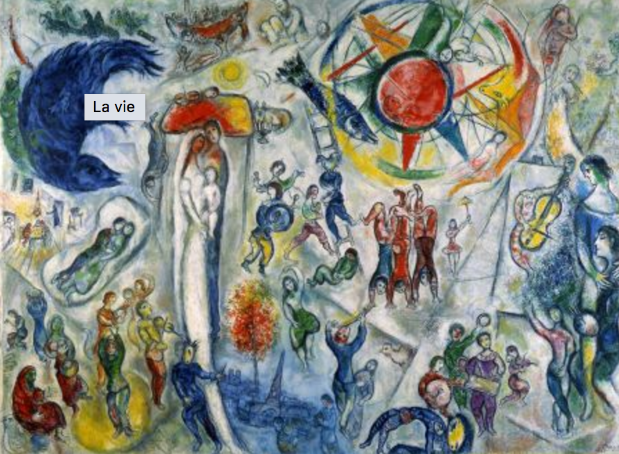
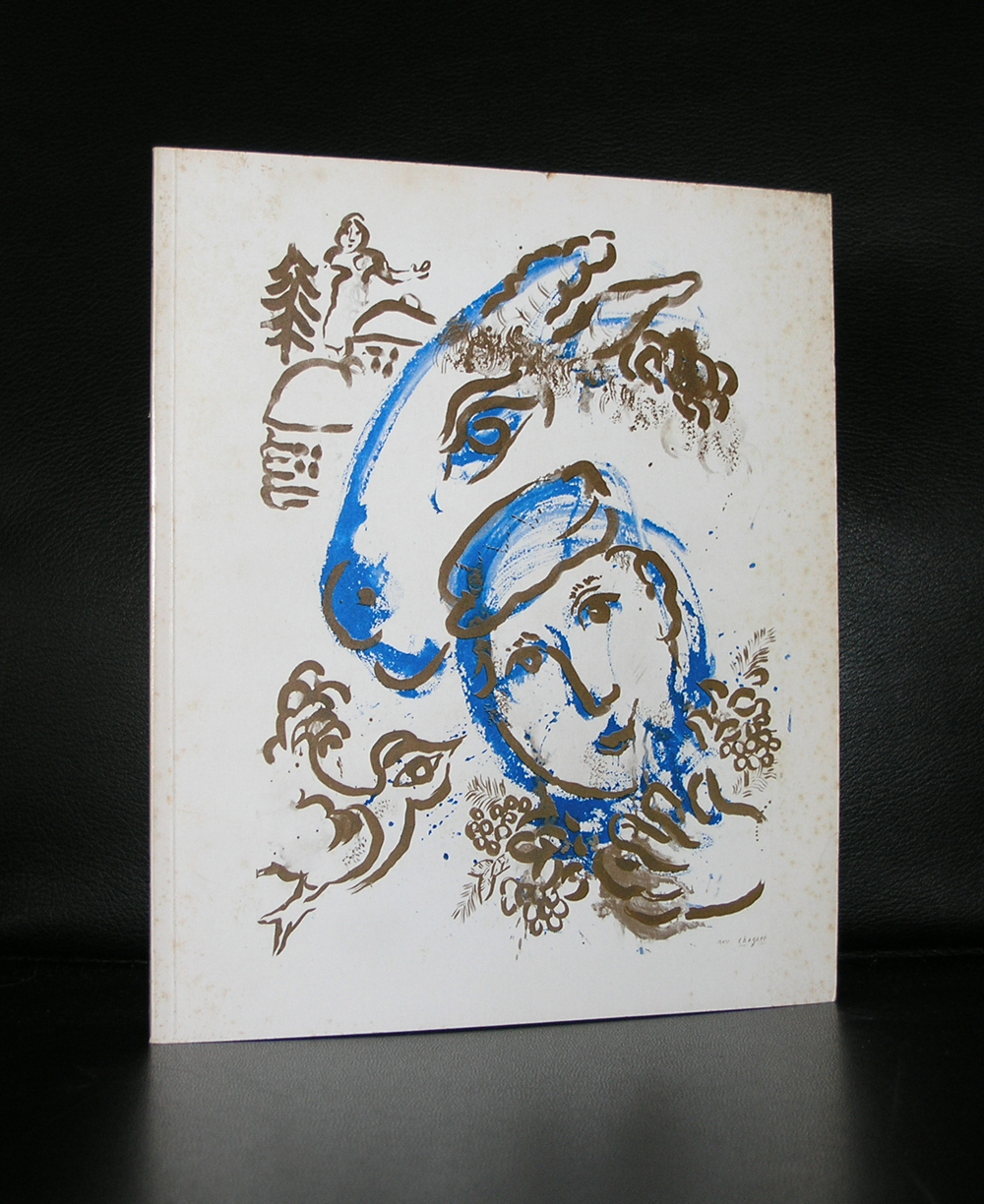
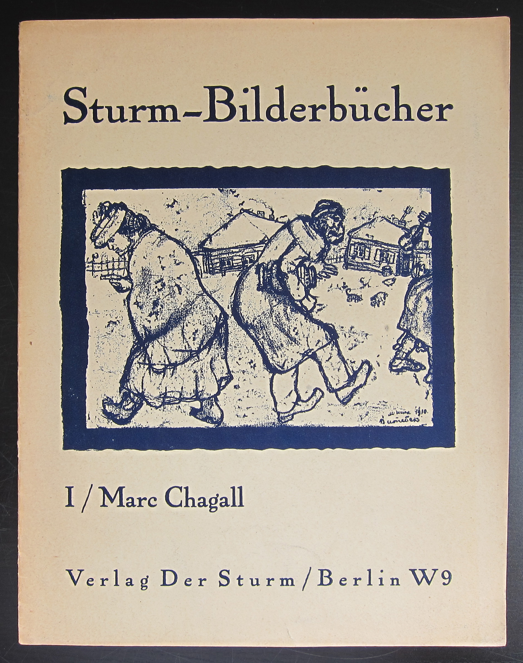
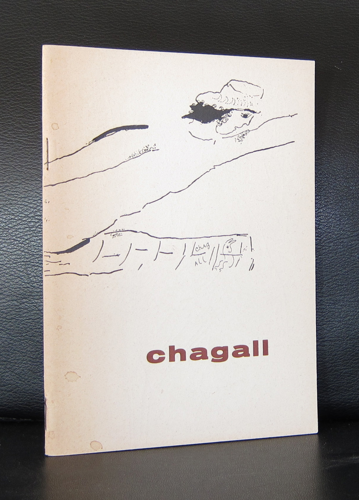
I am not an admirer of Marc Chagall. I am even one of those art lovers that does not like Chagall at all. Except there were 2 occasions i was impressed with Chagall. I remember the first time i went to the Fondation Maeght where ” La Vie ” was on display.
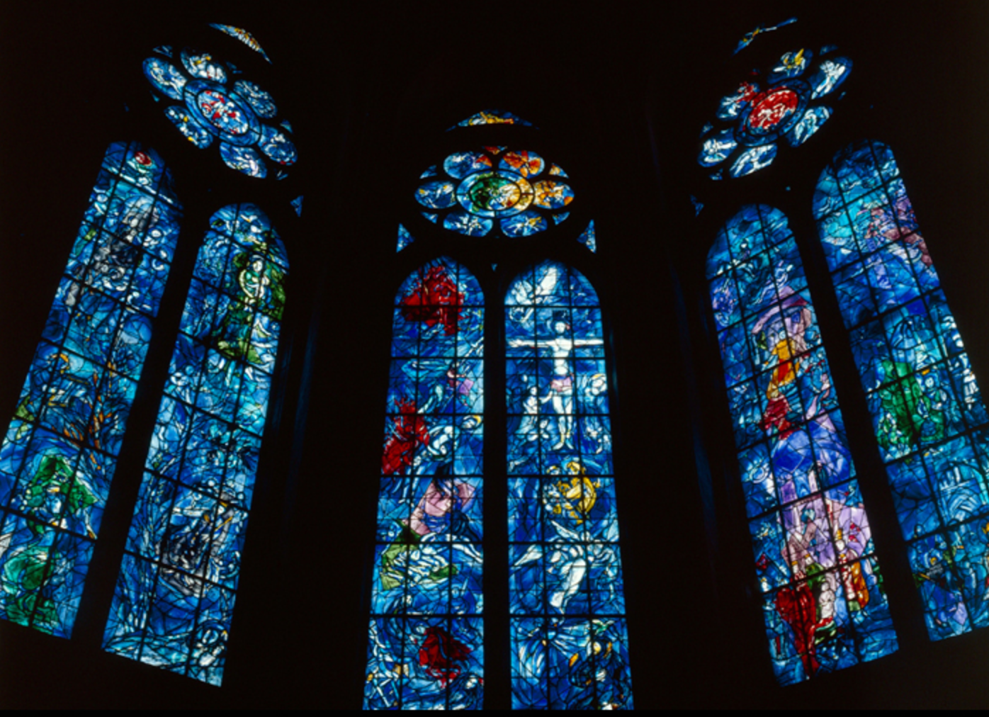
This painting had everything in it. Color, abstraction, symbolism and its size made it an overwhelming experience. The second time was in France too. I visited the Reims cathedral where the glass stained windows were designed by Chagall. In this religious setting everything came together again. Like the experience in Vence i had the same experience in Rheims…an overwhelming sence of piece and joy and realisation that life is great and beautiful. On the Maeght site i found this story on Chagall and for any publications on Chagall visit www.ftn-books.com
OLYMPUS DIGITAL CAMERA
OLYMPUS DIGITAL CAMERA
Painter born, Moïche Zakharovitch Chagalov, 7 July, 1887 near Vitebsk, in Belarus (then part of the Russian Empire), acquired French nationality in 1937 and died 28 March, 1985 in St. Paul de Vence.
Aimé Maeght met Marc Chagall for the first time in October 1947 at the opening of his retrospective at the Museum of Modern Art of the City of Paris organized by Jean Cassou to promote and celebrate the return of the painter after years of exile in the United States.
“Ida Chagall took me to her father’s house, and in the studio I was amazed when I discovered the gouaches painted in the United States and Mexico, sixty superb works that I had the chance to bring to rue de Téhéran. We all stopped the project for the first exhibition at the gallery. This meeting marked the beginning of our close and confident collaboration and a loyal friendship.” explained Aimé Maeght. This exhibition was held in March 1950. It was also the year that Chagall came to live in Vence near Saint-Paul.
When Marguerite and Aimé Maeght created the Foundation, they asked Chagall for a large painting for the room to be dedicated to him. The artist created La Vie(1964, oil on canvas, 296 x 406 cm), a large swirling composition where real-life events and dreams that had always lived within the painter come together : the rabbi grandfather,the marriage to Bella, the birth of Ida, the two exiles, the one from Russia by horse and the one to America by boat, musicians, acrobats and dancers, Paris all in blue and at the end of the path, the painter with the palette that appears to contemplate this epic that is larger than the adventure of one man. Above him, embracing him in her arms, is Vava his companion, the beneficial ally, who seems to be born of his painting to soothe the anxiety and torment of the creator.
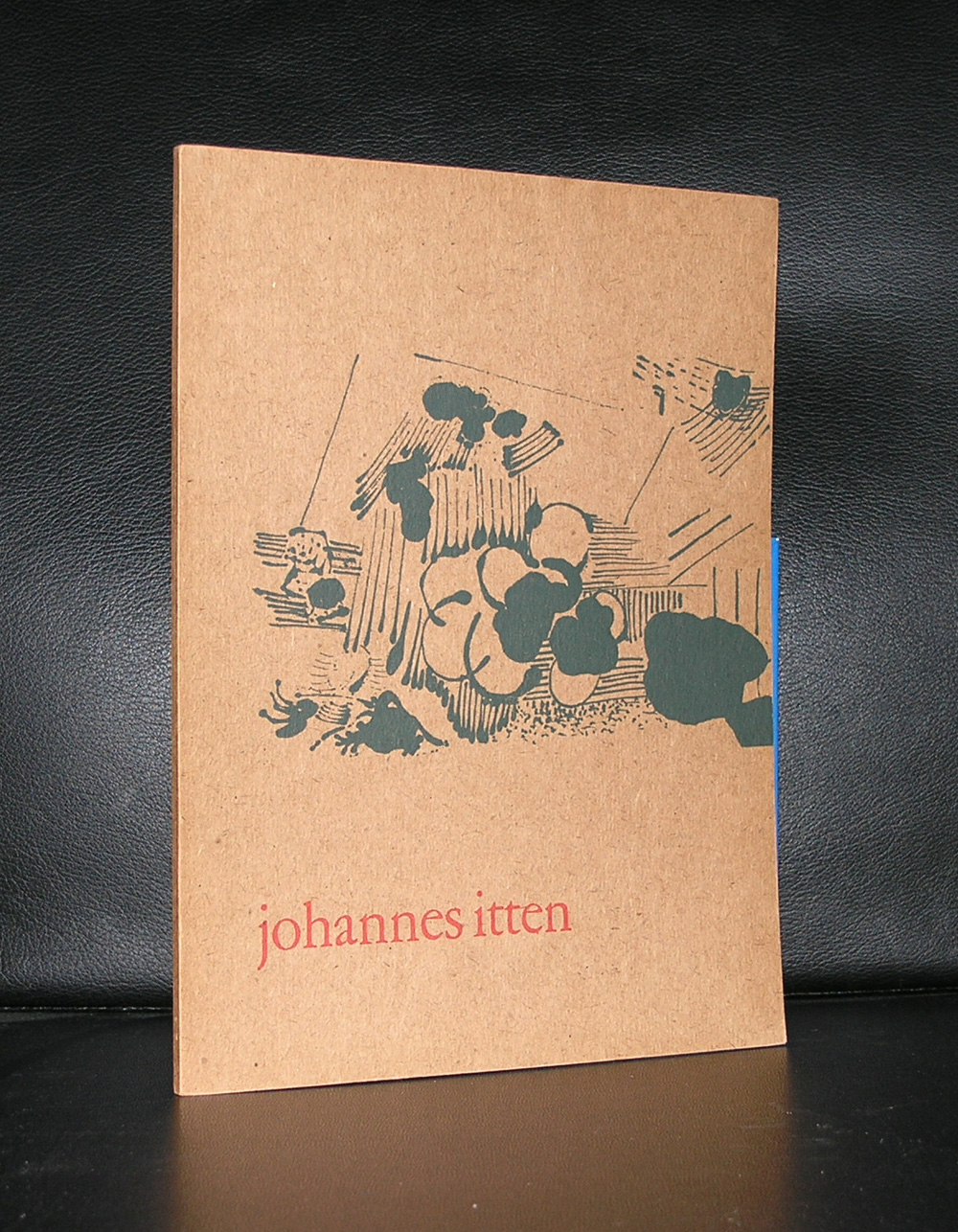
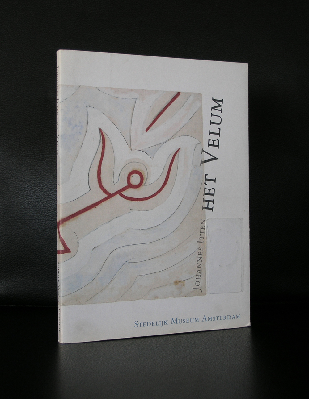
Johannes Itten. Not many know him, but through the years he has been acknowledged as being one of the teachers who developed the most important “color theory” in art.
Johannes Itten (11 November 1888 – 25 March 1967) was a Swiss expressionist painter, designer, teacher, writer and theorist associated with the Bauhaus (Staatliches Bauhaus) school. Together with German-American painter Lyonel Feininger and German sculptor Gerhard Marcks, under the direction of German architect Walter Gropius, Itten was part of the core of the Weimar Bauhaus.
But for me there is more about Itten. In 1957 the Stedelijk Museum devoted an exhibition to Itten. The catalogue of the exhibition was designed by Willem Sandberg , who made it one of the most iconic Stedelijk Museum catalogues from the 50’s. This catalogue is still available at www.ftn-books.com. But there si more on Itten and the Stedelijk Museum to be told, because Itten also designed one of the velums ( ceiling coverings) for the Stedelijk. It is rarely on show, but there is a nice publication on the project also available at www.ftn-books.com
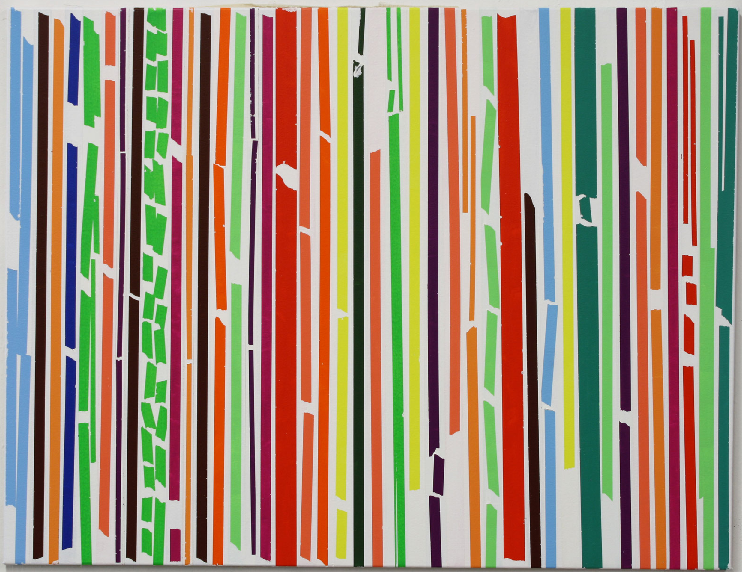
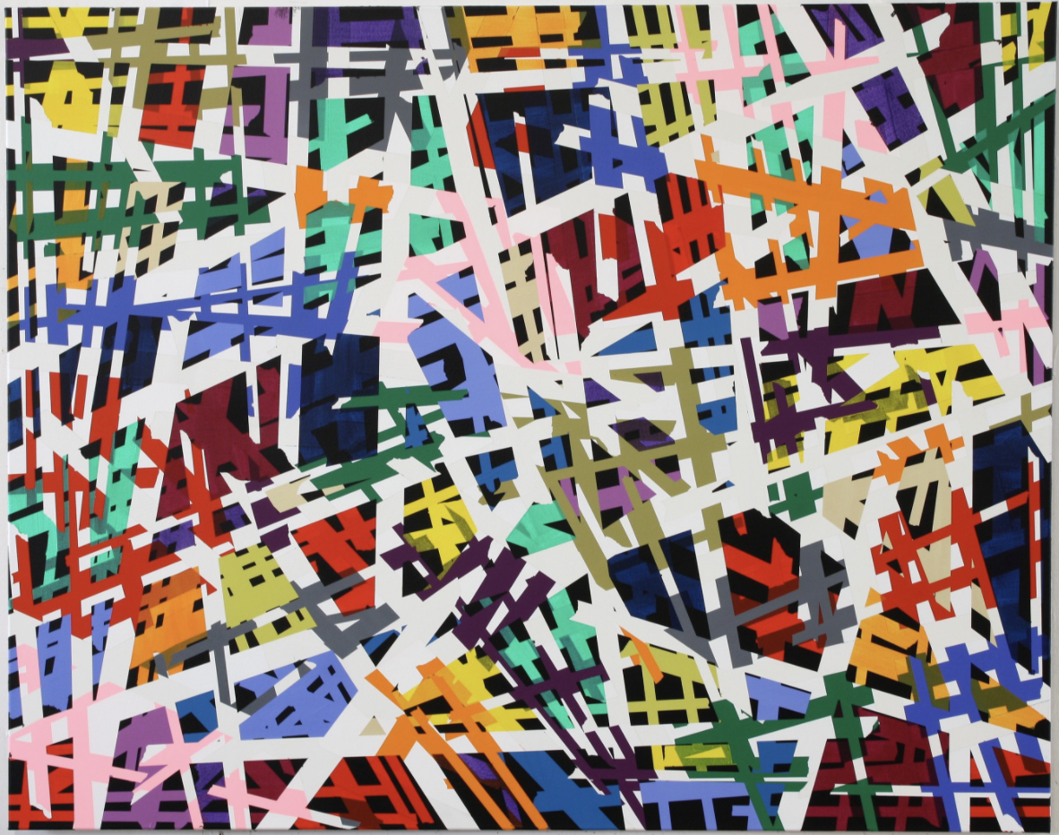
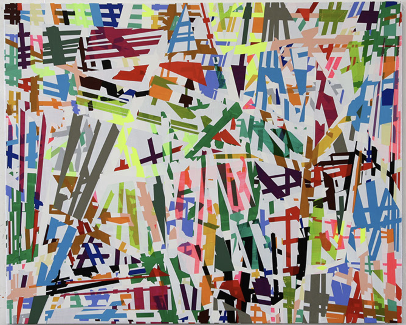
Sometimes you encounter works by an artist for which you have an instant liking and admiration. This is the case with Ruri Matsumoto. She was born in Tokyo and had her education in Japan and Germany. This is where she followed lessons with Helmut Federle and Markus Lupertz a.o.. She stayed after her education in Germany and now has her own studio in Dusseldorf, which she will leave for a temporary studio in Berlin until January 2018.
Her works are characterized by the use of very bright colors and are compositions of almost random like patterns formed with tape, but look more closely….. you will find layers of abstract constructivist forms making a spectacular work of art. Of course art is always something personal and subjective, but i like these paintings very much and because there is this rare chance to see her works at Livingstone Gallery i write this blog to let you know that until the 4th of November some of her works are on show in the PAINTING NOW exhibition, curated by Jan Wattjes.
To get an excellent impression of her works please visit:
His first exhibition was in Dusseldorf in 1977, but he nver joined the NEUE WILDEN . A group of painters who were in vogue in those days. He felt himself more comfortable when compared with painters like Broodthaers and Picabia, who had an extra layer in their paintings.
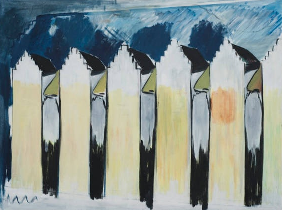
His paintings look abstract, but when you study them in more detail you see that they are a complete abstract reproduction of reality. . Piccadilly/London, WTC New York and old houses in Gent can all be distinguished when you look long enough at the paintings.
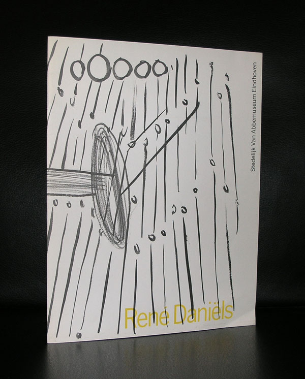
The paintings look simple, but in reality they are very thought over and are complex and typical Daniels.
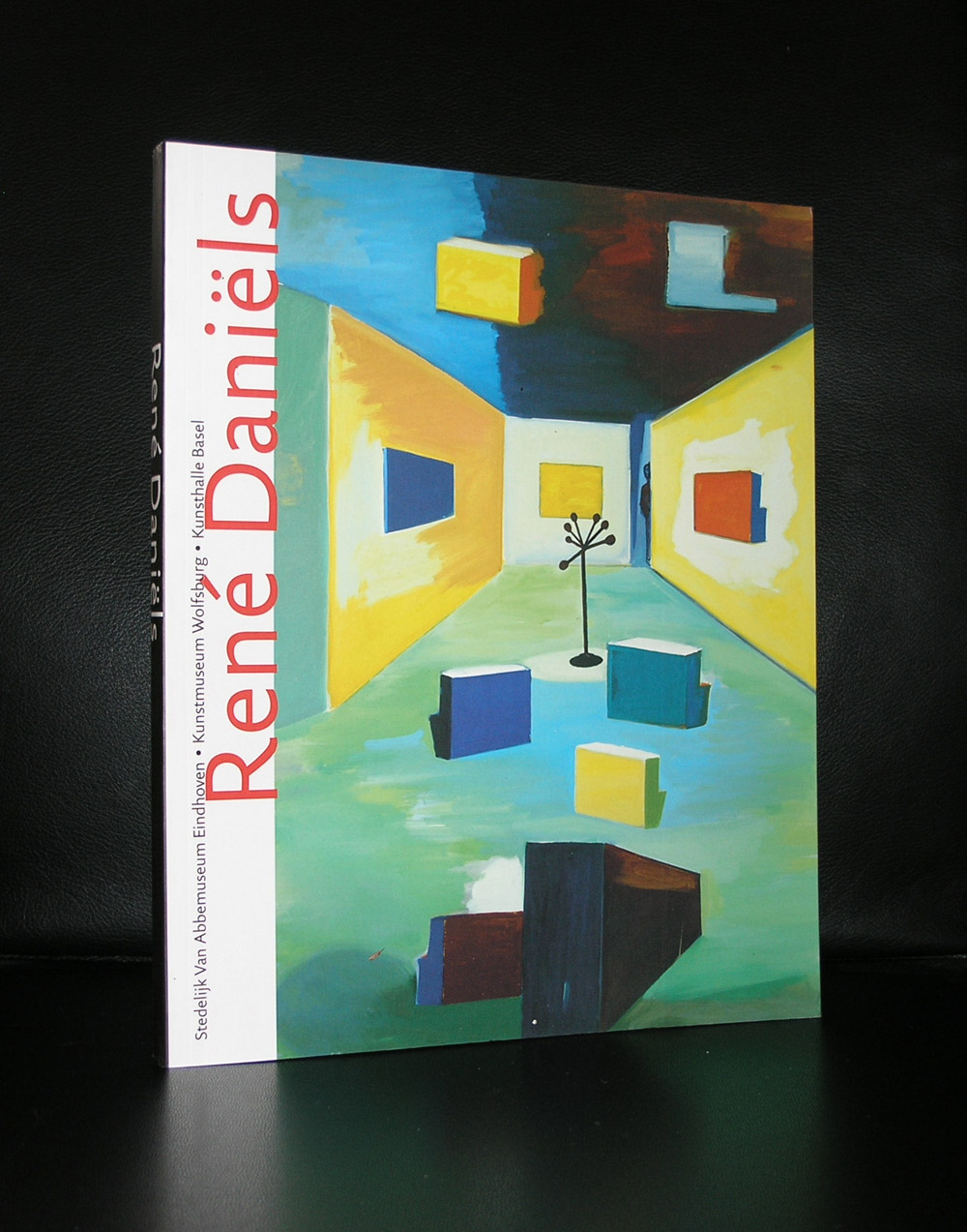
Rene Daniels has not had a long career …in 1987 he had a stroke and because of that had to finish his career at that moment as a painter. Since 2006 he paints again , but his style and approach to painting has changed, because of his motor skills are far less than before. But what he made in that very short period of nearly 10 years is of the highest quality and the museums that have work by Daniels should feel lucky to have it in their collections. You can find work(s) by Daniels in the collections of a.o. the van Abbemuseum, Gemeentemuseum Den Haag, Stedelijk Museum, Dordrechts Museum, Groninger Museum and Bonnefanten Museum
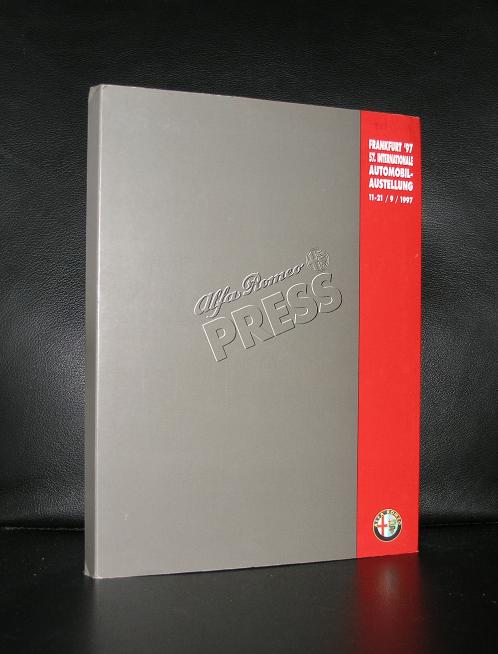
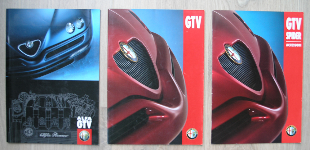
When Rudi Fuchs made it director for the Stedelijk Museum Amsterdam, one of the first acts was to fund his exhibitions with promotional activities by commercial industries. One of the first that got a chance to show his new products within the museum was Alfa Romeo who showed their new models Alfa Romeo GTV and the Cabrio version.
Sketches , clay models and the end product . Every aspect of the creation of these models was shown. Special poster and some leaflets with the exhibition made this a true museum exhibition , but was this the right place for such an event….personally i do not think so.
Although a car can be a “piece of art” it does not belong in an art museum , but certainly can be presented in a car museum. But still it must have been good for the museum funding, because since many other commercial activities have taken place , but none as outspoken as the one for ALFA ROMEO.
Because of my personal interest in cars www.ftn-books.com has some publications on the subject.
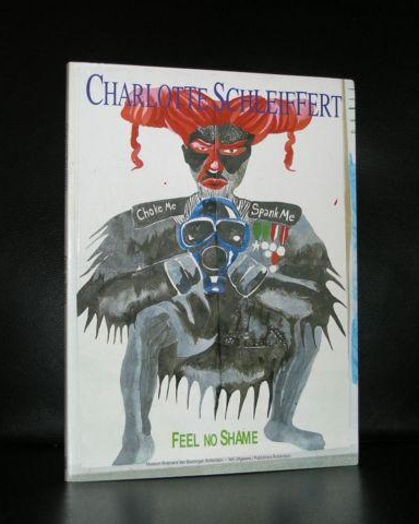
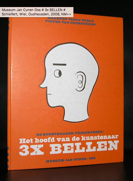
For me Charlotte Schleiffert has the same qualities as Jean-Michel Basquiat. She creates a world of Hybrid creatures, part human an part animal, dressed in strange fashion and executed in a very large size. She paints, draws and makes sculptures and with these elements she creates installations. The result …… a typical Schleiffert world made by Charlotte Schleiffert and unique in the world of art. Charlotte Schleiffert is represented by galerie Akinci . / http://www.akinci.nl/schleiffert.html
www.ftn-books.com has 2 titles on Schleiffert available
Within the series of Hollandse Meesters there is a 15 minutes documentary on Charlotte Schleiffert available:
Artist/ Author: Oliver Boberg
Title : Memorial
Publisher: Oliver Boberg
Measurements: Frame measures 51 x 42 cm. original C print is 35 x 25 cm.
Condition: mint
signed by Oliver Boberg in pen and numbered 14/20 from an edition of 20