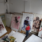
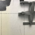
Born in Voorburg in 1946, Toon Verhoef is a renowned painter. Prior to the creation of each painting, Verhoef undertakes studies on paper. These studies are not literal drawings, but rather collages incorporating elements of paint, paper, packaging materials, and dried remnants of paint.
From these series of images, Verhoef distills the elements that he deems fit for his paintings. These elements often include a specific use of color or a certain composition. As Verhoef explains, “Unmatched, unsteady images that need to remain standing in the painting in some way or another. The unmatched must match.”
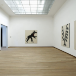
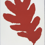
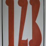
One could consider Verhoef’s paintings to be abstract. As a viewer, the images are not clearly derived from reality. However, Verhoef’s work has a connection to reality in the sense that it draws from the origin of the images he uses – a newspaper photo, a packaging material. Although Verhoef transforms these images and renders them unrecognizable, something of their source still lingers in the painting.
Verhoef’s paintings are characterized by strong contrasts of color, forms and lines that dance across the canvas. He alternates between organic shapes and geometric lines, transparent forms and opaque areas. His vocabulary is playful, exploratory, and dynamic. As Verhoef says, “Each painting asks the viewer – what exactly are you looking at, how are you looking, and what do you see? […] It must work immediately. It has to work. […] It’s about accuracy. That’s how it should be.”
Verhoef studied at the Rijksakademie van beeldende kunsten in Amsterdam (1965-1966) and pursued a degree in art history at the University of South Africa in Johannesburg (1966-1968). He continued his studies at the Ateliers (1968-1970). Verhoef’s work has been exhibited at renowned institutions such as the Stedelijk Museum Amsterdam, De Pont (Tilburg), Kunstmuseum Bonn, and the Bonnefantenmuseum (Maastricht).