Posted on Leave a comment

Jus Juchtmans (1952)

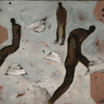
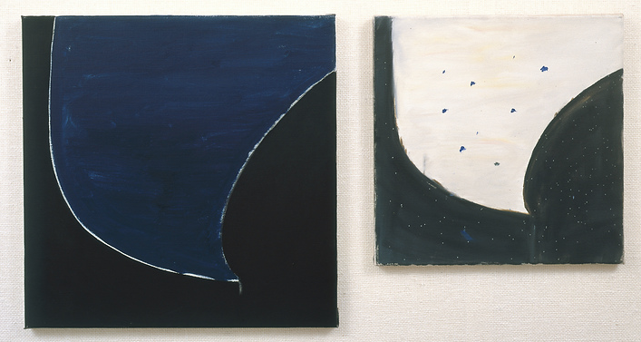
Known for his apparently monochrome paintings, and clearly related with minimal art, that rejected the dominance of visual perception and presented the idea of artworks as objects to be experienced, to be made aware of, and no longer to be seen for their visual impact, Jus Juchtmans works with a translucent painting that he applies to the canvas in different consecutive layers, not necessarily of the same color.

Sometimes there are even thirty different layers, and in this way, colors that we haven´t perceived at first sight appear under the apparently dominant color.

The result is an extremely shiny surface that resists the viewer, and looking at them is often a frustrating process that makes the spectator to feel uneasy. This reflection as well as the reflection of the gallery’s surroundings, is an integral part of the work. He wants the spectator to become conscious of the viewing conditions of his work, particularly the transitory and time specific nature of those conditions.

Born in Morstel in 1952, Jus Juchtmans studied Fine Arts and Design in Antwerp, where he has developed his artistic career from the beginning.

Since then, he has grown up to become a well-known artist, participating in different group shows in museums and institutions, among other ones the Ludwig Museum, with Callum Innes and Nicola Rae, the Kunsthalle of Recklinghaussen, and Budapest, the Kunstmuseum Celle, etc.

In the late years he has reinforced his career with individual shows in London, Munich, Cologne, Graz, Berlin, Paris and New York.

His works can be found in museums like the SMAK of Gante, The Contemporary Art museum of San Diego, the PMMPK of Belgium, the Karl Ernst Osthaus Museum of Hagen… and in collections like the Peter Stuyvesant Collection of Amsterdam, Fondation Carmignac, Porquerolles and F. van Lanschot Bankiers.

http://
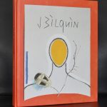
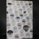
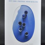
www.ftn-books.com has the DIPTYCHON IV catalog from Gent now available.

Posted on Leave a comment

Berlinde de Bruyckere (1964)

Schermafbeelding 2020-07-26 om 10.40.00

For me Berlinde de Bruyckere stands for “poetic discomfort”.

The first time I encountered a work by de Bruyckere was the very fragile “donkey” Sculpture which is in the Caldenborgh collection. In the middle of the woods from his estate, the sculpture can be found on a semi-open space between wood and leaves. Made from lead and highly detailed this shows that the lead is soft, fragile and shows the vulnerability of the composition and the materials.

The second time was when a sculpture by de Bruyckere was presented in a showcase together with the walls hung with magnificent Bacon paintings in one of the rooms of the Gemeentemuseum Den Haag. It was a rare occasion that these two great artists were combined and I rarely have seen a more impressive and beautiful presentation of both these great artists.

Schermafbeelding 2020-07-26 om 10.36.53

She makes three-dimensional sculptures, installations and aquarelles. Her older work has a minimalist character. Steel, stone and glass were her materials of choice. Gradually she leaves abstract motifs to seek recourse in recognisable forms and things, introducing the blanket, malleable lead and straw as materials.

More recently, she has extended her personal iconography with striking sculptures of (stuffed) horses and giant (once-) cuddly animals. The beauty of the materials she uses always has something of the fatal in it. The blankets in her sculptures protect and suffocate, the lead roses seduce and poison, the carpet of begonias bear witness to bloom and decay. She intentionally uses familiar forms to inspire thinking in viewers, to provide them with memories. Her preference lies with materials and forms that mirror ambiguity, something characteristic of the human experience. Beneath the delicate and sometimes deceptively endearing skin of her work is a yawning abyss. Death, fear and loneliness are recurrent themes, though never disconnected from life, love and beauty. Despite the great formal diversity of her works, there is a common thread running throughout her oeuvre in terms of choice of materials, techniques and the repeating of symbols and motifs.

Aside from her three-dimensional works, the artist has also always put her ideas on paper. These works (drawings and aquarelles, or aquarelle and gouache combined on old paper or cardboard) are often preparatory material for the sculptures but are autonomous works in themselves. Berlinde De Bruyckere does not impose ‘the’ interpretation of her works. She consciously leaves the door open for diverse understandings.

Schermafbeelding 2020-07-26 om 10.37.58

www.ftn-books.com has now the book available which was published on the occasion of the 55th Biennale di Venezia. Text by J.M. Coetzee and of course the photographs on the installation by de Bruycker

Posted on Leave a comment

Pierre Weiss (1950)


An exhibition of which i remember a hellish ride to Gent to see the print proofs of the catalogue on Pierre Weiss.  One of the first exhibitions curated by Franz Kaiser and with a catalogue designed by Gracia Lebbink. The printers waited for my arrival, but extremely heavy rain showers delayed my arrival by some 2 hours. After finally arriving it was the lunch break at the printers and lunch is “holy” in Belgium. Everybody stops working and has lunch. So did i . I was invited by the printers to have lunch and with them it meant a very nice lunch indeed at one of the finest restaurants in Gent. a 3 course lunch was normal including 2 glasses of great wine and a coffee it made me forget the terrible ride i had to arrive in Gent. This was almost 30 year ago now. I have forgotten the catalogue on Weiss, but the ride is still a vivid memory.

OLYMPUS DIGITAL CAMERA

Posted on Leave a comment

Guillaume Bijl (1946)

Schermafbeelding 2019-03-31 om 11.08.54

The first Guillaume Bijl installation/exhibition i visited was the Guillaume bIjl installation he had made for the Witte de With venue in Rotterdam. It was the opening exhibition in 1990 for which Bijl had made . It was Für Garderobe keine Haftung .

In light of the newly created exhibition space at Witte de With, Bijl’s show could be seen as a critique of the spectacular and inflationary nature of fine art production as well as an ironical poke at the profusion of exhibitions and exhibition spaces. Guillaume Bijl’s exhibition at Witte de With presented a survey of his installations and objects from the eighties, in the form of a shopping mall.

Guillaume Bijl (1946) has been testing the relationship between art and consumer society since 1979, when he made his Art Liquidation Project. This work took the form of a mock government commissioned report in which he concluded that, in light of the proven uselessness of art, all areas devoted to the arts should be made suitable for more practical purposes. Since then, Bijl has been transforming museums and art galleries into fitness centers, lamp shops, carpet stores, travel agencies, driving schools, and so on. His imitations of spaces not traditionally associated with the arts are caught up in a perplexing interplay between fiction and reality. Even more confusion is caused by Bijl’s imitations of art spaces, such as his fictive exhibition Four American Artists (1987), or his fictive commercial fair installed at the art fair of Lyon in 1986, which also included an art store selling his paintings.

Bijl ironically points out the connection between the display of goods in shop windows and showrooms and the exhibition of objects in museums and galleries. In his installations, consumer items and museum objects seem interchangeable. Bijl’s logic assumes the complete abolition of real differences in the commercial rhetoric of consumer society.

http://www.ftn-books.com has some nice Guillaume Bijl publications available.

Posted on Leave a comment

Jean Bilquin (1938)

Schermafbeelding 2018-08-26 om 12.12.27

I do not know what to say. Is Henk Visch the dutch equivalent of Jean Bilquin or is it the other way around? Certain is that both artists are inspired by the same objects and surroundings.

Another influence must have been the sculptures by Brancusi because a returning object is the portrait sculpture Brancusi has made in several versions.

But there is much more to discover in the works by Jean Bilquin. When you leaf through the catalogue which was published on the occasion of the Kunsthal exhibition ( 2008 ). You really feel that you are discovering an artist. An artist who is inspired by nature and people. Both subjects combining in a very personal kind of art on larger sized canvasses. This is the kind of work which always attracts me and which i want to discover further after i have visited the exhibition. The catalogue ( available at www.ftn-boooks.com) shows exactly why these works have a rare quality. The catalogue has several fold out pages which make the scale of these large paintings somewhat visible.

Posted on Leave a comment

Piet Stockmans (1940)

Schermafbeelding 2018-05-16 om 16.12.29

Stockmans worked for Koninklijke Mosa in Maastricht as an industrial designer for a great part of his artistic life, but since 1989 he is a free lance designer and became very well known for his extremely fragile ceramics and his cooperation with the great culinary chefs of Europe.

Schermafbeelding 2018-05-16 om 16.16.52

If you look at the eyes of Stockmans you discover where he found his favorite color beside the white of his ceramics. He frequently uses the color of pale blue on the edge of his egg shell ceramics. windlights , coffee cups and small vases have in many cases a blue edge. The edge together with the use of the fragile material is the signature of Piet Stockmans. Nice to know is that his products are fully handmade, all unique because all are made and finished by hand and still affordable. A true ceramic artist on whom www.ftn-books.com has some nice publications available.

Schermafbeelding 2018-05-16 om 16.21.56


Posted on Leave a comment

Pjeroo Robjee (1945)

Schermafbeelding 2018-02-19 om 14.17.45

The Flemmish Pjeroo Robjee is first of all a writer and secondly a painter. As a writer he is considered to be the Flemmish James Joyce. This is not what i want to write about, but i want to introduce Robjee as a painter to you. Robjee has followed some day courses in painting and started to paint in a very personal way, inventing his own style . What does it look like?… i can not describe it , but i encounter something of illustrations in his paintings. The use of Pop Art colors combined with the simplicity of Botero. Shake it and the result is Robjee.

This mix of styles resulted in an invitation by the Belgian gallery Lens Fine art , where he had at least 2 exhibitions in 1975 and 1977. Both publications with these Robjee shows are available at www.ftn-books.com.

I really do not know what to think about these Robjee paintings, but somehow they fascinate me and must be considered as an important cultural heritage for Belgium since Robjee is an important writer who had also another quality…. he made some great timeless paintings that still fascinate.


Posted on Leave a comment

Rene Daniels (1950)

Schermafbeelding 2017-08-01 om 10.03.40

His first exhibition was in Dusseldorf in 1977, but he nver joined the NEUE WILDEN . A group of painters who were in vogue in those days. He felt himself more comfortable when compared with painters like Broodthaers and Picabia, who had an extra layer in their paintings.

His paintings look abstract, but when you study them in more detail you see that they are a complete abstract reproduction of reality. . Piccadilly/London, WTC New York and old houses in Gent can all be distinguished when you look long enough at the paintings.

The paintings look simple, but in reality they are very thought over and are complex and typical Daniels.

Rene Daniels has not had a long career …in 1987 he had a stroke and because of that had to finish his career at that moment as a painter. Since 2006 he paints again , but his style and approach to painting has changed, because of his motor skills are far less than before. But what he made in that very short period of nearly 10 years is of the highest quality and the museums that have work by Daniels should feel lucky to have it in their collections. You can find work(s) by Daniels in the collections of a.o. the van Abbemuseum, Gemeentemuseum Den Haag, Stedelijk Museum, Dordrechts Museum, Groninger Museum and Bonnefanten Museum

and of course www.ftn-books.com has some nice titles on the artist

( and search on the site to find more Rene Daniels contributions to group exhibitions in which he participated)


Posted on Leave a comment

Jan Hoet (1936-2014) and Chambres d’Amis.

(drawing by Marlene Dumas )

It has been already almost 3 years that Jan Hoet died, but since his death no one has taken his place. He was truly innovative with his exhibitions and next to Rudi Fuchs , they probably were the best from their generation of curators of Contemporary Art.

His international reputation was first established by “Chambres d’Amis,” an innovative exhibition he organized in Ghent in 1986. In that show, about 50 American and European artists were invited to create works for 50 private homes in Ghent, which were then opened to the public for several weeks. Followed a few years later by Open Mind and his Documenta IX in which he performed as a boxer established his name as one of the very best in his field. His last great project was over the edges. 4 giant exhibitions spread over 2 decades made him one of the absolute best.

The Museum in Gent , his long lasting love SMAK, which he served as a curator and director from 1975 until 2003 was his laboratory for the greater projects he organized outside this Museum rooms. http://www.ftn-books.com is fortunate to have some very nice titles of his exhibitions. including the Chambres d’Amis which is getting scarce these days.