Posted on Leave a comment

Roger Bezombes (1913-1994)

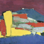
Roger Bezombes, a French artist specializing in painting, sculpture, medal-making, and design, underwent his education at l’École des Beaux-Arts in Paris. In his artistic endeavors, Bezombes adopted the vibrant color palette famously used by Henri Matisse. His paintings and studies of landscapes and figures often drew inspiration from his observations of exotic cultures, particularly those in the Mediterranean and North Africa. Bezombes had a strong affinity for travel, exploring countries such as Belgium, Germany, Italy, Greece, Crete, Israel, North Africa, and the United States. His works received regular exhibitions in Paris through prestigious events like the Salon d’Automne, the Salon des Artistes Independants, and Les Tuileries. Influenced by notable artists like Gauguin, Van Gogh, and Matisse, Bezombes developed a distinctive and widely cherished style that has captivated audiences around the globe. Additionally, he contributed to various artistic ventures, including tapestry designs for Aubusson, posters (such as the notable image employed by Air France), and costumes and sets for ballet performances at the Metropolitan Opera House in New York. Bezombes represents the quintessential French artist of our time — passionate, dedicated, and continuously engaged. These exceptional qualities resonated profoundly in his artwork, leading to its high demand and collection both within France and internationally.

www.ftn-books.com has now the Documents publication on Bezombes available.

Posted on Leave a comment

Louis Icart (1888-1950)

Schermafbeelding 2019-07-12 om 14.17.07

Another French Art deco artist to write about is the less famous, but very much intriguing Louis Icart,

He was best known for his drawings of glamorous women—often erotic or mildly humorous in tone—as well as for his depictions of 1920s Paris life. He was born in Toulouse, France in 1888, and began drawing at a young age. In 1907, he moved to Paris and began studying painting, drawing, and printmaking. Influenced by Jean Antoine Watteau, François Boucher, and Jean Honoré Fragonard, he became a major figure of the Art Deco period, with his work surging in popularity in both the United States and Europe throughout the 1920s and 1930s. He also worked as a designer in fashion studios during a time when the industry was undergoing a major change, moving away from the conservatism of the 19th century towards a more progressive simplicity. He died on December 20, 1950, at his home in Paris, France.

www.ftn-books.com has some nice publications on Icart available.

Posted on Leave a comment

Alberto Burri (1915-1995)

Schermafbeelding 2019-10-22 om 15.44.52

A blog on Burri since i acquired a very MIce 1961 catalogue by Galerie de France on Burri. Numbered 495 from an edition of only 1600 copies and in excellent condition.

Burri i have known for his MATTER paintings. A bit created like the ones Jaap Wagemaker made in the Netherlands. But there is so much mofre . His “paintings” are like three dimensional sculptures and make in some way a bridge to the zero art from a decade later.

He remained a reserved artist, ceaselessly working and creating, initially in a small studio in Via Margutta but frequently moving out. As a matter of fact, Milton Gendel – an American journalist who visited Burri’s studio in 1954 –, later reported: “The studio is thick-walled, whitewashed, neat and ascetic; his work is ‘blood and flesh,’ reddened torn fabric that seems to parallel the staunching of wounds that Burri experienced in wartime.”

Burri’s first solo figurative artworks exhibition took place on 10 July 1947 at the gallery-cum-bookshop La Margherita, in Rome, presented by the poets Leonardo Sinisgalli and Libero De Libero. However, Burri’s artistic production flowed definitively into abstract forms before the end of the same year, the use of small format tempera resulting from the influence of such artists as Jean Dubuffet and Joan Miró, whose studio was visited by Burri during a trip to Paris in the winter of 1948.

In the sixties Burri has had several exhibitions all over Europe and one, in 1961, was at the galerie de France. Who made a beautiful catalogue for it.

Posted on Leave a comment

Charles Bézie (1934)

Schermafbeelding 2019-04-16 om 12.12.25

In some way the french have a special approach to contructivist art. Their art is in many cases much “lighter” than their counterparts in Germany or the US. There are of course Francois Morellet and Aurelie Nemours and for me Charles Bezie is also one of the great ones in France.

Here is a short extract from an interview which can be found on the Charles Bézie site at http://www.charles-bezie.fr

Since 1974, I use straight, horizontal and vertical lines and two diagonal lines. 
In the beginning, I wanted to distinguish my work from that of our great elders Malevith and Mondrian by means of eradicating the geometry by a web of fines lines. I call this my graphic period. 
During the years that followed, my work passed through several phases where the line thickened becoming even a strip and resulted in a sign which i called the “Quadrille” . 
In 1995, I abandoned oblique lines. 
Since that date my work has become the research of rhythms obtained from numbers, irregular rhythms with “Gradations” where squares see their surface divided by strokes and regular rhythms with “Cadences” where rows of squares are only underlined on the top and bottom. 
The year 2003 annonces the beginning of the “Suite Fibonacci”. This XIII century Italian mathematician from whom we retain the recurrent series of numbers which constitute themselves by the simple addition of the two precedent numbers and also because the quotients between the two adjacent numbers all approach the number 1.618, the famous “golden number”. 
My actual project is to continue working from numbers for as long at it gives a sense to my pictorial conception.

C.B. 2007

http://www.ftn-books.com has some Bezie art for sale.OLYMPUS DIGITAL CAMERA

Posted on Leave a comment

Bernard WILLEM Holtrop (1941)

Schermafbeelding 2019-02-11 om 16.07.36

When i compare artist with each other  , the artist that comes to mind is  Pettibon. I think the best way to compare WILLEM is by comparing his drawings with the ones made by Raymond Pettibon.Prins Bernhard comic by Willempettibon brush a

Put them next too eachother and you see a resemblance in the directness and of course the use of black and white within them. But WILLEM is not only known for his Black / white drawings , but also for his political drawings and … some great illustrations. Among them… the illustrations he had done for FROM A -> Z by Rebecca Rass, published by Thomas Rapp in 1969 and available at www.ftn-books.com

rass

Here is a part of the biography on WILLEM published by the Lambiek gallery:

Born and bred in de Veluwe, one of the most conservative regions of Holland, Willem has become one of the world’s most unpredictable and sardonic cartoonists. While studying Fine Arts between 1962 and 1967, it all started with some early comix and cartoons for magazines like De Legerkoerier (The Army Courier), and with Willem’s contributions to the legendary student magazine Propria Cures. There, he got in touch with Roel van Duyn, the editor of the paper for the hippie movement Provo.

Since Provo at that time didn’t have an illustrator, Willem started working for them right away. In 1966 he caused quite a stir by portraying the Dutch queen Juliana as a prostitute in one of his cartoons for the Provo publication God, Nederland & Oranje. What followed was a persecution for lese majesty and a fine of 200 guilders. Following the demise of the Provo movement, his work appeared in De Nieuwe Linie in 1967. He moved to Paris, France in the following year, where his first cartooning work were contributions to L’Enragé during the May 1968 student strikes in Paris.

He subsequently became a regular contributor to Hara Kiri as well as its follow-up Charlie Hebdo. Willem’s beloved themes such as fat women, biological warfare, crabs, small children and police violence were all represented in the many political cartoons, illustrations, puzzles, comix and texts for the magazine. He also served as a promotor of Dutch comic abroad with his own publication Surprise. He was eventually editor-in-chief of Charlie Mensuel. He also appeared in Benoît Lamy’s documentary ‘Cartoon Circus’ (1972), a Belgian documentary about cartoons and comics,  in which he was interviewed alongside SinéPichaRoland ToporCabuJean-Marc Reiser, François Cavanna, Professeur Choron, GalGeorges Wolinski, Joke and Jules Feiffer.

Ever since the late seventies, Willem has been contributing controversial daily cartoons to the French left-wing daily Libération. All through these years his output has been prolific, resulting in a veritable mountain of book publications, which are almost without exception hard to find. Luckily, in 1998, the editor Jean-Pierre Faur published the anthology ‘Deadlines’, a beautiful overview of the works of one of the most internationally renowned Dutch graphic artists.

Posted on Leave a comment

Gerard Garouste (1946)

Schermafbeelding 2018-10-09 om 14.34.20

Garouste is now one of the grand “old”  mater painters in France, but that has not always been the case. From the mid Seventies until the early 80’s he was one of the angry young French wild painters who rose  to fame with (extremely) large paintings of which many were brought together in the Bordeaux CAPC museum in 1987.

Since his star rose in France and abroad and now he has the stature of one of the great 20th century painters…and deservedly so, because his paintings are one of a kind and you will not lightly forget a Garouste painting once you have seen one. Unfortunately these are far too large for any private collection and i am personally not the greatest fan of his smaller works. The best you can do is buy one of the great catalogues which is publiched in one of the last 3 decades and emerge in the world Garouste has created with his impressive paintings.

The CAPC catalogue is available at www.ftn-books.com

Posted on Leave a comment

Pierre Buraglio (1939)

Schermafbeelding 2018-09-25 om 16.26.13.png

Never heard of him before until i found a beautiful and impressive catalogue on this painter some years ago. Put together is a jar the works by Picasso, Tremois and Buffet. Hussle and the result is a work by Pierre Buraglio. THis look simple , but study more closely and you will see that his art is a very personal kind of art with some subtle influences by the mentioned artists. Outside France this artist is hardly known and i do not know of any exhibitions held in the Netherlands and when you look at the very long Wikipedia lists of exhibitions held in Museums and at art galleries you will only see venues in France where exhibitions were held. Still it is a very good artist of whom some publications are available at www.ftn-books.com

OLYMPUS DIGITAL CAMERA


Posted on Leave a comment

Nicolas de Stael (1914-1955)

Schermafbeelding 2018-09-02 om 10.49.45

Another artists artist is Nicolas de Stael. You can find some of his works in french museum and possibly there are some works in the Netherlands in collections, but the main part of his paintings that are in public collections can be found in French museum, because in France de Stael is known.  Undeservedly de Stael has not become the great name in art he deserves to be. He should be known worldwide , because his abstract art is a highly personal voyage through the landscape of Modern Art. In his short life he experimented with lyrical geometric abstract forms , using less prominent colors than many of his contemporaries.

Every decade there is another large retrospective exhibition in which is tried to explain the importance of de Stael, but so far without success. Still it is neccessary that curators from all over the world present again and again this groundbreaking atist until the greater public becomes familiar with his kind of forms , shiftings and paintings and starts to appreciate this great artist. Preferably not in a way that in every household a reproduction is hung on the wall because it is fashionable to have a “DE STAEL’ on your wall, but in a way that a large public can grow accustomed  to and appreciate this great artist. to start….

www.ftn-books.com has some great titles available

Posted on Leave a comment

Aristide Maillol (1861-1944)


Schermafbeelding 2018-01-26 om 14.33.52

If ever i had to chose two great sculptors from France , for me personally it would be Camille Claudel and Aristide Maillol. Rodin is a great sculptor , but i find his sculptures/statues to classic. He is a craftsman but for me he lacks the personal touch that i encounter with Maillol and Claudel. I have been admiring daily for 25 years a great statue by Maillol which is in the collection of the Gemeentemuseum Den Haag and i found it never boring.

Schermafbeelding 2018-01-26 om 14.34.24

This is the reason that i am always on the look out for publications on Maillol and finally i found another great one at our local bookmarket . It is the spectacular Paul Rosenberg catalogue for his sales exhibition of sculptures by Maillol from 1958. It is now available at www.ftn-books.com together with excellent Sandberg designed catalogue from the 1962 exhibition which was held at the Stedelijk Museum.

Posted on Leave a comment

Lucien Clergue (1934-2014)

Schermafbeelding 2018-02-24 om 10.32.00

Here is a classic photographer who made his name with the Corrida, Picasso and the southern French nudes. There is a story on Clergue and myself. In the early Seventies there was a gallery in the Kazernestraat in Den Haag called Arta. In the gallery graphic art was sold to members at really affordable prices and i, as a young student, could afford me some graphic works by young artists who sold their works for as little as 20 guilders. A small sum to be paid for an original work of art by mainly dutch artist, but there were exceptions which were also on offer, some sets with multiple etchings and the occasional photograph…one of them an original photograph by Lucien Clergue. A nude in the sea, sand around her torso , no face…just a body….but such an impressive photograph i had to have it.

OLYMPUS DIGITAL CAMERA

I took a loan with my parents and bought it and since , it has been in my collection. Later i learned the photograph came from one of the most famous series Lucien Clergue has ever made on THE SEA, shot in the Camargue in France in 1972 and resulting in one of the most iconic nude photo series any photographer has made . The photograph has now become for sale at FTN art.  This is a classic Clergue photograph in a small edition , stamped ,signed and numbered by Lucien Clergue and in immaculate condition.

For more publications on Lucien Clergue, please visit www.ftn-books.com