Posted on Leave a comment

galerie Willy Schoots

Schermafbeelding 2021-03-10 om 16.49.56

Galerie Willy Schoots was one of the iconic galeries that started in the Nineties with some great exhibitions. Later the gallery was continued in Antwerp  as Galerie Schoots – Van Duyse. But trying to find the internet pages of the gallery i found out that the gallery is now closed. A pitty since another great gallery whichg has dutch roots has now closed its doors . Just a few dozen of galeries for Modern Art continue their work to present dutch and international art to a dutch audience. I predict that in another decade most of these will have closed and ond only “an “online” art market will exist. Still there is lots of these galeries to collect. I have recently added some catalogues and invitations of the galerie Willy Schoots to my inventory at www.ftn-books.com

These are now for sale today the invitations and tomorrow the catalogues which are added.

Posted on Leave a comment

Simon Benson represented by gallery Phoebus

benson a

The following text is written by Mirjam de Winter from gallery Phoebus, who represents Simon Benson.

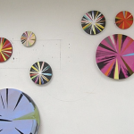
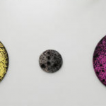
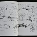
Simon Benson is a draughtsman above all else. In pencil, on A4 and A3 size paper, you find almost everything: from almost invisible organic lines drawn in a searching automatic hand, to harder lines, drawn with the help of a ruler or a template; as well as areas of solid fill or cross-hatched and soft nebulous planes. Since the end of the 80’s nature and architecture have been his main subjects in which he can deploy his drawing skills. In the course of the 90’s, language and text make an appearance, along with the human form, sensory perception and feelings. In 1998, he makes the first self-portraits. In the meantime, new techniques are being used in the works on paper: photography and digital prints. Alongside all this, Benson has been making wall-paintings and three dimensional wall and floor objects made from mdf: he has also realised a number of public space commissions.

Schermafbeelding 2021-01-19 om 14.55.17

In 1997, Simon Benson, made a text-piece, ‘Universal Anatomy’, in the form of a digital and a silk-screen print. It consists of a list of about 300 Italian words. (Italy referring to the beginnings of art in the Renaissance). The scope of this theme becomes clear: from roof to foundation, mountain peak to valley floor, from human head to feet – the body expanded to include perception, feeling and thought – all this subject matter described in one descending movement. At the same time, with a fascination for crossovers, Simon Benson drew a house in the form of a head, or a tree that appeared to be speaking; and he also made an installation entitled ‘An Anthropomorphic Landscape’, with consisted of a series of mdf objects with an block-like architectural appearance, which contained textual references to certain facets of the human form.

benson b

Not just in this conceptual framework -that to this day continues to grow and is still a way to get to know Simon Benson’s work- but individual text works also play a role. For example, ‘Solutio’, ‘Heiliger Platz’, Senza Fiato’, ‘Fluchtpunkt’, ‘Seed’, ‘Cielo’ and others confront you with a greater or lesser degree of
ambiguity, of under- or overstatement – and creates a lot of space for association. Words or letters are sometimes, through a clear yet abstract arrangement, made unreadable. For example, the sixteen letters of the name of the gallery ‘ P H O E B U S R O T T E R D A M ‘ are placed in a grid of four by four letters on the facade of the building in which the gallery in housed. Text as starting point and secret language, a labyrinth to wander around in, a place where you can stand still, think and dream.

That Simon Benson is inspired, on various levels, by the traditions of western art and architecture is discernable in his work. Sometimes it is possible to point out variations on existing images, like in the references to Dürer’s drawings or Botticelli’s, or in the assimilation of architectural drawings of Gothic cathedrals or Le Corbusier’s buildings. As far as sources from literature are concerned, Simon Benson made, in 1999, a series of drawings based on Dante’s Divine Comedy and lately he has been inspired by James Joyce’s ‘Ulysses’, especially by the notion of a varyingly, inward and outward looking subjectivity. ‘Thought Through My Eyes’- eyes open and closed. His work is becoming more and more personal. Image and text, increasingly woven together – something like what you see in a present day source of his: television and computer culture.

The ‘ DO YOU STILL HEAR THE BIRDS SINGING” publication is available at www.ftn-books.com

Posted on Leave a comment

Niek Kemps (1952)

Schermafbeelding 2020-09-25 om 15.34.25

Niek Kemps has been a part of the international art scene since the eighties. The artist wants to stimulate the spectator with his conceptual work, to process images in a different way; a statement about the attention span of modern day society and the accompanying image culture. Kemps’ work is like a laboratory, wherein he does both substantial as visual research to the social and cultural context, and how this relates to image, space, contemporary art and the concept of ‘museum’.

Sculpture becomes space, space becomes museum. A museological space can take diverse appearances: whether it’s static, collapsed, moving, hidden or even virtual. In his work, the artist questions, among other things, the more traditional configuration of the museum. From the need for a funded complexity, he analyses the different connotations, and this from a philosophical and visual stand point. In doing so, Kemps researches the impact of a full virtualization of the museological existence, wherein a virtual (read: fictional) museum merely displays digital work.

Schermafbeelding 2020-09-25 om 15.34.58

Also in this imaginary constellation, the focus remains on the perception of context and space. An intertwining between fiction and reality is created. Virtual work is easily translated into a physical construction, a spaciousness, a sculpture, and vice versa. Kemps’ images never stand alone; they consistently show a sensitivity in relation to their surroundings, they interact so to speak with the space wherein they are located.

‘The narrow line between sight and seeing’, a work from 1986, is a speaking example of this. Until now, this illustrates the essence of his oeuvre. Originally it seems to be a sculpture. Yet the work is experienced as a space; a between area that questions all sorts of traditions and clichés. By continuously operating on this interface, the artist challenges the spectator to get out of their comfort zone, to explore the work, and to spend time with / in it. The artwork reveals itself only to the patient, attentive spectator. Every composition is formulated very precisely, like a poem. This form of complexity ensures that the work can never be apprehended at first glance. To fathom the different layers of meaning(s) takes time and effort. By defying fixed landmarks, meanings, perspective, and scale, every form of rational analysis is extracted or simply removed and it results in an astonishing artwork that invites to be lived and incites the spectator to reflect one self.

Posted on Leave a comment

Arlette Brouwers…van Abbemuseum aanwinsten 1989-1993

Schermafbeelding 2020-04-06 om 14.59.19

Personally this is one of my all time favorite publications by the van Abbemuseum. Designed by Arlette Brouwers, this publication has everything.

Great cover. In all its simplicity it makes in one glance clear that these are the important acquisitions of the van Abbemuseum. In the background one of the main exhibition rooms of the museum and inside, a very transparent lay out, in which the acquisitions are described. This is a true connaisseurs publication and deserves to be collected.

abbe aanwinsten nikkels

for this and other Arlette Brouwers designed publications please visit my store at http://www.ftn-books.com


Posted on Leave a comment

Piet Dirkx weekly

Piet Dirkx contributed to the MADE BY RIETVELD exhibition and book in 2007.

Posted on Leave a comment

Kees de Goede (1954)

Schermafbeelding 2020-01-03 om 15.37.13.png

Living and working both in the Netherlands and in France. His works always have a presence because of the shape and dimensions. Still his favorite shape is the circle, but it seems to me that the composition within the circular form has become lighter. Perhaps this is the influence of France.

de Goede has had his exhibitions in the most important dutch museums and together with these exhibitions some very nice publications were published to accompany the exhibition. My personal favorit?….the van Abbemuseum catalogie from 1988, designed by Walter Nikkels and a text by Hendrik Driessen and available at www.ftn-books.com

kees de goede

Posted on Leave a comment

Mario Negri (1916-1987)

Schermafbeelding 2019-12-21 om 14.46.52

Almost forgotten this sculptor from Italy, but because of a recent addition to my inventory i rediscovered the sculptures by Negri.

negri a

Mario Negri had a dutch exhibition in 1970 in the van Abbemuseum, curated by Hammacher who made a publication possible which is quite scarce. The 8 page fold out is designed by Jan van Toorn and depicts several works by Negri and a photograph of his studio.

negri c

negri b

A bright green is chosen as a cover to draw attention and it oozes Seventies design. I love this great fold out and it even comes with a handwritte price list in Lire for those who want to complete their archives on the sculptor this is an absolute musey. A great sculptor and a great publication are brought together in this typical early Seventie van Toorn design. The Negri publication is now available at www.ftn-boooks.com


Posted on Leave a comment

Carel Visser…the 1975 van Abbemuseum catalogue

Schermafbeelding 2019-08-19 om 12.15.01

This is the catalogue which started it all for Carel Visser in the Netherlands. After having had his exhibition at the Art & Project gallery in 1974. Visser was considered to be one of the great talents in the dutch art scene. the result…. museum exhibitions like this first one at the van Abbemuseum in 1975

visser abbe aa

and in the following years consecutive exhibitions at the art & Project gallery, the Stedelijk Museum, Kröler Muller museum, Haags Gemeentemuseum and Museum Boymans van Beuningen. All these contributed to the fame of Carel Visser in the Netherlands resulting in many more gallery exhibitions, commissions and exhibitions abroad too. Carel Visser has become now one of the recognized leading sculptors and the catalogue which is now for sale at http://www.ftn-books.com is arguably one of the most important ones in the long list of publications Carel Visser has made during his career.

Visser abbe bb

Posted on Leave a comment

Ad Reinhardt, van Abbemuseum 1972

reinhardt abbe

Jan Leering, director at that the time of this exhibition , had an admiration for Ad Reinhardt and presented and purchased for the collection of the van Abbemuseum some important works by Reinhardt. The result of this admiration was a very important exhibition in 1972/1973 with the works by Reinhardt and an exhibition catalogue designed by Jan van Toorn. This catalogue is now available at http://www.ftn-books.com and it is one hard to find . Condition is still good+  of this important catalogue and it shows perfectly why Reinhardt is considered as one of the greatest painters from the US. Impressive , timeless paintings by a gifted artist. A nice extra is that the catalogue comes with hand out “invitation”