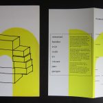
Piet Dirkx invitation for the 1990 Städtische Galerie Nordhorn exhibition.


Piet Dirkx invitation for the 1990 Städtische Galerie Nordhorn exhibition.

It has been years that i have been looking to buy a painting by Siep van den Berg…..and i finally succeeded. It was a few months ago that i first heard about a painting from 1990 which was coming up for auction. I went to the viewing days of the auction house and noticed that the painting was hung differently from the way it was depicted in both publications in which it was depicted.

One thing was a certainty, without a doubt it was a true Siep van den Berg painting and i started to make a written bid…..the outcome?…..i won the auction and now it is in my personal collection and it sits there together with a nice special book filled with 20 collage /drawings that Siep made for his wife Niesje.
The painting now is mine but it is till not clear how it should be hung. According to the eyes on the back and the way it was presented at the auction house it should be a “portrait” painting. The two books i have on van den Berg, both mention the painting as being a landscape one….

For other Siep van den Berg originals contact me at wvdelshout@ziggo.nl

Here is the text that can be found on the Menno Bauer web site. It explains the works and methods Bauer uses.
Menno Bauer is interested in the movements of dancers. “In my paintings”, says Bauer, ‘I set everything in motion. I want the figures in the painting to dance. I want to show that everything is alive and infused with tension. In fact, I am also dusting off images that already exist. He is not only inspired by Van Maanen’s ballets, but also by famous historic paintings. They too contain scenes into which Bauer breathes new life. His reasoning is simple. In a painting, everything is still, motionless, because it is all painted. Nonetheless, you can in stil the suggestion of motion. The challenge is to make that illusion convincing.
It should be said that Menno Bauer does not work in a realistic style. Against a background of broad planes of colour- an agressive red versus a friendly green -, his figures, loosely contoured in black, dance, walk and fall, imprisoned in a world of their own. Here, just as in a filmclip of Johan Cruyff slowly flying past, its utterly unclear just what these people are doing or where they are.
In Menno Bauer’s eyes, the figures inhabiting the sometimes renowned paintings that he uses as his starting points are the theatrical performers acting out their roles. The undefined space in wich they find themselves is hence their stage, a place that can be altered into all manner of environments by way of changing the decors. The actors that Bauer employs in his paintings are professionals in the art of overstatement. Cheer or drama are applied in thick layers, out to persuade their audience. Moreover, what these characters are acting out is not real. Bauer finds excitement in making use of this exaggeration, these emphatic, acted-out gestures, in order to approach the illusion of real gesture or movement.

There is one Bauer publication available at www.ftn-books.com

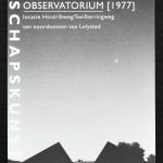
Just last year Robert Morris died at the age of 87 and because of a folder i found on his Observatory in the Netherlands, this folder reminded me of his importance for Modern and Minimal art. Robert Morris had a special connection with the Netherlands and during his life he made some iconic land Art projects on this country. One of these projects was the ” OBSERVATORIUM” at a town called Lelystad. The best is can do now is show you how impressive and “beautiful this project still is:
there are some very nice Robert Morris publications available at www.ftn-books.com

C.A. Lion Cachet (1864-1945) is considered, together with G.W. Dijsselhof and Th. Nieuwenhuis, as pioneer of the Dutch Art Nouveau. He introduced a completely new visual language of forms, font styles and patterns. One of the things he introduced was the batik technique from Indonesia that he experimented with. His style was almost un-Dutch because of his preference for labour-intensive techniques and luxurious materials.

Lion Cachet worked as a teacher before he developed himself as a decorative artist in 1890. He decorated a large variety of objects, among them books, jewellery, furniture and posters. Besides this he worked on Gesamtkunstwerken. An example of this was the commission from Stoomvaart–Maatschappij Nederland (‘Netherlands Steamship Company’) to design the interiors of the passenger ships. Additionally, he was co-founder of Wendingen, an art magazine in the Netherlands that advocated the Amsterdamse School style.
www.ftn-books.com has a beautful publication on Lion Cachet, Nieuwenhuis and Dijsselhof now available . Sublime in every aspect. printing design and an edition size of only 500 copies


At first glance i thought i had a book by Christian Boltanski, but…..studying it more closely i soon noticed that it was by Ania Bien. There are so many similarities between the two artists. Th Holocaust is a central theme within their oeuvre and both approach this theme in a very direct and personal way. They make a kind of art that makes you think and reflect.
Ania Bien (born 1946) is an American photographer.Born in Kraków, Poland, to Polish-Jewish parents, she moved to the United States in 1958, where she studied painting and cultural anthropology. Since 1973 she has lived in Amsterdam.

One of Ania’s early projects, Hotel Polen ( available at www.ftn-books.com), referred to the Hotel Polen fire (which became “part of Bien’s wider theme of destruction”) in Amsterdam, 1977, and established her reputation in Dutch art circles. The collection of photographs illustrated a hotel before World War II, showcasing the relative luxury of middle-class travel in Europe, but objects in the photographs associated with the Holocaust indicate that this was a “doomed” way of life. She fabricated 18 replicas of the hotel’s menu stands, and used them to display the photographs. David Levi-Strauss wrote that Bien’s art piece is a “polysemous work of absence, in which what happens between images is the most important.” The work was displayed at the San Francisco Museum of Modern Art in 1987 and at the Amsterdams Historisch Museum in 1988.
Some of Bien’s work is concerned with Franz Kafka; one of her photographs has her place her hand on a portrait of Kafka’s, in response to a note he wrote in 1924 to Dora Diamant, “Place your hand on my forehead for a moment, so I can gain courage.” Her 1989 installation Past Perfect asked “what would have happened had [Kafka] not died in 1924, but instead had come as a refugee to America in the late ’30s.” It gained her international recognition, and was also shown in Jerusalem.
Bien is interested in war, discrimination, and the plight of refugees. She contributed photographs from a centre for asylum seekers in Haarlem to a 1994 book on refugee children in such centers in the Netherlands, Ontheemde kinderen.
She has also exhibited at Portfolio Gallery in Edinburgh, Scotland, and the Joods Historisch Museum in Amsterdam.
CBK kunstuitleen made this card for the 1999 Piet Dirkx exhibition:
” My heart leaps up when I behold a rainbow in the sky”
The picture is the Flat at the Jan Vermeerstraat in Venlo


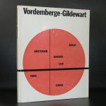
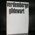
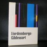
Beside the spectacular constructivist paintings Friedrich Vordemberg-Gildewart made, there is another aspect in his art life what made him special and important. FVG was the first artist who made abstract paintings throughout his entire career. At first glance his work is related to Mondriaan, de Stijl and Malewich, but look at it more careful and you notice that there is mus more space within the paintings. A way of painting which makes the painting seem less crowded. It is the way i like a painting to intrigue

Friedrich Vordemberge-Gildewart was born in Osnabrück, Germany and studied architecture, interior design and sculpture at Hanover School of Art and the Technical College, Hanover. In 1924 he formed the abstract art group Gruppe K in Hanover with Hans Nitzschke and joined Der Sturm in Berlin. After meeting Theo van Doesburg, Kurt Schwitters and Hans Arp, he became a member of De Stijl in 1925. Together with Kurt Schwitters and Carl Buchheister he formed the ‘Abstrakten Hannover’ group in 1927. He was a member of a number of other artistic groups including: the Cercle et Carré, 1930, Paris and was a founding member of Abstraction-Création (1931), also in Paris. In 1937, in Munich, the Nazi regime exposed his works in the infamous Degenerate Art exhibition. Most of his works were confiscated and he was forced to leave Germany for the Netherlands.
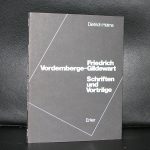

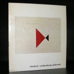
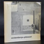
there is a very special Bottrop publication from 1980 available at www.ftn-books.com, which contains 3 silkscreen prints by FVG.
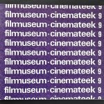
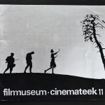
I never had heard of Nico Diemer, but a few weeks ago i bought a stack of Seventies Filmmuseum/ Cinemateek publications . All of these had intriguing covers and showed a lot of design quality. I searched on the internet and tried to find more information on this graphic designer, but found nothing at all and i concluded that mr. Diemer was an amateur designer and must have been part of the staff in the early years of the “Filmmuseum Cinemateek” in Amsterdam. But just take a look at these covers and conclude for yourself that they have a quality of their own. The relation between graphic design and Cinema is obvious and highly recognizable.

A few weeks ago i read an article by the “de Speld” ( it is an almost daily article on the backpages of the VOLKSKRANT paper), that a recently discovered Mondrian was presented to the Gemeentemuseum Den Haag to further complete its large Mondrian collection .


