In the beginning, when I started with FTN books I had a hard time to distinguish Wim Crouwel his designs from the ones made by Daphne Duijveshoff. Later the differences became more clear to me. Duijvelshoff even had even more clean designs than Wim Crouwel had. Still, I sometimes make the error to think it is a Crouwel design I am looking at and to discover a few moments later that it is made by Daphne Duijvelshoff. They worked for a very long time together at Total design but she stopped with her design work in 2006. The excellent site on Dutch designers has done a special on her which can be found over here: https://www.dutchgraphicroots.nl/?p=2144
Of course www.ftn-books.com has some great Duijvelshoff designs available.
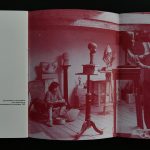
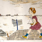
A few days ago I wrote a blog on Aat Veldhoen and illustrated it with a photograph of Jasper Grootveld selling Rotaprints by Veldhoen. In the photograph, the dutch will recognize the “classic” Philips logo on the wall of Atheneum bookstore and “HET LIEVERDJE” the iconic statue.
The Provo movement gathered at this place and the statue is still a symbol of the roaring PROVO Sixties in Amsterdam. The statue was made by Carel Kneulman, one of the leading Amsterdam artists who made a name for himself with sculptures. Forget HET LEIVERDJE and look at his other works you can see a sculptor influenced by Moore and Brancusi and making far better sculptures than the one at the Spui square. It took until his 80th birthday until he received full recognition for his art. At that time he finally received a retrospective at the Stedelijk Museum, but a few years earlier a nice exhibition was being held at the Museum Fodor ( 1990) which exquisite catalogue is now available at www.ftn-books.com
Holstein works are on the border of comics and illustrations. They have a message to be told and within the picture one can discover a complete story even fantasize about the figures and what they are doing. It is a kind of art which is timeless and easy to admire. Figures and drawings are detailed without being realistic. As said a bit like comics are drawn and made.
The Stedelijk Museum recognized the qualities of these drawings in an early stage and made a beautiful catalogue together with the exhibition in 1970. The SIPKE & PIET boek is a typical Holstein production. Drawings and design ( WIm Crouwel), make this a highly collectable item.
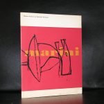
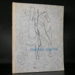
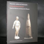
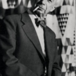
When i think of Marino Marini, i think of the guided tour we had at one time on the estate of Joop van Caldenborgh. He collected the Caldic collection and recently was the founder of the museum Voorlinden near Wassenaar.
The Marini sculpture from the Caldic collection / Cavaliere (1952) is one of the first sculptures you will see when you enter the estate and it is placed on the corner of a “fragile” red brick wall and both the times i saw the sculpture i was scared it would fall, but beside that i was struck with the beauty of the sculpture. A typical Fifties work of art and important! because many great italian sculptures were made during the Fifties and Sixties, but only a few can be found in dutch public collections.
There was a raised interest in italian art during both these decades and the Stedelijk Museum, Boymans van Beuningen and Haags Gemeentemuseum, all presented the best from Italy in those years, but only a few of the presented works of art stayed in the Netherlands and became a part of the public collections of these museums.
Still some very nice publications were published to accompany the exhibitions and some are availabel at www.ftn-books.com
My blog readers know of my admiration for Siep van den Berg. A dutch constructivist painter who was at the end of his life recognized as one of the most important dutch modern painters from last century. A true constructivist with some side steps in which he searched for the perfect landscape, still life or portrait, but the main part of his sketchbooks is filled with sketches of possible constructivist compositions ( see tomorrows blog) but in the end, out of hundreds of sketches he choose the best one and painted. First the sketch, after the sketch the alterations with small pieces of paper cut from the edge of the sheet and then he filled in the colors and noted his findings on the sketch. Followed by painting the canvas. One of the ultimate paintings i now have acquired for our collection. It was one of the highligjts of the Siep van den berg exhibition at the Genootschap Pictura in Groningen :…yes and here it is presented in landscape mode.
So my previous post on this painting has to be altered in a small way. I am getting convince more and more it has to be presented horizontally. Like this.
This and other Siep van den bBerg publications and original works are available at www.ftn-books.com and ftn-art
Why abbreviations for this blog title. It is because of Facebook and Pinterest censorship. They do not allow to show some more explicit great modern art because of the subject. However i must ask your attention for this great catalogue for one of the most controversial exhibitions at the Stedelijk Museum Amsterdam.
There is a life long friendship between Rudi Fuchs and Gilbert & George so it was the most natural venue for Gilbert & George to present this controversial series. Amsterdam, a liberal city had no problems with it . SO the show was held in 1996 and the catalogue published with it is one of the most collectable catalogues by this artists duo.
Rudi Fuchs wrote in his foreword:
Seeing these moving works for the first time, seeing their melancholy and sadness, I was reminded of paintings from long ago, for example Massaccio, of THE EXPULSION FROM PARADISE, Adam with his arm around Eve who was weeping, the two of them utterly lonely, going into the misery of human life.
R.H.F.
This tells it all….controversial but beautiful and impressive
Last Thursday i encountered finally one of the list I was hoping to find for a long time. The list is made in the beginning of the Eighties when interest rose in acquiring and collecting the Stedelijk Museum publications. Since the start in the Mid ’30s from last century, over 1100 publications have been published by the Stedelijk Museum Amsterdam and this list contains the numbers and titles of the first 500 numbered publications. Willem Sandberg, Piet Zwart and Wim Crouwel, 3 of the greatest of Dutch designers all can be found on this list and i noticed of the 500 titles on it I have over 400 currently available at www.ftn-books.com
Beside the one on the list, there are of course many others published by the Stedelijk Museum FTN books has available. Take a look, save and share this very important document. the list is in PDF format and can be downloaded with the link below:
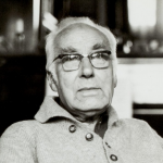
A few days ago i learned that Helena van der Kraan had died at the age of 80.
I have encountered Helena a number of times at the Gemeentemuseum Den Haag where she had become friends with many of its staff. At many occasions these friendships grew into series of portraits and i remember at one time she made photographs of all the staff to be published in a little book which was presented to Theo van Velzen at his leaving the museum. A very kind woman she was and she will be surely remembered for her great photographs she made during her entire career.
OLYMPUS DIGITAL CAMERA
On June 14th, on her 80th birthday, former participant and photographer Helena van der Kraan passed away. Born in Prague in 1940, she came to the Netherlands shortly after the uprising in former Czechoslovakya in 1968, for a two year residency at what was then known as ‘ateliers ’63’. There she met sculptor Axel van der Kraan, with whom she collaborated for many years on large-scale, wooden sculptures, until Helena’s artistic practice focussed more and more on photography. She is known for her restrained and tender portraits of artist friends. Her work is represented in the collections of the Rijksmuseum, the Stedelijk Museum and Museum Boijmans-Van Beuningen. In Fotomuseum The Hague, her series of teddybear photographs is on view until November 1st, 2020.
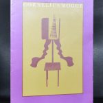
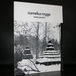
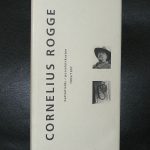
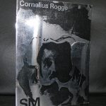
The reason i started to read about Cornelius Rogge and his art is because some 12 years ago i encountered two publications by Rogge. The first and most important one was his TENTENPROJEKT (1976) and the second Battlefield (1997) . 21 years apart from each other but both of a rare quality. Here is what the Kroller Muller writes on his tent project:
These six, mysterious, brown tents are no ordinary tents. Some have the shape of a truncated pyramid or cone. Others are reminiscent of a wigwam, a dolmen or a ziggurat; a pyramidal temple building with terraces. But what contributes most to their unusual appearance is that none of the tents has an entrance.
Secret
What lies in the darkness of these tents? What secrets do they hold? Cornelius Rogge offers no concrete solutions or answers to these questions. With the inherently mundane object of the tent, he calls attention to the mysterious, the inexplicable. ‘Every culture always has mysteries that are inaccessible to people. And that mystery has disappeared in modern culture. Perhaps today’s art has the task of bringing back mystery’.
Vanitas symbol
Over the years, the tents deteriorate and perish under the influence of the wind and weather. Rogge is also aware of this aspect of decay and impermanence. ‘Despite its concrete materialization, the subject of “the tent” is an image of decay, a vanitas symbol’, according to the artist.
These outdoor sculptures are among the largest sculptures collected in the Netherlands and because of their size you can not encounter time as much as i would like to see them, but here is a short film on Rogge in which you can see him at work in his studio.
Here are some titles available at www.ftn-books.com
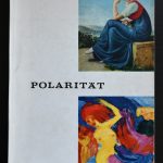
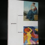
No difference in name of the exhibition. Just a different spelling. One is for the 1961 Stedelijk Museum and the other for the 19761 Recklinghausen exhibition. Both are designed by Willem Sandberg, almost identical covers and the use of different sorts of paper is equal too. …….But there is a difference. The German catalogue contains 208 pages and the dutch only 140 pages. I am still wondering if the complete exhibition was at the Stedelijk Museum or that the Recklinghaus exhibition was much more complete. I prefer the german one and i wish i could have seen this one. It is such a great exhibition and must be counted as one of the greatest exhibitions from the second half of last century.
Artist/ Author: Oliver Boberg
Title : Memorial
Publisher: Oliver Boberg
Measurements: Frame measures 51 x 42 cm. original C print is 35 x 25 cm.
Condition: mint
signed by Oliver Boberg in pen and numbered 14/20 from an edition of 20