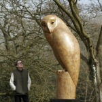
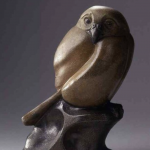
Posted on Leave a comment

Wim Crouwel (1928-2019)

Schermafbeelding 2019-09-20 om 08.21.59

This morning i heard that one of the most influential designers from our time, Wim Crouwel, has died. The last years of his life he suffered Parkinson disease, but he was still going strong and must have looked forward to the retrospective of his works being opened later this  month at the Stedelijk Museum Amsterdam. What better way to commemorate this great artist than to show a selection of the many items designed by him. www.ftn-books.com

OLYMPUS DIGITAL CAMERA

And to finish one of my personal favorites. Wim Crouwel will be an example for many designers in the decades to comewerkman crouwel aa.


Posted on Leave a comment

Bruce Mclean (1944)

Schermafbeelding 2019-06-05 om 15.05.16

This makes it easy. I like Mclean and his works resembel the ones i admire so much from the Italian 80’s painters. Cucchi, Chia and Clemente are all contemporaries of McLean and where their touch is light, Mclean paintinsg are more “heavy” still very accessible but unfortunately they have become far to expensive for a humble collector as i am. Hre is the Tate biography on Mclean.

Bruce McLean (born 1944) is a Scottish sculptor, performance artist and painter.

McLean was born in Glasgow and studied at Glasgow School of Art from 1961 to 1963, and at Saint Martin’s School of Art, London, from 1963 to 1966. At Saint Martin’s, McLean studied with Anthony Caro and Phillip King. In reaction to what he regarded as the academicism of his teachers he began making sculpture from rubbish.

McLean has produced paintings, ceramics, prints, work with film, theatre and books. McLean was Head of Graduate Painting at The Slade School of Fine Art London He has had one man exhibitions including Tate Gallery in London, The Modern Art Gallery in Vienna and Museum of Modern Art, Oxford.

In 1985, he won the John Moores Painting Prize.

Mclean lives and works in London. His son is the architect Will McLean.

http://www.ftn-books.com has added a nice special edition by Art & Project from 1981, The Bulletin 124 is beautiful with a special off set print on the inside

Posted on Leave a comment

Pat Andrea in the USA?

pat andrea schiedam f

I still have not found why there is such a raise in interest in Pat Andrea from the US.

pat andrea schiedam a

Last week i sold 2 of the best publications on this gifted dutch artist . Both to US collectors and galeries. They must know what they were doing , since these were not cheap publications, but the very best and rare books on Pat Andrea ever published. There was the Gemeentemuseum Catalogues with its main theme of Alice in Wonderland and ….The Schiedam catalogue of the 1994 retrospective on the artist. Arguably this is the better book of both, because paintings are depicted at a slightly bigger size and in many cases spread over 2 pages. Both highly collectable and better still….i have the Stedelijk Museum Schiedam catalogue available beside some other very nice and highly collectable Pat Andrea publications.

Posted on Leave a comment

Piet Dirkx weekly

The personal classic of all Piet Dirkx publications. Design by Gracia Lebbink. Biotoop is from 1995dirkx biotoop weekly

Posted on Leave a comment

Richard Schur (1971)

Schermafbeelding 2019-05-24 om 14.24.33

Writing a blog on Art is not only pointing into the right direction of the greatest of artists, but it certainly is my intention to introduce some lesser known artists and explain why they appeal to me personally. The artist Richard Schur was not known to me until i noticed his paintings at an auction. I was impressed in the way he made his compositions. Constructivist ones, but not in a rigid way like Mondrian did, but putting planes and surfaces ( almost rectangular) beside and on top of each other. It was a new approach tome and had rarely seen done this before ….plus i thought his paintings are very appealing. I was lucky that i could buy two of his works at auction . One will be for sale in a year, but in the meantime i will have it on my wall and try to find out why i fell in love with it. The other i plan to make it a permanent part of my collection. Visit Richard Schur’s site to see more of his painting and “meet” the artist and his works . ( https://www.sound-of-color.com )

For me, Abstraction is a place of collective 

and personal memories, experiences and emotions.

I’m a poet, a composer and an Old Master’s son. 

As a contemporary artist, tradition is my ally 

and my enemy. I’m interested in the directness 

of Expressionism, the clarity of Hard Edge 

and the precision of the Renaissance painters.

 Through a long, systematic and intuitive process, 

then, I aim to reflect the meaning of every brushstroke 

within the whole: anything matters here.

As if you could hear the sound of color, Richard Schur creates visual experiences based on the transcendental qualities of color.  Born in Munich (1971), Richard Schur studied with Jerry Zeniuk at the Academy of Fine Arts Munich, and graduated as “Meisterschüler” in 2000. From 2002 to 2008 he teached painting as Assistant Professor at the  Academy of Fine Arts Munich. Recent solo exhibitions include The Sound of Color, Galerie der Moderne, Stefan Vogdt, Munich (2017), Meadows, Cross Mackenzie Gallery, Washington, DC (2016), Manhattan Stories, Galerie Postel, Hamburg (2015). While recent Group shows include Ganz Konkret, Galerie Klaus Braun, Stuttgart (2017), Wendezeiten, CCA  Andraxt Kunsthalle, Mallorca, Spain (2016), Break Ground, ART 3, Brooklyn, NY, USA (2016). His work can be found in public and private collections worldwide including Pinakothek der Moderne, Munich, Guangdong Museum of Art in China, CCA, Centro Cultural Andraxt, Spain, Agnes Gund Collection, New York, BMW Group Art Collection and Allianz Art Collection.

Posted on Leave a comment

Will Ferwerda (1942-2019)

Schermafbeelding 2019-04-25 om 16.15.32

Just recently, onthe 12th of March Will ferwerda died at the age of 77. Known for his free expressionism and activist for his entire life he was one of the most colorful artists in the dutch art scene. He was locally a well known artist and many in Gorkum and Dordrecht had at some time met him.( A bit the same as Gerard Fieret in den Haag), but his art deserves so much better. It has some mysticism in it i can not explain, but when you look at he limited editions by Ferwerda ( available at http://www.ftn-books.com) , these images intrigue and show that Ferwerda was not an amateur , but a true and original artist.

Posted on Leave a comment

Oxenaar…the year 1985…the artists : David Nash and Sjoerd Buisman

It is in 1985 that David Nash and Sjoerd Buisman are both invited by Rudi Oxenaar to make a contribution to the 50 years anniversary of the Nationaal Park de Hoge Veluwe.

Schermafbeelding 2019-04-25 om 15.04.43

On the occasion of the 50th anniversary of the Hoge Veluwe National Park, the ‘Steyn-park’, designed by Henry van de Velde, is restored, ‘both in terms of the afforestation and foliage and the paving’. Furthermore, the artists David Nash and Sjoerd Buisman are invited to realize two projects each in the grounds of the Hoge Veluwe. These Growing sculptures are subsequently acquired by Oxenaar.

buisman nash

I witnissed at one time one of these growing sculptures by Sjoerd Buisman. He realized a project at the pondds of the Gemeentemuseum , by splanting sticks into the grounds of the water. Over time these sprouted into bushes along the shores of the ponds. Since i could witness the progression and growing of this sculpture it fascinated me more over time. The total length of the project was about 3 month. Ther book on the project is available at www.ftn-books.com


Posted on Leave a comment

Jan van Munster (1939)

Schermafbeelding 2019-04-24 om 11.39.23

Jan van Munster stands for me personally as the artist who experimenst with Neon and Pyrographics and using these to create Minimal objects and sculptures. I noticed his works for the first time when a work of him was presented at the Gemeentemuseum Den Haag. It weas a neon sculpture and made in an edition of a few copies and for sale at the museum shop. Unfortunately i did not have the insight at that time to buy it, but the memory remains, because it was the first van Munster i had seen. This is not the easiest of art to admire, but once you follow his career and search back throught the decades that he has made his art, you conclude that he always stayed true to his origins. One of the characteristics that keep reappearing is that he uses frequently two elements on his covers of the catalogues that are published with his works.

munster diep b

First…many of his covers are embossed and second. ….in many cases there is a special Pyrographic made/burnt into the cover of his catalogues, making these original, one of a kind works of art at a more than reasonable price. http://www.ftn-books.com has some nice van Munster titles available.

Posted on Leave a comment

Piet Dirkx weekly

A publication Piet did for Vermeulen Hollandia BV in 1992dirkx hollandia

Posted on Leave a comment

Michael Kirkham (1971)

Schermafbeelding 2019-04-20 om 12.33.05

Michael Kirkham is one of the younger British artists that implressed me immediately when i saw his first paintings at the Gemeentemuseum Den Haag.

Often highly regarded for their uncompromising nature, Michael Kirkham’s paintings give a delicate insight into the dark corners of human existence. Painted mostly from the mind, mixing fantasy and reality, Kirkham depicts his subjects in uncomfortable or awkward positions, (half) undressed, engaging in acts of sexual nature, being in love, daydreaming, or showing their genitals. While doing so, the characters in Kirkham’s paintings often appear distant, as if disconnected or sunken into the emptiness of their subconsciousness. In addition to the apathetic character of his subjects, most of Kirkham’s paintings appear covered in an apt layer of misery and ambiguity.

Schermafbeelding 2019-04-20 om 12.28.22

As much as these scenes of the despicable bring about a sense of discomfort or voyeurism to the spectator, they are equally intriguing and touching as they display a deep sense of empathy for all aspects of the human condition. This is Kirkham’s power: rather than depicting scenes that exist only in Kirkham’s own artistic universe, his works show those parts of life that, no matter our attempts to disregard or overlook them, are a core part of contemporary life. They show us the alienated or estranged individuals who are no match for the complexities of the world they themselves have helped to build.

It is in this commentary on the contemporary that any sense of melancholy, irony, or even voyeurism so often related to the Kirkham’s paintings disappears. The power and beauty of his work are inseparable from the discomfort it brings about when it confronts the viewer with the bleakness of humanity. Therefore, any form of sadness, irony, voyeurism, or discomfort felt in Kirkham’s paintings can only be a sign of confrontation, recognition or even emotion of the spectator, pointing out to us what essentially makes us human throughout the complexities of today.

Michael Kirkham (Blackpool, UK, 1971) lives and works in Berlin, Germany. He completed his education at the Glasgow School of Art and De Ateliers, Amsterdam. His work has been exhibited, among many other locations, at Gemeentemuseum, The Hague (NL), Centraal Museum, Utrecht (NL), and Kunstpalast, Düsseldorf (DE), and is part of collections such as the Gemeentemuseum, The Hague (NL), Museum Boijmans van Beuningen, Rotterdam (NL), Centraal Museum, Utrecht (NL), Sammlung Ritter Sport, Stuttgart (DE), Collection Olbricht (DE), Sollection SØR Rusche, De Nederlandsche Bank, Amsterdam (NL), and of private collections in The Netherlands, Germany and the United States, among others.

ftn-art has the limited edition of THE STORY OF THE GLOVE. a controversial “comic” in prints available. Please inquire.