The second day for the extra focus on the classics within the inventory of www.ftn-books.com
This time it is Picasso. Although i personally am not a great fan of Picasso, there are so many others that admire this Spanish artist and for them …take notice that this is the last day that the discount code is valid. Not only the many publicatons on Picasso are sold with a discount of 10%, but all publications and specials within the inventory go with a discount.
use : CLASSIC10 at your checkout and receive the discount.
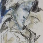
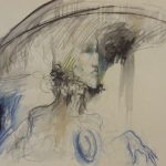
Next June 2018 the former students of the Art Academy in Bari will have their yearly show. Among them is is Giovanni Nicolai to whom i devoted a blog about a year ago. You never know when you are going to visit the beautiful Bari region, but keep in mind that beside great olive oil , food and some wines there is also some modern art to see.
Giovanni Nicolai will be among them with some exquisite paintings and drawings, which show his strength. Portraits of elegant gentleman, classic Italian profiles and great technique make these stand out from the others. A baroque artist in nowadays Italian art scene is rare and for those who like Italian art, these works are well worth to check out.
The second exhibition in which Giovanni will have a presence is in the SO art gallery in Milano. If i have more information on both exhibitions i will let my readers know.
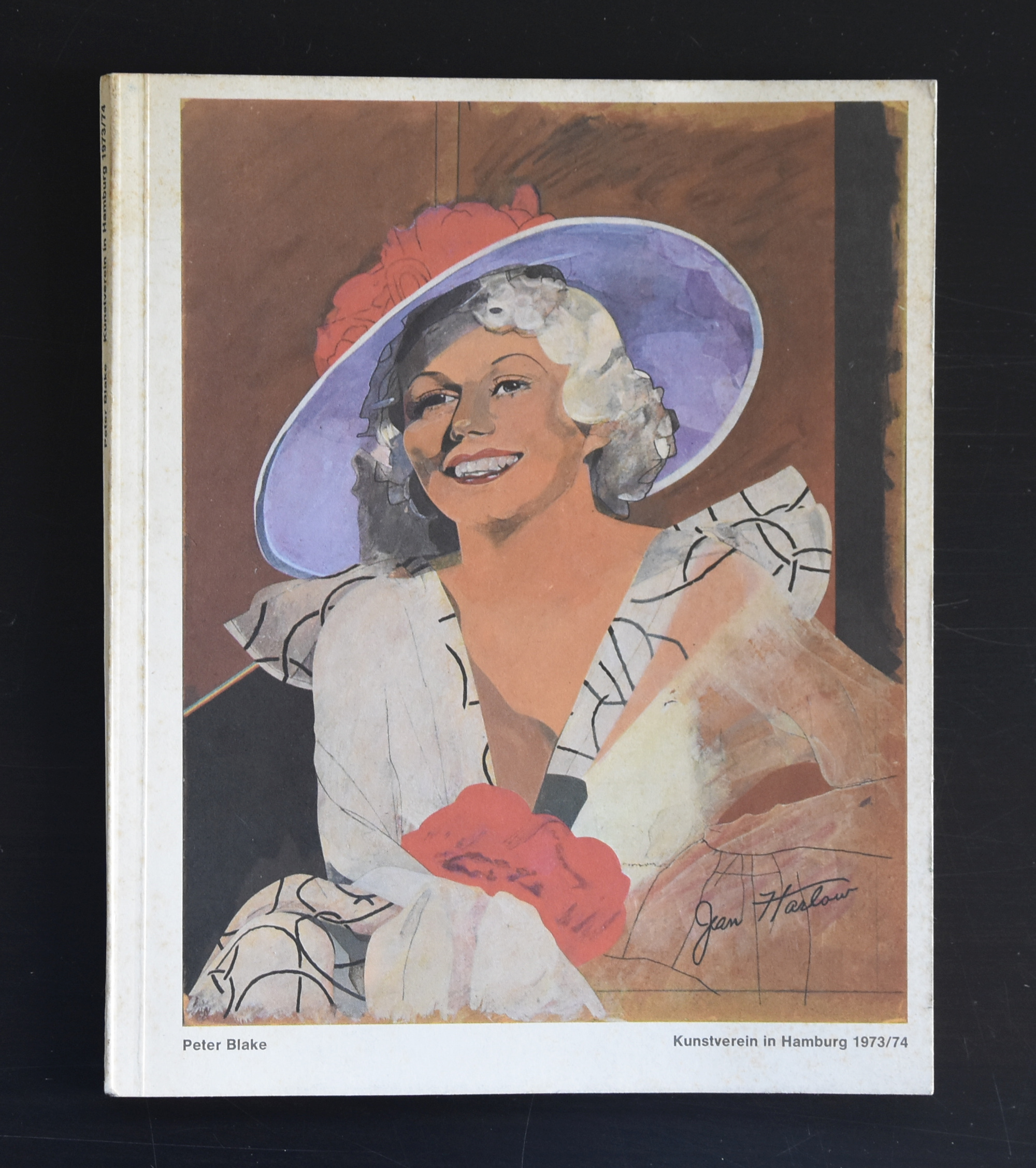
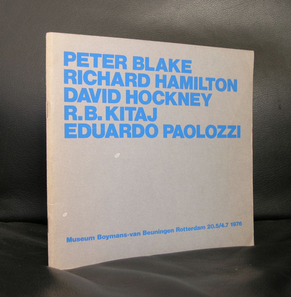
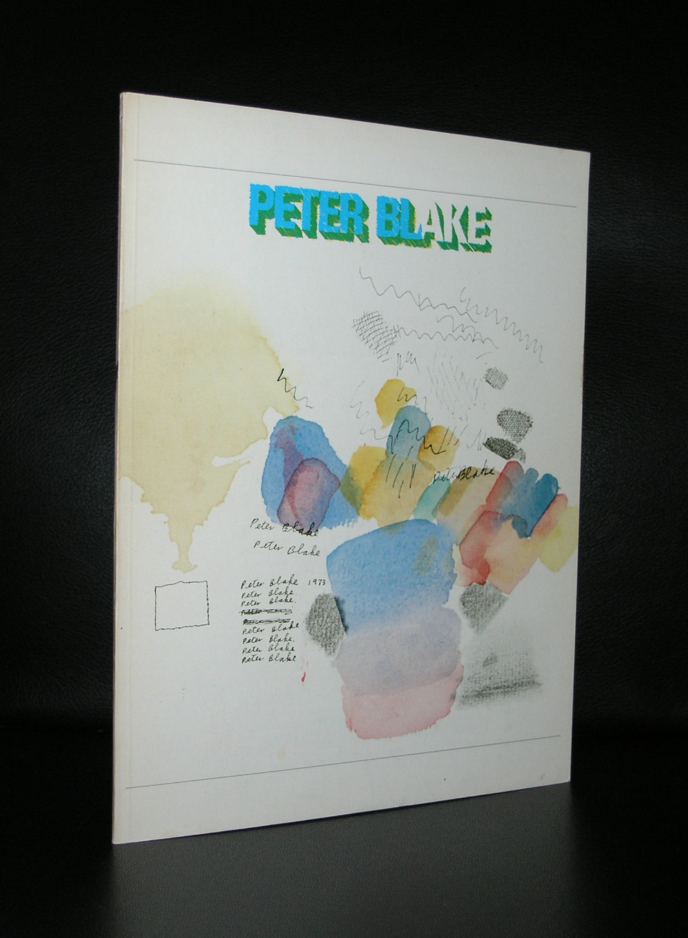
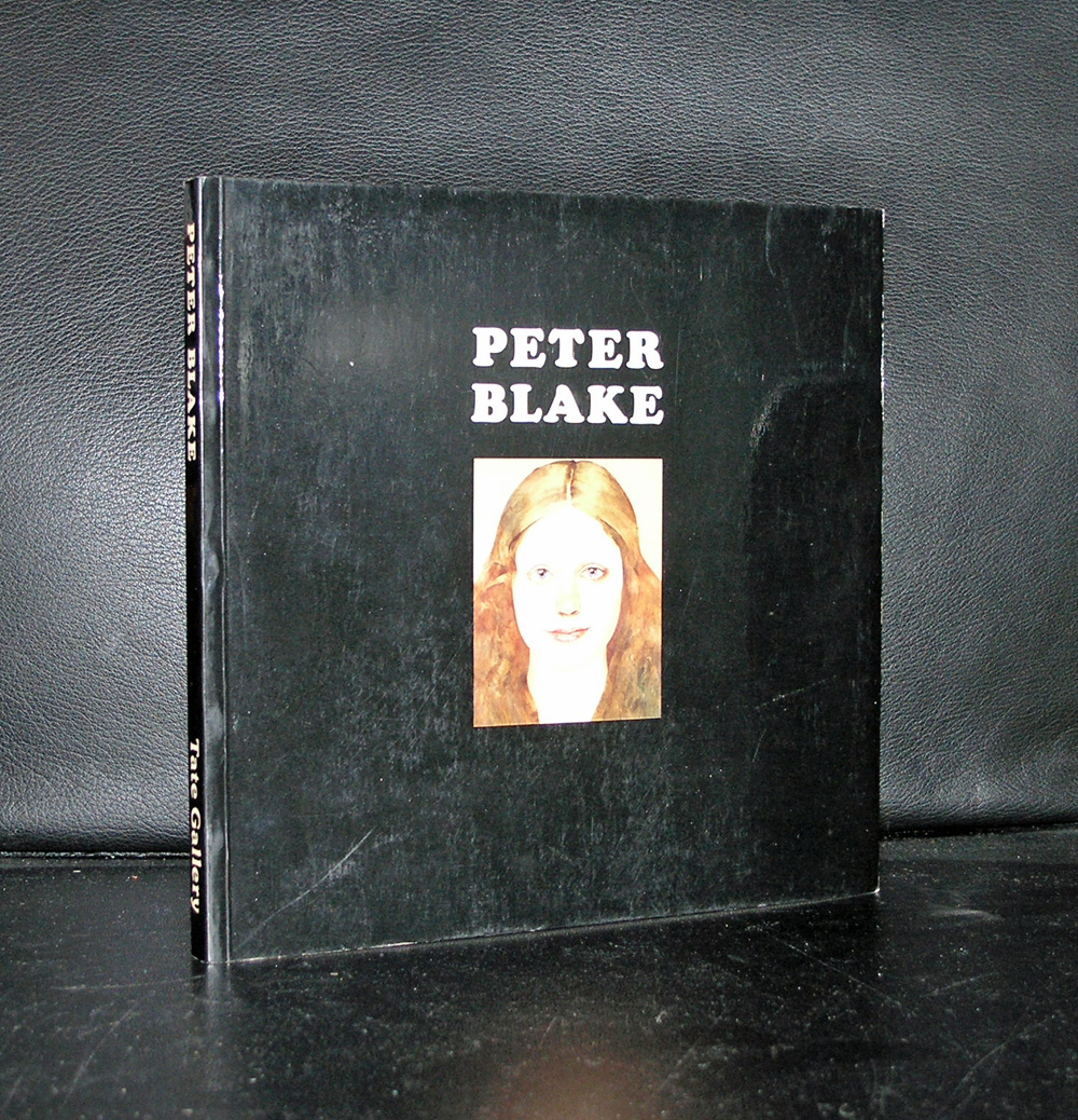
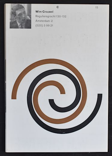
Peter Blake is known by the dutch art lovers as one of the first Pop Art artist who had the opportunity to exhibit at the Stedelijk Museum, Together with this exhibition an excellent catalogue designed by Wim Crouwel was published , bu apart from that his work is becoming more and more important every year. The same with Paolozzi works , this Pop Art is original and authentic and where it was almost forgotten 30 years ago it is now considered among the best art from the 60’s.
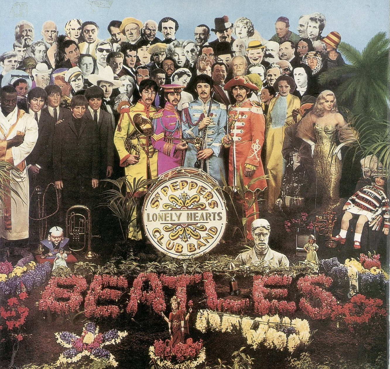
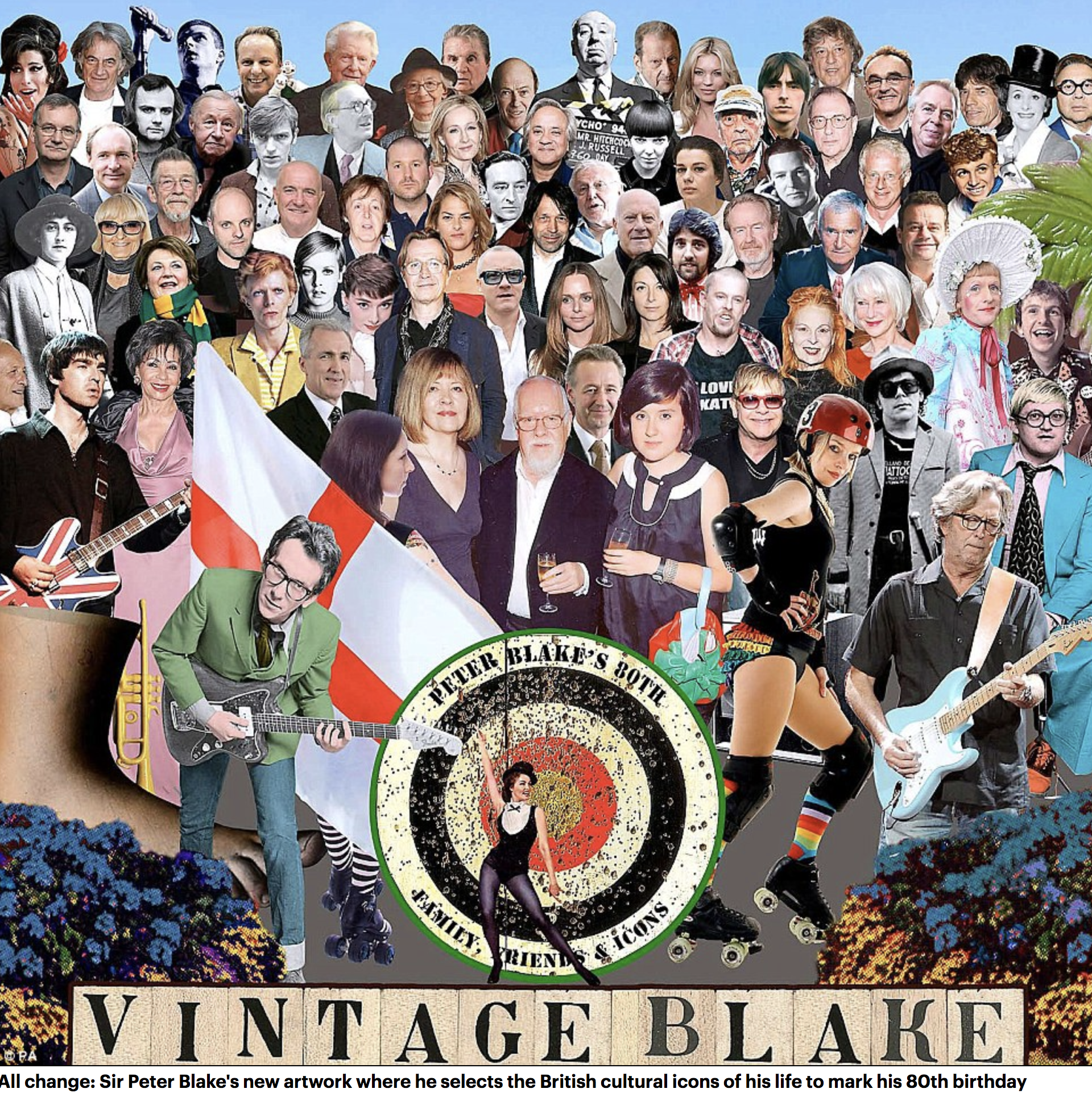
Without knowing, many people have admired Peter Blake’s works and are familiar with it . This, because he was the painter and designer of the Beatles Sgt Pepper album. He even made a second version for Liverpool being cultural capital of Europe in 2008.
In the original 1967 work, the Beatles form the centrepiece wearing colourful military-style outfits while their wax models also feature. However, in the 2012 piece, the faces of Ringo Starr and the late John Lennon and George Harrison have all been omitted.
And even Sir Paul McCartney has been relegated to the third row – one behind his daughters Stella, the fashion designer, and Mary, the photographer. Blake, known as the Godfather of Pop Art, has put his own face and images of his family where the Fab Four once stood.
Blake painted several album sleeves. He designed the sleeve for Sgt. Pepper’s Lonely Hearts Club Band with his wife Jann Haworth, the American-born artist whom he married in 1963 and divorced in 1979. The Sgt. Pepper’s sleeve has become an iconic work of pop art, much imitated and Blake’s best-known work. Producing the collage necessitated the construction of a set with cut-out photographs and objects, such as flowers, centred on a drum (sold in auction in 2008) with the title of the album. Blake has subsequently complained about the one-off fee he received for the design (£200[5][6]), with no subsequent royalties. Blake made sleeves for the Band Aid single, “Do They Know It’s Christmas?” (1984), Paul Weller’s Stanley Road (1995) and the Ian Dury tribute album Brand New Boots and Panties (2001; Blake was Dury’s tutor at the Royal College of Art in the mid-60s). He designed the sleeves for Pentangle’s Sweet Child and The Who’s Face Dances (1981), which features portraits of the band by a number of artists.
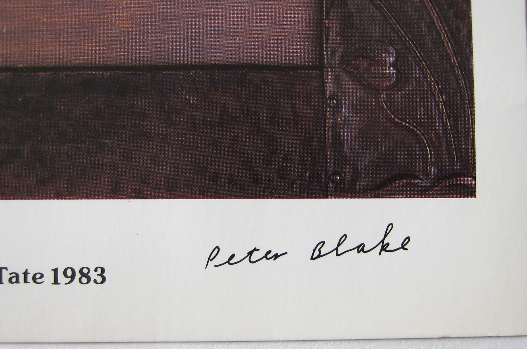
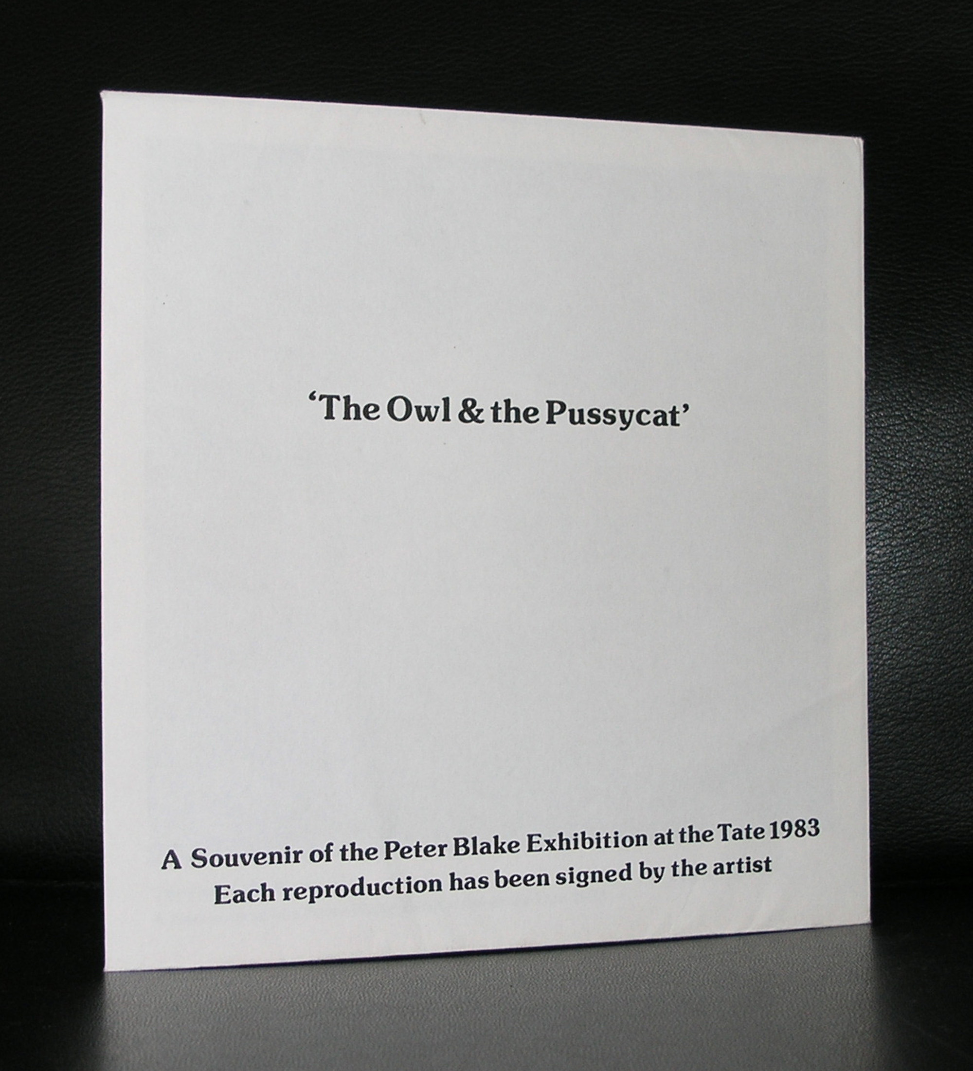
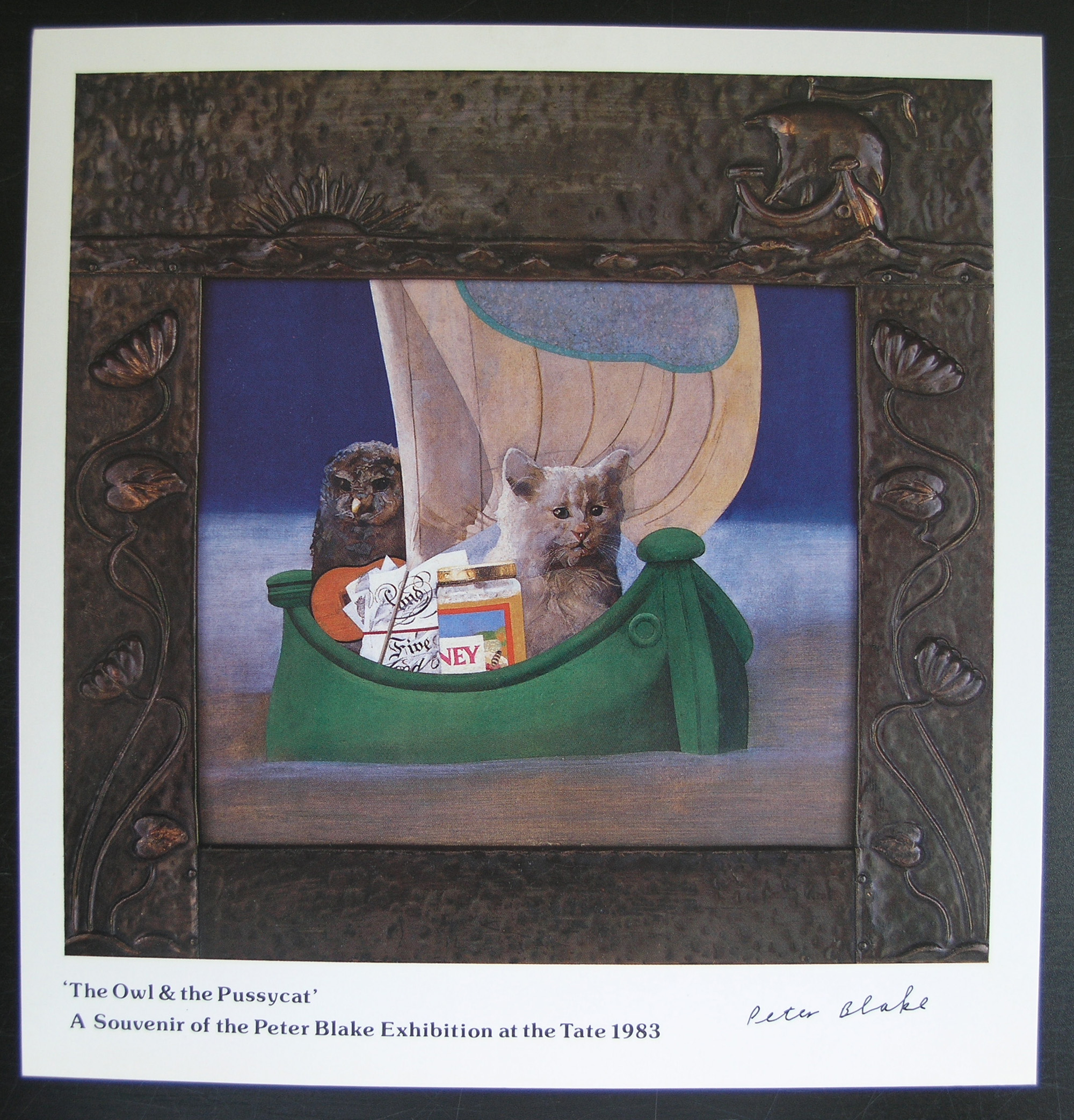
There are some excellent publications on Blake available at www.ftn-books.com
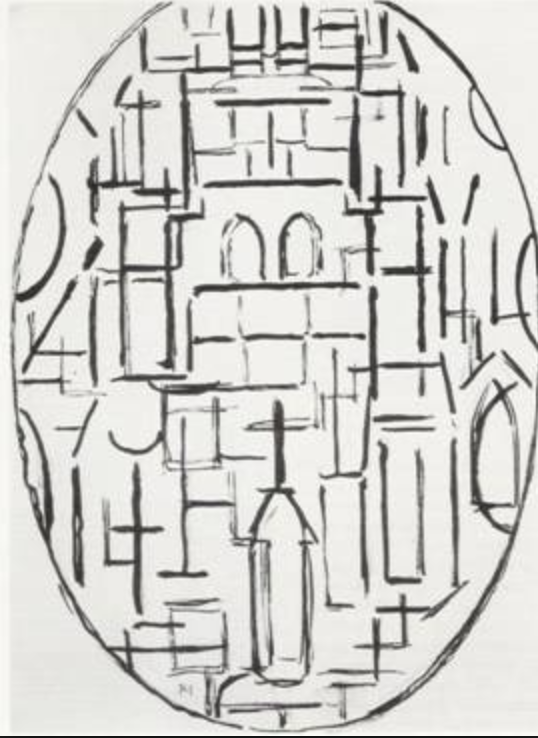
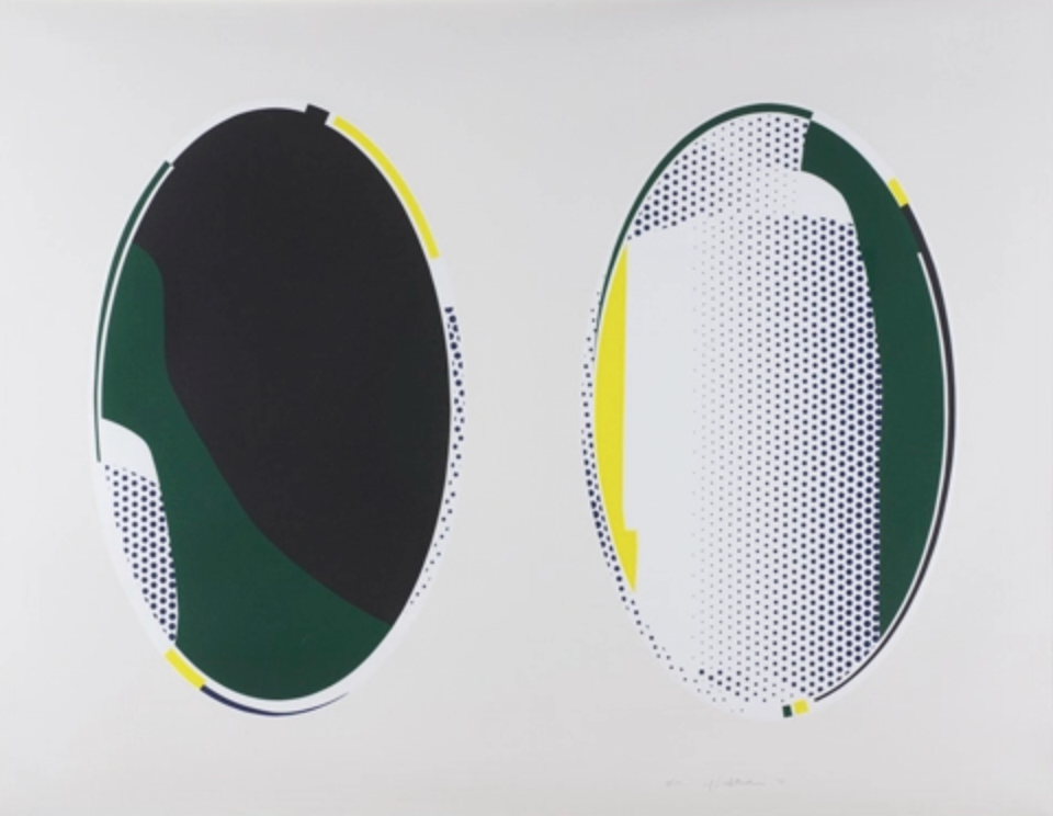
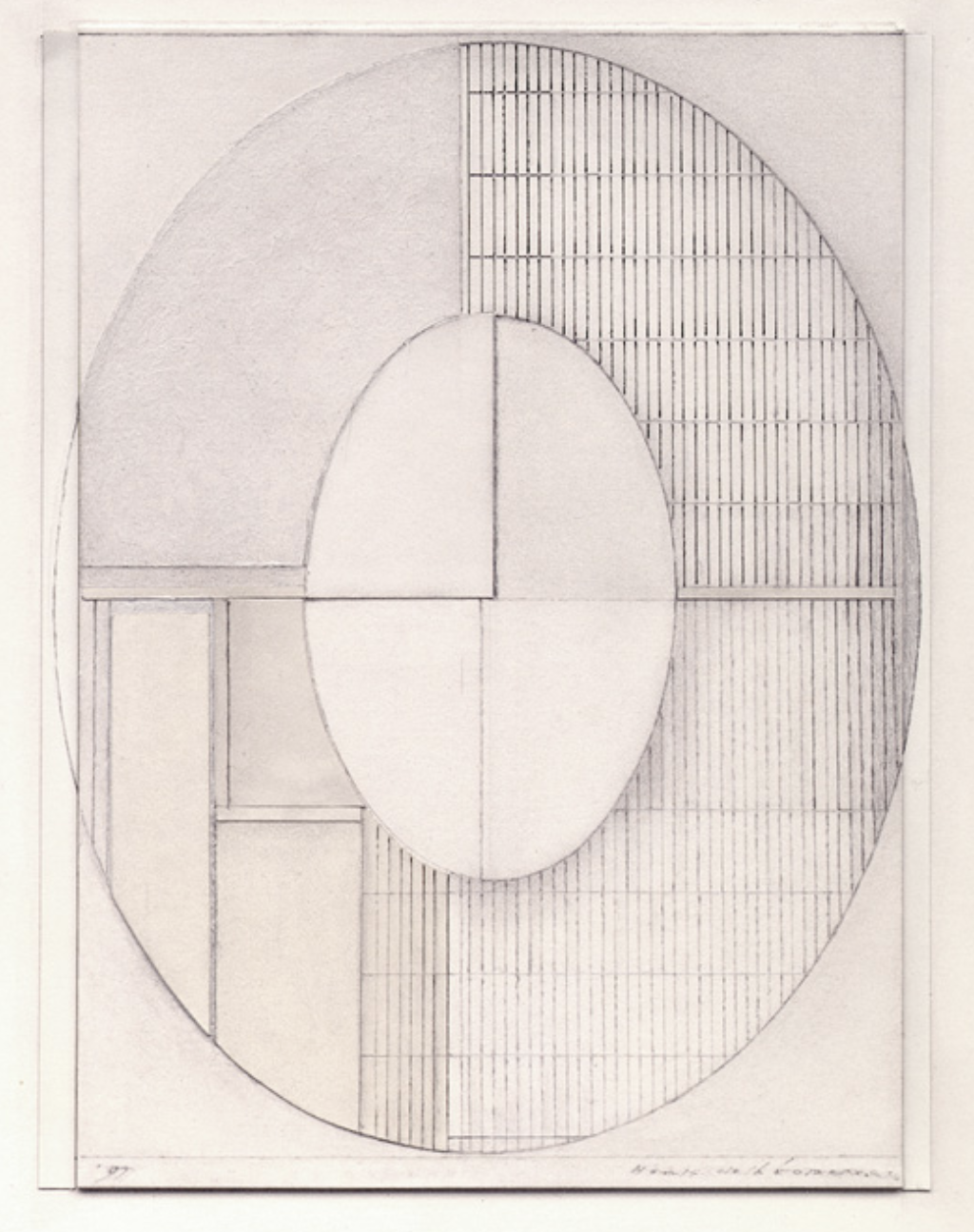
The Oval shape is the less common shape among constructivist, but is was at one time used by some great names in art. Piet Mondriaan used it and also Roy Lichtenstein was a fan and used the shape in his Mirror paintings. Put them beside each other and you will notice similarities between the two. Not only the shape , but also how the space is filled with the composition. I noticed this because a few weeks ago i went to an auction viewing and found the drawings by Henk de Looper for auction. All oval shaped and they really fascinated me.
Here is some information on this forgotten artist who deserves better and is represented by gallery PHOEBUS in Rotterdam.
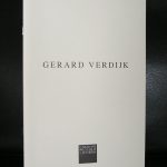
People following this blog know of my admiration for the artist Gerard Verdijk.
Verdijk is becoming increasingly recognized as one of the most avant-garde and influential artists from the last century in the Netherlands, but now his name spreads slowly across the border . During his lifetime his works were collected all over the world and because Verdijk had admirers and collectors everywhere his works can be found in the most unlikely places. Because of his exhibitions in the Netherlands, France, Italy, Germany and even the US his audience grew slowly but constantly and after he had a large retrospective in Dordrecht 2 years ago it is now time for the largest publication ever on Verdijk.
The Mountain of Einstein will be published in an edition of only 500 copies by the end of 2018. It will be a hardcover edition; size : 30 x 30 cm., pages: 396 .
Price ; 99.00 euro
This book will not be available at www.ftn-books.com, but can be ordered with:
Josephine Sloet, Les Places, St. Quentin, 24200 Marcillac, France
josephinesloet@gmail.com
info@gerardverdijk.org
In case you are looking for other publications on Gerard Verdijk please have a look at www.ftn-books.com
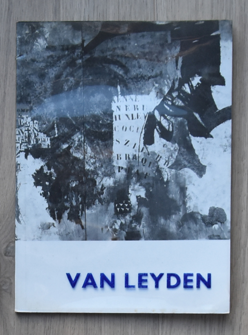
Undeservedly forgotten by most and rarely presented nowadays in exhibitions and gallery presentations. The story of van Leyden is that he fortunately had a loyal group of admirers and collectors, but after trying to give him back his popularity with an exhibition around 2008, it is again complete silence.
Van Leyden was an extremely productive and versatile artist, hugely inspired by his numerous travels: his use of warm colors, striking compositions, and strong rendition – whether figurative or abstract – of people, animals, objects and landscapes made him a thoroughly appreciated artist within a circle of peers and friends to which Picasso, Salvador Dali and Willem de Kooning belonged as well.
It just took a look at a recently acquired catalogue on van Leyden from 1964 and it oozes with quality. Rotella, Villegle and others using the art of collage must have been inspired by van Leyden. Who dares …who presents this great artist again and gives him the stage in Modern Art he deserves to have?
www.ftn-books.com has the Stedelijk Museum and galerie Anderson -Meyer catalogues available for sale.
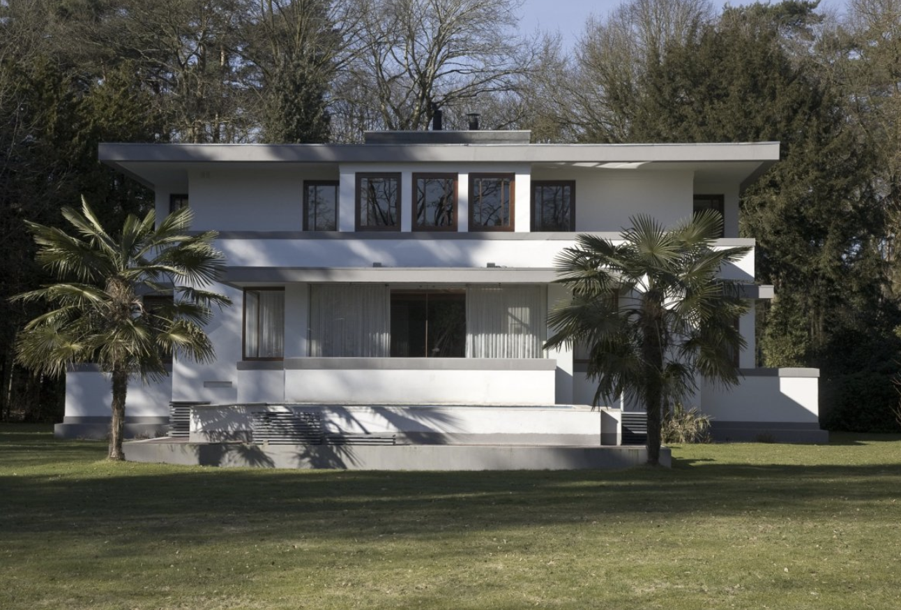
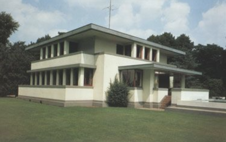
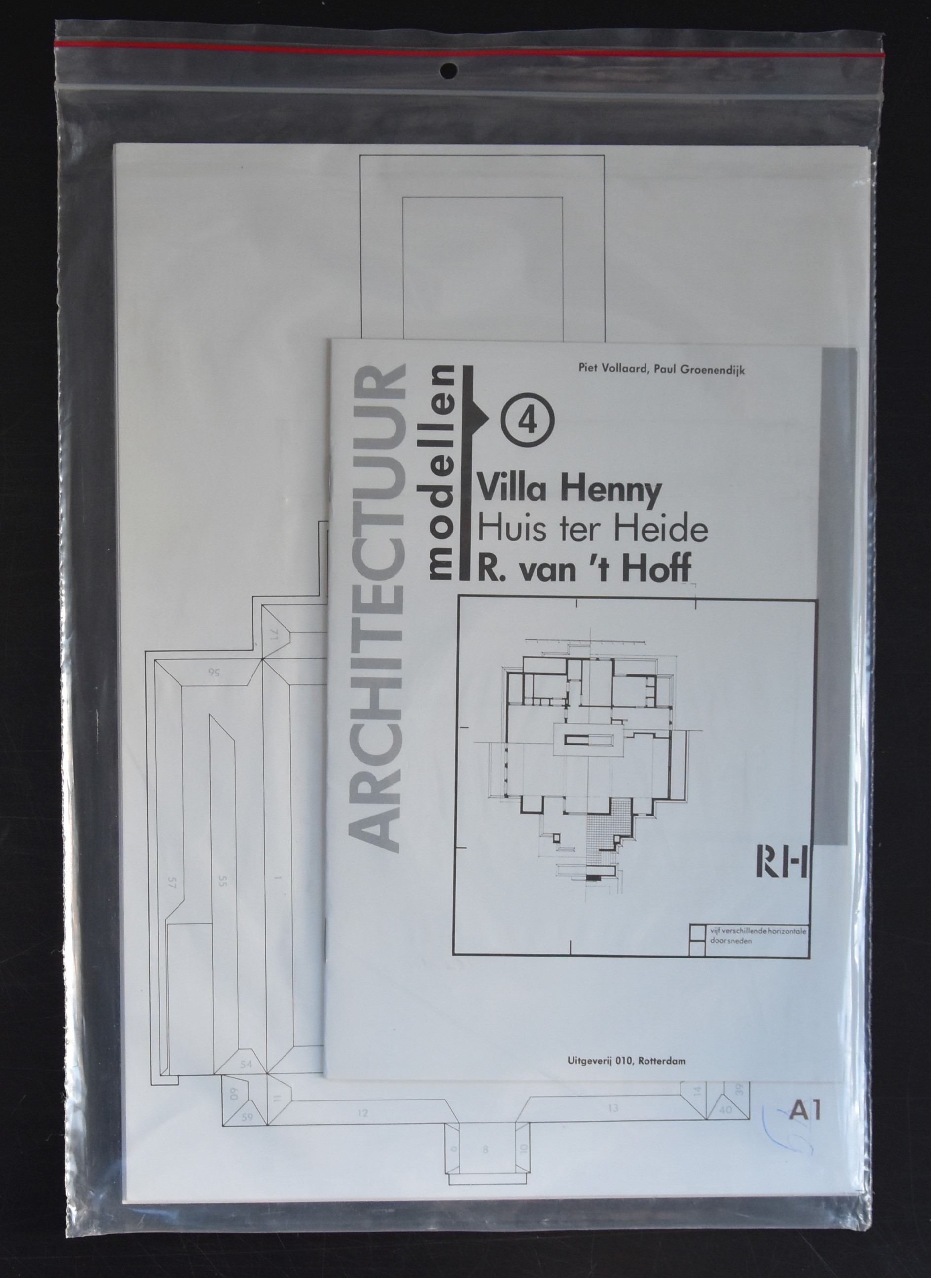
There is DE STIJL in the Netherlands , Arts, poetry and architecture were all executed along linear ways. Where Mondrian used the rectangle. Robert van ‘t Hoff exeuted his architectural along the same disciplines as the other artist of the DE STIJL group. It shows…. a little bit inspired by Frank Lloyd Wright this is one of the best dutch early architectural designs there is. The Rietveld Schroder Huis in Utrecht is more DE STIJL, but this one is far more beautiful. There are publications on DE STIJL and Rietveld available at www.ftn-books.com and since a few weeks there is the classic building cardboard kit by Piet Vollaard available too. Published by Uitgeverij 010 in the mid eighties this is a highly collectable item.
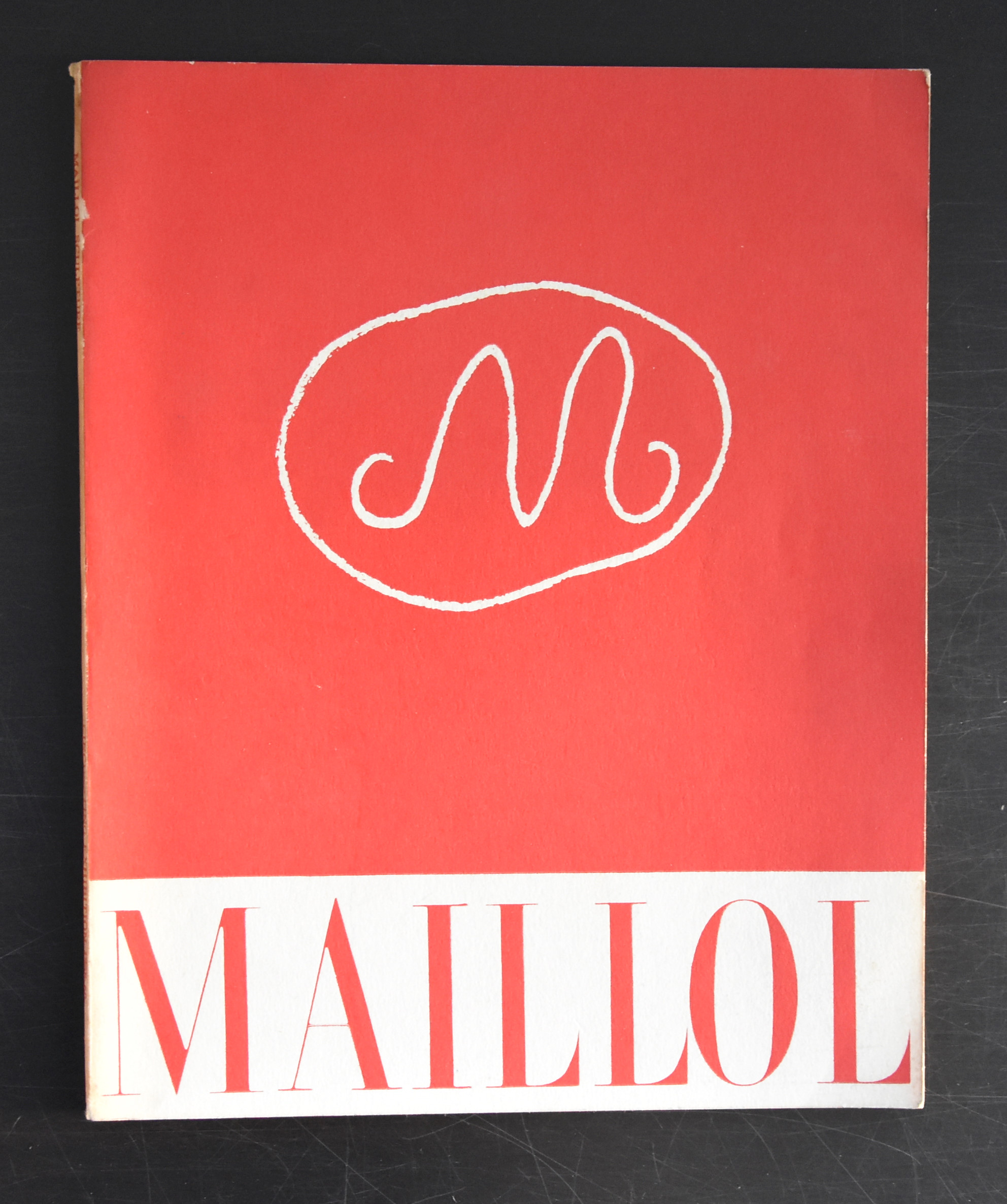
If ever i had to chose two great sculptors from France , for me personally it would be Camille Claudel and Aristide Maillol. Rodin is a great sculptor , but i find his sculptures/statues to classic. He is a craftsman but for me he lacks the personal touch that i encounter with Maillol and Claudel. I have been admiring daily for 25 years a great statue by Maillol which is in the collection of the Gemeentemuseum Den Haag and i found it never boring.
This is the reason that i am always on the look out for publications on Maillol and finally i found another great one at our local bookmarket . It is the spectacular Paul Rosenberg catalogue for his sales exhibition of sculptures by Maillol from 1958. It is now available at www.ftn-books.com together with excellent Sandberg designed catalogue from the 1962 exhibition which was held at the Stedelijk Museum.
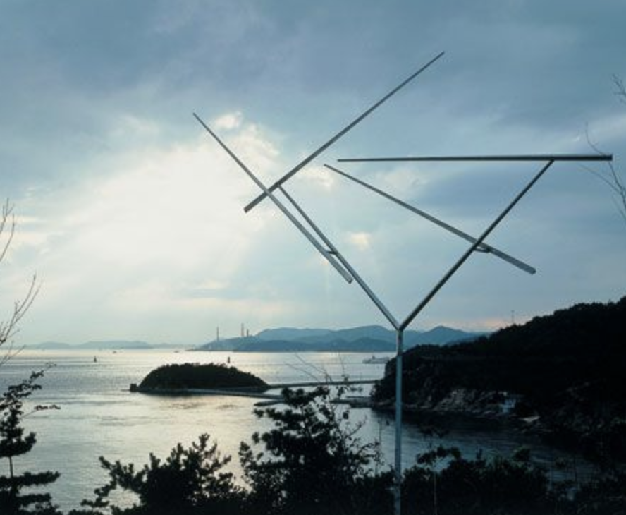
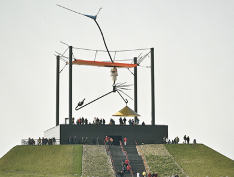
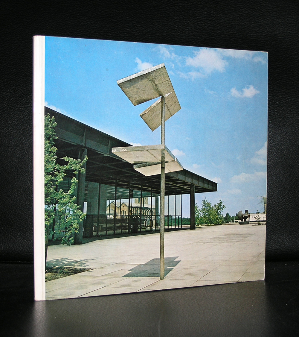
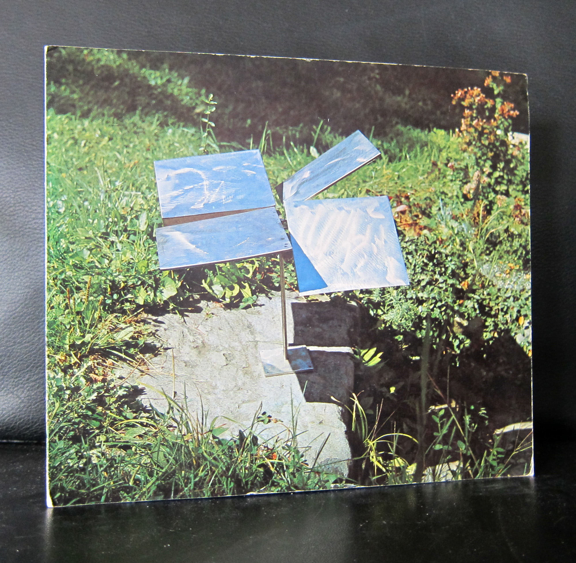
Rickey stayed an unknown artist to me until i bought 10 years ago an edition in which a small print was included of a design for a contruction in Berlin.
The print fascinated me and i started to search for publications on his work. For me he is a typical sixties artist . His works are rooted in the Kinetical art scene, because they move, turn, and spin. Elements which are also used by other artists who make large for works for outdoor place ( Auke de Vries does so in the Netherlands) .
The print and some more Rickey titles are available at www.ftn-books.com
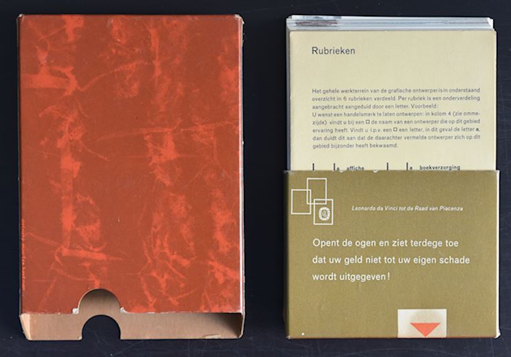
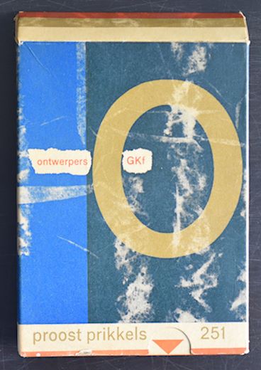
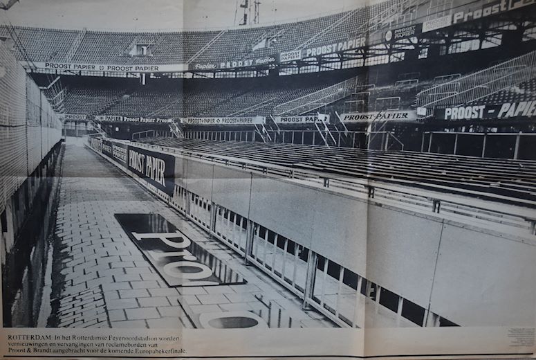
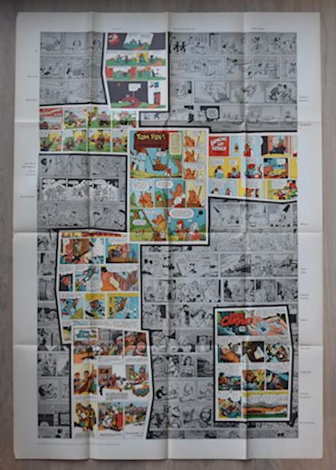
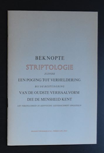
For those working in the printing business, these Proost Prikkels are possible known publications. for the others ….most people do not know them. Proost Prikkels are the publicity prestigious prints by Proost & Brandt paper. There are over 400 of these publications. They appeared irregularly ( between 1936 and the mid eighties), but were always of the highest quality and in most cases related to paper, design and typography. www.ftn-books.com has acquired over 100 numbers of these prestigious publications. Most of them were published between 1960 and 1980. Please mail me the numbers you are looking for and perhaps i have it available among the numbers i acquired. Here are some examples of these Proost Prikkels. the no. 251 is a jubilee publication ( no. 250 was skipped) and contains notecards of 79 dutch designers.
Artist/ Author: Oliver Boberg
Title : Memorial
Publisher: Oliver Boberg
Measurements: Frame measures 51 x 42 cm. original C print is 35 x 25 cm.
Condition: mint
signed by Oliver Boberg in pen and numbered 14/20 from an edition of 20