Posted on Leave a comment

Mark Manders (1968)

Schermafbeelding 2020-05-06 om 14.05.41

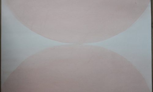
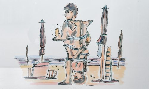
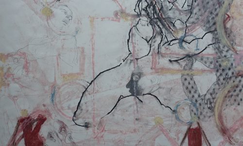
Just to illustrate the work by Mark Manders here follows a text he wrote in 1994.

The Absence of Mark Manders

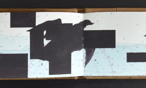
Under a table you have the possibility to test your own absence. The realization that life is taking its course, even without you, is an intense human experience; it shows the finiteness of personality. Mark Manders has inhabited his self-portrait since 1986. This building can expand or shrink at any moment. In this building all words created by mankind are on hand. The building arises, like words, out of interaction with life and things.

Schermafbeelding 2020-05-06 om 14.10.26

The thoughts that surround him in his building are, materialized or not, always important and never gratuitous. ‘When years ago I went for a walk, I would walk through streets where sometimes a clothespeg would be lying, or, when I entered a place, there would be a table with, for instance, a telephone and an empty vase, briefly I would find myself in a world that I hadn’t determined myself. I decided to build a building next to that world, or rather, in that world. A building which was dominated by a changing arrest, where and through which I would be confronted continuously with my choice, the choice of Mark Manders.’ Mark Manders considers the world surrounding his building as an evolved organism that has been constructed from so-called semi-truths. These fall as some loose atom-truths in a kind of ‘encyclopaedia basement’, a space of about four by five metres, around which he constructs his building. Herewith, Mark Manders places his self-portrait as a building actually between two world views: the world as constructed from atom-like semi-truths and the one in which these truths are accepted as facts. Often, we are not afraid in our materialized projection, the world itself has been confided to us. I remember how we determined our first priority roads and that diviners (reading the future in liver) indicated the place of the city. Walking through my building, I get confronted everywhere with deep arrest, it is terrific, the things over here surmount my momentaneous thinking and are familiar to me, I never get bored.

Mark Manders, 1994

www.ftn-books.com has some nice Mark Manders publications available

Posted on Leave a comment

Ørnulf Ranheimsæter (1909-2007)

Schermafbeelding 2020-12-08 om 11.27.31

Ørnulf Ranheimsæter was a Norwegian illustrator, graphical artist and essayist.

He was born in Skien, and educated at the Norwegian National Academy of Craft and Art Industry, where he also later worked as instructor and eventually professor. He is known for his many book designs, and received the Bokkunstprisen award in 1967 and 1987. He was awarded the Fritt Ord Honorary Award in 1998.

gullberg f
Why this rather obscure , lesser know Norwegian artist?.

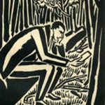
The best reason is he illustrated DEN HELIGE NATTEN by Hjalmar Gullberg.  A short story on the Holy Night ( containing 4 original prints). The most appropriate story for today. ( the book is available at www.ftn-books.com)
Merry Christmas!

wilfried


Posted on Leave a comment

Jasper Johns and Robert Rauschenberg (8)

Schermafbeelding 2020-08-31 om 13.57.30

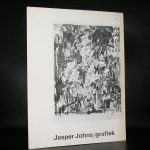
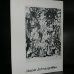
Recognised for developing the first American style to depart from Abstract Expressionism, Jasper Johns and Robert Rauschenberg came together as collaborators and lovers in the mid ’50s. Though the two are widely considered as the founding fathers of the pop art movement, their relationship was ignored due to the rampant homophobia during this time. With many believing the two to be just friends, their intense partnership is often overlooked as being a pivotal factor in their art-making. After a passionate six years, Johns and Rauschenberg broke up. The distraught revolutionaries both left New York City, changed their pictorial styles and cut off all contact with each other for over ten years.    A nice selection of both artists is available at www.ftn-books.com
Posted on Leave a comment

Posters by Willem Sandberg and Wim Crouwel…part 3

In this blog it is time to show the combination of the 1973 Tinguely poster and the Wim Crouwel designed catalogue which he designed for this 1973 exhibition.

The poster is an original design by Jean Tingeuly, where as the catalogue, which was published for this exhibition, was designed by Wim Crouwel. It is just functional where the poster is full of life and design elements . I like both very much but these are worlds apart from each other. It is up to you which is the better graphic design.

tinguely poster 1973 a

OLYMPUS DIGITAL CAMERA

Both publications are available at www.ftn-books.com

 

Posted on Leave a comment

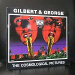
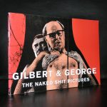
Gilbert & George (3)

Schermafbeelding 2020-08-24 om 16.32.13

Gilbert Proesch and George Passmore

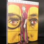
Just like a scene from your favourite rom-com, Gilbert and George first locked eyes in the halls of Central Saint Martins in 1967, where the two studied sculpture. Dubbing the encounter as love at first sight, the duo collaborated on both 3D as well as 2D works – although they would continue to refer to all artworks as sculpture. Exploring themes of religion, sexuality and identity across a wide range of media, Gilbert and George have stayed relevant beyond the confines of the elitist art. They married in 2008, having spent over 4 decades together in the art world that they collectively rebel against.

www.ftn-books.com has many Gilbert & George titles available
Posted on Leave a comment

Dr. Erich Salomon ( 1886-1944)

Schermafbeelding 2020-08-20 om 16.59.09

Erich Salomon (28 April 1886 – 7 July 1944) was a German-born news photographer known for his pictures in the diplomatic and legal professions and the innovative methods he used to acquire them.

Erich Salomon memorial Born in Berlin, Salomon studied law, engineering, and zoology up to World War I. After the war, he worked in the promotion department of the Ullstein publishing empire designing their billboard advertisements. He first picked up a camera in 1927, when he was 41, to document some legal disputes and soon after hid an Ermanox camera usable in dim light in his bowler hat. By cutting a hole in the hat for the lens, Salomon snapped a photo of a police killer on trial in a Berlin criminal court.

Schermafbeelding 2020-08-20 om 17.01.19

Beginning in 1928, Salomon worked for Ullstein’s Berliner Illustrirte Zeitung as a photographer. With his multilingual ability and clever concealment, his reputation soared among the people of Europe. When the Kellogg-Briand Pact was signed in 1928, Salomon walked into the signing room and took the vacant seat of the Polish delegate, and took several photos. He is one of only two known persons to have photographed a session of the U.S. Supreme Court.[1]

After Adolf Hitler came to power in Germany, Salomon fled to the Netherlands with his wife and continued his photographic career in The Hague. Salomon declined an invitation from Life Magazine to move to the United States. He and his family were trapped in the Low Countries after Germany invaded in 1940. Salomon and his family were held in the Westerbork transit camp, then for almost five months in Theresienstadt concentration camp and were deported from there to the Theresienstadt Family Camp in May 1944. He died in Auschwitz on 7 July 1944.

The Dr. Erich Salomon Award is a lifetime achievement award for photojournalists given by the Deutsche Gesellschaft für Fotografie (other languages) (German society for photography). www.ftn-books.com has the Stedelijk Museum catalogue from 1981 available.

salomon stedelijk

Posted on Leave a comment

Gracia Lebbink (1963)

OLYMPUS DIGITAL CAMERA

This blog is long time overdue. I met Gracia for the first time when she was designing the artist book LA STANZA VEDE by Kounellis for the Haags Gemeentemuseum in 1990. She was introduced to the Haags Gemeentemuseum by Rudi Fuchs who was the director at that time and because trusted her skills after being introduced to Rudi by  Walter Nikkels some time before.

Since, she designed for the Gemeentemuseum many publications and posters and build a prestigious agency on the way, “designing” for many cultural institutions and museums. Always recognizable, simple , beautiful designs and with a typography that invites reading the texts.

I mentioned Nikkels and Lebbink in the same sentence and that is not without a reason … I consider both to be the very best from the generations to follow Sandberg and Crouwel and because I have known Gracia professionally, she is placed on the no. 1 spot, followed at some distance by Walter Nikkels. It proves Rudi Fuchs had a nose to pick not only the best artists, but also the right choice in commissioning a designer with a project. Gracia had to stop her professional career in 2003, leaving us some very beautiful and appealing designs.

Because of my personal interest in her works I have collected many of Gracia’s designs for FTN-books. Many are available at www.ftn-books.com…..just search for Lebbink and you will encounter over 30 Gracia Lebbink designed publications available.

Posted on Leave a comment

Jan van Toorn (1932-2020)

Schermafbeelding 2020-11-17 om 13.04.26

Jan van Toorn dies last Friday at the age of 88 years.

Tragic newss this morning , but one of the greatest of all dutch designers from last century dies at the age of 88 years.

I have followed his career with all kinds of examples of his design through all decades of last half century. Many of these are also available at www.ftn-books.com
. Many of them stand out and some are also known outside our borders, since many of his designs were done for exhibitions outside the Netherlands. His style….highly recognizable and less formal than Crouwel is known for. van Toorn sits in between Sandberg and Crouwel and developed over the years a style of his own. He was one of the main designers for the van Abbemuseum and a director for the Jan van Eyck academy and beside the van Abbemuseum made design for PTT Nederland and the Cultural Foreign office. His archives are now with the Unviversity of Amsterdam.

During his life Van Toorn received two prestigious art prices for his designs. First the H.N. Werkmanprijs in 1972 and second in 1985 the BNO Piet Zwart award.


Posted on Leave a comment

Erwin Olaf and Eduard Manet… an analogy

Schermafbeelding 2020-11-16 om 10.08.14

A few weeks ago i decided to sell my pristine copy of the Borek Sipek / Erwin Olaf catalogue they made together with Irma Boom for the STIJL VORMT FUNCTIE exhibition at the Stedelijk Museum in 1991. This is probably one of the catalogues i cherish the most, but since i have decided to sell part of my private library and only keep these books that are related to our personal collection it is now for sale. What struck me most were of course the photographs by Erwin Olaf. These are timeless and highly original in their approach of the subject…..except…. he must have been inspired by at least one painting of the impressionist period. The Eduard Manet / The bar at the Folies Bergere painting is certainly a source of inspiration for the photo het took in the early Nineties. The book is now for sale at www.ftn-books.com


Posted on Leave a comment

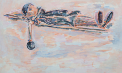
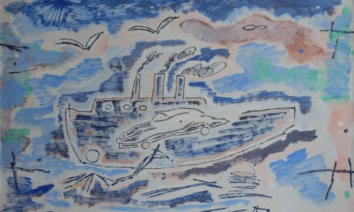
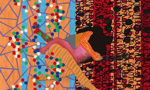
René Daniëls ( continued )

Schermafbeelding 2020-08-04 om 16.09.13

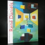
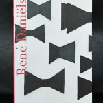
Over 3 years ago I published my first blog on René Daniëls, who I consider to be one of the great dutch artist from the last century. It took me some time but  I now have the most important publications on René Daniëls in my inventory. recently I have added Lentebloesem (1990) and The words are not in their proper place (2011). These together with the van Abbemuseum publications makes the best collection of René Daniëls. possible. All books are now available at www.ftn-books.com