Posted on Leave a comment

Koninklijke Subsidie voor Vrije Schilderkunst, 1980

vrije schilderkunst nikkels

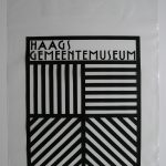
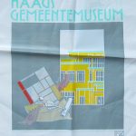
Every year the KONINKLIJKE SUBSIDIE VOOR VRIJE SCHILDERKUNST is granted to promissing, youthful artists. This series of 9 consecutive years is not randomly chosen by me. The artists that received the price are from my generation and many i have known or know personally and some are even present in our personalcollection. The reason to present these artists in this series now is because this generation is appearing on auction sites at these days, fetching such low prices that for many of you an original work of art is feasable. These artist deserve a bigger platform and your support. Many of them still make great art, some have stopped their art career, but most of them are still working every day in their studios. The series contains 9 blogs all devoted to the catalogue designed by Walter Nikkels which was published in 1987 on these artists and the price they won. This series of 7 years appears to have been important to dutch modernart and from a historical perspective it is nice to see that in the Eighties great artists and great art surfaced.

here is the first year is present to you. 1980

vrije foto 1980

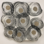
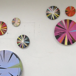
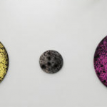
from left to right: Tiny van der sar, Lex Rijnhout, Henk Metselaar, Hedy Gubbels, Eugène Jongerius

Posted on Leave a comment

Koninklijke Subsidie voor vrije schilderkunst, 1986

year 1986

vrije foto 1986

from left to right: Jan van den Dobbelsteen, Michiel Duvekot, Steven Aalders, Bart Domburg, Diederick van Kleef, Gerard Kodde

Posted on Leave a comment

Koninklijke Subsidie voor vrije schilderkunst, 1982

Year 1982

vrije foto 1982

One of my favorit years with Maarten Ploef and Joris Geurts.

from left to right: Jos Boomkamp, Maarten Ploeg, Arja van den Berg, Nies Vooijs, beatrix, Kees de Goede, Joris Geurts

Posted on Leave a comment

Gracia Lebbink (1963)

OLYMPUS DIGITAL CAMERA

This blog is long time overdue. I met Gracia for the first time when she was designing the artist book LA STANZA VEDE by Kounellis for the Haags Gemeentemuseum in 1990. She was introduced to the Haags Gemeentemuseum by Rudi Fuchs who was the director at that time and because trusted her skills after being introduced to Rudi by  Walter Nikkels some time before.

Since, she designed for the Gemeentemuseum many publications and posters and build a prestigious agency on the way, “designing” for many cultural institutions and museums. Always recognizable, simple , beautiful designs and with a typography that invites reading the texts.

I mentioned Nikkels and Lebbink in the same sentence and that is not without a reason … I consider both to be the very best from the generations to follow Sandberg and Crouwel and because I have known Gracia professionally, she is placed on the no. 1 spot, followed at some distance by Walter Nikkels. It proves Rudi Fuchs had a nose to pick not only the best artists, but also the right choice in commissioning a designer with a project. Gracia had to stop her professional career in 2003, leaving us some very beautiful and appealing designs.

Because of my personal interest in her works I have collected many of Gracia’s designs for FTN-books. Many are available at www.ftn-books.com…..just search for Lebbink and you will encounter over 30 Gracia Lebbink designed publications available.

Posted on Leave a comment

René Daniëls ( continued )

Schermafbeelding 2020-08-04 om 16.09.13

Over 3 years ago I published my first blog on René Daniëls, who I consider to be one of the great dutch artist from the last century. It took me some time but  I now have the most important publications on René Daniëls in my inventory. recently I have added Lentebloesem (1990) and The words are not in their proper place (2011). These together with the van Abbemuseum publications makes the best collection of René Daniëls. possible. All books are now available at www.ftn-books.com

Posted on Leave a comment

Ulrich Rückriem (continued)

Schermafbeelding 2019-12-22 om 12.28.57

A few years ago i wrote a blog on the work of art i was able to buy , but did not. The story is as follows. At that time the Gemeentemuseum was printing its publications with the very best printers in the Netherlands. Among them was of course Lecturis and my contact with Lecturis was the late Jan Jongepier. Jan , knowing my interest in art , offered me at one time a series of original works of art. All were for sale through Lecturis. Lecturis had at one time accepted works of art as (partial) payment for the publications they were printing for the artists. These publications were made outside the official editions for the dutch museums or accepted as part of the financing of the editions. They build a nice collection this way, but did not know what to do with it, hence the offer, which was made to me. In retrospect i can tell that these prices were outright cheap, but at that time i could not finance any of the works offered.

Still i always remember Jan and his art collection from Lecturis. Specially now that i have added the Rückriem catalogue which must have been the origin of the Ruckriem work in the Lecturis collection. It is now available at http://www.ftn-books.com

ruckriem abbe

Posted on Leave a comment

Company design

bedrijfsstijlen

People almost forget that every publication and every outing by a larger company has been designed by a designer. In the tine that i worked at the Gemeentemuseum Den Haag, i have witnessed that every director wanted a change in company style. It was a bit like the french presidents always want to erect a building to show the people in the country that he once was their president ( Pompidou, Mitterrand, Chirac they all had their building projects and are now remembered in the name of the building.

Schermafbeelding 2020-02-03 om 16.54.05

It was the same with the directors i worked with at the Gemeentemuseum. First there was Theo van Velzen who was very fond of Donald Janssen, followed by Henk Overduin who continued with Donald. After Henk Overduin the museum had Rudi Fuchs as a director. Fuchs trusted Walter Nikkels , but after a few month he decided for Gracia Lebbink as a designer and young and saspiring designers who had the “style’ he desired for the publications of the museum and i must admit, personally i think this period produced the best and most beautiful publications. Gracia continued to design some 8 years for the museum. In the time of some 20 years i had witnessed and worked with 4 designers and as many of 4 times every printed outing of the museum was redesigned. Posters, books, printing paper , entrance tickets, shopping bags every aspect of printing was designed agin with the coming of the new company style. It the meantinme i had also witnessed 3 name changes of the museum itself. To show some of the bags that were published over the time i show you the most famous plastic bags of the museum , which are both available at www.ftn-books.com 

Posted on Leave a comment

Kees de Goede (1954)

Schermafbeelding 2020-01-03 om 15.37.13.png

Living and working both in the Netherlands and in France. His works always have a presence because of the shape and dimensions. Still his favorite shape is the circle, but it seems to me that the composition within the circular form has become lighter. Perhaps this is the influence of France.

de Goede has had his exhibitions in the most important dutch museums and together with these exhibitions some very nice publications were published to accompany the exhibition. My personal favorit?….the van Abbemuseum catalogie from 1988, designed by Walter Nikkels and a text by Hendrik Driessen and available at www.ftn-books.com

kees de goede

Posted on Leave a comment

Centraal Museum Utrecht and book design

Every decade in Dutch design and typography has its own specialties. In the Interbellum there was the photomontage, Isotype and typography by Zwart, Schuitema and Arntz. After WWII , the Stedelijk MUseum was a source of inspiration for its director Willem Sandberg who made beautiful catalogues for his exhibitions in the Stedelijk. In the late fifties and early sixties Benno Wissing and Wim Crouwel lead the way in design, followed by the Total Design agency who had a leading role in dutch design in the seventies and eighties, which brings us to the Nineties. Here it becomes interesting. The large museums in the Netherlands practically all had their contracts with dutch “house” designers. Walter Nikkels for the van Abbemuseum, Swip Stolk for the Groninger Museum and Gracia Lebbink for the Gemeentemuseum Den Haag were such designers. And then there is the Centraal Museum. They had a very consistent publication program in which design , specially sized/formatted books and bindings were very important. www.ftn-books.com has some excellent examples of these publications for sale . I knew of course of these publications, but when i rearranged some of my inventory, it struck me that these publications are and will become more important in the world of book design every year from now. These publications are still available at reasonable prices , but it will not be long before others will recognize the importance of these books too.

Posted on Leave a comment

Hans Haacke (1936)

Schermafbeelding 2018-02-19 om 14.56.35

His career spans now a period of nearly 60 years and he has always been a frontrunner in the world of art. Perhaps yu can compare him with Damien Hirts, but do not forget that there is a difference of time between them of 3 decades. Haacke never reached the stature of a Damien Hirst, but when his works emerged and were introduced into the art scene… literally every large and important Modern Art museum in the world wanted a piece of the action. Haacke was “hot”. Moma , Tate and Museum Ludwig all started to collect Hans Haacke at a large scale.

In 1978 Haacke was asked for a one man show at the van Abbemuseum / Eindhoven ( catalogue available at www.ftn-books.com)  and with this show, the Netherlands started to know Hans Haacke as an artist. Nowadays his art is less prominent present in the collections of these large museums, but i am convinced this will change in the not so far away future, because i think Haacke is important for the art of Seventies and Eighties. A forerunner for the art made by the well respected British artist like Hirst and Tracey Emin. Haacke deserves a place among them. His contribution to art is a valuable one and deserves to be recognized as such.