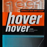
Of course I can tell you that since his breakthrough exhibition HOVER HOVER at the Stedelijk Museum ( catalogue available at www.ftn-books.com) the conceptual works by Gerald van der Kaap have been shown all over the world and that he received public acclaim for practically all his installations and projects. Everything he takes up turns into a work of art. Whether it is a book, museum catalogue, Video, record or print everything turns into something special. Best is to show you what I mean with presenting two links.
the first the Gerald van der Kaap site at : https://www.geraldvanderkaap.com/
and the second at the Hollandsche Meesters series which devoted one of his video to Gerald van der Kaap:
these 2 books are among others at this moment available:
I copied this text partly from the site of the Stedelijk Museum. The “Stedelijk” had their first van der Stokker exhibition ever. The reason…. the works by van der Stokker are strongly rooted in the collection of the Stedelijk Museum with their great collection of Conceptual Art.
Van der Stokker’s visual language of flowers, looping lines, clouds and curlicues in bold, bright colors, raises questions about what we regard as typically feminine. Her work can be placed in the tradition of feminist art, which does not conform to prevailing standards of good taste. As such, she often exploits concepts that are ‘banned’ from contemporary art, such as the frivolous and decorative. The exhibition Lily van der Stokker – Friendly Good is her most extensive presentation in a museum so far and most of the works have not been shown in the Netherlands before.
Often incorporating words and phrases, Van der Stokker’s work is firmly rooted in the tradition of conceptual art. Similar to her conceptual forbears (Joseph Kosuth, Lawrence Weiner, Robert Barry), Van der Stokker uses text to explore the essence of art, although as she does so, asks very different questions. Can artists show failures? Is it alright for art to be untrue? Or funny and sweet?
I am a beauty specialist. I have commissioned myself to research happiness and friendliness in my artwork, and with that I take a stand against irony and cynicism.
Lily van der Stokker (born Den Bosch, 1954, lives and works in Amsterdam and New York) ran a gallery in New York in the 1980s and staged one of her first exhibitions at Museum Fodor, Amsterdam (1991). In the 1990s she received international acclaim with shows at venues such as the Walker Art Center (Minneapolis), Centre Pompidou, (Paris), Villa Arson, (Nice). Her work has recently been the subject of important solos at Tate St. Ives (2010), New Museum in New York (2013) and the Hammer Museum in Los Angeles (2015). She has also completed several monumental public art projects such as the Celestial Teapot, Hoog Catharijne, Utrecht, (2013) and Pink Building during the World Expo in Hannover (2000). Lily van der Stokker exhibits at gallery Kaufmann Repetto in Milano, Air de Paris in Paris en gallery Van Gelder in Amsterdam.
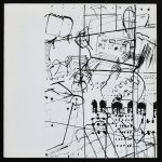
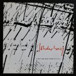
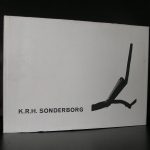
A Danish born artist where KRH stands for Kurt Rudolf Hoffmann and the Sonderborg stands for his birth town and he started to call himself KRH Sonderborg since 1951.
Sonderborg went to school in Hamburg, Germany and completed a merchant’s apprenticeship in 1939. He became a private student of the painter Ewald Becker-Carus in Hamburg in 1946. From 1947 to 1949 he studied painting, graphic art and textile design at the State Art School in Hamburg under Willem Grimm and Maria May.
Starting in 1953, he became a member of the group “Zen 49” and he went to Paris the same year where he learned engraving from Stanley William Hayter in the Atelier 17. Paris is also the place where he first encountered Tachism. In the years following the artist continued his travel and worked for some time in London, Cornwall, New York, Ascona, Rome and Paris again. While in New York, Sonderborg came into contact with Action Painting and Abstract Expressionism.
His own style is became more abstract, painting using swift, gestural strokes that reveal the painting process, with spontaneous colour application. Black and white contrasts are an important feature, later he added colours such as cadmium red.
K.R.H. Sonderborg exhibited in the 1958 Biennale in Venice. He was awarded the Prize for Graphic Art at the Biennale in Tokyo in 1960 as well as the Great International Prize for Drawing at the 1963 Biennale in Sao Paulo, Brazil.
From 1965 to 1990 Sonderborg held a post as professor of painting at the Stuttgart Art Academy. In 1969/70 he was a guest lecturer at the Minneapolis College of Art and Design, as well as at the Art Institute of Chicago in 1986.
the following Sonderborg publications are available at www.ftn-books.com
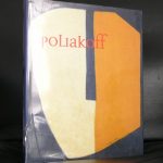
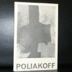
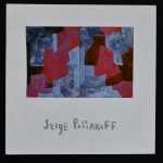
I love his art. It always reminds me of the best dutch abstract artists from the 60’s and i would not be surprised of Willem Hussem was influenced by Poliakoff’s art
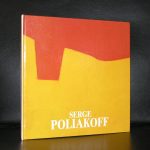
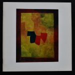
Serge Poliakoff was born in Moscow in 1906, the thirteenth of fourteen children. (Some sources claim that he was born in 1900, which in fact fits in better with his later history – 1906 would have him leaving home and earning his living as a musician at the age of 12.) His father, a Kyrgyz, supplied the army with horses that he bred himself and also owned a racing stable. His mother was heavily involved with the church, and its religious icons fascinated him. He enrolled at the Moscow School of Painting, Sculpture and Architecture, but fled Russia in 1918. He arrived in Constantinople in 1920, living off the profits from his talent as a guitarist.
He went on to pass through Sofia, Belgrade, Vienna, and Berlin before settling in Paris in 1923, all the while continuing to play in Russian cabarets. In 1929 he enrolled at the Académie de la Grande Chaumière. His paintings remained purely academic until he discovered, during his stay in London from 1935 to 1937, the abstract art and luminous colours of the Egyptian sarcophagi. It was a little afterwards that he met Wassily Kandinsky, Sonia and Robert Delaunay, and Otto Freundlich.
With these influences, Poliakoff quickly came to be considered as one of the most powerful painters of his generation. In 1947, he was trained by Jean Deyrolle in Gordes (Vaucluse region in France) amongst peers such as Gérard Schneider, Giloli, Victor Vasarely, and Jean Dewasne. By the beginning of the 1950s, he was still staying at the Old Dovecote hotel near Saint-Germain-des-Prés, which was also home to Louis Nallard and Maria Menton, and continuing to earn a reliable income by playing the balalaika.. A contract enabled him to quickly gain better financial stability.
In 1962 a room was given over to his paintings by the Venice Biennial, and Poliakoff became a French citizen in the same year. His works are now displayed in a large number of museums in Europe and New York. Poliakoff also worked with ceramics at the Manufacture nationale de Sèvres. He influenced the paintings of Arman.
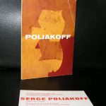
The following Poliakoff publications are available at www.ftn-books.com
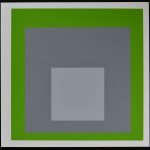
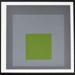
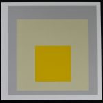
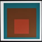
A great inspiration for Sol LeWitt and considered by many as one of the greatest artists from the 20th Century. Josef Albers is the artist I am writing about this time. In an earlier blog I explained the importance for Minimal art of Josef Albers but this time the blog is devoted solely to the great original silkscreens I am exclusively offering on eBay. The series of 4 comes from a private collector and is from 1973. The silkscreens are executed on a double sheet of paper and are exquisite in the choice of colours. Albers is the true master of matching the best colours. The composition of HOMAGE TO THE SQUARE is always the same but the choice of colours and size make you look at a different work of art the moment you see it. These original silkscreens are 8.1 x 8.1 inch and now available at eBay’s all international sites.
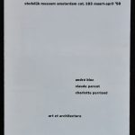
It has been a long time since i encountered the No. 183 catalogue ,published by the Stedelijk Museum in 1958. The publication is a leporello like publication which folds out and describes the contributions by three French artists. The design done by Willem Sandberg makes this one stand out and it is one of the most scarce publications by the Stedelijk Museum. The artists André Bloc, Claude Parent and Charlotte Perriand. an absolute must have for the admirers of these artists and a highly collectable item for all interested in the Stedelijk Museum publications. (now available at www.ftn-books.com)
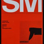
The second one is even more scarce and it is one i never have encountered before in all these years that i sell Stedelijk Museum publications. Designed by Wim Crouwel it is only a 4 page publication. Specially made for the Werkgroep Plakat Praag / Politieke affiches uit Tsjechoslowakije ( ODPOVĒDNOST)/ 1965. This is another highly desirable item for Stedelijk Museum/Crouwel collectors.
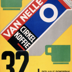
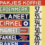
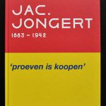
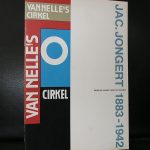
Jac ( Jacob ) Jongert is one of the classic dutch designers. It is highly likely that you once have seen a design of his , since his van NELLE box has grown into a world famous design object from the Twenties/Thirties.
It has been one of those iconic design objects executed in a style which have been of great influence to designers in the following decades. Look at the second poster and you will recognize that this typography and design elements must have influenced the POP ART designs from the Sixties.
But beside the avant garde designs there are so much more beautiful designs by Jongert and for those interested in Jongert and his design career i truly recommend the book which has been published in 2009 for the Jongert special exhibition at the Boymans van Beuningen Museum. A book which shows why Jongert is important as a designer and what is more . The book itself is one of the best and most beautiful published books which i encountered in recent years. This book is now available at www.ftn-books.com
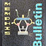
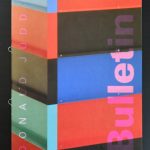
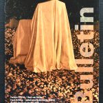
Art & Project was not the only art gallery who published a regular bulletin in the Netherlands. In 3 consecutive decades, the Stedelijk Museum Amsterdam published their Bulletin series on a regular basis. Their Bulletins were more informative and less a small piece of art. I thought they were less interesting, but now some 15 years later I have become to appreciate these Bulletin publications. Great design, very informative and always “up to date”. Over the decades some very important and highly collectable Bulletins have been published. The series consists over 400 bulletin publications among which are some true classics which are available at ww.ftn-books.com. My thought about the Bulletin series has changed over the years and I think these publications are from an art point of view important. They show the exhibitions which were held over the years and include some of the best art ever. For me the following Bulletins can not be missed in any serious art book collection: Ben, Memphis, Keith Haring on the Velum, Donald Judd, Sol LeWitt on his drawings. This is to name just a few……..
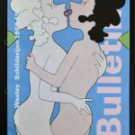
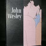
John Wesley is considered to be a Pop Art artist, however, I am in doubt because many of his qualities are timeless and are much more graphic than the 100% pop art paintings. I knew Wesly from his retrospective at the Stedelijk Museum in 1993, but what I did not realise was that many of his works have an erotic contents. I did a Google search and found many examples of nudity that were presented in great graphic paintings and prints. I am not the only person who thinks about his works in such a way.
John Wesley is a contemporary American painter. Characterized by his uniquely graphic, flattened Pop paintings, Wesley’s work addresses themes of sexuality and erotica through stylized and symmetrically composed images. Rendered in distinctive pink and blue pastel hues, Wesley repeats the same graphic symbolic images in tessellation-like patterns on his large canvases, and regularly employs leitmotifs like pornography and avian fowl—often to humorous effect—throughout his oeuvre. Though his paintings are reminiscent of his contemporary Tom Wesselmann, his personal associations were with peers Dan Flavin and Donald Judd, and he was inspired by both the Minimalist and Surrealist movements. That being said, “I didn’t go out and try to be a Surrealist,” Wesley explained of his ambiguous imagery. “It was just fun doing what I was doing.” Born on November 25, 1928 in Los Angeles, CA, he was a self-taught artist who worked for several years an illustrator for the avian industry. His work has been critically acclaimed throughout his career, and he has been the subject of several retrospectives, notably including at the PS1 Contemporary Art Center in New York in 2000.
The following publications are available at www.ftn-books.com
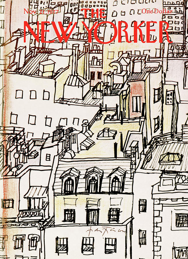
Born Rumanian, but living for most of his life in France. From the early Fifties on, France had a very lively comic art scene. This surely has been an influence since his cartoon-like drawings were strongly rooted in this kind of art in France BD / Bandes Dessinees) became increasingly popular and so did the art by André François. This was picked up by Willem Sandberg who curated an exhibition on André François in 1966. Catalogue design by Wim Crouwl makes this one of my personal favourite catalogues from the Sixties. the article below was published in the Guardian some years ago…..and of course www.ftn-books.com has the 1966 Stedelijk Museum catalogue available.
André François born André Farkas in 1915 was an illustrator known for his satirical cartoons and comics. He was born in Romania and but eventually moved to Paris. He was a left-wing Jewish and during WWII he hid away from the Germans, and after the war moved to Grisy-les-Plâtres where he eventually passed away in 2005 after a long successful career.
Francois took his early inspiration from the Art Deco movement and the renowned illustrator A.M. Cassandre. When he moved to Paris he actually studied under Cassandre for some time.
He worked in many satirical publications in France and also in American publications like the New Yorker, Vogue, Holiday and Sports Illustrated. Beyond magazines he also worked in the realm of children’s book illustration, adult content illustration and within the advertising industry (as many illustrators of the time did). In advertising he often created visual puns usually. This usually involved turning inanimate objects into human forms as well as the opposite.
He became known in Paris for the sense of humour in his work, which he primarily completed in crude black and white ink drawings, with the occasional injection of vibrant colour. He became well-known and sought after by art directors in America after he published several anthologies of his cartoon work titled “The Penguin André François”, “The Tattooed Sailor and Other Cartoons From France” and “The Half-Naked Knight”. His obituary published in the New York Times describes his style perfectly: “François’ crude but sensual black-and-white brush drawings and starkly colored paintings, employing surreal and ironic juxtapositions, introduced serious whimsy to conservative commercial art. He also injected a comedic eroticism that broke various taboos.”
At the age of 86, his house underwent a terrible house fire and he lost almost all of his work. His friends report that he wanted to create a completely new set of work to replace that which was lost. In 2005 he died from heart and kidney failure.
What drew me to François’ work is the looseness and simplicity. It reminds me of another contemporary illustrator who I love named Manddy Wyckens. It also reminds me of the illustrations done by Jean-Jacques Sempé for the children’s comic Petit Nicolas. What I love about François’ work is that he doesn’t just create cute, or beautiful images, he is always saying something. While he aims to convey a message, he also doesn’t give the audience all of the puzzle pieces. Sometimes it takes a little longer to understand what the illustration means but when you understand it, it’s all the more rewarding.
I think part of the reason I’m attracted to his work is that I can relate to it as I feel that I am always trying to say something with my work, but often the results are crude drawings and paintings.
The looseness and simplicity is also something I love about his work. Being able to communicate a message with a style that seems effortless is commendable. Looseness and simplicity is something I would love to learn how to use in my own work so I will be sure to look to André François for future inspiration.
Artist/ Author: Oliver Boberg
Title : Memorial
Publisher: Oliver Boberg
Measurements: Frame measures 51 x 42 cm. original C print is 35 x 25 cm.
Condition: mint
signed by Oliver Boberg in pen and numbered 14/20 from an edition of 20