Posted on Leave a comment

Two different Malevitch titles

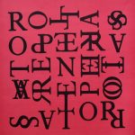
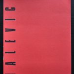
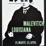
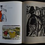
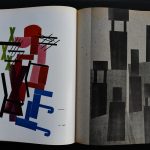
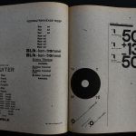
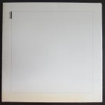
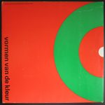
On a recent book market visit i found 2 totally different publications on the same artist. Malevich being the subject it occurred to me that there was a great difference between both publications. One rather modern with the emphasize on his early works proved that the interest in his early works was not there from the early beginning. The other being earlier…. a Louisiana / Denmark Museum publication from 1959. Shows the influence of Willem Sandberg in its catalogue design and its approach is totally different. Only a few early works are depicted and the focus is on his Suprematist works, which were being discovered as highly important in those days. The ultimate “BLACK SQUARE” being the final result of his search in constructivist painting.

Schermafbeelding 2019-10-14 om 14.26.16

These and other great Malevitch publications are available at www.ftn-books.com

Posted on Leave a comment

Willem Sandberg a 1961 publication

Schermafbeelding 2019-09-09 om 10.45.14

Willem Sandberg has designed many publication for the Stedelijk Museum. Starting as early as 1939 until in the early 60’s he finished designing publications for the Stedelijk and Wim Crouwel took over this task. In those 25 years he rarely made a large sized publication. This book is the exception. In collaboration with Meulenhoff publishers the Stedelijk Museum published its highlights and asked Sandberg to be the designer. A Large sized book of 12.1 x 10.6 inches  containing over 200 pages, linnen bound with dustcover. Sandberg took the typical elements ( use of multiple sorts of paper) of his Stedelijk designs and incorporated these in his own way into this much larger publication. The extra size makes the art even more impressive.

stedelijk kunst heden c

This book is now for sale at http://www.ftn-books.com and has been included in the ever expanding inventory of Stedelijk Museum catalogues. I know that sometimes these emerge and come to the market, but i rarely have seen one at a reasonable price. This one, includes the dustcover, which is almost every time missing ans it is now for sale. A Willem Sandberg masterpiece which has been under valued for far too long.

Posted on Leave a comment

A tribute to Cor Rosbeek ( 1944-2019 )

Schermafbeelding 2019-07-16 om 14.29.57

Recently one of the driving forces in the dutch museum publications world died. I remember Cor Rosbeek as one of the most gifted of all printers in Europe. On those occasions that we met professionally he came up with practical solutions and had always in mind the quality of the finished product.

Schermafbeelding 2019-07-16 om 14.30.15

He made the impossible possible with a printing press and found solutions for the product that were thought to be impossible to realize. One of his best publications was the Diary of Anne Frank for which he made the facsimile reprint. Cor Rosbeek was a printing genius and realized many beautiful publications with the greatest of practically all (dutch) designers. His series of Rosbeek publications is known all over the world. In these publications everything comes together….great design, typography, layout, choice of papers and subject make these publications a monument for Cor Rosbeek. Some of these highly collectable publications are available at www.ftn-books.com


Posted on Leave a comment

Wim Crouwel and DE VOLKSKRANT


Schermafbeelding-2019-09-22-om-09.28.00.png

Wim Crouwel passed away some days ago and since, a great number of articles have been published on his life and accomplishments as a designer. His works will prove to be highly important for designers all over the world in the future and DE VOLKSKRANT ( one of the most important newspapers in the Netherlands) recognized that fact and devoted  a 2 page article on Crouwel in their Saturday paper. It is only on rare occasions that such a long and detailed article is published on just one person. Wim Crouwel and his works prove to be that important. The article can be found on the internet here (dutch)

https://www.volkskrant.nl/mensen/wim-crouwel-hoeder-van-het-functionele-ontwerp-en-een-onverzettelijke-rechtlegger~bf53fa62/

Posted on Leave a comment

Wim Crouwel (1928-2019)

Schermafbeelding 2019-09-20 om 08.21.59

This morning i heard that one of the most influential designers from our time, Wim Crouwel, has died. The last years of his life he suffered Parkinson disease, but he was still going strong and must have looked forward to the retrospective of his works being opened later this  month at the Stedelijk Museum Amsterdam. What better way to commemorate this great artist than to show a selection of the many items designed by him. www.ftn-books.com

OLYMPUS DIGITAL CAMERA

And to finish one of my personal favorites. Wim Crouwel will be an example for many designers in the decades to comewerkman crouwel aa.


Posted on Leave a comment

A rare Wim Crouwel designed publication.

Schermafbeelding 2019-05-31 om 15.29.32

Most of the people who admire the designs by Wim Crouwel, know that at one time he designed a series of stamps for the PTT ( the postal service in the Netherlands) The series of stamps was widely used and became famous for being functional and still having a great design.

Schermafbeelding 2019-05-31 om 15.26.43

Because the series was widely used and succesfull, Crouwel was asked to design the book on the publication of the stamps of 1977. This has become a typical Wim Crouwel publication. The book is smaller than usual, but one can recognize the Crouwel Lay-out of the pages. The editions of these “YEARBOOKS” were small and after inquiring i heard the number of 1000 copies. Of these many will have be destroyed or were lost and this is a ncie chance to add this to your Crouwel collection. Available at www.ftn-books.com

Posted on Leave a comment

Jack B. Yeats (1871-1957)

Schermafbeelding 2019-04-25 om 17.03.55

Never heard of Yeats as a painter, until Rudi Fuchs curated an exhibition with his paintings at the Haags Gemeentemuseum and it was a nice surprise. His painting is spontane , a little childish and impressionistic at the same time and thus resulting in a painting what is typical for Yeats with a signature of its own. The exhibition was not that large and i remember that the sizes of the paintings were not that large too.

Schermafbeelding 2019-04-25 om 17.05.31

What i do remember was the excellent catalogue Gracia Lebbink designed with the exhibition. It was one of her first lareg catalogues she made for the Gemeentemuseum but it has proven to be a classic and available at www.ftn-books.com

yeats

Posted on Leave a comment

Stuttgarter Hefte IIII… also in the Moma collection

stuttgarter a

I am proud to have finally found one of these iconic publications by the Staatliche Kunstgewerbeschule Stuttgart. It was a lucky find, but still one i have been looking for for for many many years in the past. The location was secret for many years because it was protected by another book which i recently had bought and which is roughly from the same date. It must have been the former owner who knew its value and wanted to protect the precious publication. These Stuttgarter Hefte were published in only 400 copies in the mid Twenties and printed in the printing rooms of the Kunstgewerbeschule. Everything is special about these publications. Sizes are far larger than usual. The lay out is impressive and the designs are true avant-garde for those years. This one was printed in 1926 and as said in an edition of only 400 copies. I am sure that only a few have survived over the years and most of these have found new owners or are in important libraries. I found the set being a part of the MOMA collection and when i tried to find other copies on the internet….. i found as expected…. ZERO of them. Now this excellent copy is for sale. On a scale of 1 to 10 i would rate this one at 8+ points

Pictures tell a better story so here are some of the pages an designs of this truly remarkable publication.

Posted on Leave a comment

Lettering by Modern Artists

The above title is the same title as the exhibition held at the Museum of Modern Art in 1966. I recently acquired this catalogue which is now for sale at www.ftn-books.com and for me it makes clear the importance Modern Artists have for Modern typography. this is not the printed letter, but the much more free and personal lettering by artists on paper and canvas, making this a source of inspiration for modern typographers and designers and it shows clearly the way lettering can be used to make a splendid composition and be informative at the same time. A catalogue i can truly recommend.

lettering

Posted on Leave a comment

Josua Reichert…5 additions

Schermafbeelding 2019-05-27 om 08.13.05

It took me a while, but finally i purchased the small and interesting collection of Josua Reichert prints/posters i had my eye on. It contains 2 of his best and signed lino cut prints and 3 Museum publications from the Sixties. The one i want to point out is the one Reichert specially made for the Werkman exhibition in Baden-Baden. Two print masters united in one print makes this very special to me and shows the genius and complexity Reichert could realize with prints. all prints are available at www.ftn-books.com

reichert werkman a