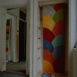
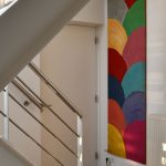
There is a work by Piet Dirkx that has been with me as long as i know it existed. I first have seen this long multi colored wax painting in Piet’s studio. Later i noticed the same work being a part of BIOTOOP and after our purchase it was one of our favorite works by Piet on our Sijzenlaan location and now, it is still “going strong” as our entrance work of art. The painting has been a part of our lives for nearly 30 years now. Long live ” MUSIQUE ORIGINALE ”
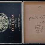
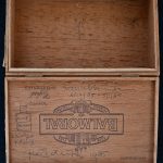
This week i am making up for an incomplete blog . I just noticed that to make the story on last weeks blog complete i had to add the photographs of the inner sides of both objects which were on show in the Piet Dirkx exhibition at the van Abbemuseum in 1985. Pier had indicated on the inside of both boxes in what way both had to be combined and showed. So to make the story complete here are both insides.
One of the two recent editions was an object by Piet Dirkx which figured in the van Abbemuseum exhibition of 1985. With tnis exhibition a small catalogue in an edition of 500 copies was publihed. This catalogue is available at www.ftn-books.com
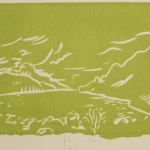
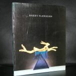
Barry Flanagan, a protege of Rudi Fuchs, presented this artist at different venues on several occasions. The van Abbemuseum and the Stedelijk Museum among them. This way creating a platform for this artist who, after the exhibitions in dutch museums , could count on a loyal following of admirers. He began his career as a minimalist working in folded cloth, but later became Britain’s best-known and most controversial modernist, internationally renowned for his colossal bronze figures of leaping hares.
That said i personally am impressed with his small scale art. His drawings, linocuts and lithographs are like dreamlike landscapes with an abstract twist and bright colors, making these far more intimate. For us in the Netherlands it is still hard to find the nice publications published on this artist, because the edition size was on all occasions “small”. Less than 1000 copies were produced of his catalogue of which most part was over the years destroyed. His following may be loyal and admiring, but it is too small too sell a complete edition of his art catalogues. www.ftn-books.com has some Flanagan titles available.
It was a necessary step to make the site more accessible, so i changed the lay-out made it much more clear for all visitors to find their way among the 8000+ items that are for sale at www.ftn-books.com.
The result a clean and pleasing site in a blue and creme color scheme. Pleasing to the eye, with a great search engine to find those titltes you are looking for . Please take a look at www.ftn-books.com and when you order use the discount code: FTNnew (10% discount on all items), which is valid until the 6th of February 2019.
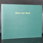
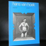
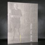
Hans van Hoek, a typical dutch artist who’s work is rooted in the classical approach to painting. You can recognize parts by Rubens and Cezanne in his painting but overall it is typical Hans Van Hoek. Look closely and you can distinguish figures…from a distance it is different and it is almost like looking at an abstract painting.
van Hoek was a very well known and appreciated painter in the Netherlands and he had his exhibitions in the large museums over here. Stedelijk Museum and van Abbemuseum had their exhibitions with this great artist, but people lost interest in his works when he decided to move to South Africa where he stayed in Barrydale for a period of 12 years. In 2008 he returned to the Netherlands and he had to build his reputation as an artist once again, but somehow he has lost momentum in the period he stayed in South AFrica because when he left he was a welll appreciated and colelcted artist and recently i encountered work by van Hoek at auction for prices as low as euro 600,–
Hans van Hoek will prove to be important in the near future so i can only recommend his works to be collected. www.ftn-books.com has some nice hans van Hoek publications available.
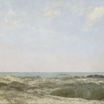
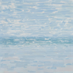
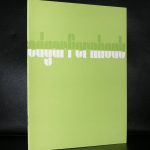
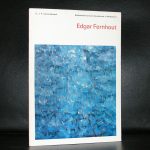
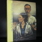
Edgar Fernhout comes from an interesting background. His grandfather was Jan Toorop and his mother Charley Toorop. This meant he was raised among artists and writers. An inspiring surroundings in which art took centre stage. He specially moved to Bergen after the divorce of his mother , where his grandfather has built the house/studio de VLERKEN specially for the family of his daughter to raise her children and create her own works of art. The interesting part of Fernhout for me personally was his transition from realism into abstract art. Fernhout being one of the first in the Netherland together with M0ndrian to discover abstract art as a genre.
the other aspect i like of his history is that when he received his first large museum presentation in the Netherlands at the van Abbemuseum , the catalogue with exhibition was designed by Wim Crouwel. This being one of the first publications he made for a large museum in the Netherlands. This catalogue is of course available at www.ftn-books.com
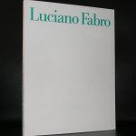
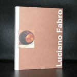
Luciano Fabro…an italian artist rooted in the ARTE POVERA and perhaps a little bit forgotten nowadays.
But Fabro stays very imortant for Modern Art, since his works are very much in line with other great artist from that era. Castellani and Manzoni were of great influence to him and in 1958, after he saw Lucio Fontana’s work at Venice Biennale, Fabro moved to Milan where he spent the rest of his life pursuing his artistic career.
Fabro was involved in the Arte Povera group, which was interested in experimenting with industrial and natural materials, focusing on process, language and the body. Fabro’s best known works were sculptural reliefs of Italy made out of glass, steel, bronze, gold and even soft leather. The signature unorthodox, ‘poor’ materials in his works include steel tubes, cloth, newspapers, and wax; the artist, however, often used also traditional and expensive art materials such as gold, marble, and bronze. At the height of the ARTE POVERA group, the Boymans van Beuningen Museum organized and exhibition with the works by Luciano Fabro and after this exhibition other exhibitions followed in the Netherlands. The catalogue is available at www.ftn-books.com
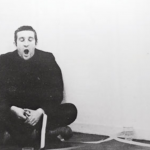
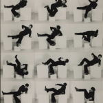
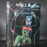
It took me decades to discover the art of Bruce McLean. A typical Sixties artist who started with performances and now ends his career with HUGE paintings. In between …… an abundance of works of which the large canvasses i appreciate most.
An original and personal style of painting . …the result…. recognizable paintings. I looked up the artist Bruce McLean and found that his paintings are still on the verge of affordable to wealthy private collectors and maybe now is the time to start looking and finding a beautiful McLean painting for your collection?
Bruce McLean is a Scottish sculptor, performance artist, filmmaker and painter. He studied at the Glasgow School of Art from 1961 to 1963, and from 1963 to 1966 at St. Martin’s School of Art, London, where he and others rebelled against what appeared to be the formalist academicism of his teachers, including Anthony Caro and Phillip King. In 1965 he abandoned conventional studio production in favour of impermanent sculptures using materials such as water, along with performances of a generally satirical nature directed against the art world. When in 1972 he was offered an exhibition at the Tate Gallery, he opted for a ‘retrospective’ he titled “King for a Day” which lasted only one day. From the mid 1970s, while continuing to mount occasional performances, McLean has turned increasingly to painting/sculpture and film work. In 1985, McLean won the John Moores Painting Prize. Since retiring from his professorship of painting at the Slade School of Art, he has taken on a large studio in west London where he has been making increasingly large paintings and sculptural film works.
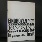
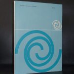
Before Wim Crouwel became the main designer for all publications published by the Stedelijk Museum Amsterdam in in the 60’s, 70’s and early Eighties (TD). There was a short 4 years that he made some beautiful publications for the van Abbemuseum Eindhoven. In these you can recognize the early Wim Crouwel. Size, use of multiple ( colored) papers, typography and layout are all typical for the early Wim Crouwel. www.ftn-books.com is fortunate to have a nice selection of these early WimCrouwel designed publications. Pictures tell a better story than words can . In this case , this certainly true. So here are some nice van Abbemuseum publications by Wim Crouwel.
Artist/ Author: Oliver Boberg
Title : Memorial
Publisher: Oliver Boberg
Measurements: Frame measures 51 x 42 cm. original C print is 35 x 25 cm.
Condition: mint
signed by Oliver Boberg in pen and numbered 14/20 from an edition of 20