Posted on Leave a comment

Lion Cachet ( 1864-1945)

Schermafbeelding 2019-08-30 om 15.31.53

C.A. Lion Cachet (1864-1945) is considered, together with G.W. Dijsselhof and Th. Nieuwenhuis, as pioneer of the Dutch Art Nouveau. He introduced a completely new visual language of forms, font styles and patterns. One of the things he introduced was the batik technique from Indonesia that he experimented with. His style was almost un-Dutch because of his preference for labour-intensive techniques and luxurious materials.

Schermafbeelding 2019-08-30 om 15.32.36

Lion Cachet worked as a teacher before he developed himself as a decorative artist in 1890. He decorated a large variety of objects, among them books, jewellery, furniture and posters. Besides this he worked on Gesamtkunstwerken. An example of this was the commission from StoomvaartMaatschappij Nederland (‘Netherlands Steamship Company’) to design the interiors of the passenger ships. Additionally, he was co-founder of Wendingen, an art magazine in the Netherlands that advocated the Amsterdamse School style.

www.ftn-books.com has a beautful publication on Lion Cachet, Nieuwenhuis and Dijsselhof now available . Sublime in every aspect. printing design  and an edition size of only 500 copies


Posted on Leave a comment

Ania Bien (1946)

Schermafbeelding 2019-08-28 om 16.27.07

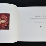
At first glance i thought i had a book by Christian Boltanski, but…..studying it more closely i soon noticed that it was by Ania Bien. There are so many similarities between the two artists. Th Holocaust is a central theme within their oeuvre and both approach this theme in a very direct and personal way. They make a kind of art that makes you think and reflect.

Ania Bien (born 1946) is an American photographer.Born in Kraków, Poland, to Polish-Jewish parents, she moved to the United States in 1958, where she studied painting and cultural anthropology. Since 1973 she has lived in Amsterdam.

bien hotel polen

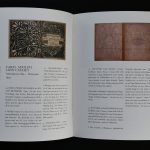
One of Ania’s early projects, Hotel Polen ( available at www.ftn-books.com), referred to the Hotel Polen fire (which became “part of Bien’s wider theme of destruction”) in Amsterdam, 1977, and established her reputation in Dutch art circles. The collection of photographs illustrated a hotel before World War II, showcasing the relative luxury of middle-class travel in Europe, but objects in the photographs associated with the Holocaust indicate that this was a “doomed” way of life. She fabricated 18 replicas of the hotel’s menu stands, and used them to display the photographs. David Levi-Strauss wrote that Bien’s art piece is a “polysemous work of absence, in which what happens between images is the most important.” The work was displayed at the San Francisco Museum of Modern Art in 1987 and at the Amsterdams Historisch Museum in 1988.

Some of Bien’s work is concerned with Franz Kafka; one of her photographs has her place her hand on a portrait of Kafka’s, in response to a note he wrote in 1924 to Dora Diamant, “Place your hand on my forehead for a moment, so I can gain courage.” Her 1989 installation Past Perfect asked “what would have happened had [Kafka] not died in 1924, but instead had come as a refugee to America in the late ’30s.” It gained her international recognition, and was also shown in Jerusalem.

Bien is interested in war, discrimination, and the plight of refugees. She contributed photographs from a centre for asylum seekers in Haarlem to a 1994 book on refugee children in such centers in the Netherlands, Ontheemde kinderen.

She has also exhibited at Portfolio Gallery in Edinburgh, Scotland, and the Joods Historisch Museum in Amsterdam.

Posted on Leave a comment

Piet Dirkx weekly

CBK kunstuitleen made this card for the 1999 Piet Dirkx exhibition:

” My heart leaps up when I behold a rainbow in the sky”

The picture is the Flat at the Jan Vermeerstraat in Venlo

dirkx gevel

Posted on Leave a comment

Friedrich Vordemberge-Gildewart (1899-1962)

Schermafbeelding 2019-08-13 om 13.28.51

Beside the spectacular constructivist paintings Friedrich Vordemberg-Gildewart made, there is another aspect in his art life what made him special and important. FVG was the first artist who made abstract paintings throughout his entire career. At first glance his work is related to Mondriaan, de Stijl and Malewich, but look at it more careful and you notice that there is mus more space within the paintings. A way of painting which makes the painting seem less crowded. It is the way i like a painting to intrigue

OLYMPUS DIGITAL CAMERA

Friedrich Vordemberge-Gildewart was born in Osnabrück, Germany and studied architecture, interior design and sculpture at Hanover School of Art and the Technical College, Hanover. In 1924 he formed the abstract art group Gruppe K in Hanover with Hans Nitzschke and joined Der Sturm in Berlin. After meeting Theo van Doesburg, Kurt Schwitters and Hans Arp, he became a member of De Stijl in 1925. Together with Kurt Schwitters and Carl Buchheister he formed the ‘Abstrakten Hannover’ group in 1927. He was a member of a number of other artistic groups including: the Cercle et Carré, 1930, Paris and was a founding member of Abstraction-Création (1931), also in Paris. In 1937, in Munich, the Nazi regime exposed his works in the infamous Degenerate Art exhibition. Most of his works were confiscated and he was forced to leave Germany for the Netherlands.

there is a very special Bottrop publication from 1980 available at www.ftn-books.com, which contains 3 silkscreen prints by FVG.

Posted on Leave a comment

Nico Diemer designer for the Filmmuseum Cinematheek

I never had heard of Nico Diemer, but a few weeks ago i bought a stack of Seventies Filmmuseum/ Cinemateek publications . All of these had intriguing covers and showed a lot of design quality. I searched on the internet and tried to find more information on this graphic designer, but found nothing at all and i concluded that mr. Diemer was an amateur designer and must have been part of the staff in the early years of the “Filmmuseum Cinemateek” in Amsterdam. But just take a look at these covers and conclude for yourself that they have a quality of their own. The relation between graphic design and Cinema is obvious and highly recognizable.

Posted on Leave a comment

Cor van Dijk (1952)

Schermafbeelding 2019-12-23 om 14.45.07

It took me along time to fianally appreciate the sculptures by van Dijk. At first i thought them to be too much copies of Judd sculptures, but i discovered them to be completely different. Why….surface , composition and construction differ from the one by Donald Judd. Still i consider his sculptures to be Minimal art and not constructivist.


He was  born in 1952 in Pernis, is a Dutch artist. The steel sculptures of Cor van Dijk are characterised by clear lines and geometric shapes. From first stages of their design, the material used for these works – steel – and their realisation are inextricably linked. To create his work, the artist uses separate sheets of solid steel, which he joins together with extreme precision. Van Dijk bases the dimensions of his sculptures on the standard gauge of the sheet metal. As a result, the mill scale found on the rolled steel is left intact in the finished works.

Viewing Van Dijk’s sculptures, one’s eyes constantly move across their surface and one’s attention keeps shifting from areas of open space to sections that take up space. The seams between the different segments play a key role in the works, since they lend a sense of scale to the mass of steel and define its different volumes. The artist strives to show interior space – its layout, possible compartments, the spaces between the segments and the massive quality of the steel itself. The different dimensions all interact with one another. Ultimately, this is also what gives the sculptures their specific presence: the precise handling of volumes and the perfect connection of individual sections in space. Each newly-realised concept is intended to bring even greater clarity to the context of the preceding work – while also pointing ahead, suggesting new concepts that are still waiting to be developed.

Van Dijk’s most recent sculptures comprise a single segment. The location of the open space and its dimensions determine the scale of the work as a whole. The result is an object in which mass (matter) and open space interact more intensively than ever before. In technical terms, the steel used for the sculptures shows no traces of machining or processing. Thanks to their mass, the open space and the interaction of these two elements, these tranquil objects seem to speak directly to the viewer.

www.ftn-books.com has the monograph on van Dijk now for sale

cor van dijk

Posted on Leave a comment

Teun Hocks (1947)

Schermafbeelding 2019-12-22 om 14.23.58

Teun Hocks. Is it staged photography or is it painting on photographs. It is a combination of both and the result is always absurd. Like Magritte he sketches a scene which is impossible , but pushes you to discover the meaning of the composition and look for the sabsurd and surreal in the painting/photograph. Hocks has build an oeuvre with these compositions and always plays a part in them.

He is an artist who creates self portraits with the utmost charm. “In my images I aim to achieve not so much, offering a mirror sometimes, or/and gaining a smile, and maybe a good feeling,” Teun tells It’s Nice That. This is a refreshingly humble aim, and one that is achieved with heart-warming artworks despite their surrealist edge.

The artworks featured are each part of Teun’s Analogue Works painted pieces that are the result of a thorough process from the artist. “First I start out with almost no ideas, or vague ones, drawing thoughts I have about all kinds of situations that get me dreaming.” The artist explains that once he is settled upon a concept, “I build and paint a setting, checking and controlling everything by taking digital photos to compare to my drawings”.

Next, once a desired light is found, “I take my place, and start to take polaroids (using a self-timer and longer cable release). If I am satisfied with the result I take eight photos on 6×9cm black and white film. Looking at the contact sheet, I decide which negative is the one to print. If not I start all over again.” This extensive process doesn’t stop there either. “I make three large black and white prints on fibre-based photographic paper, tone them to sepia, glue them on aluminium and start to colour them with transparent oil paint.”

The result of Teun’s perfectionism is a series of artworks that leave the viewer bewildered. Are they paintings? Are they photographs? The answer as the artist explains is both, and his ability to merge the mediums flawlessly is brilliantly baffling.


Posted on Leave a comment

Barend Blankert ( 1941 )

Schermafbeelding 2019-12-22 om 13.09.43

Barend Blankert excels in realism with a twist. In some cases his works remind me of  Teun Hocks ( tomorrows blog) , but most of the time one feels an “unease” in the scene. Wether the object/person is curled up on the floor, on the edge of a bed or crouching at a table. You feel a pity for the person in the painting. Blankert does not hesitate to refer to other painters in his paintings. There is this great example of the two boys in the Seurat painting BAIGNEURS A ASNIERES (in the National gallery collection). The two boys in the Blankert painting are exact copies of the ones in the Seurat painting, but where the painting by Seurat is crowded by others. The two boys are alone in an empty room, making the scene a sad one.

Schermafbeelding 2019-12-22 om 13.03.19

DSC_3867blankert b

Still his works are worthwhile to look at and timeless. Barend Blankert is represented by galerie Mokum. The  Blankert monograph is available at www.ftn-books.com

Posted on Leave a comment

Tiong Ang (1961)

Schermafbeelding 2019-12-22 om 12.36.51

The work of TIONG ANG spans a wide array of media, from collective performance, experimental film, through video and installation to painting, photography, and the display of objects. His practice across these forms centers around the social, emotional and existential consequences and negotiation of dislocation, disparate identities, and dispersion of imagery. _ Recurring themes are the impact of mass and digital media on individual perspective and collective memory, and the anxieties evoked by mobility and globalization. In these hybrid contexts, Ang addresses multiple modes of human presence and representation, using social intervention and juxtaposition, chance and communality, mockery and disguise. He explores subjective positions in divided, ambivalent, and collective conditions, be it on ethical, ethnic, or sociopolitical grounds. _Initially an object/painting based studio artist, from the mid-1990s Ang has expanded his production including experimental film, performative and relational enactments, interdisciplinary collaborations and curated projects. In a divergent practice, he examines authority and sustainability of images and narratives. The common thread in the work is the conflict between detached objectivity and engaged subjectivity; it demonstrates how universal media not only affect our perceptions of places and events but also denote our concept of reality. Elements of selfhood, cultural meaning, and social absorption have emerged in a diversity of mediated images. Thus, human perception and behaviour converge in complexities of disparate truths. The persona of the artist, distorted by media based projections, is the ultimate body to explore the human experience.

The above text comes from the Tiong Ang site.

www.ftn-books.com has recently added 2 important Tiong Ang publications to its inventory.

Posted on Leave a comment

2x Borek Sipek and 2x Erwin Olaf

sipek olaf aa

Why another blog on Erwin Olaf? This one is on the occasion of the addition of the book BOREK SIPEK / Glas Design Architectuur in which a series of photographs by Erwin Olaf with works by Sipek is published . Almost the exact series was used before. The series was made on location with gypsies holding glas and design by Sipek and photographed by Erwin Olaf for the Stedelijk Museum exhibition and publication which was designed by Irma Boom ( Book on the left/private collection). The addition to my inventory is the book published by the Drents Museum, which contains 8 color photographs by Erwin Olaf together with the Anton Corbijn cover. This makes the book a true collectors item since these photo’s are among the best Olaf ever made.

sipek olaf cc

When you study both series ( Stedelijk Museum and Drents museum), at first you think the photographs are the same , but study them closely and you will notice some subtil differences. I conclude that Erwin Olaf must have made shortly after each other two series. One in Black and white, the other in color.

sipek olaf bb

Using 2 cameras this must have been technically possible. Just look at the position of the hand of the gypsy boy. The book published for the Drents Museum is now for sale at www.ftn-books.com