Posted on Leave a comment

Gabriel Orozco (1955)

Schermafbeelding 2017-08-28 om 14.21.21

Yes ….it takes time to appreciate the works by Gabriel Orozco, but fortunately we have had the chance to experience his works on several occasions including the exhibition at the Stedelijk Museum Amsterdam. He is widely regarded as one of the most influential contemporary artists of his generation. Employing a diverse practice that includes installation, sculpture, painting, and video, Orozco’s work is characterized by its focus on reinterpreting everyday objects: in his seminal La DS (1993), the artist cuts out the middle third of a Citroën car, resulting in an object that is at once familiar and totally alien. “What is most important is not so much what people see in the gallery or the museum,” he has said, “but what people see after looking at these things, how they confront reality again.” Born on April 27, 1962 in Jalapa, Veracruz, his father was the Mexican muralist Mario Orozco Rivera. Through him, the younger Orozco was exposed to the world of galleries and artists at a young age, and he went on to study at the Circulo de Bellas Artes in Madrid. He has been the subject of several major exhibitions, notably including a 2009 mid-career retrospective at The Museum of Modern Art in New York which went on to travel to the Kunstmuseum Basel, the Centre Pompidou in Paris, and finally the Tate Modern in London in 2011.

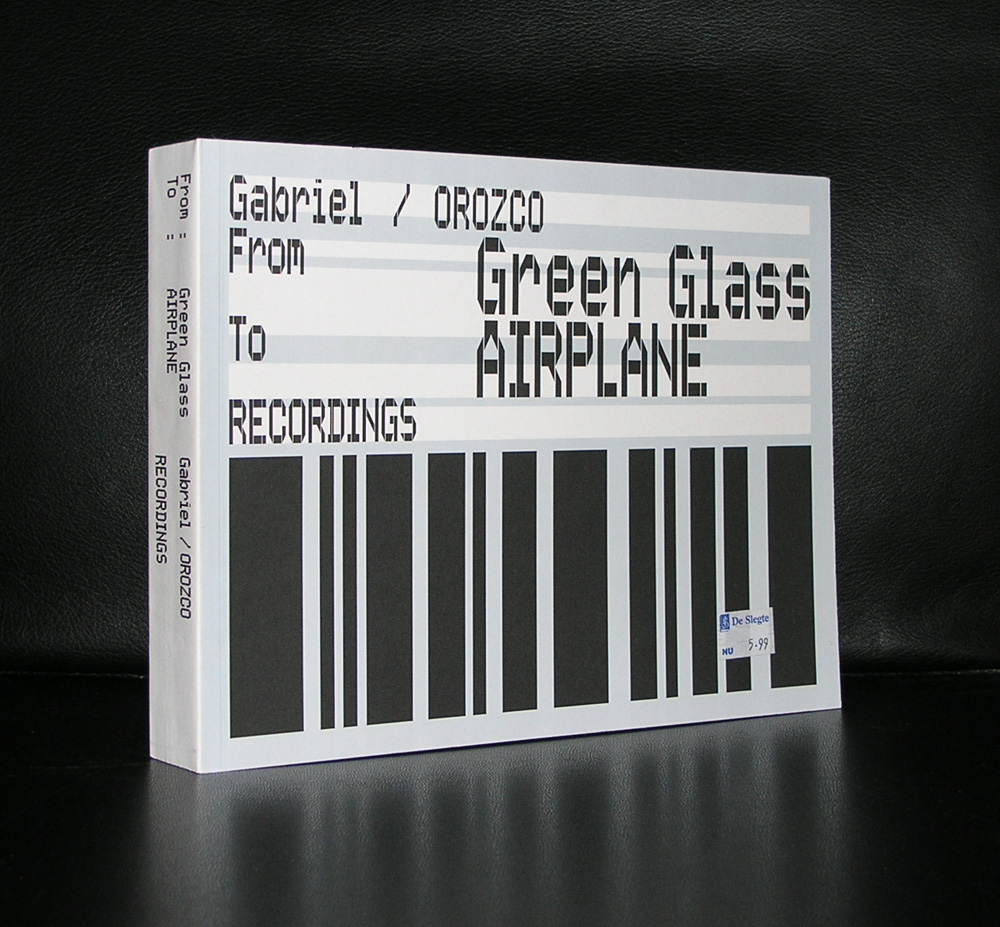
Only one monographic publications on Orozco is available at www.ftn-books.com, but his importance is growing every year and he has participated in some major exhibitions which catalogues are available too.


Posted on Leave a comment

Ulrich Rückriem (1938)… a rectangular work

Schermafbeelding 2017-08-25 om 08.56.42

It must have been in the mid nineties and because of my contact with Jan Jongepier, who worked for Drukkerij Lecturis, i was proposed to acquire some works for my personal collection. It were the works artists used for a partial payment of the printers services and were now for sale. One of them was a rectangular stone sculpture by Ulrich Ruckriem and ….i did not buy it. ( if i remember it well it looked something like this)

Schermafbeelding 2017-08-25 om 09.07.17

At that time i thought it to be too expensive for only 1.5 meters of stone and secondly and even more important  ..where would i put it? Both were reasons not to buy the work and now 20 years later i am sorry that i did not buy it, because now i appreciate in full the simplicity , but also the strength of Ruckriems works. The only thing that is left is that the memory is still there and every time i pick up a book from www.ftn-books.com on Ruckriem i am reminded of the work i once could have bought.

Posted on Leave a comment

Henri Cartier Bresson (1908-2004)

Schermafbeelding 2017-08-24 om 12.01.59

If ever there is a photographer who is recognized as one of the greatest ever, it is Henri Cartier Bresson. Being a Magnum photographer you can see and discover many known and unknown photographs by Henri Cartier Bresson on this site:

http://pro.magnumphotos.com/C.aspx?VP3=CMS3&VF=MAGO31_10_VForm&ERID=24KL53ZMYN

Schermafbeelding 2017-08-24 om 12.05.04

What it also shows is the power of black and white photography. It is in many cases far more authentic and beautiful than color photography and Heni Cartier Bresson proves that he is one of the most original and talented . Beautiful compositions and catching the very best important moments to make the perfect photograph.

www.ftn-books.com has some nice books on Henri Cartier Bresson , including the excellent Sandberg designed catalogue for his Stedelijk Museum exhibition in 1963.

Posted on Leave a comment

Betty Woodman (1930)

Schermafbeelding 2017-08-21 om 12.03.03

If there is one ceramist who has had an international career and exhibited all over the world it must be Betty Woodman. On several occasions she exhibited her works in the Netherlands in Museums and Galleries and i remember her exhibition from 1996 in the Stedelijk Museum Amsterdam. With this exhibition an excellent catalogue was published, which is available at www.ftn-books.com

The reason why she had such an interesting and world wide career must be found in the accessibility of her art. Bright, primary colors and abundant shapes of her ceramics make her work stand out and are very appealing for many and because of this many museums and collectors around the globe added her works to their collections. Betty Woodman ceramics can be found in ao.:

  • Museum of Fine Arts, Boston
  • Stedelijk Museum, Amsterdam
  • Denver Art Museum, Denver, CO
  • Metropolitan Museum of Art, New York
  • Musée des Arts Décoratifs, Paris
  • Museum of Modern Art, New York
  • Whitney Museum of American Art, New York
  • National Gallery of Art, Washington D.C.
  • Philadelphia Museum of Art, Philadelphia, PA
  • Victoria and Albert Museum, London
Posted on Leave a comment

John Chamberlain (1927-2011)

Schermafbeelding 2017-08-17 om 16.47.17

I was trying to write a short blog on John Chamberlain, but of course i found something far better than any short story i could write myself. Here is the start of the site i found:

John Chamberlain is known internationally for his long career of making vividly colored and vibrantly dynamic sculptures using discarded automobile parts that he twisted and welded into monumental shapes. He used the early modernist techniques of collage and assemblage at a magnified scale and he emphasized the brilliant colors of automotive paint. Chamberlain’s sculptures appeared in New York at the same time as the paintings of the Abstract Expressionists; some were his mentors and they shared a similar critical reception.

You can find the complete history on Chamberlain over here:

http://www.theartstory.org/artist-chamberlain-john.htm

and for some moving material :

and for some book titles visit www.ftn-books.com


Posted on Leave a comment

Willem Sandberg (1897-1984) typography

It is almost a year since I tipped the readers of my blog to start to collect Willem Sandberg typography. Since, i have found some interesting examples of his excellent typography which i want to present to you. For those of you who are new in reading this blog. Willem Sandberg was a designer /typographer who became director of the Stedelijk Museum Amsterdam for a very long period ( 1945-1963) who designed many of the publications during this period of time and who contacted and presented many of the most famous 20th century artists in the Stedelijk Museum. His publications are characterized by the use of plain ( carton like papers) and the lettering looks random, made out of torn papers. But these are very accurate designs. You can find many sources of information on Sandberg on the internet, but one of the best is still the site of the Stedelijk Museum Amsterdam. ( www.stedelijk.nl ). Now here are some new and old additions to the inventory of www.ftn-books.com


Posted on Leave a comment

Polish art and typography

While leafing through my documents, I noticed some very nice and interesting publications from and on Polish art and typography. These are a combination of Russian and western art and typography, making them stand out and being typical for Poland. It is the same with Japanese typography.

Schermafbeelding 2017-08-13 om 09.53.50

A style of typography of its own , but with influences from western typography and design. But back to Poland. This very unique way of design was recognized by Willem Sandberg, who organized an exhibition on Polish posters. Whenever i visit a  book) market i always pick them up , because of their appearance and some are worth collecting and selling. Take a look at www.ftn-books.com

to find some of these very nice publications.

Posted on Leave a comment

Alberto Giacometti (1901-1966) at Tate Modern

I just received by Blouin art info the announcement that a large Giacometti retrospective will be held at Tate Modern. read the Blouin article below:

Tate Modern, London presents a retrospective exhibition of works by Alberto Giacometti

Alberto Giacometti (1901-1966), celebrated sculptor, painter, and draughtsman, traced the shifting enthusiasms of European art before and after the Second World War in his remarkable career. As a Surrealist in the 1930s, he devised innovative sculptural forms, sometimes reminiscent of toys and games. As an Existentialist after the war, he led the way in creating a style that summed up the philosophy’s interests in perception, alienation, and anxiety. Although his output extends into painting and drawing, Giacometti is most famous for his sculpture. He is perhaps best remembered for his figurative works that helped make the motif of the suffering human figure a popular symbol of post-war trauma.

The exhibition reasserts Giacometti’s place alongside the likes of Matisse, Picasso, and Degas as one of the great painter-sculptors of the 20th century. Through unparalleled access to the extraordinary collection and archive of the Fondation Alberto et Annette Giacometti, Paris, this wide-ranging exhibition brings together over 250 works. It includes rarely seen plasters and drawings which have never been exhibited before and showcases the full evolution of Giacometti’s career across five decades.

The exhibition is on view through September 10, 2017 at Tate Modern, London, Bankside, London SE1 9TG, UK.

Alberto Giacometti publications are available at www.ftn-books.com


Posted on Leave a comment

Jeff Wall (1946)…coincidence or staged?

Schermafbeelding 2017-08-02 om 14.15.29

The scenes that Jeff Wall photographs look random and by chance, but reality is …..they are completely staged.

Since the 1980s, Wall  ( Born in Vancouver/Canada) has produced critically acclaimed work in the form of color transparencies backlit by fluorescent light strips and presented in lightboxes. He was one of the first artists to make photographs on a large scale. The standard lightbox was created for the primary purpose of outdoor advertising. In Wall’s work, this medium became a platform for his figurative tableaux, street scenes and interiors, landscapes and cityscapes. Wall explores themes such as the relationships between men and women and the boundary between metropolis and nature. He offers social commentary on violence and cultural miscommunication, and conjures seductive nightmarish fantasies and personal memories. These scenes provide the basis for photographic reconstructions of Wall’s experience. They derive their inherent suspense from a combination of extreme realism and sometimes elaborate artifice.

www.ftn-books.com has some important publications by Jeff Wall available.


Posted on Leave a comment

Rene Daniels (1950)

Schermafbeelding 2017-08-01 om 10.03.40

His first exhibition was in Dusseldorf in 1977, but he nver joined the NEUE WILDEN . A group of painters who were in vogue in those days. He felt himself more comfortable when compared with painters like Broodthaers and Picabia, who had an extra layer in their paintings.

His paintings look abstract, but when you study them in more detail you see that they are a complete abstract reproduction of reality. . Piccadilly/London, WTC New York and old houses in Gent can all be distinguished when you look long enough at the paintings.

The paintings look simple, but in reality they are very thought over and are complex and typical Daniels.

Rene Daniels has not had a long career …in 1987 he had a stroke and because of that had to finish his career at that moment as a painter. Since 2006 he paints again , but his style and approach to painting has changed, because of his motor skills are far less than before. But what he made in that very short period of nearly 10 years is of the highest quality and the museums that have work by Daniels should feel lucky to have it in their collections. You can find work(s) by Daniels in the collections of a.o. the van Abbemuseum, Gemeentemuseum Den Haag, Stedelijk Museum, Dordrechts Museum, Groninger Museum and Bonnefanten Museum

and of course www.ftn-books.com has some nice titles on the artist

( and search on the site to find more Rene Daniels contributions to group exhibitions in which he participated)