Because i get notified by Pinterest which items are shared and saved, i found out that this is one of the most appreciated photographs of all publications on www.ftn-books.com
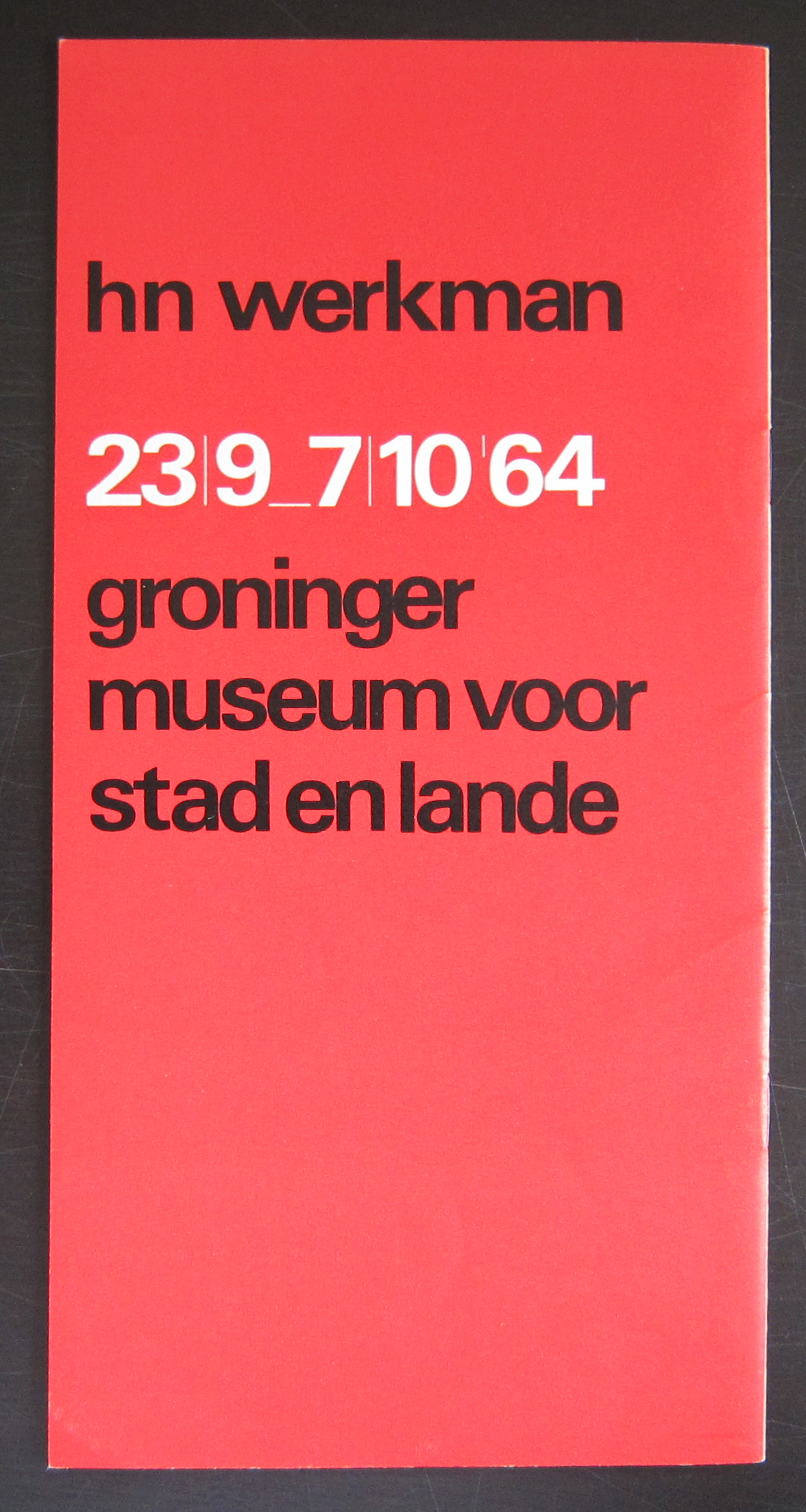
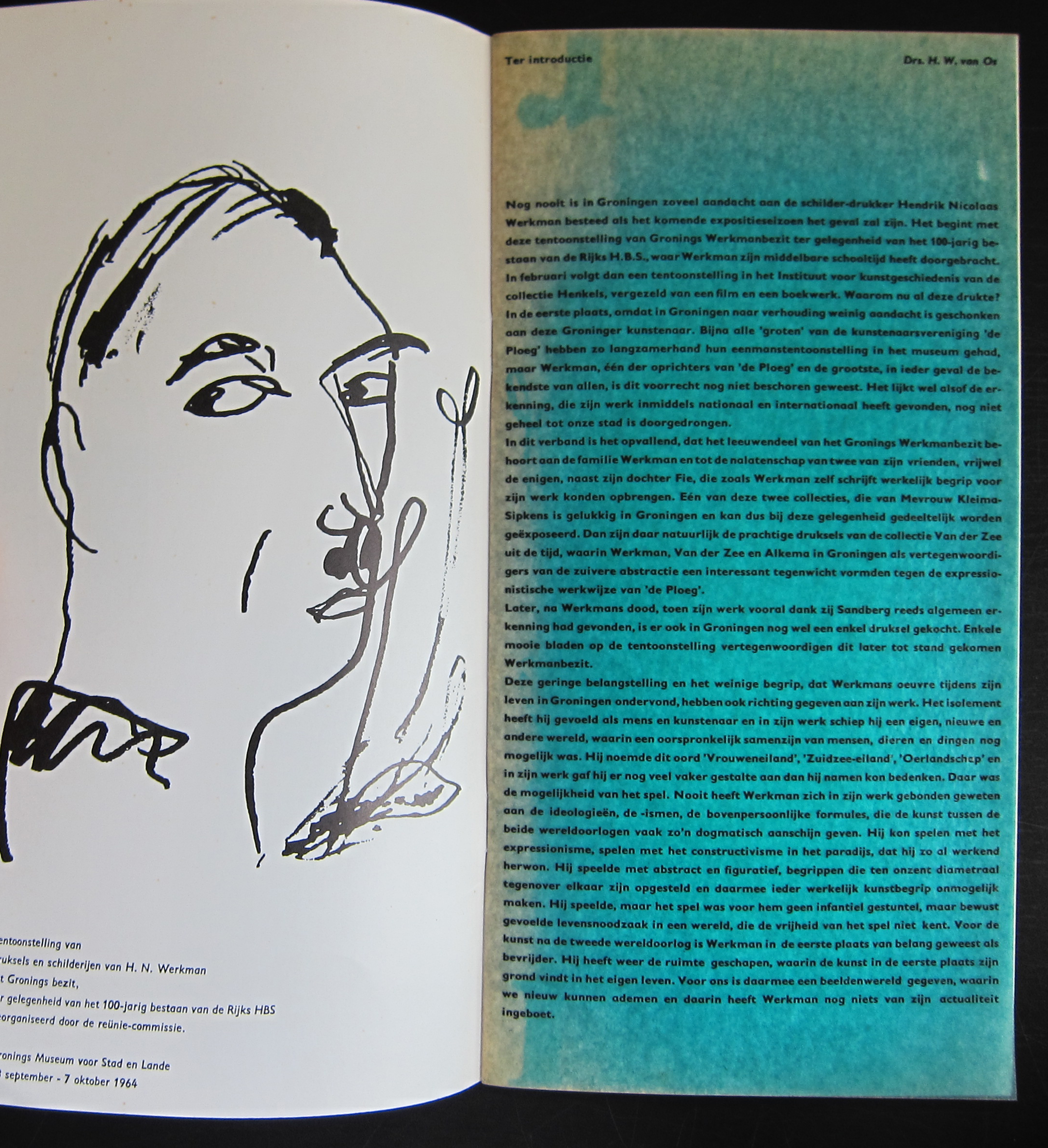
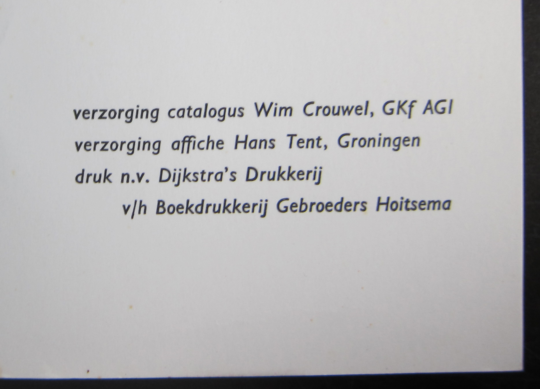
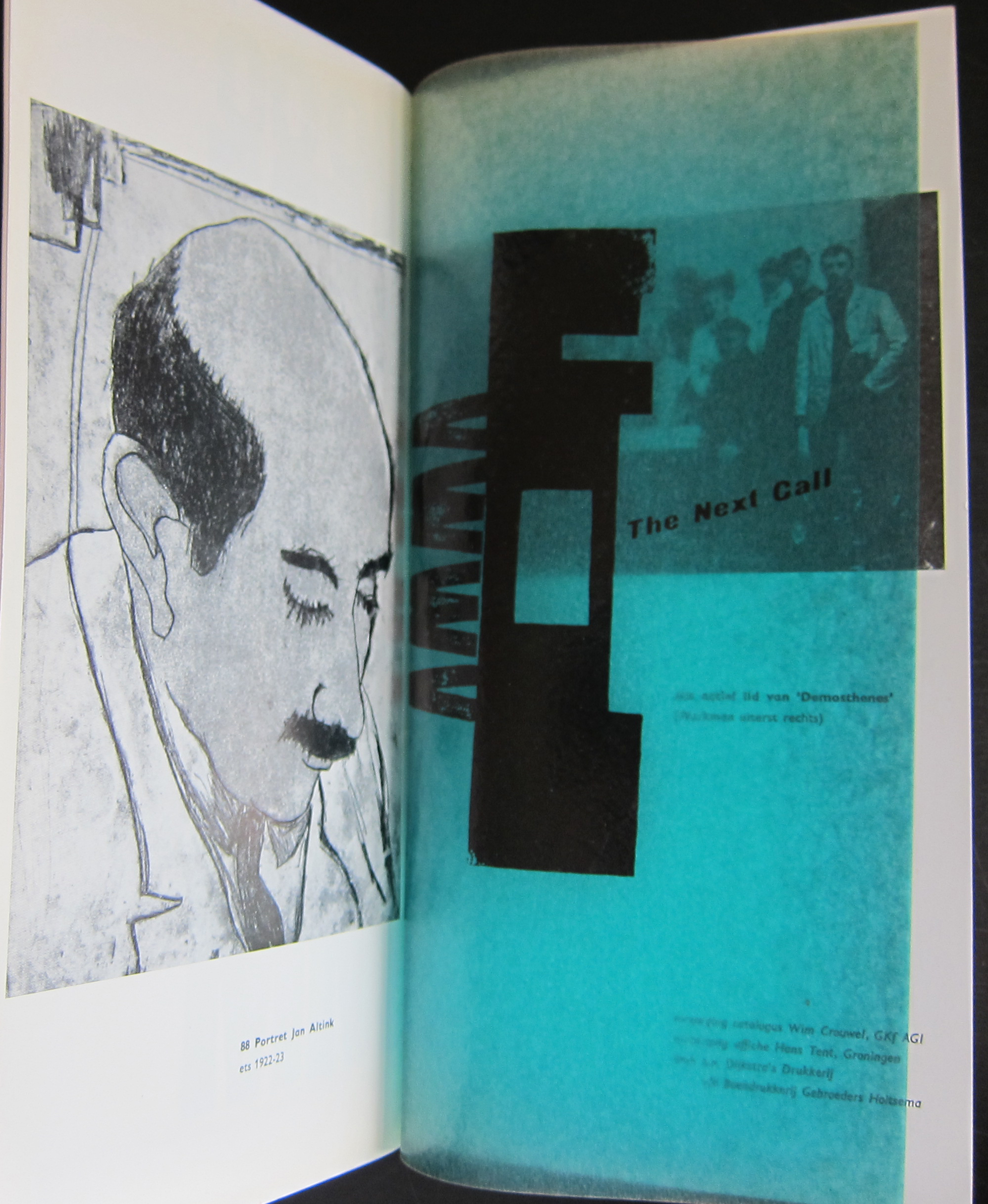
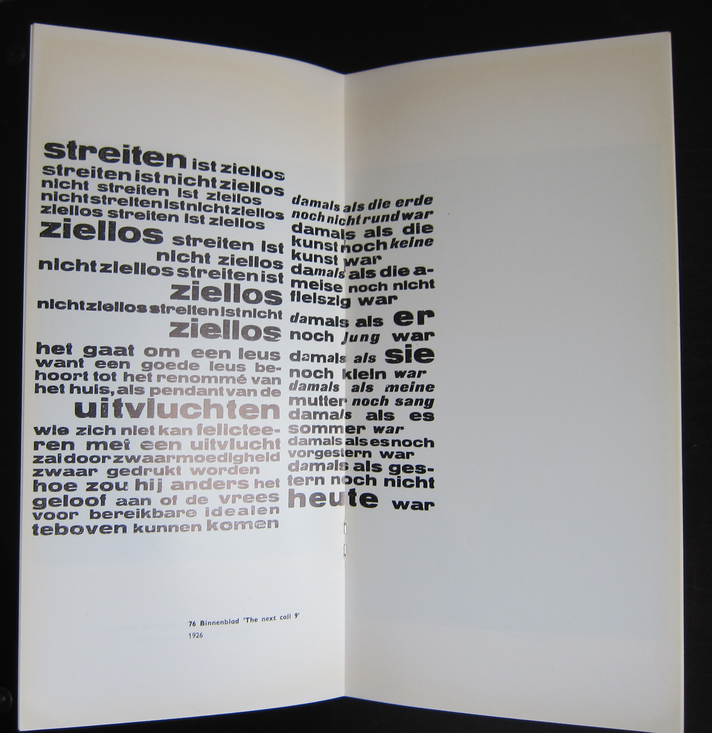
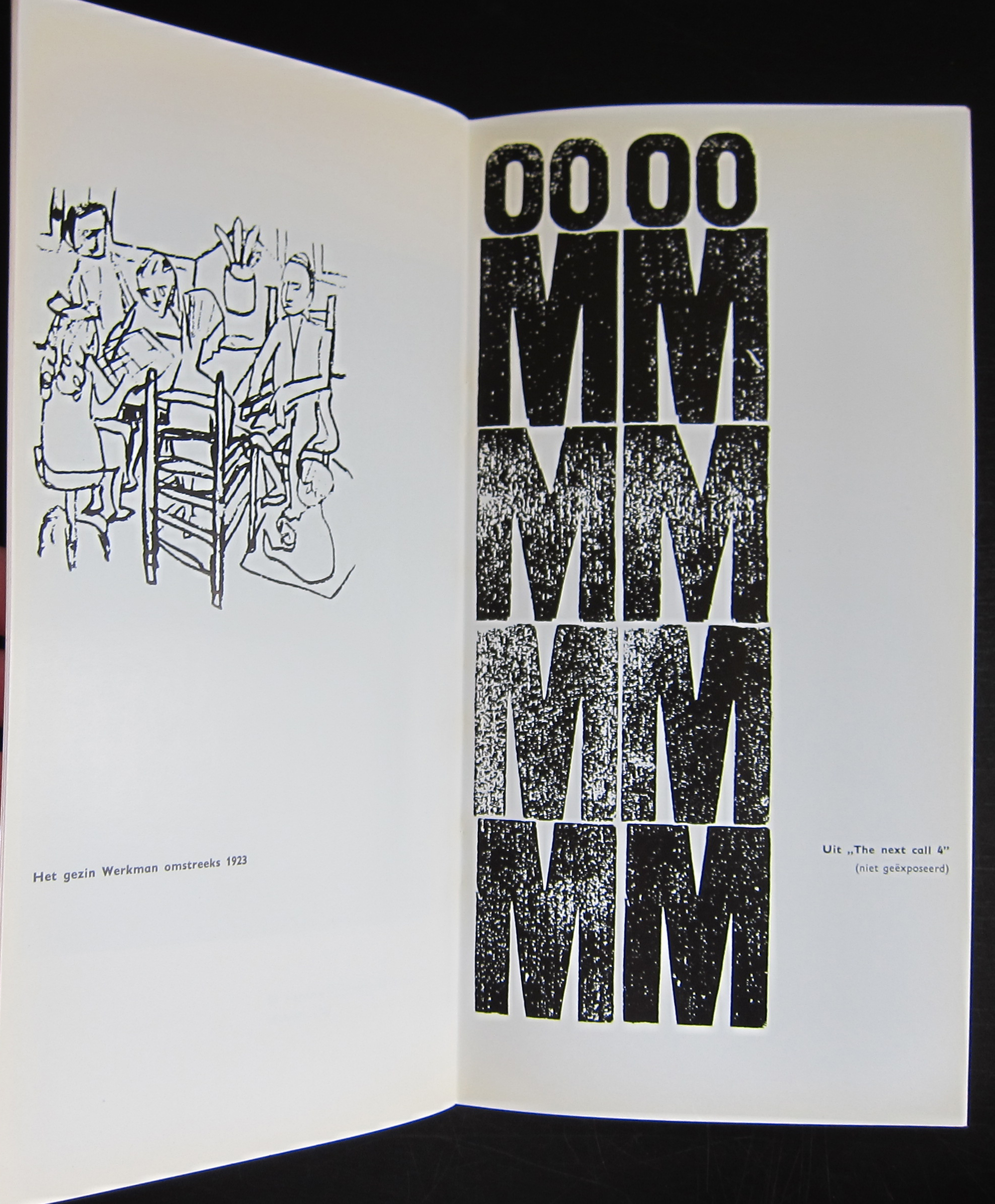
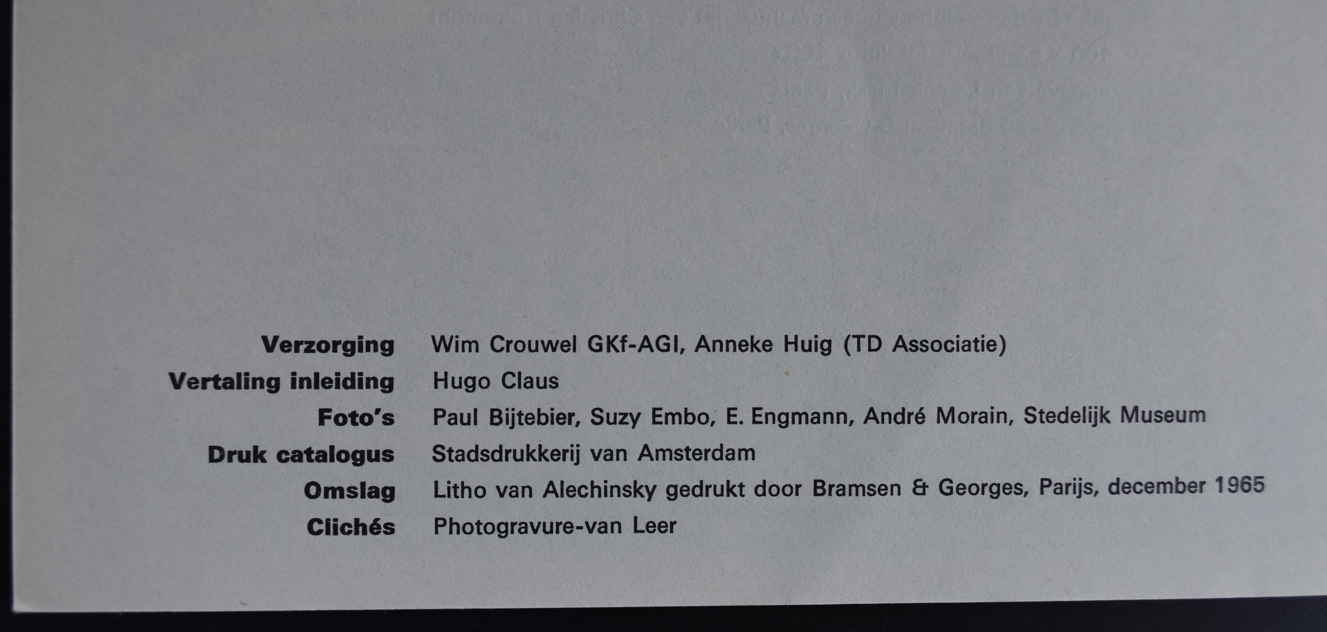
This publication was published on the occasion of the Werkman exhibition in Groningen in 1964 and one of the first designs that Wim Crouwel made for a dutch museum. In this same period he designed the publications for the van Abbemuseum which were followed from the early sixties on by the publications of the Stedelijk Museum. What makes this one special is the condition it is in and the highly unusual appearance. The use of multi colored papers, its odd size and a cover chosen in relation with the Werkman print which is used as a cover. This publication is the top in dutch lay-out and design and must be considered as one of the very best publications of the sixties. Curious?………take a look at
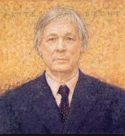
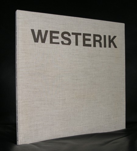
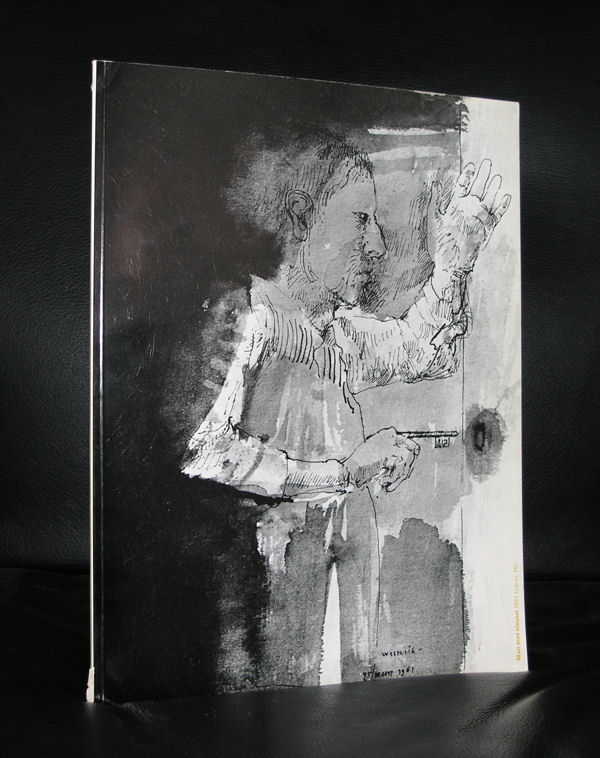
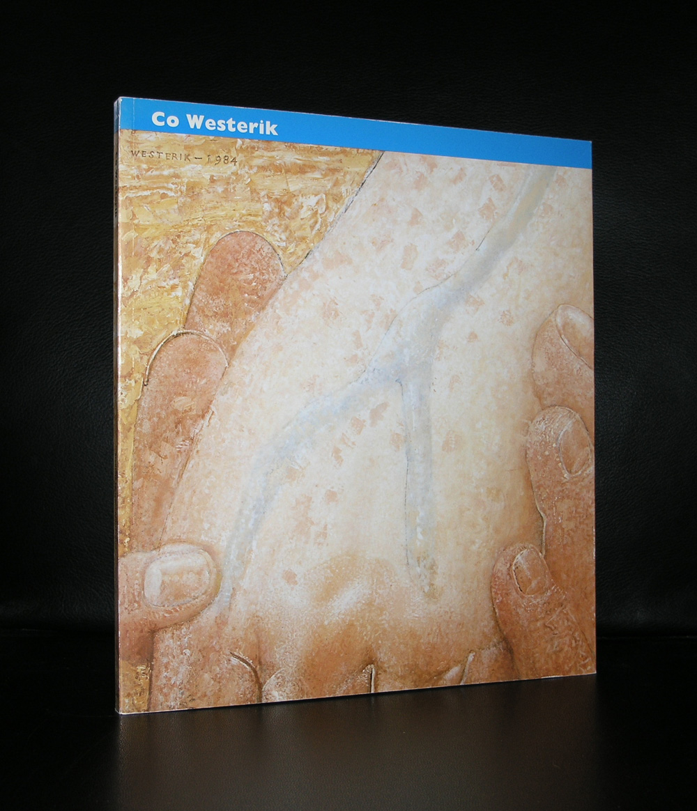
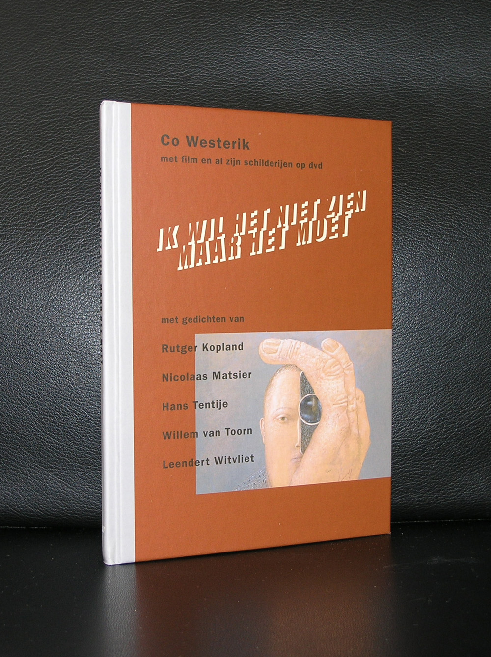
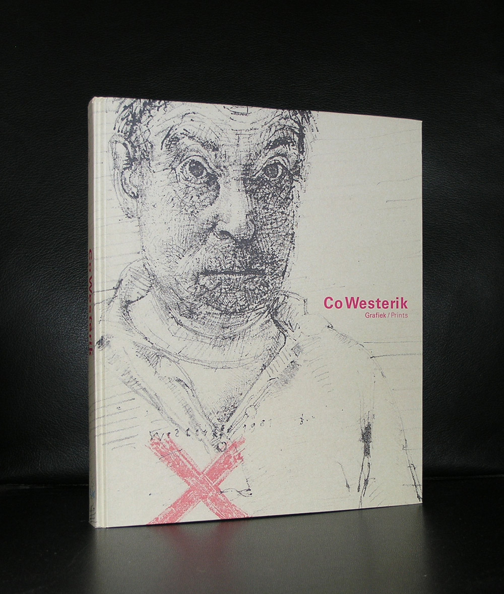
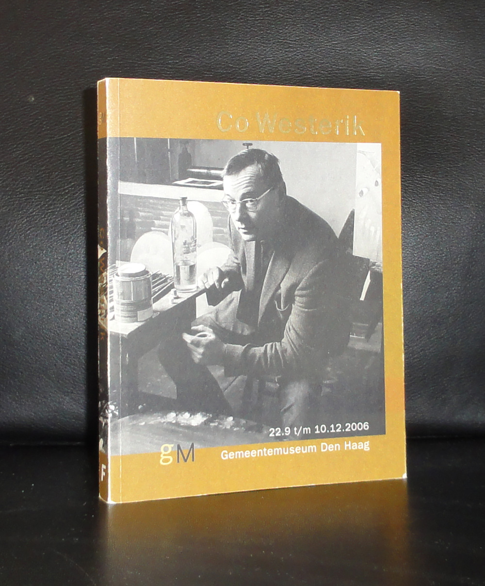
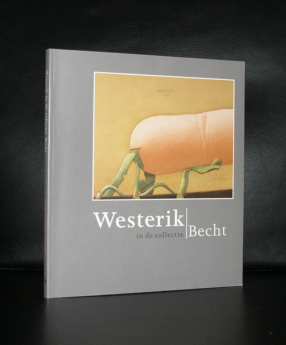
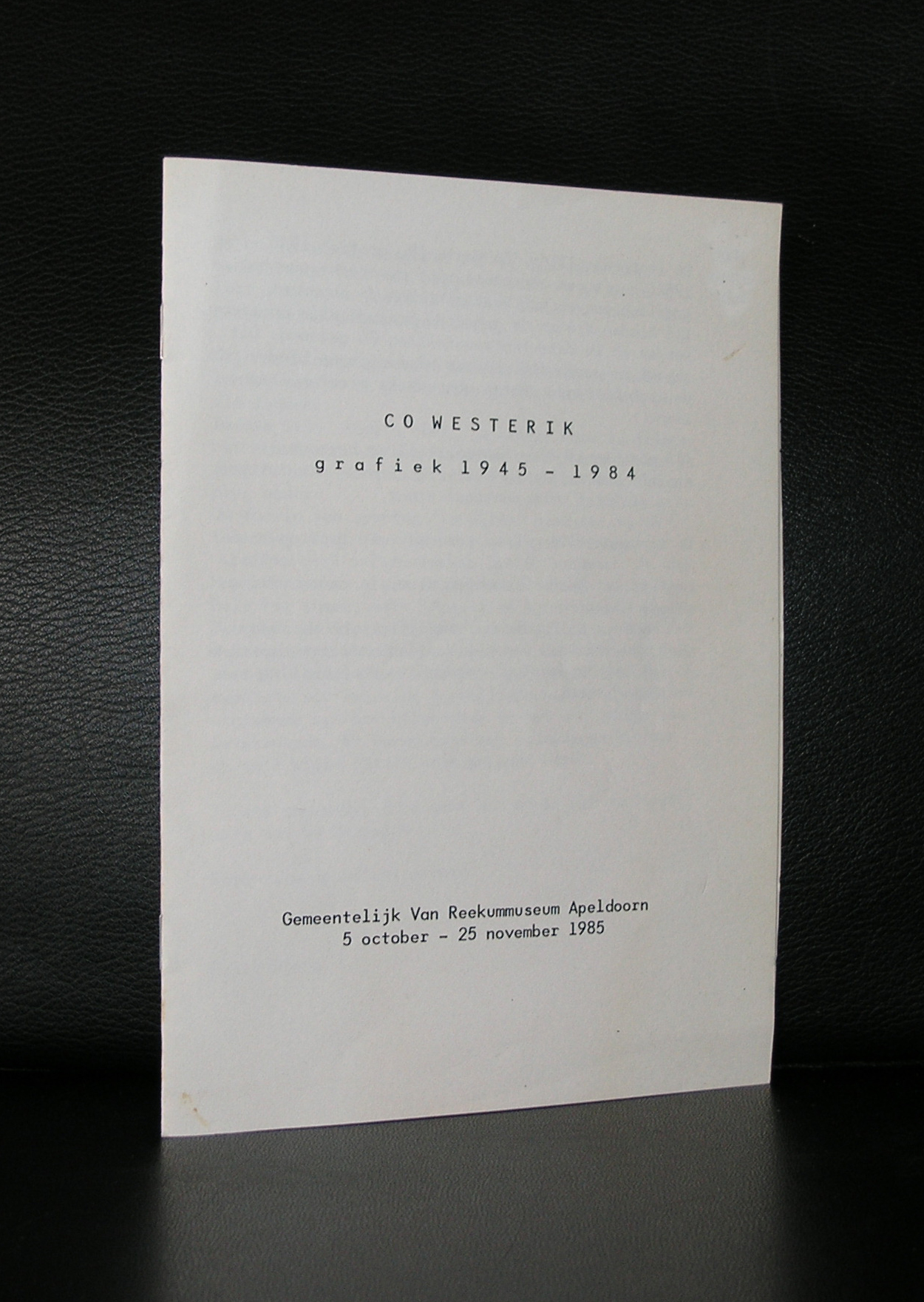
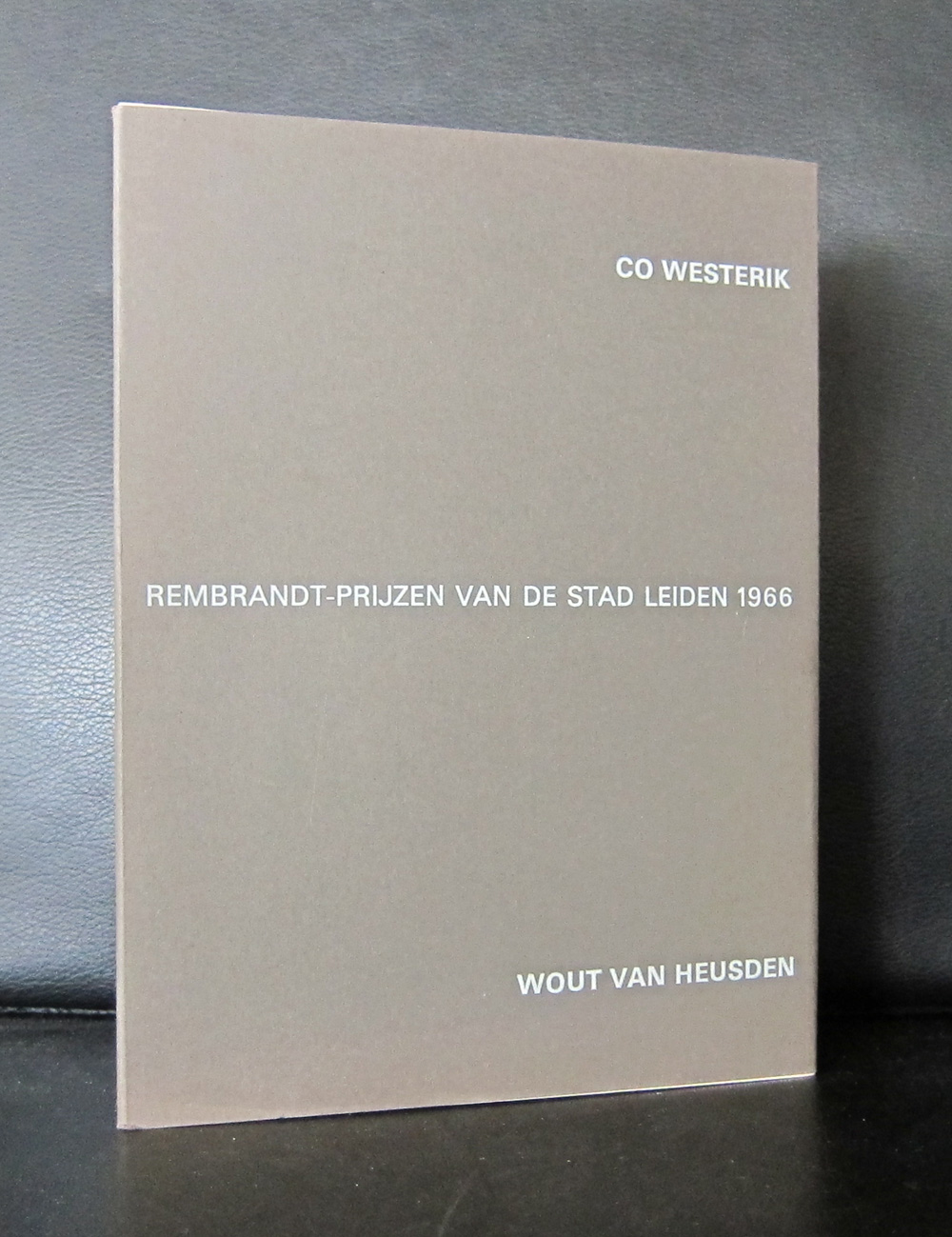
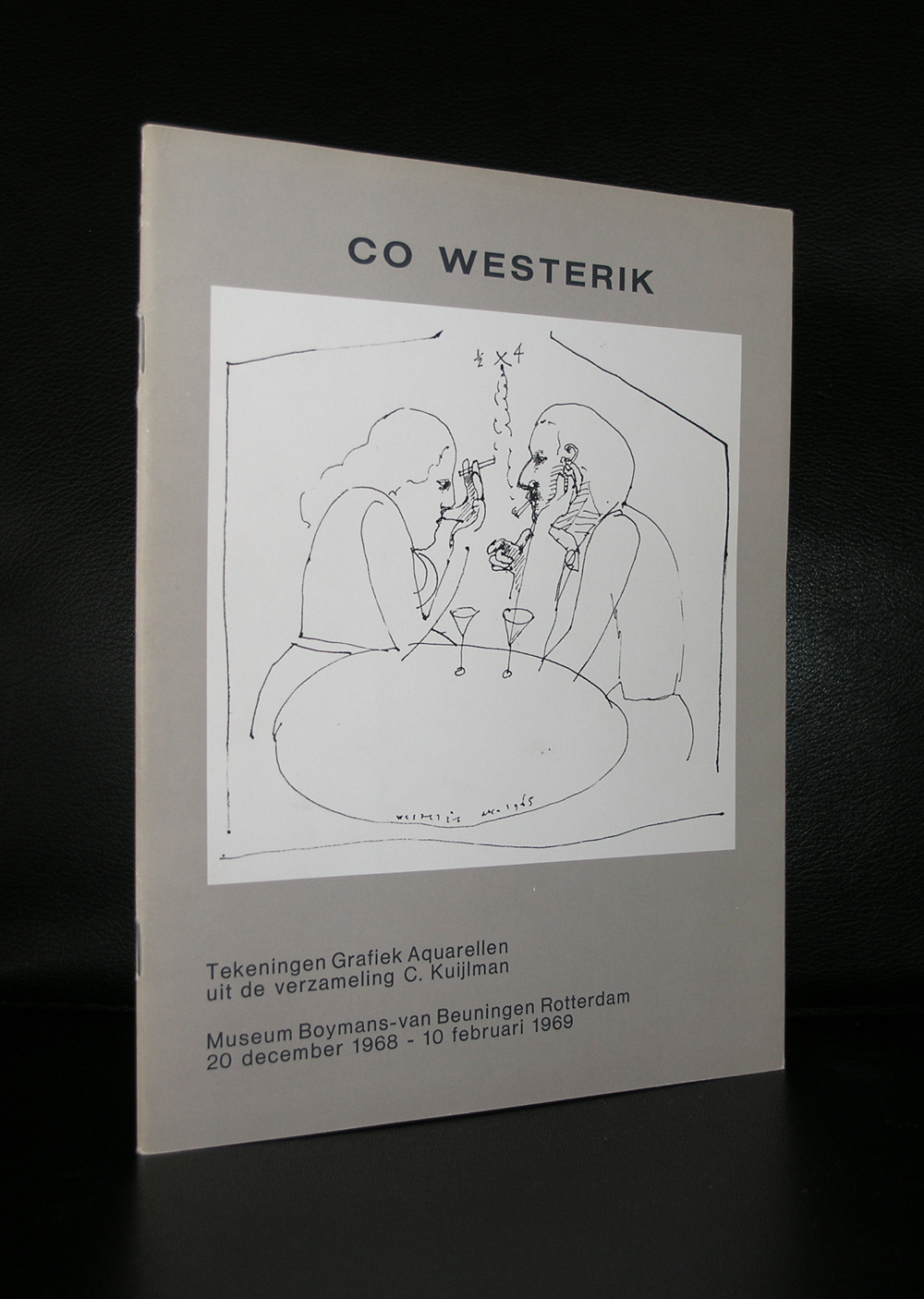
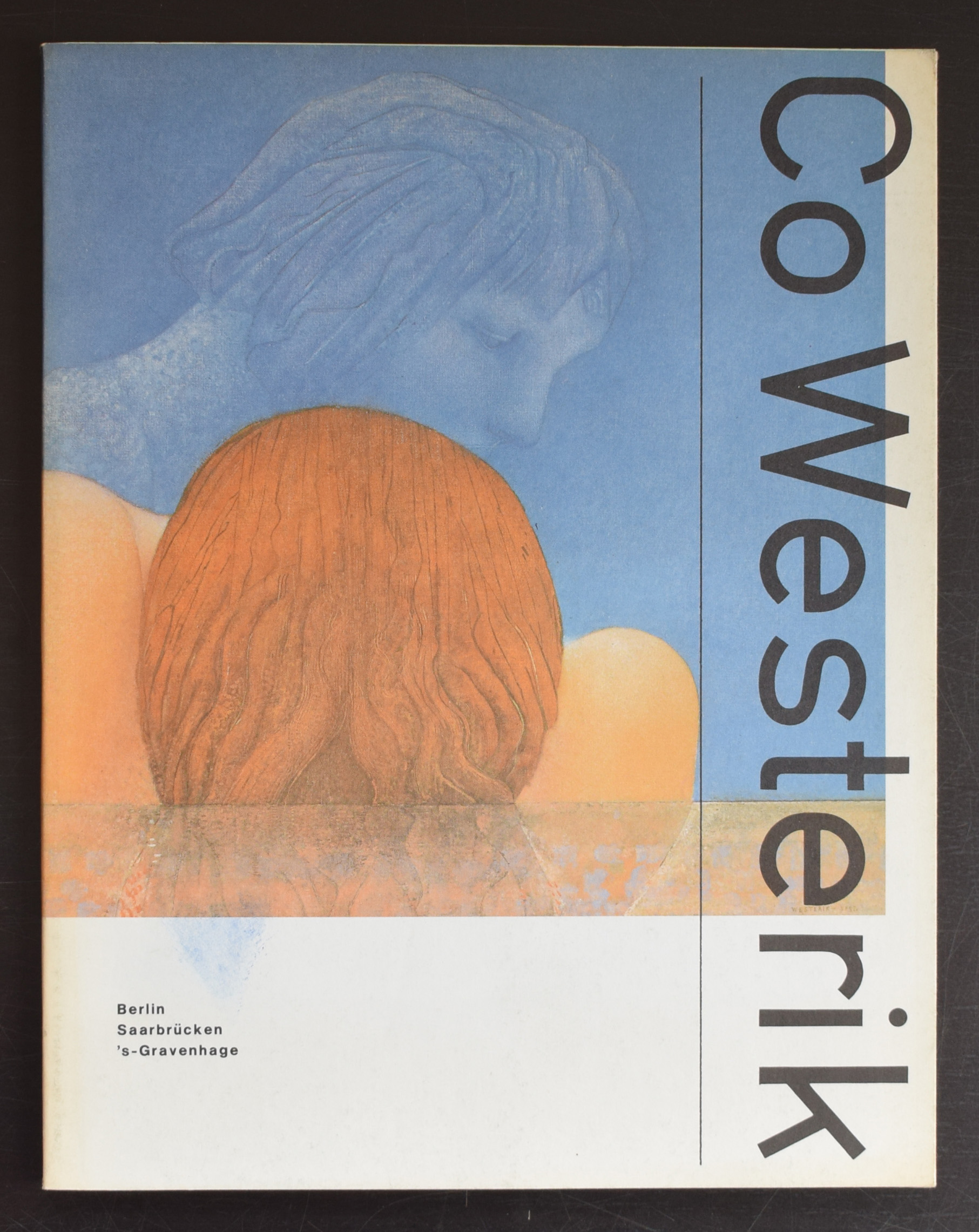
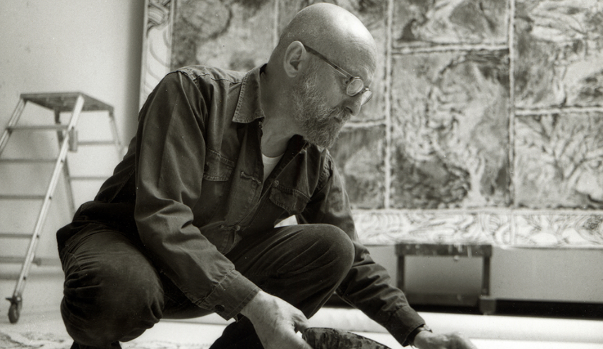
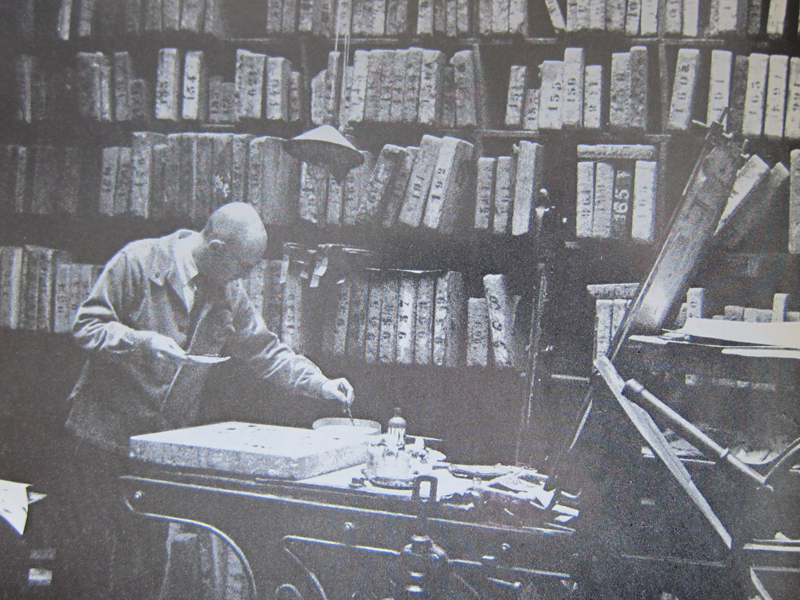
One of the last grand “old” masters of the dutch Art scene. Of course C ( Jacobus) Westerik has had his exhibitions abroad, but beside the Netherlands, germany and Belgium his name is not that well known. I met Westerik at the time he was making the portrait of Theo van Velzen. One of the former directors of the Haags Gemeentemuseum. The portrait was presented as a farewell present when van Velzen resigned to be hung in a gallery with portraits of other former directors. A small portrait which he managed to squeeze in and complete it in between 2 other paintings. His canvasses are not too big , but they are scarce because Westerik has a very small production yearly. I really do not know if he still is active as a painter, but at the time the van Velzen portrait was made , his production was 3 paintings a year. All were sold up front to collectors and museums. Among them Frits Becht (1930-2006) .He was the private collector with the largest Westerik collection .
He who was a personal friend for his entire life and followed his career through the years and bought many works. beside a painter Westerik was also known for his graphics in which he excelled. His production as a graphic artist was much much larger and there are almost a thousand different prints known by him. Westerik is a very important artist for dutch art and because i followed him over the years www.ftn-books.com has many publications on Westerik available.
OLYMPUS DIGITAL CAMERA
OLYMPUS DIGITAL CAMERA
OLYMPUS DIGITAL CAMERA
OLYMPUS DIGITAL CAMERA
OLYMPUS DIGITAL CAMERA
OLYMPUS DIGITAL CAMERA
OLYMPUS DIGITAL CAMERA
OLYMPUS DIGITAL CAMERA
A short documentary on Westerik can be found at this address: http://hollandsemeesters.info/posts/show/7738
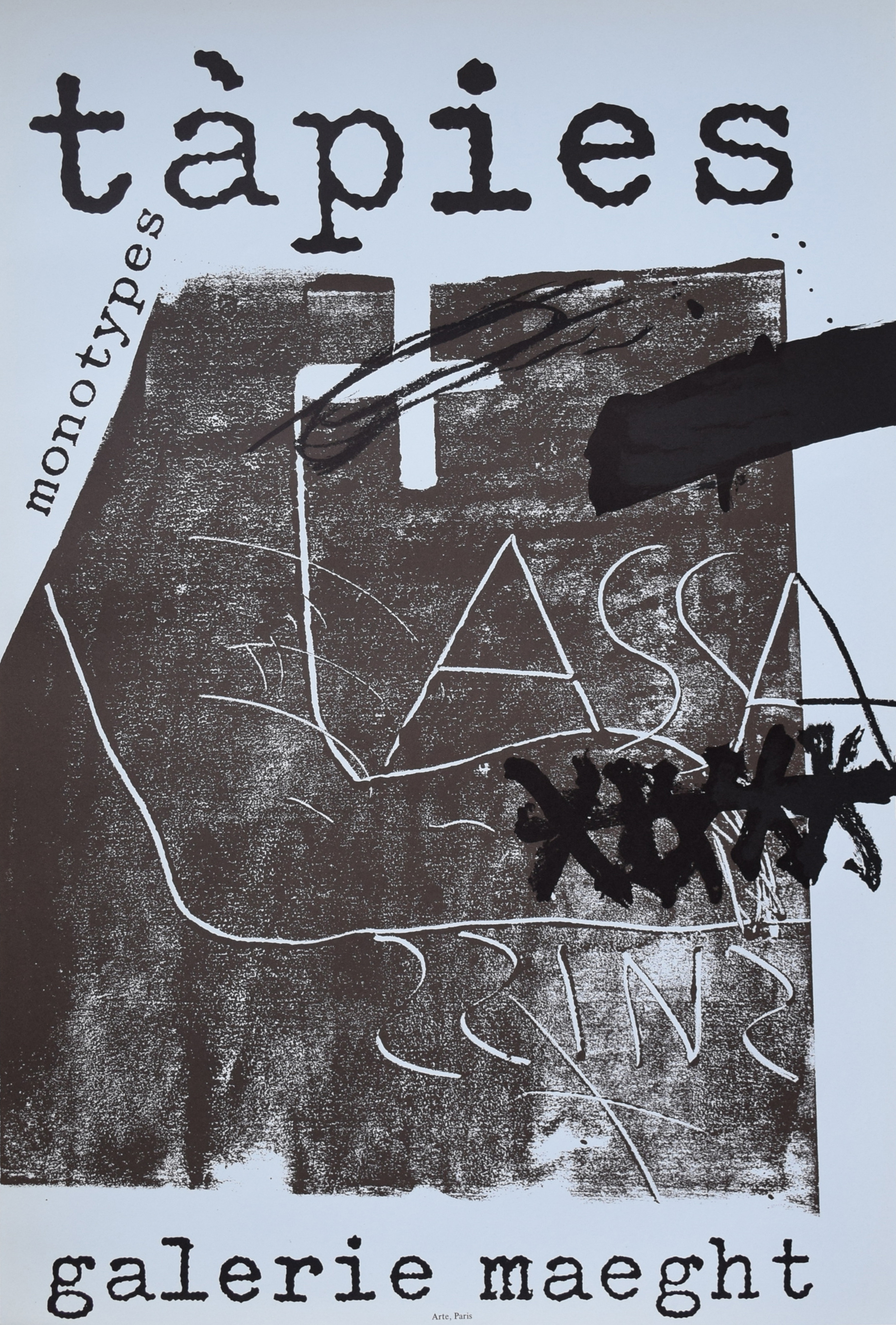
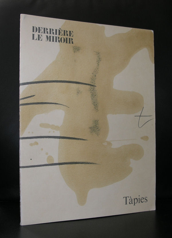
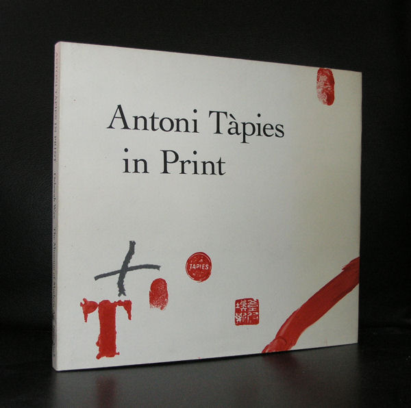
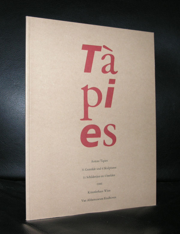
It must have been some 12 years ago that i first visited Barcelona and found myself amazed and surprised by this city full of Gaudi and other modernista marvels, but the best find for me was the discovery and first visit of the Fundacio Antoni Tapies.
The building itself is already worth visiting and the inside is even more spectacular. An old facade houses a very modern museum inside which houses the works donated by Antoni and Theresa Tapies. I loved its collection and it proved to me that Tapies his art is timeless, very spanish and cosmopolitan at the same time. Tapies is possibly , next to Picasso and Dali , the most important spanish name in Modern Art. He often uses large canvasses and on them paints with “earth” colors impressive abstract compositions and uses matter in them.
In these matter paintings , the materials used are no longer simple media used to express an idea; they are the idea itself. That process produces a complete identification between material and form, between concept and language. Those works become opaque surfaces, walls on which the artist writes his graffiti and attaches the forms of objects or people. His identification with the work through his surname (in Catalan Tàpies means “walls”) expresses a more profound desire to break with Western dualism and blend with the material in a continuous formlessness.
Over the post-war years there was a general interest among artists on both sides of the Atlantic in material. Awareness of the atomic bomb and the new scientific discoveries aroused a strong curiosity in science, the new ideas about space-time and substance, while inventions such as the electronic microscope provided a new view of nature.
At the same time, Tàpies had developed an interest in Eastern philosophy, because of its emphasis on material, the identity between man and nature and its denial of the dualism of our society.
There are some excellent Tapies publications available at www.ftn-books.com
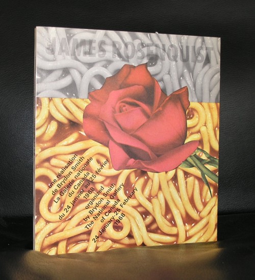
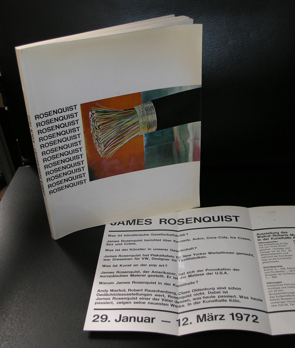
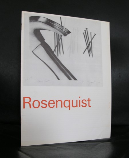
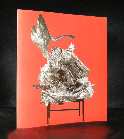
Sad news this morning, one of the greatest Pop Art artists, James Rosenquist, died at the age of 83 of March 31, 2017.
Rosenquist was one of the last living great Pop Art artists and a contemporary of Warhol Lichtenstein,and Wesselman. He was the lesser known of these 4 names, but what made him special and stand out from them was the use of extremely large canvasses. But also his prints were larger than normal. He holds the record for the largest print in the world measuring 35 x 7 feet!
Rosenquist works are present in all major collections of Contemporary art in the world. A large part of his inventory was destroyed during a fire in 2009 in which all his works present in the studio were destroyed. Rosenquist will be remembered as one of the great Pop Art artist. www.ftn-books.com has some nice catalogues on him.
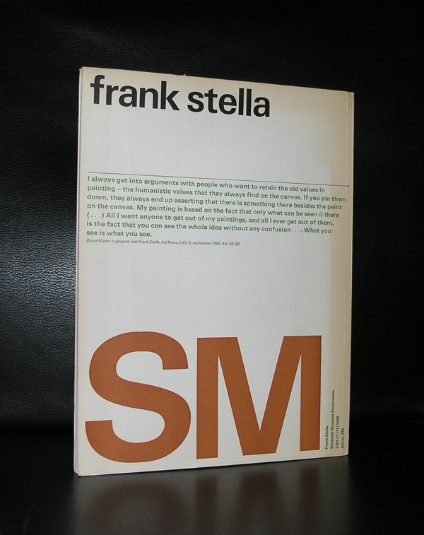
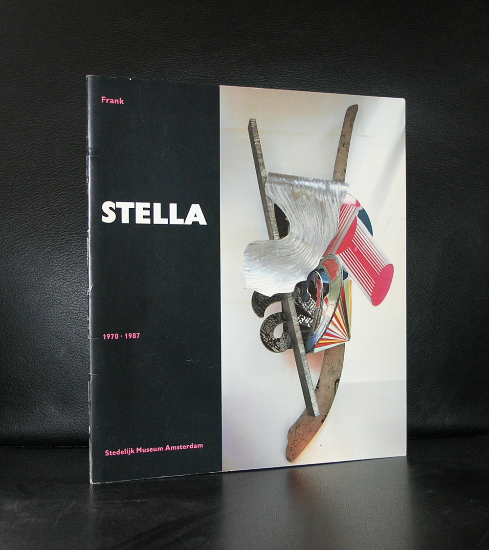
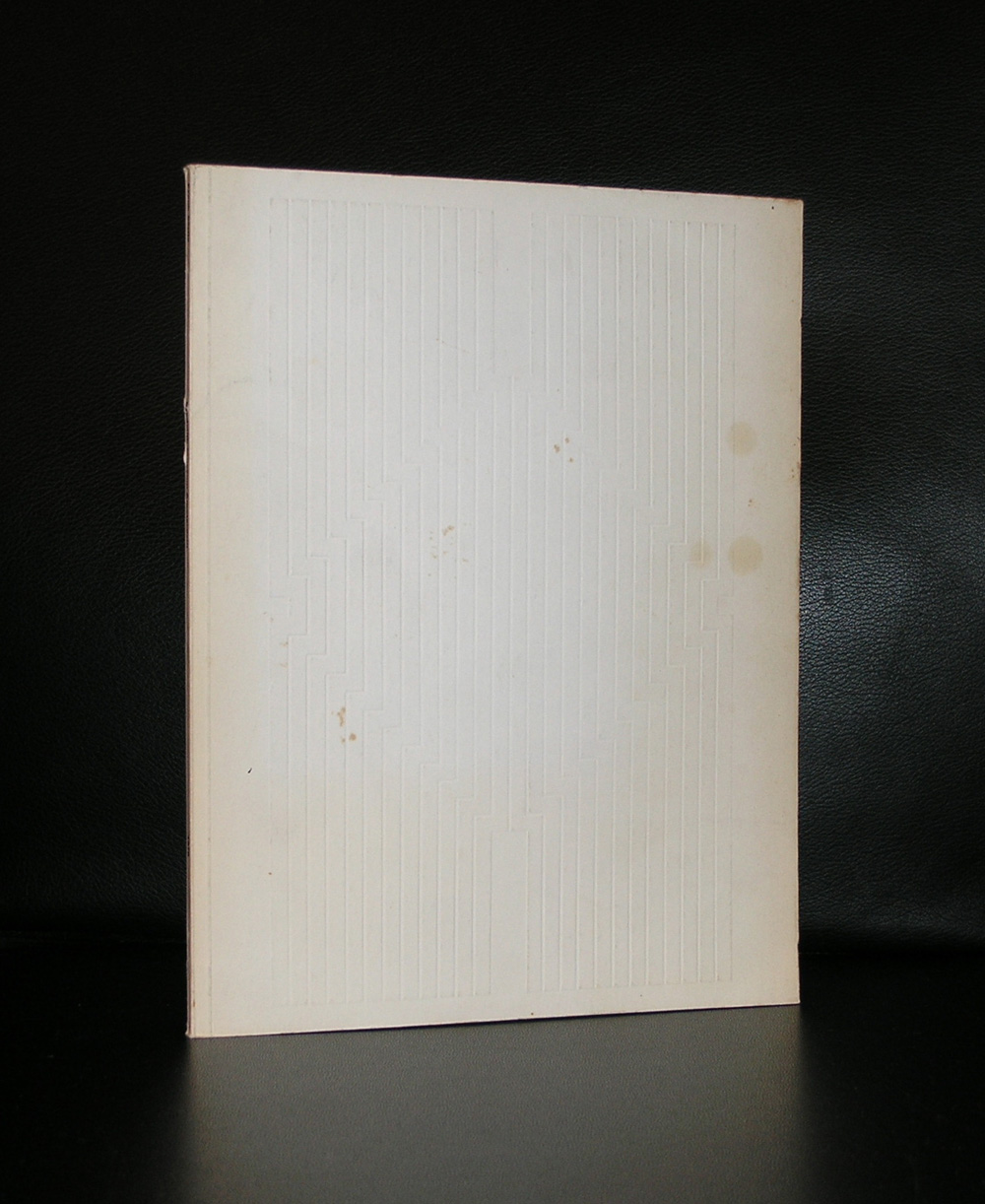
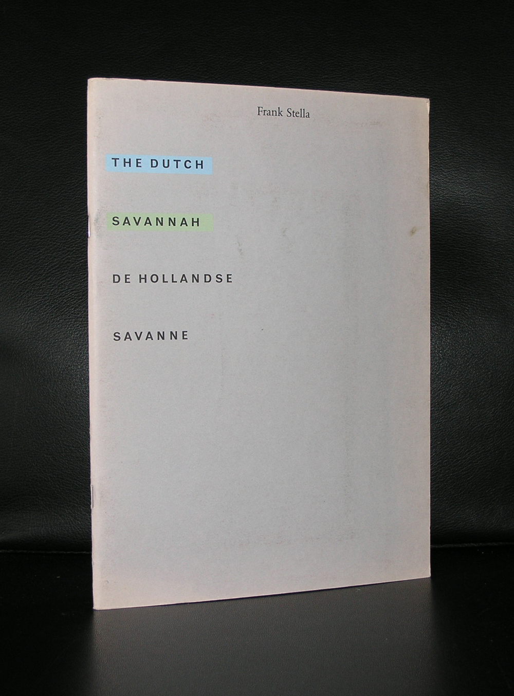
Two reasons to devote a blog to Frank Stella. First there is an acquisition by the Gemeentemuseum Den Haag which i do not understand. For me it is a “stand alone” work of art with no relation with other works within the collection and at the time i saw it , i recognized it as a Stella, but was not very impressed by it. I would have thought the Stedelijk Museum Amsterdam would have bought a work by Stella, because it fits in….but at the Gemeentemuseum it looks to be “a stranger at our midst”. Still Frank Stella is a great print maker and one of the reasons for this blog is to point out a very fine publication the Stedelijk Museum has published in 1970. The design was done by Wim Crouwel, but the best is there is a highly original “blind print” used as cover for this great catalogue.
It is one of the most spectacular catalogues from the 70’s with its embossed cover. A special artist cover which relates to one of the first “shaped canvases” use of multiple papers and ink colors. Typical Crouwel design. Book measures 10.8 x 8.2 inches, contains 78 pages plus cover. text in dutch and english.
Frank Stella is an important artist, has made some great works of art, but especially his minimal early works are for me among his best, including this great 1970 catalogue.
The Wim Crouwel / Stella catalogue from 1970 and other Frank Stella publications are available at www.ftn-books.com
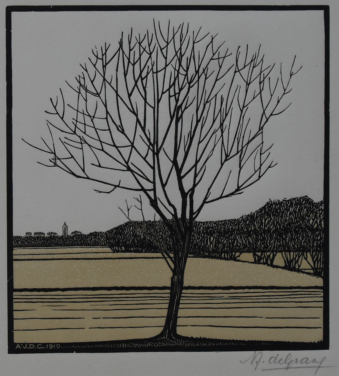
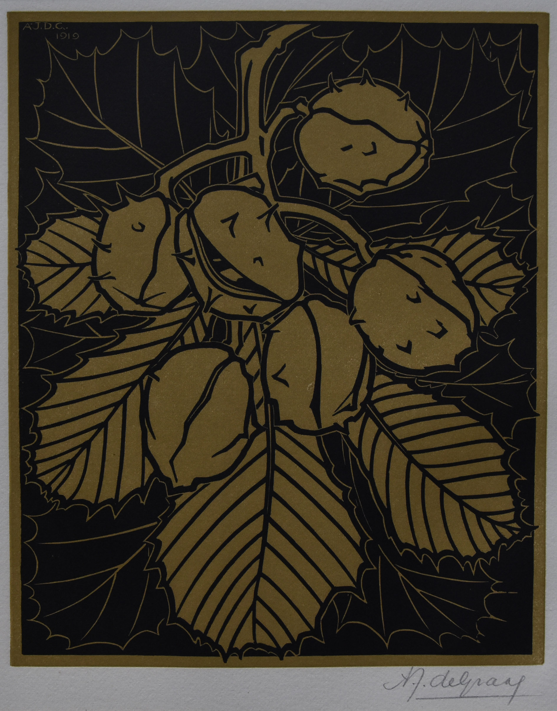
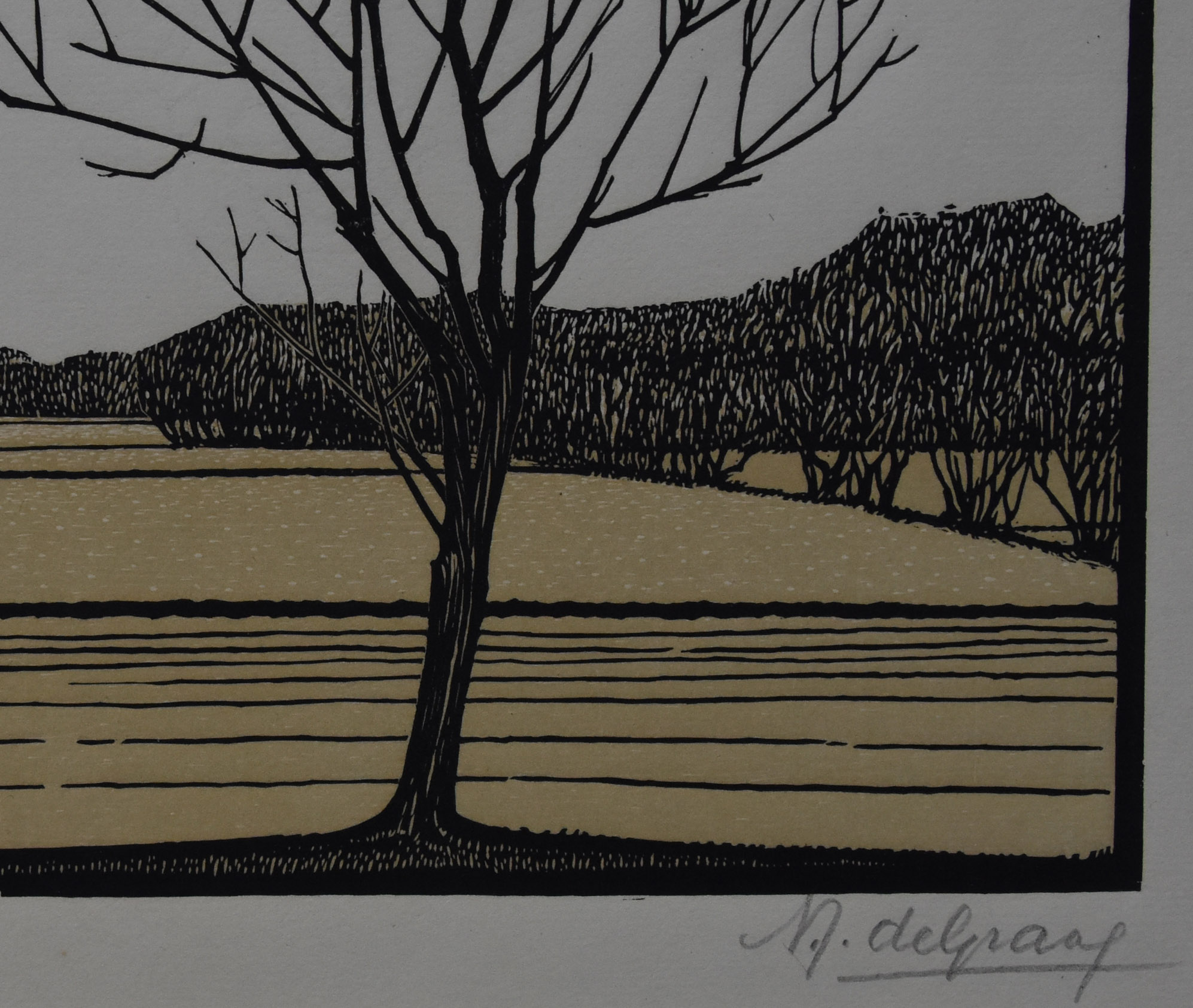
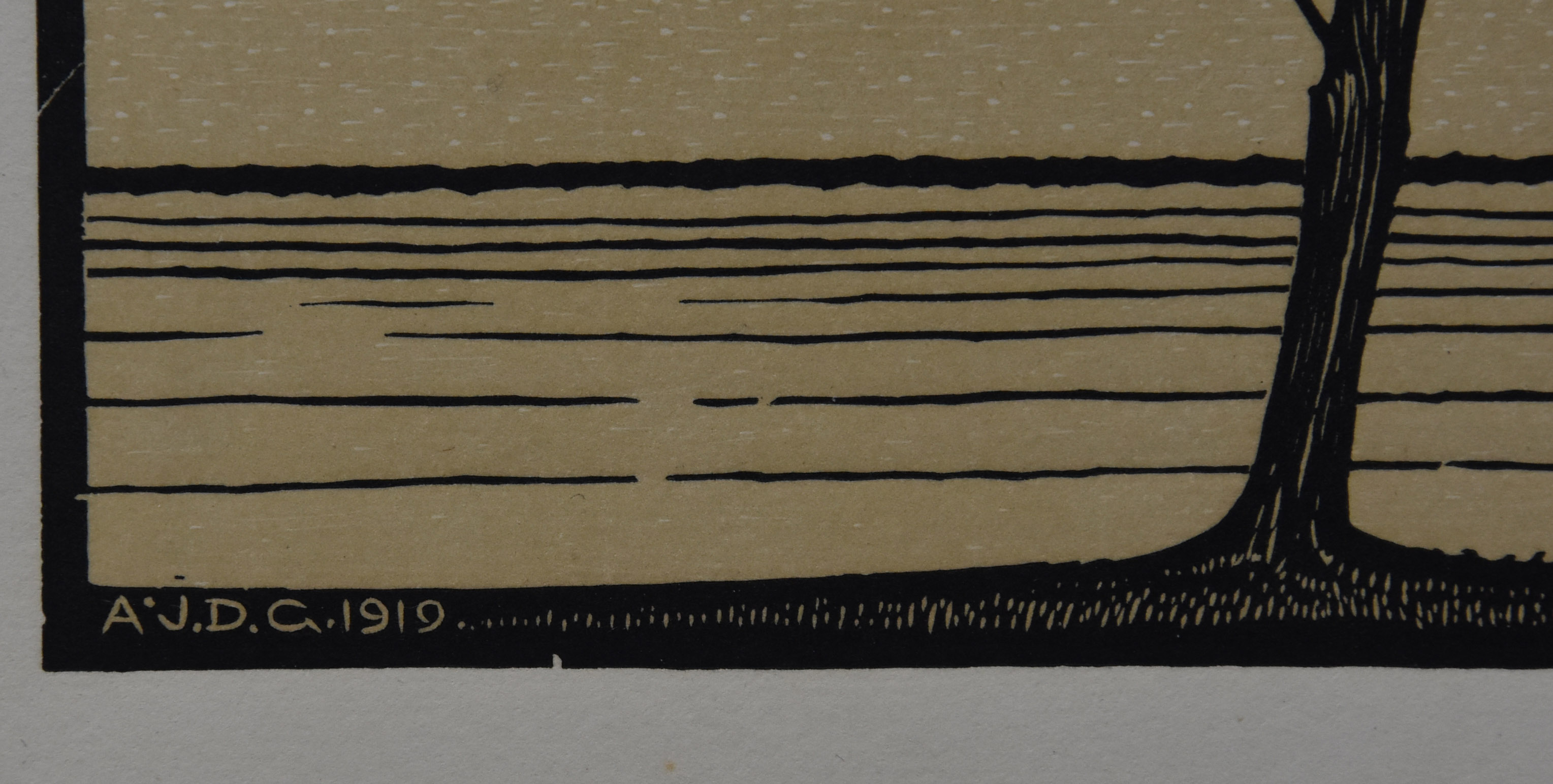
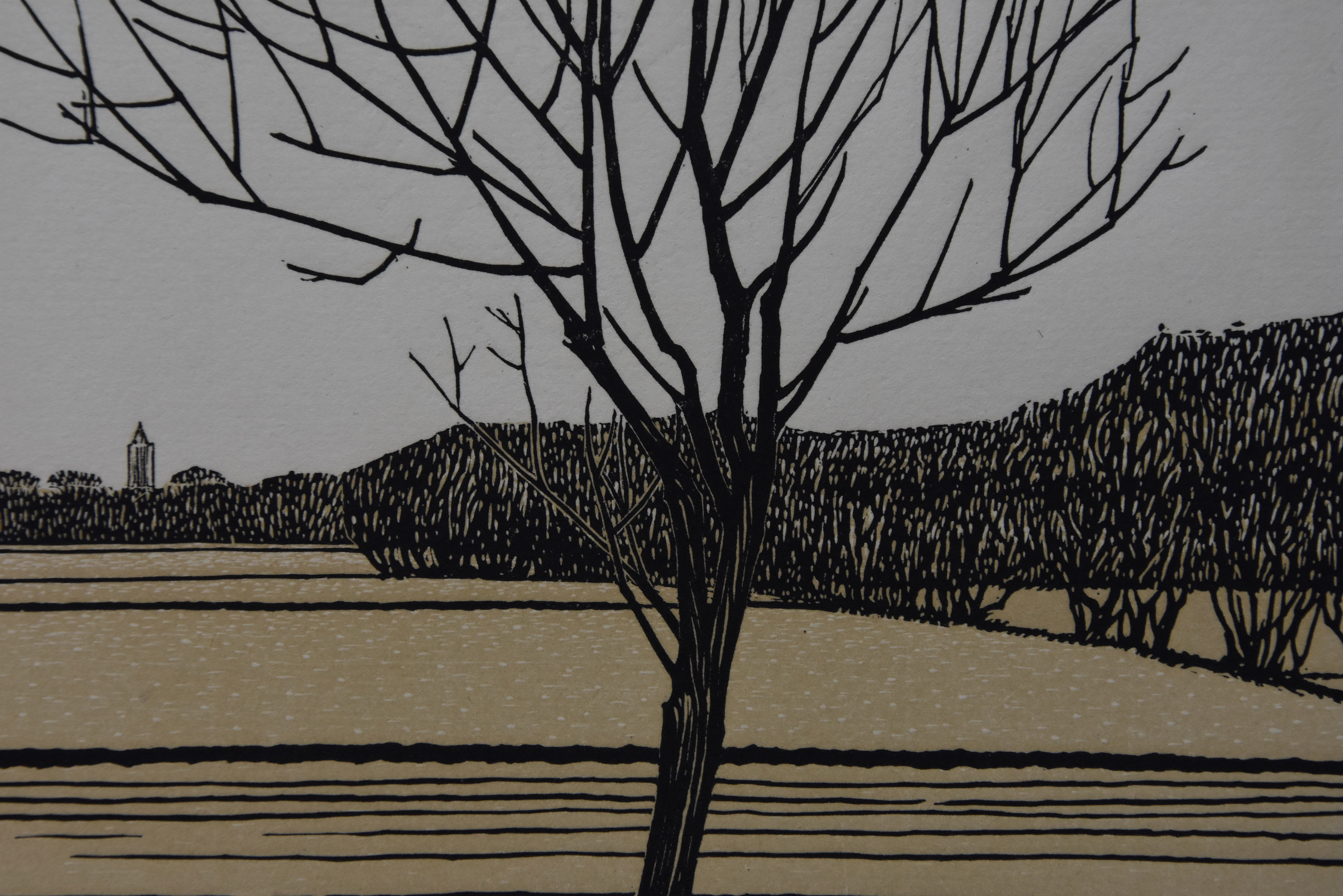
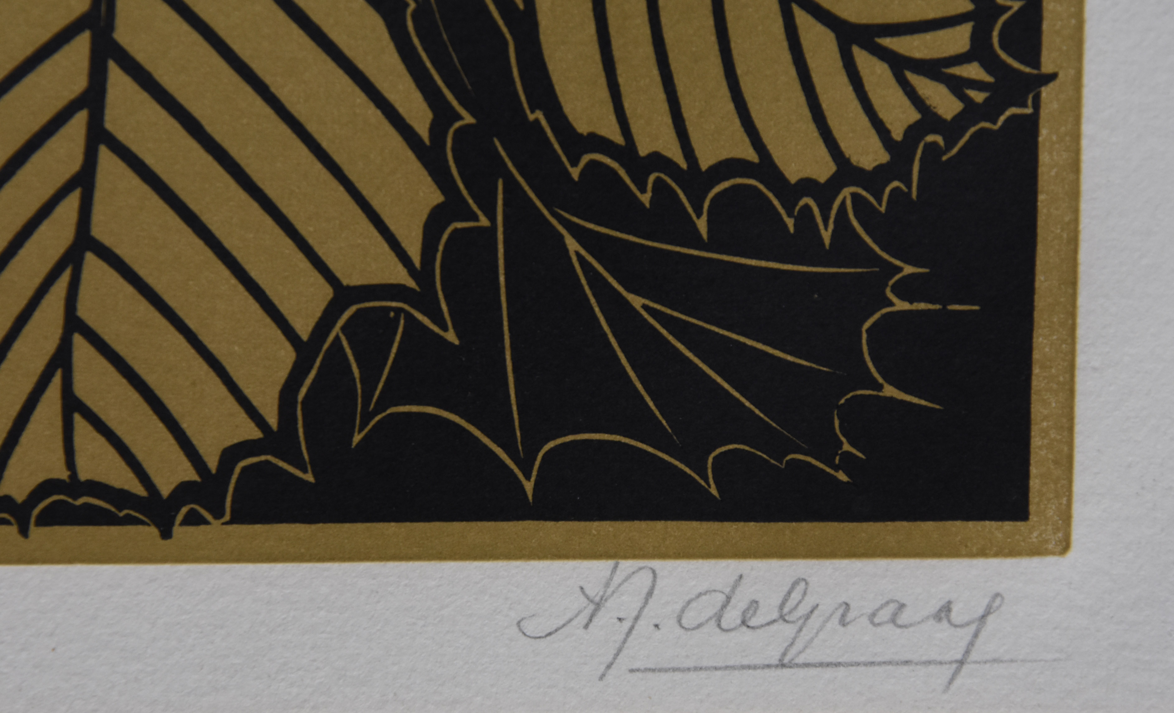
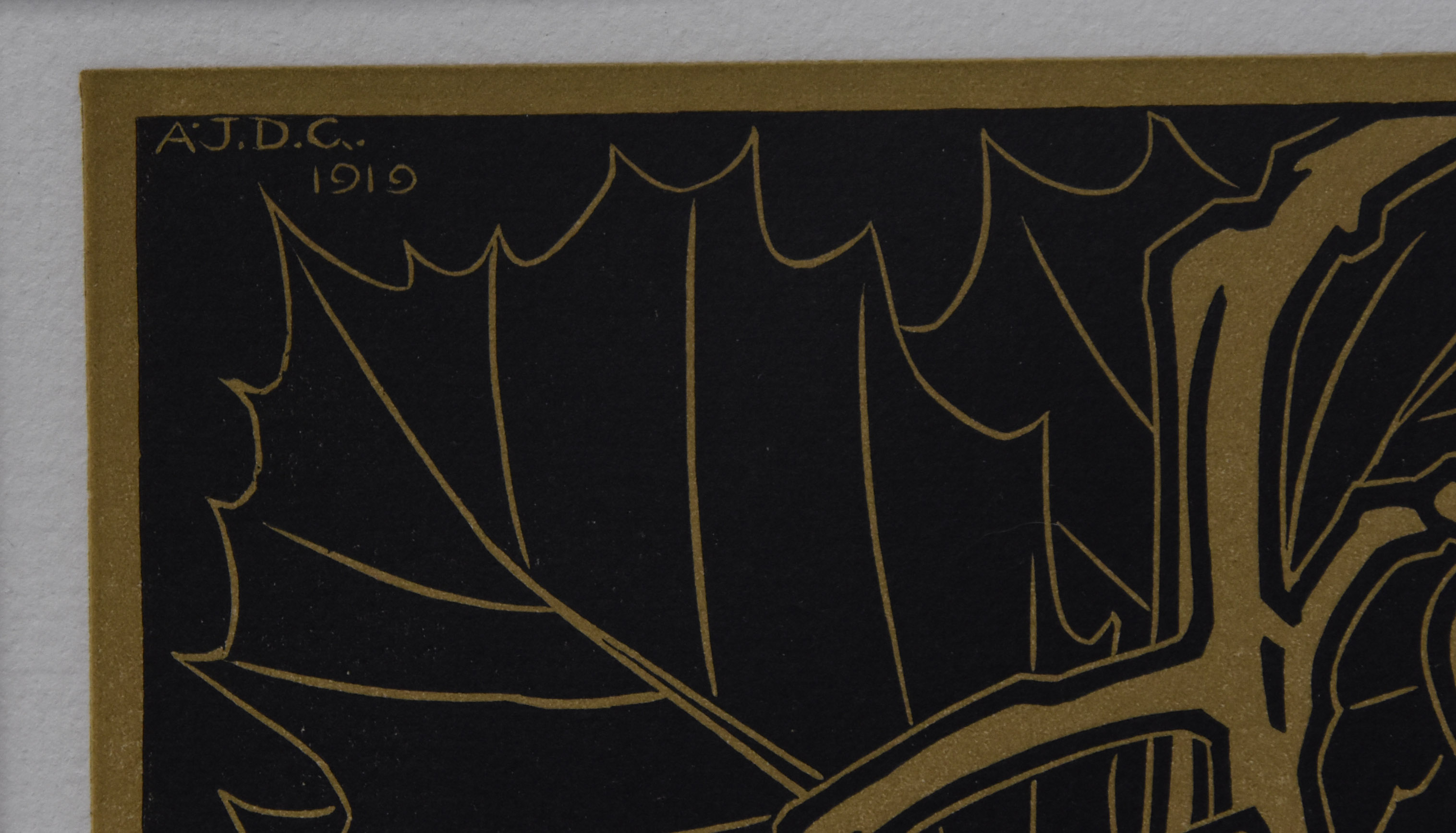
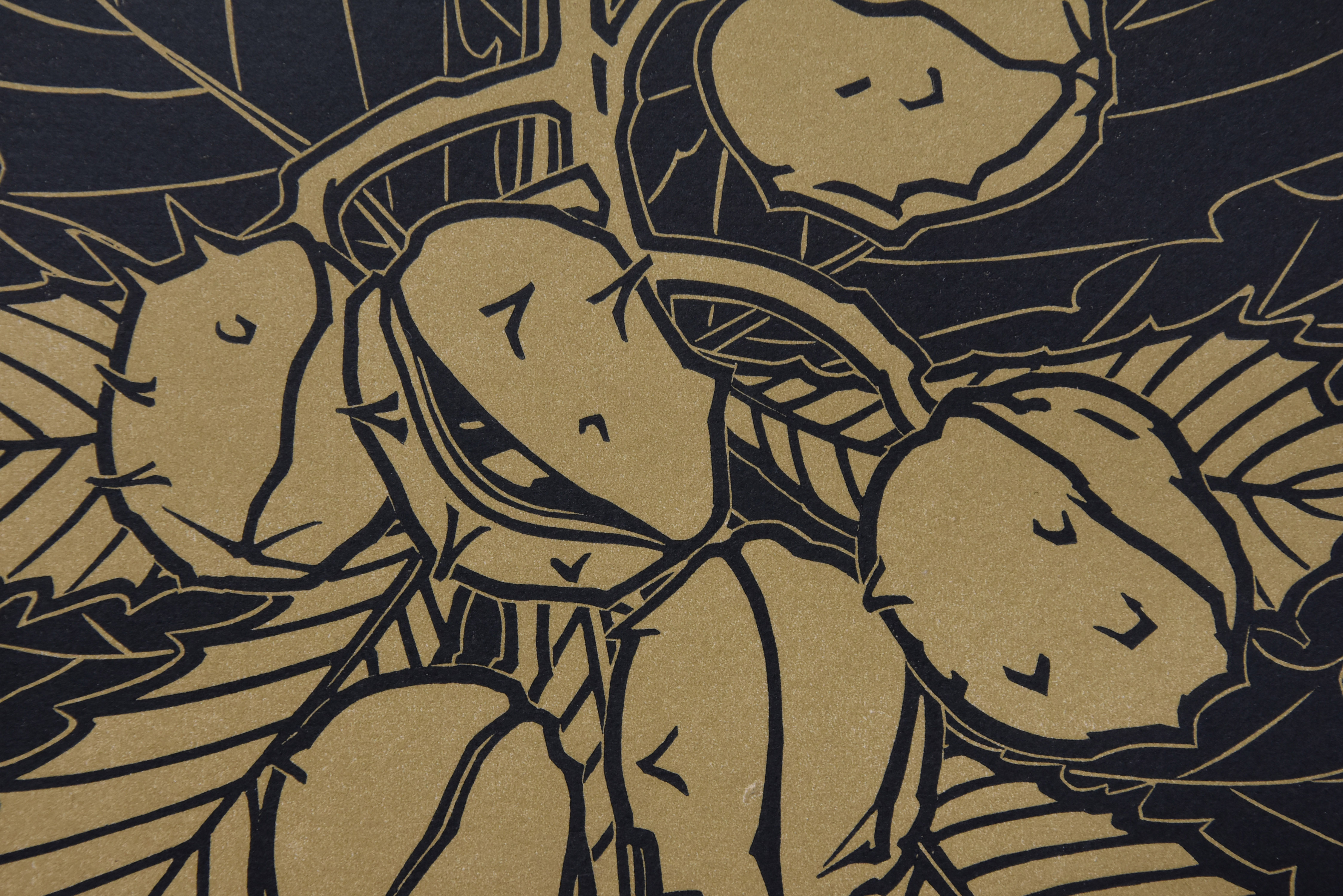
Anna Julia de Graag was born in Gorinchem and followed her art education at the Koninklijke Academie voor Beeldende Kunsten with Aarts and Bremmer. This H.P. Bremmer would later become the most important art advisor for mrs. Kroller Muller and was from the beginning of her career the personwho guided her into the world of art. Julie de Graag had a very personal way of depicting everyday subjects. Stylized, thick outlines, nature brought back to its essence. Julie de Graag was first and foremost a graphic artist. Her skills were superb and this resulted in great , beautiful small works of art. Her woodcuts i consider to be the very best and most beautiful i know of.
For me it started with a very small , but delicate exhibition in the Gemeentemuseum some 15 years ago and since i have been looking for these true masterpieces. There are not many of them , because Julie de Graag , had a small oeuvre and not many of these remain,because there had been a fire in her studio in which many of these works were lost. Furthermore she had to stop working in the early 20’s because she fell physically and mentally ill . and because of this illness and her weakening she committed suicide at the age of 46 . A sad life with beautiful exquisite art as a result.
It has been a while, but i am fortunate to have found another 2 excellent examples of her art and skills and both are for sale at www.ftn-books.com. For Julie de Graag these are large woodcuts ( approx. 23 x 19 cm) and best of all both are signed in the block and in pencil and in excellent condition.
The end of this year is near and almost 300 blogs have been published since I started blogging on WordPress. www.ftn-blog.com grew in an excellent way and i am looking forward to keep you informed on my inventory and exploits in art.
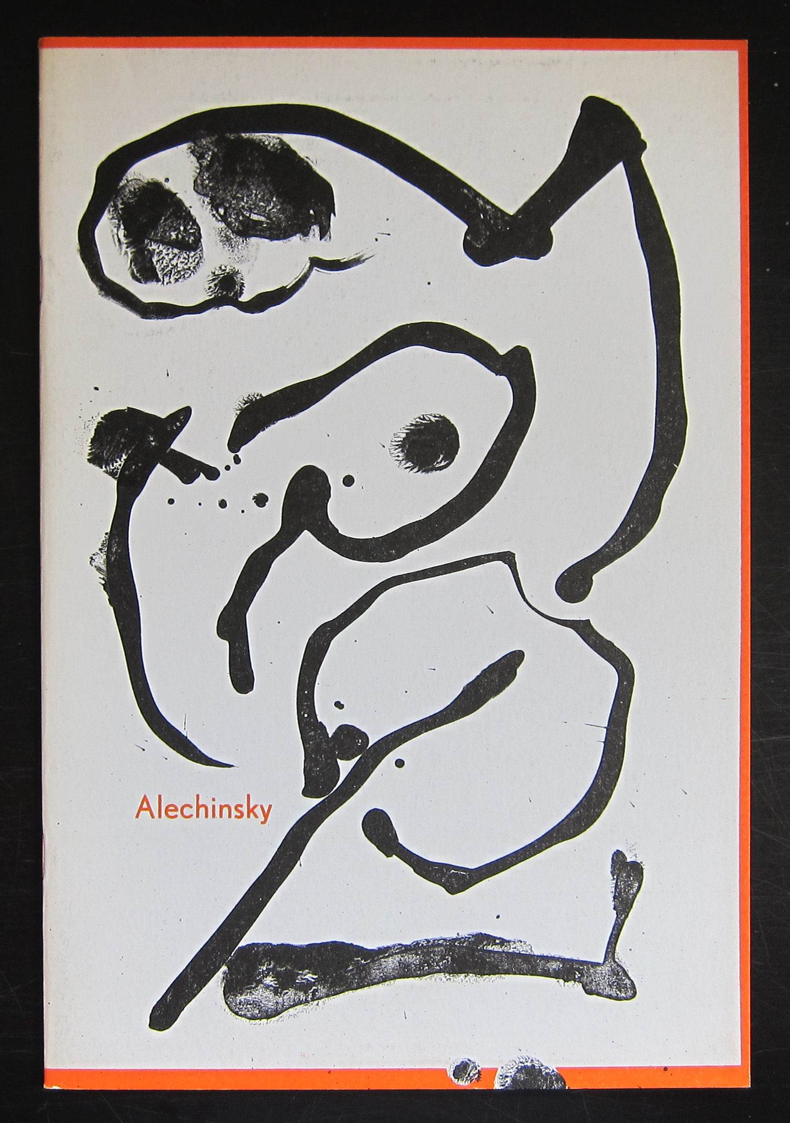
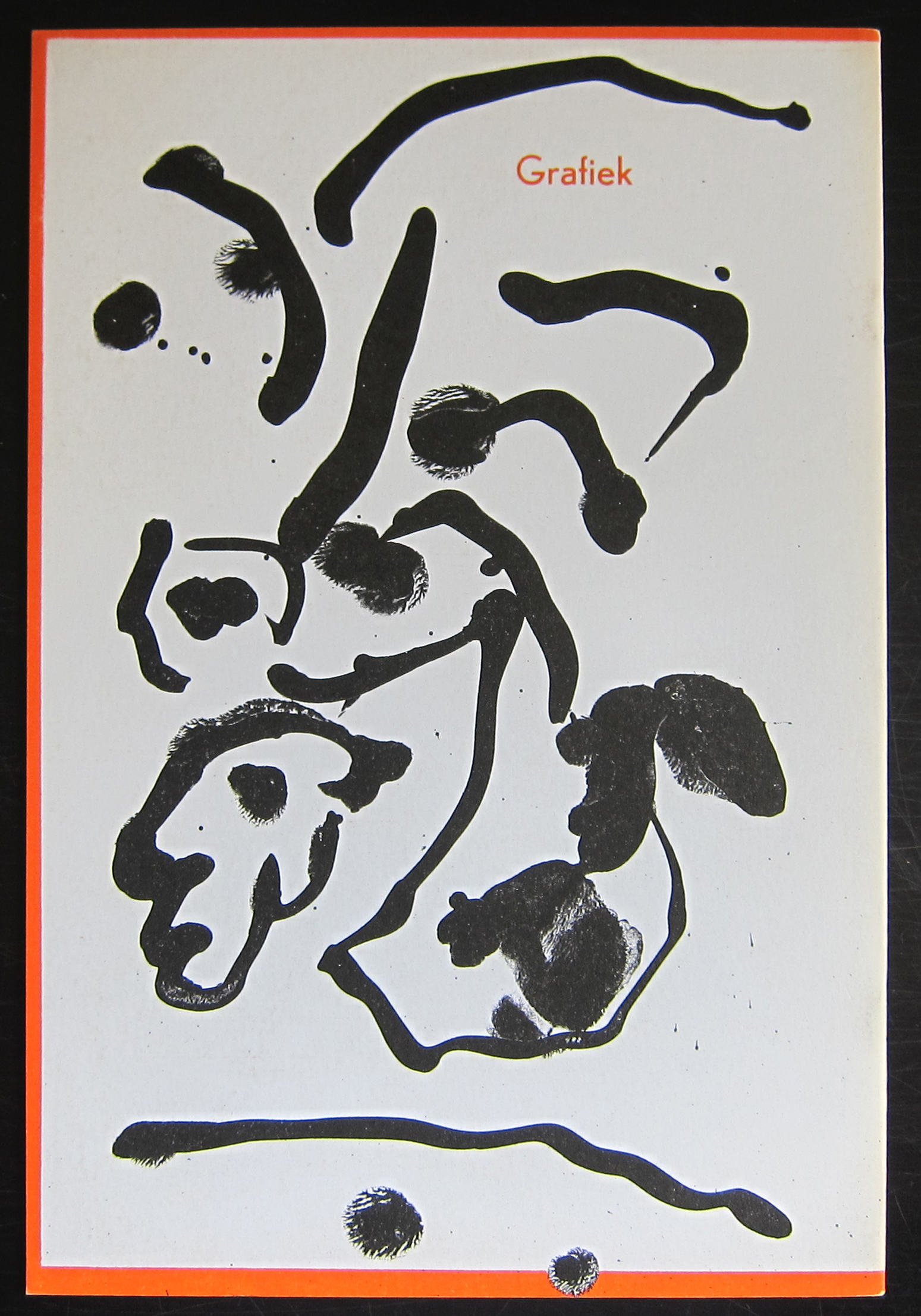
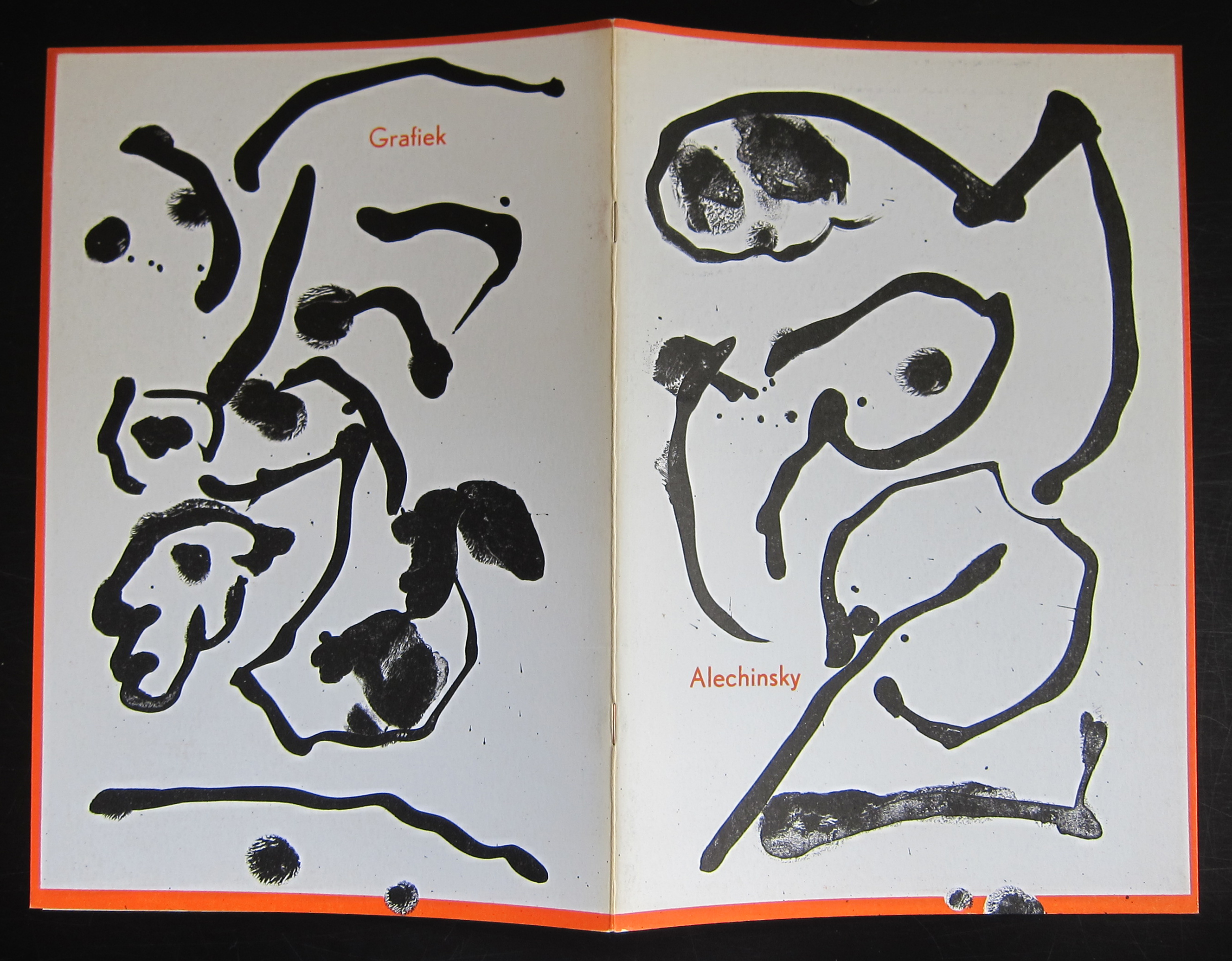
And what better way to end this year with a PERFECT publication by Pierre Alechinsky. In the sixties Alechinsky used original lithographs as cover for his exhibition publications and one of these is the no. 391 he made for the Stedelijk Museum in 1966 for his graphic exhibition. Photographs by Suzy Embo ( see earlier blog this month) and designed by Wim Crouwel. (available at www.ftn-books.com)
Arguably this is one of the top 5 publications the Stedelijk Museum made in the sixties, but for me this is perfection. Simple clean Crouwel design. the photographs are all excellent and the lithograph printed by Bramsen & Georges makes this one really stand out.
A perfect catalogue to end this year and start the New Year.
My best wishes to all my readers and followers for the New Year 2017.
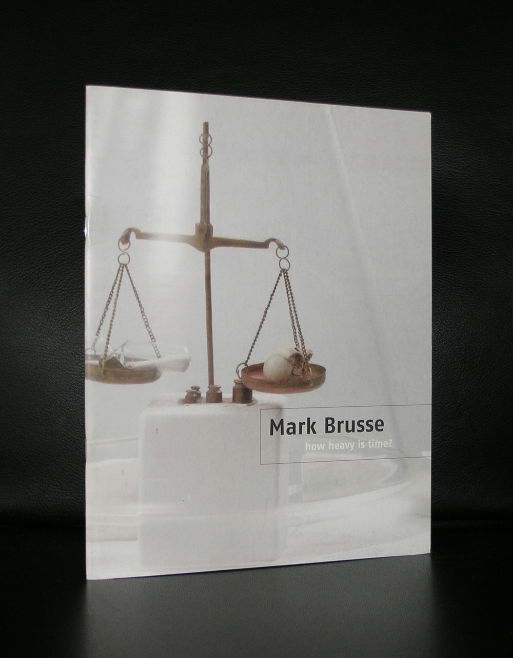
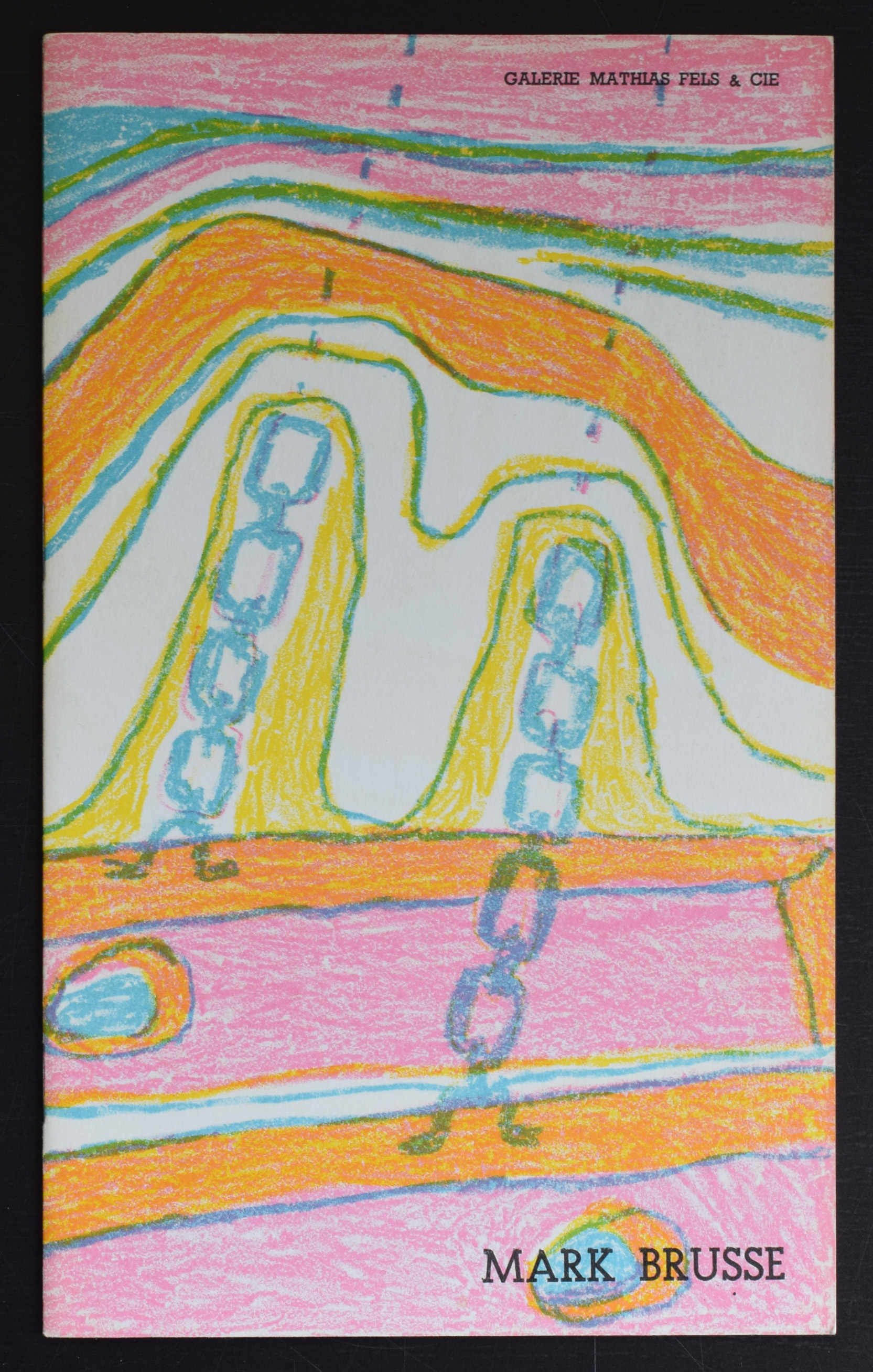
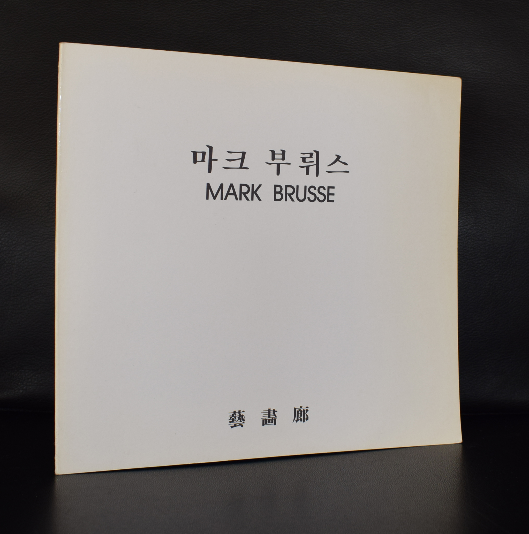
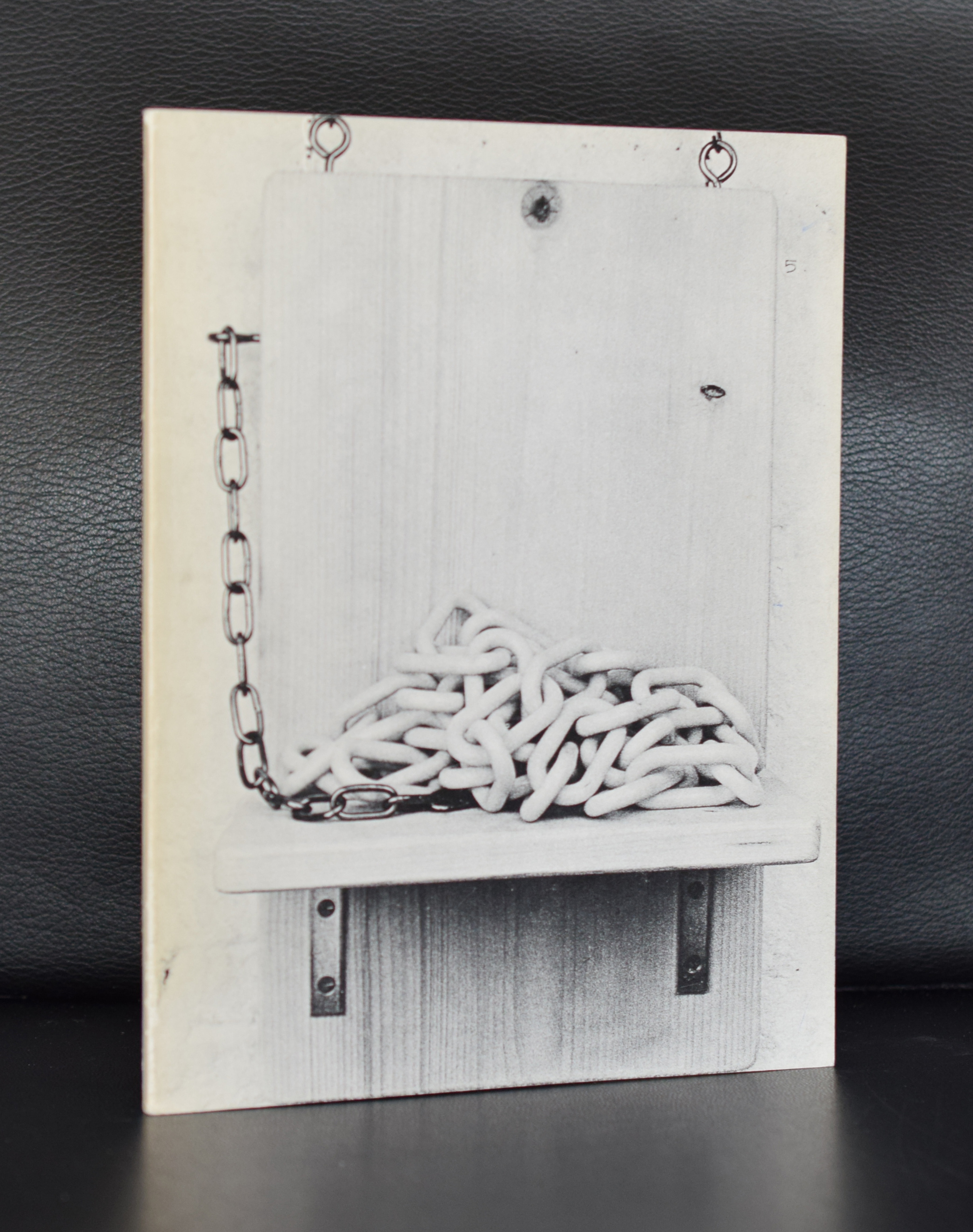
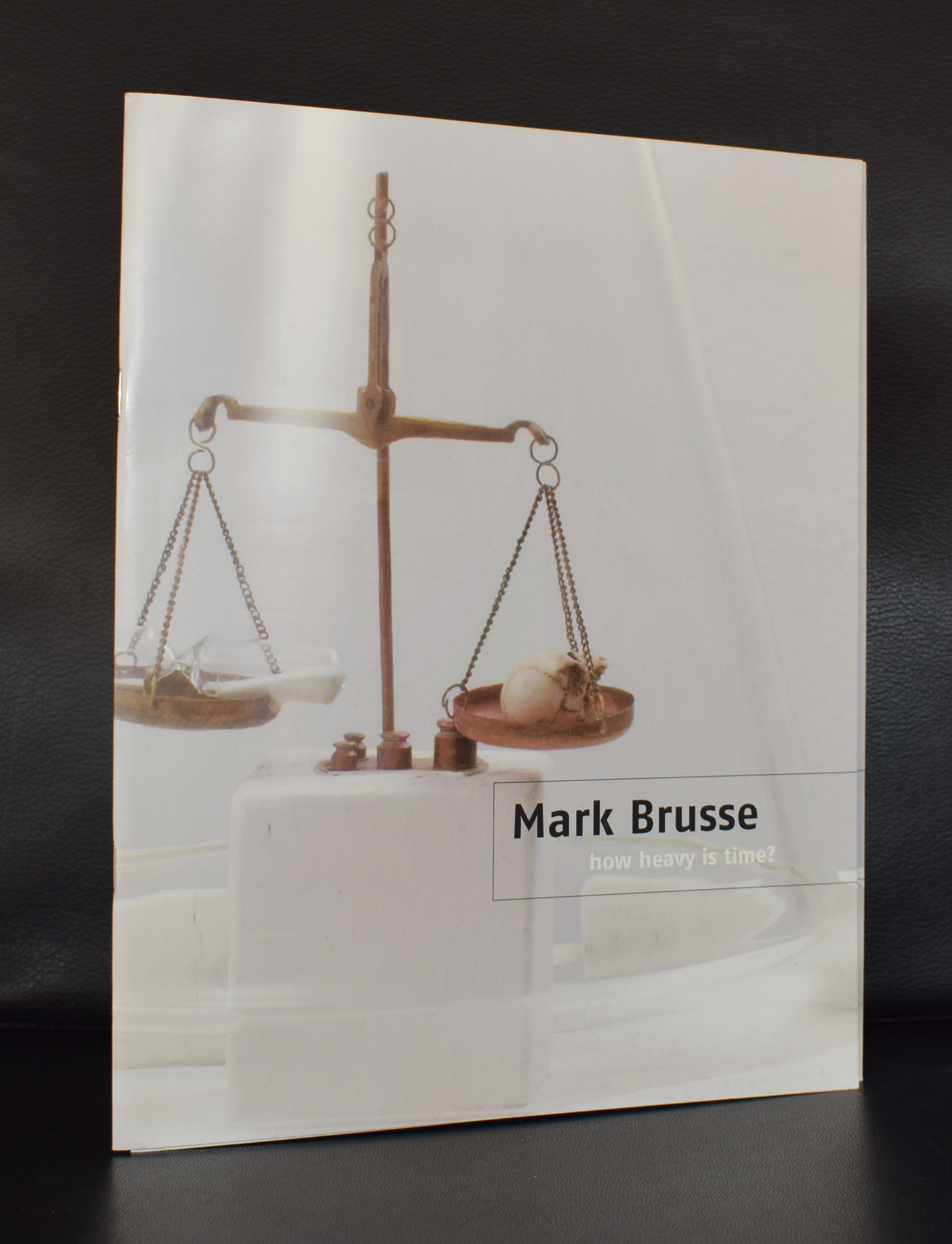
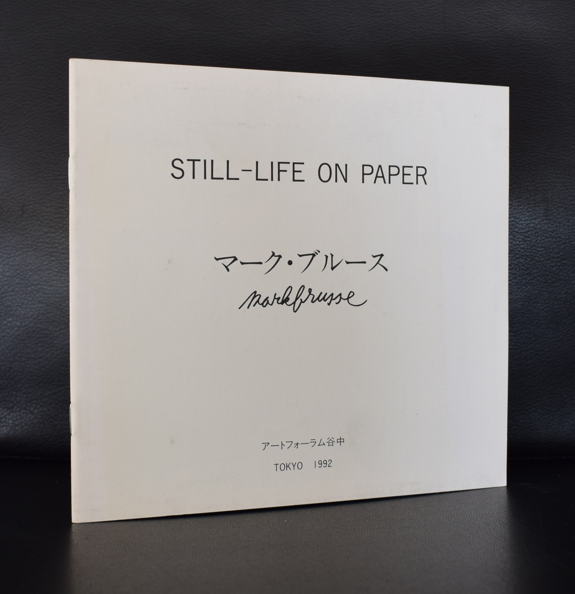
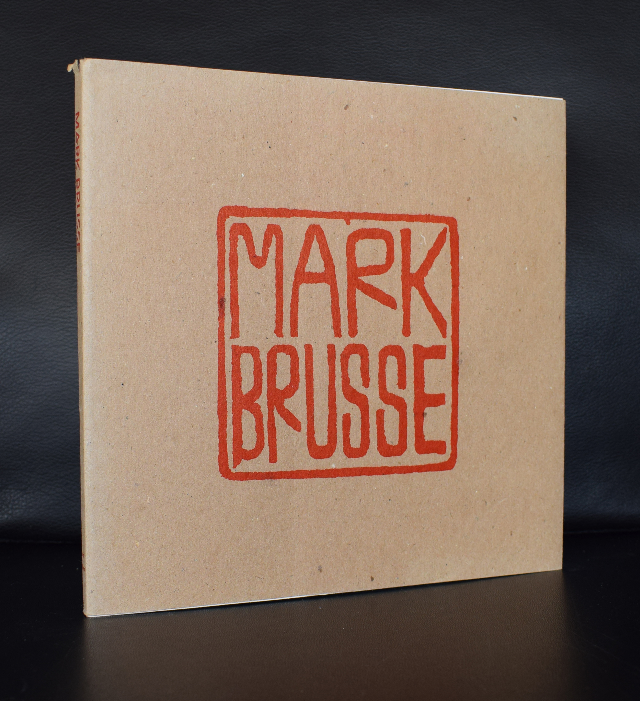
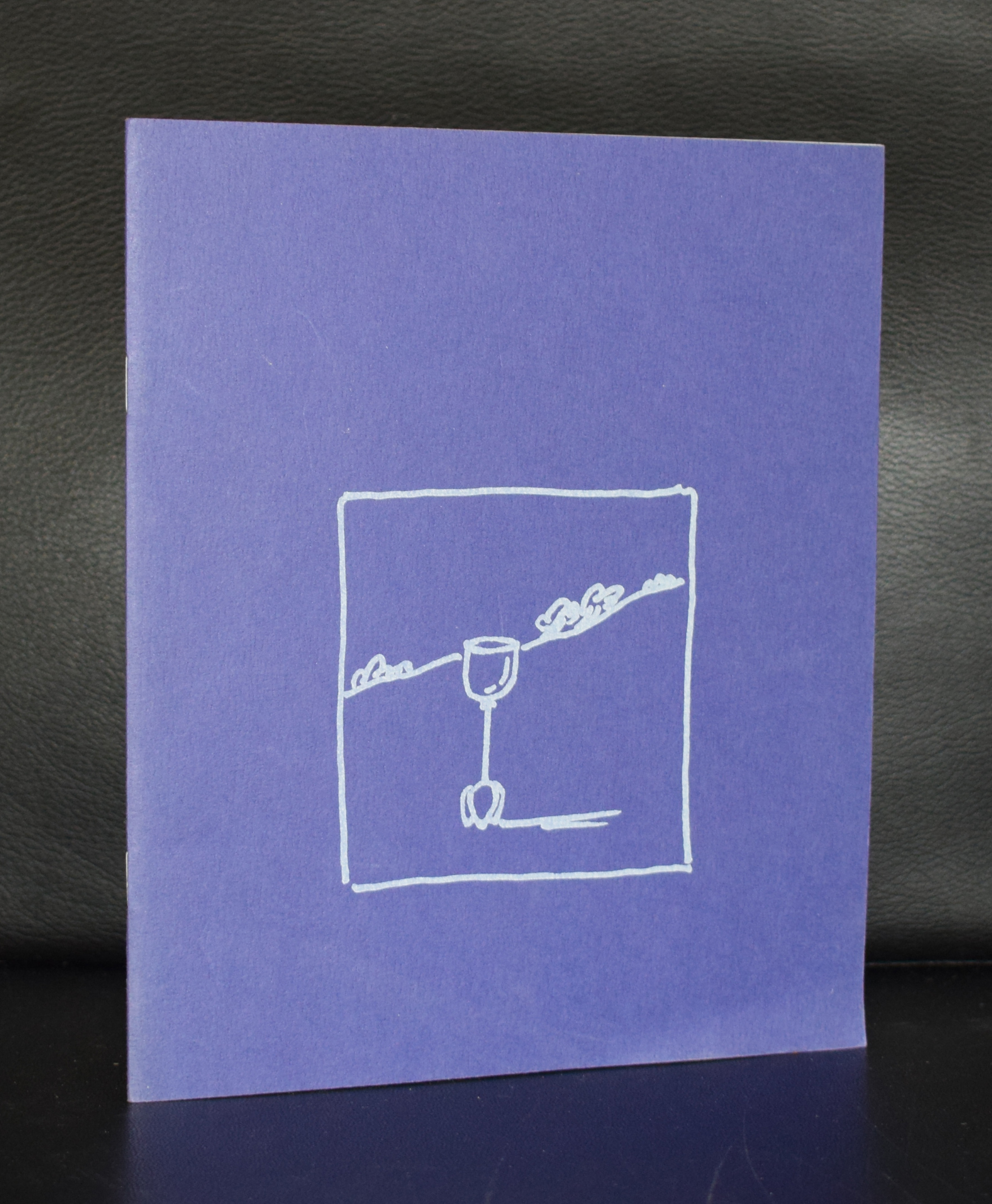
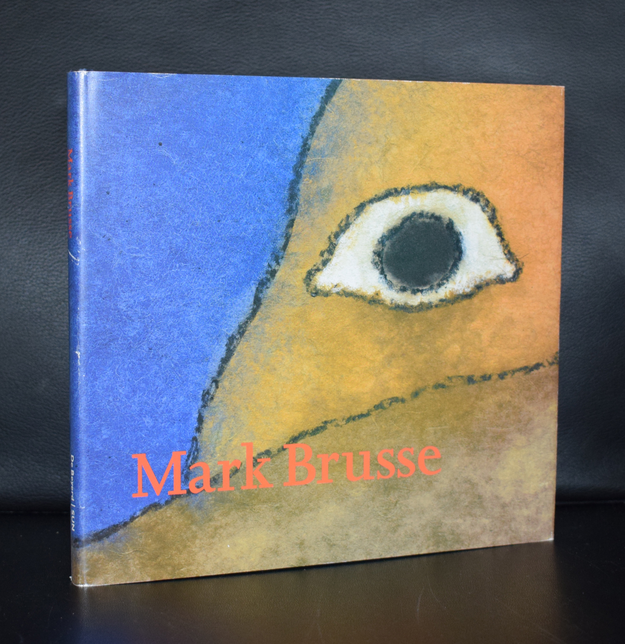
Mark Brusse has been living in Paris/France now for a very long time , but he originated from the Netherlands, where he started his career as an artist in the 60’s. He is described as a “poetic” artist and works with a multitude of materials. Painting, drawing, etching and making sculptures….. a multi talented artist who was far less appreciated in his home country than in France, where has has lived now for most of his life. This is the reason why many more publications in French can be found on this artist than there are in dutch. The strength of Brusse is his simplicity. Whith a few lines, a small drawing or some well chosen colors he draws your attention into the work and because this poetic simplicity he persuades you to like and admire it. In recent months i myself experienced on at least 2 occasions the strength of his works. The first time was at auction at the Venduehuis where the BLUE SHACK was sold.
…. a powerful painting and one i would have loved to have for my collection and the second time was a week ago where some Brusse prints were sold at Bubb Kuyper. These i was lucky enough to buy at a reasonable price and at least 2 of them will be for sale shortly at www.ftn-books.com
….but if you can’t wait for more information look at www.ftn-books.com to find many more publications on Mark Brusse.
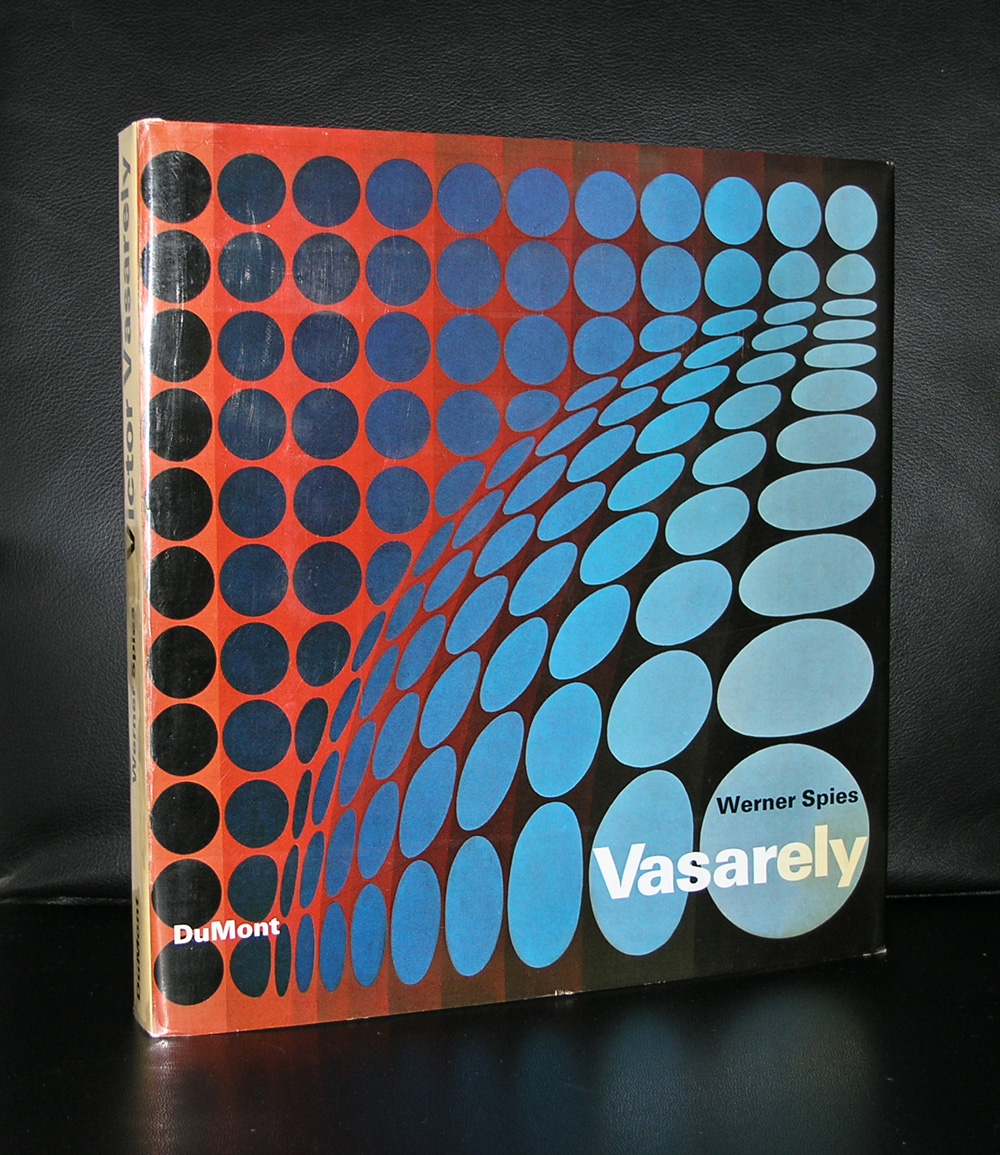
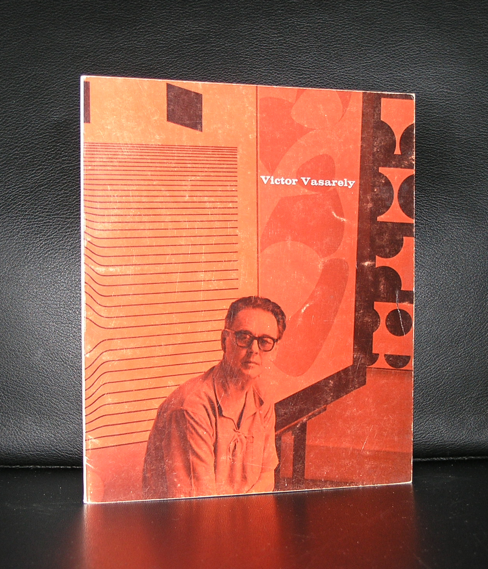
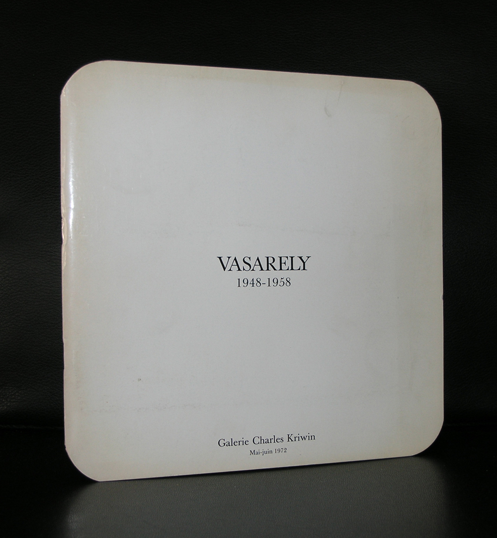
It must have been the early 70’s. There was an art dealer in the Hoogstraat in The Hague, who had in his window 2 silkscreen prints by Vasarely. I thought them wonderful, but lost interest in them because the edition size was 100 numbered /signed copies. At that moment i never had heard of art published in an edition. Nowadays it is common practice. Artists make a living out of these editions and people can purchase an affordable original piece of art. I should have bought them at that time, but time passes and one forgets about these. All of Vasarely’s works are practically forgotten in the 3 decades to follow, but now in the present days, Vasarely works are sought after and well worth collecting…even the one’s which are published in editions of over 100 copies.
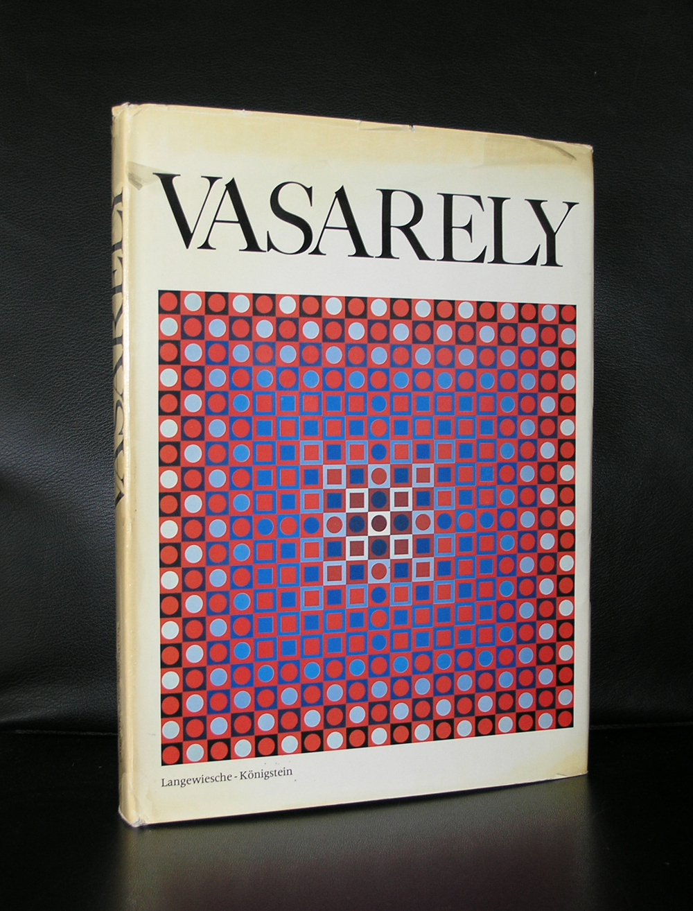
Vasarely has become one of the leading artists from the Geometric Abstract art/ optical art movement and the interest in his works is well deserved. With a highly original point of view and approach to Modern Art he has made many beautiful and impressive works of art and you can encounter them in all the large museums of the world.
When you travel Budapest do not forget to visit the Vasarely museum on the outskirts of this town. ( half an hour by tram ). It is not a museum as we nowadays have grown used to, but the art by Vasarely within this “basic” Museum is fantastic and the best OP ART you will seen gathered within one place .
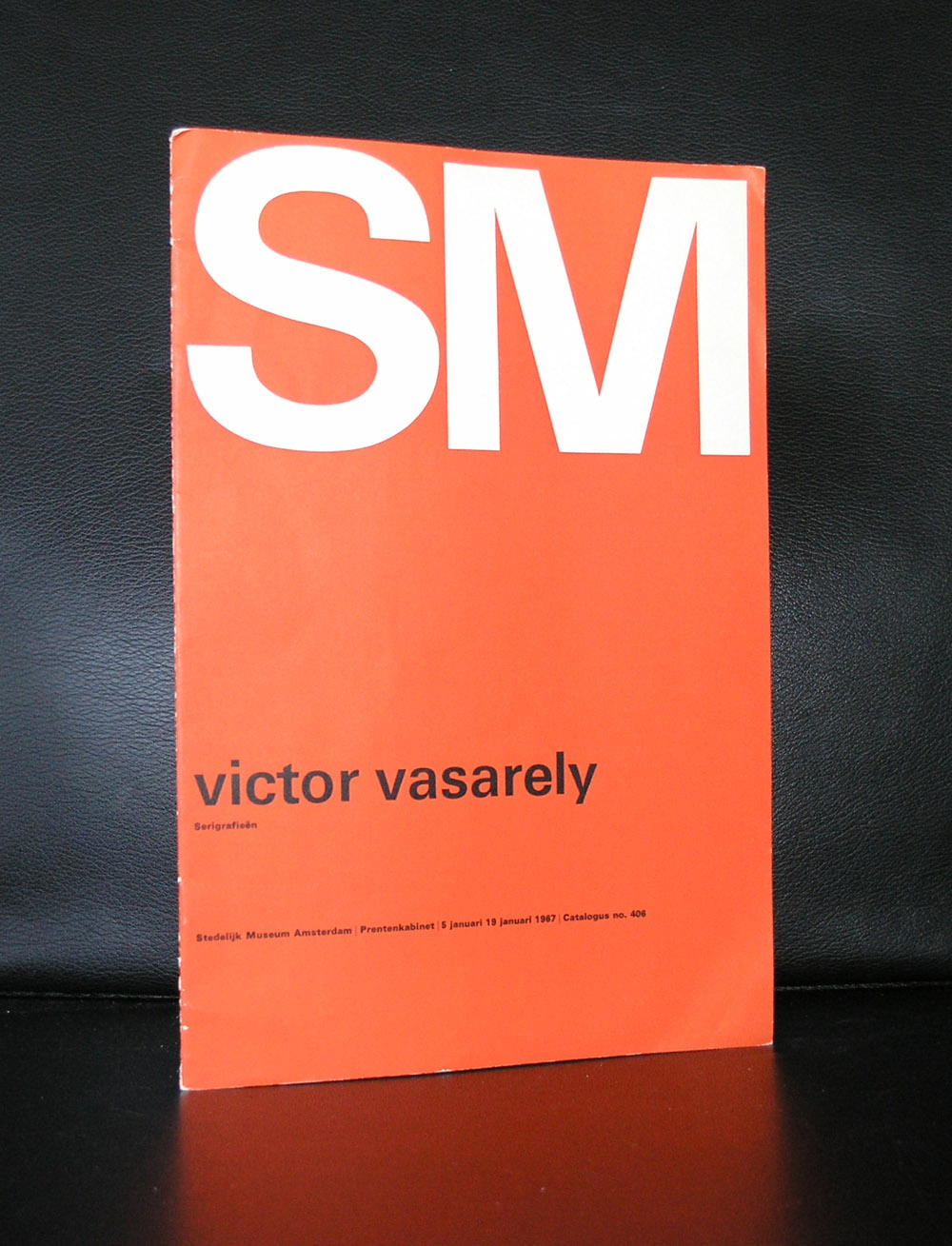
It even has in a showcase one of the Kriwin catalogues which is depicted below.
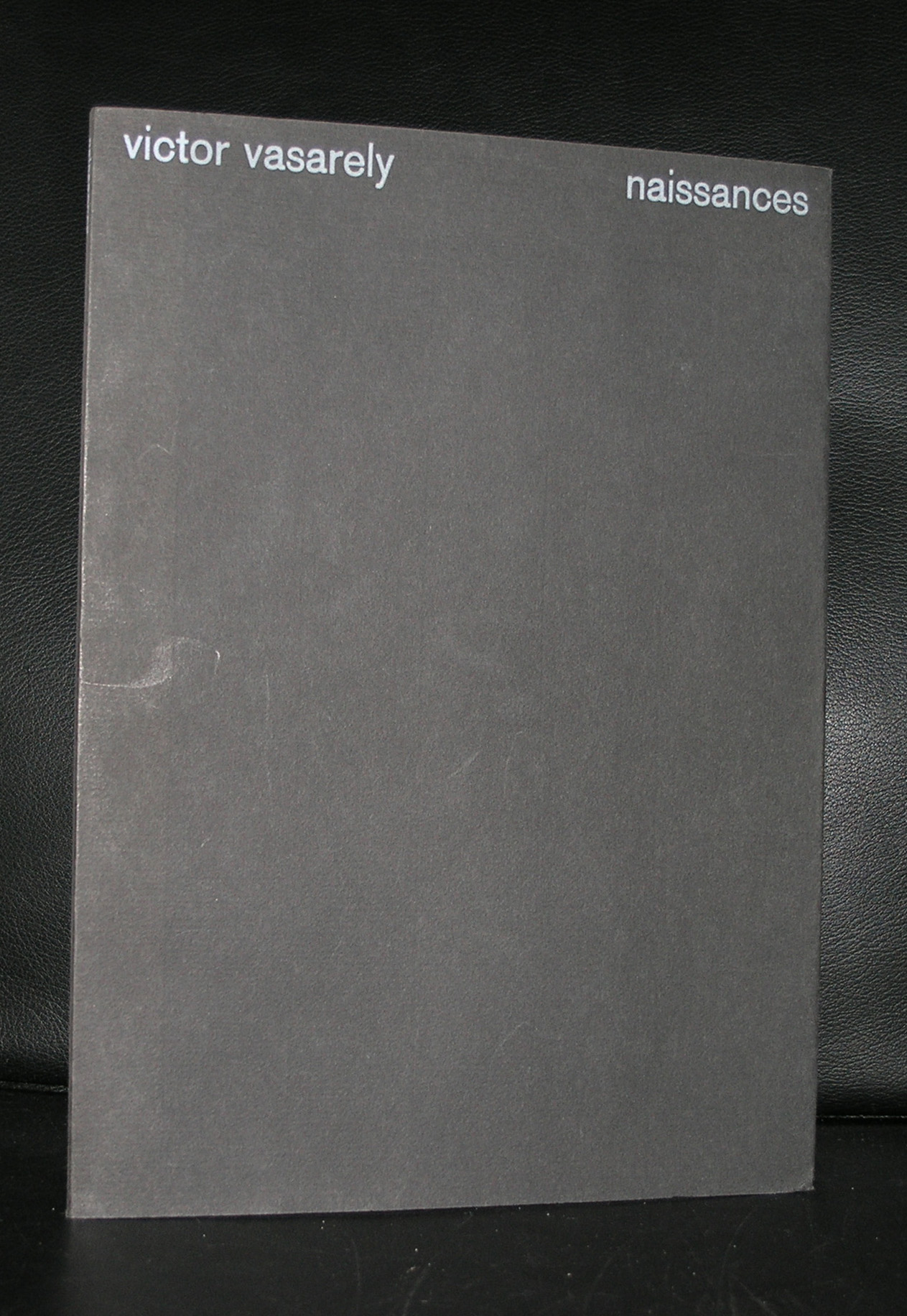
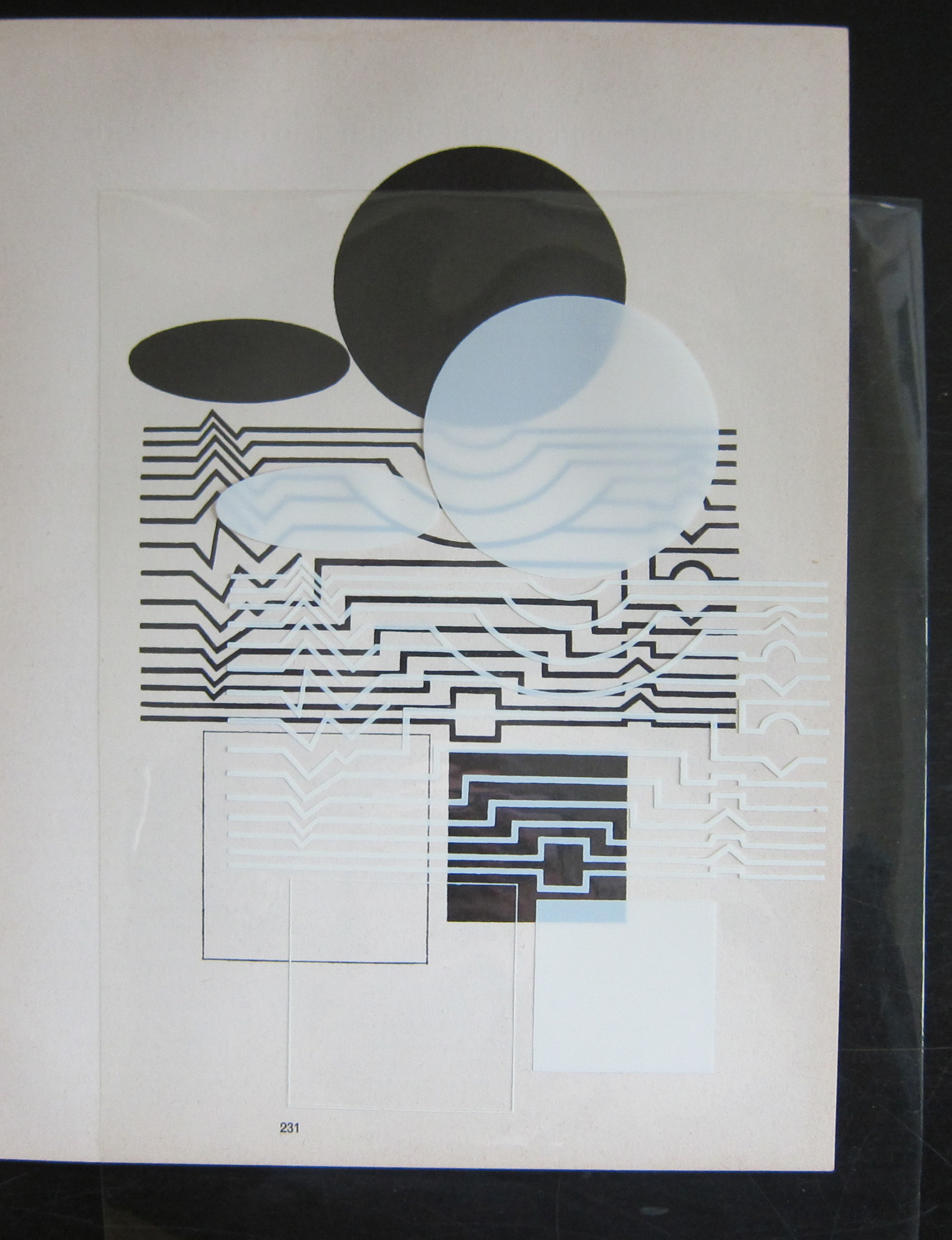
It is nice to know that the Vasarely catalogue published by the Stedelijk Museum has on the backside of the cover an original relief print in black and white. (above)
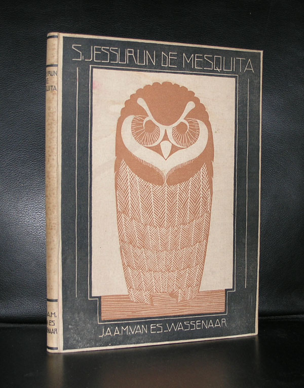
Did you know that Jessurun de Mesquita was the teacher of M.C. Escher?
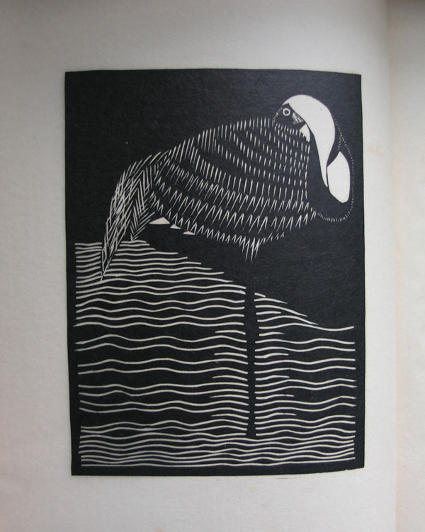
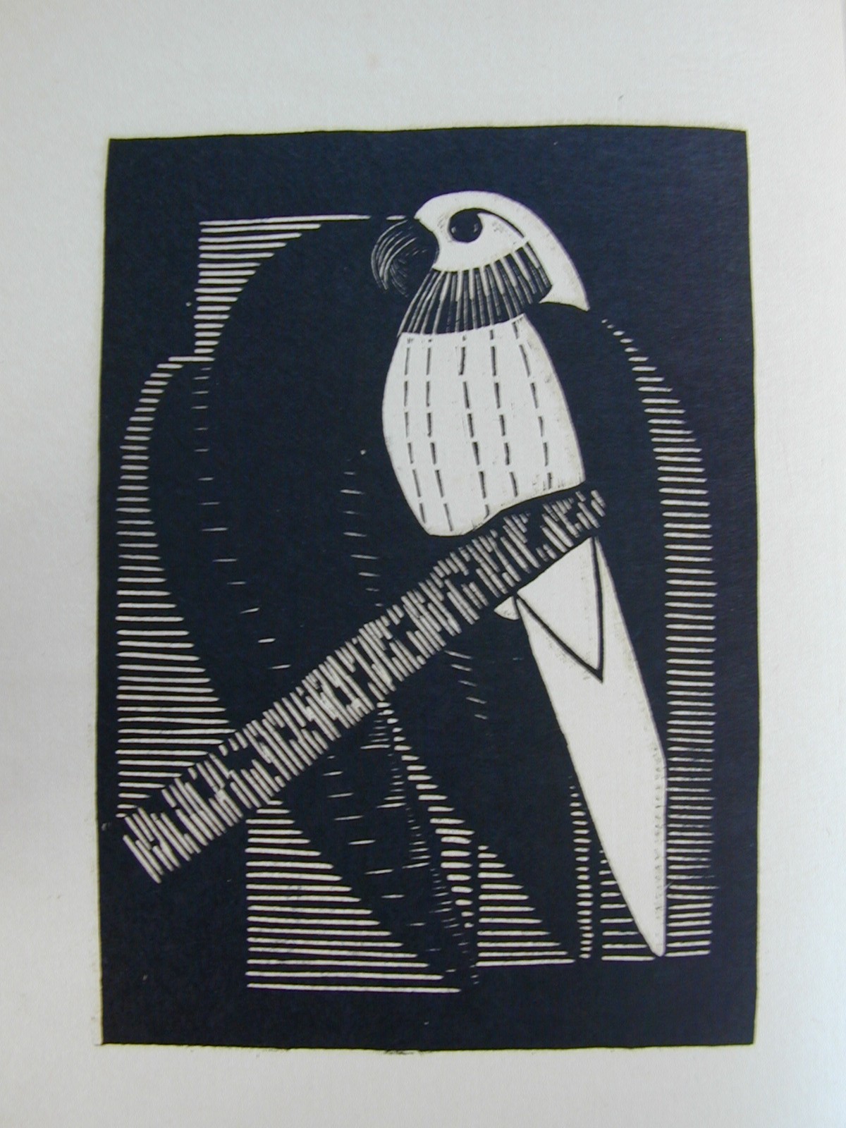
Escher developed his woodcutting skills under the supervision of Jessurun de Mesquita. From both sides there was a great admiration and respect for the other and Escher wrote the text on the commemorative exhibition Jessurun de Mesquita and Mendes da Costa received right after WWII in the Stedelijk Museum Amsterdam. An exhibition curated by another “star” from the forties an fifties, Willem Sandberg. Sandberg started right after WWII with this exhibition because he wanted to show the world the great loss of these 2 great jewish artists that did not survive the war. But lets focus on the works by Jessurun de Mesquita. Technically one of the very best at that time and with subjects that stood very nearby daily life and some surrealistic / Sensivistic drawings.
Many animals were depicted because the Artis Zoo was allways nearby and a much appreciated source for all his animal drawings and woodcuts. Nature, art deco and the best possible technique in the art of the woodcut print resulted in almost all of the cases in the best dutch art prints from that time.
Some excellent publications at www.ftn-books.com and for those reading the blog and want to order the very special Samuel Jessurun de Mesquita by Wassenaar/van Es from 1928. Use the code JESSURUNes and receive 10% discount on this title. Only 1 available and valid in september 2016.
This title from 1928 is the highlight in the book publications by Jessurun de Mesquita. It contains 2 original woodcuts on the inside and one original on the cover ( owl).
There is one other publication i can recommend and it is the monograph on Jessurun de Mesquita by the late Jonieke van Es, who wrote it and put one of the most complete catalogue Raisone’s together on any artist. This one for Samuel Jessurun de Mesquita is very special indeed.
And finally . for all readers of this blog….I have a nice set of Jessurun de Mesquita available 7 postcards for $15.00 including Worldwide shipping.
Artist/ Author: Oliver Boberg
Title : Memorial
Publisher: Oliver Boberg
Measurements: Frame measures 51 x 42 cm. original C print is 35 x 25 cm.
Condition: mint
signed by Oliver Boberg in pen and numbered 14/20 from an edition of 20