Posted on Leave a comment

Corneille and Jaski Art (1992)

corneille koster

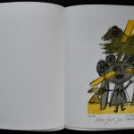
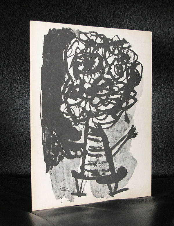
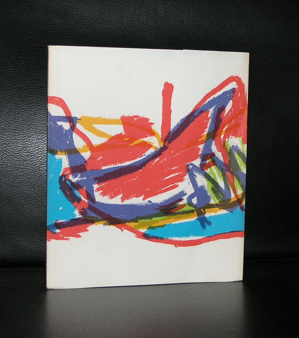
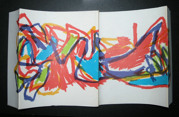
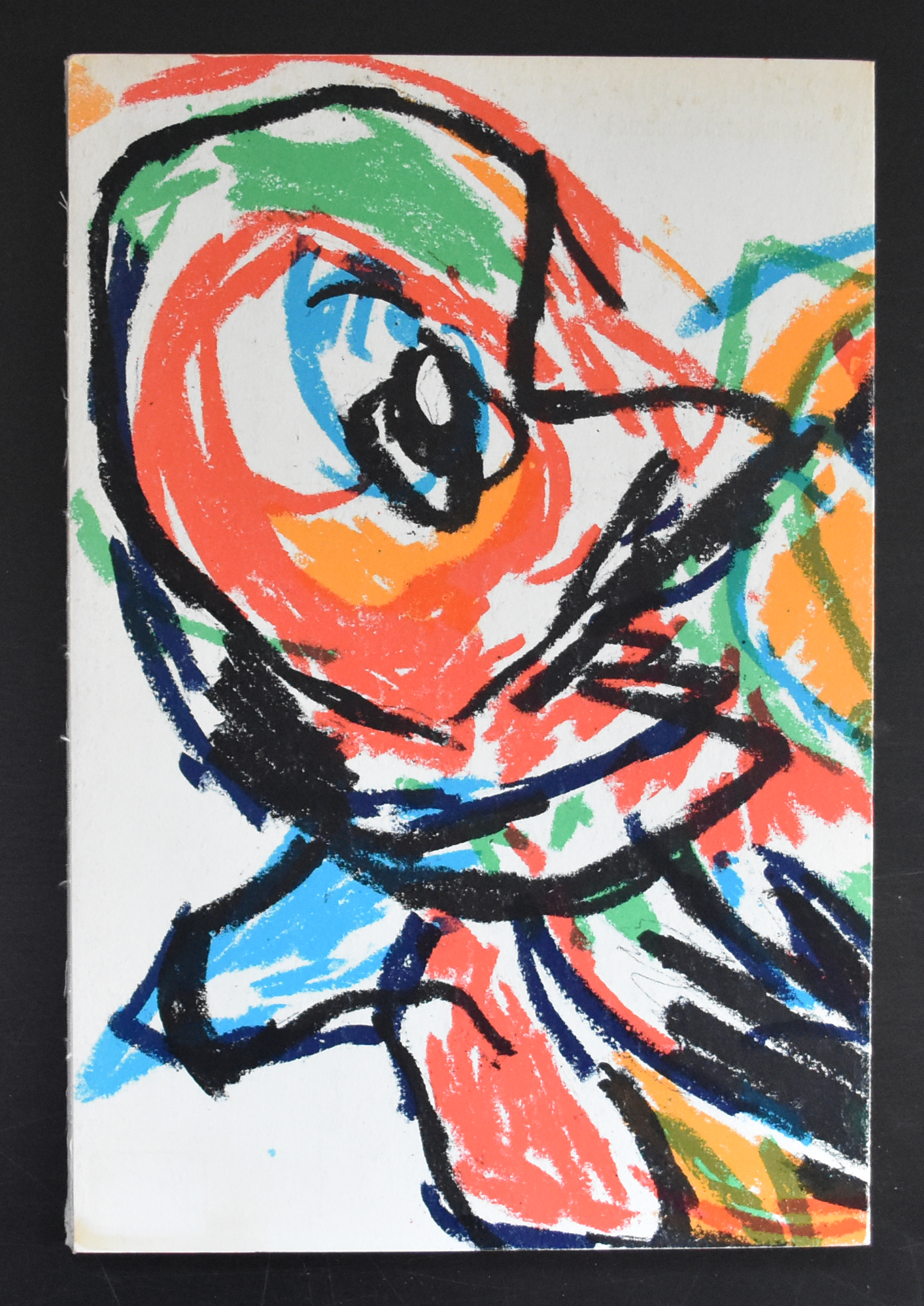
Jaski Art was founded in 1988 and it must have been shortly after that they represented Corneille as an artist. From that day on Corneille commercial success was far more than ever expected. AS a CBRA artist , Corneille was known for his composition and child like drawings, but as his name grew he was appreciated for his female heads, nudes and birds and in many cases a colorful comppostion soft all three elements. Personally i think Corneille of the last 3 decades is less interesteing than his early period. There are of course exceptions and one of those is the Corneille 1992 publications which contains an original  lithograph with one of his child like drawings . Signed and numbered from an edition of only 250 copies this is the one to have and available at www.ftn-books.com

It has all the qualities of his early Cobra work and illustrated why as a COBRA artist Corneille is one of the greatest.

corneille jaski cc

Posted on Leave a comment

Pierre Alechinsky…. a perfect publication.


The end of this year is near and almost 300 blogs have been published since I started blogging on WordPress. www.ftn-blog.com grew in an excellent way and i am looking forward to keep you informed on my inventory and exploits in art.

And what better way to end this year with a PERFECT publication by Pierre Alechinsky. In the sixties Alechinsky used original lithographs as cover for his exhibition publications and one of these is the no. 391 he made for the Stedelijk Museum in 1966 for his graphic exhibition. Photographs by Suzy Embo ( see earlier blog this month) and designed by Wim Crouwel. (available at www.ftn-books.com)

Arguably this is one of the top 5 publications the Stedelijk Museum made in the sixties, but for me this is perfection. Simple clean Crouwel design. the photographs are all excellent and the lithograph printed by Bramsen & Georges makes this one really stand out.

A perfect catalogue to end this year and start the New Year.

My best wishes to all my readers and followers for the New Year 2017.

wilfried

Posted on Leave a comment

Karel Appel and the original litho covers

No….this is not a title for a classic Roald Dahl story, but this is reality. Some museums, but specially the Stedelijk Museum Amsterdam, had a policy to make affordable catalogues for their visitors to accompany their exhibitions in the 50’s and 60’s.

Designed by the best in the business ( Willem Sandberg and Wim Crouwel ) they had the task to produce these catalogues at a low price without being cheap looking. They experimented with low cost papers, small editions, number of pages between 24  and 48, most of the time stapled and a scarce use of color. Only one exception was made ….in some cases an original lithograph by the artist was used as a cover. This is why some of these beautiful catalogues are even more desirable…all because of the original lithograph.

Karel Appel was one of those artist who had his peak in the sixties and was able to demand the best possible catalogues with his exhibitions and Sandberg granted this. The Appel catalogues which were published in the late 50’s and early sixties are among the best from the catalogue series of the Stedelijk and should be present in every serious Karel Appel collection.

Just look at this foldout cover and be convinced yourself that this is special.

appel-litho-sm-b

For the readers of this blog…i have two of the above 1965 catalogues available at

www.ftn-books.com