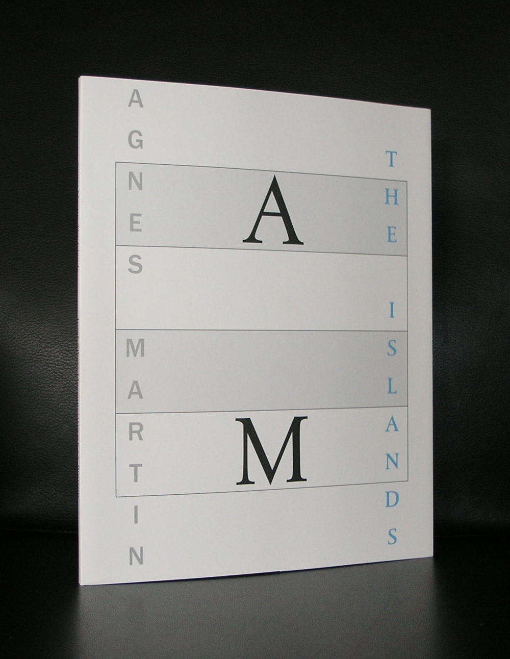
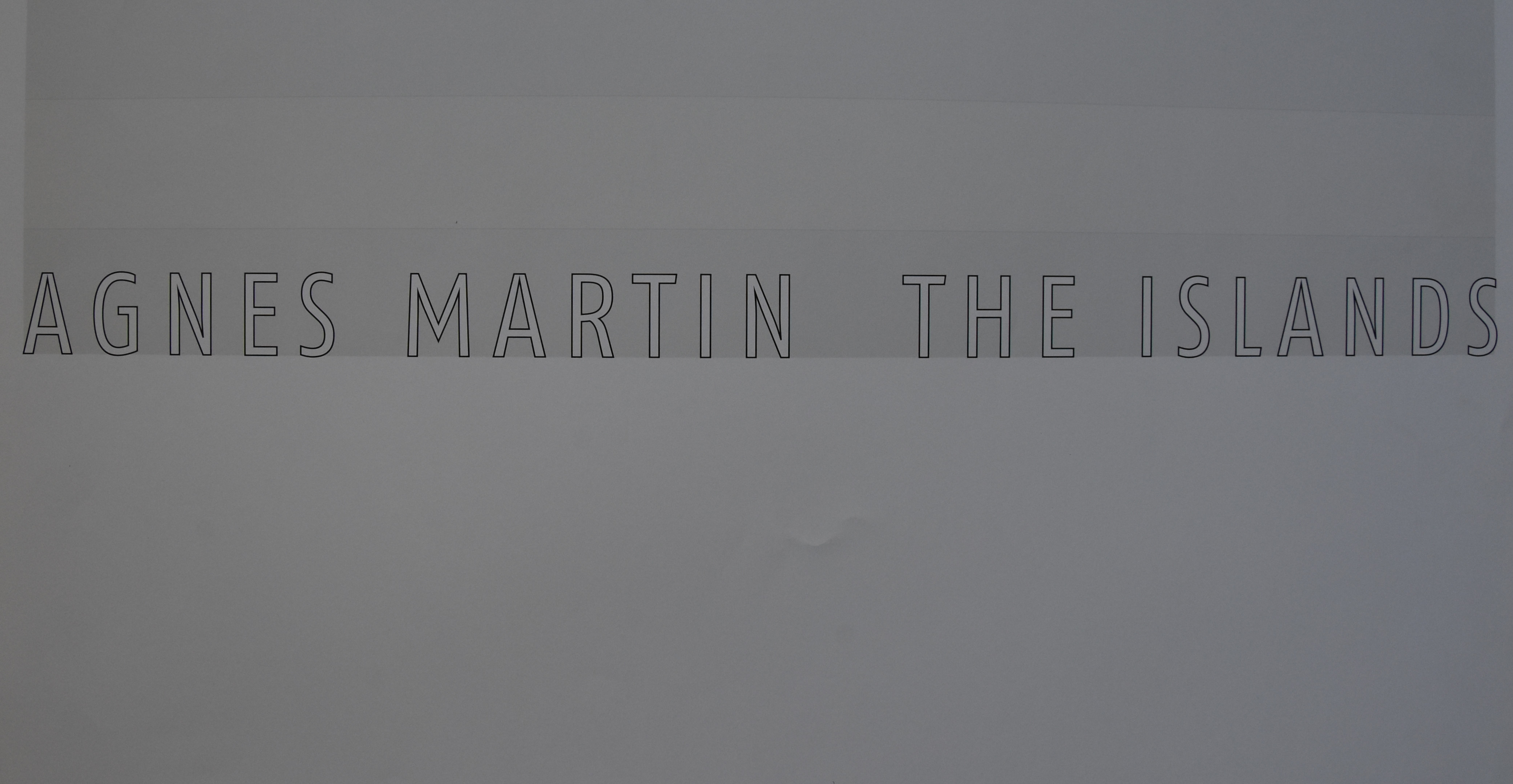
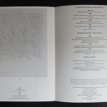
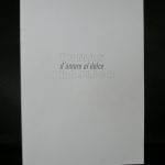
Yesterday i spoke about the Josef Albers Museum in Bottrop and their excellent poster publications. Today i will present the very best of them. It is the magnificent Agnes Martin poster for the “the ISLANDS’ exhibition. Executed as an original silkscreen this poster is a true work of art.
This is a highly collectable and important poster> not only because the exhibition was important, but because of the printing technique this is a masterpiece.
Poster and exhibition catalogue are both available through www.ftn-books.com
Tomitaro Nachi was one of the first japanese artist ever to have an exhibition in the Stedelijk Museum. Wim Crouwel designed the catalogue for his exhibition and what makes it extra special is that the catalogue included a rare and beautiful multiple. There is wonderful short movie about this artist which was made at the time of his exhibition at the Stedelijk Museum in 1974.
The catalogue shines. It is like a minimal artist book and reflects the spirit of “Zero” and Kinetic art and was forgotten by most until recently it was sold at a local book auction and fetched a steep price of euro 120,– because it had the original multiple included. www.ftn-books.com has both copies available. The one with and the one without the multiple. Both are worth collecting, but as lng as it is there i would chose the one with the multiple included.
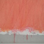
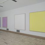
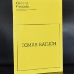
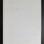
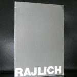
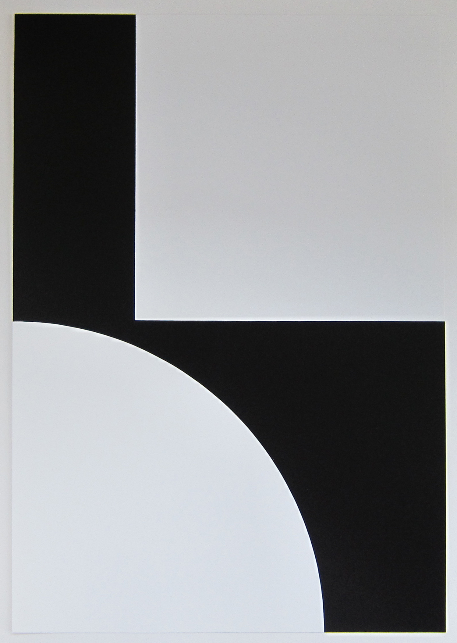
Last Sunday me and Linda visited the Tomas Rajlich exhibition in the Boijmans van Beuningen museum in Rotterdam. I had to see it , because i am a long time admirer of the works by Rajlich. Fundamental paintings almost like Minimal art , Rajlich stayed loyal to his monochrome paintings, with or without a grid with or without a very precise space of 5 cm. in between the lines just paint. I admire his gold paintings with the pencil grids, but his grids can appear in very different ways. white lines, black lines, pencil or painted with the fingers or the entire hand. The ones in the Boijmans have a vertical grid which is applied with some sort of comb and like the smaller sketches/drawings in the adjacent room, glitter is applied on the surface which gives an extra dimension. Still the execution of the paintings is almost the same like some 30 years ago.
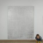
Look at the details of one of his gold paintings and the much more recent red painting. At the bottom of the painting it looks like paint is dripping from the canvas. as if all sites matter except the bottom. Rajlich is for my personally one of the most fascinating artist whom i have met and his art is timelesss. I am glad this show is organized with a great and impressive overview of some of his best recent paintings ( 2003) which he has lent on an extended loan to the Boijmans van Beuningen.
www.ftn-books.com has some nice and rare Tomas Rajlich publications available
Here is the text Boijmans published on its site:
Painting was declared dead in the early 1970s. Tomas Rajlich (1940) opposed this notion and revived painting by making the act of painting itself the subject of his canvases. In 1975 he was one of the most important exponents of Fundamental painting: a collective term for works in which idea and materials are inseparable. Rajlich still considers himself a Fundamental painter and has continued to develop as such to the present day.
The grids that were so characteristic of Rajlich’s early works seem to have disappeared from his recent monochrome canvases. The grid has become simply one of the elements, like the paint, glitter and linen that Rajlich uses to build up his extravagant paintings.
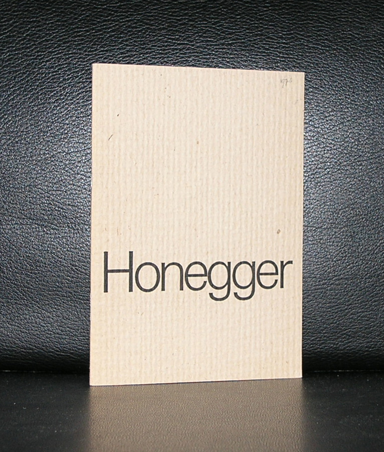
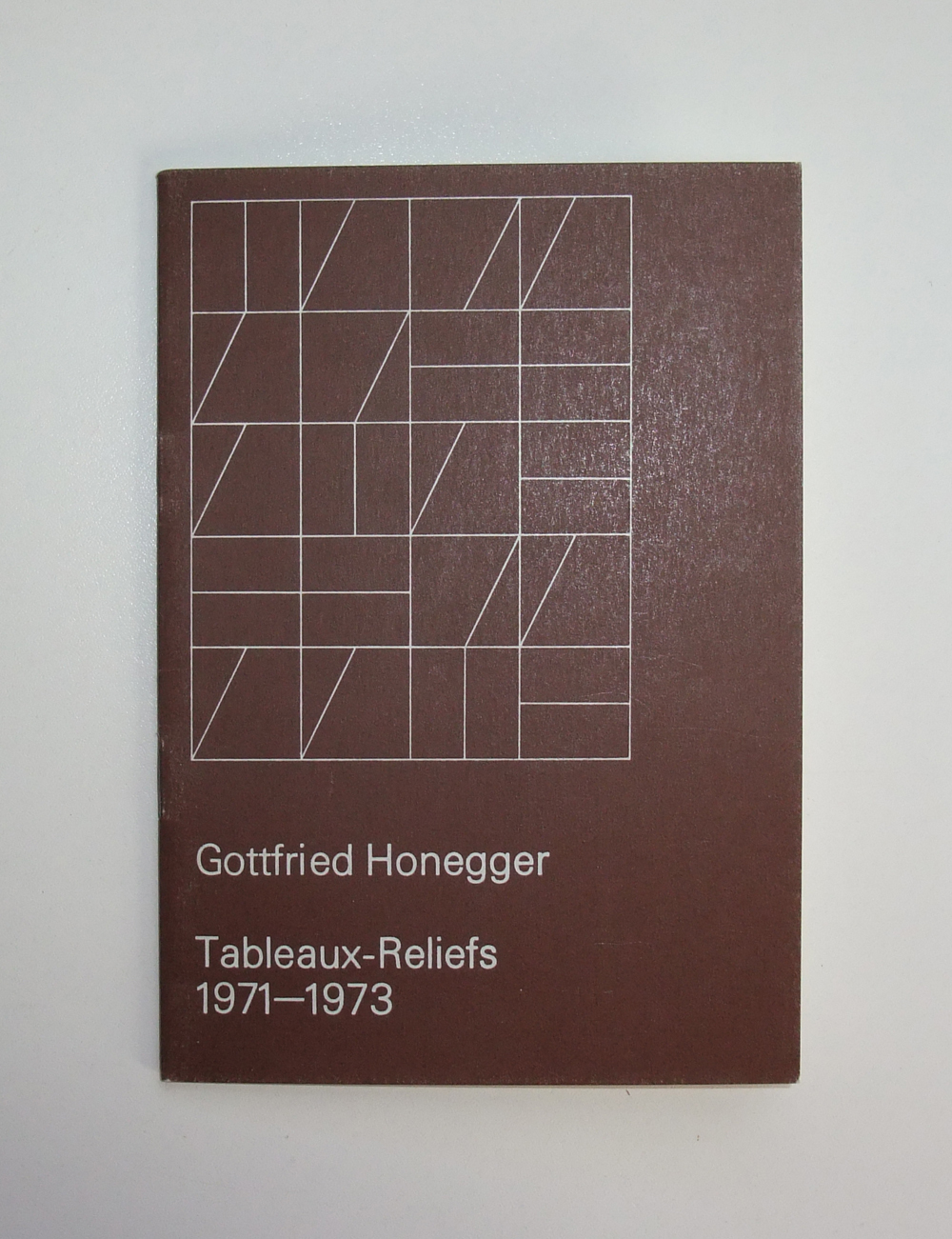
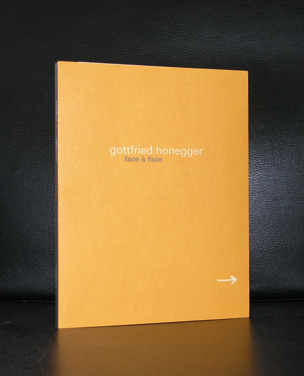
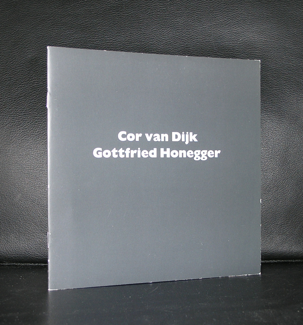
Nearly 100 years , Gottfried Honegger died at the age of 98 in 2016 and left us a beautiful ouevre of Geometric and constructivist art.
was a Swiss artist and graphic designer. He was married to the Swiss illustrator Warja Lavater. He studied shop-window display at the Zurich Kunstgewerbeschule and taught there from 1948. His early work was commercial graphic design.
From 1955-1958 he was art director at Geigy. He lived in New York City between 1958 and 1960, and held his first exhibition there. In 1961 he moved to Paris and concentrated on painting, which concentrated on exacting explorations of circles and squares,[4] and (from 1968), sculpture.
OLYMPUS DIGITAL CAMERA
Honegger also spent time in Dallas, Texas as the artist in residence at the University of Dallas. Honegger died at his home in Zürich, Switzerland from a short-illness on 17 January 2016, aged 98. The first time i heard of this artist when i acquired a beautiful series of books which included 2 special prints by Honegger. The first artist i thought of was Ellsworth Kelly, but no this was for me an unknown Swiss artist who had the same quality as Kelly only only a much smaller scale. These works are time less and deserve to be collected by all great museum in the Modern Art world, but until now only in a few museums in Switzerland and Germany i encountered these works. It was easier for me to find some great publications on this artist which are now available at www.ftn-books.com
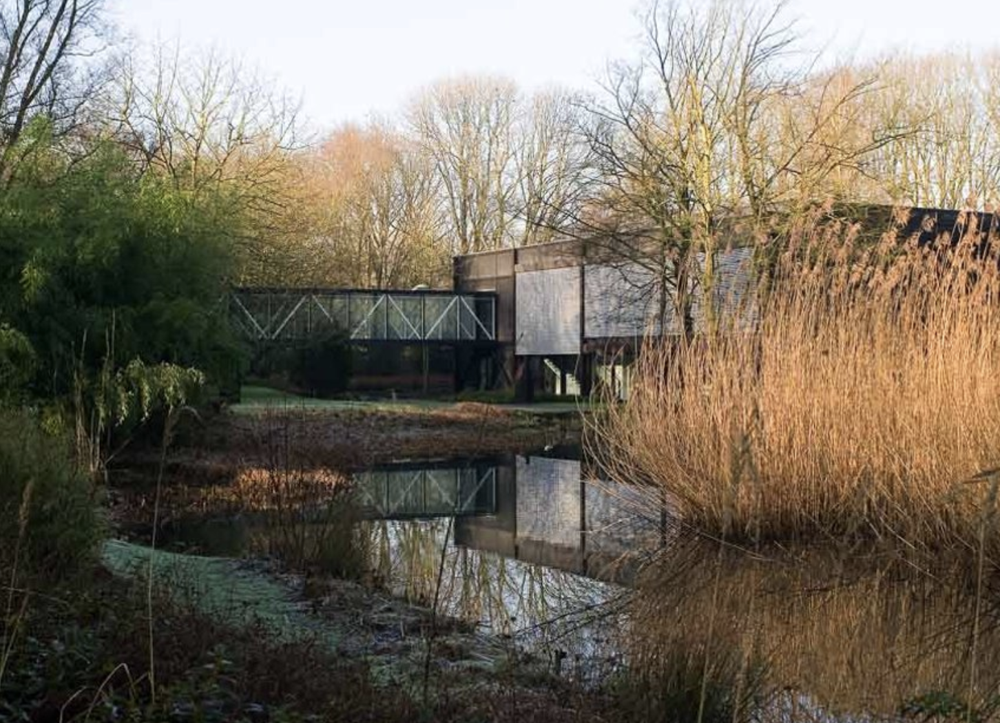
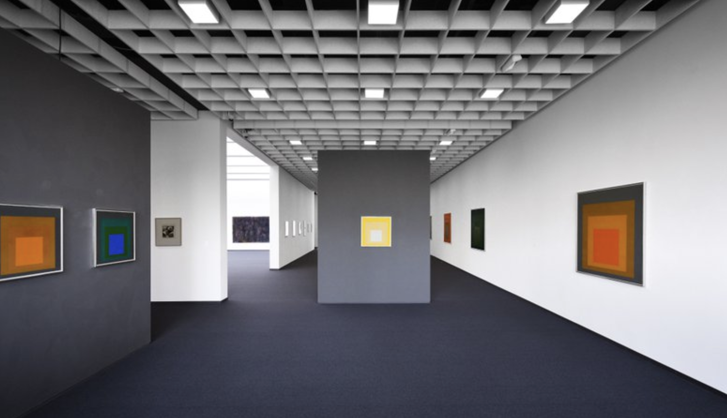
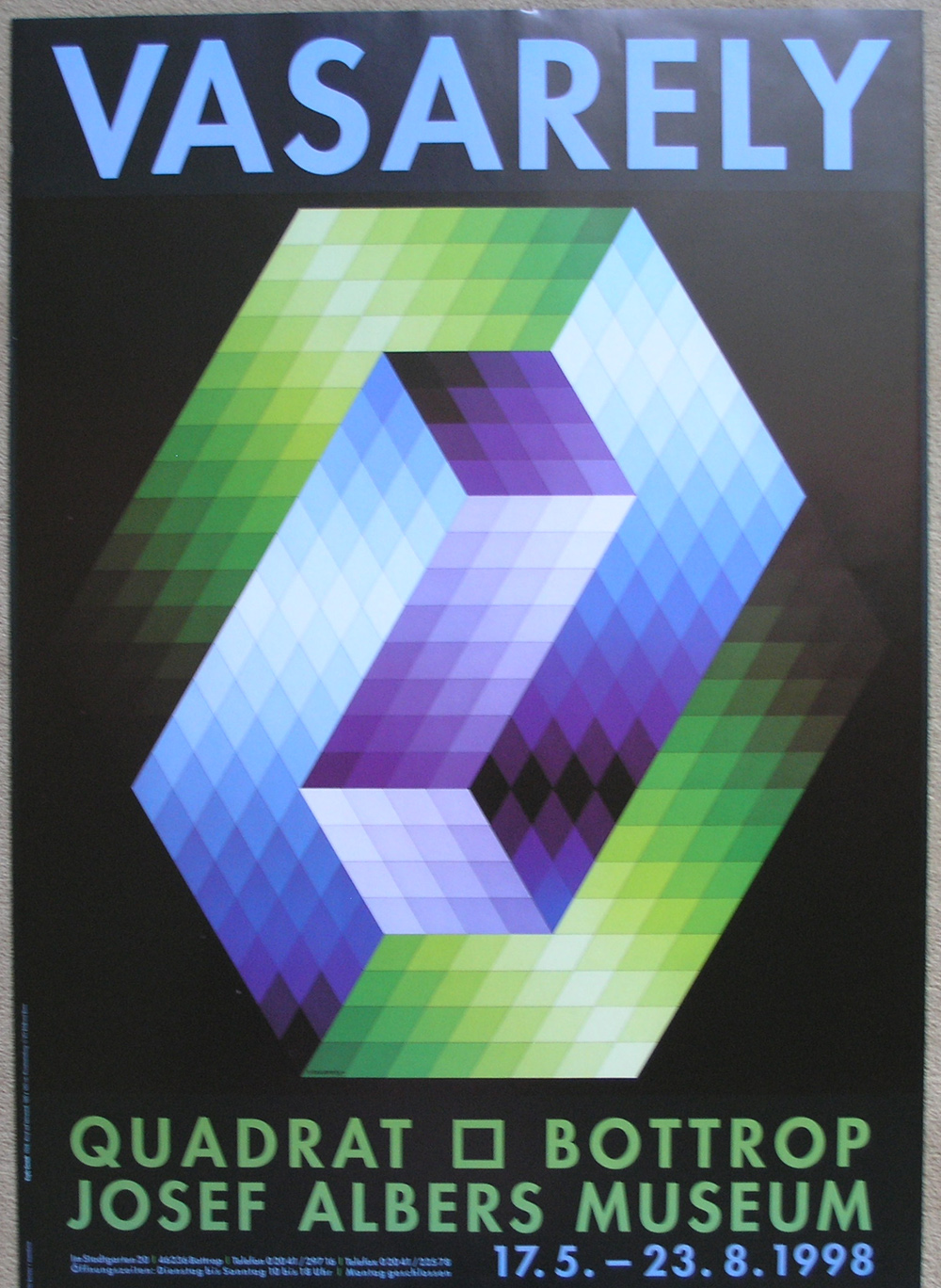
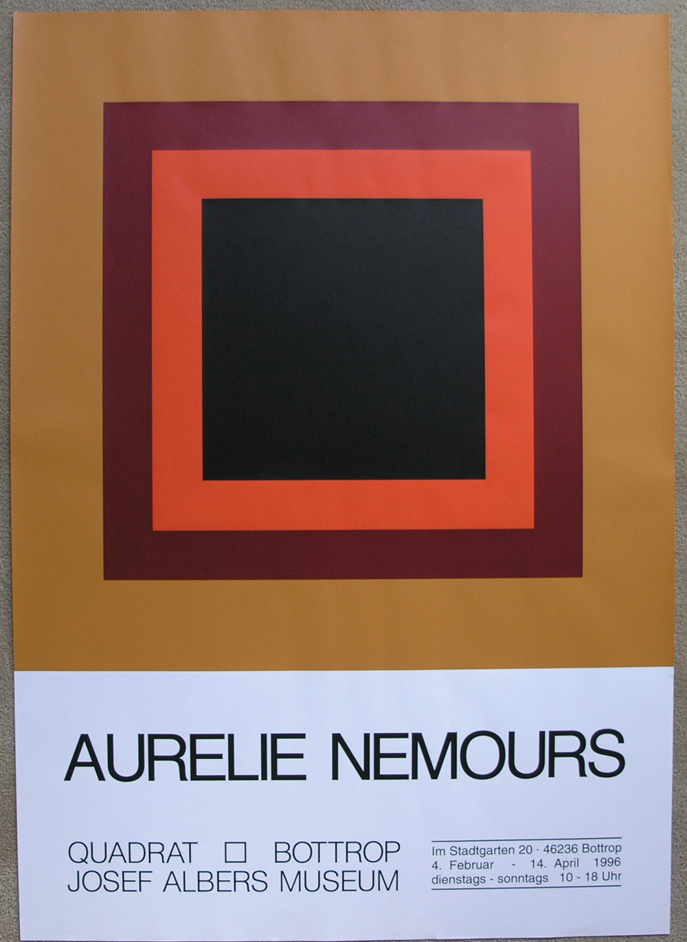
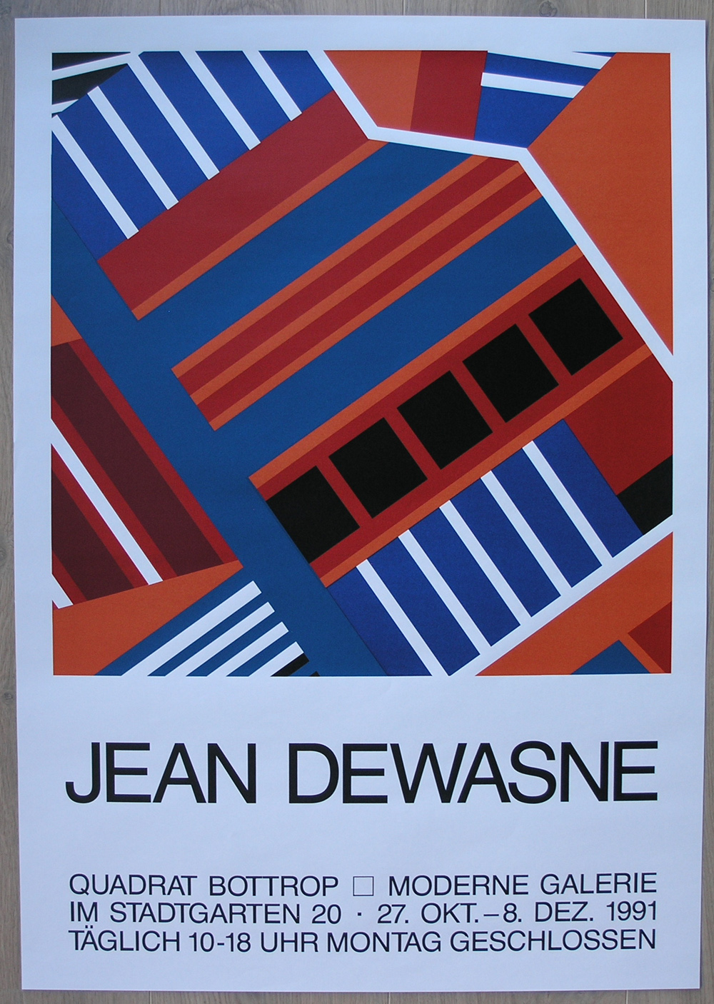
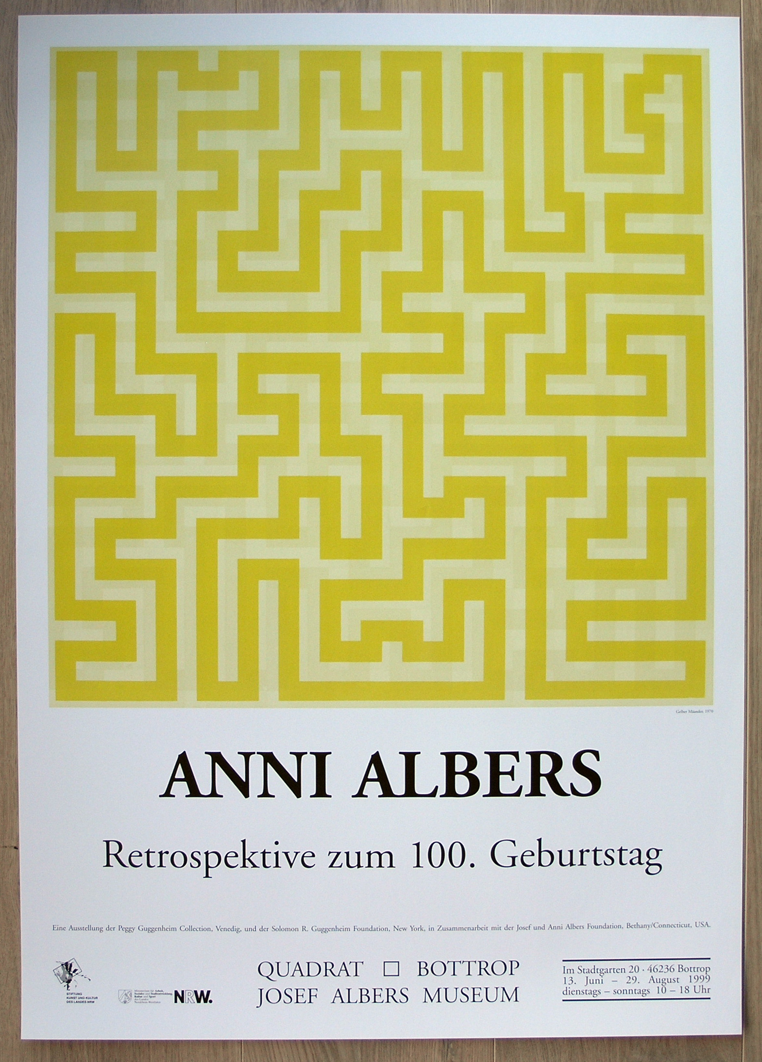
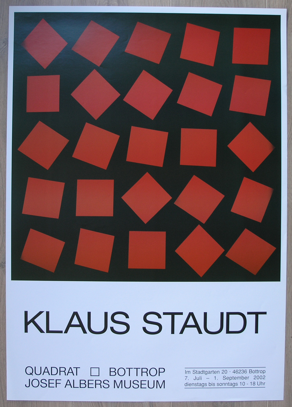
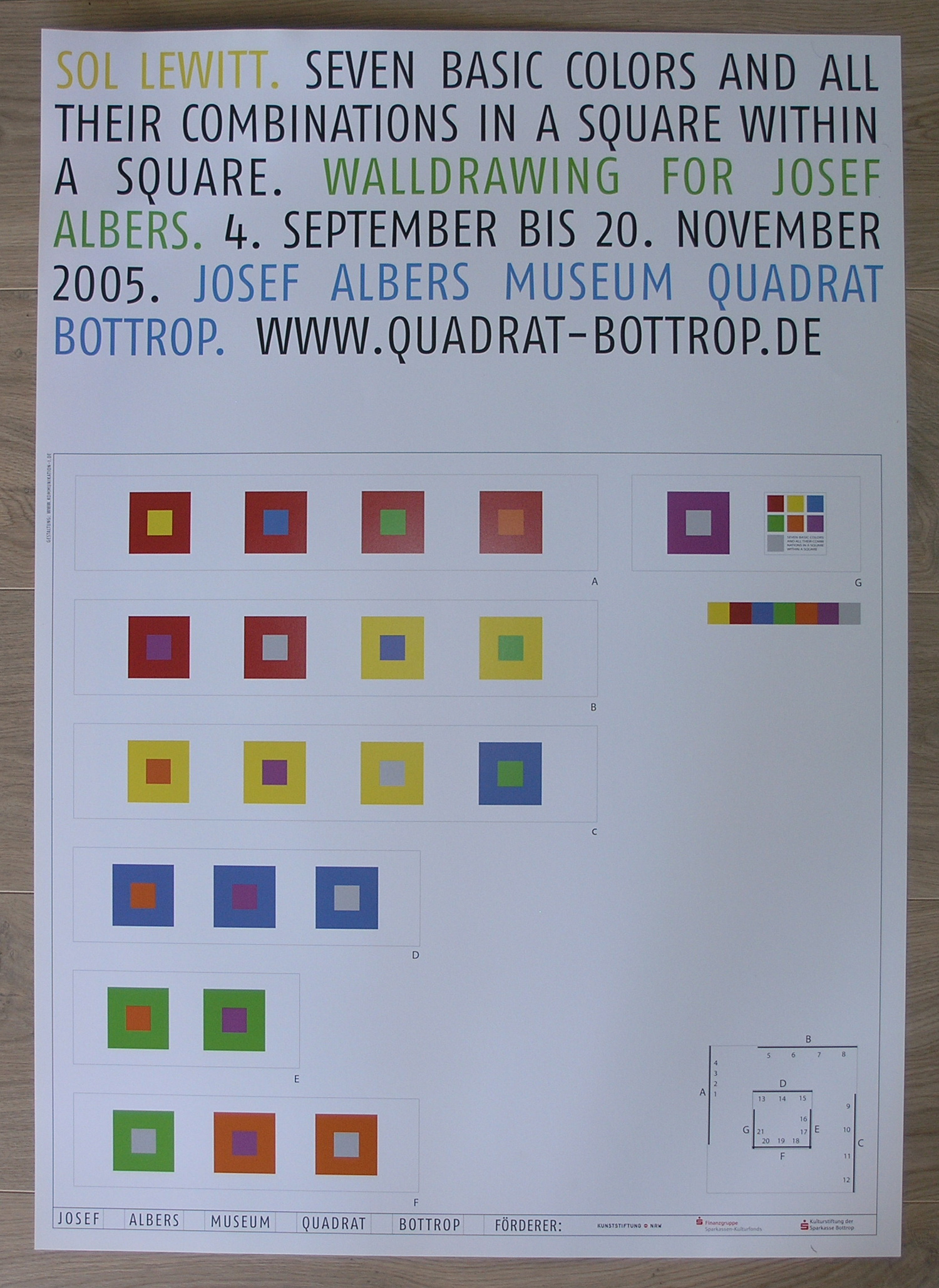
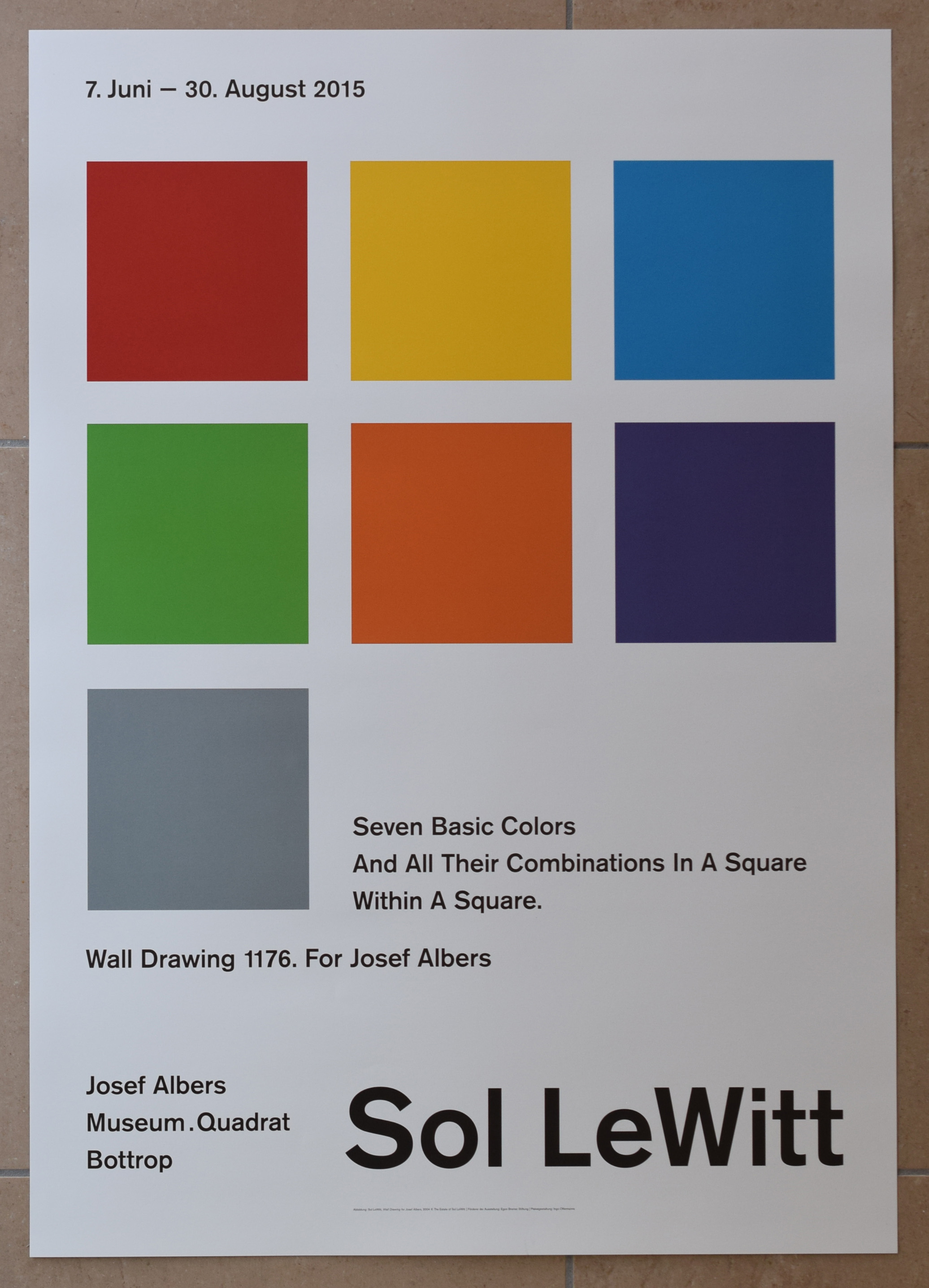
It must have been in december some eight years ago that me, my wife and Ellis my sister in law decided to make a small detour to Bottrop after vsiting the Alsace region. When we arrived there were were impressed by the surroundings of the museum. a park and a sculpture garden next door to the museum building itself. Of coursse we came over there to see the Josef Albers paintings, but after the visit we started to see what wonderful items the bookshop was selling. Among them….posters, special prints and Josef Albers furniture.
I bought the posters , because they were there for sale in all sorts of appearances. Specila prints, silks screened, signed and even limited editions and they were not exported or could not be ordered only bought on site. That is the reason why we returned one year later and i bought more of them. Making them a substantial part of my inventory. Most of them are sold out now, but i am fortunate to be able to offer them. These are among the very best exhibition poster sin the world by some of the grewatest names in Art today. The posters i bought are available at www.ftn-books.com…just search for Albers or Bottrop.
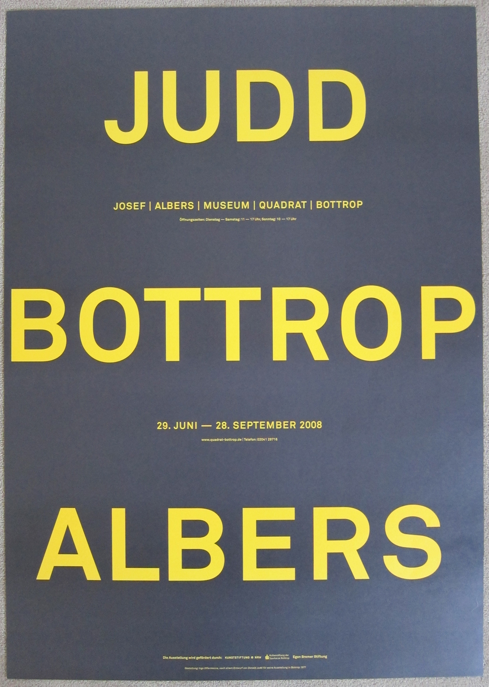
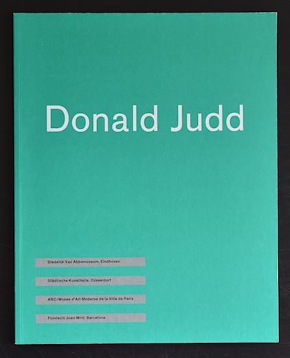
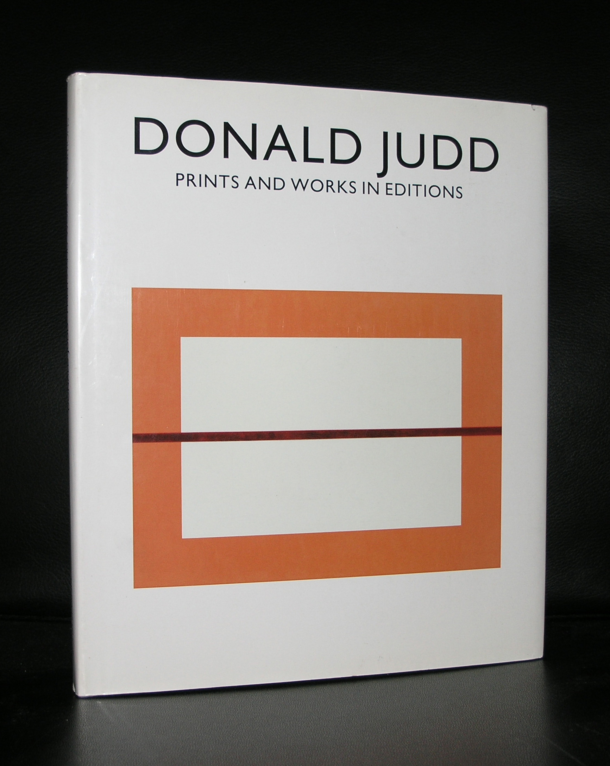
It looks like Donald Judd publications are getting more rare every month. Since his tragic death in 1994 no more “original” exhibition publications have been published. Of course there are some retrospective ones on the market, but the original ones during his lifetime are harder and harder to find. www.ftn-books.com is therefore proud to have 2 of these rare publications available in pristine condition. First there is the van Abbemuseum catalogue from 1987. The book served as a catalogue for 4 venues of which the van Abbemuseum was the most impiortant one because the exhibition was curated by Rudi Fuchs. Secondly there is the Donald Judd / Prints and Works in ecitions published by Schellmann , which even is shrink wrapped. This is rare opportunity to acquire these rare and highly collectable Judd publications for your collection.
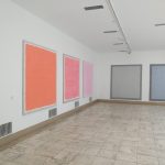
Jan Maarten Voskuil was my personal discovery during the auction of the Klein Breteler collection last month. Immediately that i saw his monochrome “paintings” i got excited. These paintings have a quality which reminded me of a combination of both Donald Judd and Ellsworth Kelly. Two artist i admire very much and both artists are among the most important ones from last century. That standing is not for Jan Maarten Voskuil yet, but look as his approach to his paintings and the way he prepares the works to reach the ultimate result with the finished work and conclude that it is a question of time that he will be presented as one of the great contemporary minimal painters. These works shine with their simplicity and are in the meantime complex to execute. In every work he uses only one color to make a monochrome work, but put some together and the result is a multi colored wall with Voskuil works.
It was my luck that i could purchase one of the works at the Breteler auction. It was the lot. 152 titled “Wat een toeval” from 2009.
Originally this was made for the LADE PROJEKT of gallery Phoebus and because of the height of the drawers, the dimensions of the work itself were limited, but it still has all the qualities the works of Voskuil contain. A mochrome white surface and assembled from 3 different parts combine into a fascinating painting
www.ftn-books.com has no books on Voskuil , but i know that there is one book titled “Getting to a point” which is well worth reading and to have in your collection of Minimal art books ISBN. 978-90-811487-3-3
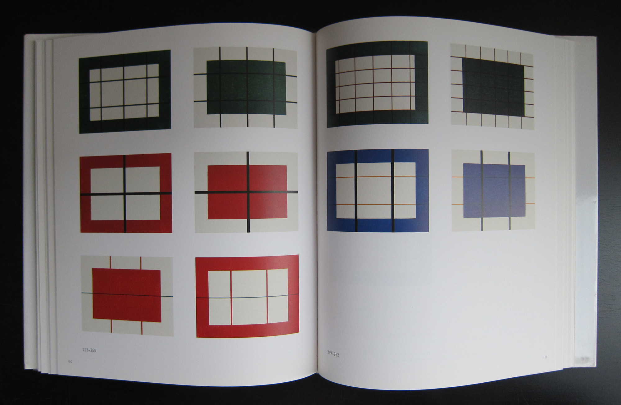
For me Alan Charlton stands for British Minimalism. Characterized by the color Grey, he makes constructivist shaped monochrome paintings. This is in short how you can describe the works by Alan Charlton. There were not many occasions that i have seen his works in Museums, but i remember at least to have seen three times his works. First at the van Abbemuseum, secondly at the Stedelijk Museum and thirdly at the Tate Modern. On all three occasions i thought these works were magnificent. I saw these works quite some time apart from each other, over a period of over 15 years they were viewed, but I always was impressed with the monochrome grey’s, each slightly different from each other making these a true color scale of grey’s.
They blend into their space and because of their monotony and regular shapes they become a part of the room they are exhibited in. It takes some time to appreciate them , but once you do , there are few more exciting paintings and therefore better artists than Alan Charlton, who makes these wonders in grey.
It is not that long that i admire the works by Dora Maurer. It took me 20 years to appreciate minimal art and not much less to appreciate constructivist works, but the instant i encountered works by Maurer i became fascinated.
Dora Maurer (born 1937 in Budapest) is a Hungarian artist whose work has spanned a 50-year career. With an emphasis on photography, film, graphic design, amongst other things, Maurer has made herself a household name in the art world. Principally achieving recognition in the 1970s with avant-garde work, Maurer has developed her art career from works with contemporary and modern influences that have been shown worldwide. All of her art is based on mathematical and complex system processes. Most of Maurer’s work follows the theme of showing options to the viewer and what the viewer can do with those options. Many of her works break down simple actions so the viewer can really view the piece as movement, not a photograph of movement. Dora Maurer has in addition been a professor at the Faculty of Fine Arts in Budapest and a curator.
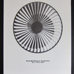
In 1998 she was given a nice retrospective at the Josef Albers Museum in Bottrop for which occasion she made a wonderful and original silkscreen print for her exhibition. The Josef Albers museum had, beside the small edition for publicity purposes, about 15 copies signed by Dora Maurer and www.ftn-books.com has 3 available of these rare signed silkscreen prints.
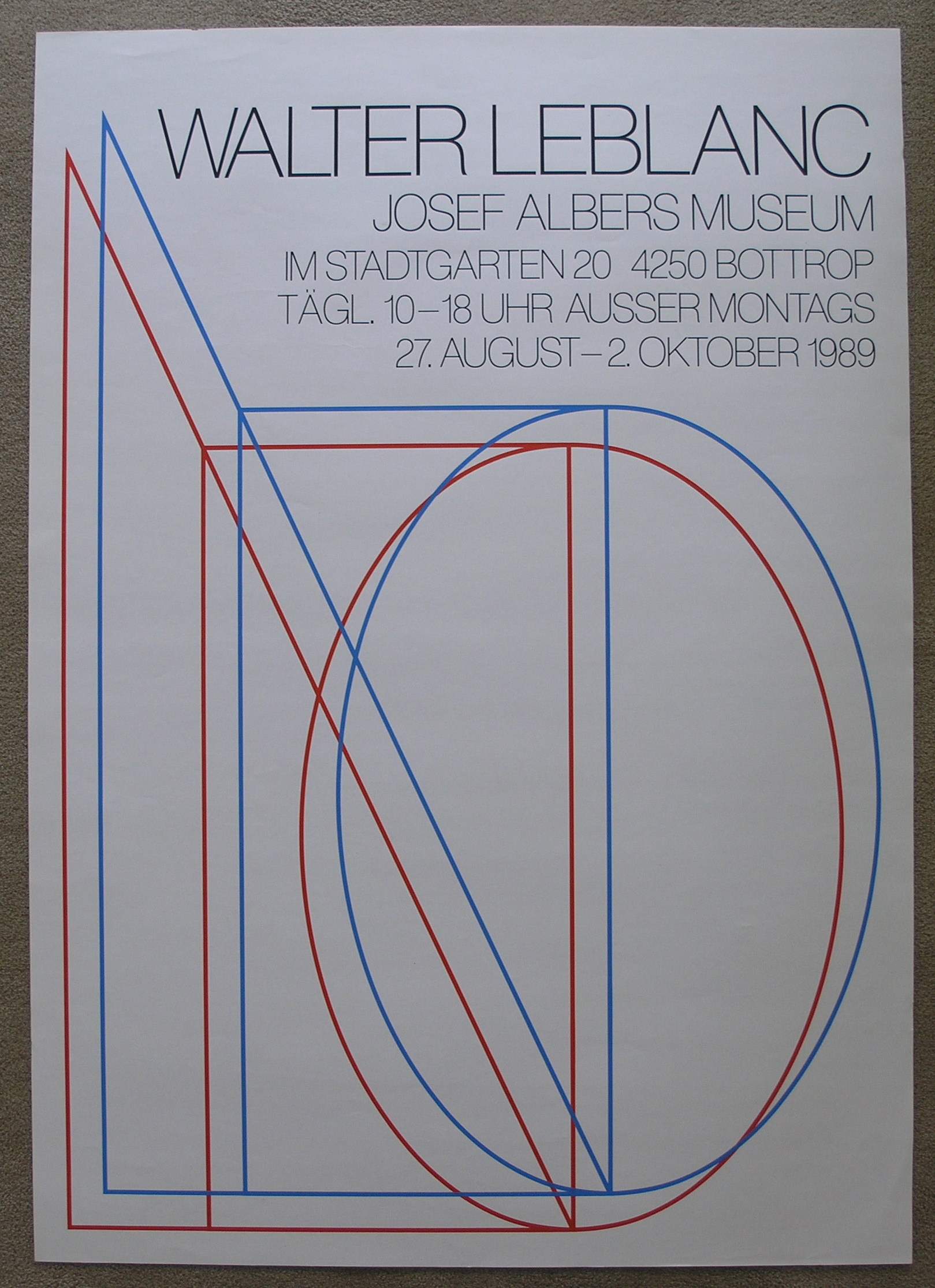
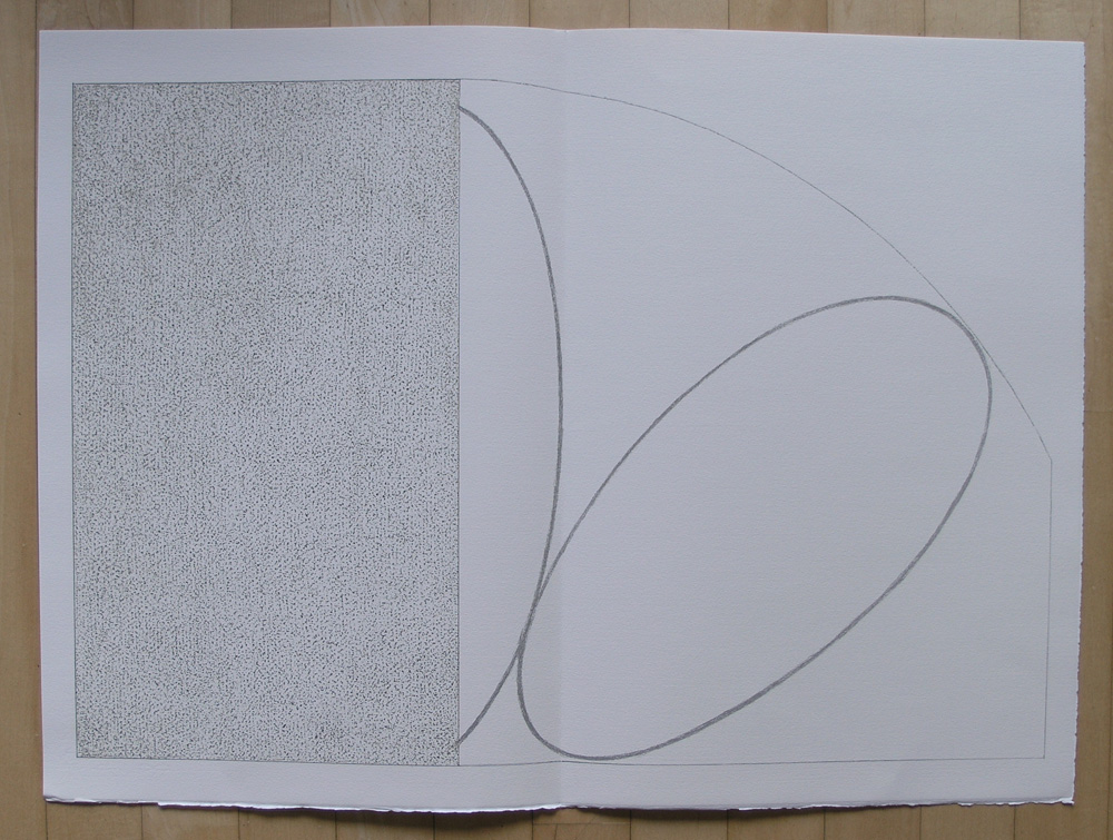
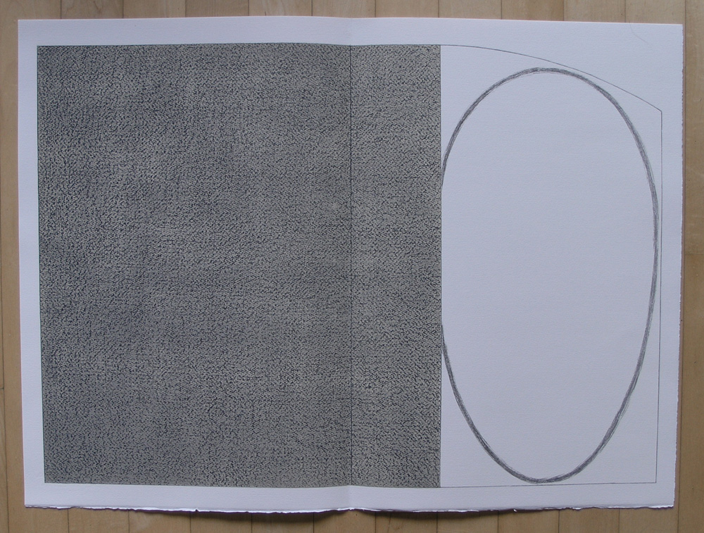
Yesterday, i wrote the blog on SEVEN MAXIMS by Robert Mangold and when i searched on my harddisk for the pictures it struck me that there is a great similarity between these 2 artists. Specially the forms they use in their compositions resemble each other. Because the number of years between them is almost 20 years it is not likely that Walter Leblanc was influenced by Mangold, but the other way around is a real possibility. ….judge for yourself.
OLYMPUS DIGITAL CAMERA
OLYMPUS DIGITAL CAMERA
OLYMPUS DIGITAL CAMERA
Publications on both artists are available at www.ftn-books.com
Artist/ Author: Oliver Boberg
Title : Memorial
Publisher: Oliver Boberg
Measurements: Frame measures 51 x 42 cm. original C print is 35 x 25 cm.
Condition: mint
signed by Oliver Boberg in pen and numbered 14/20 from an edition of 20