Posted on 2 Comments

Suzy Embo and Louise Nevelson(1899-1988)

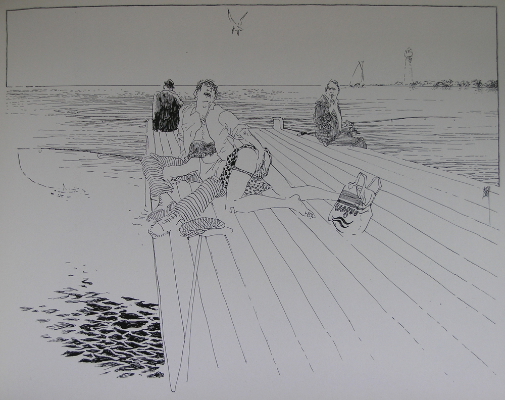
The next 3 days will be with short blogs on female artists that i admire very much. Today’s one is on Louise Nevelson who’s portrait by Suzy Embo is for sale at www.ftn-books.com.

OLYMPUS DIGITAL CAMERA

Next year , starting at 23rd of june 2017 a large retrospective on Embo’s photographs will be organized at the FOMU /FotoMuseum Antwerpen. The photograph i have for sale was a lucky find , because it was hidden in one of the great Nevelson catalogues i bought years ago. Excellent condition of the photograph and the strong image of Louise Nevelson makes this one of my favorite artists photographs i have ever seen.

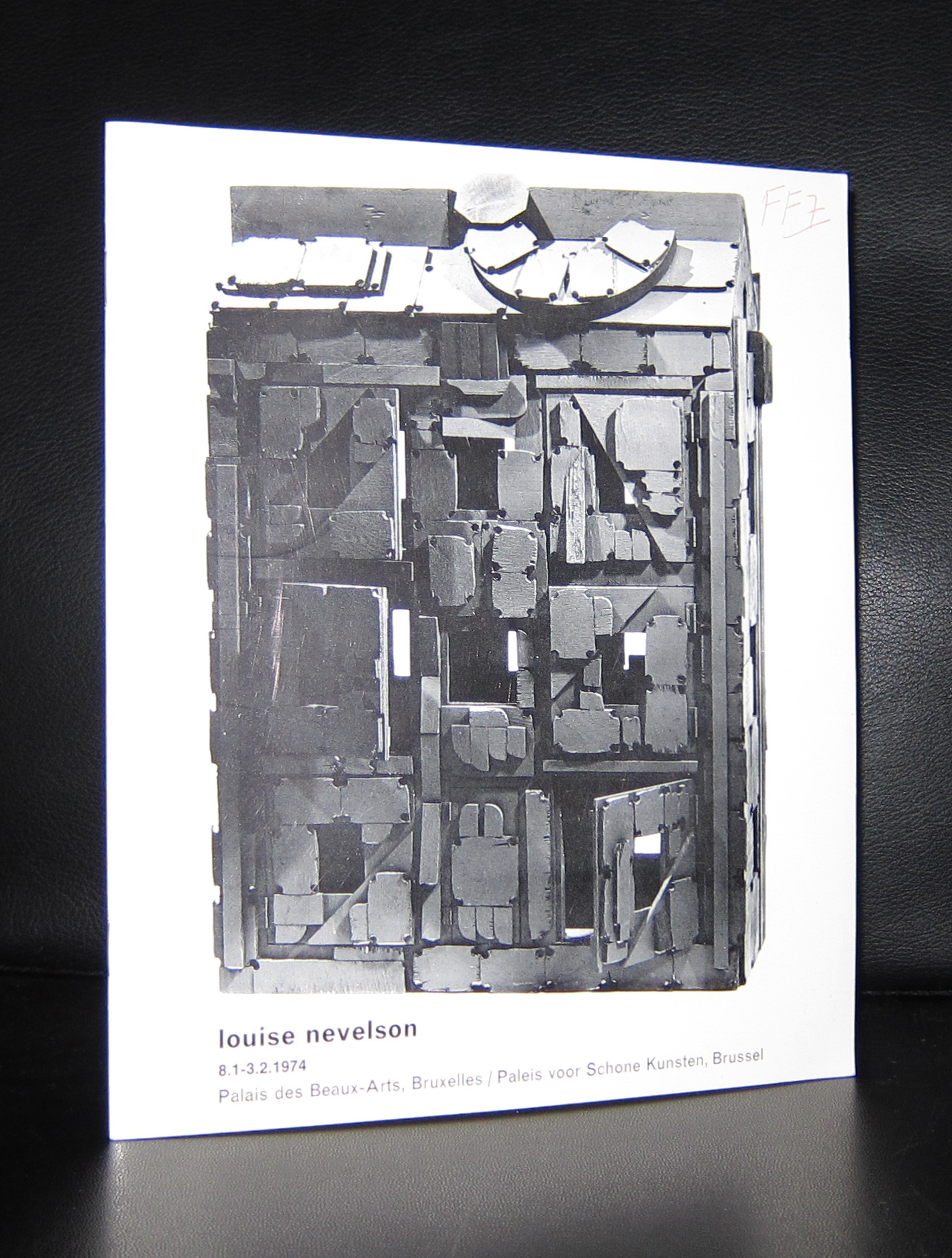
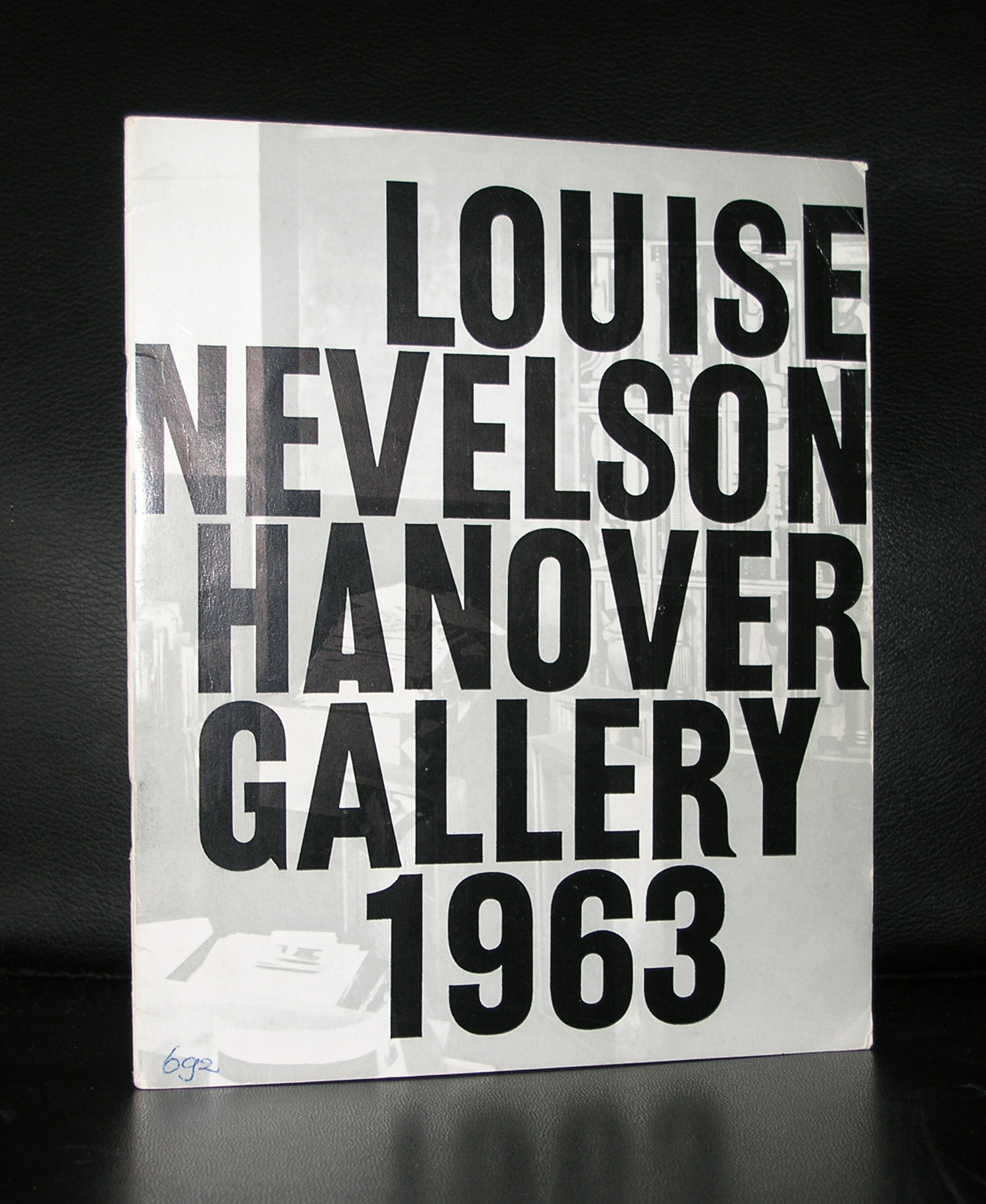
Louise Nevelson is in European undervalued artist, who made assemblages from left over materials and who was not that well known some 30 years ago. She had her exhibitions and retrospectives, but only since a few decades her works appear at auctions and in group exhibitions by Abstract expressionists. Stil she had a loyal following of admirers in the Netherlands and Belgium. In Belgium she even had a solo exhibition in the Paleis voor Schone Kunsten in 197 and you can visit one of the large works at the Centre Pompidou museum in Metz, but for the most of us in Europe this artist was a mystery….(and still is). The case in the US was a total different one. She was recognized as one of the most important sculptors from the 20th century from the early 60’s and onwards.

Major museums began purchasing Nevelson’s wall sculptures in the late 1950s, and she was included in the landmark “Sixteen Americans” exhibition at New York’s Museum of Modern Art in 1959. In the following decades she earned commissions for large-scale sculptures from institutions such as Princeton University (Atmosphere and Environment X, 1969), the Massachusetts Institute of Technology (Transparent Horizon, 1975), and the Philadelphia Federal Courthouse (Bicentennial Dawn, 1976). In 1967 the first major retrospective of her work was presented at the Whitney Museum of American Art in New York City. During the 1970s and ’80s Nevelson expanded the variety of materials used in her sculptures, incorporating objects made of aluminum, Plexiglas, and Lucite. Not until she was in her 60s did Nevelson win recognition as one of the foremost sculptors of the 20th century.

Posted on 5 Comments

Jan Groover (1943-2012) and the Tabletop still life

schermafbeelding-2016-12-18-om-11-46-13

Jan Groover, one of those photographers that have a cult following but are hardly known with the large public. The post of some months ago on Henk Tas and his staged photography reminded me of Jan Groover and her still life photography. The Smithsonian made a wonderful catalogue on the subject of her Tabletop photo’s and it deserves to be better known. That is the reason for this blog, because Groover is a great photographer.

Pictures tell a far better story than i can, but there is a great short biography over here:

www.nytimes.com/2012/01/12/arts/design/jan-groover-postmodern-photographer-dies-at-68.html

Groover publications that are available at www.ftn-books.com

Posted on 1 Comment

Peter van Straaten ( 1935 – 8 December 2016)

schermafbeelding-2016-12-10-om-14-14-28

This is probably not for the dutch. There have been numerous articles on Peter van Straaten, who died 2 days ago. But for those who are not familiar with the works by van Straaten …. Here is a short blog on him. He is one of those who documented every day life, politics and even sex in drawings and with his drawings commented on the dutch society. Drawings with pen and black ink made his drawings stand out through over 5 decades. He published his drawings in newspapers ( Volkskrant), weekly magazines ( Vrij Nederland ) and his famous series of erotic drawings were published directly as a book . The last series is rarely encountered in the biographies of van Straaten, because of its explicit content, but look past the nudity and you will see a highly entertaining drawing of a situation in which one can feel the unease of it.

This series is for me what van Straaten stands for. A free mind and a different approach of every situation, made his drawings worthwhile looking at. Highly detailed, beautiful drawings of an artist who will be missed. There are some publications by Peter van Straaten available at www.ftn-books.com

Posted on 3 Comments

Klaus Staudt and Konkrete Kunst

schermafbeelding-2016-11-27-om-10-20-49

The people who follow this blog, must know by now of my love for Konkrete Kunst and one of the people who is in the centre of this mouvement is Klaus Staudt. Born in 1931 he originally studied medicines , but after an initial study into the arts in 1957 , he started following classes at the Academy of Arts. Soon he began to experiment with forms and grids, a little like the Minimal artists in the US were doing at that time and from that moment on he began to develop his own style , using multi layers and perspex/plastics ao. as his materials to make his creations. Because of this multi layer aspect his works have a 3D quality which makes them very special and typical Staudt.

Staudt being one of the first Konkrete artists is becoming more and more important and has had some very nice retropektives in the last 2 decades. Some of his publications and multiples are availabe at www.ftn-books.com

Posted on Leave a comment

Roger Raveel (1921-2013)

I am not the greatest fan of Roger Raveel, but occasionally i can appreciate his works. Specially the Beervelde project in the cellar corridors together with his friends from the Nieuwe Figuratie is a highlight. From his early days he has held exhibitions in the Netherlands and therefore a nice set of publications was published in the 60’s and 70’s by galerie Espace, who represented Raveel during these decades. Raveel is one of the great artists in Belgium, but beyond the Belgian borders his works are scarce. There are some in the Stedelijk Museum and van Abbemuseum, but those are the only ones i know of. Given the fact that he is not very well known outside Belgium and the Netherlands, i was surprised to find the number of publications i managed to collect over the years and which are now in my inventory. So if you are looking for Raveel publications please visit www.ftn-books.com

and complete your collection.

Posted on 6 Comments

Maeght edition…Derriere le Miroir

Starting in 1946 ( December) and ending in 1982 with number 250. This publication was published by Maeght on an almost regular basis of 5 publications each year. Many great artists have made contributions to this famous magazine and what is best, these contributions were in almost all cases original works of art.

Original lithographs were publiohed on one or 2 pages  in each publications and in most of the sases there were more than 2 lithographs included. Thre is even a famous publications on Miro with over 20 originals within.

What made it affordable is the edition size which were far more than regular art editions by Maeght, but because these lithographs were not signed they were “original’ cheap works of art. ~Many great artists like Chagall, Chillida, Giacometti and Miro made special editions within the series.

My personal favorit…Wifredo Lam


This series is collectable and affordable and whenever you see a copy in which you are interested make sure that it is complete, because many of the editions did not survive as complete copies because these were torn down and sold separately.

Look for some nice ones

at www.ftn-books.com and search for “Derriere”

Posted on 2 Comments

Seurat and pointillism

schermafbeelding-2016-11-06-om-10-47-48

Seurat can be seen as one of the founders of the style which is now know as Pointillism. Painting small dots in a specific color and order, thus making a composition which is fresh, clear, has vivid colors , because the dots look to melt which each other and in this way producing a vivid , shiny color. The composition itself was in many cases linear with imaginary lines all moving in one direction. For instance the lines of Le Chahut all go up. ( see the moustaches).

There are not many paintings executed in the pointillistic style by Seurat. Seurat only became 31 years of age and in this time he made 50 known paintings in the pointillist style. We are fortunate to have one  in the Netherlands and it is not the least important one, because mrs Kroller Muller chose this herself to be part of her impressive collection. So do not visit the Museum Kroller Mulelr for the van Gogh’s , but instead look at the other paintings in the collection which are at least as impressive . The Seurat being one of them.

Tip. When you visit the Kroller Muller Museum. Leave your car at the entrance and hop on a bike to cycle to the museum and the Jachtslot by Berlage one of the most beautiful National Parks the Netherlands has and a great way to spend a day.

for some nice titles on Seurat: www.ftn-books.com

Posted on 3 Comments

Maria by Lee Friedlander

It was 10 years ago that i encountered a remainder stock of books published by the Smithsonian museum. Among them…. one title that immediately caught my interest, because its photographs were by Lee Friedlander. For me personally this is one of the very best photographers from last century and this title particularly was all about his wife MARIA. At the time of publication i did not know of any exhibitions on Friedlander, but i was so happy to have found this little stack of Maria books and the number of them ( over 20 copies), that the first ones i sold way to cheap. Over the years i sold many of them to different locations in the world.

What remains now are only 4 copies of which the last 3 are still for sale. One i will keep for my photo book collection and as a souvenir of the stack of Friedlanders i found, bought and sold.

A future classic and a highly collectable photo book. This book is available at www.ftn-books.com

Posted on Leave a comment

Roman Cieslewicz

schermafbeelding-2016-11-01-om-09-24-30

Another great artist who i forgot to mention in my blog on Topor is Roman Cieslewicz. Cieslewicz was a long time friend of Topor , lived in Paris too and rose to fame in the sixties with his graphic design for Vogue and Elle and the posters he designed for several other events.

For the dutch his work was presented for the first time in the Stedelijk Museum in 1973 . An excellent catalogue designed by Wim Crouwel was published on that occasion. The exhibition showed the strength of this artist, because the main part of the exhibition consisted of poster designs he had made in the previous 20 years.

Cieslewicz is one of those rare artist, who in his life was far less appreciated than in these days. Graphic art students from all over the world have inquired about his books in the last few years, which shows to me his star is on the rise and soon the books on Cieslewicz will become rare collectable items.

catalogue available at www.ftn-books.com

Posted on 1 Comment

Jurriaan Schrofer

schermafbeelding-2016-10-26-om-09-33-45

Yesterday we ate with our good friend Annemarie Schrofer and because of the beautiful paintings by her father on the walls, i remembered another member of the Schrofer family ……Jurriaan Schrofer.

Born in 1926 and also a child of Annemarie’s father Willem Schrofer he would become one of the leading typography and graphic designers in the Netherlands. His works can be considered as “avant garde” design, thinking “out of the box” and soon he would develop his very own style . He originally wanted to become a film director, but ended being the assistant to Dick Elffers. This was the starting point of a splendid career as a graphic designer. For a few years in the seventies he was a member of Total Design, but soon followed again his own path. Highly original and recognizable are his designs. He was commissioned by many dutch important institutions and was appreciated for the designs he made for them, but his true recognition as one of the leading graphic designers from last century is only 25 years old. His works would become internationally known and appreciated. There now is a high interest in his works from leading British Graphic design schools and recently the same interest comes from the US.

Jurriaan Schrofer books can still be picked up at reasonable prices and for those interested in dutch graphic design, the designs by Schrofer are an absolute and quintessential part in the history of Graphic design and not to be missed in any collection. www.ftn-books.com