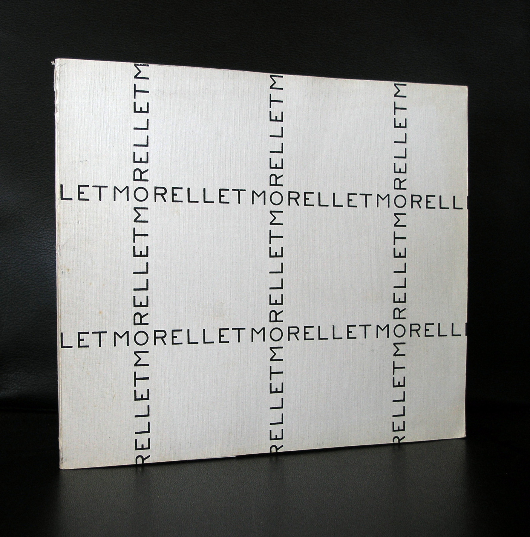
Piet Dirkx cigarbox 200
Piet Dirkx cigarbox 200

Piet Dirkx cigarbox 199

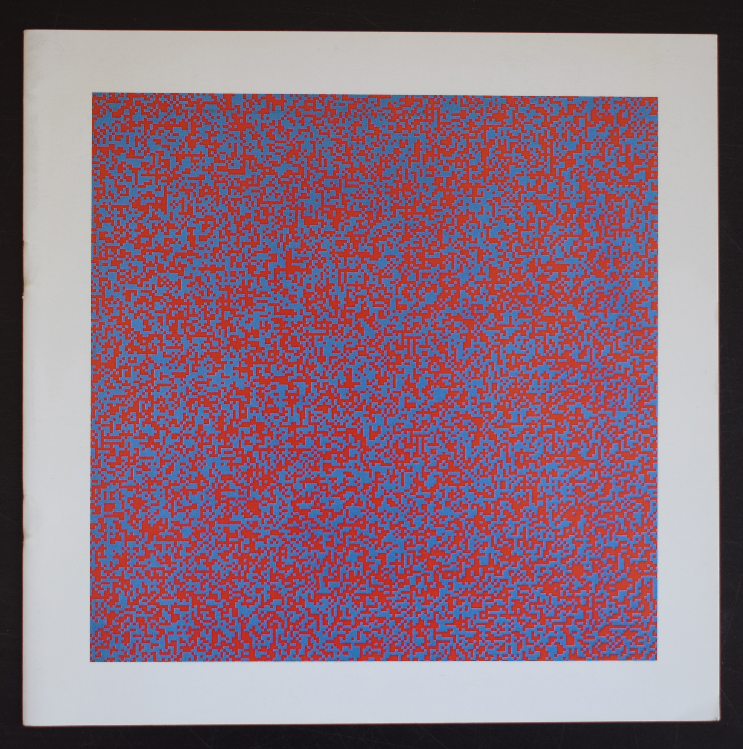
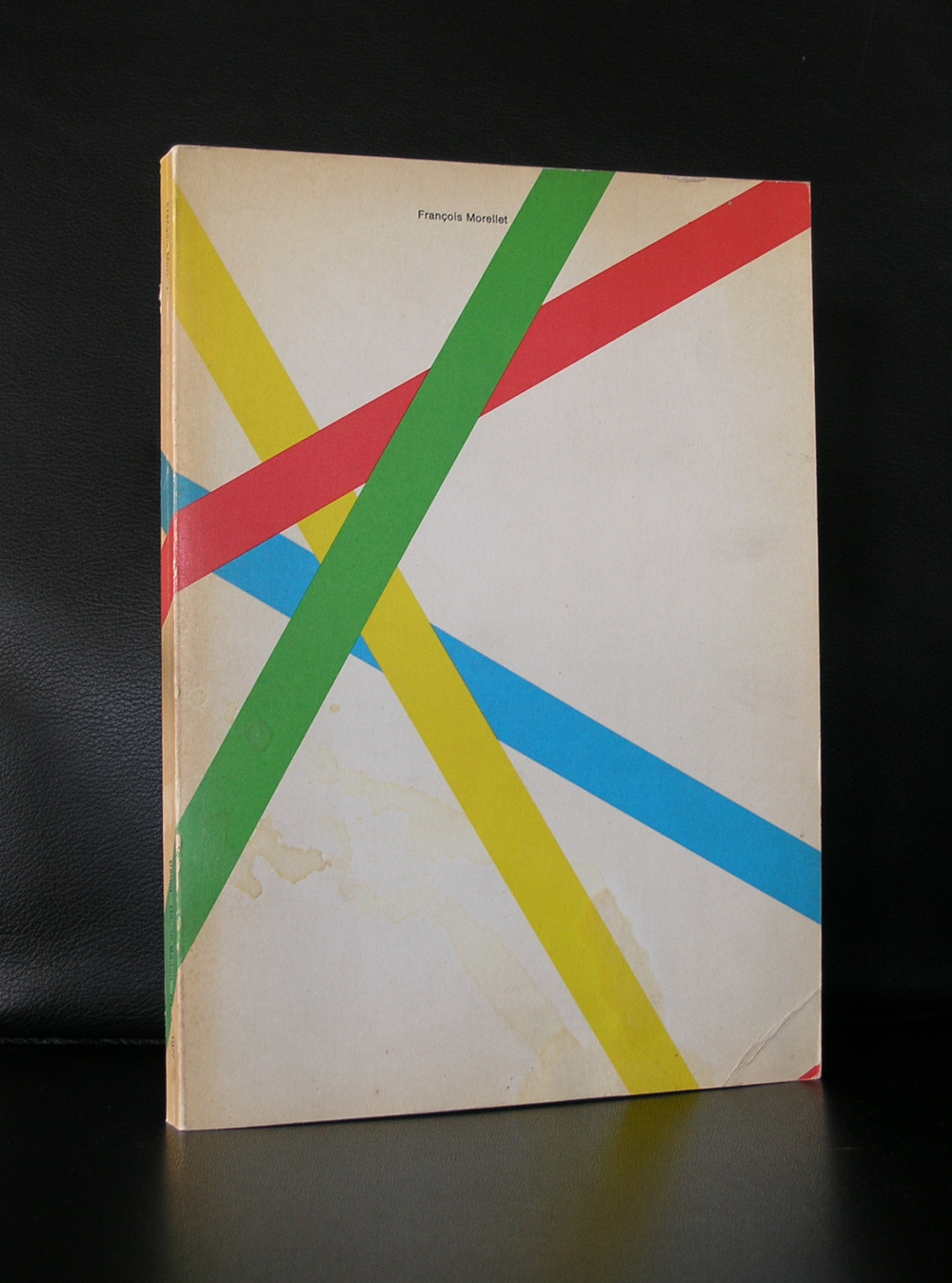
It was 7 years ago that the Peter Stuyvesant collection was sold by Sothebys Amsterdam. Within this collection there were some very important Morellet paintings. Large , complex and typical Morellet. As i learned later one of them was bought by Joop van Caldenborgh. The initiator and founder of the Museum Voorlinden in Wassenaar. This painting was fantastic and showed for me why Morellet has become one of my favorite painters of all time. The painting from the BAT collection was estimated between 20.000 and 30.000 euro, but had a hammer price of euro 432.750. Which is 14x the maximum estimated price.

For us “mortals” this is completely out of reach, but still some great works by Morellet can be had at affordable prices , because Morellet contributed in many ways, to excellent publications in which original silkscreens or lithographs were included. One of these publications is available at www.ftn-books.com ( for availability inquire/ p.o.a.), together with many other rare Morellet publications from the 60’s and 70’s.

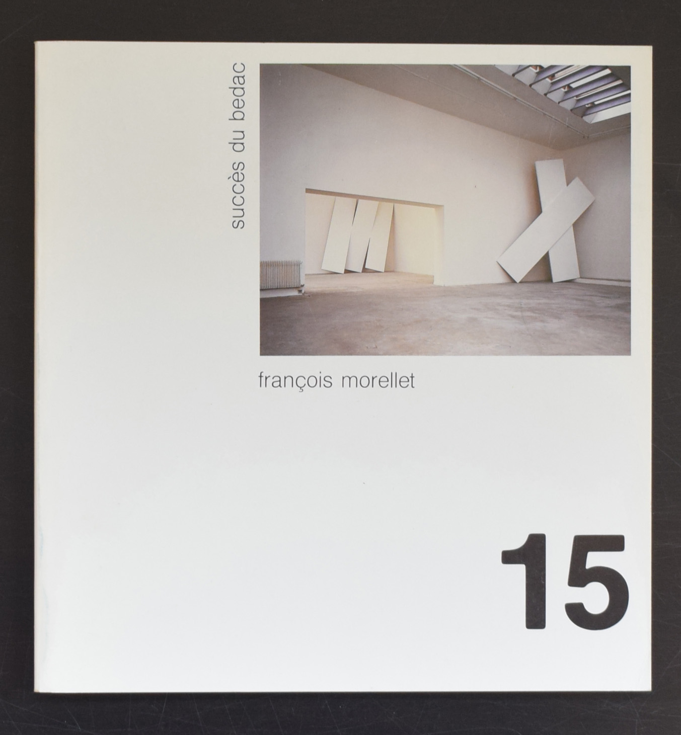
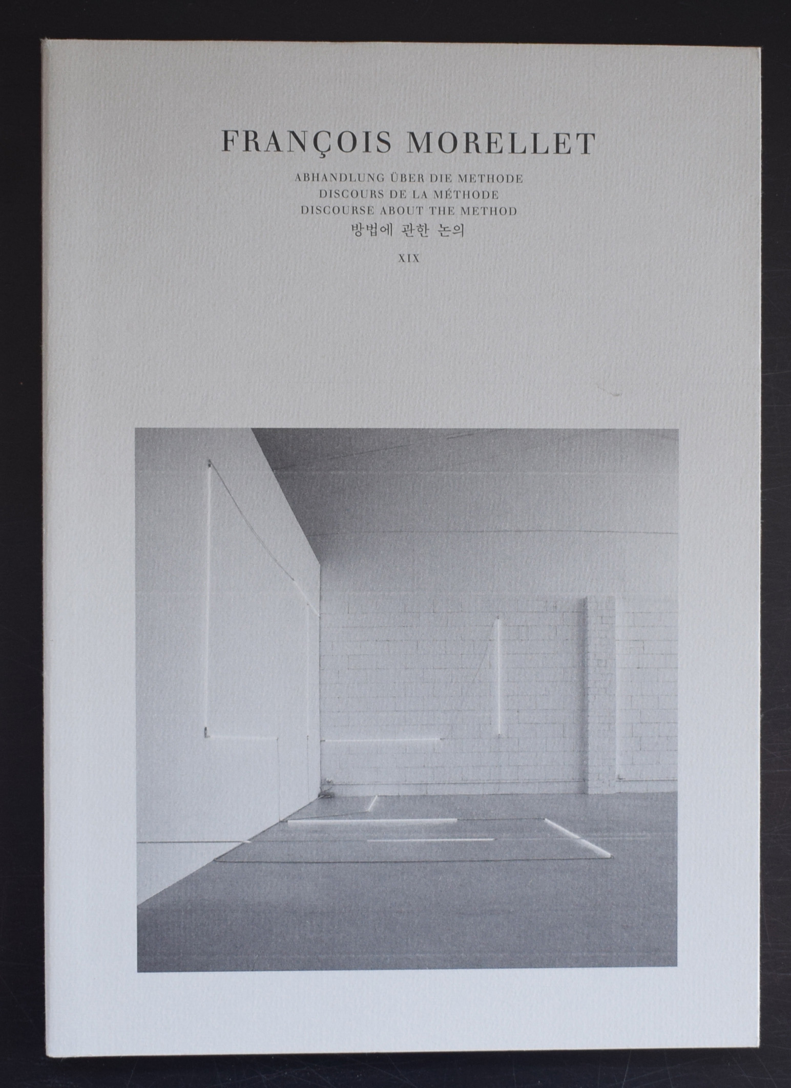
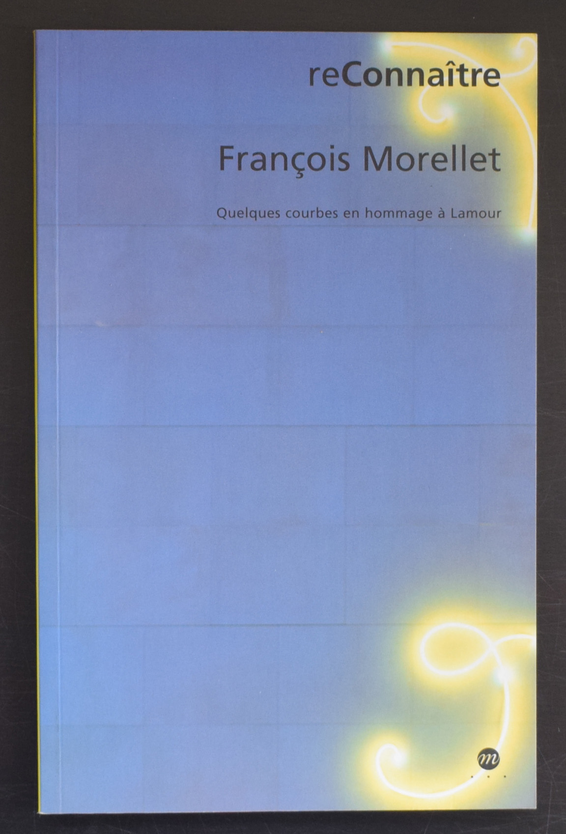
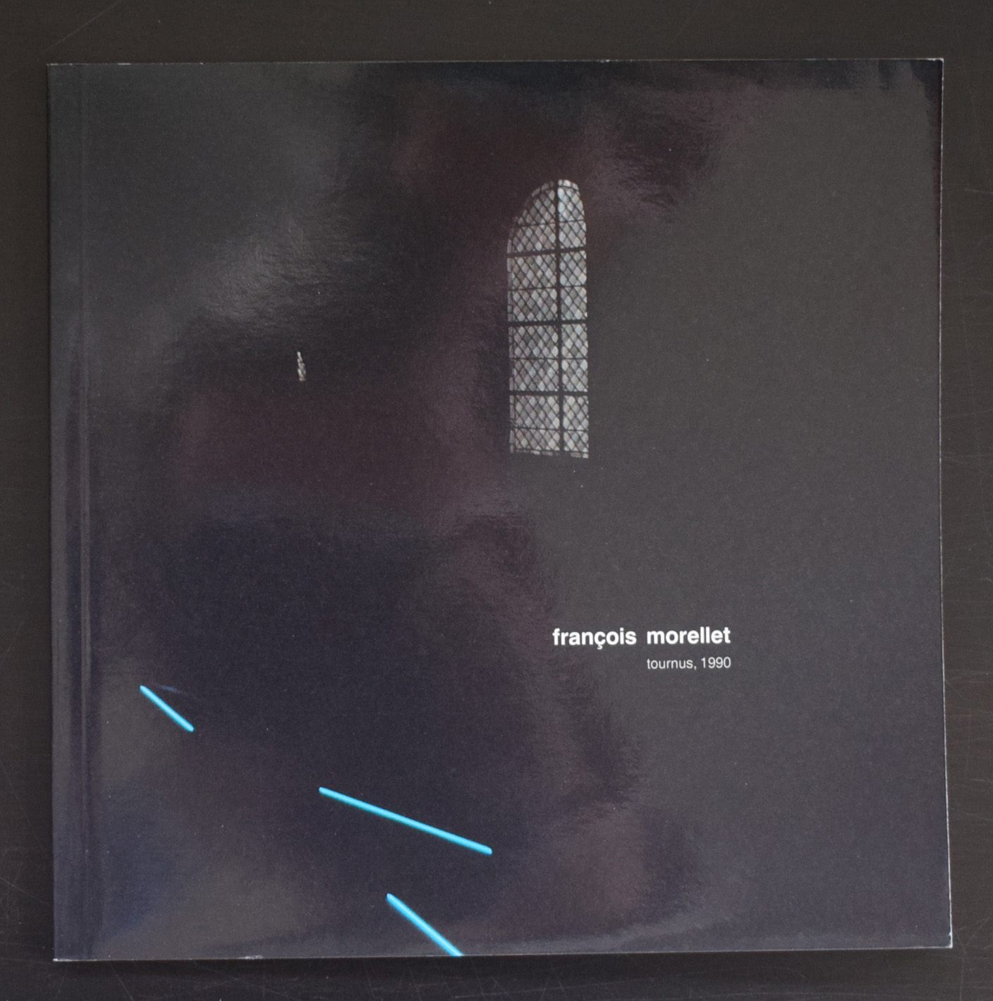
After a short period of figurative/representational work, Morellet turned to abstraction in 1950 and he adopted a pictorial language of simple geometric forms: lines, squares and triangles assembled into two-dimensional compositions. In 1961, he was one of the founders of the Groupe de Recherche d’Art Visuel (GRAV), with fellow artists Francisco Sobrino, Horatio Garcia-Rossi, Hugo DeMarco, Julio Le Parc, Jean-Pierre Yvaral (the son of Victor Vasarely) and Joël Stein, François Molnar and Vera Molnar (the last two left the group shortly after). Morellet began at this time to work with neon tube lighting.
From the 1960s on, Morellet worked in various materials (fabric, tape, neon, walls…) and in doing so investigated the use of the exhibition space in terms similar to artists of installation art and environmental art. He gained an international reputation, especially in Germany and France, and he was commissioned to create work for public and private collections in Switzerland, Great Britain, Italy, the Netherlands and the U.S.A.
Morellet , french, but in his approach to art more cosmopolitan, because he must be influenced by the minimal artists that were starting to appear on the art scene during the 60’s and early 70’s. He experimented with lines, grids, and light and developed an art form recognizable as being Morellet. an important artist and for me personally one of the greatest from last century.
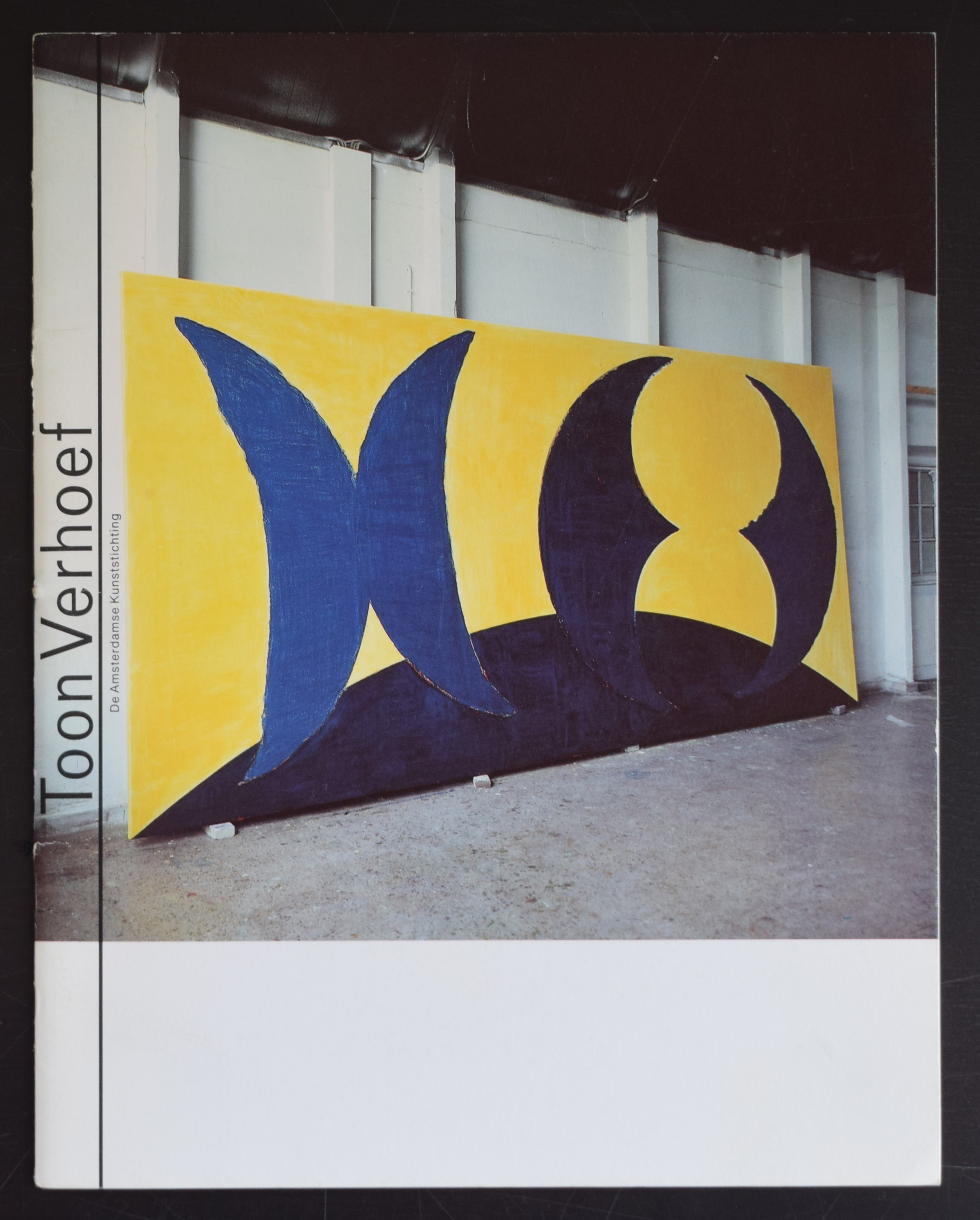
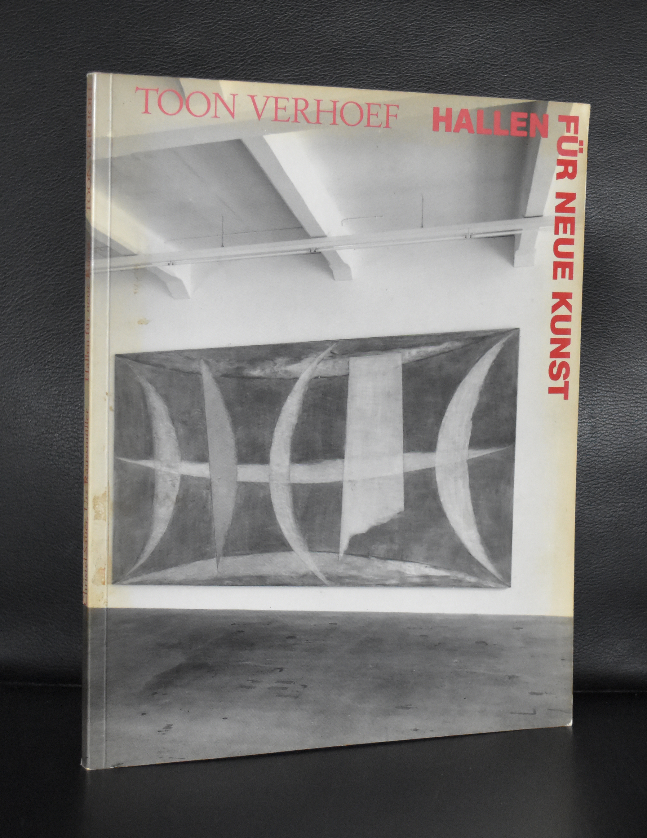
I have always admired the works by Toon Verhoef. The first time i met Verhoef was when i was introduced to him when he visited the Gemeentemuseum on the occasion of the preparation of an exhibition. Since i have tried to obtain a work by Verhoef for our collection, but never succeeded…… i came close when i bid on an extremely large work which came from the former collection of the Artesia bank. It was sold at AAG and when i researched the work i found out that the composition was not random, but an abstract representation of the british queen Elizabeth II parading before Aboriginal warriors.
Verhoef is for me a fascinating artist and his compositions are timeless and brilliant.
there is a nice documentary on Youtube where Verhoef explains the history of the painting and the “Elizabeth” picture.
and for a nice selection of Verhoef titles visit www.ftn-books.com
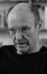
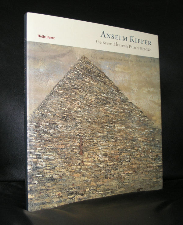
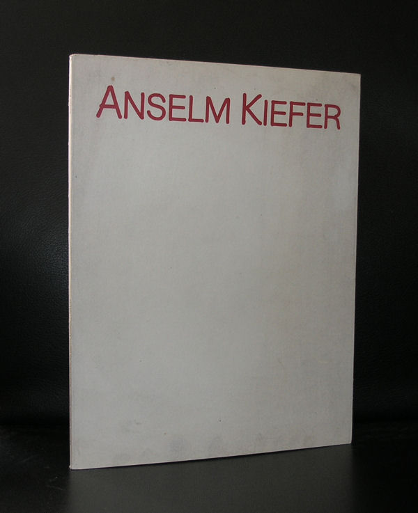
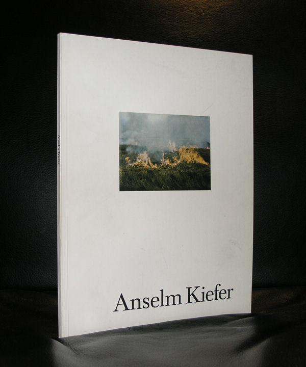
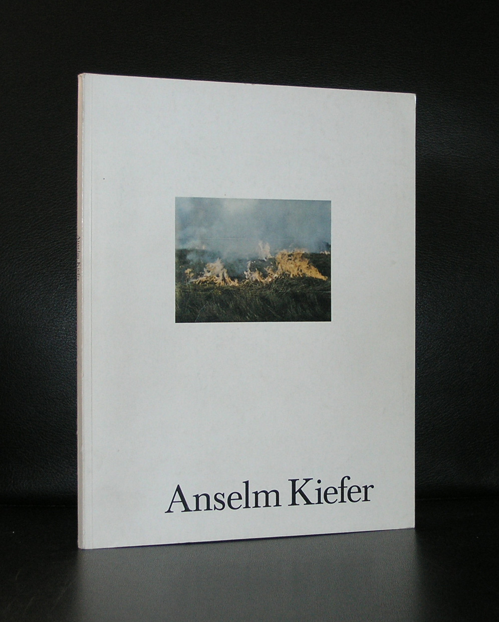
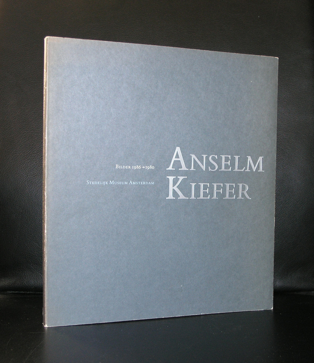
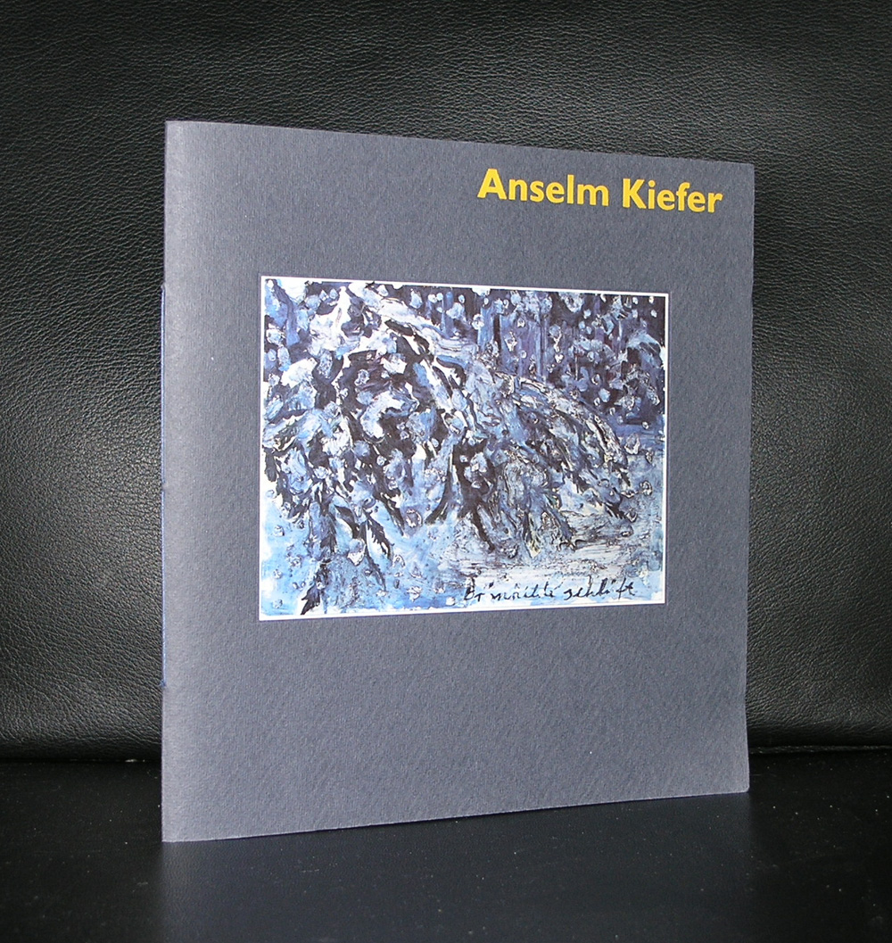
It is 31 years ago that i saw a work by Kiefer for the first time I and was really impressed . I remember the occasion….the occasion the Anselm Kiefer exhibition at the Stedelijk Museum Amsterdam. Grey, sombre , large paintings with scenes that reminded of war, devastation and ruins . Later i learned that the German history and the Holocaust were main themes Kiefer always used in his works. The history of Germany being one of the main subjects in his extremely large paintings. The Stedelijk Museum bought one of the paintings for its collection. “Innenraum” is a large painting ( 280 x 311 cm.) , but small compared to other Kiefer works.

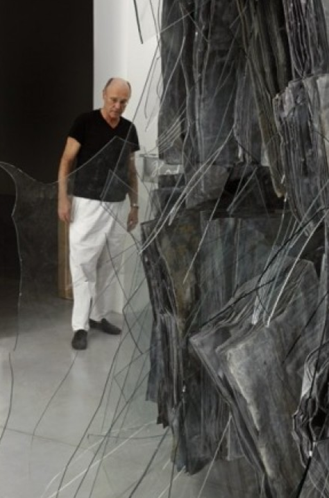
The exhibition was a great succes and since i encountered several other Kiefers in museums. One stands out, impressive and it’s size is overwhelming. ( almost 10 meters in length) and is a must see whenever you visit the North of Spain.

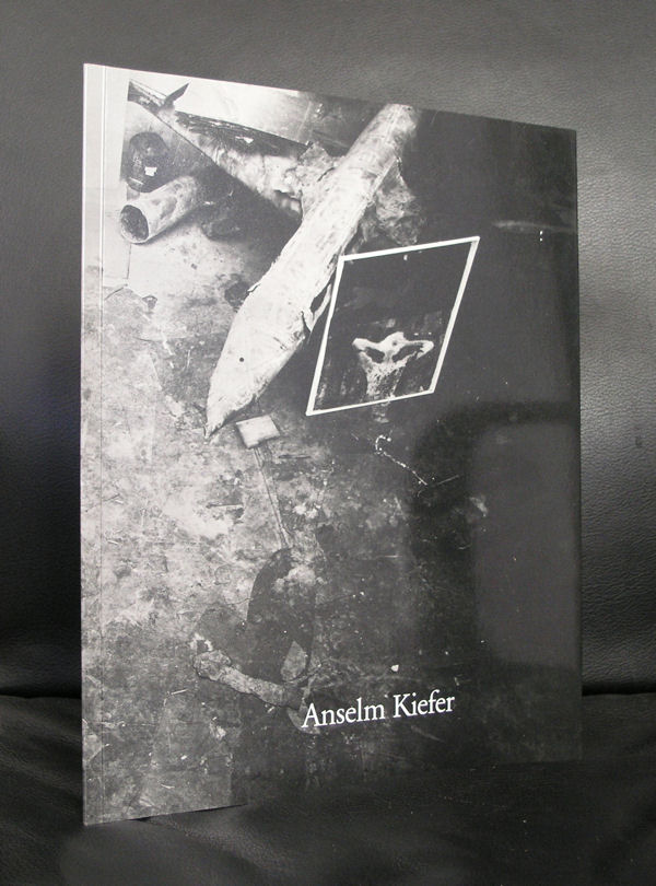
Anselm Kiefer
Only with Wind, Time, and Sound (Nur mit Wind, mit Zeit und mit Klang), 1997
Acrylic and emulsion on canvas
473 x 944 x 22 cm
Guggenheim Bilbao Museoa
( the following text comes from the Art Story site)
It is the Anselm Kiefer’s monumental, often confrontational canvases were groundbreaking at a time when painting was considered all but dead as a medium. The artist is most known for his subject matter dealing with German history and myth, particularly as it relates to the Holocaust. These works forced his contemporaries to deal with Germany’s past in an era when acknowledgment of Nazism was taboo. Kiefer incorporates heavy impasto and uncommon materials into his pieces, such as lead, glass shards, dried flowers, and strands of hay, many of which reference various aspects of history and myth, German and otherwise. Influenced by his contemporaries Joseph Beuys and Georg Baselitz, as well as by postwar tendencies in Abstract Expressionism and Conceptual art, Kiefer is considered part of the Neo-Expressionist movement, which diverged from Minimalism and abstraction to develop new representational and symbolic languages.

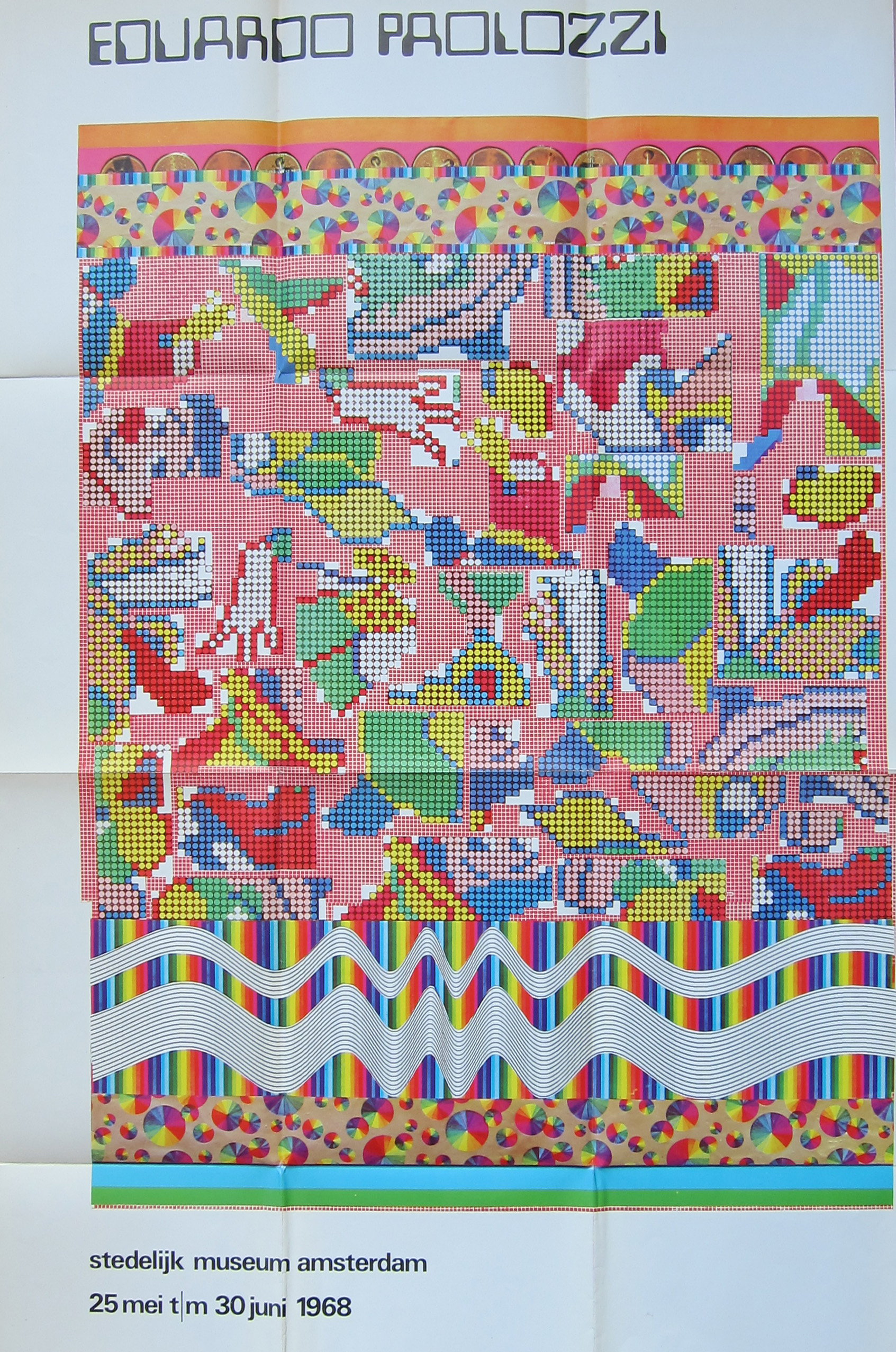
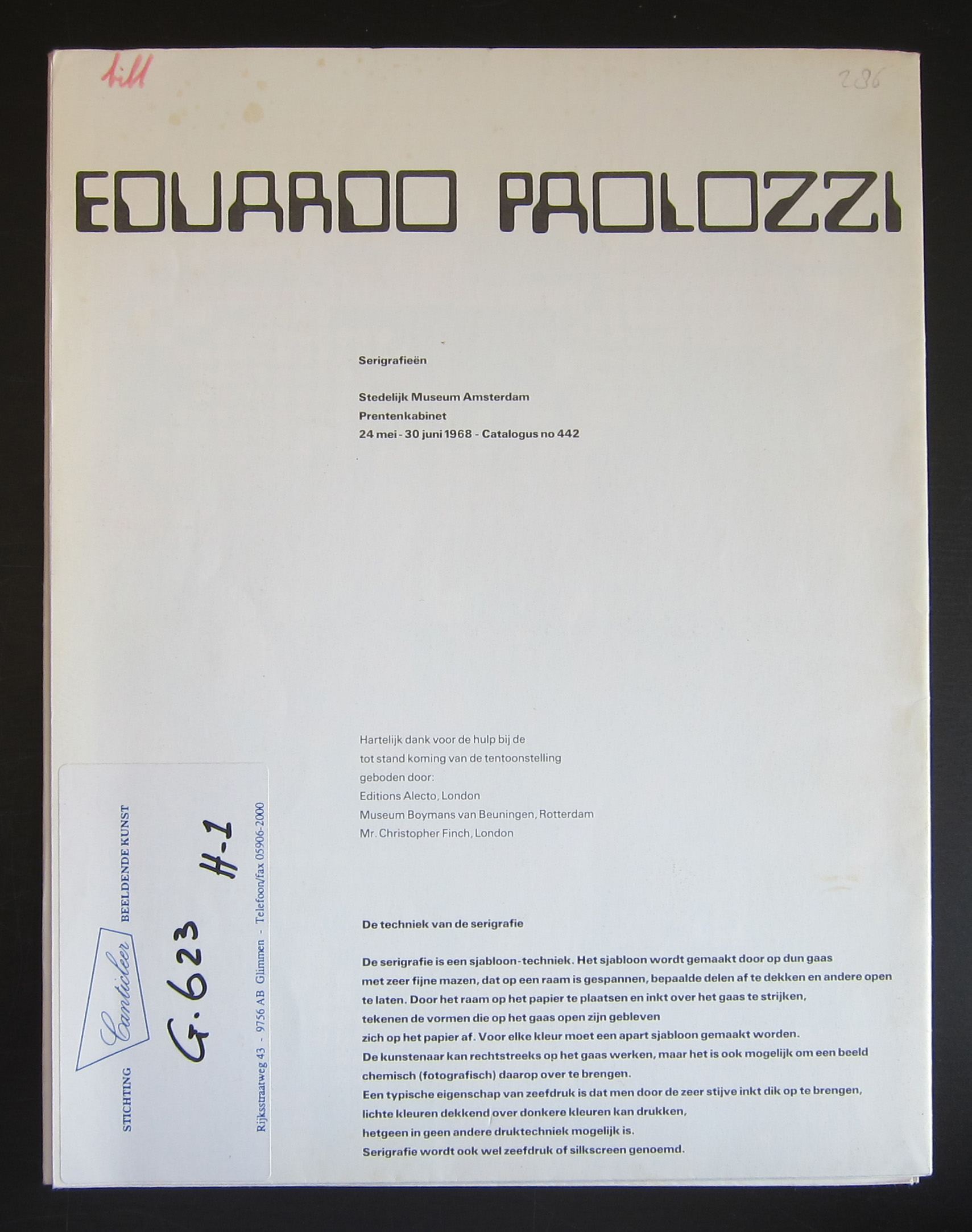
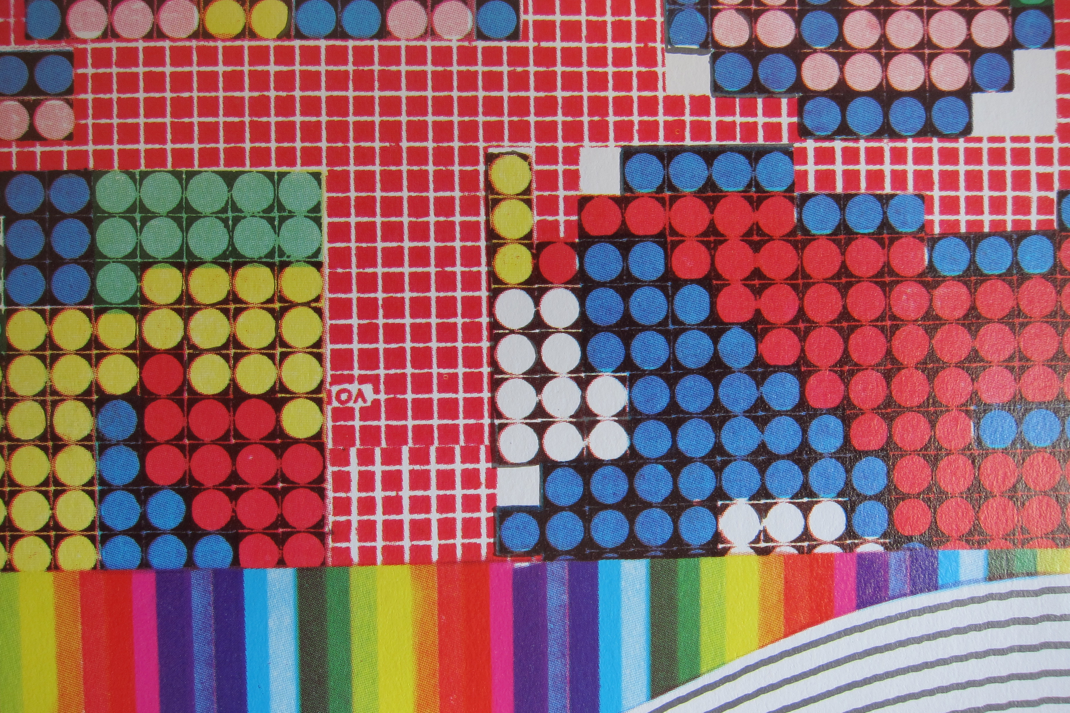
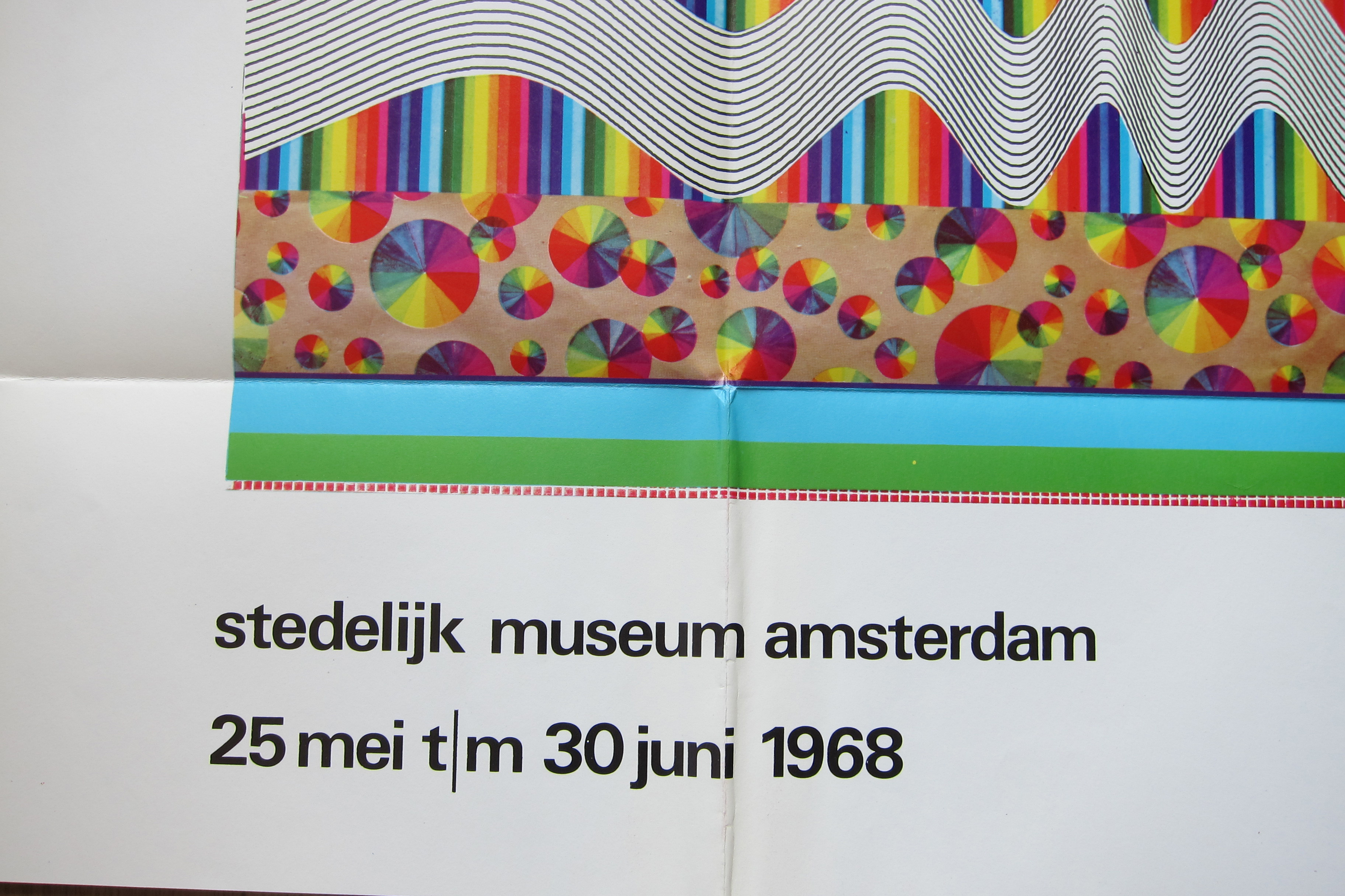
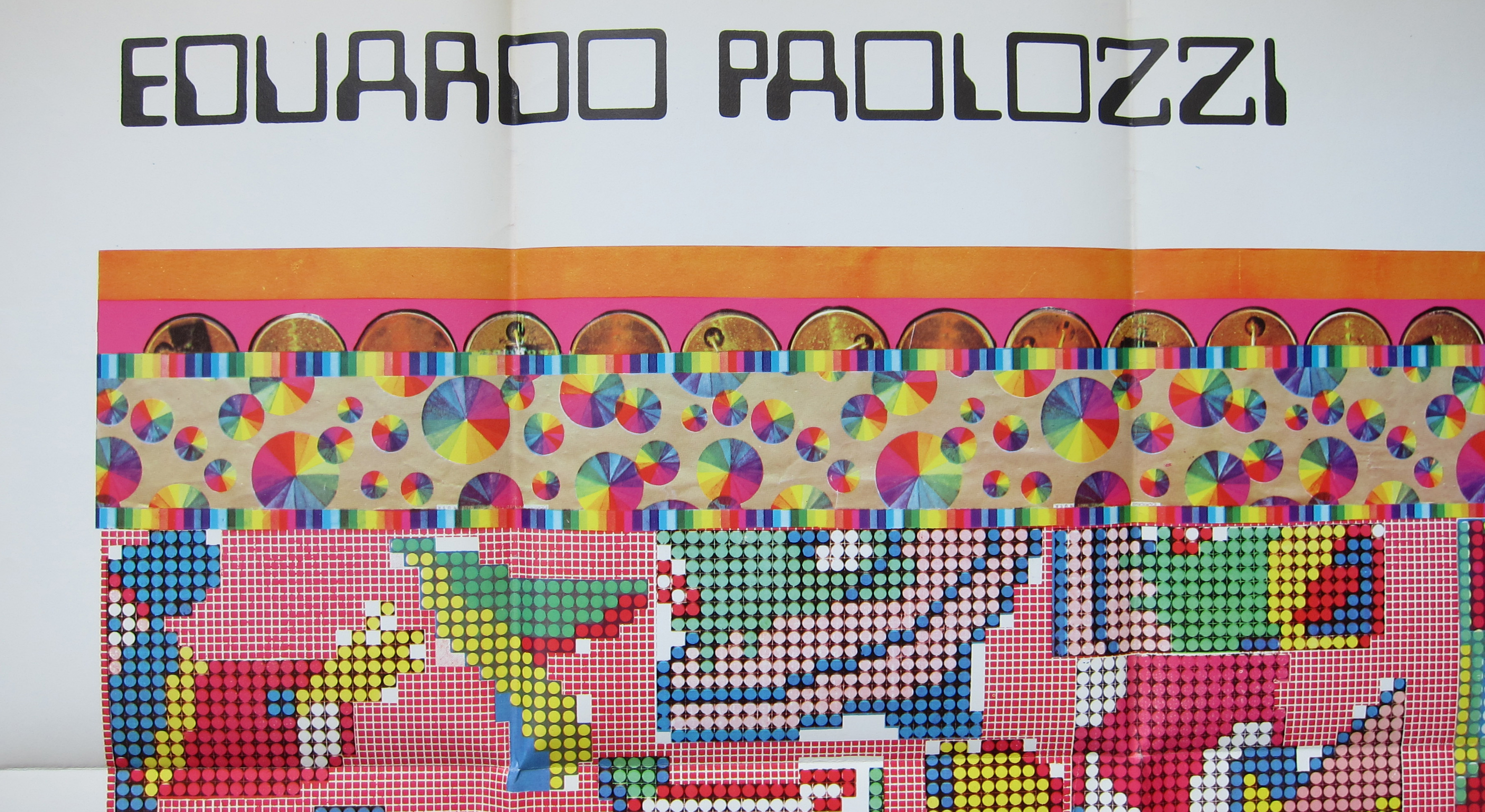
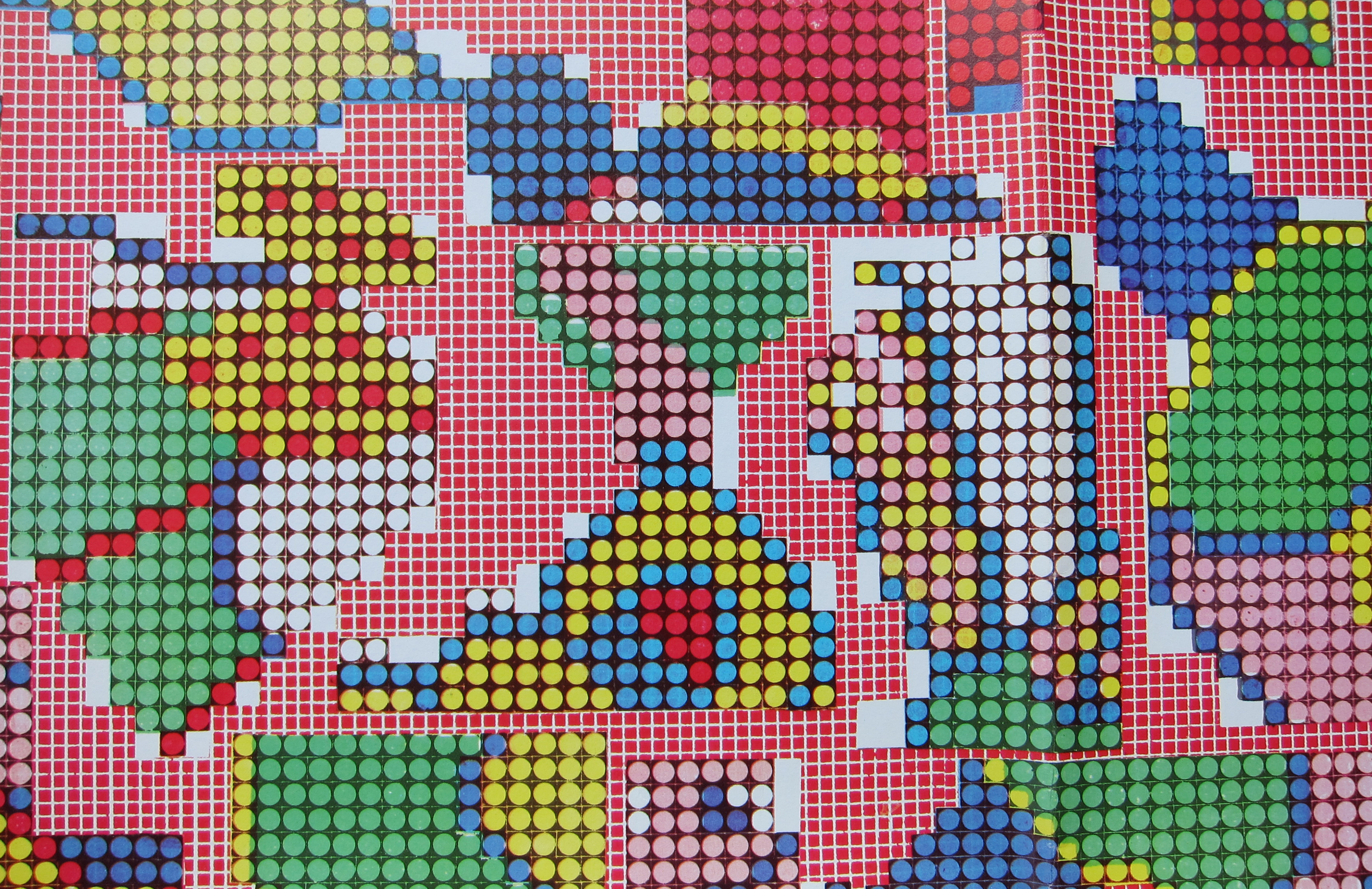
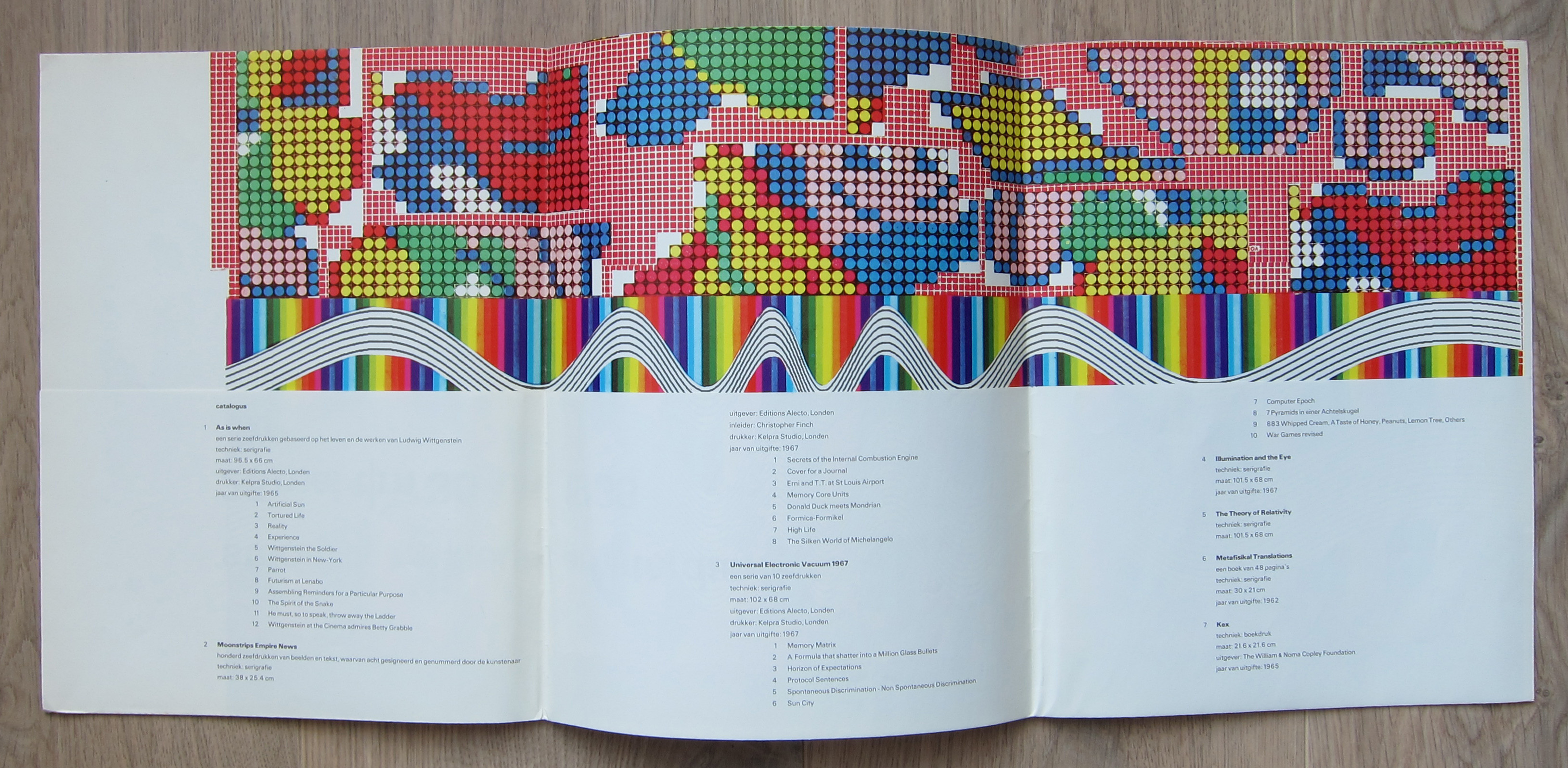
There are multiple reasons to like the publication no 442. of the Stedelijk Museum Amsterdam. Published in 1968 on the occasion of the Eduardo Paolozzi exhibition this is a 100% original work of art . A serigraphie by Paolozzi in his typical Pop Art style. Folded as issued and when folded out an impressive large work of art. Design?….by Wim Crouwel who used the backside of the serigraphie for all the information on Paolozzi. A great Pop Art work of art and available at www.ftn-books.com
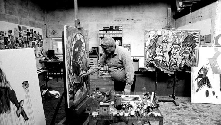
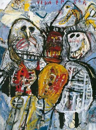
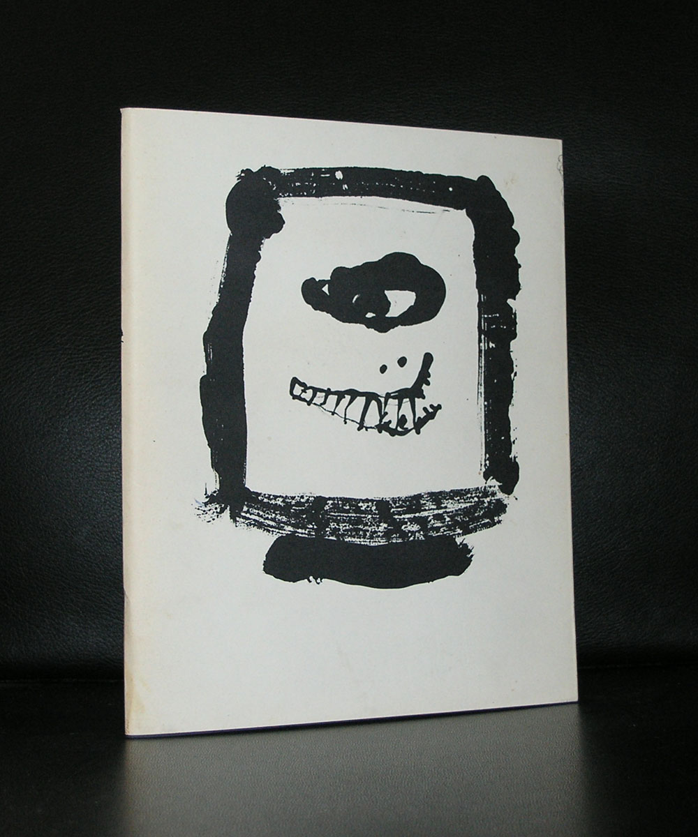
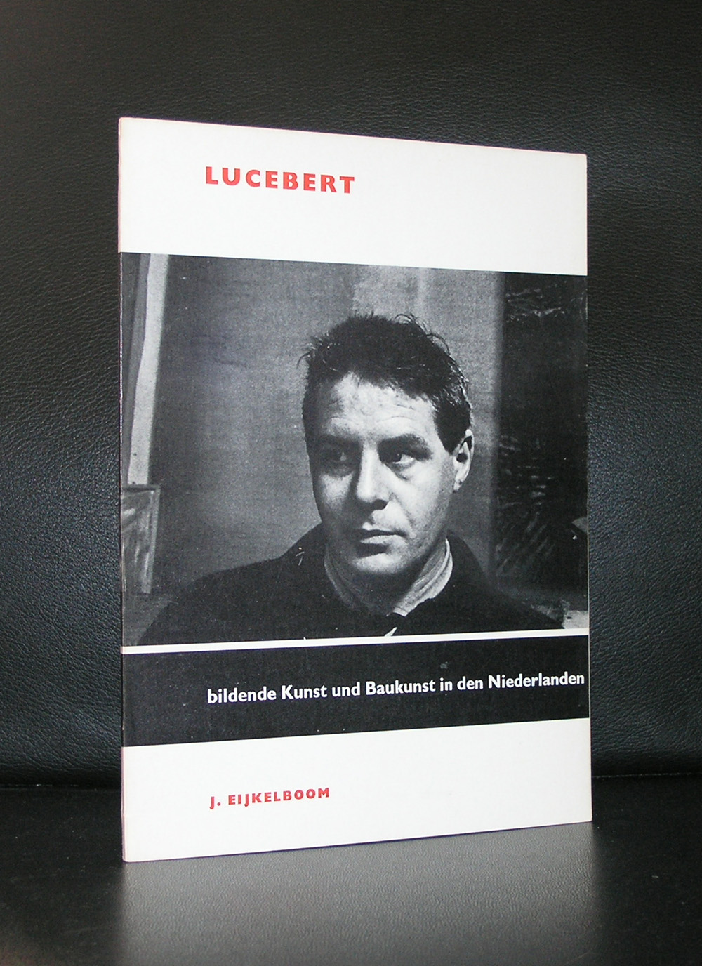
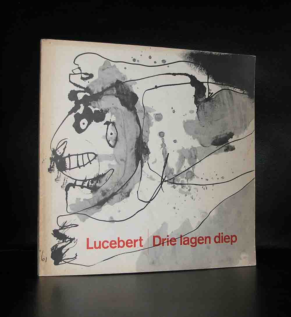
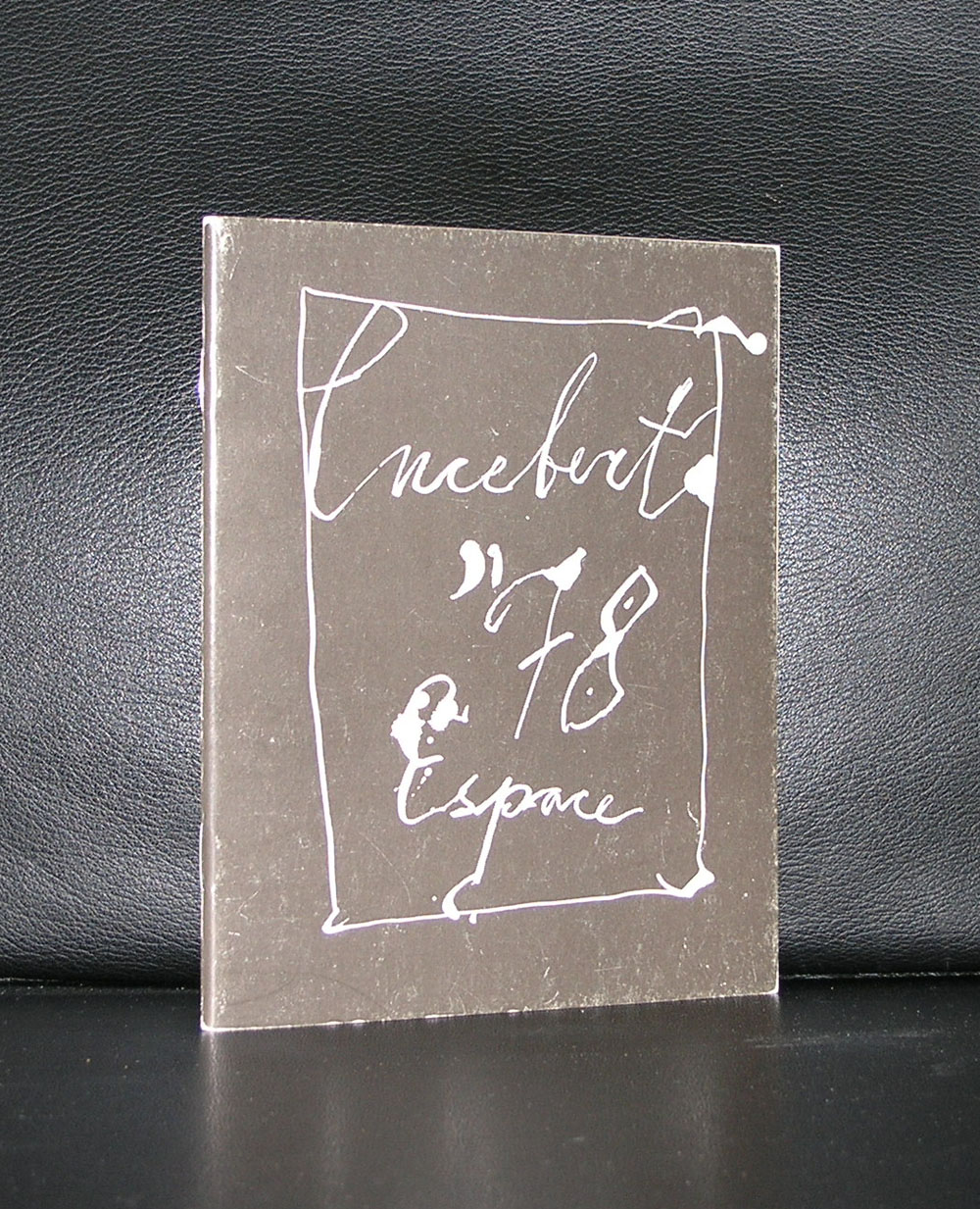
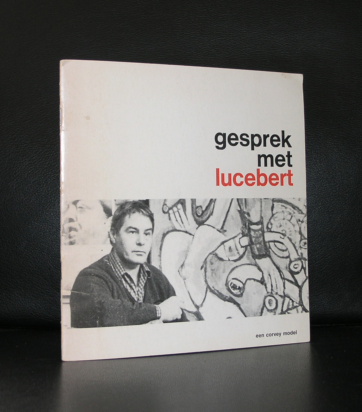
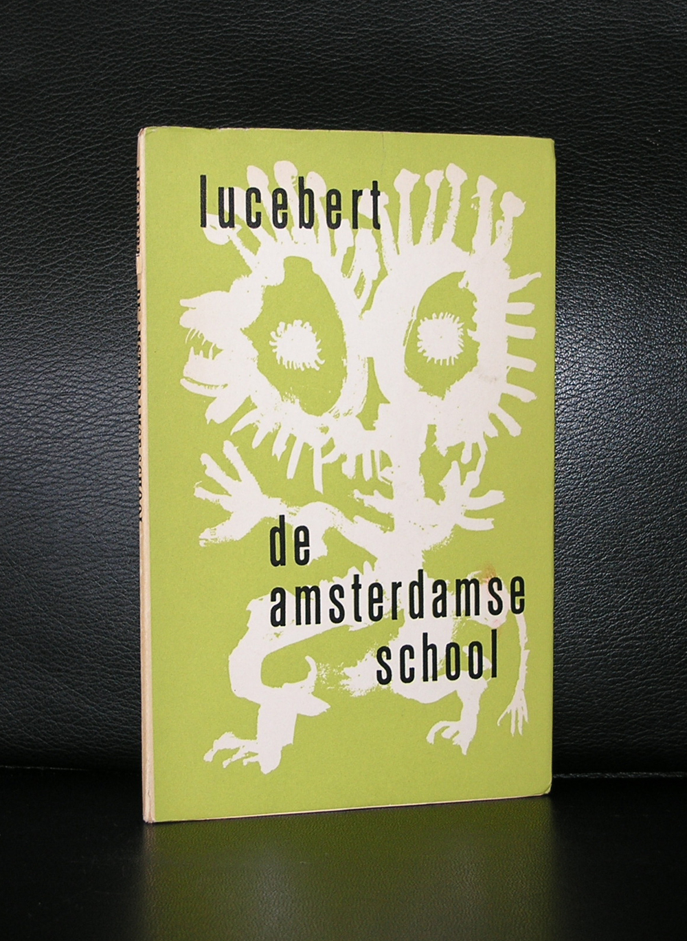
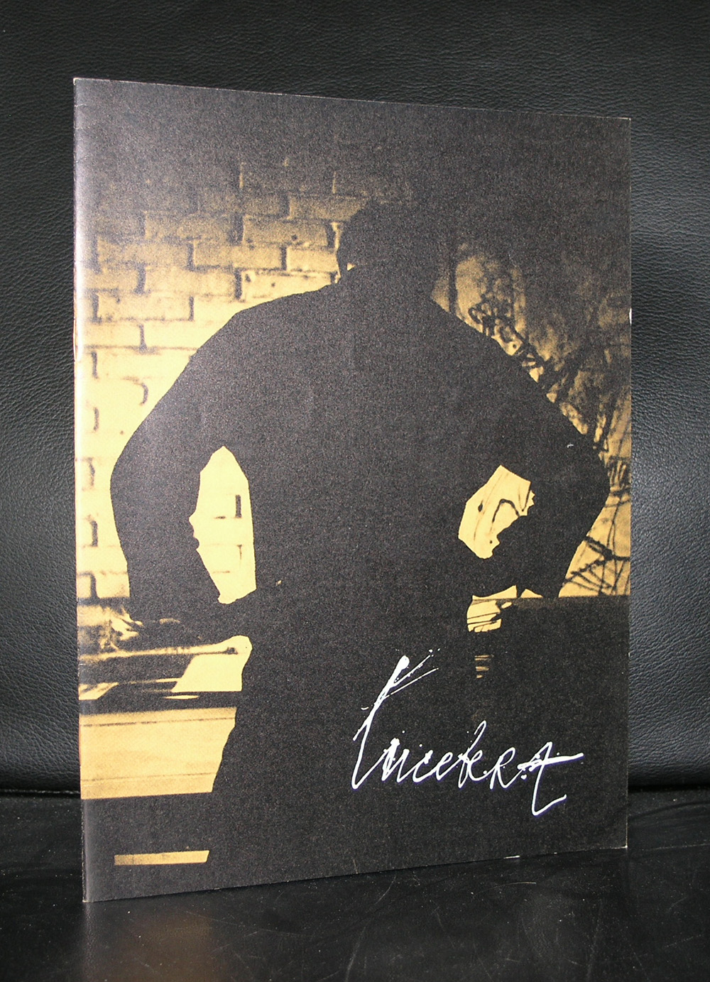
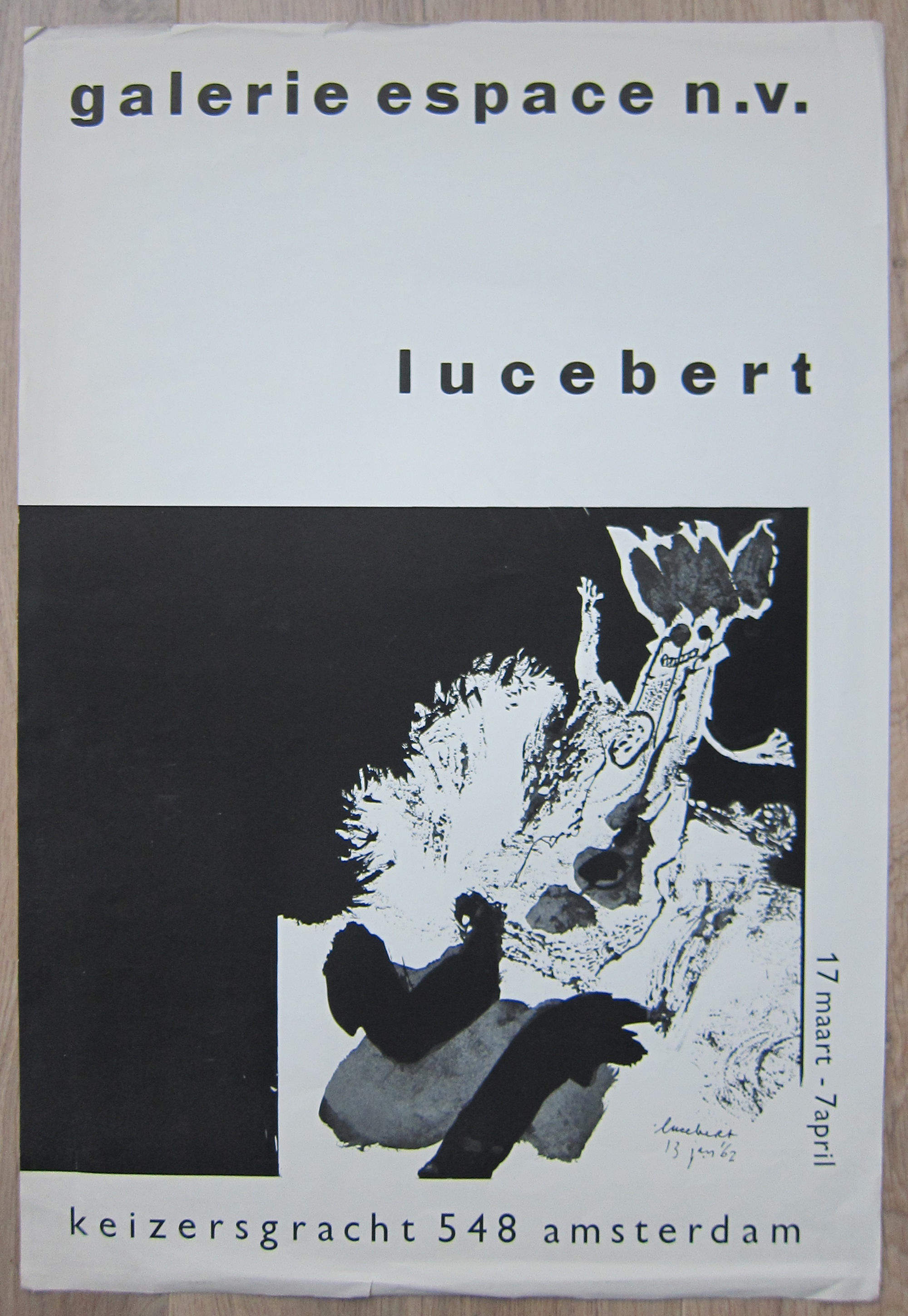
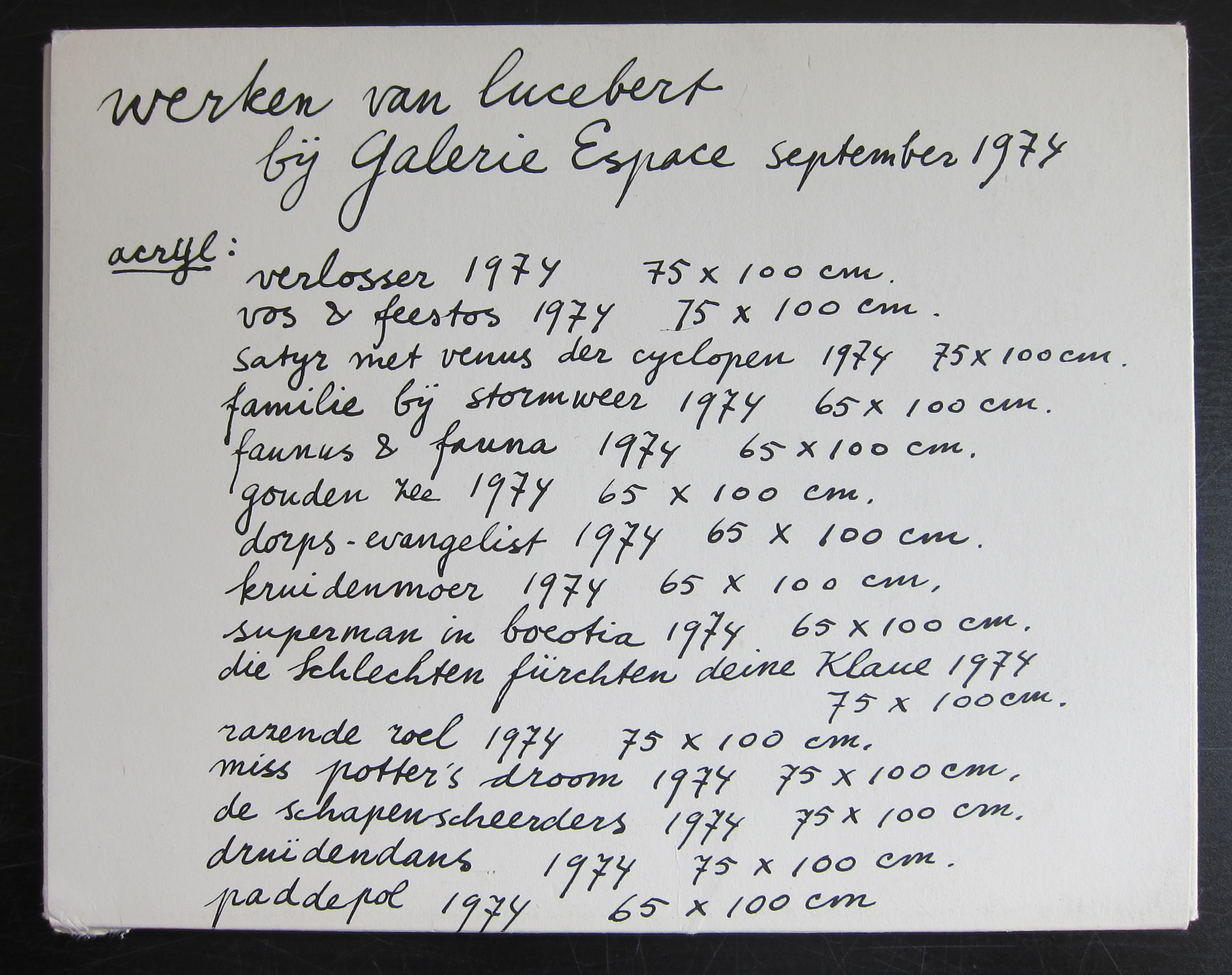
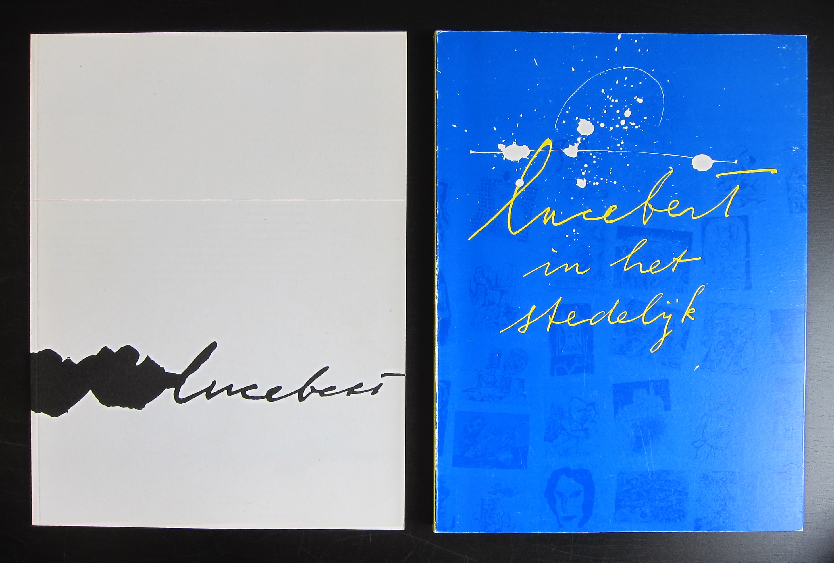
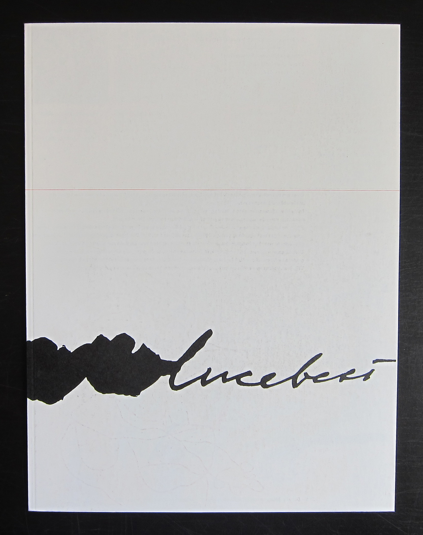
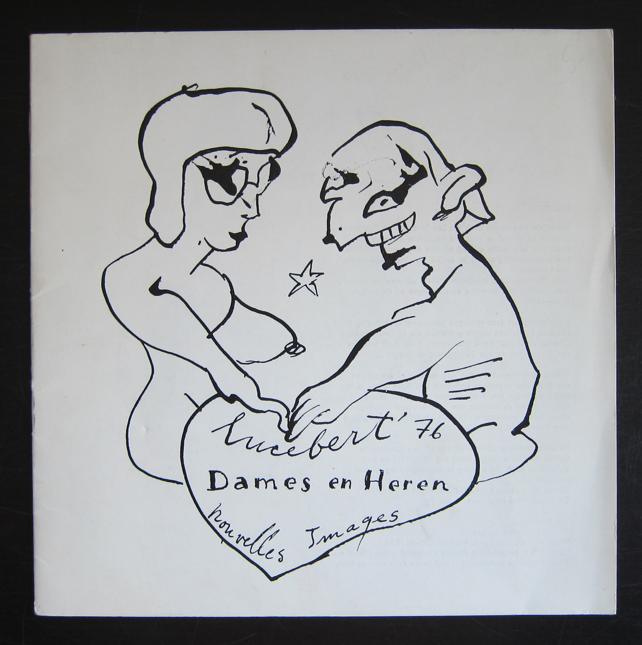
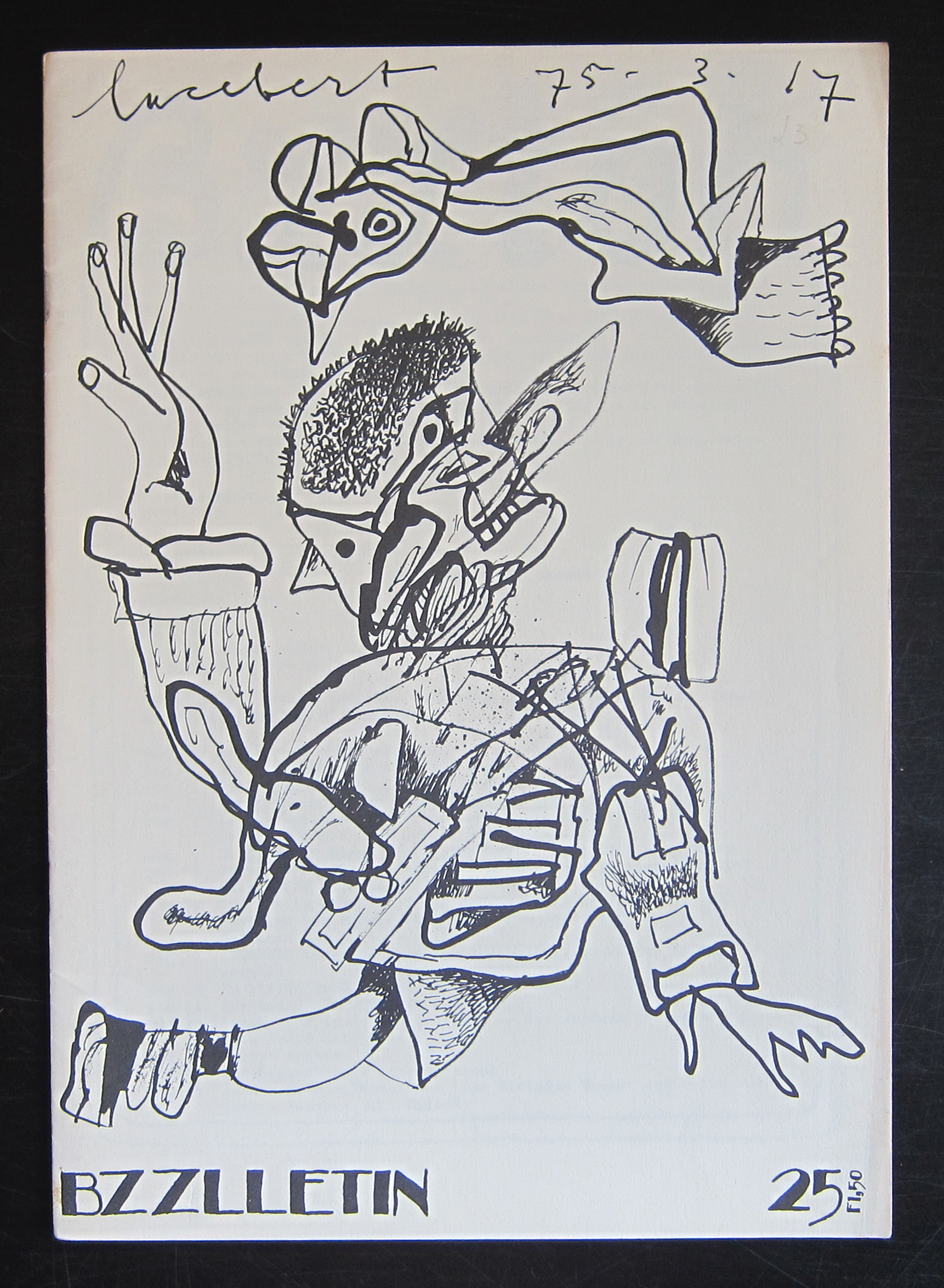
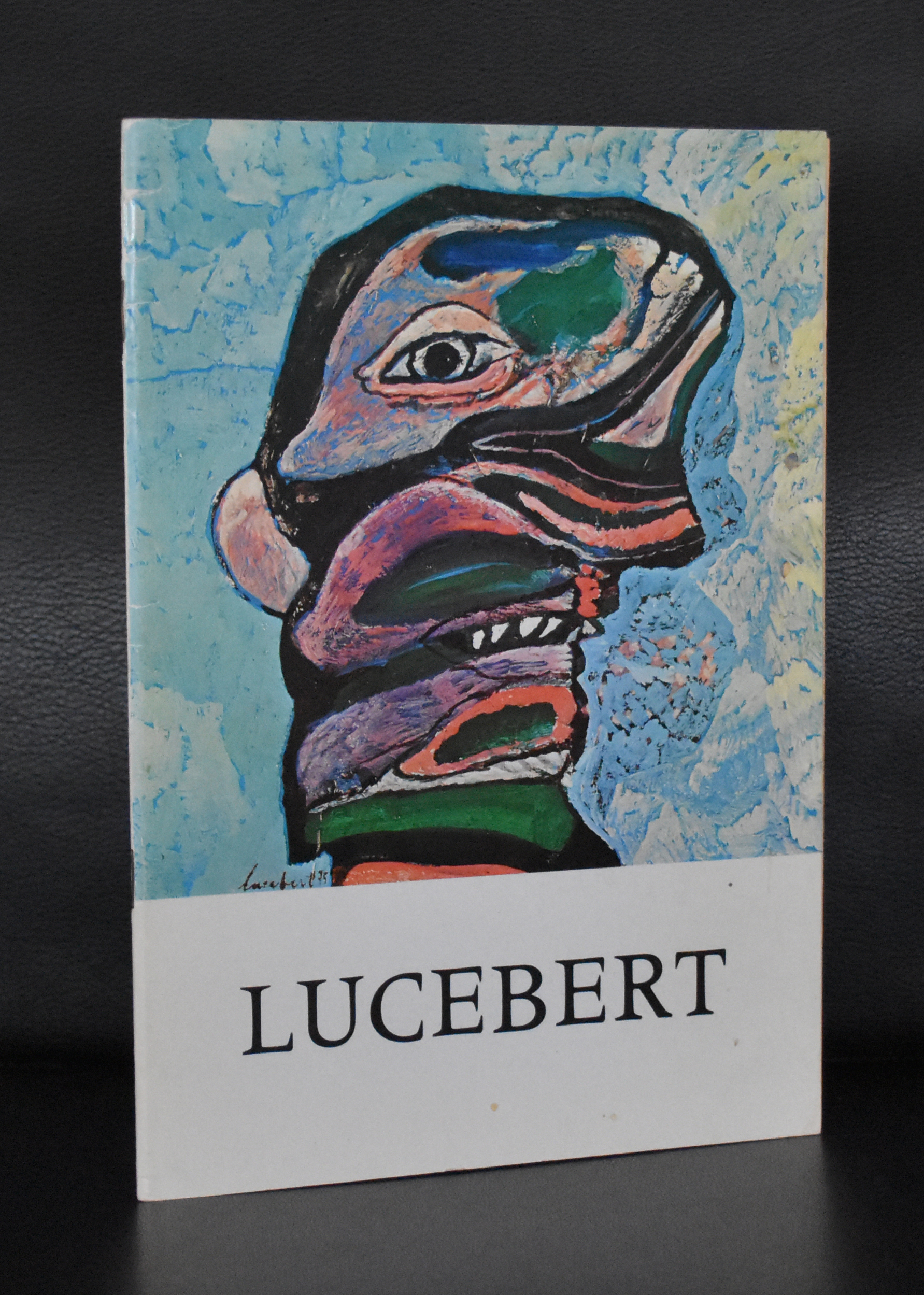
Everywhere i come across Lucebert (Lubertus Jacobus Swaanswijk) nowadays. Re-editions of his poems, paintings at auction and exhibitions in galleries and museums. There is a huge interest in his works since 20 years or so, but before that period he was hardly known as a painter , but nowadays he is considered as one of the leading dutch artists from the 20th century . In his early years he was very much influenced by Cobra , but soon he developed his personal style which for me is a crossing between Cobra and Art Brut. He became known for his poems, but when you ask about Lucebert nowadays, people think of him first and foremost as a painter and because of this interest it is harder and harder to find the early publications on his paintings and etchings. There are some by Nouvelles Images, but the most important ones come from the pubvlications series of the Stedelijk Museum Amsterdam. Publications in which original etchings were bound and therefore are highly collectable ( and expensive) publications. www.ftn-books.com has a nice selection of classic and collectable Lucebert publications.
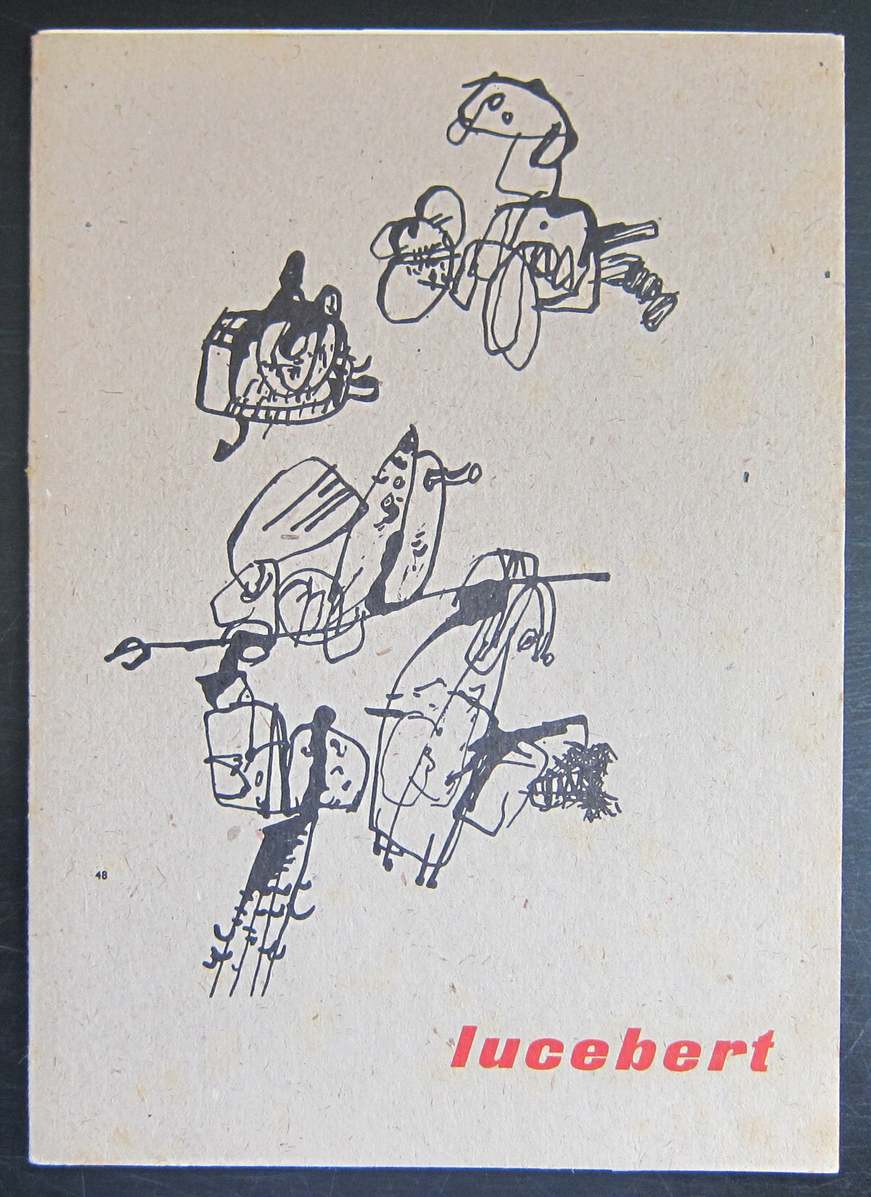
for more information on Lucebert visit http://lucebertstichting.nl
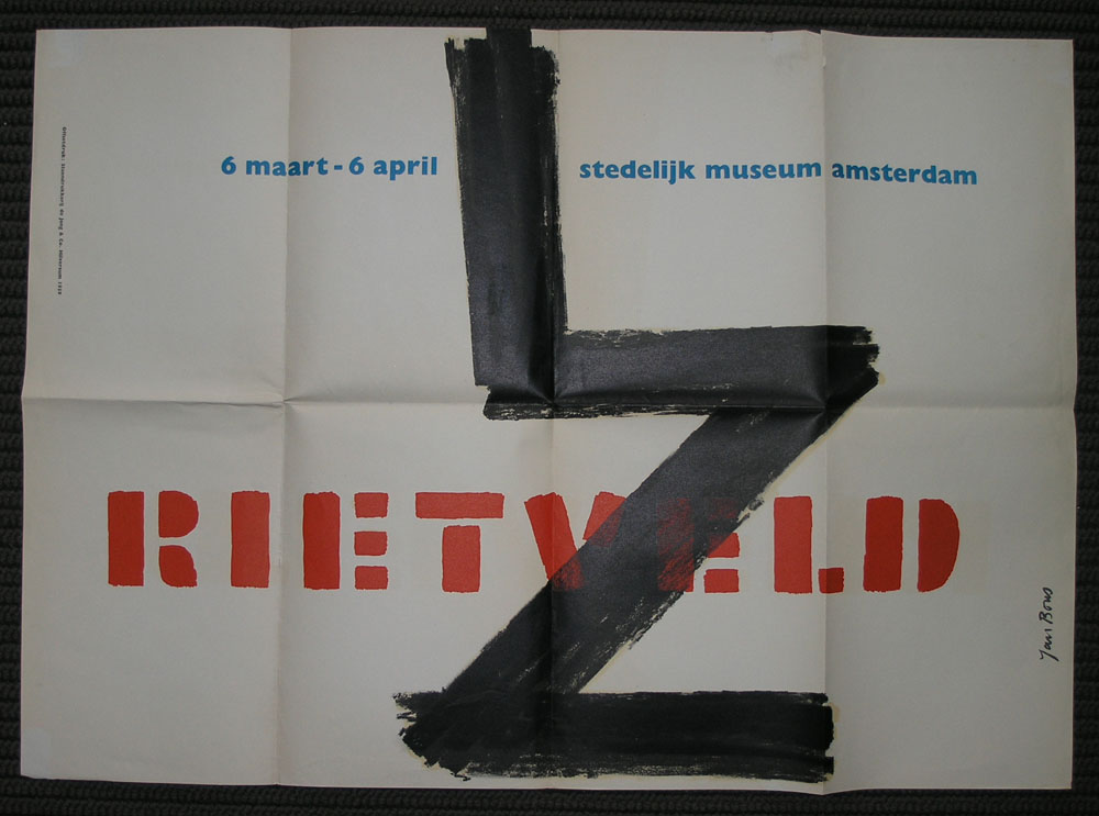
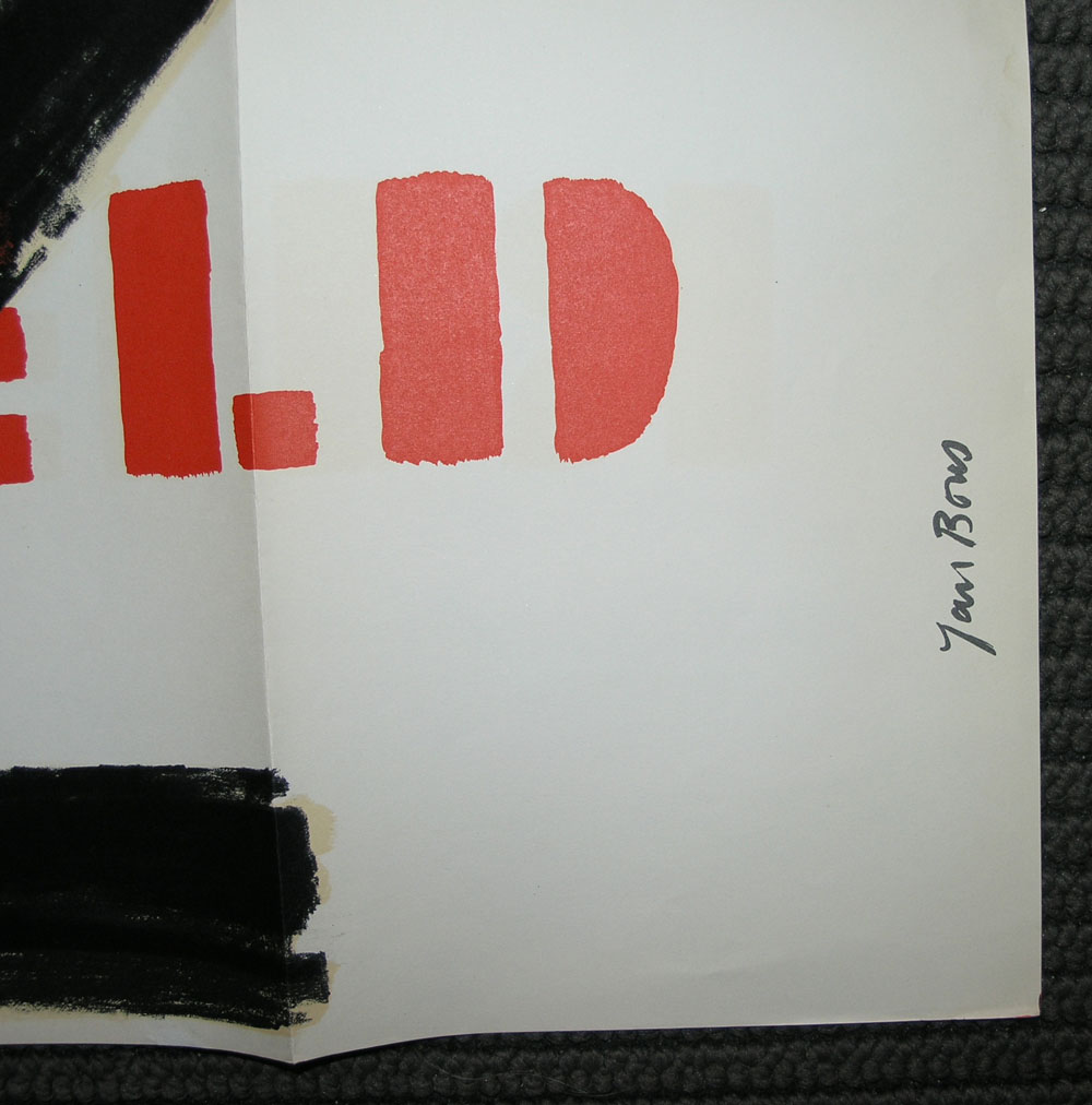
First of all this great RIETVELD poster is sold to Japan and it was the only one available at this moment, but i wanted to make sure my readers know of its existence. This is such a powerful design by Jan Bons with the Z of the ZigZag chair by Rietveld. If ever there is a Stedelijk Museum poster to be reissued/reprinted again…i will vote for this one. For some other nice Stedelijk Museum posters visit www.ftn-books.com

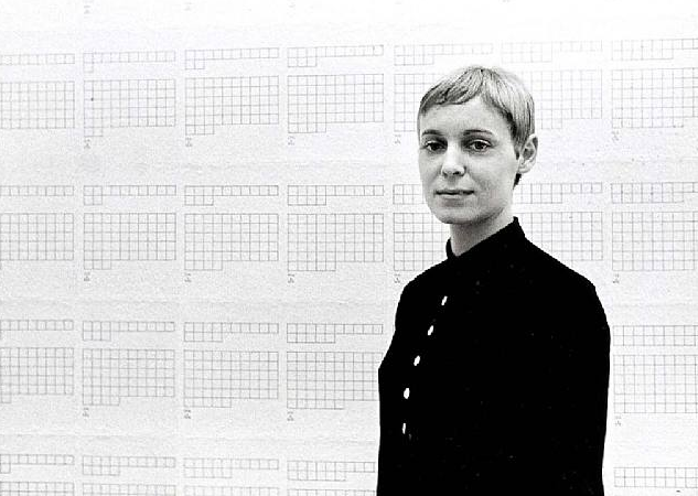

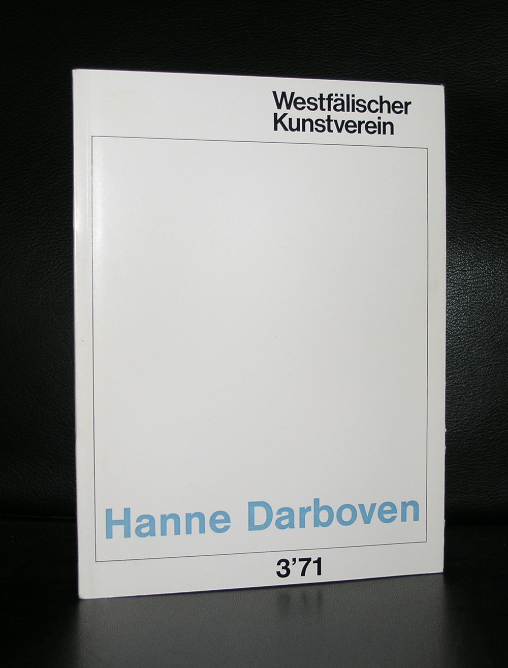
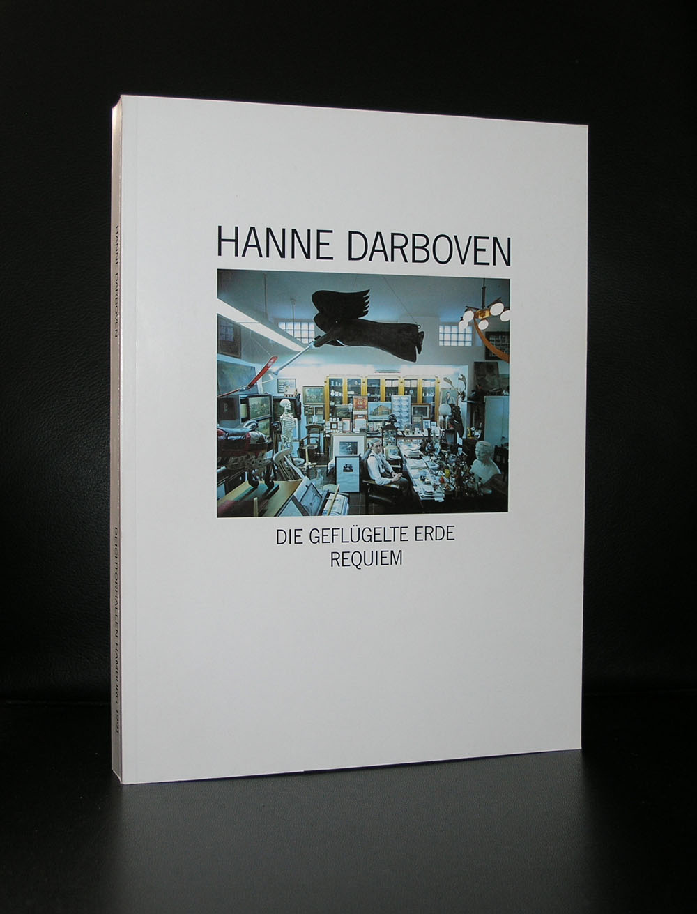
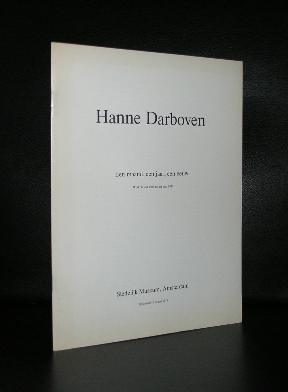
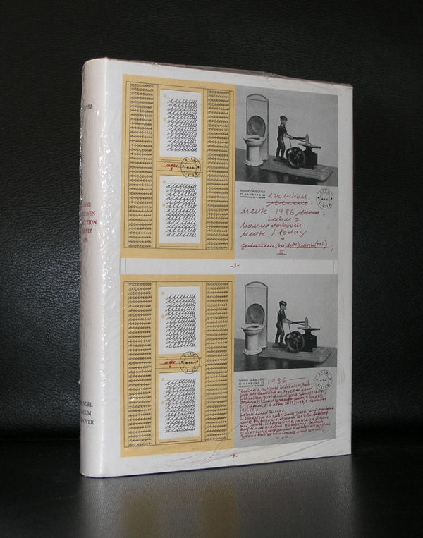
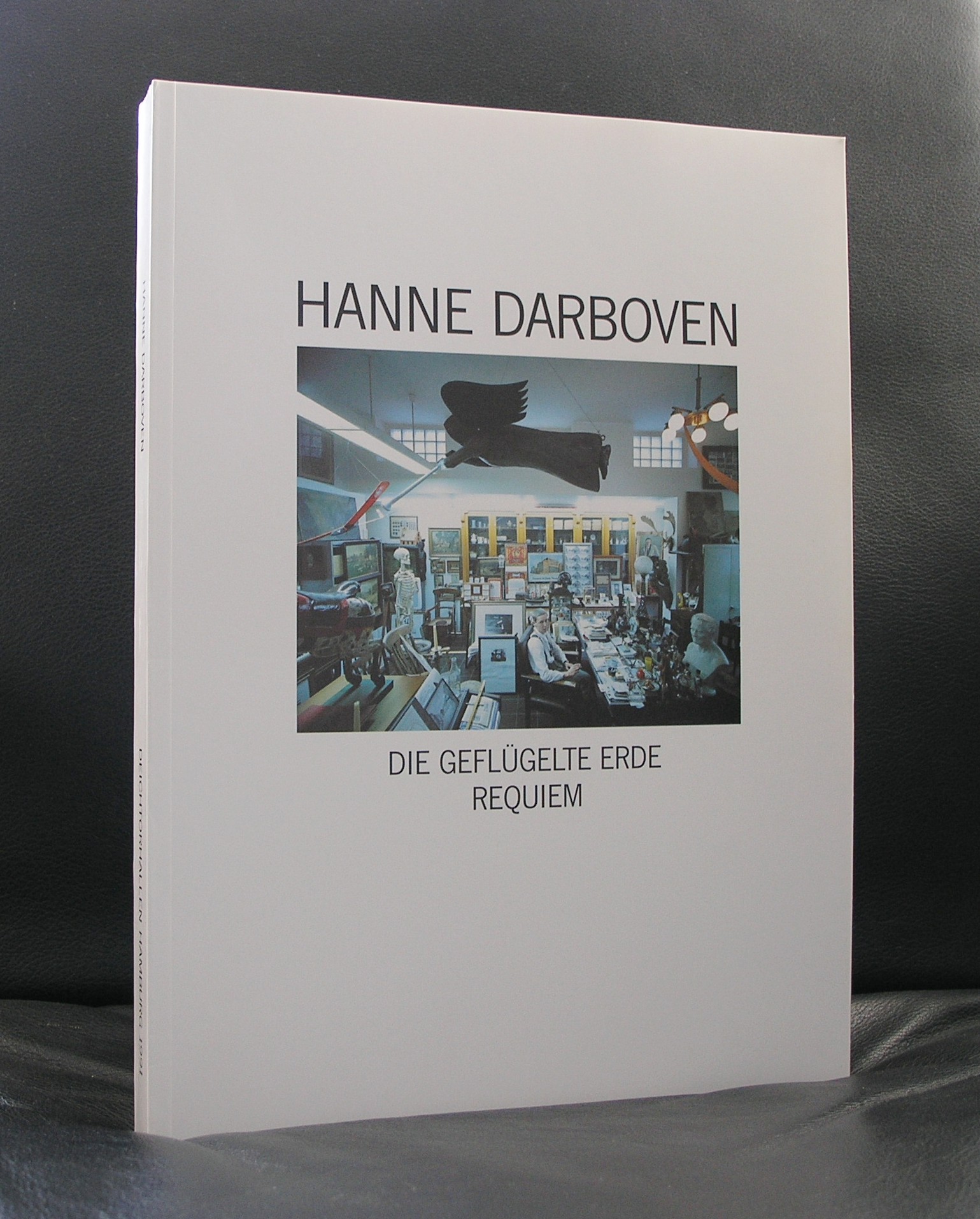
An impressive list and far from complete is this list of Museums that have a work or works by Hanne Darboven in their collection. Hanne Darboven was one of the most extreme Conceptual Artist from the last century. Making works with text, letters and numbers…always written and notated by hand in sequences reminding of the sequential works by the Minimal Art artists, by whom she was influenced ( LeWitt and Judd).
The calendar sequence has consistently formed the basis for the majority of her installations, and the ‘daily arithmetic’ consisting of checksums came to replace the year’s calendrical progression according to a complex and challenging mathematical logic. Always written out by hand, her paperwork thus comprised rows and rows of ascending and descending numbers, u-shapes, grids, line-notations and boxes. Employing this neutral language of numbers and using pen, pencil, the typewriter, and graph paper as materials, she began to make simple linear constructions of numbers that she called Konstruktionen.
Whenever you encounter a Darboven, the detail is of less importance. It is the pure extreme large scale that impresses , which is the same reason that so little of her works are on permanent display. When you encounter one of Darboven’s works…. Take your time and experience the space and the walls, covered with her works from top to bottom and never forget it anymore.
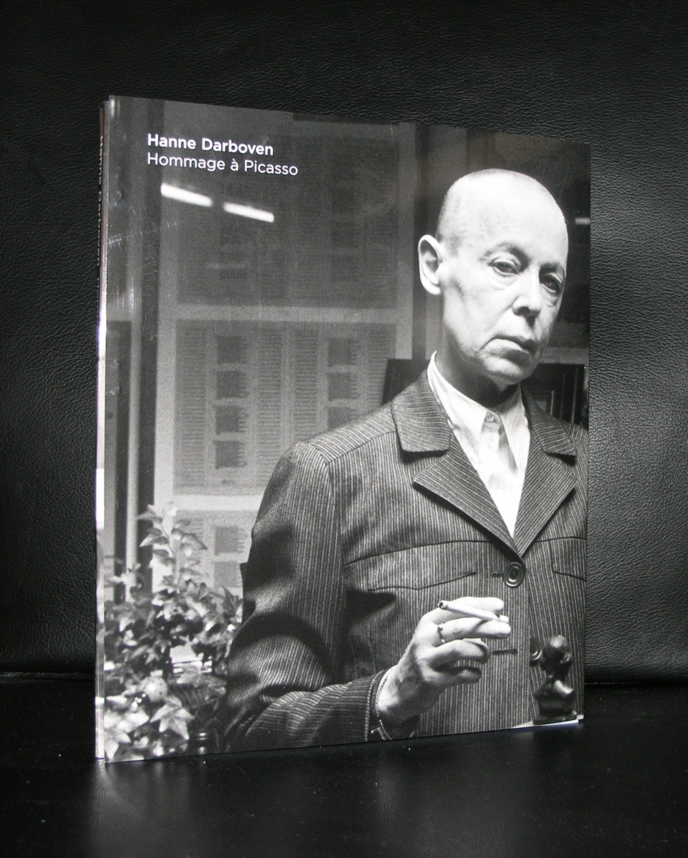
Some nice publications available at www.ftn-books.com

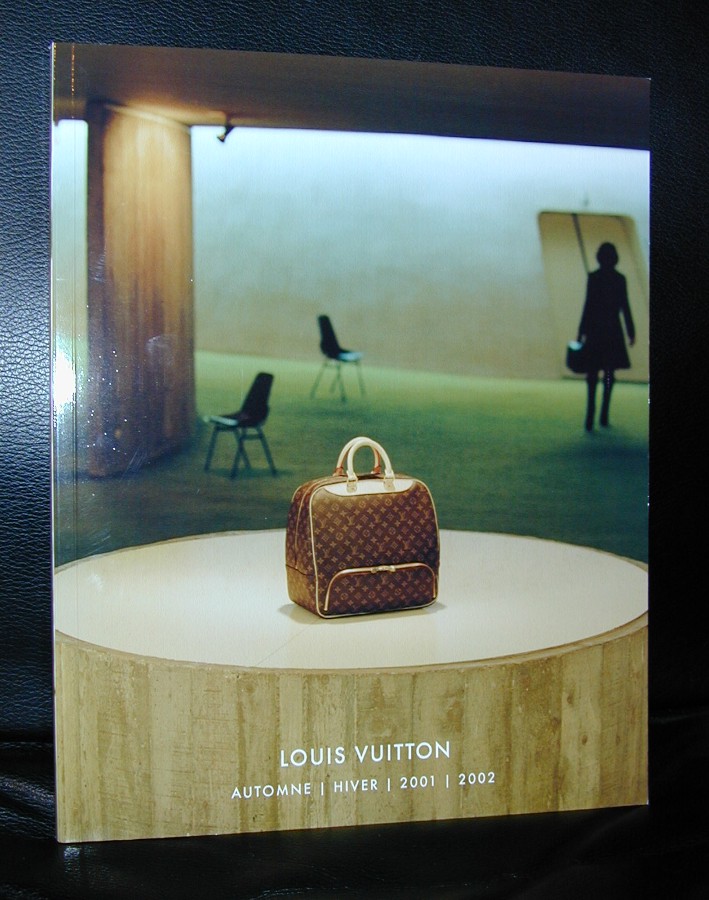
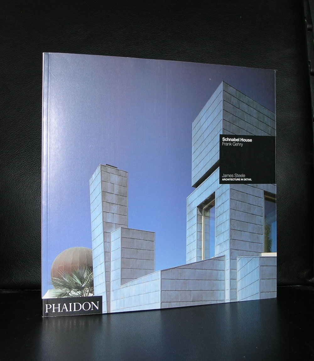
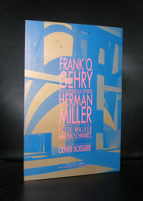
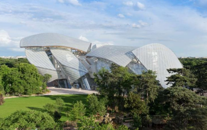
We joined our friends David and Monica this weekend in Paris. Planning this to meet each other half way planet earth took some organization, but it was worth it, because the exhibition of the Sergueï Chtchoukine collection is probably a once in a lifetime opportunity to see all these marvelous paintings in one place. Later i will blog on the exhibition itself, but for now i will focus on the building in which it is presented…the Fondation Louis Vuitton. Starting as a company making high quality bags, travel trunks and accessories out of prepared canvas and leather, the company later became one of the leading companies in the fashion world. Nowadays they are part of the LVMH group. A large holding specializing in luxury goods and one of the wealthiest companies in the world….and that shows, because in the Bois de Boulogne they build a museum which can not be compared with anything i have seen except the other Gehry designed buildings. Guggenheim Bilbao, Vitra in Weil Am Rhein and the Disney Concert Hall in LA), but this one is special….. First of all the layers / shells are all executed in white instead of the aluminium ones in Bilbao and L.A.). constructed and attached to each other with wooden supporting beams and because of the outer layer material, it was possible for Daniel Buren to convert these shells into one of his most complex, impressive and colorful In Situ works ever.
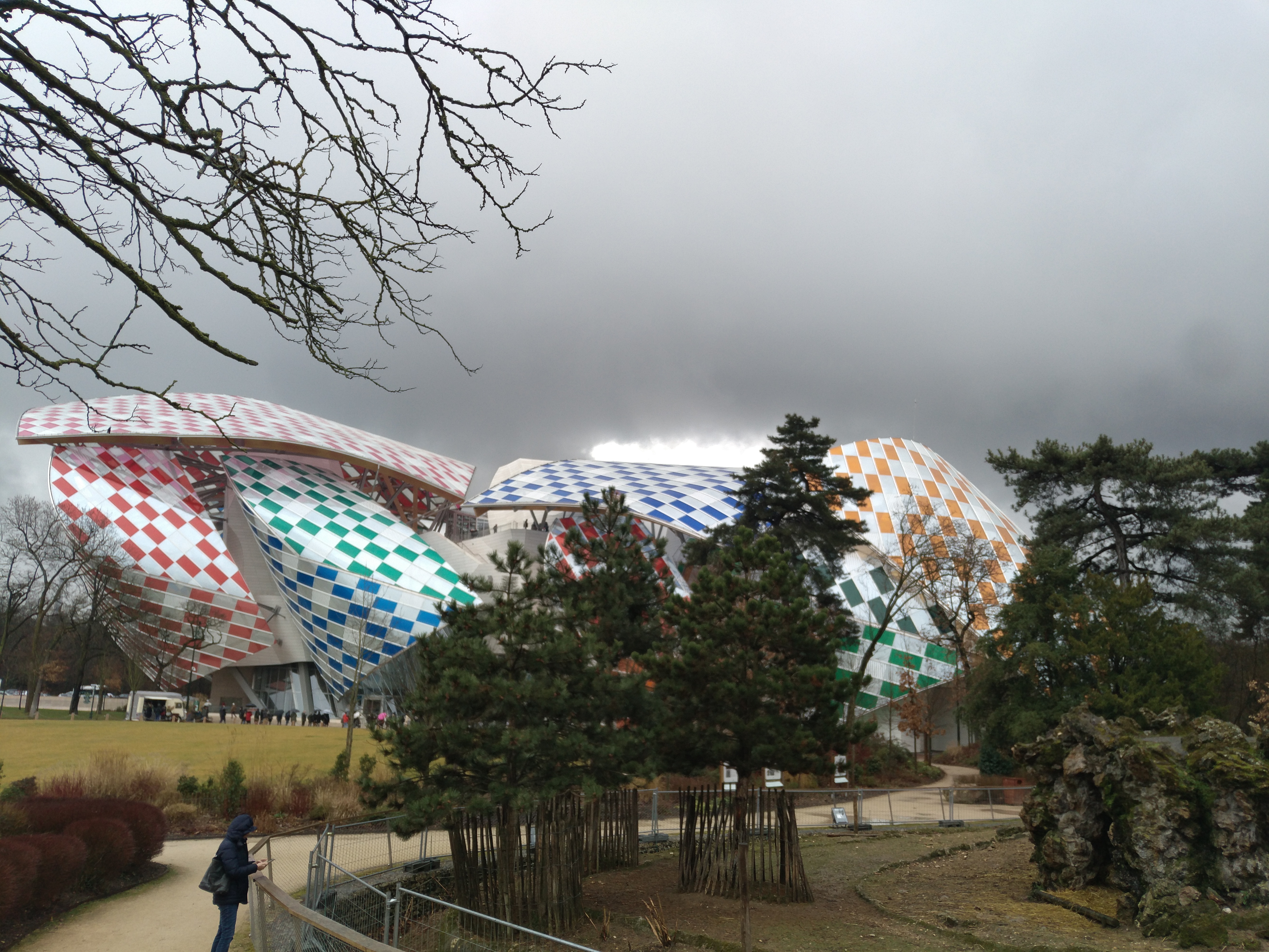
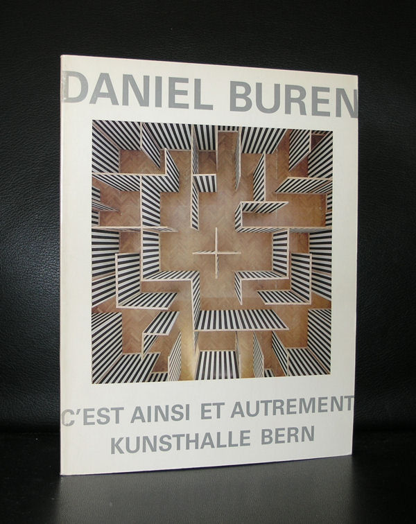
When you walk towards the entrance you get a glimpse of the pattern as it is executed, but when you leave the museum at the other side and walk into the garden, …..get some distance…..there it is …. you see a beautiful building totally covered by a great work of art. I do not know how long the Buren will be visible on the building but as long it is there, try to see it because it is well worth to see this one “live”. Compare it with the Christo In Situ works. Whenever you have seen one there is no photograph which can be compared with seeing the project with your own eyes. The scale in which it is executed makes these works special and so is this Daniel Buren….and Yes the Fondation Louis Vuitton is not the only one who combined these artist together, because books on Vuitton, Gehry and Buren can all be found at www.ftn-books.com