Personally this is one of my all time favorite publications by the van Abbemuseum. Designed by Arlette Brouwers, this publication has everything.
Great cover. In all its simplicity it makes in one glance clear that these are the important acquisitions of the van Abbemuseum. In the background one of the main exhibition rooms of the museum and inside, a very transparent lay out, in which the acquisitions are described. This is a true connaisseurs publication and deserves to be collected.
for this and other Arlette Brouwers designed publications please visit my store at www.ftn-books.com
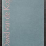
I would have liked to have known David van de Kop, since i have seen practically all his exhibitions in the Netherlands from the mid Eighties until his death in 1994. For me van de Kop is foremost a sculptor and less a painter. Most if his sculptures a fairly large and compositions with different kinds of materials . Steel, stone, ceramics. Every material is suitable for a sculpture. David van de Kop was educated by Carel Visser and in his turn he taught Arjanne van der Spek. Two artists i admire very much.
So for me personally it is a natural admiration, but his works are not only admired by me. His works are present in numerous dutch Museums of Modern art, but because of their size are hardly present within the collections of the well known dutch private collectors. This should be different, but time will show the importance of van de Kop and it will not take long before his works receive the recognition they deserve. David van de Kop publications are now available at www.ftn-books.com
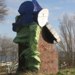
( and yes it still is possible to not find a portrait photo of the artist, so i have put his sculpture DE WACHTERS, on top of the blog)
A few years ago i wrote a blog on the work of art i was able to buy , but did not. The story is as follows. At that time the Gemeentemuseum was printing its publications with the very best printers in the Netherlands. Among them was of course Lecturis and my contact with Lecturis was the late Jan Jongepier. Jan , knowing my interest in art , offered me at one time a series of original works of art. All were for sale through Lecturis. Lecturis had at one time accepted works of art as (partial) payment for the publications they were printing for the artists. These publications were made outside the official editions for the dutch museums or accepted as part of the financing of the editions. They build a nice collection this way, but did not know what to do with it, hence the offer, which was made to me. In retrospect i can tell that these prices were outright cheap, but at that time i could not finance any of the works offered.
Still i always remember Jan and his art collection from Lecturis. Specially now that i have added the Rückriem catalogue which must have been the origin of the Ruckriem work in the Lecturis collection. It is now available at www.ftn-books.com
Part of the inside of both publications is the same. Covers are the same , but here comes the difference. Backcovers are different and there are less pages in the Steendrukkerij de Jong catalogue. It is clear that Steendrukkerij de Jong used the same design by Wim Crouwel he made for the van Abbemuseum for this iconic Sixties catalogue. But where the van Abbemuseum is scarce, The Steendrukkerij de Jong publication is nowhere to be found anymore. This is probably because it was a simple “handout” publication for the exhibition at the printers. My guess is only a few hundred were printed and this is one of the only surviving ones. The publication is now available at www.ftn-books.com
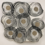
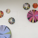
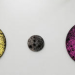
Living and working both in the Netherlands and in France. His works always have a presence because of the shape and dimensions. Still his favorite shape is the circle, but it seems to me that the composition within the circular form has become lighter. Perhaps this is the influence of France.
de Goede has had his exhibitions in the most important dutch museums and together with these exhibitions some very nice publications were published to accompany the exhibition. My personal favorit?….the van Abbemuseum catalogie from 1988, designed by Walter Nikkels and a text by Hendrik Driessen and available at www.ftn-books.com
Almost forgotten this sculptor from Italy, but because of a recent addition to my inventory i rediscovered the sculptures by Negri.
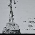
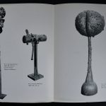
Mario Negri had a dutch exhibition in 1970 in the van Abbemuseum, curated by Hammacher who made a publication possible which is quite scarce. The 8 page fold out is designed by Jan van Toorn and depicts several works by Negri and a photograph of his studio.
A bright green is chosen as a cover to draw attention and it oozes Seventies design. I love this great fold out and it even comes with a handwritte price list in Lire for those who want to complete their archives on the sculptor this is an absolute musey. A great sculptor and a great publication are brought together in this typical early Seventie van Toorn design. The Negri publication is now available at www.ftn-boooks.com
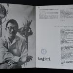
It was in the earliest years of his career that Wim Crouwel was invited to design the catalogues of the van Abbemuseum and in these years several iconic publications were published that were designed by Crouwel. I have encountered over the years many of them and have a nice selection for sale at www.ftn-books.com, but until last month i never had seen the Tajiri catalogue from 1961. It was one of the earliest of Tajiri his catalogues for a major museum, but Wim Crouwel must have felt the same about the catalogue as Tajiri did. Both must have the iedea that is was important for them personally. The typography on the cover is outstanding and the photograph by Cas Oorthuys even enhances it. This is a thin 12 page catalogue with a special 4 page inlay ( with photographs of sculptures), but every page shows the quality of Wim Crouwel his design in combination with the works by Tajiri.
Early September 2019 i recommended the Mr Gridnik exhibition which would open shortly after in the Stedelijk Museum. Just a few days before opening Mr. Gridnik/ Wim Crouwel died and he never witnessed his tribute at the Stedelijk. Since i have not found the time to go to this exhibition myself, but now that i finally have the opportunity and started planning my visit, i found out that all rooms are photographed and can be visited on line. It is a worthy tribute to one of the greatest designers from the last decade, but could have been much more complete. It focusses for 90% on the Stedelijk Museum publications, but it is still a very impressive sight to see so many great designs collected, but the real surprise is that i noticed that i have almost all of the books on show in my inventory. (www.ftn-books.com)
For those living too far away to visit the exhibition….here is the direct link to the rooms and showcases with Crouwel material:
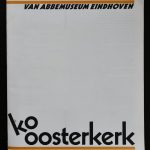
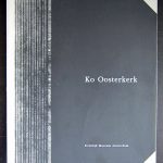
Jacobus Willem (Ko) Oosterkerk. It has not been recently that Ko Oosterkerk was admired for his black and white , highly abstract etchings. Almost in a contstructivist way he builds his compositions, but always was free, where the constructivist set their limitations.
A few years ago (2016) there was an exhibition at the Kampen Museum, which showed all the qualities of his work through the years. Just have a look at all these wonderful works by searching with Google and you will be amazed how timeless these works are. I leafed through the van Abbemuseum catalogue from 1975 and noticed the quality of all his works. I can highly recommend this artist who is on the verge of becoming much more popular, but now still is very affordable.
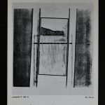
Artist/ Author: Oliver Boberg
Title : Memorial
Publisher: Oliver Boberg
Measurements: Frame measures 51 x 42 cm. original C print is 35 x 25 cm.
Condition: mint
signed by Oliver Boberg in pen and numbered 14/20 from an edition of 20