Posted on Leave a comment

Edward Weston (1886-1956)

Schermafbeelding 2018-08-13 om 15.36.27

This text comes from a wonderful and beautiful site devoted to Edward Weston and his works. Weston is one of the most important photography artist from last century and this site ( edward-weston.com) is a deserved and “classic” tribute to this great photographer.

Edward Henry Weston was born March 24, 1886, in Highland Park, Illinois.  He spent the majority of his childhood in Chicago where he attended Oakland Grammar School. He began photographing at the age of sixteen after receiving a Bull’s Eye #2 camera from his father. Weston’s first photographs captured the parks of Chicago and his aunt’s farm. In 1906, following the publication of his first photograph in Camera and Darkroom, Weston moved to California. After working briefly as a surveyor for San Pedro, Los Angeles and Salt Lake Railroad, he began working as an itinerant photographer. He peddled his wares door to door photographing children, pets and funerals. Realizing the need for formal training, in 1908 Weston returned east and attended the Illinois College of Photography in Effingham, Illinois. He completed the 12-month course in six months and returned to California. In Los Angeles, he was employed as a retoucher at the George Steckel Portrait Studio. In 1909, Weston moved on to the Louis A. Mojoiner Portrait Studio as a photographer and demonstrated outstanding abilities with lighting and posing.) Weston married his first wife, Flora Chandler in 1909. He had four children with Flora; Edward Chandler (1910), Theodore Brett (1911), Laurence Neil (1916) and Cole (1919). In 1911, Weston opened his own portrait studio in Tropico, California. This would be his base of operation for the next two decades. Weston became successful working in soft-focus, pictorial style; winning many salons and professional awards. Weston gained an international reputation for his high key portraits and modern dance studies. Articles about his work were published in magazines such as American Photography, Photo Era and Photo Miniature. Weston also authored many articles himself for many of these publications. In 1912, Weston met photographer Margrethe Mather in his Tropico studio. Mather becomes his studio assistant and most frequent model for the next decade. Mather had a very strong influence on Weston. He would later call her, “the first important woman in my life.” Weston began keeping journals in 1915 that came to be known as his “Daybooks.” They would chronicle his life and photographic development into the 1930’s.

In 1922 Weston visited the ARMCO Steel Plant in Middletown, Ohio. The photographs taken here marked a turning point in Weston’s career. During this period, Weston renounced his Pictorialism style with a new emphasis on abstract form and sharper resolution of detail. The industrial photographs were true straight images: unpretentious, and true to reality. Weston later wrote, “The camera should be used for a recording of life, for rendering the very substance and quintessence of the thing itself, whether it be polished steel or palpitating flesh.” Weston also traveled to New York City this same year, where he met Alfred Stieglitz, Paul Strand, Charles Sheeler and Georgia O’Keefe.

In 1923 Weston moved to Mexico City where he opened a photographic studio with his apprentice and lover Tina Modotti. Many important portraits and nudes were taken during his time in Mexico. It was also here that famous artists; Diego Rivera, David Siqueiros, and Jose Orozco hailed Weston as the master of 20th century art.

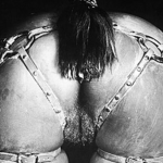
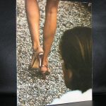
After moving back to California in 1926, Weston began his work for which he is most deservedly famous: natural forms, close-ups, nudes, and landscapes. Between 1927 and 1930, Weston made a series of monumental close-ups of seashells, peppers, and halved cabbages, bringing out the rich textures of their sculpture-like forms. Weston moved to Carmel, California in 1929 and shot the first of many photographs of rocks and trees at Point Lobos, California. Weston became one of the founding members of Group f/64 in 1932 with Ansel Adams, Willard Van Dyke, Imogen Cunningham and Sonya Noskowiak. The group chose this optical term because they habitually set their lenses to that aperture to secure maximum image sharpness of both foreground and distance. 1936 marked the start of Weston’s series of nudes and sand dunes in Oceano, California, which are often considered some of his finest work. Weston became the first photographer to receive a Guggenheim Fellowship for experimental work in 1936. Following the receipt of this fellowship Weston spent the next two years taking photographs in the West and Southwest United States with assistant and future wife Charis Wilson. Later, in 1941 using photographs of the East and South Weston provided illustrations for a new edition of Walt Whitman’s Leaves of Grass.

Weston began experiencing symptoms of Parkinson’s disease in 1946 and in 1948 shot his last photograph of Point Lobos. In 1946 the Museum of Modern Art, New York featured a major retrospective of 300 prints of Weston’s work. Over the next 10 years of progressively incapacitating illness, Weston supervised the printing of his prints by his sons, Brett and Cole. His 50th Anniversary Portfolio was published in 1952 with photographs printed by Brett. An even larger printing project took place between1952 and 1955. Brett printed what was known as the Project Prints. A series of 8 -10 prints from 832 negatives considered Edward’s lifetime best. The Smithsonian Institution held
the show, “The World of Edward Weston” in 1956 paying tribute to his remarkable accomplishments in American photography. Edward Weston died on January 1, 1958 at his home, Wildcat Hill, in Carmel, California. Weston’s ashes were scattered into the Pacific Ocean at Pebbly Beach at Point Lobos.

www.ftn-books.com has some titles with works by Weston available.

Posted on Leave a comment

Ivan Puni / Jean Pougny (1892-1956)

Schermafbeelding 2018-08-09 om 13.54.27

I had never known this before, but now that i searched for Ivan Puni i found out that Jean Pougny and Puni are one and the same person. I knew that he stayed for most of his life in France and was succesful in France  and that must have been the reason that Puni became Pougny. the catalogue i have in my inventory is one of the best ones Willem Sandberg designed in the Fifties . It is a typical Sandberg designed catalogue and one of the first with tipped in color plates.

Puni received his formal training in Paris in 1910-11 at the Académie Julien and other schools, where he painted in a derivative fauvistestyle. Upon his return to Russia in 1912, he met, and exhibited with, members of the St Petersburg avant-garde, including Kazimir Malevich and Vladimir Tatlin. He made a second trip to Paris in 1914, returning to St. Petersburg in 1915. At this point, he began painting in a Cubist style reminiscent of Juan Gris. In 1915, Puni, (Aleksandra Ekster, Liubov Popova, Ivan Kliun, Ksenia Boguslavskaya, Olga Rozanova, Nadezhda Udaltsova, Nina Genke and others) formed Supremus, a group of artists dedicated to the promulgation of Suprematism, the abstract art movement founded by Malevich. Malevich and Puni co-authored the Suprematist Manifesto, published in 1916, which proclaimed a new, abstract art for a new historical era. Puni also organized the exhibitions Tramway 5 and 0.10, both held in St Petersburg in 1915, in which Malevich, Tatlin, Popova and others participated, and to which Puni contributed constructions and paintings. In 1915-1916 Puni, together with other Suprematist artists, worked at Verbovka Village Folk Centre. In 1919, he taught at the Vitebsk Art School under Marc Chagall.

Puni and his wife, Kseniya Boguslavskaya, emigrated from Russia in 1919, first to Finland, then in 1920 to Berlin, where the first exhibition consisting entirely of his work was held at the Galerie der Sturm. While in Berlin, Puni also designed costumes and sets for theatrical productions. Puni and Boguslavskaya relocated to Paris in 1924, where his style changed once again to a variant of Impressionism. In France, he signed his work Jean Pougny in an effort to distance his new art practice from his previous one in Russia. In 1946, Puni/Pougny became a French citizen. He died in Paris in 1956.

www.ftn-books.com has Puni/Pougny titles available.

Posted on Leave a comment

Claude Monet and Keith Haring

Schermafbeelding 2018-07-31 om 15.32.27

Worlds apart in their art but with one common factor in their lives. Because of the blog on Liebermann, i Realized that there were many famous artist who visited at one time in their life the Netherlands and worked together with dutch artists or were in residence to refresh their point of views and make some impressive works of art. So did Claude Monet who visited more than once de Zaanse Schans to make some impressive and beautiful impressionist paintings

and one century later there was Keith Haring who stayed a month in Amsterdam and during that time he made the “velum” in the Stedelijk Museum.

There are more examples to be found but these two sprung to my mind when i thought about the frequent times Liebermann spent his summer holiday in the Netherlands.

On both artists there are some nice publications to be found at www.ftn-books.com


Posted on Leave a comment

Kenneth Noland (1924-2010)

Schermafbeelding 2018-07-31 om 16.08.00

I love color field painting and what i think interesting about the works by Kenneth Noland is that he applied the color theories of Josef Albers to his own art.

Noland developed a signature style based on simplified abstract forms, including targets, chevrons, and stripes. Noland’s paintings are characterized by strikingly minimalist compositions of shape and color. In this regard, Noland’s art has influenced a wide range of contemporary abstractionists who continue to experiment with highly simplified forms and pure saturated color. The beginning of Minimalism is not far away in these works.

Noland applied Josef Albers’s theory of “the interaction of colors” to his own compositions, which explore the relationships between contrasting or complementary colors; painted in thin yet opaque layers, each tone reveals its particular characteristic weight, density, and transparency.

In the late 1960s, Noland’s approach to Color Field Painting grew even more reductive, but no less bold. Having run through multiple permutations of both the target and chevron format for the time being, Noland switched to using rectangular canvases and horizontal lines in a new series he called Stripes (1967-70). In his Targets and Chevrons, the artist tended to juxtapose color bands of equal width and to impose some form of axial symmetry on the canvas, leaving portions of unprimed canvas blank in contrast to the color. None of these features occur in Noland’s Stripes. Instead, Noland began playing with scale, color, and form on new levels. He reduced his compositions to a basic formula: parallel horizontal lines of varying widths and colors, running along the entire width of the canvas.

An interesting artist of whom not many publications are available in Europe, still there are some available at www.ftn-books.com

Posted on Leave a comment

Jacques Monory (1924) and the color BLUE

Schermafbeelding 2018-07-30 om 09.17.02

Here is the first few lines of the text i found on Wikipedia. Berside i noticeed the high age of the artist i also noticed that the color Blue was present in his works during his entire career.

Jacques Monory, June 25, 1924 (age 94) Cachan, France Nationality French Education École nationale supérieure des arts appliqués et des métiers d’art Known for Painter, filmmaker Movement Narrative Figuration Spouse(s) Paule Monory Website www.jacquesmonory.com Jacques Monory (25 June 1924) is a French painter and filmmaker whose work, highly influenced by photography and cinema, is an allegory of the contemporary world with a focus on the violence of everyday reality. His canvases evoke a heavy atmosphere, pulling subject matter from modern civilization through the lens of his signature monochrome color blue.

OLYMPUS DIGITAL CAMERA

If you look at the catalogue which was published for his Stedelijk Museum exhibition in 1972, You will notice 2 things. First there is the excellent design by Wim Crouwel, but secondly the use of Blue for the cover and the photographic scene on the front. A lesser known catalogue , but certainly an excellent designed Crouwel one and available at www.ftn-books.com. Monory is still not very well known, but i am convinced of his importance and will look forward to more exhibitions of this fascinating artist.

Posted on Leave a comment

Willem Sandberg… Experimenta Typographica 1943 – 68.

OLYMPUS DIGITAL CAMERA

As you can read in the title , Willem Sandberg experimented with typography and designs.

During the occupation by the Germans he published experimental books with his own typography. Mostly a combination of very original and personal lay-out and torn out letters, making these publications unique. Unique because of their chosen size, material, printing ,their design and the very limited numbers in which they were produced.

Sandberg produced nineteen pamphlets between December 1943 and April 1945, making a couple of copies of each one, all done by hand. They consisted of twenty to sixty pages of drawings, collages, and texts, which were either written by Sandberg himself or quoted from Confucius, Proudhon, Stendhal, and other favorite writers on themes like love, death, education, architecture, and typography. As Sandberg had no money and materials were scarce in wartime, he improvised by using whatever he could find: scraps of wallpaper, cardboard packaging, tissue paper, and wrapping paper together with photographs, drawings, and symbols torn from magazines for his collages.

The originals are very very rare and exceptionally hard to find. Luckily some of the dutch publishers decided to make some reprints and make them in this way available for other admirers. These reprints are getting more scarce every year now, but www.ftn-books.com still has some available.

Posted on Leave a comment

A new OSSIP addition from 2003.

Schermafbeelding 2018-07-06 om 15.40.41
Ossip / JONGEN, 2003

Just take a look and see that i added this beautiful hypnotizing Ossip to FTN collection about 2 months ago at www.ftn-blog.com. It comes from the the Vescom collection . A collection which was created over the last 3 decades and was sold at auction in Amsterdam. I was lucky to buy this “JONGEN” by Ossip together with 2 works by Joris Geurts ( in another blog later). This “Jongen” is one of the more “static” works . It has the same qualities as the works he presented in his exhibition at the Gemeentemuseum Den Haag . Most of the works i know of have moving parts but this late Nineties /early 2000 work was made when composition and image were the typical Ossip elements within a work of art. I know that there exists also a larger version of ” JONGEN” which is depicted in the Ossip monograph , but this version measures 112 x 89 cm. and is signed and dated Ossip, 23-11-2003 and now available at www.ftn.blog.com

at : https://wordpressstrato-pacfwc5kp0.live-website.com/product/ossip-jongen-2003-112-x-89-cm-excellent-condition/

Posted on Leave a comment

Ewerdt Hilgemann (1938)


Schermafbeelding 2018-07-04 om 12.19.28

For me Hilgemann was one of the first Zero artists i learned to appreciate, but there is so  much more to Hilgemann as an artist. Here is an excellent article i found on Hilgemann  at the Borzo site / www.borzo.com

Borzo still sells his works and perhaps now is right the time  for Hilgemann.

A child of about six in the war, Ewerdt Hilgemann searches through the rubble of the bombed ruins of his hometown Dortmund for shrapnel. He finds them interesting, exciting too, these sharp-edged metal splinters.

Forty years later, and now an artist, Hilgemann works in the marble quarries of Carrara (1975-1985). A truck transports a perfectly sawn one and a half metre cube of marble that he has carefully polished, to the top and then with a thunderous crash sends it toppling off the steep mountainside. And a marble sphere of a similar size, polished to a perfect sheen, has explosives inserted and is then blown up.

Both conceptual ‘performances’ are recorded on film. The artist creates perfect forms, which are then deformed using forces of nature: a sort of reverse creative process.

Thirty years later, in the summer of 2014, Hilgemann exhibits his Magnum Opus. In response to an invitation from the City of New York he places a series of implosion sculptures on Park Avenue. ‘Dancers’, ‘Triples, ’Flowers’ and ‘Cubes’, six metres high, gleaming in the sun, the deformed surfaces of these Titans of steel distort and reflect the overwhelming architecture of the buildings on each side of Park Avenue.

From his earliest days in a devastated Dortmund to the Park Avenue manifestation in New York, Hilgemann has been consistent in his fascination and his art. In his own words: “To deform a perfect shape without me hammering on it”.

From the start the cube and the square are his best-loved shapes. Hilgemann studies and comes to understand these solid forms. He learns it at the Saarbrucken Art Academy under his tutor Oskar Holweck. (In 1958 Holweck had joined the Zero movement, founded that year by Mack and Piene). Here the young art student Hilgemann learns to respect material and form in their most elementary states. Plasticity is achieved through the effect of light on the surface and the – mathematic – interventions performed thereon by the artist.

In 1970 Hilgemann and his wife Antoinette settle in Gorinchem and here a close friendship develops with Ad Dekkers, Marinus Boezem and herman de vries. In these days Gorinchem is apparently a hotbed for avant-garde art. Irritated – provoked even – by a conservative artistic climate in this small town on the River Merwede, these artists discover common ground for their minimalistic and conceptual ideas.

Their haven at the time is Riekje Swart’s legendary Amsterdam gallery. Hilgemann exhibits his white objects oriented according to mathematical studies here from 1966.

In 1973 the four artist friends – and their partners! – take the initiative for a much discussed and now legendary symposium, whereby the town wants to be a centre for “examining the position of the visual arts in our society”. Fifteen European artists stay together in Gorinchem for six weeks. These include now famous artists such as Kenneth Martin, Morellet, Panamarenko, Pohl, Prantl and Winiarski. Exceptional works of art, lectures and performances fill the town. For Hilgemann ‘Gorinchem’ is an extraordinarily significant period in which his art reaches full maturity and he also establishes his international orientation.

Hilgemann produces his first sculpture created through implosion in 1984 for the exhibition “Beelden aan de Linge” by collector Piet Cleveringa from the neighbouring town of Acquoy. He moves to Amsterdam the same year and from that moment on this visual language of imploded constructions will always typify the art of the ‘air-smith’ Ewerdt Hilgemann.

m has some Hilgemann publications available.


Posted on Leave a comment

Anthon Beeke (1940-2018)

Schermafbeelding 2018-09-26 om 09.15.13

This morning i learned that one of the greatest of all dutch graphic designers, Anton Beeke, died in an Amsterdam hospital, yesterday on the 25th of September. Born in 1940 he soon became part of Fluxus and Provo and was one of the famous names in the AMSTERDAM art world in the sixties. He even became later a contributing partner of Total Design, the agency which was founded by Wim Crouwel ao. I mention this because where Total design was one of the first agencies to apply the computer in designing, Beeke stayed true to his own method, the typical way of composing an image with “camera, scissors and glue”.

His images are strong and stood out and drew immediate attention to the subject. One of his best known designs was the alphabet composed with nude woman.

Schermafbeelding 2018-09-26 om 09.17.55

It was a meant and searched for reaction on the New Alphabet by Crouwel. There are several Beeke publications available at www.ftn-books.com

Posted on Leave a comment

Robert Filliou (1926-1987)

For me Fluxus is Robert Filliou and Robert Filliou is Fluxus. There are so many examples how Filliou approached art in his very personal way. Born in France, but at one time he worked in Los Angeles for Coca Cola. This is where he must have learned to speak and write english, but when you listen to him he learned to speak the language, but not without the french accent.

Still i like his works and there is always something to discover within his projects of which one  was a project he did at the StedelijK Museum Amsterdam in 1971 after which project a catalogue was published. The catalogue RESEARCH AT THE STEDELIJK Nov.5-Dec.5 1971 is available at www.ftn-books.com , is one of the rarest from the Seventies Stedelijk catalogues and is an excellent introduction into the fascinating world of Robert Filliou.