Posted on Leave a comment

the Stuyvesant Foundation

Schermafbeelding 2019-11-01 om 11.41.35

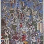
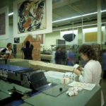
I have a weakness for the Stuyvesant Foundatio. The foundation was founded by Alexander Orlow of Turmac company who had the brilliant idea to bring great art works among his factory workers by placing the art in the middle of the production. This meant that many large sized works were purchased over a period of 30 years. Zero, Cobra en abstract expressionism being the most important among these works.  For most of the collection they had one thing in common. Their size was large and larger, since the works had to be seen by the people who worked a fair distance from them.

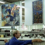
The following article appeared in the Telegraph a few days before the first auction was being held. In total there were 3 auctions. Personally i thought the first was exceptional, the second very good and the third was filled with the leftovers. I was lucky to buy one of the best Gerard Verdijk paintings ever in the 2nd auction at AAG. My luck….it is too large for many, so no bids were placed after the initial price set by the auctioneer.

Schermafbeelding 2019-11-01 om 11.44.54

The cream of one of Europe’s most highly regarded corporate art collections is to be dispersed by Sotheby’s next week in spite of efforts by civil authorities and art experts to preserve it and turn it into a museum. Known as the Peter Stuyvesant collection, it originated in the late 1950’s when Alexander Orlow, managing director of Turmac Tobacco, which made the popular Peter Stuyvesant brand of cigarettes in its factory in Zevenaar, Holland, decided his workforce needed something to cheer them up. “However complicated the operations of a machine may look, it soon becomes monotonous to a factory worker,” he said.

His solution was to buy art – preferably big, colourful abstract paintings – and in 1960 commissioned 13 artists from different European countries to make works on the theme of “joie de vivre” to hang in the factory’s production halls. The experiment was so popular that in the following year he invited William Sandberg, formerly the director of Amsterdam’s Stedelijk Museum, to expand the collection. Over the next 50 years, the collection grew under the supervision of a series of former Dutch museum directors.

However, in 2000, Turmac was swallowed up by the British American Tobacco Company (BAT), and the art collection renamed the BAT Artventure collection. But there was not to be much in the way of artistic venture in store. In June of 2006 it was announced that the Zevenaar factory would close with the loss of 570 jobs, so that European production could be concentrated in Germany and Poland. That left over 1,400 works in the art collection valued at some 23 million pounds looking for a new home.

Jan de Ruiter, the mayor of Zevenaar, supported by Martijn Sanders, chairman of the Advisory Committee on the Future of the Stedelijk Museum, looked for a way to buy the collection and keep it locally, possibly as a wing of the museum. But “BAT did not really want to make a deal,” said de Ruiter. It went to Sotheby’s instead.

Sotheby’s has a good track record in handling corporate art collections. Back in 1989 it handled the disposal of the British Rail Pension Fund collection and the $93 million (£62.5 million) Reader’s Digest collection. Since then we’ve seen a series of high profile sales for IBM, the 7-Eleven photo collection, the HSBC collection of 19th century pictures, not to mention a certain £65 million sculpture by Giacometti from the German Commerzbank last month.

The company clearly sets some store by advising corporations on the acquisition and disposal of art, setting up a department just to deal with that in New York 20 years ago, and another in London last year. Saul Ingram, who runs the London department, says most companies sell to buy new work or channel profits into broader cultural activities. The Stuyesant/BAT collection is different because it was site specific, and without the factory and its workers, its purpose has gone.

Its value, though, is still substantial. The 163 works to be sold by Sotheby’s Amsterdam next week are estimated to fetch between £3.6 million and £4.6 million, with further sales planned in the future. Avant garde European groups from the 50s and 60s such as CoBrA, the abstract expressionist group based around Copenhagen, Brussels and Amsterdam, and Zero, the Dusseldorf based group who worked with experimental materials such as fire, nails and papier mache, are to the fore.

The Zero artists, Gunther Uecker and Jan Schoonhoven, who starred at Sotheby’s recent Lenz collection sale last month, are expected to do exceptionally well. A rarity is Lily ou Tony (1965), one of Nicki de St Phalle’s first Nana sculptures that celebrate womanhood. Though fragile, made of tissue and wire mesh, it carries a £180,000 to £270,000 estimate. The most significant example of British art is a 1958 Alan Davie painting that has been undervalued at £27,000 to £36,000.

In addition to the stylish brand name Stuyvesant gave to the world of smoking, it also achieved brand recognition in the art world, especially in Britain, where, during the sixties, the Stuyvesant Foundation sponsored the Whitechapel Gallery’s trendsetting The New Generation exhibition, which included David Hockney and Bridget Riley, and also the talent spotting Young Contemporaries, much of which was immortalised in the Tate Gallery’s Recent British Art show of 1967. The separate collection of British art that was formed by the Stuyvesant Foundation between 1964 and 1967 was eventually sold in the late 1980s and established what were then huge prices for Davie, Riley, and others of that generation. The last sale, held at Bonhams in 1989, was a complete sell out. Next week will see how well the Stuyvesant brand has survived.

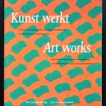
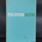
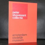
www.ftn-books.com has nearly all  dutch publications on the Stuyvesant collection available.

Posted on Leave a comment

Ben Akkerman (1920-2010)

Schermafbeelding 2019-10-17 om 16.22.21

I have always been an admirer of the works by Ben Akkerman. The first time i saw a painting by Akkerman was at the Centraal Museum and since i have been interested in his works. The paintings and drawings i could not afford so instead i started to collect Ben Akkerman publications. The result is that i have collected myself a small but important Akkerman library and the years made me find some duplicates which i now have put up for sale at www.ftn-books.com

Ben Akkerman was , the same as Jan Schoonhoven, an employee for the municipality of Enschede and he painted in the evening in his spare time. Called a ‘hardcore abstract ” painter i personally share his paintings among the Minimal paintings from that era. These are very delicate compositions that are pure minimal art.

Schermafbeelding 2019-10-17 om 16.34.27

The Gemeentemuseum used the “diamond” by Ben Akkerman for almost 10 years in its letters and invitations, but now that the name has changed in the far less appealing name ” Kunstmuseum Den Haag” they left the beautiful yellow diamond shaped logo for one i do not like at all. To commemorate the diamond they collected 30 Ben Akkerman paintings and made a wonderful presentation  to honor Ben Akkerman and its “diamond”.


Posted on Leave a comment

Ger Dekkers (1929-2020)

Schermafbeelding 2020-01-24 om 16.01.41

This morning i read in our newspaper that the artist/photograph Ger Dekkers died on the 20th of January. Dekkers will always be known for his series of landscapes that he combined into an abstract almost constructivist composition. Dekkers was the artist who needed a landscape for his art. www,ftn-books.com has several books on Dekkers available.

Schermafbeelding 2020-01-24 om 15.56.51

Posted on Leave a comment

Vali Myers (1930-2003)

Schermafbeelding 2019-10-20 om 10.50.32

……..and in the title also should also be Ed van der Elsken. Van der Elsken was fascinated by Myers, from his early days in Paris until his death he followed Myers and her career.

Myers was born in Canterbury, Sydney, on 2 August 1930, to a violinist mother and marine wireless operator father. She displayed a talent for art at an early age. The family moved to Box Hill, Melbourne in 1941 and Vali left home at 14. After working in factories to support her dance lessons, she became immersed in dance and later became the leading dancer for the Melbourne Modern Ballet Company.[1] In 1949 at age 19 Myers travelled to impoverished post-war Paris to pursue a dance career but found herself living on the streets of the Saint-Germain-des-Prés Quarter on the Left Bank.[1] Love on the Left Bank is a 1954 book of photographs from Dutch photographer Ed van der Elsken (1925–1990), documenting the bohemian life on the Rive Gauche of Paris; Vali Myers is the heroine of this semi-biographical roman à clef, and is also photographed along with some of her early drawings.

Myers was a flamboyant fantasy artist who worked in pen and ink and watercolour as well as being a nightclub dancer. She divided her life between her adopted home of Melbourne, the Hotel Chelsea in New York City, Paris, and a 14th-century cottage in a valley near Il Porto (Positano), Italy. This is wher4e the following van der Elsken documentary was filmed:

www.ftn-books.com has recently added some Myers collectibles to its collection.

myers a


Posted on Leave a comment

Dick Elffers ( continued )

Schermafbeelding 2019-10-18 om 17.09.19

A few years ago i wrote a blog on Dick Elffers , who had been designing for the Holland festival during the Fifties. I illustrated this blog with some examples which i had found on the internet, but now i have added two Holland festival items which i have found and bought recently. Both are from 1955. One is for the New York City Ballet performance and the other for Theatro alla Scala, Milano who performed l’Italiana in Algeri by Rossini. These programs ar4e a true delight . Embossed cover and the typical Elffers typography takes the spotlight. Both are now available at www.ftn-books.com

elffers holland b

elffers holland a

Posted on Leave a comment

Two different Malevitch titles

On a recent book market visit i found 2 totally different publications on the same artist. Malevich being the subject it occurred to me that there was a great difference between both publications. One rather modern with the emphasize on his early works proved that the interest in his early works was not there from the early beginning. The other being earlier…. a Louisiana / Denmark Museum publication from 1959. Shows the influence of Willem Sandberg in its catalogue design and its approach is totally different. Only a few early works are depicted and the focus is on his Suprematist works, which were being discovered as highly important in those days. The ultimate “BLACK SQUARE” being the final result of his search in constructivist painting.

Schermafbeelding 2019-10-14 om 14.26.16

These and other great Malevitch publications are available at www.ftn-books.com

Posted on Leave a comment

Tomas Rajlich, Bulletin 134, 1983


The following blog has certainly to do with my personal fascination for the works of Tomas Rajlich. Rajlich has been a long time favorit of us and i was very happy that i finally could add the Art & Project Bulletin 134 from 1983 to our collection. Within the 4 pages the pages 2 and 3 are devoted to a beautiful golden composition with a fine mazed grid. This is a great composition and shows what Rajlich was doing at that time. Gold painted minimal compositions were painted and on it a grid in pencil was drawn. IN almost all cases the grid was 5 x 5 cm. squares in pencil. The Bulletin 134 is available at www.ftn-books.com

rajlich bulletin 134 b

Posted on Leave a comment

Jaap Berghuis (1945-2005)


Schermafbeelding 2019-05-29 om 16.14.11

To be honest …i lost track of Jaap Berghuis in the last decades. Berghuis was educated at Ateliers 63 and one of the most promising young artists in the Seventies, but somehow after his shows at the gallery Art & Project, the collectors lost interest in his works and to me it now seems that this was not just.

Schermafbeelding 2019-05-29 om 16.11.58

Recently i encountered a truly wonderful painting at auction (i was outbid) and the amazing Art & Project BULLETIN publications that Berghuis made for van Ravesteijn and van Beijeren in their series of Bulletin publications. It shows now that Berghuis may have been ahead of his time since his painting now look as fresh as it must have been 40 years ago.

berghuis bulletin 130 b

www.ftn-books.com has the Art & Project Bulletin 77, 79, 118 and 130 available

Posted on Leave a comment

Mark Tobey (1890-1976)

tobey beyeler e

Mark Tobey is a great artist and well ahead of his time with his abstract painting. His works look to be coincidental, but these abstract paintings and drawings are far from accidentally. It is a bit like the painting by Hans Hartung. The sketches he makes are the starting point for the paintings. Tobey has influenced Jackson Pollock with his paintings, but never has become the household name that Pollock became after his death. Still his paintings are impressive and there are always parts to discover and admire. It is a way of modern painting, greatly influenced by Chinese calligraphy,  that never grows old fashioned. It fascinates from beginning to end. Finding Tobey paintings in Europe is a hard job. There are some of them to be found in the Beyeler and Kunstmuseum Basel since he moved to Switzerland in the Sixties with his companion. But his paintings are rare, i am not completely sure, but according to my information, but even the Stedelijk Museum has no works by Tobey in its collection. They had an exhibition with Tobey in 1966, which catalogue was designed by Wim Crouwel and is one of the best Crouwel designed in the Sixties for the Stedelijk Museum (available at www.ftn-books.com), but that is all i could find. Still Tobey is well worth checking out, since he is the natural link between Jackson Pollock and the newest generation of Abstract painters.

Posted on Leave a comment

An important Antonio Calderara portfolio

Schermafbeelding 2019-04-20 om 12.41.26

Recently i acquired for my inventory one of the most important of all Calderara portfolio’s published just a few years before his death. It is the Tempo Spazio Luce portfolio published by the recently closed Galerie Nouvelles Images in 1975. The edition size, only 40 copies. 18 serigraphs….all signed with initials and numbered. Condition mint. I consider this period as Calderara’s best. The prints are as delicate as most of his prints from this period and these are not the small prints that are offered elsewhere but the large printed sheets that are 50 x 50 cm.

A beautiful and impressive set held togethjer in a special box, which is now 44 years and a rare offer for the Calderara fan. Box is Near Mint+, but all prints are in pristine /mint condition.

calderara ni c

calderara ni b