
Today added item no. 3 to FTN art. It is the statue by Ossip from 2007
In Ten Natisimo!
PLease take a look at this typical Ossip work.
Today added item no. 3 to FTN art. It is the statue by Ossip from 2007
In Ten Natisimo!
PLease take a look at this typical Ossip work.

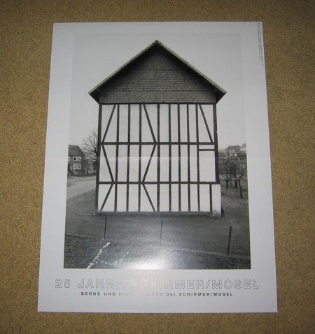
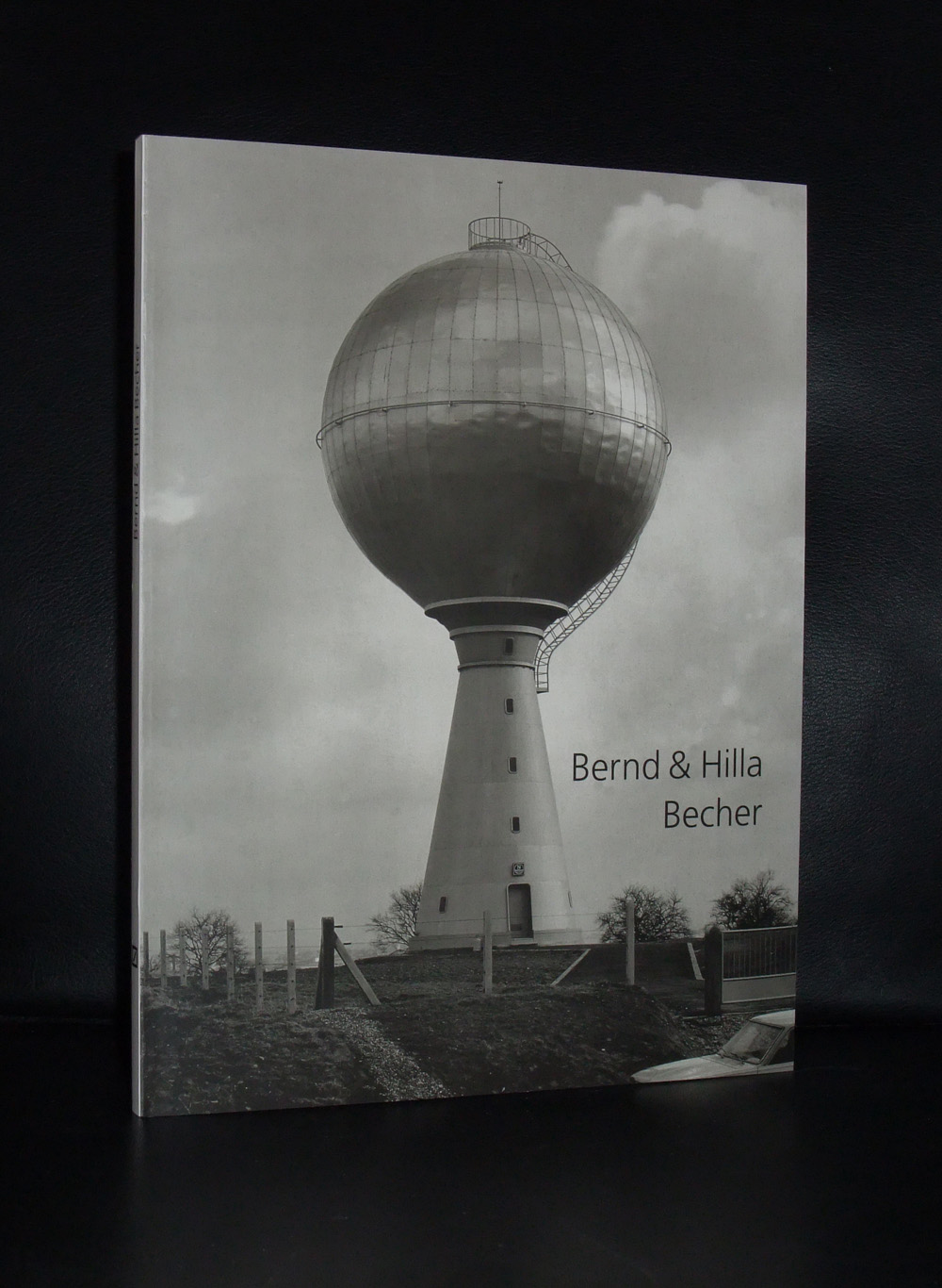
It must have been about 15 years ago that my father asked me if i had an idea for a Christmas present and because i knew of a book i could order with a 40% discount i told him that i wanted a special publication by Bernd and Hilla Becher / Hochofen. Published by Schirmer Mosel in 2002 in an edition of only 100 copies containing a beautiful original photograph of a row of Furnaces.

These industrial scenes are typical for the Bechers and because of these scenes of Industrial complexes and lonely rural buildings. their photography is highly recognizable. The photograph i own is one of the most cherished works i have in my collection. It is not the value which makes it special , but the idea that it was one of the last gifts my father gave me. Since i have been collecting Becher items and one of the best i found was a poster , published by the Josef Albers Museum in 2010 and available at www.ftn-books.com


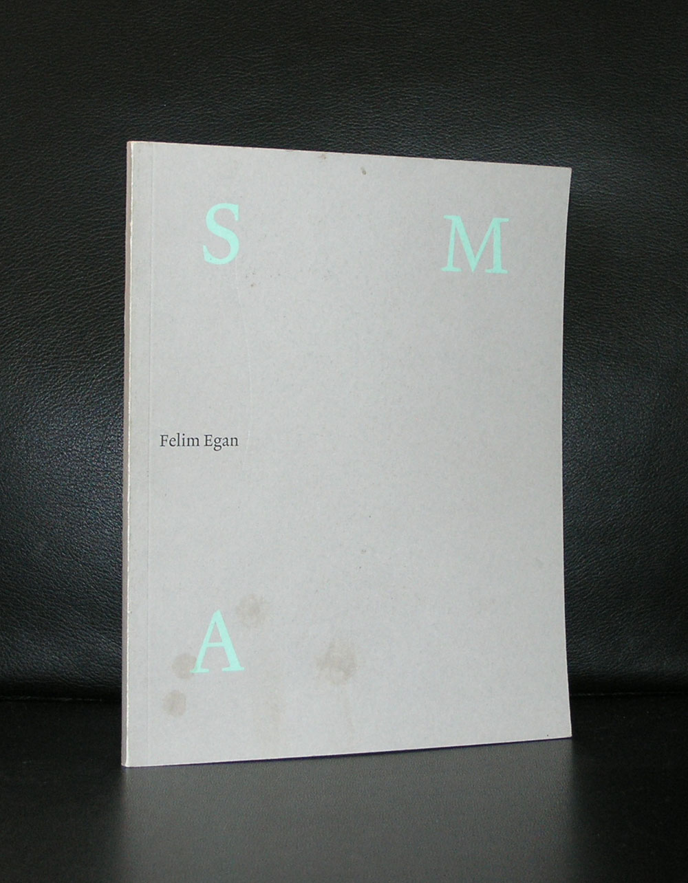
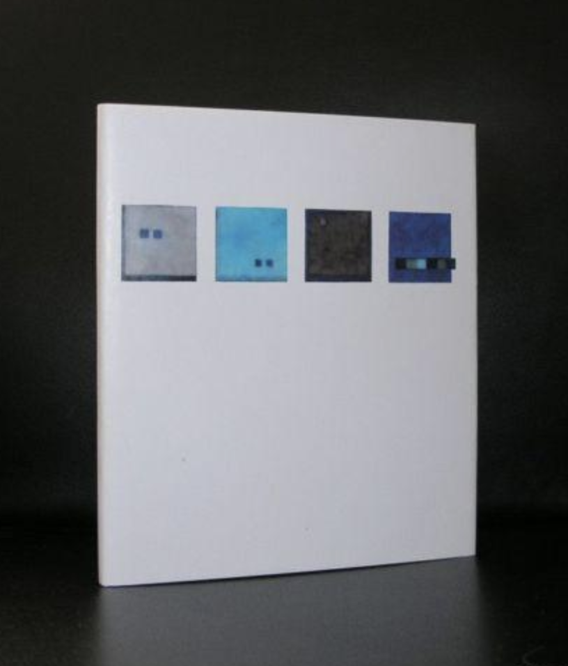
I had never heard of Felim Egan, but when i saw one of his paintings ( for the first time at Seasons gallery in Den Haag) i became an admirer. A free kind of constructivist abstraction in soft colors, which looks like Irish mist over a landscape. Later i found 2 publications on this artist which are now available at www.ftn-books.com so when i encountered these i decide to write a blog on an artist of whom i did not know very much except that he had exhibited in the Stedelijk Museum. I searched and found this article on his Felim Egan’s own website : www.felimegan.ie
FELlM EGAN was born in lreland in 1952 and studied at Belfast and Portsmouth, England before attending the Slade School of Art in London. He then spent a year at the British School at Rome in 1980 before returning to Dublin. Since then he has lived and worked at Sandymount Strand and the Docklands, on the edge of Dublin Bay.
He is known as a painter of restrained eloquence, who sparingly deploys a vocabulary of hieroglyphic motifs over monochromatic expanses of colour. His paintings are built up slowly with layers of thin colour applied to the surface and stone powder ground into the acrylic. The work is universal in spirit and at the same time emotionally intimate. His paintings are epiphanic, in that they convey to us the essential nature or meaning of something of which we were previously unaware. He is an abstract artist, a painter of quite formal abstract images, and yet his work is tied to the place he lives and works, to the long horizons, big skies and empty sands of the Strand and sea. In this way his abstract paintings are almost landscapes, with a magical quality that his neighbour, the poet Seamus Heaney, has aptly described “a balance of shifting brilliances”.
Egan has exhibited widely across Europe with 72 solo exhibitions since 1979 including major shows at the lrish Museum of Modern Art, Dublin,1996 and the Stedelijk Museum in Amsterdam, 1999. In 1981 he represented Ireland at the Xie Biennale de Paris and in 1985 at the San Paulo Bienal. In 1993 he won the prestigious UNESCO prize in Paris, and in 1995 the Premiere Prize at Cagnes-sur-Mer. His work hangs in numerous public collections including the Stedelijk Museum, Amsterdam; the Irish Museum of Modern Art, Dublin; the Ulster Museum, Belfast; the Metropolitan Museum of Art, New York, and the collection of the European Parliament. Major Commissions include; Dublin Castle; National Gallery of Ireland: O’Reilly Hall, UCD; Meeting House Square, Temple Bar; Pavilion Theatre, Dunlaoghaire; City Quay Building, Dublin; New Providence Wharf, London; the National Gallery of Ireland; Deutsche Bank, UK and Dublin and a large scale public ‘sculptural work’ at Cork Street, Dublin.
In 2005 he completed an installation of paintings at Deutsche Bank Headquarters, Dublin.
Felim Egan is a member of Aosdána.

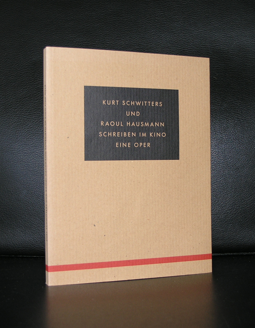
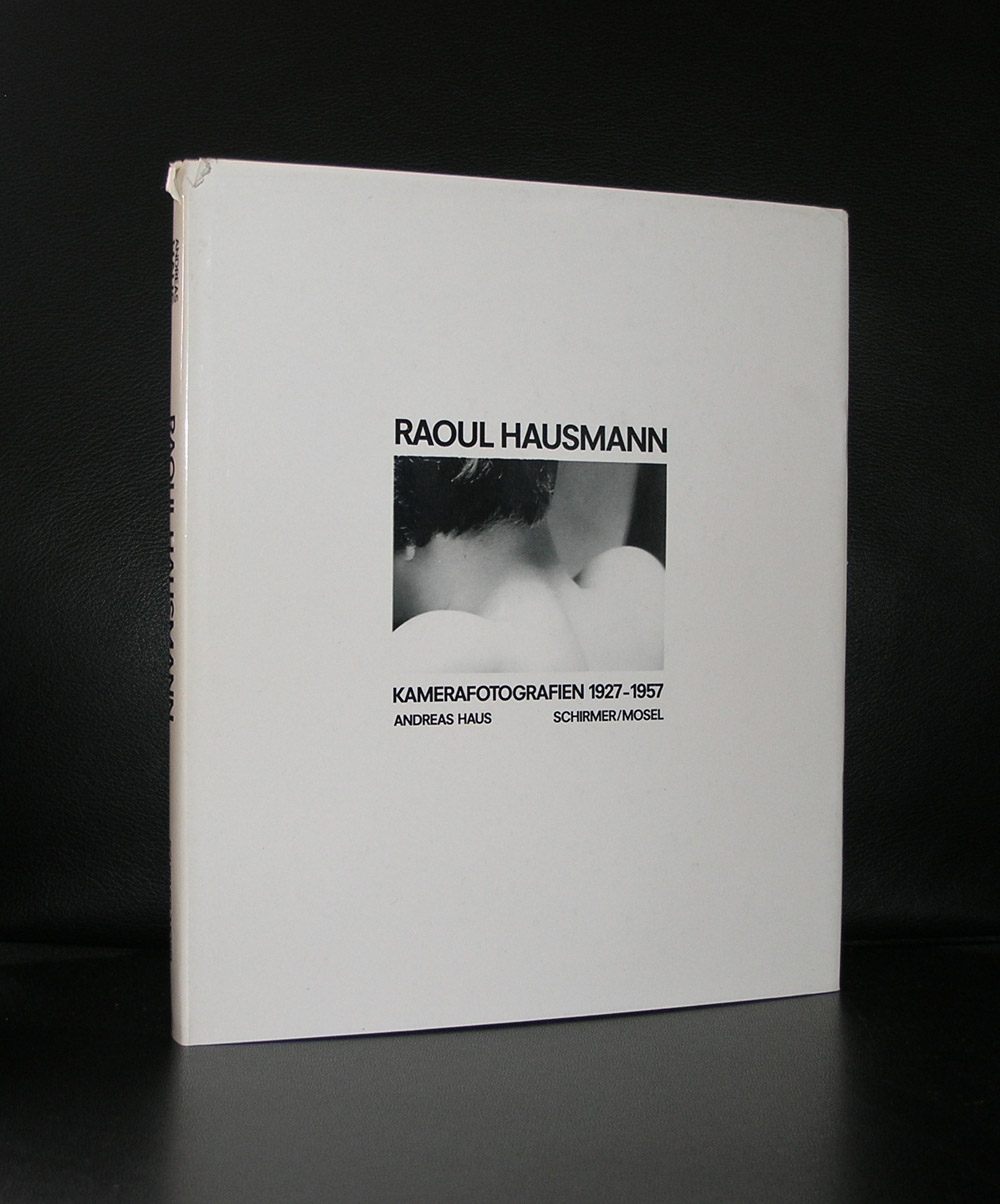
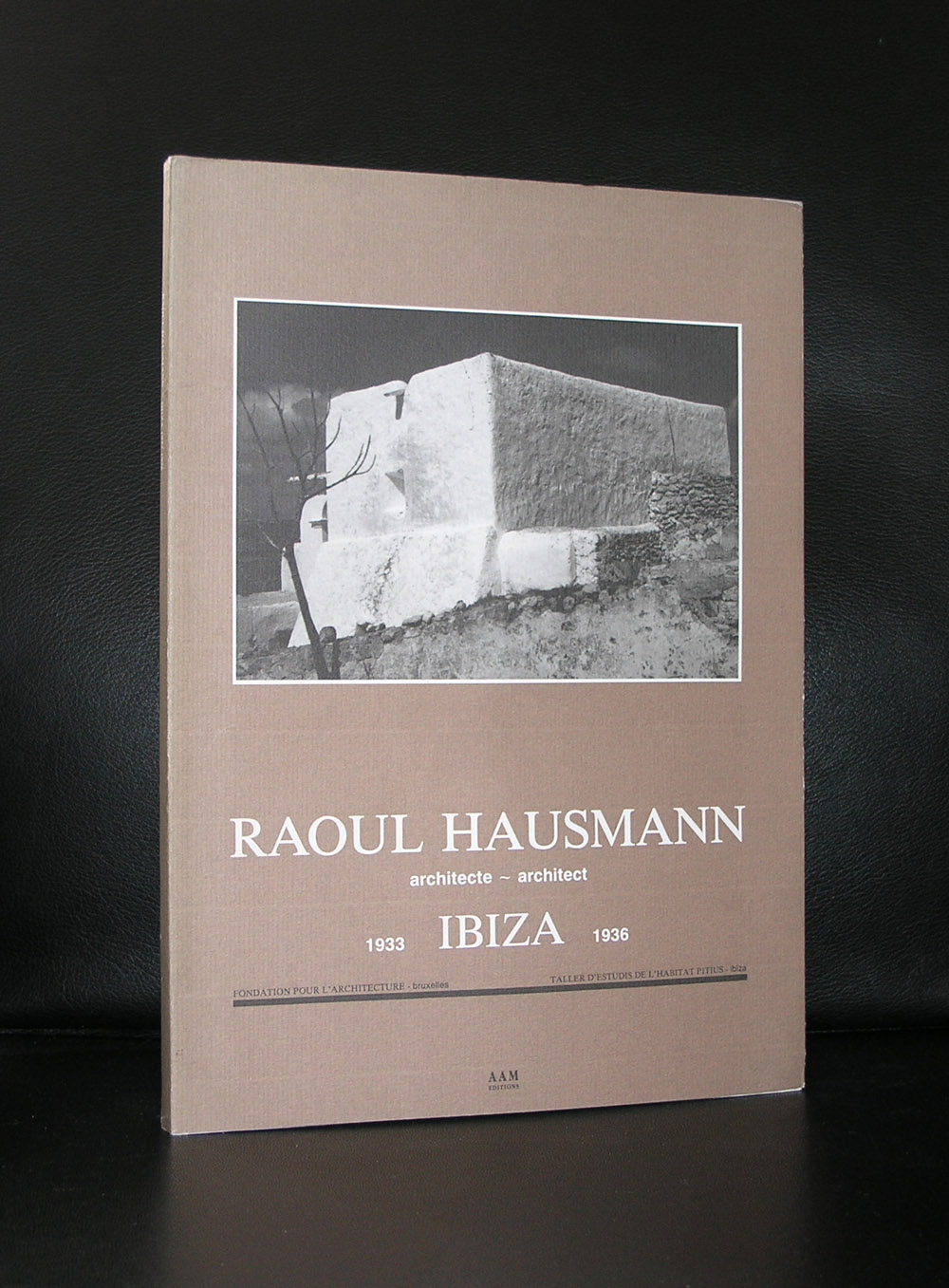
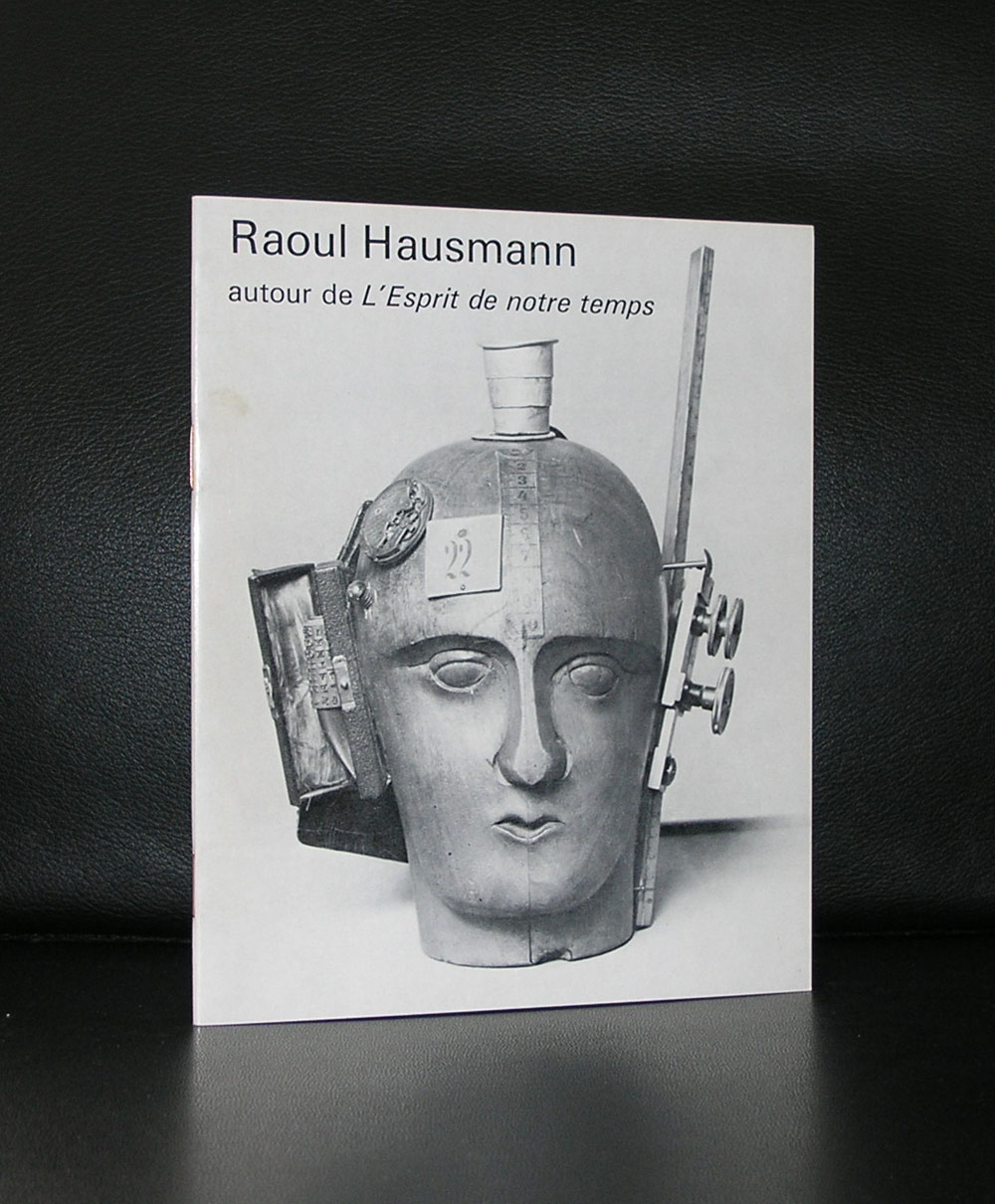
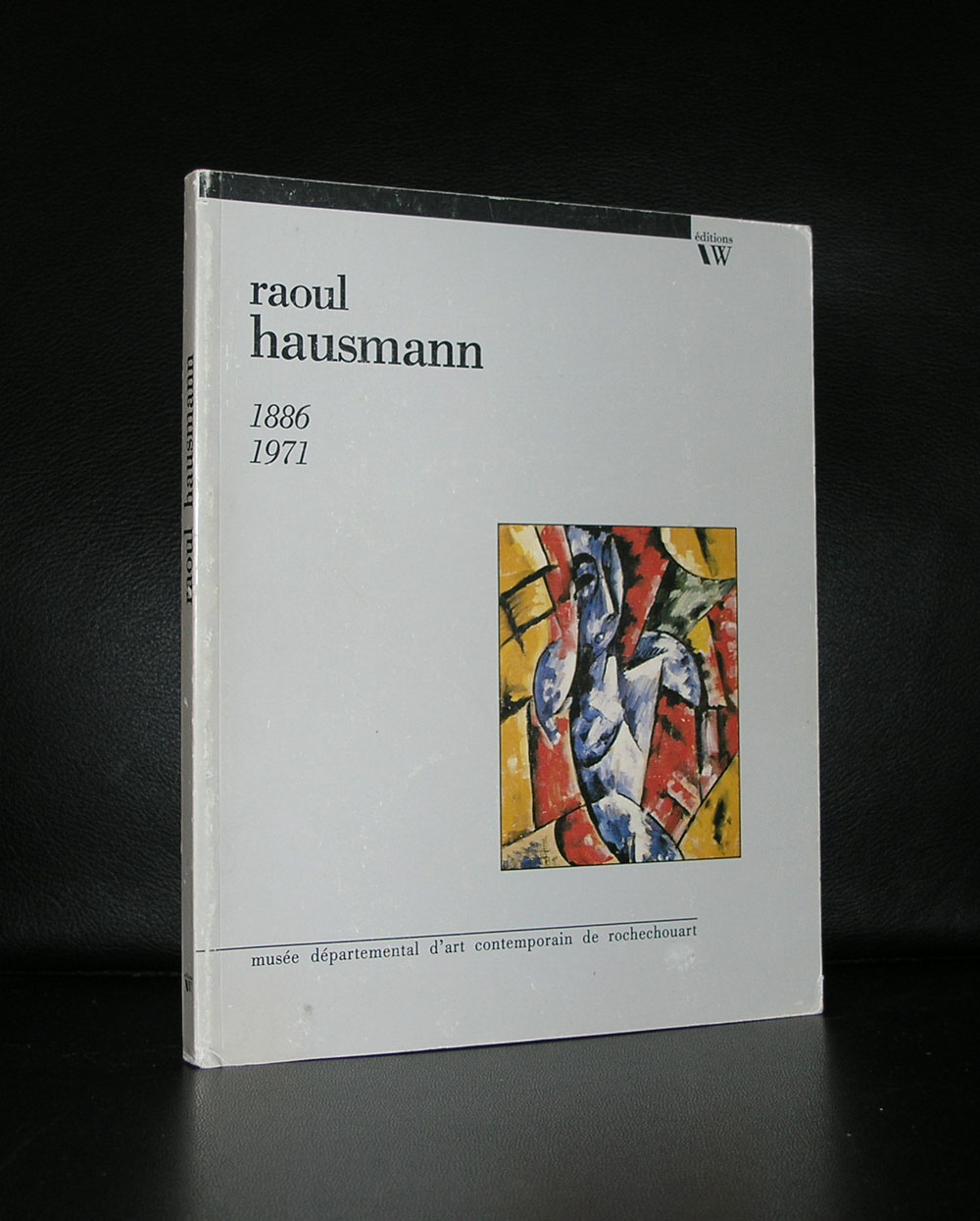
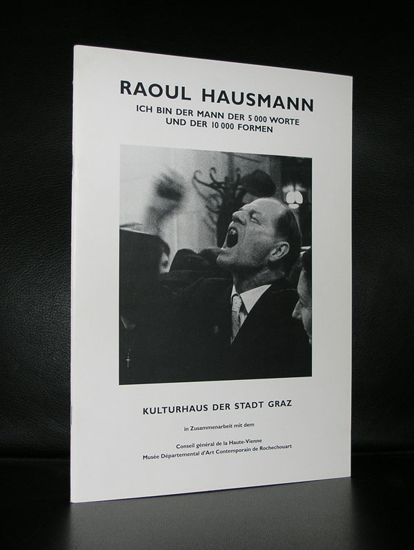
For me Hausmann stands for Dada and photomontages. He , together with Hannah Hoch ( his longtime lover) developed a style of photomontages typical for Dada. Combining classical elements together with industrial elements set on o a colorful background these photomontages are among the very best from that period.
The photomontage became the technique most associated with Berlin Dada, used extensively by Hausmann, Höch, Heartfield, Baader and Grosz, and would prove a crucial influence on Kurt Schwitters, El Lissitsky and Russian Constructivism. It should also be pointed out that Grosz, Heartfield and Baader all laid claim to having invented the technique in later memoirs, although no works have surfaced to justify these claims.
At the same time, Hausmann started to experiment with sound poems he called “phonemes”] and “poster poems”, originally created by the chance lining up of letters by a printer without Hausmann’s direct intervention. Later poems used words which were reversed, chopped up and strung out, then either typed out using a full range of typographical strategies, or performed with boisterous exuberance. Schwitters’ Ursonate was directly influenced by a performance of one of Hausmann’s poems, “fmsbwtazdu”, at an event in Prague in 1921.
Raoul Hausmann and Dada publications are both available at www.ftn-books.com
Today is another milestone for me as a bookdealer in art books, because today i started on these pages ………FTN art
There will be irregular additions to this page, but all works depicted on these pages are for sale and guaranteed originals. The first original is a drawing/collage by Siep van den Berg who made this in 1979.
tekening/collage uit een serie constructivistische tekening/ Collage in blauw die Siep van den Berg heeft gemaakt op 16 augustus 1979 in Andelaroche ( Fr.) De tekening is eerst opgezet in balpen waarna er blauwe vlakken zijn bijgeplaatst ( of omgekeerd).
De tekening is gedateerd 16 9 79. Met notitie “Heleen Jarig Geweest” en signatuur in zwarte inkt …SvdB.
Kunstenaar : Siep van den Berg
titel: Heleen Jarig Geweest
techniek ; balpen en collage in blauw
afmetingen ; 27,7 x 20 cm.
gesigneerd : SvdB in zwarte inkt
gedateerd : 16 9 79
conditie : MINT-
price : euro 150,–
shipping Netherlands : euro 8,60
worldwide shipping costs: 11,95


Jan Maarten Voskuil was my personal discovery during the auction of the Klein Breteler collection last month. Immediately that i saw his monochrome “paintings” i got excited. These paintings have a quality which reminded me of a combination of both Donald Judd and Ellsworth Kelly. Two artist i admire very much and both artists are among the most important ones from last century. That standing is not for Jan Maarten Voskuil yet, but look as his approach to his paintings and the way he prepares the works to reach the ultimate result with the finished work and conclude that it is a question of time that he will be presented as one of the great contemporary minimal painters. These works shine with their simplicity and are in the meantime complex to execute. In every work he uses only one color to make a monochrome work, but put some together and the result is a multi colored wall with Voskuil works.

It was my luck that i could purchase one of the works at the Breteler auction. It was the lot. 152 titled “Wat een toeval” from 2009.

Originally this was made for the LADE PROJEKT of gallery Phoebus and because of the height of the drawers, the dimensions of the work itself were limited, but it still has all the qualities the works of Voskuil contain. A mochrome white surface and assembled from 3 different parts combine into a fascinating painting
www.ftn-books.com has no books on Voskuil , but i know that there is one book titled “Getting to a point” which is well worth reading and to have in your collection of Minimal art books ISBN. 978-90-811487-3-3

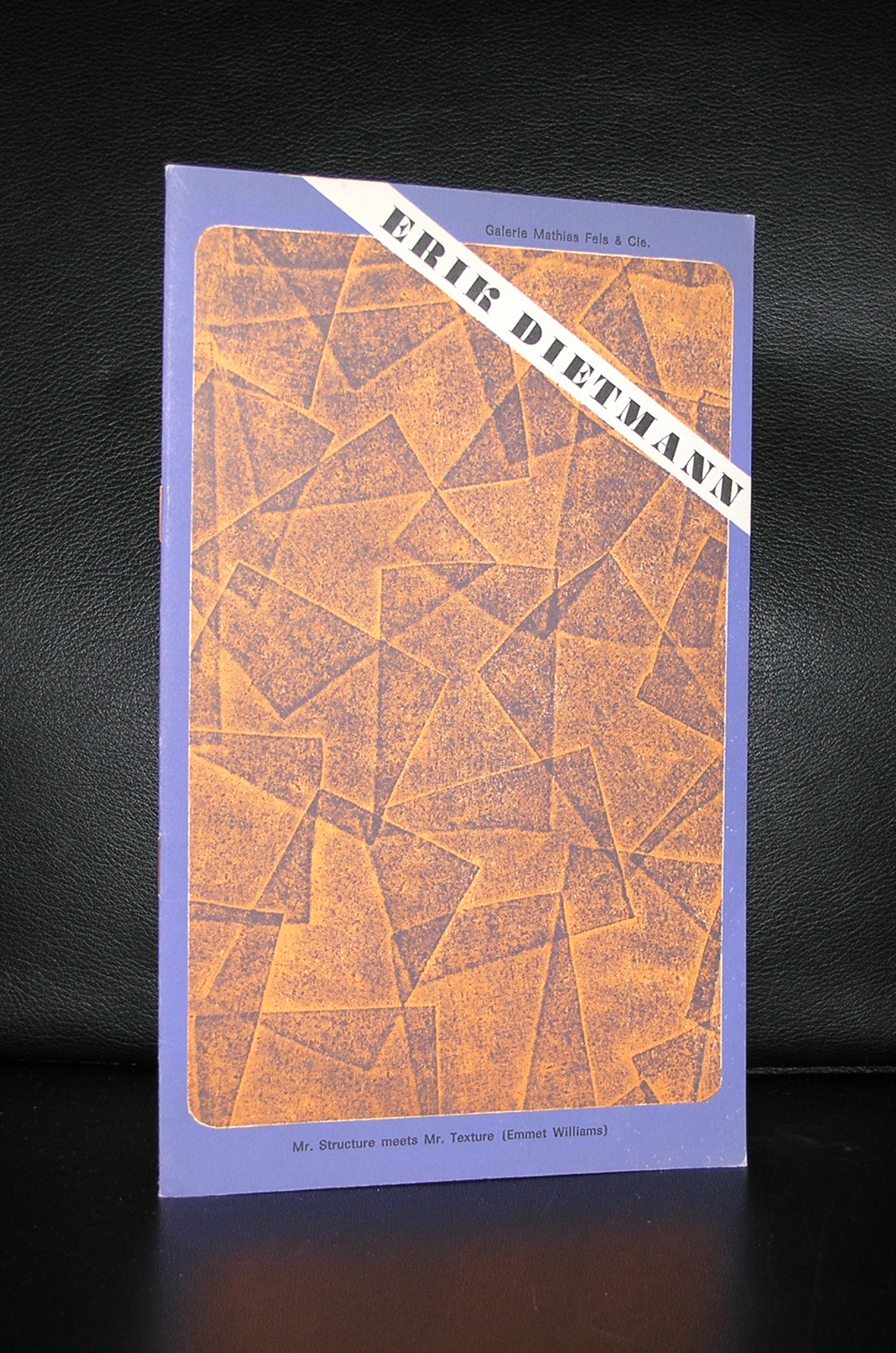
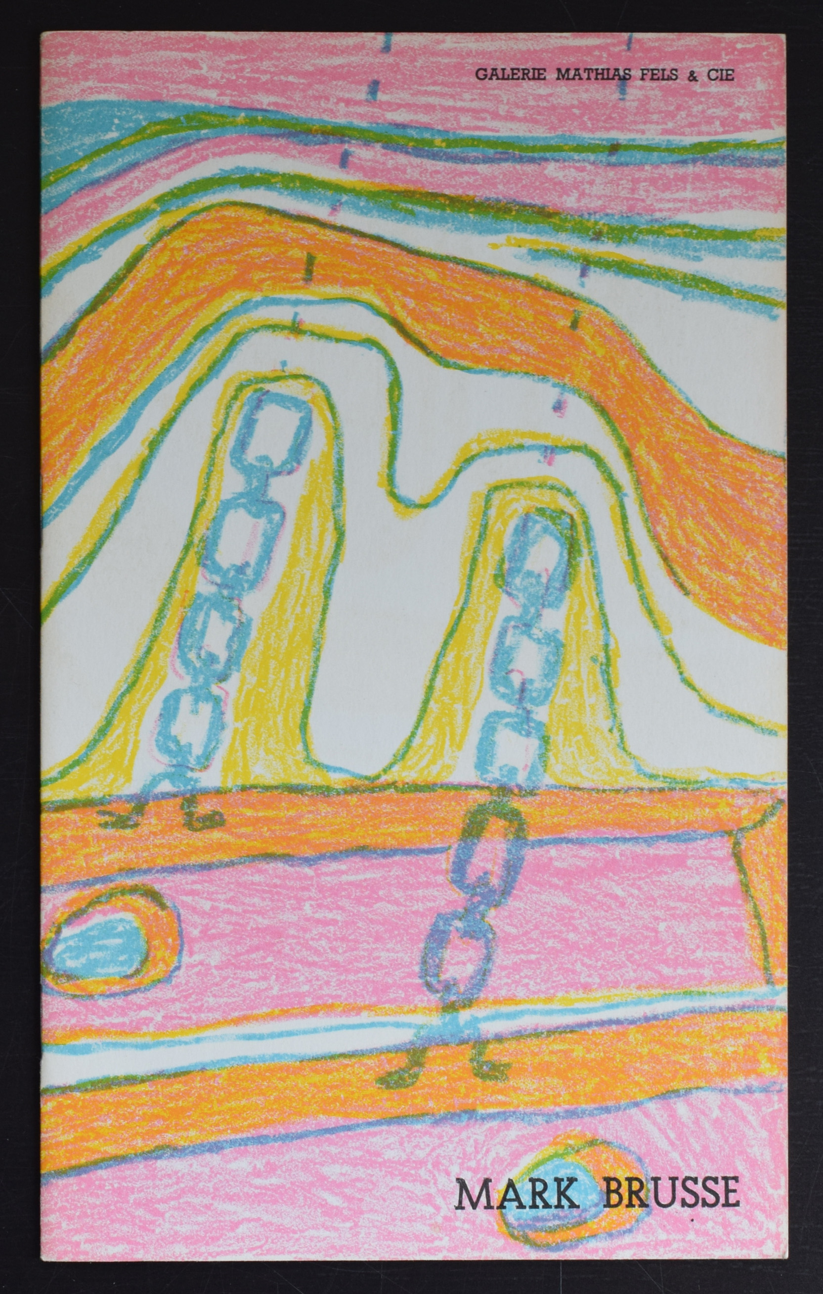
One of the great gallery owners of our town was Mathias Fels. Her started the gallery in 1955 and the gallery has since become one of the leading galleries in the world. With the death of Mathias Fels the gallery stopped, but until that date they organized some very important exhibitions and with these exhibitions catalogues were published using special designs, papers and in many cases special covers . The covers in some cases being original lithographs. As one of the leading art scene figures, Fels has become an icon for many gallery owners and together with gallery Denise Rene in Paris he always had a keen eye to present new modern artists in his gallery.
www.ftn-books.com has some beautiful and important Fels publications available.

You can find an excellent interview( in french) with Fels at:
http://www.visuelimage.com/ch/fels/

Why a blog on Mumprecht…. first reason is this artist is too long a forgotten artists. He rose to some fame in the 60’s while he was showing his works at gallery Berggruen/Paris, but was forgotten again . The second reason is that this artist reached the age of 100 years on the 1st of January 2018. It made me take up the Berggruen catalogue again and examine it carefully and noticed that this special catalogue is filled with 14(!) original “pochoirs” prints making it an outstanding and highly collectable artist catalogue. Mumprecht deserves better.

His works are great and typical for the 50’s and 60’s and being one of the original Berggruen “stable” artists his works will probably also become much more expensive in the decades to come. The Berggruen catalogue is now available at www.ftn-books.com


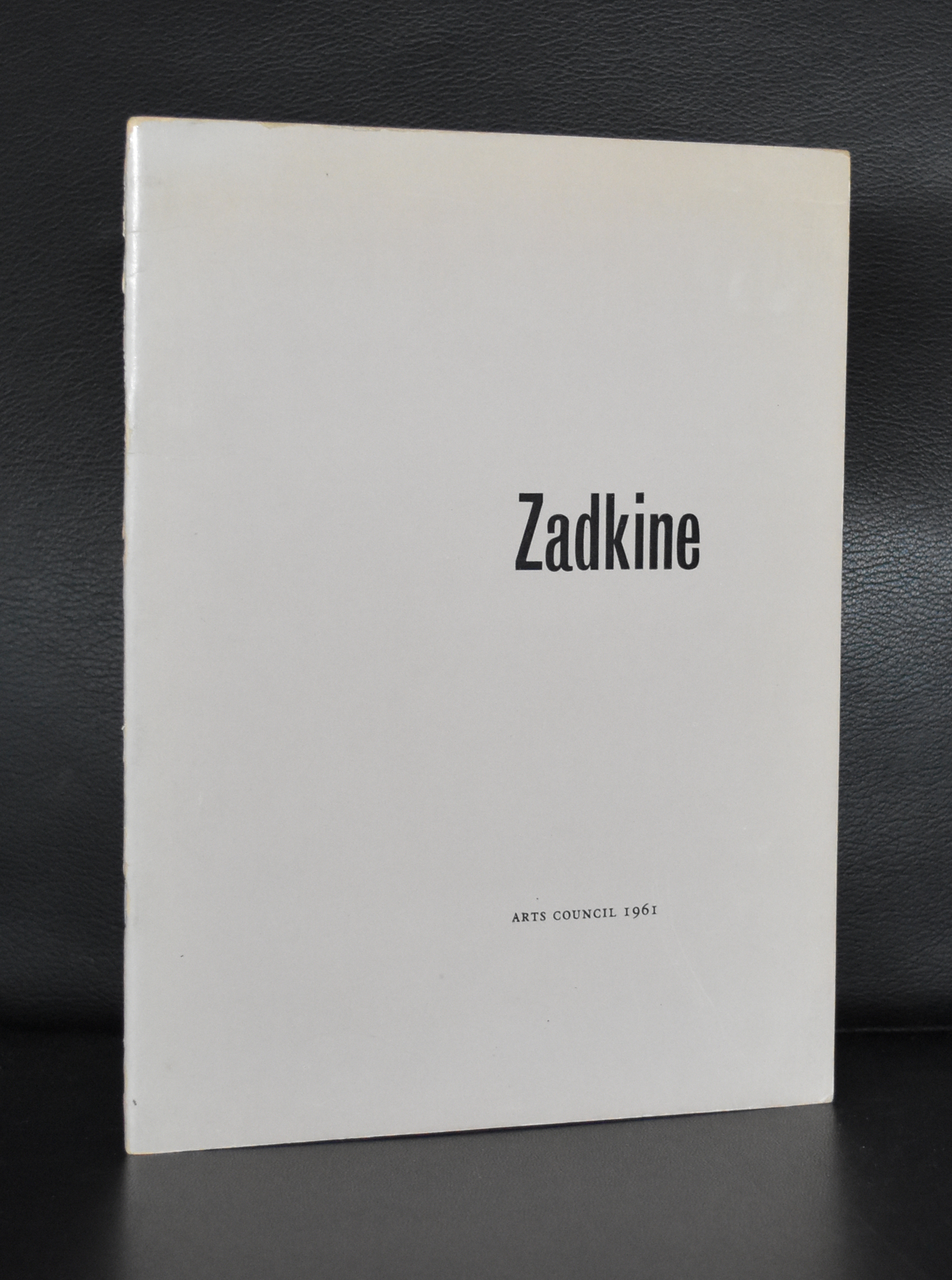
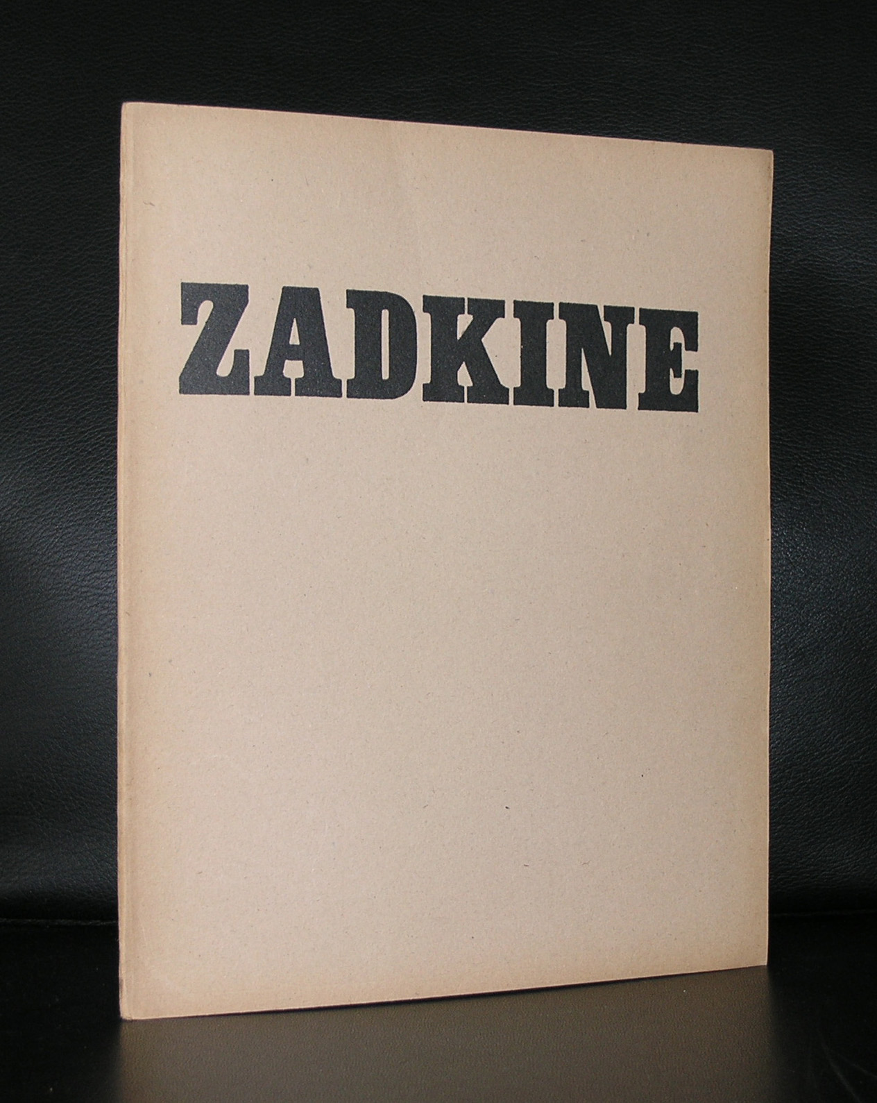
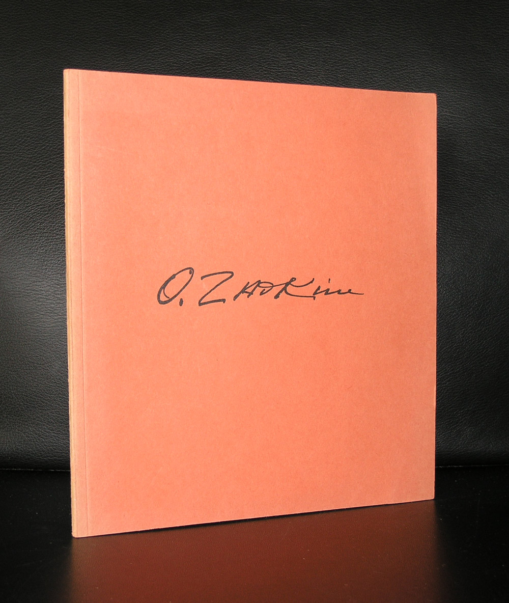
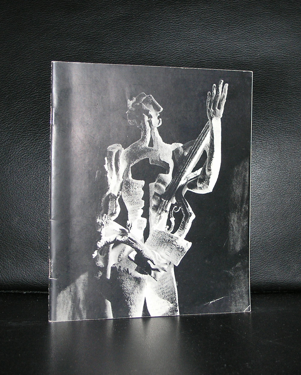
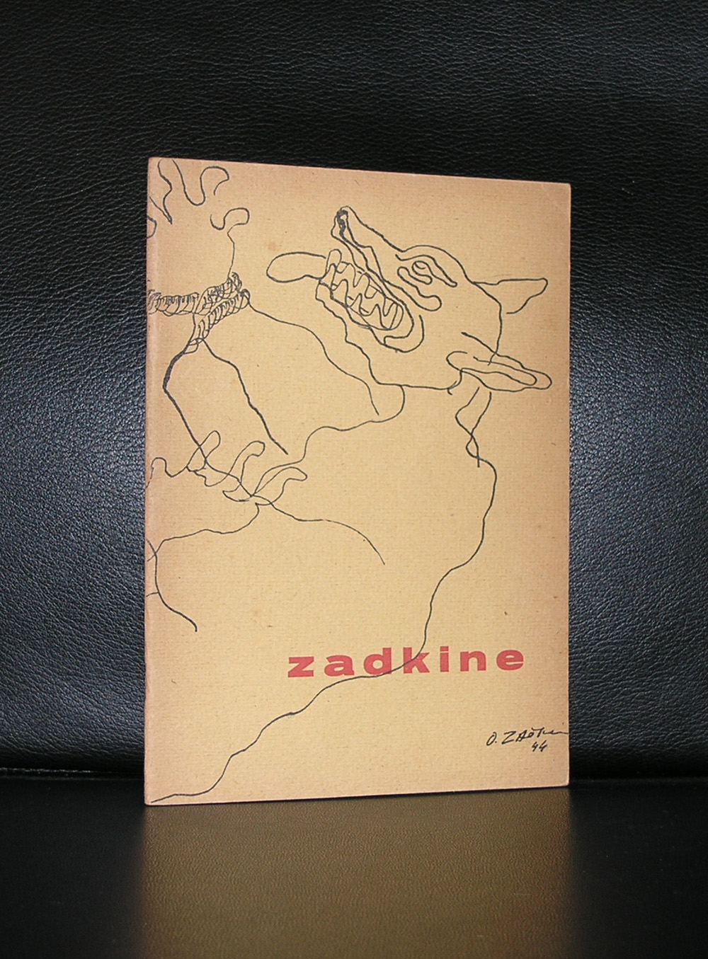
Ossip Zadkine is perhaps one of the most famous artists in the Netherlands without people knowing him by name. Zadkine made the sculpture ” DE VERWOESTE STAD” which symbolizes the destruction of the heart of Rotterdam after the bombardment of it in the early stages of WWII ( 14 mei, 1940) .

The sculpture was revealed in 1953 and financed by DE BIJENKORF on the condition that it always must be on the same spot within the centre. The human figure has a hole where the heart should be making it the perfect image for a destroyed city centre.
Since the revealing of this statue Ossip Zadkine received on several occasions exhibitions of his works in the large museums in the Netherlands , but for many his claim to fame here is this ” DE VERWOESTE STAD”
There are some nice publications on Zadkine available at www.ftn-books.com

If ever there was one artist who raised the bar of the art of the small /pochoir print to tremendous proportions it is Sonia Delaunay. Delaunay had her peak during the Art-Deco period and it shows. Here is just a selection of Delaunay prints found on Google .

Her use of colors, patterns is typical for Delaunay and her art has proven to be timeless and typical Avant Garde for the time she was most productive. The same as Mondrian, she used primary colors, but in a much more free way of making her compositions. Where her husband Robert Delaunay was influenced by cubism and made colorful cubist interpretations of reality, Sonia stayed true to her abstract compositions with just one side step into the world of fashion for which she made colorful costume and fashion designs.
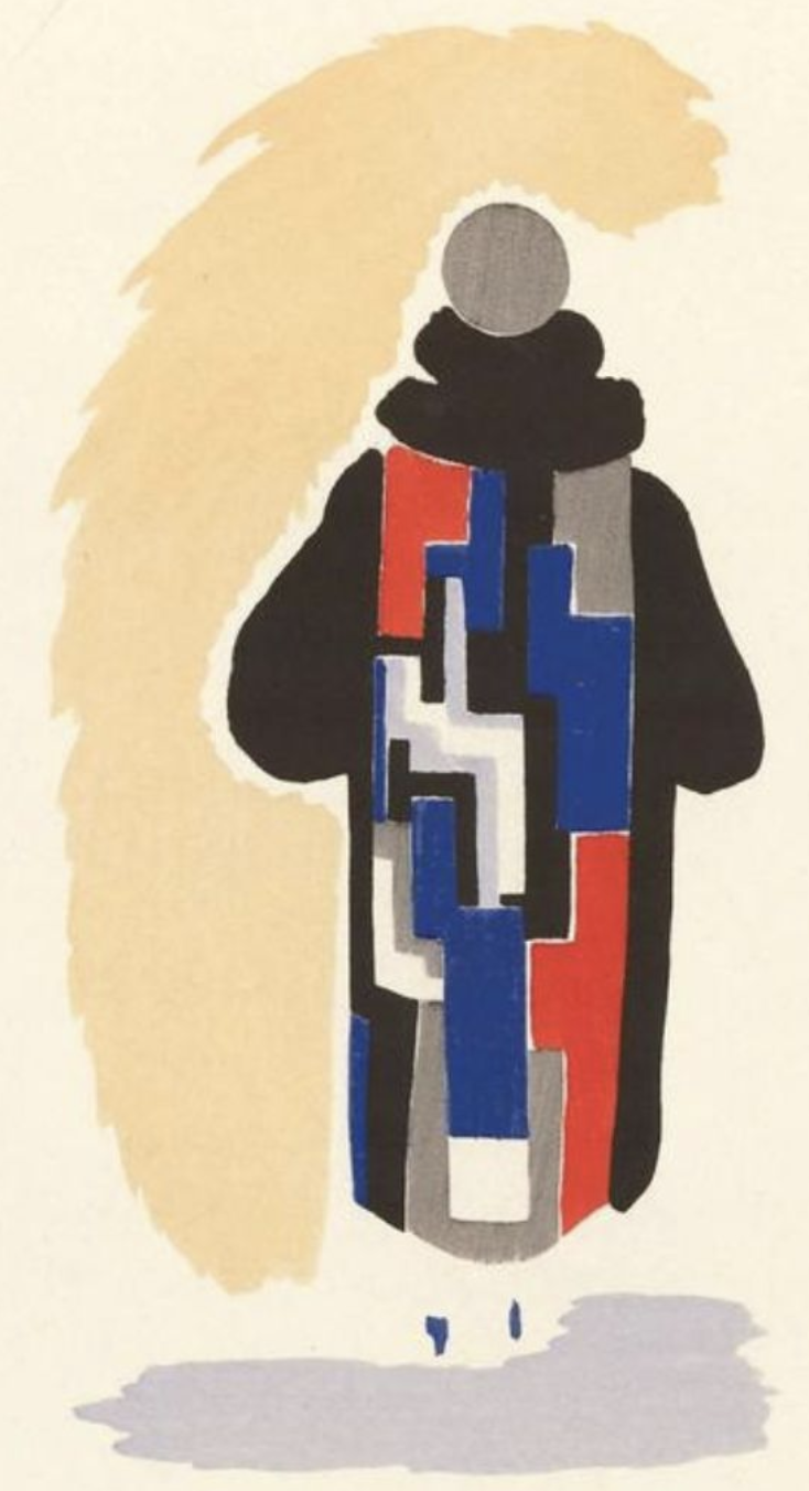
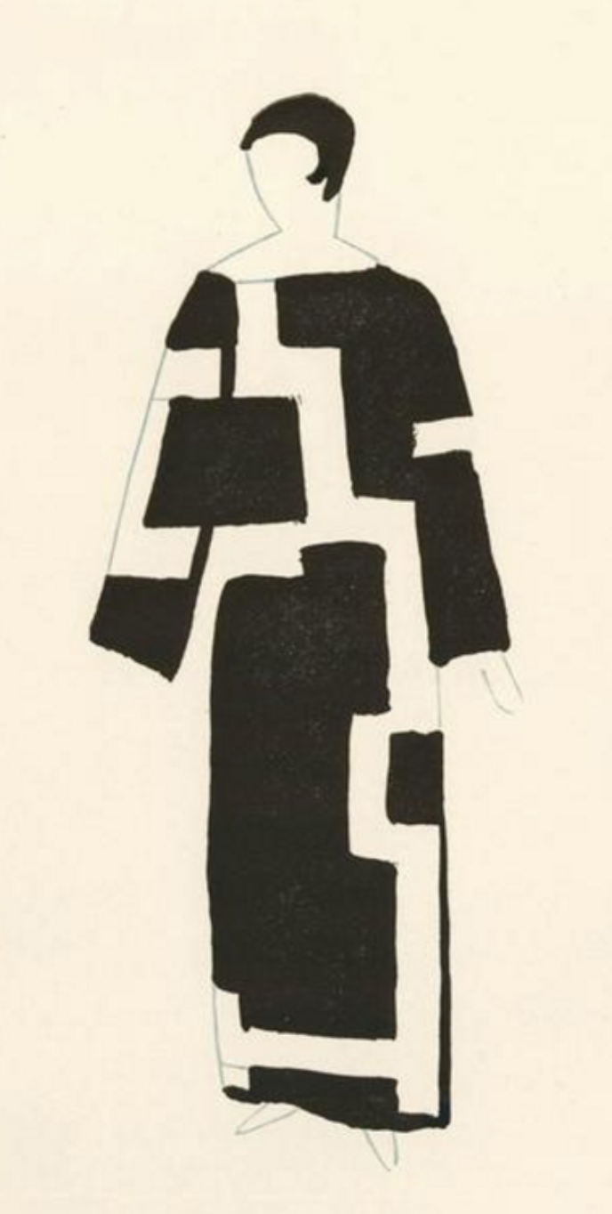
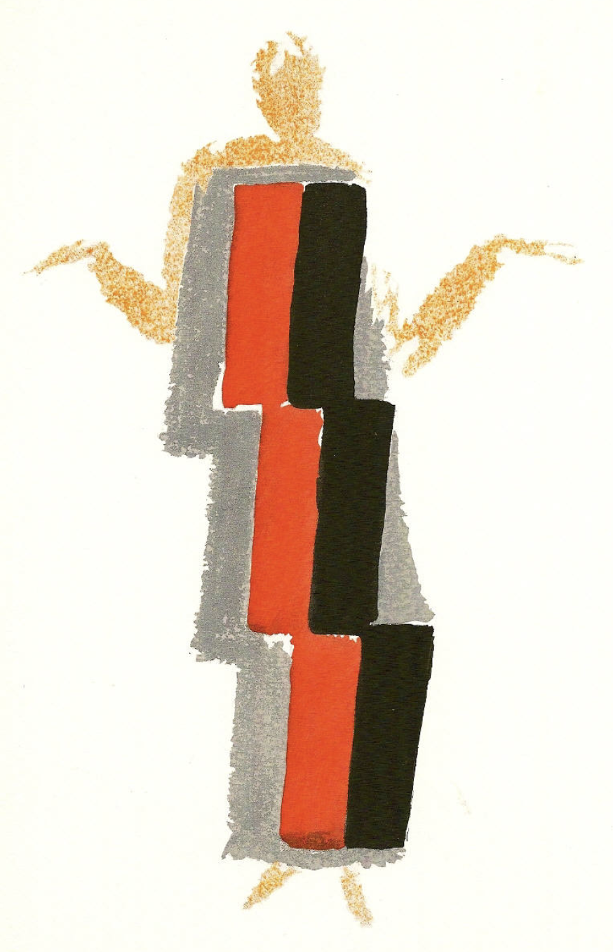
For me the first pochoir print i ever saw was the cover of the Stedelijk Museum catalogue for the Sonia Delaunay exhibition in 1958. Willem Sandberg did the design of the catalogue, but what makes this catalogue so special is of course the original pochoir print by Sonia Delaunay on the cover.

This publication is available at www.ftn-books.com


