Posted on Leave a comment

Rainer Fetting (1949)

Schermafbeelding 2019-01-14 om 10.53.10

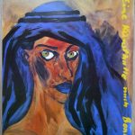
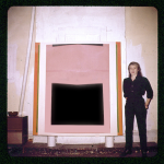
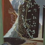
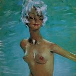
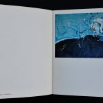
Rainer Fetting was one of my favorit artists in the Eighties, but i almost had forgotten him until half a year ago a beautiful and impressive painting by Fetting was auctioned at the Venduehuis. A large painting which belonged to the Hans Sonnenberg collection. A famous gallery owner who was always charmed by artists who focussed on male figures and nudes. Fetting was certaimly one of them. Fetting was considered to be part of the NEUE WILDE mouvement from the early eighties and had developed a very recognizable style of his own. Bright colors , loose in composition and technique his paintings shine after they are finished and the one from the Venduehuis is an excellent example.

Schermafbeelding 2019-01-14 om 10.52.25

His paintings are starting to appear at auctions and i am very curious what the future will bring. My personal guess is that Fetting is such an artist who is forgotten for the last 2 decades , but in a few years will be one of the great artists from the eighties. www.ftn-books.com has some excellent catalogues on this great germna artist.

Posted on Leave a comment

Peter Struycken ..a leporello of 212 inches

Schermafbeelding 2019-02-19 om 15.06.06

It is certainly the longest of all leporello items i have in my inventory and perhaps it is one of the longest ever published.

Splash was published on the occasion of the Sikkens price which was presented to Peter Struycken in 1974. On this price winning occasions, Sikkens provides for the funds to have a special publication published on the artist and Struycken made/designed this special Leporello. The leporello is available at www.ftn-books.com

Artist/ Author:  Peter Struycken

Title : Splash / Plons 1972 / 1974

Publisher: Sikkens, 1974

Number of pages:  96 pages plus cover + leperello of 212 inches  !!!!

Text / Language:  dutch and englsih

Measurements: 8.2 x 8.2  inches

Condition: nm+ for the leperello and nm for the sleeve

extra information on this item:
Rare , important and collectible . This Sikkens publication is one of the most important Struycken  publications. a true artist book and highly recommended

Posted on Leave a comment

Jo Baer (1929)

Schermafbeelding 2019-02-19 om 14.21.04

There is a firm relationship between the Netherland and Jo Baer, because since the early years of her career she has had her exhibitions in Amsterdam. She is considered to be a Minimal artist, but personally i am not so certain about this. In her early days she was more related to the Hard Edge mouvement, but in later paintings a great emptiness fills the canvasses only enhanced by a painted frame or a simple scarce geometrical object making these paintings as typical Minimal paintings and in the last 2 decades she turns again completely and produces lyrical abstract expressionist paintings. When you look at these 3 stages of her career you can destinguish 3 completely different styles and approaches to painting, but with one constant…the artist Jo Baer

www.ftn-books has some of the dutch Jo Baer publications available


Posted on Leave a comment

Marien Schouten (1956)

Schermafbeelding 2019-02-19 om 13.34.59.png

Two things i remember about Marien Schouten. First that i read an article on the artist ( Metropolis M??) and soon after that i visited the old Bonnefanten Museum in Maastricht. The exhibition by Schouten i visited solely to see this work for myself and not a little picture in a book. I remember that these paintings were altered and reshaped with pieces of metal and i was very much impressed.

After this special exhibition i have encountered his works on several occasion, but none of these events had the same effect on me as the first Bonnefanten exhibition. At the time of the Bonnefantenmuseum i feld the urge to add, at one time ,  a work to my collection, but somehow over the years i lost this feeling. But who knows, ….perhaps a nice early painting by Schouten will appear at auction and i feel i must bid on it, because these early works are special and in my opinion belong to the very best art in the Netherlands from the Eighties.

www.ftn-books.com has some Marien Schouten catalogues available.


Posted on Leave a comment

Jan Gregoor (1914-1982)

Schermafbeelding 2019-03-06 om 11.08.35

Jan Gregoor, became “famous” in the Netherlands for his crayon works, but for me it is not his art that makes the artist attractive. It is typical for the decades he lived and worked in, but what struck me most about Gregoor was the EXCELLENT exhibition poster that was made by the van Abbemuseum for an exhibition on the artist and designed by Cornet. It has the simplicity of the greatest of 60’s designs and for me personally i think this is absolutely one of the most splendid of all van Abbemuseum posters ( available at www.ftn-books.com).

gregoor agregoor d

I just told that i am not that fond of Gregoor, but still he has made some excellent prints., which are worthwile to search for.

gregoor shop


Posted on Leave a comment

Jean-Gabriel Domergue (1889-1962)

Schermafbeelding 2019-02-18 om 16.31.13

France has had its share of society painters and i f ever there was one who came after the flood of great names who build a career in making portraits of wealthy women,  it must have been Domergue. He started his career in 1911 after he had finished his art studies at the École nationale supérieure des Beaux-Arts. Onwards he specialized in makeing portraits of Parisian women. Some people even say that this is how the French Pin Up was invented. His technique is something between impressionism and the style of Matisse.

domergue 1966 dd

His portraits are highly recognizable and the artistic appreciation and also the value of his works are starting to grow. This making him an artist for the future. The importance of Domergue is not only his figure studies , but also the works he has done as a fashion designer. The clothes he designed for Paul Poiret are considered as true classics. www.ftn-books.com has some nice vintage 60’s cataloges of the artist available.

Posted on Leave a comment

Vitra…das Original


vitra original a

There is a very close realtionship between the heirs of Charles Eames an the heirs of VITRA company. This relation has developed and resulted in one of the most well known and respected furniture companies in Europe. VITRA stands for truly original designs, classic furniture and the best quality money can buy. This philosophy comes back in every printed outing the VITRA company does. Their publications are truely innovative and designed by he best graphic designers in the business. I have seen many books and commercial publications, but the one below is one of the best i have ever seen. Its size, print quality and design are all outstanding. It is a leporello kind of fold out but stapled within there are 3 separate books. making this 4 publications in one package. Photography, paper design and layout…..all AAA.  Short stories on Eames, Jongerius and Morrison included, what else do you want in a small publication. This is highly collectable and now available at www.ftn-books.com

vitra original c

vitra original d

vitra original b

Posted on Leave a comment

Albert Flocon (1909-1994)

Schermafbeelding 2019-02-16 om 15.08.16

If i must compare Flocon with dutch artist it must be Maurits Cornelis Escher. Where Escher has its roots in geometry and math, Flocon is inspired by architecture and science He even studied at the Bauhaus under Josef Albers. Still Flocon has never become a household name in art.

In March 1965 they finally met.

Escher met the French artist and professor Albert Flocon, lecturer at the prestigious Ecole des Beaux Arts in Paris. Flocon mainly created copper engravings and, like Escher, he was fascinated by the mystery of the perspective. Especially the curvilinear perspective, a form that Escher has also used several times (think of Hand with reflecting sphereBalconyThree Spheres IIDrop (Dewdrop) and Self Portrait in Spherical Mirror). Together with his colleague André Barre, in 1967 he published a book about this special perspective: La Perspective curviligne de l’espace visuel à l’image construite. In 1987 it was published in the US under the title Curvilinear Perspective: From Visual Space to the Constructed Image.The meeting proved to be of great importance to Escher; Flocon ensured that his prints became known in Paris. The professor personally mediated on the sale of prints and an organized Escher exhibition in Paris. In October 1965 Flocon published a ten-page article about Escher in the important monthly Jardin des ArtsA la frontiere de l’art graphique et desiques: Maurits-Cornelis Escher. In it he combined biographical information with analyzes of the prints and quotations from a conversation with Escher. The article gives a good description of Escher’s place in the art world. Previous Dutch art critics never came much further than pointing out that Escher’s work was (too) cerebral. Flocon gave a positive turn to this.

there are not many publications on Flocon, but ftn-books.com has one together with may Escher publications.

flocon

Posted on Leave a comment

Evert Thielen (1954)

Schermafbeelding 2019-02-16 om 14.46.11

He is called the master of the multi pannelled painting and i do not doubt it, because his technique is phenomenal. I have followed the career of Thielen from the very first moment i first saw a painting of his he presented to my old school. They had, if i remember well, their 75th anniversary and he had made a painting of the school facade.  It looked like the real thing. great perspective, nice colors, but to me it looked very much like a clone of the best facade Carel Willink could do with textures and colors. But from that moment on his career took off  with exhibition in the Netherlands and abroad. In the process he developped a style of his own and was one of the few in the Netherlands that could paint a truly large canvas. In many cases devided over multiple panels. This is not my kind of art i would like to have in my collection, but one must admire his paintings for their realistic qualities they undoubtedly have.


www.ftn-books.com has some nice Thielen titles available

Posted on Leave a comment

Arranz Bravo and Rafael Bartolozzi stand for italian Pop Art.

Schermafbeelding 2019-02-14 om 16.02.18

Every country in the world was at some time during the Sixties and Seventies influenced by the american Masters of Pop Art. In the Netherlands there were Woody van Amen and Tajiri. In France there were Monory and Raysse. Germany has Dieter Hesserer and Italy they had Arranz Barvo and Rafael Bartolozzi. They worked together and made some great paintings at that time, but now….many of these artists are almost forgotten. This does not mean that their works are of no importance, but at the moment these are not “In VOGUE”. It is a litlle like it was some 30 year ago. Zero/Nul and Kinetic were thought of no importance, but now….every collector in the world wants its share of the ZERO art and not much is available at reasonable prices anymore. I predict that it will be the same with…. first POP ART from outside the US and later after the art market has devided all good Pop Art…. it will be time for Minimal Art. These are my tips for the future if you want to build a collection that gathers value over the years to come. www.ftn-books.com has some great books on Pop art and Minimal Art available but also the Bravo/Bartolozzi catalogue including the invitation they made for one of their first exhibitions at IL FAUNO in Torino.

bartolozzi a