Posted on Leave a comment

Tom Claassen (1964)

Tom Claassen (1964, The Netherlands) is best known in the art scene as well as among the general public for his works created for the public arena. Klaasen’s work often traverses the boundaries of culture and nature, firmly rooted in the sculptural tradition, but with a unique, playful and personal touch. Soft, rounded shapes often invite caresses, but this proves to be deceptive. Because the material that looks so soft and friendly is actually bronze. Similarly, sculptures that appear hard and unattractive to the touch are actually made of rubber. artistic background

Claassen studied at the St. Joost Academy of Fine Arts in the Netherlands and was awarded the “PRIX DE ROME” in 1992. Claassen’s work is in the collections of the Stedelijk Museum Amsterdam, the Kroller-Muller Museum in Otterlo (both in the Netherlands), the FRAC Franche-Comte Museum in Besançon, France, and the Gateway Foundation in St. Louis, USA.

www.ftn-books.com has the 2009 Tom Claassen book now available

Posted on Leave a comment

Marc Bijl (1970)

Schermafbeelding 2020-07-31 om 15.20.04

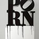
The most informative text on Marc Bijl i encountered on Wikipedia, but on a personal note, i agree with every element of this text. Marc Bijl stands for art on the borders of society in which gothic and punk are combined with Pop Culture…. I love it.

From 1992 until 1997 Marc Bijl studied at the Royal Academy of Art & Design in ‘sHertogenbosch. In 1996 he studied for a year at Glasgow School of Art. In his early work, Marc Bijl reacted to global themes and to popular fascination with symbols of political power, globalization of the economy, religion and nationalism. This resulted in interventions in public space, videos, sculptures and installations that underscored or undermined world views. Bijl endeavours to expose superficialities and myths via his work. Bijl switches in his work between political activity and street culture as he does between the media of image, text and music. He exposes the superficialities, icons and myths of popular culture in his work to stimulate the spectator to contemplate about moral and ethical issues. The symbol, the logo and the label are his potential targets and his artistic tools. He likes to upset, relocate and re-connote their superficial image and their mythmaking – always aiming at a critical analysis of the social conditions of the society. Bijl employs visual elements borrowed from punk and Gothic subcultures and from anarchism. His early works are representational, cartoon-like and often textual. His recent work is more abstract and minimalistic, exemplifying a shift in approach, by which he pares down different perspectives and methodologies to a new essence. The crux is no longer the ‘symbolism’ but what that symbolism represents and signifies. In these most recent works, Bijl makes clear references to modernist art-historical icons such as Mark Rothko, Mondriaan, De Stijl (Rietveld chair) and more subtle references to Jannis Kounellis and Joseph Beuys. Bijl adapts these classical works to his own corporate style. He seeks a more abstract formal language that is in many respects more ambiguous than his earlier vocabulary.

Bijl undermines systems but at the same time he is depended on these systems. Bijl’s work is often rebellious and tends to the illegality. His work is clearly rooted in street culture and possesses elements of graffiti, performance and installation art.

www.ftn-books.com has some nice Marc Bijl publications available.

marc bijl nai


Posted on Leave a comment

Peter Struycken ..a leporello of 212 inches

Schermafbeelding 2019-02-19 om 15.06.06

It is certainly the longest of all leporello items i have in my inventory and perhaps it is one of the longest ever published.

Splash was published on the occasion of the Sikkens price which was presented to Peter Struycken in 1974. On this price winning occasions, Sikkens provides for the funds to have a special publication published on the artist and Struycken made/designed this special Leporello. The leporello is available at www.ftn-books.com

Artist/ Author:  Peter Struycken

Title : Splash / Plons 1972 / 1974

Publisher: Sikkens, 1974

Number of pages:  96 pages plus cover + leperello of 212 inches  !!!!

Text / Language:  dutch and englsih

Measurements: 8.2 x 8.2  inches

Condition: nm+ for the leperello and nm for the sleeve

extra information on this item:
Rare , important and collectible . This Sikkens publication is one of the most important Struycken  publications. a true artist book and highly recommended

Posted on Leave a comment

Wally Elenbaas (1912-2008) & Esther Hartog.

An artist couple that survived WWII but of whom Wally was put in prison, because of Nude photography which was still forbidden in the sixties. Wally spent 9 months in jail because of these beautiful photographs, taking all the blame and preventing that his wife would be punished too for making the same kind of photographs. Now in these modern times it is almost unthinkable that an artist would be put in prison, but in the early sixties it was done. Why took Wally all the blame on him?…… because he feared that esther would become insane since her family lost their lives in prison and concentration camps and by all means he wanted to prevent this to happen. A sad, but also beautiful love story which was the fundament of all their great photographs they made together and of each other.

It is now almost 10 years after Elenbaas died, but since his death a growing appreciation is there for the photography of both these artists which resulted in a beautiful impressive book published by nai010 which is also available at www.ftn-books.com

ellenbaas


Posted on Leave a comment

Peter Struycken… multiple structuur 67

struycken-gron-a

Yesterday i listed the Peter Struycken publication Structuur 67 on the www.ftn-books.com site and found this publication surprisingly mature.

structuur-shop

The publication was published in the mid sixties and the only dutch museum that did something ” special ” with their publications at that time , was the Stedelijk Museum, however this publication shows that the Haags Gemeentemuseum knew about the importance of good design and because the artist himself did the design, an excellent and collectable multiple was published. The Structuur 67 consists om several silkscreened sheets , all bundled within one see through cover , making together a constructivist composition. One of the first special Struycken publications , which would be followed by many more. Struycken always had his special wishes regarding most of his publications which resulted in highly collectable “multiple” items. The monograph which was published some years ago gives an excellent overview of these publications.

Struycken is an artist who will become increasingly more important each year and now is the time to collect his works and special publications.


Posted on Leave a comment

the ultimate Auke de Vries book

A week ago i found in a small bookstore a remainder of this excellent book on the works by Auke de Vries. A book i must share with you, because it not only is the largest, but also by far the best publication on Auke de Vries. In over 400 pages you will see the best of over 5 decades of this artist.

For all Auke de Vries fans, this is not to be missed and i have only 2 copies available at:

www.ftn-books.com

wilfried