Posted on Leave a comment

ZERO..the first Stedelijk Museum catalogue

OLYMPUS DIGITAL CAMERA
NUL Stedeljk Museum

If there is one iconic ZERO catalogue it is the very first ZERO catalogue published with the ZERO exhibition of 1963. SO here are the photographs which makes this very important catalogue available to all. catalogue for sale at www.ftn-books.com

OLYMPUS DIGITAL CAMERA
NUL stedelijk Mueum
OLYMPUS DIGITAL CAMERA
Nul Stedelijk Museum
OLYMPUS DIGITAL CAMERA
Nul Stedelijk Museum
OLYMPUS DIGITAL CAMERA
NUL SM

Next week the second ZERO/NUL exhibition set

Posted on Leave a comment

Friso Kramer (1922)


schermafbeelding-2017-01-11-om-09-16-00
Friso Kramer

Friso Kramer was one of the founding members of Total design but before that date he was one of the leading dutch designers together with Benno Wissing and Wim Crouwel. Known for his excellent but sober designs, he was the man behind the famous REVOLT Friso Kramer chair, which is still in production until this date. Still active as a designer , he recently designed a LED streetlamp for Lightwell. A lamp which will eventually replace all the Friso Kramer designed streetlamps which were placed in the sixties and seventies.

schermafbeelding-2017-01-11-om-09-25-07
kramer paallamp

The main part of his career he was the leading designer and director for Ahrend ,a firm which produces office furniture

Two major exhibitions were held on Friso Kramer of which one catalogue is available at www.ftn-books.com

OLYMPUS DIGITAL CAMERA
Kramer SM
Posted on Leave a comment

Antonio Calderara (1903-1978)

schermafbeelding-2017-01-04-om-09-42-49

Because of a sale today, i was reminded of the very nice Antonio Calderara catalogue published by the Stedelijk Museum Amsterdam in 1977. The catalogue was designed by Wim Crouwel and what this one makes really special are the 3 original silkscreen prints within this publication. Thin, only  16 pages but with 3 striking silkscreens i consider this as one of the very best seventies Stedelijk Museum publications. Published with Sm catalogue number 616 the catalogue stands out from the others published in the same period. One of the silkscreens is used as cover ( orange /red) and 2 are within ( yellow and sky blue). The very little text and the beautiful impressive photograph of Calderara complete this exquisite publication. This one and others on Antonio Calderara are available at www.ftn-books.com


Posted on Leave a comment

Pierre Alechinsky…. a perfect publication.


The end of this year is near and almost 300 blogs have been published since I started blogging on WordPress. www.ftn-blog.com grew in an excellent way and i am looking forward to keep you informed on my inventory and exploits in art.

And what better way to end this year with a PERFECT publication by Pierre Alechinsky. In the sixties Alechinsky used original lithographs as cover for his exhibition publications and one of these is the no. 391 he made for the Stedelijk Museum in 1966 for his graphic exhibition. Photographs by Suzy Embo ( see earlier blog this month) and designed by Wim Crouwel. (available at www.ftn-books.com)

Arguably this is one of the top 5 publications the Stedelijk Museum made in the sixties, but for me this is perfection. Simple clean Crouwel design. the photographs are all excellent and the lithograph printed by Bramsen & Georges makes this one really stand out.

A perfect catalogue to end this year and start the New Year.

My best wishes to all my readers and followers for the New Year 2017.

wilfried

Posted on Leave a comment

Agnes Martin (1912-2004)

The 3rd blog on a female artist. Tate, Moma, Lacma, Guggenheim, Centre Pompidou, Stedelijk Museum…..They all have in common that they have a work or works by Agnes Martin in their Permanent collections. Martin is considered by most as a Minimal artist but she herself thinks more of herself as an abstract expressionist painter. Anyway ,she is absolutely one of the most important and original artists from the 20th century. Personally i think her paintings have a unique quality. More Minimal than abstract, but made with a technique that is typical Agnes Martin. The Guardian says the following on Martin.

A late starter, Martin kept on going, working at the height of her powers right through her 80s; a stocky figure with apple cheeks and cropped silver hair, dressed in overalls and Indian shirts. She produced the last of her masterpieces a few months before her death in 2004, at the grand old age of 92. But she was also so deeply ambivalent about pride and success and the ego-driven business of making a name for yourself that in the 1960s she abandoned the art world altogether, packing up her New York studio, giving away her materials and disappearing in a pickup truck, surfacing 18 months later on a remote mesa in New Mexico.

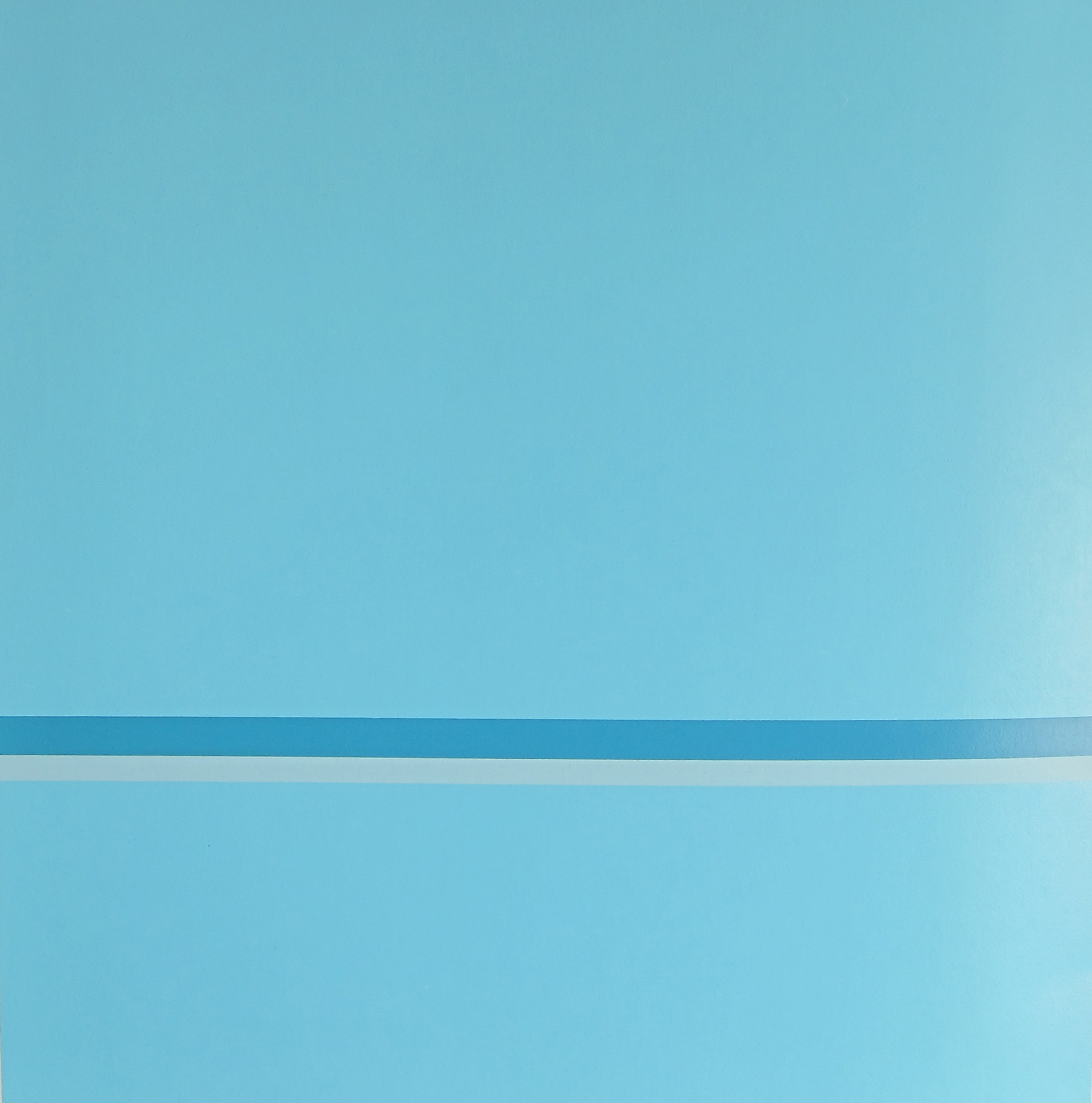
When she returned to painting in 1971, the grids had gone, replaced by horizontal or vertical lines, the old palette of grey and white and brown giving way to glowing stripes and bands of very pale pink and blue and yellow. “Sippy cup colours”, the critic Terry Castle once called them, and their titles likewise address states of pre-verbal, infantile bliss. Little Children Loving Love, I Love the Whole World, Lovely Life, even Infant Response to Love. And yet these images of absolute calm did not arise from a life replete with love or ease, but rather out of turbulence, solitude and hardship. Though inspired, they represent an act of dogged will and extreme effort, and their perfection is hard-won.

Martin’s work is in museums and collections across the world, and changes hands for millions of dollars at a time. All the same, she hasn’t achieved quite the renown of her mostly male contemporaries in abstraction, partly because the subtleties of her paintings are almost impossible to reproduce in print.
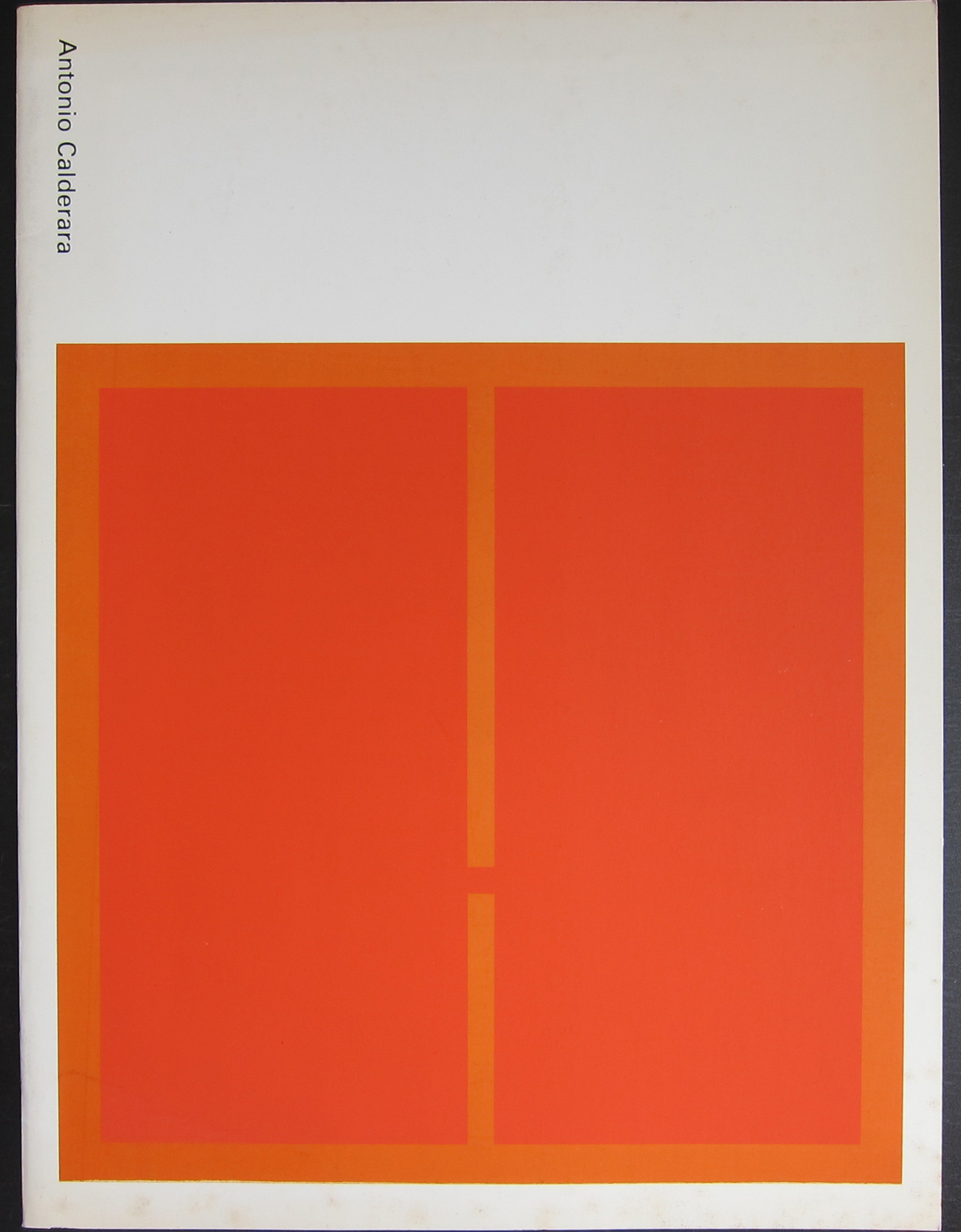
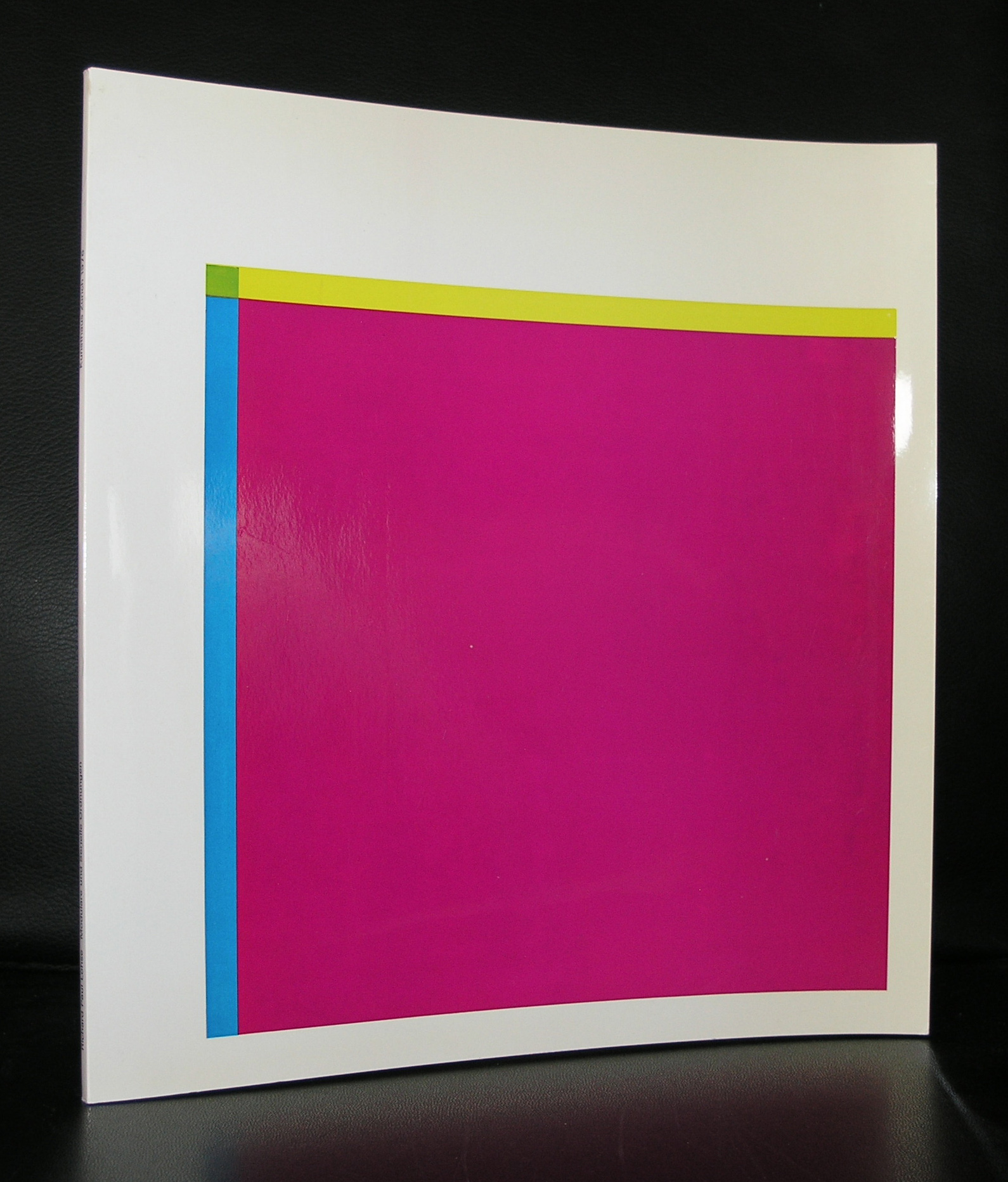
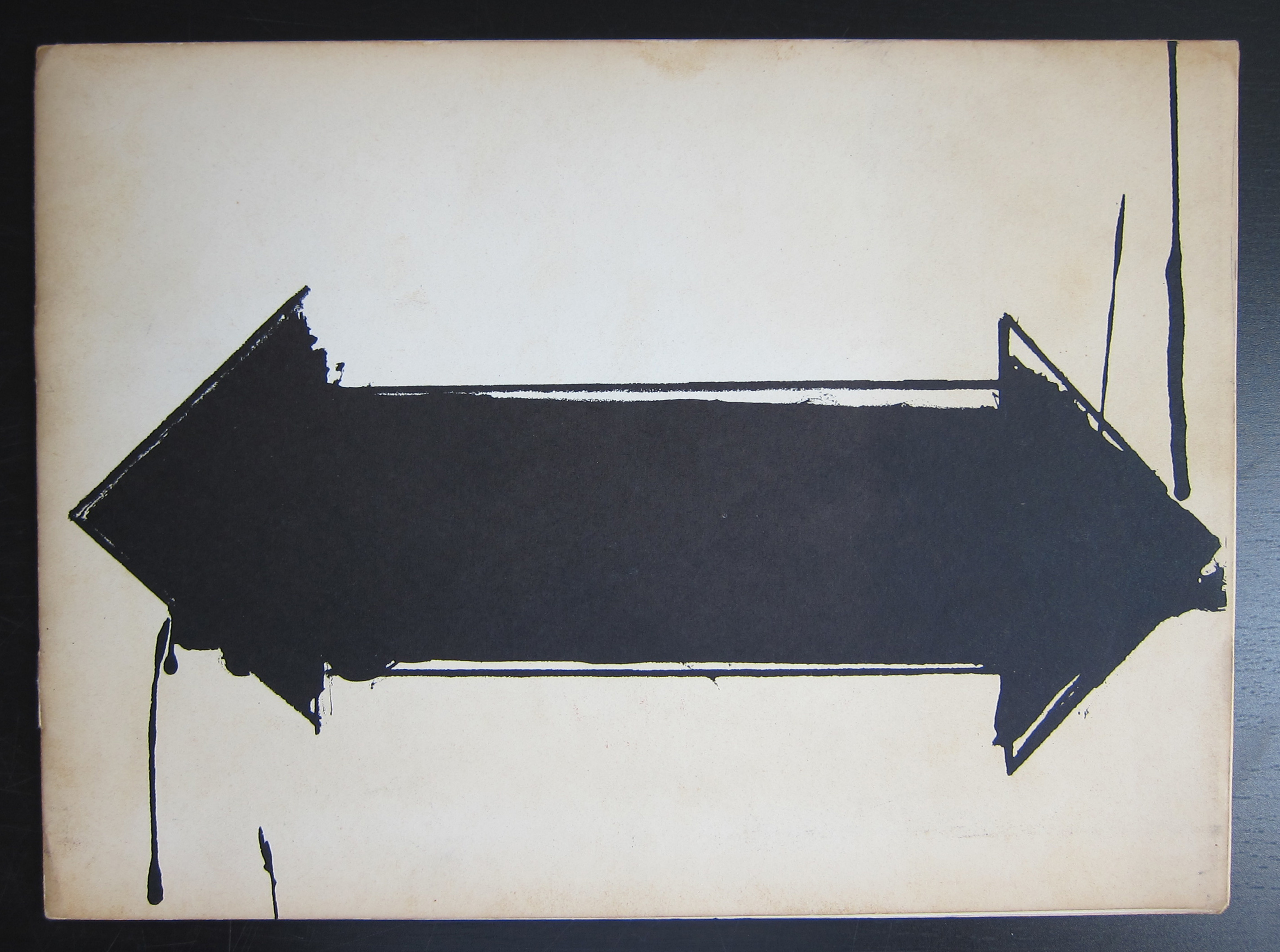
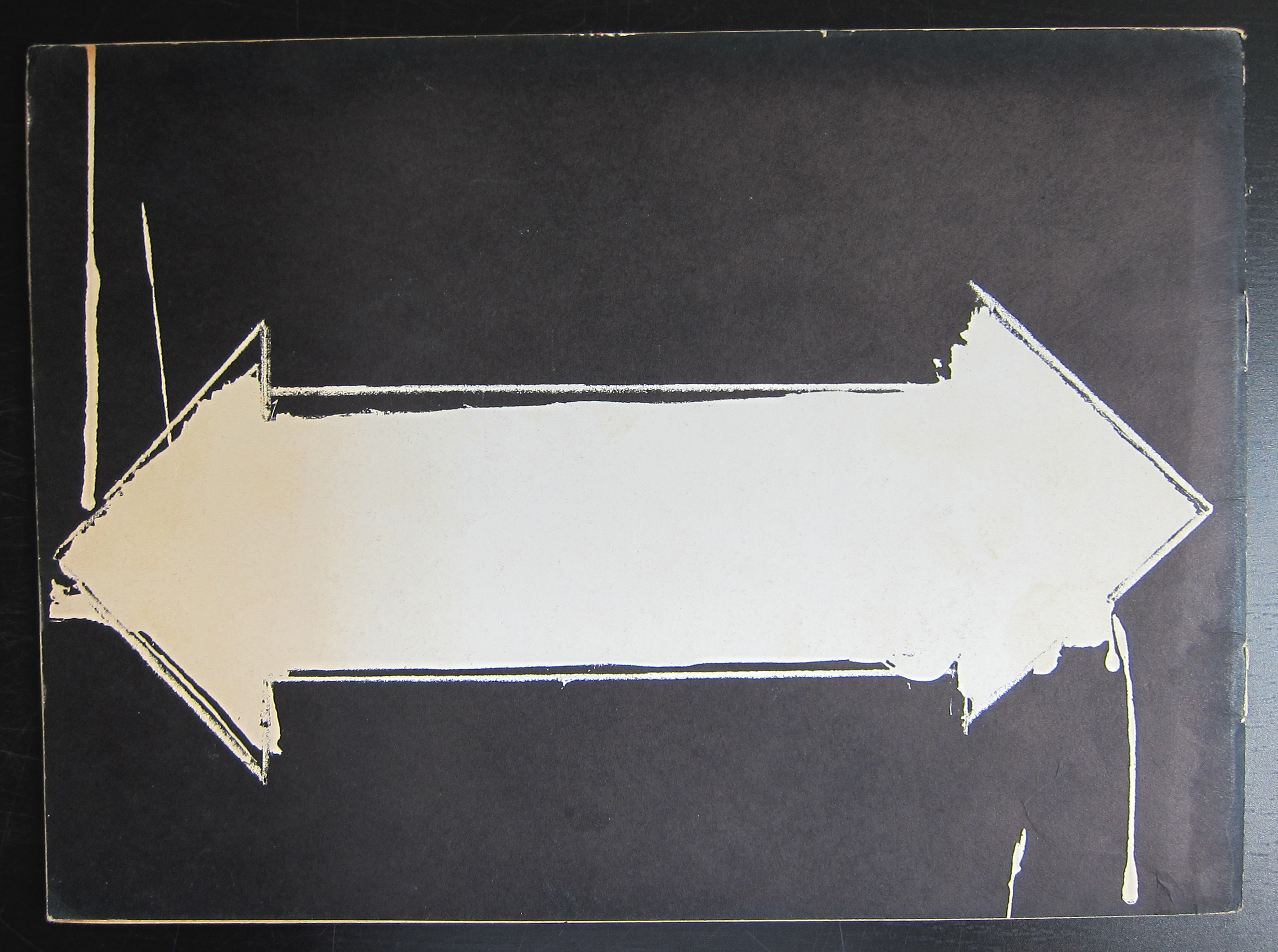
I think there is one exception. the excellent poster that was an original silkscreen for the Quadrat Bottrop exhibition. It is still available at www.ftn-books.com
please follow this blog on www.ftn-blog.com
martin-bottrop-a
Posted on Leave a comment

Ap Gewald …. 40 years Gemeentemuseum Den Haag.

ap-met-bestel

In the first couple of years i always thought Ap was Ab, because i had known several people with the name Ab. Since Ap corrected me, it became Ap/ @p and since we have stayed in contact with each other…not only professionally , but also socially.

His career at the Haags Gemeentemuseum/Gemeentemuseum now spans a period of 40 years. 40 years in which Ap has become one of the “mastodons” of the museum and one of those few within the organization of the museum, who contributes, as a registrar, to every exhibition that takes place within the museum walls. I think Ap is one of those people that you like instantly… easygoing and open hearted and because of that we stayed in contact with each other, meeting occasionally and discussing the art and museum world. There is one occasion that i want to mention in this blog. A few years ago i held an auction on Catawiki, within the auction there was a small Stedelijk Museum book with a lithographed cover by Christa Ehrlich . I mentioned it on Facebook and got an answer from Ap in New York. He was there with the design of the cover from the collection of the Gemeentemuseum which was lend to the Moma(?). This can not be coincidence, but must have a meaning…. so let us try to find out what the meaning of this is in the years to come. Ap, not only a colleague but also a friend! Thanks for 40 years Gemeentemuseum and 36 years of friendship and keep practicing your logistic skills in the coming years with the present we just gave you 😉

wilfried & linda

ehrlich-a

Posted on Leave a comment

David Robilliard . musician, poet and painter (1952-1988)

OLYMPUS DIGITAL CAMERA

I first encountered the works by David Robilliard at the exhibition which was held at the Stedelijk Museum Amsterdam in 1993. I learned that he was diagnosed HIV positive and died from aids in 1988. Before that time he was one of the models of Gilbert & George and found for them others who were willing to pose for them.

OLYMPUS DIGITAL CAMERA

During his life he was not that succes full, but after his death his  drawings and paintings were finding their way into museums, art dealers and collectors. Resulting in the 1993 exhibition curated by Rudi Fuchs who is a long time friend of Gilbert & George. They must have persuaded him to organize a Robilliard exhibition because on the invitation for the Anthony d’Offay presentation they described Robilliard as “the new master of the modern person. Looking, thinking, feeling, seeing, bitching – he brilliantly encapsulates the ‘Existers’ spirit of our time. This must have been for Fuchs the trigger to organize the exhibition in the Stedelijk Museum in 1993 and publish the book  A ROOMFUL OF HUNGRY LOOKS.

Robilliard is strongly related to the 80’s and together with his partner Andrew Heard, they are two of those eighties artists who deserve to be remembered and must not fall into oblivion.( both books are available at www.ftn-books.com

Posted on Leave a comment

Richard Paul Lohse ( 1902 – 1988 )

schermafbeelding-2016-12-12-om-14-48-35

A few months ago i published a blog on a very special Lohse poster published by the van Abbemuseum, but that was a blog on just a single item. Richard Paul Lohse deserves much more, because he is a very important artist. Not only for Switzerland but for Modern Art as a whole. Designer, painter and

I first encountered his work when i was working at the Gemeentemuseum and Rudi Fuchs bought a beautiful Lohse for its collection. It must have been right after his death and because of the connection with cubism and the DE STIJL collection it fitted in perfectly. The painting itself is a typical Lohse painting and because this aroused my interest in Lohse, i started collecting his books and publications. Since the collection has grown and contains at this moment some very specials items that are duplicates and are for sale at

www. ftn-books.com

The most special one is Kalte Kunst ( blog next week ) which contains a beautiful serigraph by Lohse.

Lohse is a multi talented artist , 2 time participant of the Documenta and important for modern art, because without his contributions KONKRETE Kunst would probably not have existed.


Posted on Leave a comment

Ed van der Elsken(1925-1990)…an almost complete list of publications.

If there is one dutch sixties photographer who deserves world recognition for his entire oeuvre it certainly is Ed van der Elsken. Over 40 years of work in photography and cinema gives a spectacular list of publications:

Een liefdesgeschiedenis in Saint Germain des Prés (1956)

Bagara (1958)

Jazz (1959)

Dans Theater (1960)

Nederlands Dans Theater (1960)

de jong & van dam nv 1912-1962 (1962)

Sweet Life (1966)

Wereldreis in foto’s vier delen (1967-1968)

Eye Love you (1977)

Zomaar in een sloot ergens bij Edam (1977)

Hallo! Een nieuwe Ed van der Elsken (1978)

Amsterdam! Oude foto’s 1947-1970 (1979)

Avonturen op het land (1980)

Parijs! Foto’s 1950-1954 (1981)

Amsterdam? (1984)

‘Are you famous?’ (1985)

Elsken: PARIS 1950-1954 (1985)

San-jeruman-de-pure no koi L’Amour à Saint Germain des Près (1986)

Jong Nederland ‘Adorabele rotzakken’ 1947-1987 (1987)

Elsken: JAPAN 1959-1960 Nippon data (1987)

De ontdekking van Japan (1988)

JAZZ Ed van der Elsken 1955-1959.61 (1988)

Natlab (1989)

Africa Ed van der Elsken 1957 (1990)

ONCE UPON A TIME (1991)

Once upon a time (1993)

l’Amour! (1995)

Hong Kong the way it was (1997)

Leve ik! Ed van der Elsken Foto & Film Essays Filmografie (1997)

Nippon data & After Ed van der Elsken (2000)

Fotografie + Film 1949-1990 Ed van der Elsken Kunstmuseum Wolfsburg (2000)

Eye love you Ed van der Elsken Fotografies + films (1949-1990) (2001)

55 Ed van der Elsken (2002)

My Amsterdam Ed van der Elsken (2005)


But there is one which is not on this list published by the official site of Ed van der Elsken. It is the exceptional publication made for the van Abbemuseum in 1961, designed by Wim Crouwel with contributions by Karel Appel ( who made a special inlay) , Schierbeek and Lucebert….photography… YES!, by Ed van der Elsken.

OLYMPUS DIGITAL CAMERA

Like some of the others from the above publications this is available at www.ftn-books.com

and here are some of the others:

Posted on Leave a comment

The DYLABY correspondence

Yesterday, i dedicated my blog to the Tinguely exhibition in the Stedelijk Museum and promised to blog on the correspondence for the DYLABY ( Dynamisch Labyrinth) exhibition. Possibly the most important exhibition in the Stedelijk Museum in the 60’s.

I blogged on the DYLABY catalogue some months ago…available at www.ftn-books.com,

but this extremely large and complex exhibition required thorough preparation. In the current Tinguely exhibition there is a showcase in which the letters from the invited artists are presented and because i have a great admiration for Tinguely and Sandberg , i had to photograph the correspondence for my own archives. Because the light above and the glass in between make it hard to make a good quality photograph, there is a shadow cast on the paper, but still text and names can be read and i think it is nice for all interested to read about the invitations and preparations for the DYLABY exhibition. Let me know what you think about them!

dylaby-adylaby-idylaby-hdylaby-gdylaby-fdylaby-edylaby-ddylaby-cdylaby-bdylaby-docs