Posted on Leave a comment

Jaap Wagemaker (1906-1972)

Schermafbeelding 2019-06-24 om 13.15.55

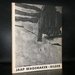
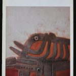
Jaap Wagemaker, fascinated by Cobra, but never wanted to connect to the mouvement. Instead he searched for his won style. Influenced by and admiring Burri he discovered an interest in Oceanic art too. This influences he mixed into a style of his own. Building layers of paint and other materials into 3D paintings. Giving them a feel of assemblages, using materials that only few had used before. Bolts, paper, sand, wood everything could have a place in the paintings as long as it had an abstract function. This is how his painting became recognizable and in the last decade or so, his paintings are sought after and fetch prices higher than average.

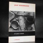
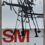
Now that Zero is hardly affordable and kinetic goes the same way. It is time to focus on something different. I am sure that Minimal will fill this void, but this kind of material painting comes in a close second. Jaap Wagemaker publications are available at www.ftn-books.com including the impressive one Wim Crouwel designed for the Jaap Wagemaker exhibition at the Stedelijk Museum.

OLYMPUS DIGITAL CAMERA

Posted on Leave a comment

Wim Crouwel and DE VOLKSKRANT


Schermafbeelding-2019-09-22-om-09.28.00.png

Wim Crouwel passed away some days ago and since, a great number of articles have been published on his life and accomplishments as a designer. His works will prove to be highly important for designers all over the world in the future and DE VOLKSKRANT ( one of the most important newspapers in the Netherlands) recognized that fact and devoted  a 2 page article on Crouwel in their Saturday paper. It is only on rare occasions that such a long and detailed article is published on just one person. Wim Crouwel and his works prove to be that important. The article can be found on the internet here (dutch)

https://www.volkskrant.nl/mensen/wim-crouwel-hoeder-van-het-functionele-ontwerp-en-een-onverzettelijke-rechtlegger~bf53fa62/

Posted on Leave a comment

and now for something completely different…Rosanne Cash

Because i have missed her concert i have been listening yesterday almost the entire day to Rosanne Cash. Listing more Wim Crouwel’s Stedelijk Museum catalogues, TD special items on eBay and www.ftn-books.com. This is for all those that admire her and don’t be afraid this is just a “one day blog” side step from the usual art and books.

as many of you know, “The Only Thing Worth Fighting For” was featured on HBO’s “True Detective: Season 2” as sung by Lera Lynn … what you may not know is it was Written By T-Bone Burnett, Lera & Rosanne Cash

Posted on Leave a comment

Wim Crouwel (1928-2019)

Schermafbeelding 2019-09-20 om 08.21.59

This morning i heard that one of the most influential designers from our time, Wim Crouwel, has died. The last years of his life he suffered Parkinson disease, but he was still going strong and must have looked forward to the retrospective of his works being opened later this  month at the Stedelijk Museum Amsterdam. What better way to commemorate this great artist than to show a selection of the many items designed by him. www.ftn-books.com

OLYMPUS DIGITAL CAMERA

And to finish one of my personal favorites. Wim Crouwel will be an example for many designers in the decades to comewerkman crouwel aa.


Posted on Leave a comment

Jean Pierre Raynaud (1939)

Schermafbeelding 2019-06-03 om 14.05.18

Raynaud has had a long career in Modern Art and until recently he was the perfect artists artist. Known and appreciated by his colleagues, but outside the inner circle of artists hardly known. He has had a fairly successful exhibition at the Stedelijk Museum in 1968, which catalogue was designed by Wim Crouwel, but beside that exhibition it lasted over 30 years in the Netherlands before the DE PONT museum decided to have another  Raynaud exhibition in 1999.

IMG_20190530_144647

( both catalogues available at www.ftn-books.com).

Of course Raynaud has had his exhibitions at galleries and museums, but the appreciation of collectors was not there. However in recent years his works have become more popular among collectors and since 2000 the appreciation of his works and prices start to rise. His works are characterized by the use of primary colors and in many a grid is used and part of the composition . There are several Raynaud publications available at www.ftn-books.com


Posted on Leave a comment

A rare Wim Crouwel designed publication.

Schermafbeelding 2019-05-31 om 15.29.32

Most of the people who admire the designs by Wim Crouwel, know that at one time he designed a series of stamps for the PTT ( the postal service in the Netherlands) The series of stamps was widely used and became famous for being functional and still having a great design.

Schermafbeelding 2019-05-31 om 15.26.43

Because the series was widely used and succesfull, Crouwel was asked to design the book on the publication of the stamps of 1977. This has become a typical Wim Crouwel publication. The book is smaller than usual, but one can recognize the Crouwel Lay-out of the pages. The editions of these “YEARBOOKS” were small and after inquiring i heard the number of 1000 copies. Of these many will have be destroyed or were lost and this is a ncie chance to add this to your Crouwel collection. Available at www.ftn-books.com

Posted on Leave a comment

Ed van der Elsken ( continued )

Schermafbeelding 2019-07-05 om 13.32.58

A just reason to devote another blog to Ed van der Elsken. Van der Elsken is without a doubt one of our greatest photographers from last century, but what makes van der Elsken special for me personally is that his photographs are the scenes and events i remember from my youth. Artistically they are among the very best, but emotionally there is an extra quality for me personally. The exhibitions showing a selection of his best color photography is now on show at the Nederlands Fotomuseum in Rotterdam ( https://www.nederlandsfotomuseum.nl) and is very well worth visiting. In the cellar there is an extra asset to this exhibition….. a 15 minute slideshow which is among the very best and informative slide shows i have ever seen. The exhibition is on view until the 6th of October 2019.

www.ftn-books.com has some classic van der Elsken books available.


Posted on Leave a comment

BNO & GKf and Proost Prikkels 251

ontwerpers gkf

The Beroepsorganistaie Nederlandse ontwerpers and the Beroepsvereniging van Fotografen GKF joint forces in a premium edition by the manufacturer of paper for printing purposes….Proost. Proost was known for its quality papers they delivered for printers in the Netherlands and abroad and every few month they published a Proost Prikkels edition to show in which way their papers could be used. The no. 251 is a very prestigious project since it contains fiches ( cards) on all the designers and  photgraphers that used their papers. There are 80 fiches in this cassette which itseld is a beautifully typically designed 60’s project . On the front of the card , names address and short biography of the designer and the back holds a picture of one of his most iconic designs.

On the cards famous names like Piet Zwart, Wim Crouwel, Willem Sandberg, Jurriaan Schrofer and Otto Treumann ao. This is the history of dutch design in a smalll box and available at www.ftn-books.com

Posted on Leave a comment

the dutch Still Life painting

There is a tradition in dutch painting that the dutch are specially good at Still Life painting. It does not matter if the subject is flowers, a kitchen table or just some pots and pans, through the ages they have made beautiful and highly detailed still life paintings. How about this as an example: Jan van Huysem floral painting.

Schermafbeelding 2019-03-18 om 13.38.04

Filled with details and just an example of the many many still life paintings the dutch have made through the ages. Van Huysum is just an example , but to prove my point i want to present the Groninger painter Henk Helmantel as a contemporary colleague of the old masters. His technique is one of a kind and his works can be compared with the very best from the GOLDEN AGE in dutch painting.

If ever you want to see his paintings in a semi public surroundings, please visit the Hotel Restaurant de Zon in Ommen because they have some of his classic still life painting on permanent show and while at it have a nice lunch at the restaurant and enjoy the Vechtdal.

Schermafbeelding 2019-03-18 om 13.41.18

There ara several books on still life painting available at www.ftn-books.com, among them this one designed by Wim Crouwel for the Stilleven exhibition at the van Abbemuseum

Schermafbeelding 2019-03-18 om 13.50.27

Posted on Leave a comment

Hildo Krop (1884-1970)

Schermafbeelding 2019-03-14 om 14.15.45

Hildo Krop is truly the one and only city sculptor of the city of AMsterdam. When you see an ornament at a building or a statue on a square there is a fair chance that it was done by Hildo Krop. Krop was active in the period that Amsteram had its biggest growth .

Schermafbeelding 2019-03-14 om 14.17.27

It was in preparation of the Olympic games of 1928 and many new buildings and parks were built in those days and if one wanted to make them more beautiful with a sclpture or statue, Hildo Krop was the artist of choice for many new projects in those days.

This was recognized by the Stedelijk Museum who devoted an exhibition to Krop in 1964 and had Wim Crouwel design the catalogue with the exhibition. Since that year there has been a growth of interest in Hildo Krop as an artist which resulted in a Museum devoted to Hildo Krop….location Amsterdam and on the internet at : http://hildokrop.nl

The Wim Crouwel publication is available at www.ftn-books.com