Why this blog on a publisher? It is just plain simple…. Stoof is one of the most influential European publishers who paved the way for the alternative comic scene of which for instance , Joost Swarte, was one.
Robert Olaf Stoop was born in Amsterdam and grew up with his grandmother in Indonesia. He grew up to be a full-blooded anarchist, putting provocational pamphlets in the newspapers of non-suspecting travellers when he was working at the AKO in Schiphol Airport. He made posters for Provo magazine, and got involved with comics during the 1960s. In 1966, he self-published his comic ‘De Lotgevallen van Roza’, which can be considered the first European underground comic.

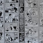
He founded publishing house The Real Free Press in Amsterdam, “the lost connection for solid facts” which imported American underground comics and reprinted the work of long-forgotten geniuses such as George Herriman, Winsor McCay, Gustave Verbeck and George McManus. Stoop also published magazine De Real Free Press Illustratie, which featured many old and new comic artists, and ran from 1968 until 1974.
Olaf Stoop was one of the first to recognize the talent of Joost Swarte, and published his work in several forms, such as ‘De Papalagi’, which became famous world-wide, and Swarte’s first comic, ‘Modern Art’ (1980).
Stoop can be considered the founder of the Dutch alternative comics scene. An intriguing personality, he lived his whole life as an anarchist and a free mind. He died of a heart attack at the age of 52.
www.ftn-books.com has found of the Real Free Press papers with works by a.o Robert Crumb and has them for sale .