An important site on dutch graphics and dutch designers can be found over here:
https://www.dutchgraphicroots.nl
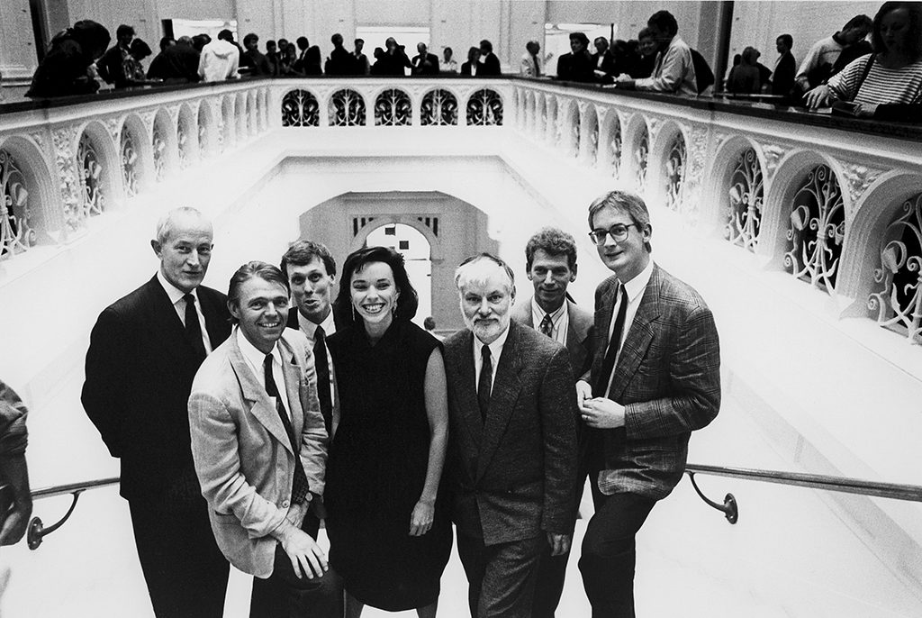
Here is the latest example of this site. This one is on Cor Rosbeek. One of the driving forces behind Rosbeek printers.
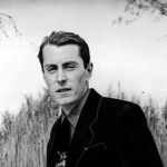
Cor Rosbeek
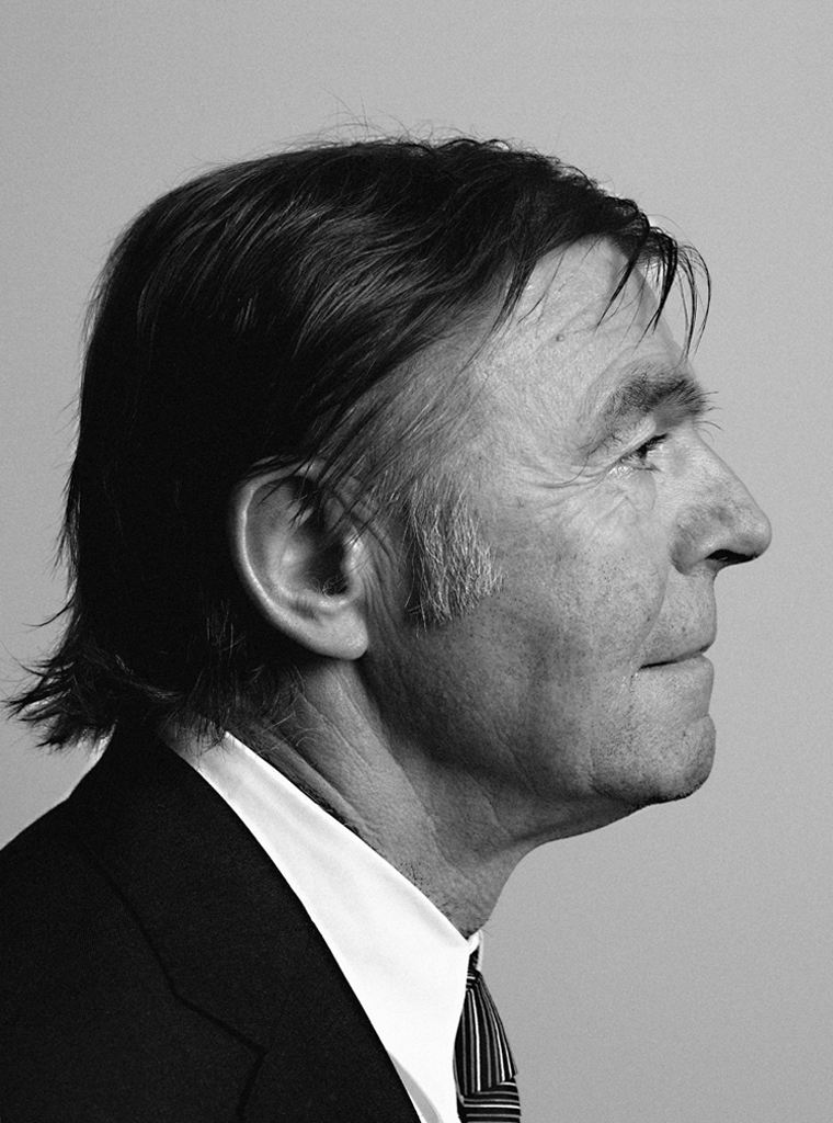
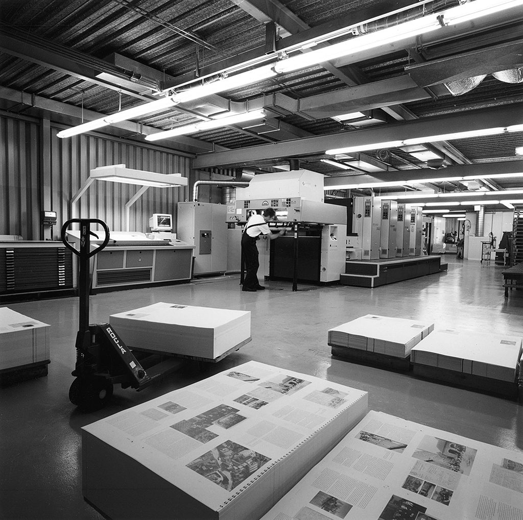
“Impossible doesn’t exist” and “I’m not selling print, I am selling trust.” Two sayings that characterize Cor Rosbeek who, together with his brother Jean, for long years ran Rosbeek printers in Nuth. The first maxim refers to the dedication shown by this printing house since 1963 to always deliver the best of the best, the highest of high quality print, and to be willing to listen closely to graphic designers. The Rosbeek’s capability to listen to and work with designers became legendary. The second saying indicates how supple and subtle they managed to perform their intermediary role between clients and designers. Rosbeek in Nuth, in the southern province of Limburg, were not just printers, they were actively participating partners in the print production process; they were important contributors to cultural developments.
The young Cor Rosbeek never showed any ambition of becoming a printer like his father. He’d rather become a commercial representative and drive flashy cars. Art wasn’t his cup of tea either: “I didn’t have the urge to create.” But Cor at age sixteen had to cope with his father’s sudden demise. As the oldest Rosbeek son he had to jump in and continue the family business. Born in 1944, he had grown up in the family home above the printer’s shop where his father produced all sorts of commercial print for small industries and for private people living in the area of Hoensbroek. His father’s prewar dreams of becoming the chief of the in-house printing shop at Bata’s shoe factory were disturbed by WW II. The Czech-born Bata owners, of Jewish descent, escaped to England. But Cor Rosbeek the elder knew about printing and by hard work single-handedly managed to build up a small business of his own, with only his sons, Cor junior and Jean, and their younger sister helping out when it was busy. In his off time, father Rosbeek liked to make music. He could play no less than thirteen different musical instruments.
The best ever
Cor Rosbeek went to trade school. Bent over maps and atlases he fantasized about other worlds. On Saturdays he put on his fashionable shoes and went dancing: rock and roll. But he was ambitious. He wanted to surpass his father and move on to a better world, he had an open mind as well as an eye for the modern times, and he explored whatever cultural life there was in his remote corner of the Netherlands. It was only later that he fell in love with the printing profession. “From that moment on no one could stop me, I wanted to be the best.”
His first client, the paint producer Jo Eyck whose company became a part of the Sikkens group and their distributor for Limburg, had taken over his own father’s management position around the same time as Cor. Jo Eyck was fascinated by anything related to art and design and already collaborated with designers. He was a perfectionist and a demanding client. Cor Rosbeek admitted he learned much from Jo Eyck: “Everything you do, should be done well and with quality in mind. Jo always aimed for a position in the quality-conscious market of architects, project developers and their clients. I noticed this was a highly effective approach. In his Heerlen head office Jo Eyck organized exhibitions about the role of paint in art, presenting artists such as Richard Lohse, Ad Dekkers, and Peter Struycken. He collected contemporary art and bought Wijlre castle to turn it into a private museum. He had architect Wiel Arets build a glass pavilion for a part of his art collection, the Hedge House, open to the public.” A second influential contact was with interior architect Herman Zeekaf, who sold modern furniture in Heerlen. With Zeekaf, too, Cor Rosbeek developed close ties. Zeekaf designed the new building for the printing company as well as later extensions and renovations.
Goodwill publications
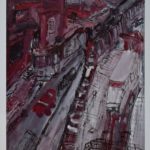
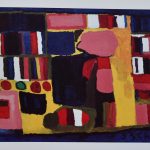
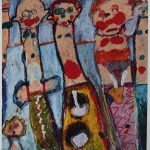
The production of high-quality print in collaboration with leading designers became Rosbeek’s goal. The brothers looked at printers such as Meijer in Wormerveer and Steendrukkerij De Jong & Co in Hilversum, where graphic designers produced daring print projects including the famed Christmas editions of Drukkersweekblad en Autolijn and the Kwadraat series published by De Jong & Co. In their own region, Rosbeek acquired assignments through designers like Baer Cornet and Geert Setola from clients such as furniture producer ’t Spectrum, Océ van der Grinten copiers, Stork machines, and Randstad (temp workers). Wim Crouwel was one of the first designers coming “all the way from the West” to collaborate with Rosbeek on work commissioned by fashion importers Kreymborg. Jan Bons brought his calendar designs for Van Ommeren shipping. Others followed, bringing with them a growing number of clients, including Art Unlimited and the Rijksmuseum. These clients came from all over the Netherlands.
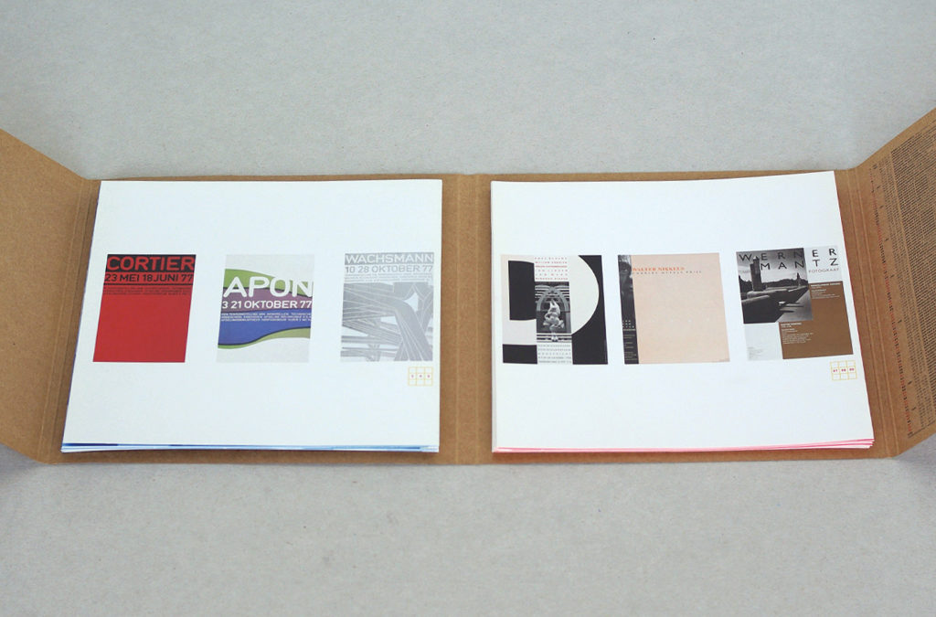
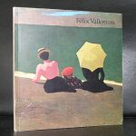
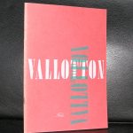
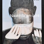
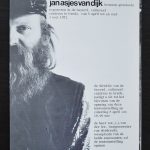
Many of these publications by Rosbeek are available at www.ftn-books.com