Born in Amersfoort this little known photographer is still working.
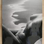
Haytsma has become known for his nude photography in which he shapes the body into almost abstract forms. Inspired by the greats of all nude photographers like Bill Brandt and Lucien Clergue, his nudes are almost always made in a studio setting.
The difference is therefore the way light in the photograph is used . He can set up his studio lights in a way that is never possible when photographing outside. Personally i prefer the natural light of the outside photography, but that does not mean that i am not attracted to the photographs of Haytsma. His photographs still have a quality of their own, making these highly collectable items at a reasonable price. This is an artist to watch whenever an item appears on an online auction site. The ATZE book is available at www.ftn-books.com
Atze Haytsma (1929) was educated to be a sculptor. At fourteen years old he started his professional career as an assistant of Geert Marree, just before the Dutch famine of 1944. After that he studied at the Applied Art School and the State Academy of Expressive Arts. He also learned how to glaze and work with modelling clay in a pottery to finally produce the designs of sculptors such as Bill Couzijn, Carel Kneulman, Marie Andriesse and many others. Basically everything in his life revolves around shape. Where he used to work with stone, he now, because of his age, works only with wax. But it has always been about the shape of a woman’s body.

Photographing women became an essential part of his life. It all began when he started to teach portrait and model moulding. At first he used nude models in the classes, but when the school could no longer afford to pay for the models, Atze started to photograph women and used the pictures as reference material for his students. They posed for him at his home, in the -presence of Atze’s wife, Mieke, who was a painter. First, they were students of the art academy he was teaching at, but by word of mouth the list grew longer through the years.
Around the age of sixty, Atze quit teaching. He then started to create small sculptures. He did this without a model; the female body was imprinted in his head in such a way, that he did not need a model. However, the longing to photograph women remained. Since then, Atze has been working in a pocket-sized attic, with construction lamps as lighting. He started out with two cameras, but soon needed others, because of the use of different lenses. By now he has eight of them, all Mamiya and Rolleiflex cameras, purchased for a small price at the end of the analogue era, when everyone switched to using digital cameras. Twin-lens reflex cameras for a 6 x 6 cm picture size on a 120 mm roll-film. Cameras that should be handled with caution, perfectly suitable for portrait and model photography because of their precision and handy size. Ideal for Atze, who has a soft, modest, almost shy personality. Using a Rolleiflex camera, you look down, into the waist-level finder, indirect, much more pleasant for the model. Instead of piercing, probing eyes she sees a head humbly bowed. The camera, placed on a tripod, is deliberately at about the same height as the top of the sofa bed. Atze does not for a moment want to give the models the feeling he is looking down on them.
The models are amateurs. Just women he met or who were referred to him. He will never ask someone himself, he does not have the courage. Maybe after a second posing session he could ask: ‘Will you come again?’. Sometimes he only speaks to them over the telephone and sees them for the first time when they walk through the door. The first time, they are a bit uneasy and nervous. Atze himself is relaxed, because he has been working with nude models his whole life. Atze always asks new models to come and see his photographs first so they can decide after that. If you feel that you are too fat or not pretty enough, he reassures them. A roll of fat or a skin crease can heavenly divide the body.
Posing for the first time the woman sits uncertainly on the corner of the sofa bed. ‘Just let yourself fall on the sofa,’ is Atze’s friendly advice. Followed by: ‘Beautiful, keep it like that’. That is how it starts and it doesn’t get more complicated then: ‘Can you turn around’, ‘Stretch a little more’ or ‘Can you crouch’. Photographs improve when a woman is aware of her body. He wants to give as few directions as possible, because it is all about interaction. A few words suffice.
He always photographs his women naked. Atze sees clothing as a kind of mask, so he wants his models to take it off. The absence of jewellery and other modern body embellishments make the images look like they could have been taken in the 1930ties.
Atze keeps his sculptures anonymous. Because a face has such a different expression than a body, he keeps the face out of the picture. Sometimes if a model lies in such a way that her eyes are prominent, he asks her to look at the lens and takes a portrait as a present for the model.
The pictures are a mirror image of Atze’s softness and admiration. The women show themselves unrestrainedly, bask in his gaze, let his eyes caress them. It is about surrender and relief. From Atze’s side, it is reverence for a woman’s body. And a kind of eagerness. If it is there, he wants to capture it.
For 25 years Atze has been capturing the tangible in moulding clay, the visible in photography and his thoughts in poetry. Three things that are inseparably linked.