Posted on Leave a comment

Sandro Chia (1946)

Schermafbeelding 2020-10-02 om 15.27.12

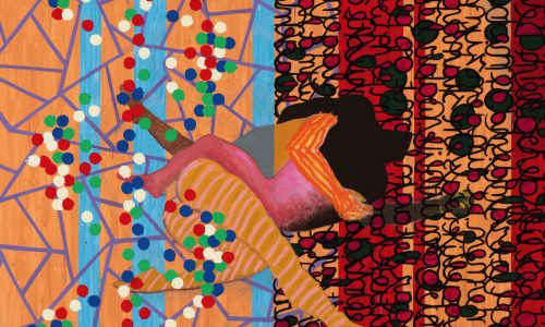
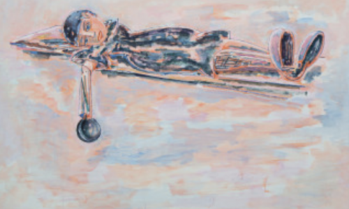
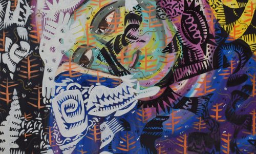
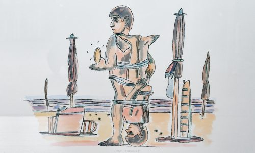
The very first time when i saw work by the Italian CHia was when he was presented together with contemporary artist from Italy presented at the Stedelijk Museum and i decided at that moment that fro me personally i liked the works by Chia the best. Not cucchi, not Clemente and not Palladino i liked most but the semi bombastic paintings by Chia  i liked most. They have a classical quality, but look very contemporary. Bright colors and filled with action his paintings still fascinate me.

chia sm a

Sandro Chia is an Italian painter and sculptor. A native of Florence, he was a key member of the Italian Transavanguardia movement, along with fellow countrymen Francesco Clemente, Mimmo Paladino, Nicola De Maria, and Enzo Cucchi. The movement was at its peak during the 1980s and was part of a wider movement of Neo-Expressionist painters around the world.

www.ftn-books.com has some nice Chia titles available.

Posted on Leave a comment

Gerard Unger (1942-2018)

Schermafbeelding 2021-02-01 om 14.54.43

Longtime overdue…this short piece on Gerard Unger does not do justice to the importance of Unger for dutch graphic design.

Unger was a Dutch graphic and type designer. He studied at the Gerrit Rietveld Academie in Amsterdam from 1963–67. A pioneer of digital type and an eyewitness to the important technological shifts of the past five decades, prolific writer and researcher. Unger has taught at the Gerrit Rietveld Academie for over 30 years, and since 1994, he is a visiting professor at the University of Reading at the Department of Typography and Graphic Communication. From 2006 to 2012, he has been lecturer in typography at the Department of Fine Arts of the University of Leiden.


The following text comes from EYEmagazine

Gerard Unger was a quietly ambitious typeface designer whose fonts have achieved a popularity and ubiquity that few superstar designers can equal. Born in The Netherlands in 1942, he has been involved in digital type design since 1974: for print (Dr-Ing Rudolf Hell GmbH, now Linotype Library); for office use (OcZ Nederland, Venlo); and for the screen (Philips Data Systems). Unger studied at the Gerrit Rietveld Academy in Amsterdam from 1963-67 and he has taught there for more than 30 years. Since 1994 he has been a visiting professor of typography and graphic communication at the University of Reading in the UK.

The many typefaces he has designed include Hollander (1983), Flora (1984), Swift (1984-86), Swift 2.0 (1996), Amerigo (1986), Oranda (1986), Argo (1991), Gulliver (1993), Paradox (1998), Coranto (1999) and Vesta (2001), a new sans serif. Many of these are used internationally in newspapers and magazines: for example Coranto for The Scotsman and the Brazilian newspaper Valor, launched in 2000; Gulliver for USA Today and Stuttgarter Zeitung. Swift (see Eye no. 3 vol. 1) has acquired the status of a late twentieth-century classic.

He has also designed several typefaces for signage, including the one used for the Amsterdam Underground and in 1996, in conjunction with the Leiden-based company n|p|k industrial design, a new face for Dutch road signs, commissioned by the Dutch tourist organisation ANWB. He made a personal contribution to the tradition of public lettering in Rome when he was commissioned to developing an orientation and information system for the City of Rome’s Jubilee year 2000. He headed a team of six designers, working again in conjunction with n|p|k. Part of this project was a new type family, Capitolium (1998), to be used in seven languages and in different technologies, including public touch screens.

Unger also designs corporate identities, magazines, newspapers and books, writes regularly about graphic design and typography and lectures abroad. He claims he is proud to remain an ‘old-fashioned designer, satisfying clients, solving problems,’ continuing a Dutch tradition of text face design for reading. ‘Over the past decade,’ he says, ‘while many designers were producing post-structuralist, post-industrial, Deconstructivist designs and … more interested in how things look than in what they have to say, I remained interested in content first.’

Posted on Leave a comment

the ZERO FOUNDATION

Schermafbeelding 2021-01-28 om 16.56.34

Looking for more infor on ZERO/NUL i stumbled upon this nice site . Site is in German and English and one can open and enlarge some very nice ZERO publications. For some real authentic ZERO publications please find what is available at www.ftn-books.com, but for those only wanting a short “fix” this is perfect.

http://zerofoundation.de/en/

Posted on Leave a comment

Lothar Baumgarten (1944-2018)

Schermafbeelding 2021-01-27 om 13.14.35

Lothar Baumgarten is one of those artists who’s fame never was never worldwide, but who rightfully deserves to be known and admired by many more. In recent years a new reveived interest grows in his works. Baumgarten, a conceptual artist< has had his exhibitions in the Netherlands at the Stedelijk Museum and Museum de PONT, but these have been some years ago, but lately i see a raised in interest and the works that appear at acution are sold at fair but rising prices. A good work from an edition is sttill to be acquired far below euro 250,–

Baumgarten is an artist to follow, and if you admire his works, like i do, focus on the editions. These are still to be bought at low prices.

www.ftn-books.combaumgarten bulletin has some nice Baumgarten publications available.


Posted on Leave a comment

Keith Haring, Bulletin contribution, 1990

Schermafbeelding 2021-01-21 om 14.22.19

1986….Keith Haring had his retropective at the Stedelijk Museum and made the VELUM for the entrance at that time. Since, there has been a friendship between Wim Beeren and Keith Haring. The 1990 Bulletin published by the STEDELIJK MUSEUM, had a small contribution on the memorial held at the MAZZO discotheque in Amsterdam. With the article a note written by Keith Haring addressed to Wim (beeren) was published for the first time. Here is the letter.

haring brief

The Bulletin frm 1990 is now availabe at www.ftn-books.com

Posted on Leave a comment

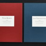
Niek Kemps (1952)

Schermafbeelding 2020-09-25 om 15.34.25

Niek Kemps has been a part of the international art scene since the eighties. The artist wants to stimulate the spectator with his conceptual work, to process images in a different way; a statement about the attention span of modern day society and the accompanying image culture. Kemps’ work is like a laboratory, wherein he does both substantial as visual research to the social and cultural context, and how this relates to image, space, contemporary art and the concept of ‘museum’.

Sculpture becomes space, space becomes museum. A museological space can take diverse appearances: whether it’s static, collapsed, moving, hidden or even virtual. In his work, the artist questions, among other things, the more traditional configuration of the museum. From the need for a funded complexity, he analyses the different connotations, and this from a philosophical and visual stand point. In doing so, Kemps researches the impact of a full virtualization of the museological existence, wherein a virtual (read: fictional) museum merely displays digital work.

Schermafbeelding 2020-09-25 om 15.34.58

Also in this imaginary constellation, the focus remains on the perception of context and space. An intertwining between fiction and reality is created. Virtual work is easily translated into a physical construction, a spaciousness, a sculpture, and vice versa. Kemps’ images never stand alone; they consistently show a sensitivity in relation to their surroundings, they interact so to speak with the space wherein they are located.

‘The narrow line between sight and seeing’, a work from 1986, is a speaking example of this. Until now, this illustrates the essence of his oeuvre. Originally it seems to be a sculpture. Yet the work is experienced as a space; a between area that questions all sorts of traditions and clichés. By continuously operating on this interface, the artist challenges the spectator to get out of their comfort zone, to explore the work, and to spend time with / in it. The artwork reveals itself only to the patient, attentive spectator. Every composition is formulated very precisely, like a poem. This form of complexity ensures that the work can never be apprehended at first glance. To fathom the different layers of meaning(s) takes time and effort. By defying fixed landmarks, meanings, perspective, and scale, every form of rational analysis is extracted or simply removed and it results in an astonishing artwork that invites to be lived and incites the spectator to reflect one self.

Posted on Leave a comment

VIII Bienal 65 at Sao Paulo by Jurriaan Schrofer

Schermafbeelding 2021-01-14 om 16.31.06

For many years this was the last time a dutch group of artists presented diutch art at the Sao Paulo Bienal exhibition. For several reasons the Bienal was boycotted and only in the late Eighties dutch art was presented once again at the Sao Paulo Bienal.

But the reason for this blog is not the presence of dutch art in SAo Paulo….no….. the reason is that this 1965 catalogue for the dutch pavillion was designed by Jurriaan Schrofer, who made this catalogue a very special one. The idea came from a leporello in which each fold contains a small catalogue. The artists present are for the official contribution: Co Westerik adnPeter Vos and for the special room: Melle, Carel Willink, Charles Roelofsz and Pyke Koch.

bienale schrofer a

Schrofer managed to include all these artist in a very special way in this catalogue in which all the artists received their own small book. Cover design is special too in which the title spirals away….I really am a great fan of this catalogie which is now available at www.ftn-books.com.

bienale schrofer b

bienale schrofer c


\

Posted on Leave a comment

Donald Judd and the Sikkens prijs ’93

Schermafbeelding 2021-01-08 om 16.28.35

In 1993 Donald Judd was awarded the Sikkens Prijs for his radical approach to Modern Art. It was a well deserverd award for an artist who stood at the brink of Minimal Art and founded one of the most inspiring artists “colonies” in Marfa texas.

Schermafbeelding 2021-01-08 om 16.31.14

Not much later Judd died in 1994 of Cancer, but his art remains and has proven to be (arguably) being the most important art made in the 20th century. The Stedelijk Museum and the Gemeentemuseum Den Haag both have some very important Judd’s in their collections and over time these works have not lost their appeal. I am personally convinced that in a few decades , the Minimal art by Judd is considered to be of the highest importance in the development of Modern Art/ www.ftn-books.com has the Judd publication published with the Sikkens Award ao. available .

judd sik a

Posted on Leave a comment

Jan van Munster (continued)

Schermafbeelding 2020-12-22 om 16.04.31

If i would make a top 10 of my favorit Stedelijk Museum publications this Jan van Munster publication from 1970 would be ceertainly somewhere in my top 10.


Published in 1970. It is typical Wim Crouwel design, but some details make it exceptional. First there is the use of a viny cover which has a silkscreened print in bright red on cover and backside. The vinyl cover is used as a portfolio for just one 2 page publication. Printed recto/verso and protected by a blank sheet of white paper. This publication is very special and instead of being a full catalogue with the exhibition , this is a true artist publication making this much more valuable for all Stedelijk Museum collectors and Jan van Munster admirers. The Jan van Munster 1970 / Stedelijk Museum by Wim Crouwel publication is now available at www.ftn-books.com

Posted on Leave a comment

Wim Crouwel designed series for Museum Fodor

Schermafbeelding 2020-12-15 om 09.15.21

Around 1972 , Wim Crouwel started to use a computer design inspired layout for the Museum Fodor publications.  A bright orange/red color with in the background a pattern of fine white dot. Just below the middle a tin white line. Fodor in Pink. On the left half the exhibition in info and in Most cases above the white line the artist name. Over 40 publications have appreared within these series and nearly all belong to the very best of Crouwel designs from the Seventies. www.ftn-books.com has many of these publications available. This is a typical connoiseurs choice, not expensive and with all the qualities of a Seventies Crouwel designed publication.