Posted on Leave a comment

Joachim Grommek (1957)

Schermafbeelding 2019-12-12 om 14.24.11

Joachim Grommek, Master of Arts of Free Art/ Film at HBK Braunschweig (Professor: Malte Sartorius), Germany, in 1982 has mainly shown in German and European institutions and galleries since 1987, among them important solo shows like “Malerei 300” at the Städtische Galerie Wolfsburg, Wolfsburg, Germany in 2011. His geometric-abstract, illusionary work in perfection lays varies the topic of authentic image and copy like the ancient Trompe-l’œils, always asking for a second look. Grommek’s work though is reflecting art history and prominent artists like Kasimir Malewitsch, Piet Mondrian, Blinky Palermo or Robert Ryman.

grommek voor wordpress

This is how the Taubert gallery describes the works by Joachim Grommek. They have a nice selection in stock. This blog on Grommek is written on the occasion of the purchase for FTN-art of a beautiful impressive diamond shaped work : STAR IV, 2006 (Black Diamond). You really have to study his works from very close up. It appears these are not tapes nor raw chipped wood material, but literally everything….lines , wood, tapes …is painted. Materials used, acrylic paint, lack, wood , special paints…the result a fascinating work of art that impresses with its composition, but in the meantime is a technical painters masterpiece.

The works by Grommek can be found in numerous German museums and ao. the Centraal Museum / Utrecht

here is the text from the book TILT:

Grommek’s pictures have an extraordinarily immediate visual presence, despite their comparatively small size. Whereas they seem rigorously minimalistic in terms of both areal composition and chromatic clarity, there is still something provisional and unfinished about them. More like tantalising intermediates, they seem to imply that the artist has not yet decided which area should be superimposed on which. Patches of bald fibreboard are visible in places, as are strips of adhesive tape.

But nothing is what it seems in these works. Although Grommek does indeed use standard industrially laminated fibreboard as a ground, the grey-brown speckled areas that the viewer takes for unpainted fibreboard turn out to be no less painted albeit with deceptive verisimi|itude -than all the other areas. Even the brightly coloured transparent »adhesive tape« turns out to be lacquer which, perfectly applied layer upon layer, creates the illusion of overlapping strips of plastic tape. An abstract, »unrepresentational« picture by Grommek, therefore, is actually the result of a highly representational style of painting, with what it represents being its own materiality.

Once the temptation to tear off the strips of non-exlstent adhesive tape has been resisted, the viewer can step back a few paces and in doing so go back to the beginning and to the play of shapes and colours. The tension remains, just as the contradictions between the reality seen, painted and represented remain unresolved.
Posted on Leave a comment

A.R. Penck exhibition at Kunstmuseum Den Haag…HOW IT WORKS

Schermafbeelding 2020-02-29 om 15.14.37

Until the 10th of May there will be a Penck exhibition at the Kunstmuseum Den Haag.

8 days ago i visited the combined opening of 3 exhibitions. I came for the Verdijk exhibition to see part of the gift which the Kunstmuseum received and exhibited in a very small room. But because i was early i had the pleasure to look atat the great art by Penck. I met Penck in 1988 when he drummed on the opening of his own exhibition at the Haags Gemeentemuseum  ( curated by Rudi Fuchs), so this was my second retrospective, with one great difference.

This show includes the oversized paintings. For the first 15 minutes after the rooms were opened i was almost on my own , because the guest stayed with the Lucassen exhibition which was openend too.

This is a great exhibition which shows that Penck is and will be very important to modern art and i really appreciated that the museum had made an extra effort to show the extreme sized paintings. This is a show you must see…modern art at its best and if i must compare the inmpact that the show had on me i must go back in time to the Basquiat exhibition at the Beyeler. The size and impact of these paintings is overwhelming. A must see.


There are several Penck publications available at www.ftn-books.com

Posted on Leave a comment

David Bade (1970)

Schermafbeelding 2020-02-29 om 14.36.20

It must have been round 2002 that i first saw a sculpture by David Bade. It was the Yellow one/ BIG FISH DAY  that was placed at the entrance of the GEM, the contemporary museum next door to the Kunstmuseum Den Haag.  A bright yellow sculpture with a stork ( weapon of THE HAGUE) in top .

Schermafbeelding 2020-02-29 om 14.37.01

My personal thought is that this is a monstrosity and over the nearly 20 years now that it is at this spot i never learned to appreciate it. Last week i walked by it , looked at the sculpture and noticed it was worn at some places and a thin layer of green algae is covering the sculpture, so perhaps in short time the sculpture will be removed from its spot and placed elsewhere. So far the negative on David Bade, because one always must have an open mind and when i leafed through the 2010 David Bade catalogue i was impressed….powerful sculptures, great paintings and drawings which reminded me of the great Expressionist painters . So there is a shift towards the positive. It does not mean that i now admire the sculpture outside GEM, but i definitely makes me look different to David Bade his art. The 2010 book is now available at www.ftn-books.com

david bade

Posted on Leave a comment

Paul Schwer (1951)

Schermafbeelding 2019-12-09 om 16.01.19

A large text this time by Ludwig Seyfarth ,which can also be found on the Paul Schwer site. Why?…because FTN art has acquired 2 works by Paul Schwer and which will be for sale shortly.

„One would be tempted to believe that this structure used to have some convenient form, and now it was only broken. This does not seem to be the case; at least there is no indication; nowhere are approaches or fractures to be seen that would point to such a thing; The whole thing seems pointless, but completed in its kind. Incidentally, nothing more can be said about it, since Odradek is extremely flexible and can not be caught. „- From: Franz Kafka, The Care of the House Father

Extremely agile and unstoppable – that‘s also what Paul Schwer and his art say. The objects (an auxiliary term for quite different things) that Schwer produces do not move themselves, but almost systematically dispense with the usual names and categories with which works of art are classed in terms of genre, media or style.

How consistently Paul Schwer places his work between the chairs of conventional art forms, the various attempts make it clear that they capture it in an orderly manner. In the Wikipedia article he is called installation artist. On the website of the Goch Museum, he is considered one of the most famous German sculptors. And the radio contribution by Thomas Frank, which was broadcast to the exhibitions in Ratingen and Goch, sees the aspect of extended painting as central, thus ultimately following the artist himself. Somewhat surprisingly, he then places Paul Schwer in the art-historical tradition of stained glass. The fact that each interpreter sees a different artist, depending on the perspective, could be due to a very divergent design vocabulary within the work. Even well-known artistic oeuvres do not offer a uniform picture. Suppose someone is not familiar with Pablo Picasso‘s work and enters a solo exhibition of this painter who has become the cliché of the modern artist. If he then sees works from the blue and pink period, then the cubist, the classicist and the later phases, he is likely to expect to attend a group exhibition.

That would hardly be suspected in an exhibition by Paul Schwer despite the diversity of media and materials. Plexiglass and polyethylene terephthalate (PET9, wood or fluorescent tubes are repeatedly used materials that, in addition to a clear color, a game with transparency and semi-transparency and a play of surface shapes and complex volumes,a clear, consistent „handwriting“.

At the same time, however, seemingly contradictory things are always connected with each other. Both the individual object as well as an overall arrangement in an exhibition or in an outdoor space (often Paul Schwers works outdoors) often suggest a lability and fragility, a situation that would immediately get out of hand with a small change in the heavyweight.

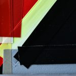
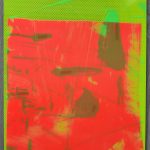
Not just a house is upside down, on the edge of the roof (which we will come to). The relationship between two- and three-dimensionality always stands in the balance. The „painterly“ application of color does not take place on a flat surface. The most common image carrier is a transparent, heated PET fluid (or Plexiglas) that has been thrown in a fluid state and re-hardened. Thus, the „image ground“ becomes a plastic, free-standing object or lying on the ground object. The latter is reminiscent of the irregular outline of a crumpled paper, as if a picture or a drawing were discarded and thrown away, which also applies to the various red forms in the exhibition in Goch.

Thus, each image is simultaneously a sculpture, with sculptural elements, so to speak on the other side, also tending to be architectural elements in space. The prototype for this are the natural-brown or green lattices, which are made of roof battens and based on the outline of two pillars in the room, which reach below the ceiling in Goch and divide one of the two exhibition rooms, divided into different directions, into compartments. However, these rooms in the room are not completed; The grids are not fixed walls, but largely open to the view. The different sawed out sections correspond exactly to the dimensions of the door and window openings of the room. Other elements that also have an optical outline function are colored rectangular discs made of corrugated polyester, which hang pictures on the construction like single panels – not all at the usual eye level, but their size and position is also derived from the architectural conditions of the room.

The reference to the conditions of space based on strictly geometrical forms and dimensions could almost be read as a continuation of the tradition of Minimal Art. But one may also be reminded of the Cabinet of Abstracts, which El Lissitzky set up between 1926 and 1928 in the Sprengel Museum Hannover and which since 2017 has been accessible there as a reconstruction. Lissitzky designed a kind of Gesamtkunstwerk for the presentation of works by other artists as well, based on a clear constructivist vocabulary of forms. However, Paul Schwer also incorporates in his „Gesamtkunstwerk“ other elements that would be unthinkable to Lissitzky or strict minimalists. Thus, several red PET objects form a radical contrast to the geometric reduction. Complex wrinkled and folded forms can not be grasped at a glance, suggesting a baroque overabundance, an impression of the random and the chaotic. A staging of the exhibition space based on such strong formal counterparts may seem like an attempt to bring things right back to their original level after an explosion or other destruction.

The corrugated iron hut, which stands diagonally upside down in the other showroom, could also have been torn away by a flood. It does not seem habitable anymore, even when light is on. Inside, there is an accumulation of fluorescent tubes, the cables of which hang down at the bottom, reminiscent of a torrent of water.

„Model“ for this architectural sculpture is a corrugated iron hut that Paul Schwer has seen far away from human settlements in Iceland. Travel memories often form associative starting points for his spatial stagings. The second room was inspired by the facade of a vegetable shop in Istanbul, where the artist had a scholarship in 2015.

However, such references and narrative references never become clear; mental impressions, like physical materials, enter into the composition of an „installation“. After all, is Paul Schwer ultimately an „installation artist“ who combines various individual elements into a spatial entity? Or does he create three-dimensional images that extend concepts of painting into space? Even though Paul Schwer himself, as already mentioned, tends towards the latter „categorization“, in the end it is up to us how we classify our mode of experience conceptually. The emotional impact can also vary depending on the observer. Thus, the strong color and the physical force of the sculptural forms combined with the often surprising light effects of the fluorescent tubes can trigger a feeling of expressive affection. If you look more closely at the constructive components, you will discover in Paul Schwer‘s work a seemingly contradictory, almost hermetic feature, in which the elements, as on different levels of presentation, almost seem to interlock with one another like a Russian doll.

Furthermore, one could ask how Paul Schwer‘s art of spatial presentation could be classified in the context of contemporary installation art. If we follow Claire Bishop‘s 2005 installmentage „Criitical History“ in the Tate Modern Press, different forms of installation are distinguished not by their spatial presentation, but by the way they are viewed („viewer“) that are, are mentally and physically involved. Dream scene, heightened perception, Mimetic engulfment and Activated Spectatorship are the guidelines here, which are also based on different subject theories. The recipient subject is involved, but also decentred: psychoanalytically, phenomenologically, libidinally or in the sense of a post-structuralist political subject.

The receiving subject is called upon to actively explore the spatial staging. But this is no self­assured subject with a sovereign command of a unitary space as in Renaissance perspective but one that is decentred in the sense of post­structuralist theories. There is no sovereign viewer’s standpoint from where the entire spatial installation can be grasped in one sweep. This is a central characteristic of Paul Schwer’s spatial stagings, aligning them with the procedures of many well­known installation artists like Allan Kapow, Lucas Samaras, Paul Thek, Ilya Kabakov, and Gregor Schneider.

However, the combination of different, seemingly incongruent things in stage­like spatial ensembles also calls to mind the psychoanalytically inspired combinatorics of the Surrealists. And perhaps the individual elements brought together by Paul Schwer take on a »sense« only if read as Freud read dreams: as picture puzzles whose deeper meaning does not lie in what is to be seen in the images.

Posted on Leave a comment

Gerard Verdijk at the Kunstmuseum Den Haag

Readers of this blog know of my admiration for Gerard Verdijk. It is a pleasure to know and announce that once again there is a large exhibition being held at a major dutch museum. This time the Kunstmuseum Den Haag ( Gemeentemuseum Den Haag ) has an exhibition which opens on the 29th of February and will close on the 13th of April.

( the invitation depicts ” fetish + tabou” from 2000 )

Posted on Leave a comment

Sergei Lobanov (1887-1943)

Schermafbeelding 2019-12-02 om 14.23.36.png

This is one of those artists that stayed out of sight for me because i never had seen his work in a museum before, but after i found a book ( available at www.ftn-books.com) it became clear to me that his implressionist art is not less than the the works by his french  and european counterparts.

Sergey Ivanovich Lobanov was one of the significant but little known artists of the first half of the 20th century. His fauvist landscapes participated in exhibitions of the Jack of Diamonds in 1910 and 1912. Unfortunately, Sergey Lobanov’s works were hardly displayed hereafter but for few exhibitions in the 1920s.
<divSergey Lobanov studied in art studios of F.I. Rerberg (1906) and I.I. Mashkov (1907), at the Moscow School for Painting, Sculpture and Architecture (1907-1913). As a school student yet, he got interested in the history of fine arts. Sergey Lobanov attended courses on the history of arts at the Moscow Archaeological Institute in 1914.

He became an official of the Museum and Monument Protection Department of the People’s Commissariat for Education in 1918. Sergey Lobanov was seated the custodian of the nationalized collection of S. I. Schukin in 1922. For one and a half decades the artist was the deputy director of the State Museum of New Western Art (later a considerable part of the museum collection was shifted to the Pushkin Museum of Fine Arts and made the basis of the collection of French painting of the second half of the 19th and 20th centuries).

After his short membership in the Artists Association of Revolutionary Russia he was excluded from it as being “alien to ideology of the Association” in 1924 and walked off from any art groups.

lobanov

Posted on Leave a comment

Franceso Clemente at Paul Maenz, 1988

Schermafbeelding 2019-12-02 om 16.36.28


You wonder why there have not been many more publications like the CROWN SKY WAR special which was published on the occasion of the opening of the Clemente exhibition at the Paul Maenz gallery in 1988.

An important exhibition  and the specially designed collectible should be an example for other gallery publishers. It is not too expensive to produce, but its appearance is like no other publication. It looks and feels special from the moment you set eyes on it and when you “unbutton” it it shows its contents….3 fold out cards CROWN…SKY…WAR. estimated costs…less than 1 euro. But this special is worth much much more since it’s importance means that the Paul Maenz gallery is mentioned in all the years after its publication. Whenever a copy surfaces , one is reminded of the Clemente exhibitions at their gallery in 1988.

I have now finally found me a copy which is for sale at www.ftn-books.com. This gallery was/is an example to many others in the business

clemente crown c

Posted on Leave a comment

Arie van Geest …naar Beckmann, 1999

Schermafbeelding 2019-12-02 om 15.51.21

Recently i had the chance to acquire another Arie van Geest watercolor for the FTN art collection. The moment i saw it i was impressed and decided to make a bid. The watercolor is from the 17th of August of 1999 and fits perfect between the painting and another drawing i have in my inventory by Arie van Geest. I have grown fond of his art over the years. His earliest more abstract , fantasy like drawings are wonderful and his later paintings keep impressing and this drawing is one of the nicest i have seen by his hand. Both other drawings i have purchased i will keep for a later blog , but in case you are interested in purchasing do not hesitate to contact me at wvdelshout@ziggo.nl

Title of this drawing/watercolor is ” NAAR BECKMANN #, size paper 30 x 22 inches / ca. 75 x 55 cm.

geest beckmanna

Posted on Leave a comment

An important Tajiri/Crouwel book

Schermafbeelding 2019-11-29 om 09.05.04

It was in the earliest years of his career that Wim Crouwel was invited to design the catalogues of the van Abbemuseum and in these years several iconic publications were published that were designed by Crouwel. I have encountered over the years many of them and have a nice selection for sale at www.ftn-books.com, but until last month i never had seen the Tajiri catalogue from 1961. It was one of the earliest of Tajiri his catalogues for a major museum, but Wim Crouwel must have felt the same about the catalogue as Tajiri did. Both must have the iedea that is was important for them personally. The typography on the cover is outstanding and the photograph by Cas Oorthuys even enhances it. This is a thin 12 page catalogue with a special 4 page inlay ( with photographs of sculptures), but every page shows the quality of Wim Crouwel his design in combination with the works by Tajiri.

tajiri abbe a


Posted on Leave a comment

John Davies (1946)

Schermafbeelding 2019-11-25 om 16.55.18

“I call myself a haunted house… we all have ghosts and histories.” – John Davies

Davies’ interest in the human presence set him apart from many of his contemporaries in British sculpture at the beginning of his career. Of his early figures, often cast from life and clothed, Davies has said, ‘I wanted to make a figure, not like a piece of sculpture, more like a person…. I wanted my sculpture to be more like life in the street’.

His more recent works are modelled in clay, before being cast in polychrome polyester and fibreglass, or bronze. Davies arranges these figures in carefully choreographed relationships. Animals and inanimate objects such as houses also appear in works whose thematic concerns are always with human experience.

Of The Deerson Series, shown for the first time in this exhibition, John has said: ‘This series of scarecrow-like figures, with their moons, are a kind of self-portrait. I never intended to make these images, having other ideas to the fore, when I had a car crash in 2010. My life always leaks into my work, so inevitably and reluctantly these images emerged. They are works processing my long recovery. Now to me they seem to have a life of their own, independent of my story. Mad dancing ‘scarecrows’ coming to life, a protest against fate and physical frailty, like the figures in the Watersons’ song, ‘The Scarecrow’.’

Drawing, often in series, has always been an important aspect of John Davies’ practice, and the sculpture and drawings are equally important to him. The drawings in this installation demonstrate how the two practices influence each other.

The above text was found in Fuse magazine

www.ftn-books.com has some John Davies catalogues available