Posted on Leave a comment

Piet Dirkx weekly

Only two Piet Dirkx weekly’s to go. But 2 very special ones.

This one was made for the 2003 New Years wish. A drawing in watercolor and signed by Piet .

“La Creation” is a beautiful smal artwork . measuring 14,8 x 10, 4 cm.

dirkx creation

dirkx nieuwjaar 2003 b

Posted on Leave a comment

Oey Tjeng Sit (1917-1987)

Schermafbeelding 2019-12-11 om 12.16.34

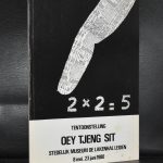
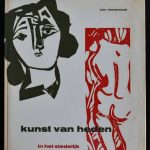
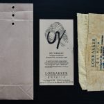
I thought i had, but i just discovered that i had not written a blog on Oey Tjeng Sit before and there is now every reason to write a blog on this self taught artist, because i recently added a wonderful multiple to the collection of www.ftn-books.com. It is the Loerakker multiple on the occasion of the presentation of the monograph on the artist.

Amsterdam based pharmacist-artist Oey Tjeng Sit (1917-1987) invited visitors of an art fair to throw paper balls toward tin cans, decided to set fire to cages filled with balls of newspapers, or to fill warehouses with the same second hand paper material. He liked to add bizar titles to his works such as ‘Bicycling against the wind one might forget the invention of the wheel’, ‘An artist who is fashionable is a victim of good taste’ or ‘The only thing I know is that I trust blindly a feeling that promises me secrets.’
Oey Tjeng Sit, whose name means Yellow Clear Solid was born in Purwokerto (Java) at the foot of the Klud Volcano, that erupted just at the time of Oey’s birth. Born in the Year of the Dragon he found himself released of the duty to take care of his parents; that is why – after visiting high school in Bandung – he traveled to the Netherlands in 1938 in order to study pharmacy. Twenty years later he opened Apotheek Oey (Oey Pharmacy) at the Prinsengracht opposite the Anne Frank House. He took away the pills and potions out of the window display and started a small art gallery there. One of his nicknames was a ‘Dragon Man with a Dada Passion’ who showed the art work of colleagues and friends which gave him another epitheton: ‘the nestor of Amsterdam window art’. Oey’s work as an autodidact is characterized by a wide artistic range of disciplines: after a period of surrealistic drawings and paintings he started making wood and linoleum cuts, collages, assemblages and editing books through his own editorial ‘The Finger Press’.
In his collages, often together with Chinese ink and brush, as well as in his installations he used frequently news papers, of which he wanted to extend their short life, tied as they are to daily actuality. The newspaper was a source for many questions for Oey ‘Can we measure the weight of printed news?’ and ‘What contains more wood than newspaper letters?’ ‘If there is an order, then is it a temporary one.’

Oeys oeuvre – light-hearted, playful with a subtle feeling for the hidden esthetic quality of daily life – can be a long lasting confirmation of these words.

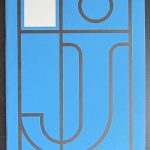
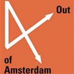
Beside the multiple i have more collectable books by the artist in my inventory

Posted on Leave a comment

Lawrence Weiner at Konrad Fischer, 1989

Schermafbeelding 2019-12-10 om 15.15.23

Readers of this blog know of my admiration for Lawrence Weiner and this is the reason i want to share this very special invitation that i recently added to my inventory. It is the invitation for the Weiner exhibition from 1989 at Konrad Fischer . The invitation by the artist is a piece of art by itself. Making this a true collectable multiple by the artist.

WEINER HYDRO A

weiner hydro b

weiner hydro c

Posted on Leave a comment

Luciano Fabro at Christian Stein, 1988

Schermafbeelding 2019-12-10 om 09.44.42

Christian Stein was the preferred location for Fabro to present his latest works on a regular basis.

Fabro was born in Turin, so this was a natural choice , and he moved to Udine, in the Friuli region after his father’s death. He was influenced by artists such as Yves Klein, and Lucio Fontana; he was also close to the artists involved in Azimut, such as Piero Manzoni and Enrico Castellani. In 1958, after he saw Lucio Fontana’s work at Venice Biennale, Fabro moved to Milan where he spent the rest of his life pursuing his artistic career.

Fabro was involved in the Arte Povera group, which was interested in experimenting with industrial and natural materials, focusing on process, language and the body. Fabro’s best known works were sculptural reliefs of Italy made out of glass, steel, bronze, gold and even soft leather. The signature unorthodox, ‘poor’ materials in his works include steel tubes, cloth, newspapers, and wax;[3] the artist, however, often used also traditional and expensive art materials such as gold, marble, and bronze.[4]

He died on 22 June 2007 in Milan following a heart attack.

The Stein location presented some wonderful works and together with these exhibitions some great art related material was produced. Here is the invitation for the 1988 exhibition which is now for sale at www.ftn-books.com. A fold out card with prints on both sides.

fabro stein a

fabro stein b


Posted on Leave a comment

Allen Ruppersberg (1944)

Schermafbeelding 2019-06-19 om 15.37.20

Allen Ruppersberg and the Netherlands is a combination which feels natural. It is a little bit the same like with Lawrence Weiner. Both were supported by Willem Sandberg and had their first major exhibitions outside the US in the Stedelijk Museum and after?……they kept a strong link with the Netherlands since both were represented by the Art & Project gallery who published with both important Bulletins within their series of Bulletins. Both these artists are considered by many as the next worldwide greatest, since Conceptual Art is becoming more and more important in time and admiration for these two is growing significantly.

Schermafbeelding 2019-06-19 om 15.37.04

I like both , but perhaps i more have a weakness for Weiner since his work at the Gemeentemuseum was present all the time i was working there and it never stopped impressing me. But Ruppersberg….. certainly a close second and perhaps in the long run i will like him even more. www.ftn-books.com has soem of the mentioned Ruppersberg items still available.


Posted on Leave a comment

One Week….Lefebre gallery…day 6

Last week I acquired a large collection of catalogues from the LEFEBRE GALLERY. The collection contains 63 different exhibition catalogues all fro the period that this famous gallery was open between 1960 and 1986. A great collection which I will share in the coming 7 days….today day 1

lefebre 4

from top to bottom /left to right:

Cobra artists of the Lefebre gallery, 1983

Double Exposure, John Lefebre photographs, 1981

Juan Martinez, 1984

Georges Noel, 1962

Jan Voss, 1966

Jean Messagier, 1964

Jean Dewasne,  1972

Cobra Graphic, Jorn cover, 1965

This is the Lefebre gallery, 1969

The series i have available at www.ftn-books.com contains 62 different titles. These publications will be listed in the upcoming 4 weeks. If there is a publication you would like to buy, please sent an email to ftnbooksandart@gmail.com and i will quote you your best preview price.

Posted on Leave a comment

Piet Dirkx weekly

A small exhibition at HEDEN in Den Haag was held in 2009. On this occasion a special book ( like a Moleskine) was published by Piet Dirkx and HEDEN. edition of only 400 copies. This was the invitation for the opening of the exhibition.

dirkx heden aa

dirkx heden bb

Posted on Leave a comment

The greatest men and women in dutch graphic design.

I have had the pleasure to suggest this site in earlier blogs, but it still expands and contains the very best of dutch graphic designers over the last 50 years or so. Of course i have books available by all these gifted dutch designers and i can not recommend enough to visit their excellent site at: https://www.dutchgraphicroots.nl

Posted on Leave a comment

Piet Dirkx weekly

For me personally one of the great publications of all time. Slipcase with artwork on the outside. Printed by Lecturis, edition of only 1000 copies , specially made for the Serpentine gallery exhibition in 1990. COLOUR ANONYMOUS is a classic.

dirkx anonymous

Posted on Leave a comment

Stephen Prina a Post Conceptual artist (1954)

Schermafbeelding 2020-01-24 om 15.45.38

Stephen Prina is an American artist whose work has been categorized as post-conceptualism. Prina is a professor at the Department of Visual and Environmental Studies at Harvard University.

He was born in 1954 in Galesburg, Illinois.

This is probably one of the shortest introductions i found on an artist on the internet. I like Prina’s art very much. Crates, monochrome paintings , ladders and the decoration of an entire space/ room are the elements that Piet Dirkx uses too. Both are from my generation and perhaps that is also one of the reasons i understand their art and like it so much. Where i have followed Dirkx for over 3 decades now, Prina is a discovery from the last 10 years. His exhibitions are true events but rare to be found in Europe. Still there was one held at the Boymans van Beuningen Museum in 1992 and to accompany that exhibition an artist book was published . The only color used for all pages is a bright yellow. A scarce book and now available at www.ftn-books.com

prina a