Posted on Leave a comment

Bouke Ylstra (1933)

Schermafbeelding 2019-03-08 om 12.20.15

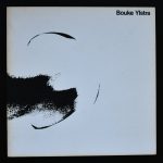
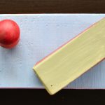
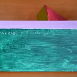
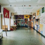
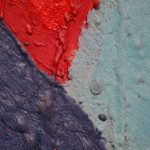
In some ways Bouke Ylstrat reminds me of Jan Roëde. An artists who uses bright colors in combination with child like scenes, but Ylstra works differ enough to stand on their own. Where Roede populates many of his paintings with children, Ylstra depicts adults in their world and creates a world of their own. Combining human elements with abstract surfaces, filling them with symbolism and creating in this way a world of its own. Ylstra is not that know. Even in the Netherlands his work is rare to find, but when you look at his biography you will find that his works has been included in practically all of the large museums in the Netherlands.

Schermafbeelding 2019-03-08 om 12.24.35

1933 Geboren in Den Haag. Groeit op in Rotterdam.
1950 -1954 Academie voor Beeldende kunsten in Rotterdam.
1955 Ontmoet Marie José Nicolaí met wie hij trouwt. Ze gaan in Dordrecht wonen en krijgen drie kinderen.
1959 Maakt zijn eerste monumentale werk, een zeventig meter lang mozaïek in Leeuwarden.
1960 -1964 Docent “Vrij schilderen”aan de Academie voor Industriële Vormgeving in Eindhoven.
1964 -1967 Docent “Grafische technieken”aan de Academie voor Beeldende Kunsten in Rotterdam.
1967 -1972 Afdelingsdocent “Gebonden kunsten” aan de Academie van BK in Rotterdam.
1979 -1981 Adviseur “Beeldende kunst”van de Rijksbouwmeester Ministerie VROM.
1983 -1990 
Docent “Vrij schilderen”aan de afdeling “Monumentaal” van de Rietveld Academie in Amsterdam.

1993.  Eerste expositie Galerie Duo Duo / Rotterdam
Galerie Sapet / Mirmande Frankrijk
1994. Galerie Witt /Dordrecht
Zomerexpositie Duo Duo / Rotterdam
1995. Galerie Duo Duo / Rotterdam
Opdracht: ontwerp vloerintarsia school Rotterdam
1996. Galerie Witt / Dordrecht – Institut Néerlandais / Parijs Groepstentoonstelling
1997. Galerie Duo Duo / Rotterdam
1998. Galerie Witt /Dordrecht. Zomerexpo Duo Duo
Houten beeld bij experimentele bouw Almere
1999. Duo Duo / Rotterdam
2000. Galerie Witt / Dordrecht
2001. Galerie Duo Duo / Rotterdam – Opdracht ontwerp i.s.m Cor Kraat beelden voor het Raadhuis te Veenendaal
2002. Galerie Dom Arte / Rucphen Galerie Witt / Dordrecht
Opdracht beeld Rijkspolitie te Dordrecht
2003.  Galerie Witt / Dordrecht
Opdracht Beeldengroep Westelijk Handelsterrein Rotterdam
2004.  Galerie Duo Duo / Rotterdam
2005.  Galerie Sapet / Mirmande frankrijk
Galerie Les Sagnes / st.Michel de Chabrianoux Frankrijk
Galerie Witt / Dordrecht
2006.  Galerie Duo Duo / Dordrecht
Opdracht 4 beeldengroepen voor scholengemeenschap
ROC te Leeuwarden
2009. Bouke Ylstra is op 17 Augustus 2009 in zijn woonplaats Dordrecht overleden.
    

www.ftn-books.com has a nice Ylstra publication including an original drawing for sale.


ystra eva b

Posted on Leave a comment

Mariken Wessels (1963)..Taking Off / Henry my Neighbor

Schermafbeelding 2019-03-07 om 11.06.01


By chance i stumbled upon this beautiful and highly collectable publication by Mariken Wessels. I always have admired her publications, but because of their price i never had purchased one, until recently i found one at the local book market, reasonably priced and i had to had it. The book has so many layers. It has a beautiful design and contains the 5000+ photographs  of “model” Martha. Reading and leaf throught the book is like travelling in time and experiencing art in the meantime . It is an artist book of a rare quality and i am lucky that i can offer an extra copy at www.ftn-books.com, because …the bookseller had three copies available from a bookshop that went out of business. One for myself, one for my son and one copy is for sale.

Justine Kurland on Mariken Wessels Taking Off. Henry My Neighbor

If there is one part of a woman’s body available to anyone as a site of erotic fantasy, it is the breast. We all either did or did not satisfy our needs for nutrients from its voluptuous, pendulous amplitude. Drunk from milk, my son used to push his Hot Wheels car over the then-mountainous terrain of my chest. Or he might hold fast to the left nipple while sucking the right, as if trying to reconcile the doppelgängers with his little fist—the good mommy that nursed him, and the bad mommy that took it away. There are a hundred different scenarios that lead to the same fetish. The titular artist of Mariken Wessels’s Taking Off. Henry My Neighbor, Henry, was a boob man. More specifically, he loved his wife Martha’s breasts.

Of the three-hundred-plus pages, edited and arranged by Wessels from Henry’s archive, over a hundred pages show repetitive grids of middle-aged Martha posing in quasi-erotic positions, in states of undress at their home in New Jersey, from 1981 to 1983. She stiffly offers herself to her husband’s camera, exhibiting more of a clinical awareness of her body than any real pleasure in it. Her gaze never meets the lens, but seems to follow directions to look stage right or stage left. There is nothing extraordinary about these pictures, aside from their immense number. Anyone with an iPhone might have many similar images. By 1984 Martha had left Henry, maybe tired of the constant attention of his mammogram-like camera, or maybe simply tired of Henry. A photograph shows her now-familiar arms, stretching out from an upstairs window and throwing streams of photographs down to the street below. We see the objects of Henry’s fantasy unhinged from the person of Martha, literally blowing away.

Mariken Wessels, Taking Off. Henry My Neighbor, Art Paper Editions. Ghent, Belgium, 2015. Designed by Mariken Wessels and Jurgen Maelfeyt.

What happened after Martha left marked Henry as an artist. He recycled his archive of photographs and collaged together fantastic mutations, recombining body parts into sprawling new forms. These images enact Martha’s symbolic death, engendering a battalion of phantasmagoric monsters in her place. She becomes a mostly headless totem of bulbous flesh, an orgy of breasts, a psychosexual grotesquerie. Henry then used these composites as studies for clay figures, which are also documented here. These sculptures complete the process of abstraction. Martha remains only as a disembodied breast-phallus with a striking resemblance to modernist sculpture.

What is clear is this: Henry’s long obsessive relationship with his wife allowed him to develop a voice that gave rise to a powerful and complex body of work.It is less clear what Wessels’s relationship with Henry yielded. We are told only that Henry left his work in his house under a neighbor’s care, and the neighbor later gave the work to Wessels. Henry is not given a last name, and the neighbor remains anonymous. How did Henry, an artist from New Jersey, end up having his life’s work published by a Dutch artist? What distinguishes her work from that of an editor or curator?

Mariken Wessels, Taking Off. Henry My Neighbor, Art Paper Editions. Ghent, Belgium, 2015. Designed by Mariken Wessels and Jurgen Maelfeyt.

After Henry abandoned his work he built a cabin in the woods to live out his last days. This follows a fantasy dear to my heart, one of isolation and self-reliance—a trope as familiar for visionaries and outsiders as the proverbial ride into the sunset is for cowboys. The final sequence in the book, presumably made after Henry had retreated to his cabin, shows traps laid in the forest and the animals caught in them. These pictures can be read as a final objectification of Martha, or as a reflection of Henry’s own emotional state. In either case he seemed to repudiate carnal pleasure, finally reducing the body to the raw condition of meat.

taking off

Posted on Leave a comment

Cassina


Schermafbeelding 2019-03-04 om 12.20.54

Cassina is one of the most renowned producers of furniture. Together with Herman Miller and Vitra they are the top in furniture design and all are producing new and proven classics in the best way possible. What makes these producers also stand out is the meticulous way in which they produce their furniture catalogues. Excellent designs and print quality by the best designers and printers. This way of making catalogues , designing and producing catalogues for their products makes these catalogues highly desirable and collectable items.

It is always worthwile to pick these up ( for free ) when you have the chance and if you want to complete your collection , know that www.ftn-books.com has some of these catalogues still available.


Posted on Leave a comment

Piet Dirkx weekly… Parbleu

Schermafbeelding 2019-03-31 om 11.56.32

Parbleu is the famous remark when this comic character makes a remark to his fellow compagnion Tom Poes. This is also the tile by one of the small objects by Piet Dirkx from our collection. Parbleu was made in 1994 and has been in our collection since.

dirkx parbleu a

Posted on Leave a comment

Piet Dirkx weekly

As promissed another detail which shows the thick layers of wax paint Piet uses to make his compositions. This painting was discussed earlier in another blog on Piet and has been presented on 3 locations before it finally was part of our collection. Among the locations was the Biotoop project at the Haags Gemeentemuseum.

Posted on Leave a comment

Giorgetto Giugiaro (1938)

Schermafbeelding 2019-02-25 om 17.16.32

For me Giugiaro stands for car design. Specially the iconic Alfa Romeo GTV and Sprint are the cars i am thinking of when i think of Giugiaro, but others  are reminded of other objects when they hear the name of Giugiaro, because he is one of the most influential Italian designers from our days. Coffee machimes, furniture, lamps etc. all by the hand or studio of Giugiaro have been produced in the last 50 years.

Giugiaro was named Car Designer of the Century in 1999 and inducted into the Automotive Hall of Fame in 2002 and this is the model i would like to share with you. After driving the original Austi Mini for a few years i changed to the even less reliable Alfa Romeo Sprint by Giugiaro. Less reliabel, but great fun to own and drive,

Schermafbeelding 2019-02-25 om 17.13.17

In addition to cars, Giugiaro designed camera bodies for Nikon, computer prototypes for Apple, Navigation promenade of Porto Santo Stefano, and developed a new pasta shape “Marille”, as well as office furniture for Okamura Corporation.

Giugiaro’s earliest cars, like the Alfa Romeo 105/115 Series Coupés, often featured tastefully arched and curving shapes, such as the De Tomaso Mangusta, Iso Grifo, and Maserati Ghibli. However, as the 1970s approached, Giugiaro’s designs became increasingly angular, culminating in the “folded paper” era of the 1970s. Straight-lined designs such as the BMW M1, Lotus Esprit S1, and Maserati Bora followed before a softer approach returned in the Maserati Merak, Lamborghini Calà, Maserati Spyder, and Ferrari GG50.

Giugiaro is widely known for the DeLorean DMC-12, featured prominently in the Hollywood blockbuster series Back to the Future. His most commercially successful design was the Volkswagen Golf Mk1.

There is a nice book on Giugiaro avaialble at www.ftn-books.com

giugiaro

Posted on Leave a comment

Karel F. Treebus (1938)

Schermafbeelding 2019-02-23 om 16.21.28

He is an important dutch Typographer, but is not that known outside the Netherlands, but because Treebus has witnessed the transsition from lead printing into the digital age of printing it is nice to see how this process has taken effect in the designs of Treebus. Treebus has made numerous designs in those 32 years he was sdesigning papers, letters and forms for the STAATSDRUKKERIJ /Uitgeverij.

Treebus is one of those people that has influenced 3 genarations of designers, because his designs used by many over a period of 40 years

www.ftn-books.com has an excellent monographic book on Treebus available.OLYMPUS DIGITAL CAMERA

Posted on Leave a comment

Jean-Gabriel Domergue (1889-1962)

Schermafbeelding 2019-02-18 om 16.31.13

France has had its share of society painters and i f ever there was one who came after the flood of great names who build a career in making portraits of wealthy women,  it must have been Domergue. He started his career in 1911 after he had finished his art studies at the École nationale supérieure des Beaux-Arts. Onwards he specialized in makeing portraits of Parisian women. Some people even say that this is how the French Pin Up was invented. His technique is something between impressionism and the style of Matisse.

domergue 1966 dd

His portraits are highly recognizable and the artistic appreciation and also the value of his works are starting to grow. This making him an artist for the future. The importance of Domergue is not only his figure studies , but also the works he has done as a fashion designer. The clothes he designed for Paul Poiret are considered as true classics. www.ftn-books.com has some nice vintage 60’s cataloges of the artist available.

Posted on Leave a comment

Bernard WILLEM Holtrop (1941)

Schermafbeelding 2019-02-11 om 16.07.36

When i compare artist with each other  , the artist that comes to mind is  Pettibon. I think the best way to compare WILLEM is by comparing his drawings with the ones made by Raymond Pettibon.Prins Bernhard comic by Willempettibon brush a

Put them next too eachother and you see a resemblance in the directness and of course the use of black and white within them. But WILLEM is not only known for his Black / white drawings , but also for his political drawings and … some great illustrations. Among them… the illustrations he had done for FROM A -> Z by Rebecca Rass, published by Thomas Rapp in 1969 and available at www.ftn-books.com

rass

Here is a part of the biography on WILLEM published by the Lambiek gallery:

Born and bred in de Veluwe, one of the most conservative regions of Holland, Willem has become one of the world’s most unpredictable and sardonic cartoonists. While studying Fine Arts between 1962 and 1967, it all started with some early comix and cartoons for magazines like De Legerkoerier (The Army Courier), and with Willem’s contributions to the legendary student magazine Propria Cures. There, he got in touch with Roel van Duyn, the editor of the paper for the hippie movement Provo.

Since Provo at that time didn’t have an illustrator, Willem started working for them right away. In 1966 he caused quite a stir by portraying the Dutch queen Juliana as a prostitute in one of his cartoons for the Provo publication God, Nederland & Oranje. What followed was a persecution for lese majesty and a fine of 200 guilders. Following the demise of the Provo movement, his work appeared in De Nieuwe Linie in 1967. He moved to Paris, France in the following year, where his first cartooning work were contributions to L’Enragé during the May 1968 student strikes in Paris.

He subsequently became a regular contributor to Hara Kiri as well as its follow-up Charlie Hebdo. Willem’s beloved themes such as fat women, biological warfare, crabs, small children and police violence were all represented in the many political cartoons, illustrations, puzzles, comix and texts for the magazine. He also served as a promotor of Dutch comic abroad with his own publication Surprise. He was eventually editor-in-chief of Charlie Mensuel. He also appeared in Benoît Lamy’s documentary ‘Cartoon Circus’ (1972), a Belgian documentary about cartoons and comics,  in which he was interviewed alongside SinéPichaRoland ToporCabuJean-Marc Reiser, François Cavanna, Professeur Choron, GalGeorges Wolinski, Joke and Jules Feiffer.

Ever since the late seventies, Willem has been contributing controversial daily cartoons to the French left-wing daily Libération. All through these years his output has been prolific, resulting in a veritable mountain of book publications, which are almost without exception hard to find. Luckily, in 1998, the editor Jean-Pierre Faur published the anthology ‘Deadlines’, a beautiful overview of the works of one of the most internationally renowned Dutch graphic artists.

Posted on Leave a comment

Kunstenaar en Fabriek / Judd & LeWitt

Schermafbeelding 2019-01-24 om 14.51.53.png

In 1970 only 2 years after the first exhibition with Minimal Art at the Haags Gemeentemuseum ( Curated by Enno Develing) , there was an initiative by 3 aspiring admirers who wanted to present their choice of Contemporary Art with a focus on Minimal Art. Organized by the Kunsthistorisch Instituut in 1970  a location was found with the Nebato Fabriek in Bergeijk. The Nebato metal construction company executed some of the works by LeWitt and Judd and in the meantime the artists stayed nearby with Martin and Mia Visser. The Visser’s collected during 3 decades one of the most famous of dutch  Modern Art collections and  focussed in those early years on Minimal Art . From the early beginning of 1966 they started collecting LeWitt and Judd. Building this way a world famous collection of Minimal Art. It all comes together in this exhibition at the Nebato factory in 1970. Participating artists were: van Amen, Balth, van benthumn, Graatsma, Gribling, Grosvenor, Judd, LeWit, Morris, van Munster, Naumann, Slothouber and Staakman. This catalogue is rare and one of the most important Minimal Art collectibles there is. publication is available at www.ftn-books.com

There is a nice article to be found on the internet in which the relation between Visser the collector and the (minimal )artists is explained.

Friday Food For Thought: Martin Visser – collector, designer, free spirit