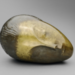
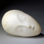
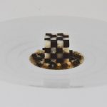
The First Hofkunst items i had in collection were the Pop Swatch series he made for Swatch. These watches were “specials” and sold among the groceries and vegetables in which these specials were presented and sold as ordinary groceries. The small edition of them made them highly collectable items and because of that and as soon as i had acquired them with much physical and financial effort, i sold them to another collector with a nice profit. It was at the height of the Swatch watches craze. A craze where simple plastic, but highly accurate and reliable watches fetched prices as much as 30 times their original value. In retrospect these watches were not worth this kind of money, but nowadays that prices have normalized and you might want to collect these specially designed watches. Alfred Hofkunst was one of the first that was invited to make a special for the newly introduced POP watches and came up with this series including a cucumber, bacon & egg and pepper watch.

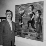
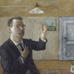
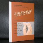
Hofkunst himself is a well known Suisse artist who was friends with Jean Tinguely and Bernhard Luginbühl and can be considered as one of the most important Suisse artist from last century. Of all these 3 artists www.ftn-books.com has catalogues and posters available. Unfortunately Hofkunst died too early at the age of 62.